Tom's Guide Verdict
macOS Big Sur gives Safari major improvements, but its design changes may require some adjustments on your end.
Pros
- +
Safari gets more complete
- +
Control Center collects options
- +
Messages gets pinned texts, GIF search
Cons
- -
Interface changes may not please all
- -
Doesn't support some older Macs
Why you can trust Tom's Guide
macOS Big Sur is finally here. I've spent the summer playing around with the Developer Beta, where I saw some the perks of Apple's biggest refresh to its laptops and desktops in ages, and I'm ready to tell you if you should or shouldn't update now.
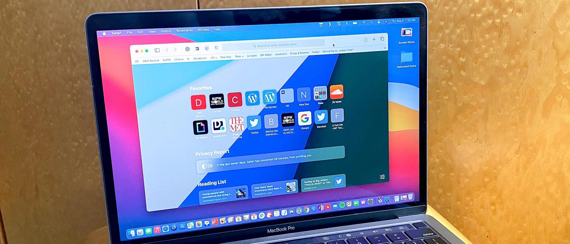
The biggest Big Sur changes revolve around the interface, which has become more iOS-like, and pushed for bolder color, thanks to increased use of transparency and translucency. Safari's gotten a lot of tricks as well, including a tab preview option that we're surprised they beat Chrome to.
- The best laptops right now
- MacBook Air vs Pro: What's right for you?
- macOS Big Sur is here — How to download it now
That being said, macOS Big Sur isn't coming out in a vacuum. A new generation of Macs just debuted — all running the Apple M1 chip, including the new MacBook Air (2020) — and they will run Big Sur and also offer the ability to emulate iOS and iPadOS apps. We haven't gotten our hands on those yet, so I can't speak to how well that works.
But for everyone else considering the upgrade from macOS Catalina (or earlier), here's everything you need to know to see if you should download the macOS Big Sur today:
macOS Big Sur review: Release date and supported devices
macOS Big Sur's release date has been "this fall," and since that season doesn't end until mid-December, they've hit that window. At the "One more thing" event, Apple announced that macOS Big Sur is arriving on Thursday, Nov. 12.
Here's the complete list of Macs that support Big Sur:
- MacBook: 2015 and later
- MacBook Air: 2013 and later
- MacBook Pro: Late 2013 and later
- Mac mini: 2014 and later
- iMac: 2014 and later
- iMac Pro: 2017 and later (all models)
- Mac Pro: 2013 and later
Personally, this is the biggest issue I have with macOS Big Sur, as my personal MacBook Pro, the first Retina Display model, came out in 2012. While it still runs (albeit a bit slower than it once did), I can see the writing on the walls, and anticipate buying a new Mac soon.
macOS Big Sur review: Design
I almost worry about the day my parents update to macOS Big Sur, because they're going to call or text and say "it's so different!" The biggest change from my point of view is the increased use of transparent and translucent layers, which you'll see everywhere from the Menu Bar at the top of the screen to every app's Toolbar, where all of its buttons are found.
Your preference for Apple's changes here — where they're seemingly having the menus recede into the background to make content more prominent — will likely depend on how your eyes like (or dislike) text overlaid on transparent layers.
At first, I saw the combination of white text on an opaque bright blue background as ... not what I would have chosen personally. Fortunately, you can switch your desktop background, and Apple offers plenty of options, which can and will change the color of the menu bar text for optimal legibility.
Gripes aside, though, I love some of the new stock desktop backgrounds, so play around and find what works best for you.

I probably wouldn't have gone this route had I been given the choice, as a more consistent interface allows you to pick the background you want and stay with it. That being said, I understand Apple's decision, and in the months I've used Big Sur, I've gotten used to all the different combinations.
These moments happen throughout macOS Big Sur, including in Safari, where the backgrounds of websites can change the colors of the Toolbar and bookmark bar as you scroll down. To adjust, open System Preferences, select Accessibility, select Display in the left menu and click "Reduce transparency."
Also, Apple's dialed back the silver hues of many of their applications, including Finder, Music and Safari, to a more neutral white tone. This may just be personal preference — I'm not sure — but while I preferred the silver hue of the past, this is something I quickly got over as well.
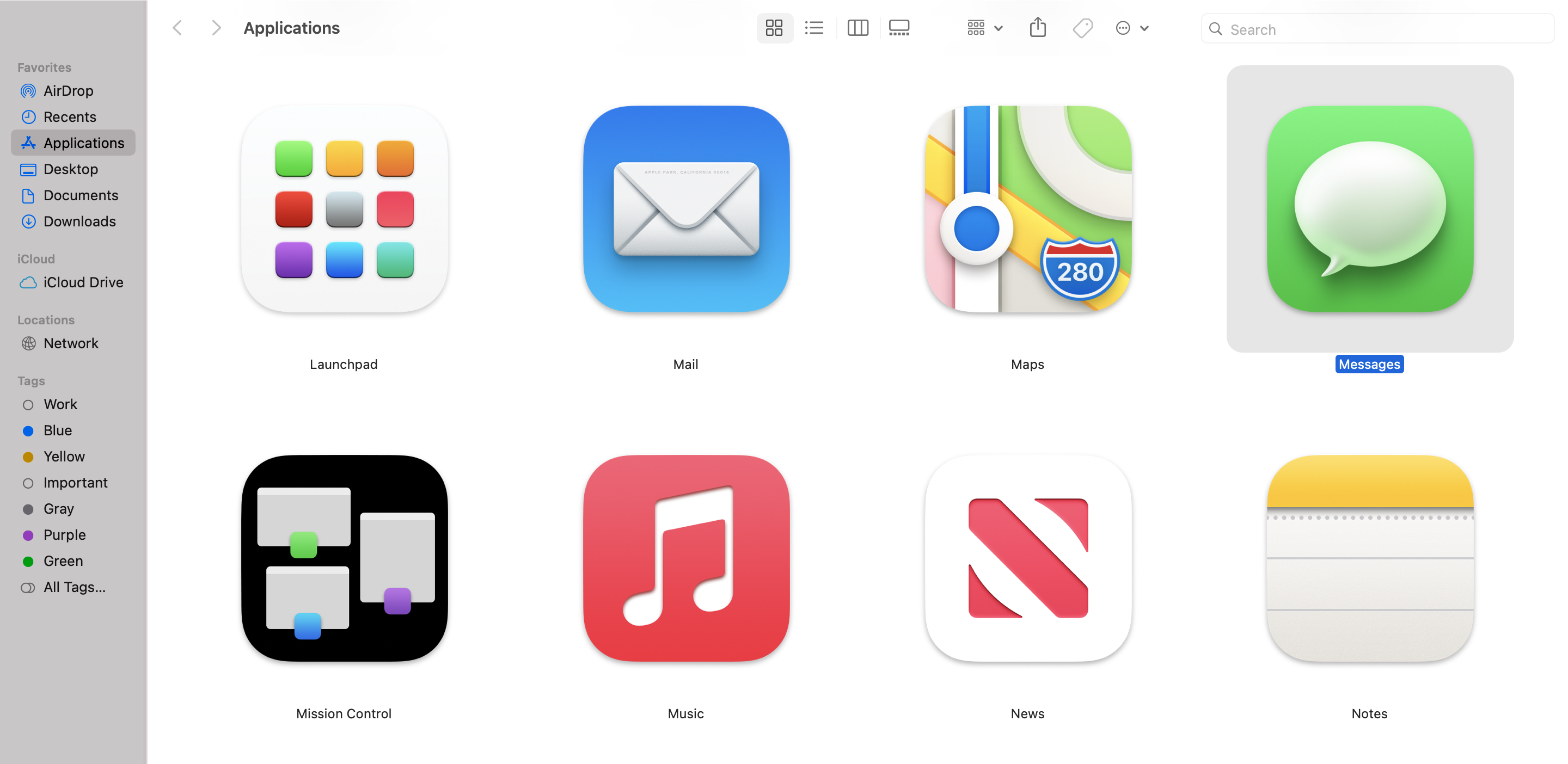
The other big aesthetic change comes to macOS' app icons. Apple's introduced a new standard icon shape, using the squares with rounded edges seen in iOS. Along with that, we've got icons that look a lot more bubbly and curved. The design language used here is known as Neumorphism, and it puts an emphasis on shadows and dimensionality.
If you're the type to care about app icons (and I count myself as one of those nit-picky types), you'll probably have strong opinions. I prefer how Music and News look, where the secondary element looks debossed, rather than how the chat bubble for Messages and the envelope for Mail are seemingly popping up out of the background.
The one actually annoying part of this is that I have not gotten used to the new red hue of the Music app icon, making it hard to visually find it (I know I'll get used to it).

One design discrepancy I've noticed, though, is how macOS handles security alerts and notifications. The former appear in middle-of-screen boxes, while the latter are smaller in the top-right corner, often times only showing you there's a button to click when your cursor hovers over it buttons. For new email notifications, that's not a big deal, but those initial notifications for each app, where they ask for permission to send notifications, I'd rather those appear in the center, where they'd be harder to ignore. Anything that appears in the top right corner is easier to dismiss.
It's hard to be especially critical about design, since it's so much more subjective than almost any other aspect of technology, so I couch all of the above in "your mileage may vary."
macOS Big Sur: Safari
Every time Apple announces a big new macOS update, I decide to use it as a chance to spend more time with Safari, which often gets more and more perks. And with macOS Big Sur, it feels like I'm going to be spending more time with Safari than ever. Sure, I won't be able to use it for some work stuff (some of our extensions are Chrome-only), but Safari's finally getting some features it's long needed.
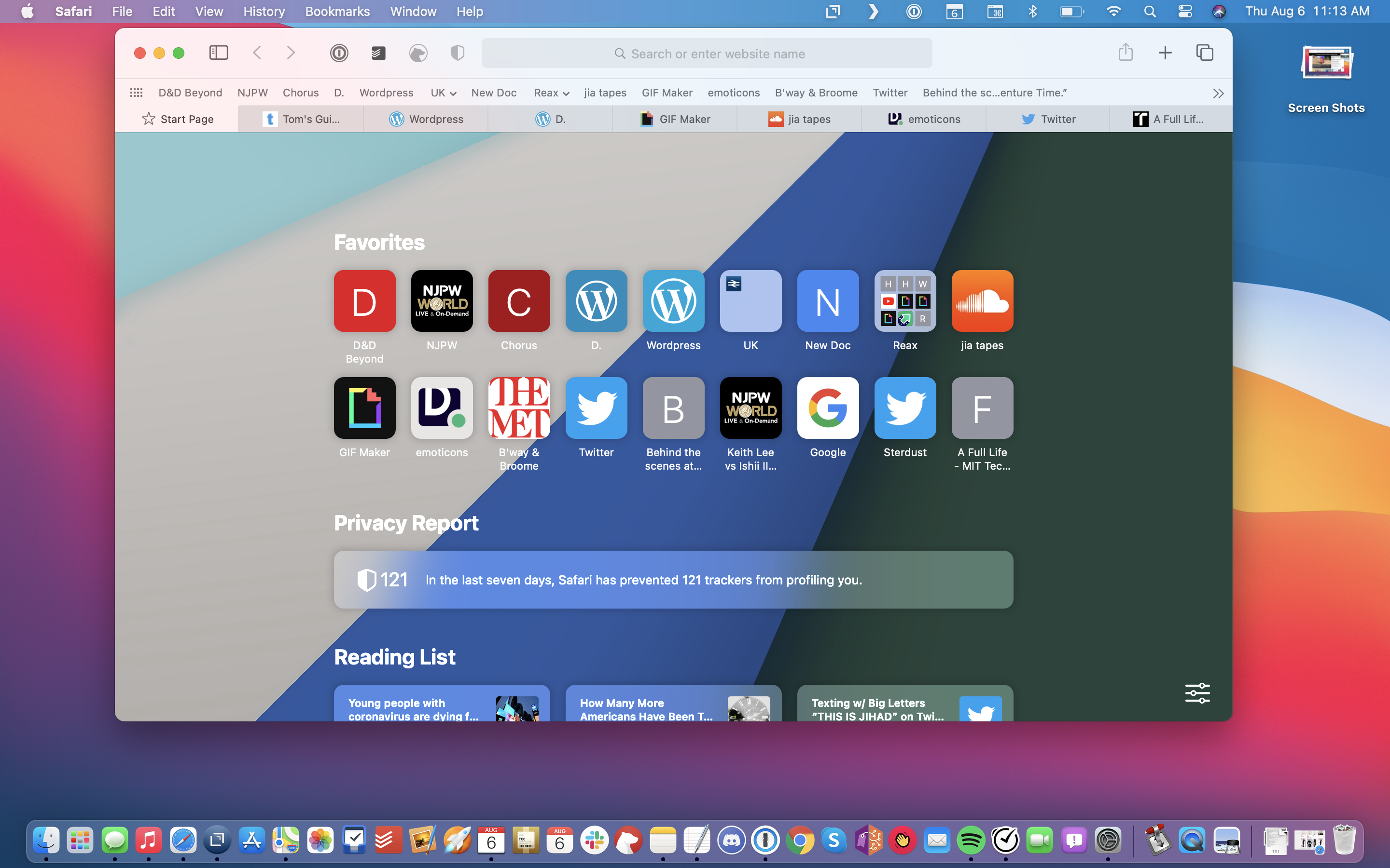
First off, you can choose a splash image for your blank tab screen. I chose the basic "diagonal rays of color" image that's pre-loaded into Big Sur, but you can pick whatever image you want. Chrome's had this forever, and it's good to see Safari catch up.
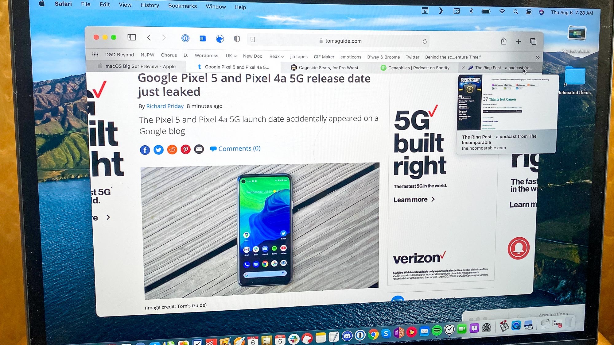
Similarly, I'm saying "finally" at the sight of favicons — the little icons for each website, like Twitter's bird and Dropbox's opened box — for tabs in Safari. These make it much easier to keep track of which tab is which, and have been in every other web browser since I can remember. Apple had made favicons available in Safari previously, but they were in the app's settings, where many people might not poke around and find.
Apple didn't stop at that low-hanging fruit, though, as it's also rolled out tab previews. If the favicon isn't enough for you to realize what's on that page (it's been enough for me so far), you can hover over a tab to see what that page looks like, as a pop-over image will show a glimpse of said site.
Apple rates Safari on macOS Big Sur as "50% faster on average at loading frequently visited websites than Chrome," but I haven't noticed any significantly faster performance myself, though I haven't done any testing yet. Apple also claims that Safari is going to last an hour longer on battery than Chrome and Firefox for web browsing, and up to 3 hours longer for streaming video online.
macOS Big Sur: Control Center and widgets on the Mac
Apple's also imported iOS' Control Center, which collects a lot of system preferences (Wi-Fi, Bluetooth, AirDrop, display brightness, volume, Do Not Disturb, keyboard brightness and screen mirroring) under a Menu Bar button that looks like a pair of on/off toggles.
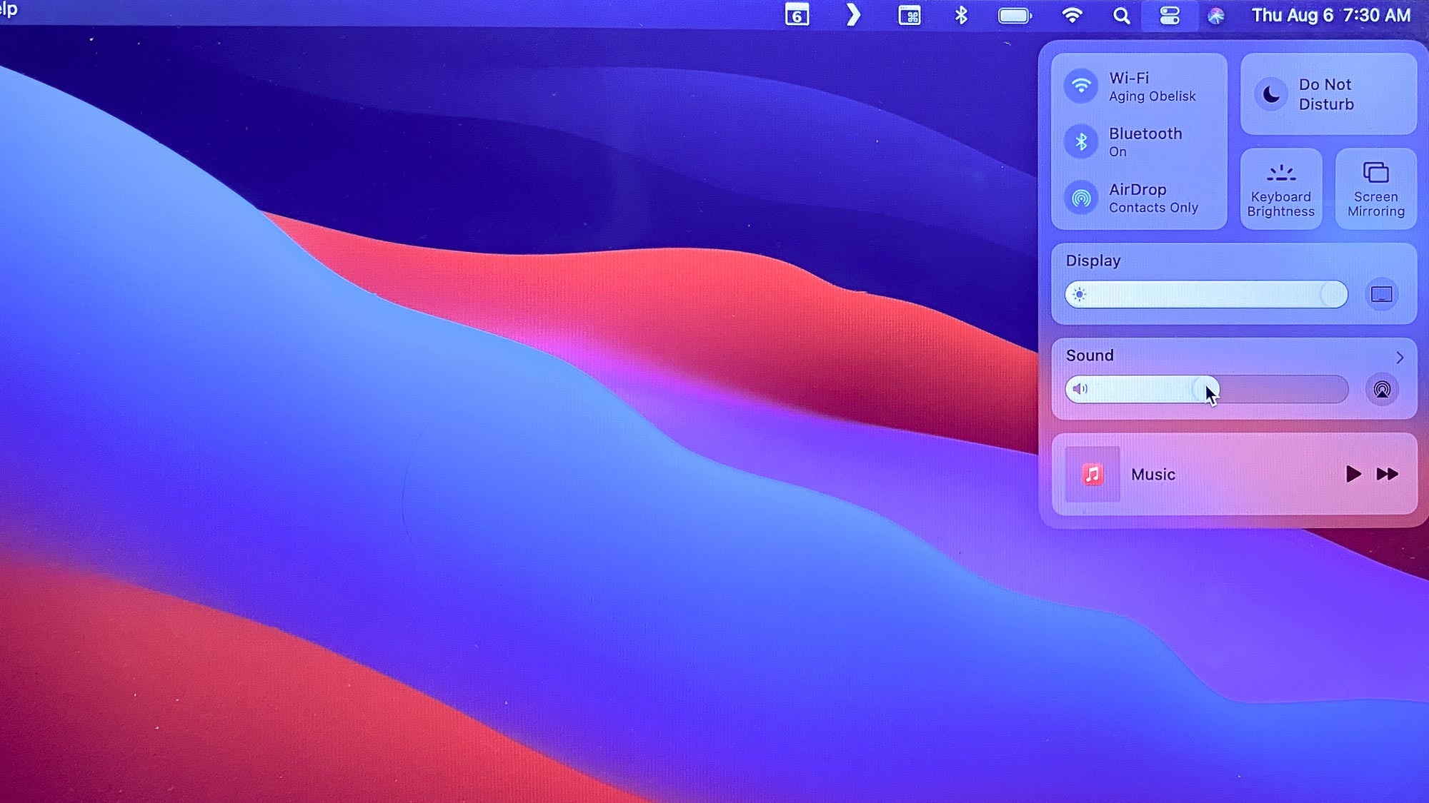
The best part of this feature is that it's not moving any features away from where they were, but consolidating them under one easy to find area, so users who are more familiar with their iPhone (both place this set of options in the top right corner) may find them faster. At the same time, these buttons all look a little bigger than they did in previous macOS versions. The larger icons aren't just easier to see, they're also a little more finger friendly, suggesting that Macs will some day offer a touch screen.
That being said, I didn't find myself using Control Center at all, because my ingrained muscle memory for macOS defaults to using the traditional means. Yes, that includes the Touch Bar, which I don't like, but use anyways, as my fingers are still reaching for the row of keys at the top of the keyboard.
Oh, and Apple's so in love with widgets in iOS 14 that Big Sur is also getting widgets. I haven't gotten to use any third party widgets (the best on iOS if you ask me), but I do like how the Notes widget makes it easier to access my household's shared grocery list. I just wish I could see more of it, as the single note version of the Notes app widget is only available in the small size, and not medium (2x) or large (4x).
macOS Big Sur: Security and privacy
macOS Catalina got a lot of flack for its heavy-handed security measures, forcing users to manually approve access for a lot of features -- over and over again. Personally, I'm all for it, because people should be more aware of what applications can do what with their data.

Similarly, people should be more capable of seeing how websites are tracking them, something that Safari has pushed harder on. From the Safari start page you're presented with a counter of how many trackers Safari has stopped from "profiling you." Mozilla's Firefox browser has a similar feature.
And when you load any website in Safari, you can click the Shield icon to see how many trackers are active and prevented on that page.
macOS Big Sur: Beta notes
Beta versions of software are (nearly all of the time) less stable than the final versions released to the public — and that's been true for some of my time with macOS Big Sur. Most of the time, though it was stable, but when I did hit insurmountable flaws, I remembered why I warn people to never ever use beta software on their production machine. For example, software developers tend to only put betas on their test machines, and not their actual work machines.
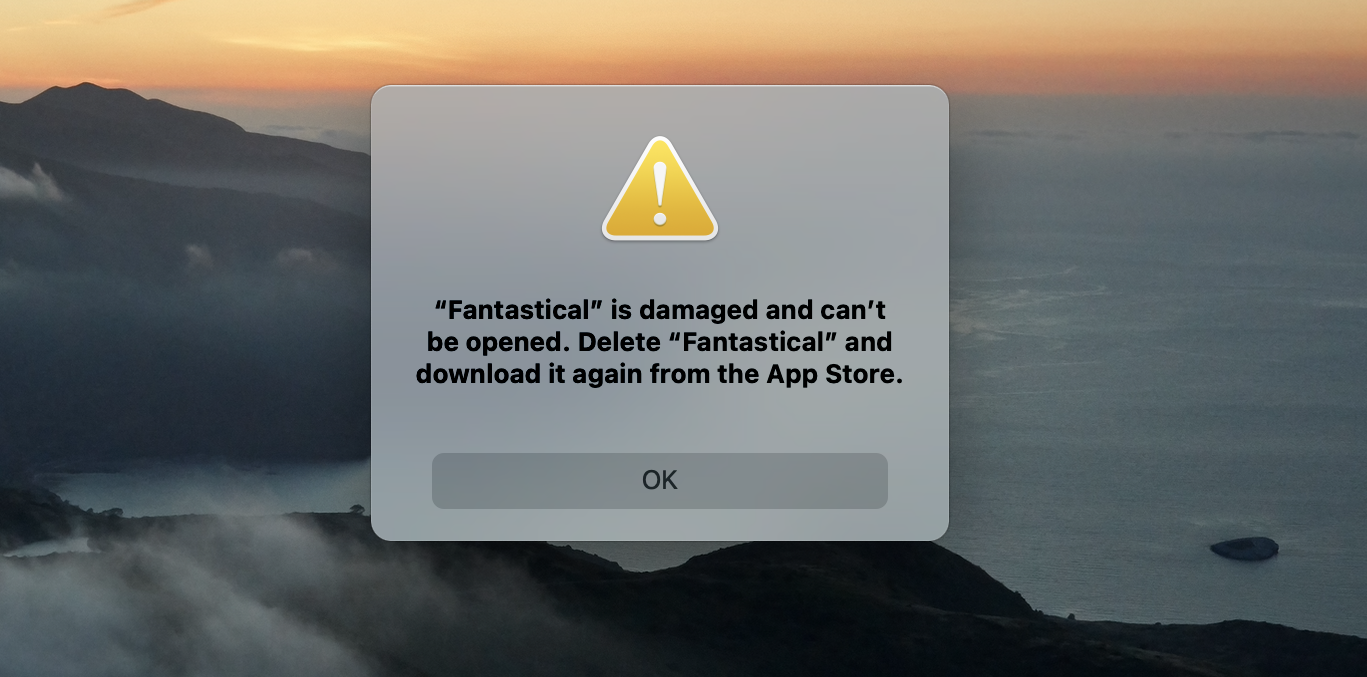
During earlier builds of the Big Sur developer betas, I ran into a really annoying problem where Mac App Store apps such as Due and Fantastical had to be deleted and reinstalled, but you couldn't delete them without restarting.
Later, and this is the one that really sent me chasing answers, I couldn't open any Google Docs in Chrome. I kept getting an "Aw, snap" error message, which was both annoying and reminiscent of Steve Buscemi's "hello fellow kids" moment on 30 Rock (though that's more an issue with Google than Apple).
macOS Big Sur: Features also found on iOS 14
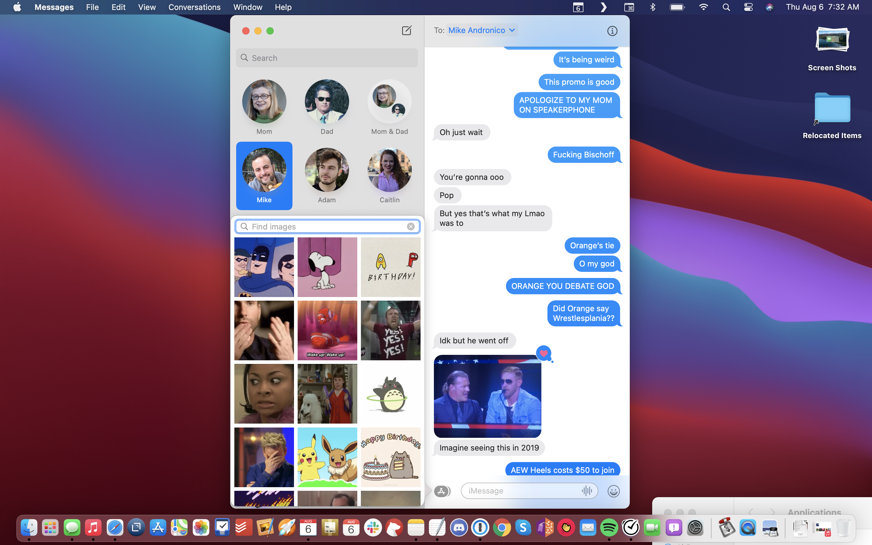
In Messages, macOS gets the pinned messages (up to 9) that we see in the iOS 14 and iPadOS 14, but also threaded messages for replies in group chats. Those are nice, but I'm more happy to see the GIF search engine finally built into the OS. Now, when you tap on the Messages Apps icon next to the text entry field, you get the #images search option, to pull GIFs off the internet.
I don't know if or when folks will give Apple Maps another shot, but if they pull up Maps on macOS Big Sur, they'll get a pleasant surprise at how full featured it is. In the left rail, you see our favorites (home, work, the movie theater you used to go to before COVID-19) and recent locations, such as the one NYC park that's actually quiet and my nearby UPS store.
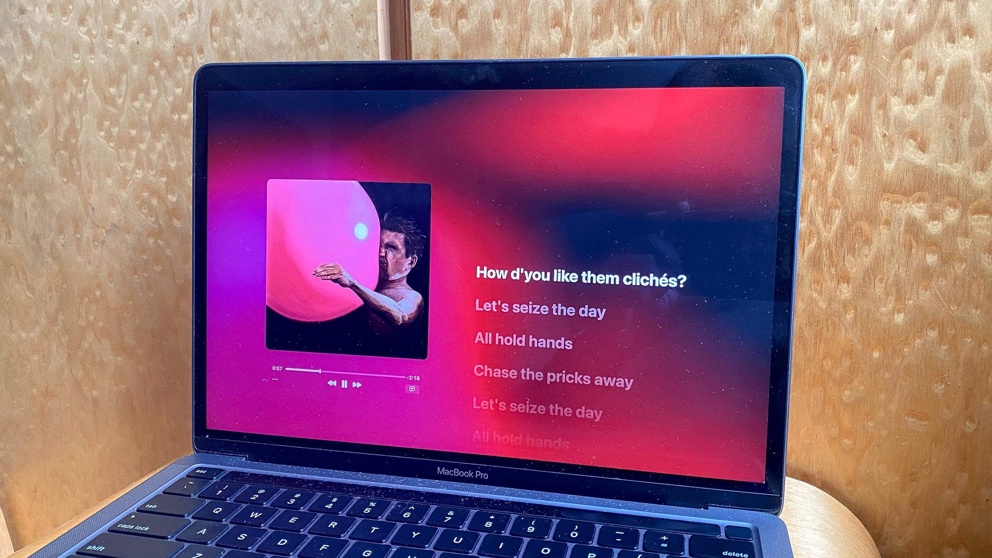
What I really like is how the Music app mini player can be turned into a beautiful full-screen experience presenting lyrics and artwork on a larger scale. Hit Shift + Command + M to open the Mini Viewer, and click the Green full screen button to see it for yourself.
Big Sur also gets the automatic AirPods device switching that the iOS and iPadOS got earlier this fall. It works a little differently, though, as you'll only switch the audio after confirming a small pop-up in the top right corner of the screen. Wish it were more truly automatic, but I guess Apple's trying to avoid false-positives when people own multiple devices.
macOS Big Sur: Outlook
While I like a fair share of macOS Big Sur's features, I have a hard time telling people to install it ASAP. The design changes and Safari improvements are nice, but this is arguably not where all the big news in the land of Macs is happening.
Maybe one of the above features is calling your name, and that's well and good. My one piece of advice is to look up any third-party applications that you rely on for work, and make sure they have been updated for Big Sur. Major updates always carry a risk for compatibility issues — just like how the beta of Big Sur wasn't
As noted above, the biggest story in macOS is the impending arrival of Apple M1 chip Macs that run on ARM-based chips. Not only will those bring iOS apps to the Mac, but the performance and endurance gains found in Apple Silicon chips have a chance to reshape the Mac as we know it.
Maybe you can wait until your first Apple Silicon Mac to get Big Sur, as that may be a safer bet. For now, though, Big Sur looks like solid terrain for the future of the Mac.

Henry is a managing editor at Tom’s Guide covering streaming media, laptops and all things Apple, reviewing devices and services for the past seven years. Prior to joining Tom's Guide, he reviewed software and hardware for TechRadar Pro, and interviewed artists for Patek Philippe International Magazine. He's also covered the wild world of professional wrestling for Cageside Seats, interviewing athletes and other industry veterans.
