Tom's Guide Verdict
Frustrating software and printed products that are average at best make CVS Photo an also-ran that's easily outshone by Mixbook and Printique.
Pros
- +
Editable book and calendar templates
- +
Variable size photo borders
- +
Simple photo editing
Cons
- -
No search engine for clip art or backgrounds
- -
Limited color selection tools
- -
Threadbare card software
- -
Unexciting print quality
Why you can trust Tom's Guide
CVS stores are so numerous, and its website is quite popular. But the CVS Photo website isn’t a great place to create and buy photo books, cards or calendars. The software (licensed from Snapfish, as is Walmart’s) has almost as many negatives as it does positives, and the printed products are either undistinguished or downright unappealing. For far better software and printed quality, at similar prices, go with Mixbook or Printique instead.
CVS Photo review: Prices
CVS photo books
Our test 20-page 8.5 x 11-inch hardcover book cost $39.99. That’s the only size available for a standard customized hardcover. Layflats cost $44.99 for an 8 x 11-inch book.
CVS photo calendars
Our test 8. 5x 11-inch wall calendar cost $19.99. Other calendars include 11 x 14 or 9 x 12-inch wall calendars for $29.99. Desktops start at $9.99 for a 10 x 5-inch flip calendar, and include a $29.99 wood easel that holds individual month cards.
CVS photo cards
Our test 5 x 7-inch cards on 120-pound cardstock cost $1.99 each and included a blank envelope. The price for a thinner 110-pound cardstock is $1.49. There’s no discount for volume. A printed return address on your envelopes costs 15 cents each.
CVS Photo review: Software
CVS licenses its software from Snapfish, so its interface is similar, but more limited in terms of content. Walmart, which also uses Snapfish’s software, has even less content than CVS.
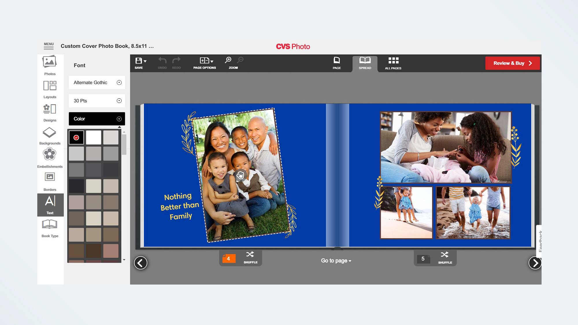
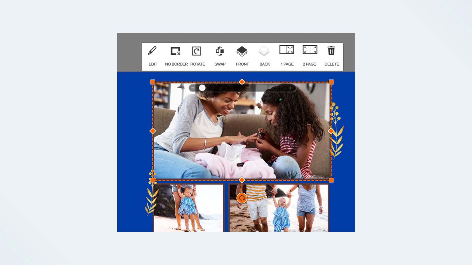
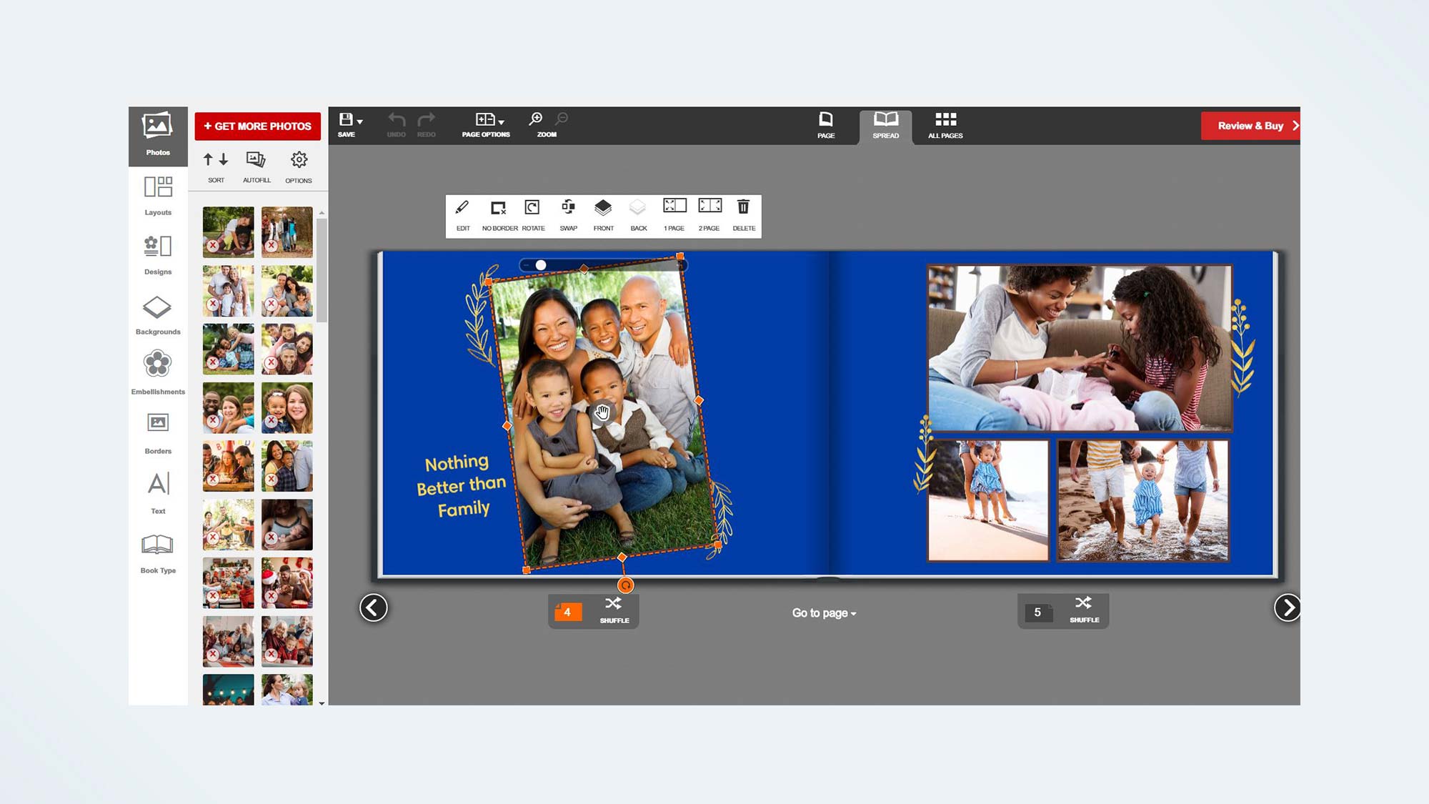
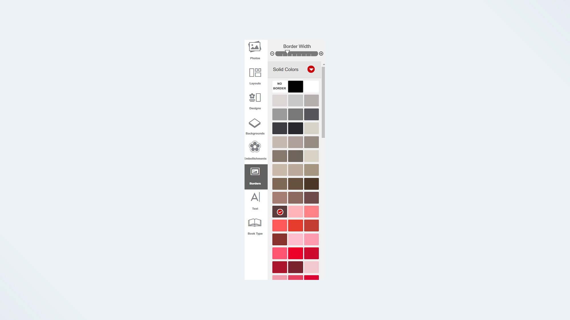
While the library of templates wasn’t large, we were able to fully customize our book and the top section of our calendar, regardless of the template or selected page layout. CVS gives you control over the width of book and calendar photo borders with a simple slider that has eight stop points. This is far better than Shutterfly's and Costco's fixed border widths. (The card interface has no borders.)
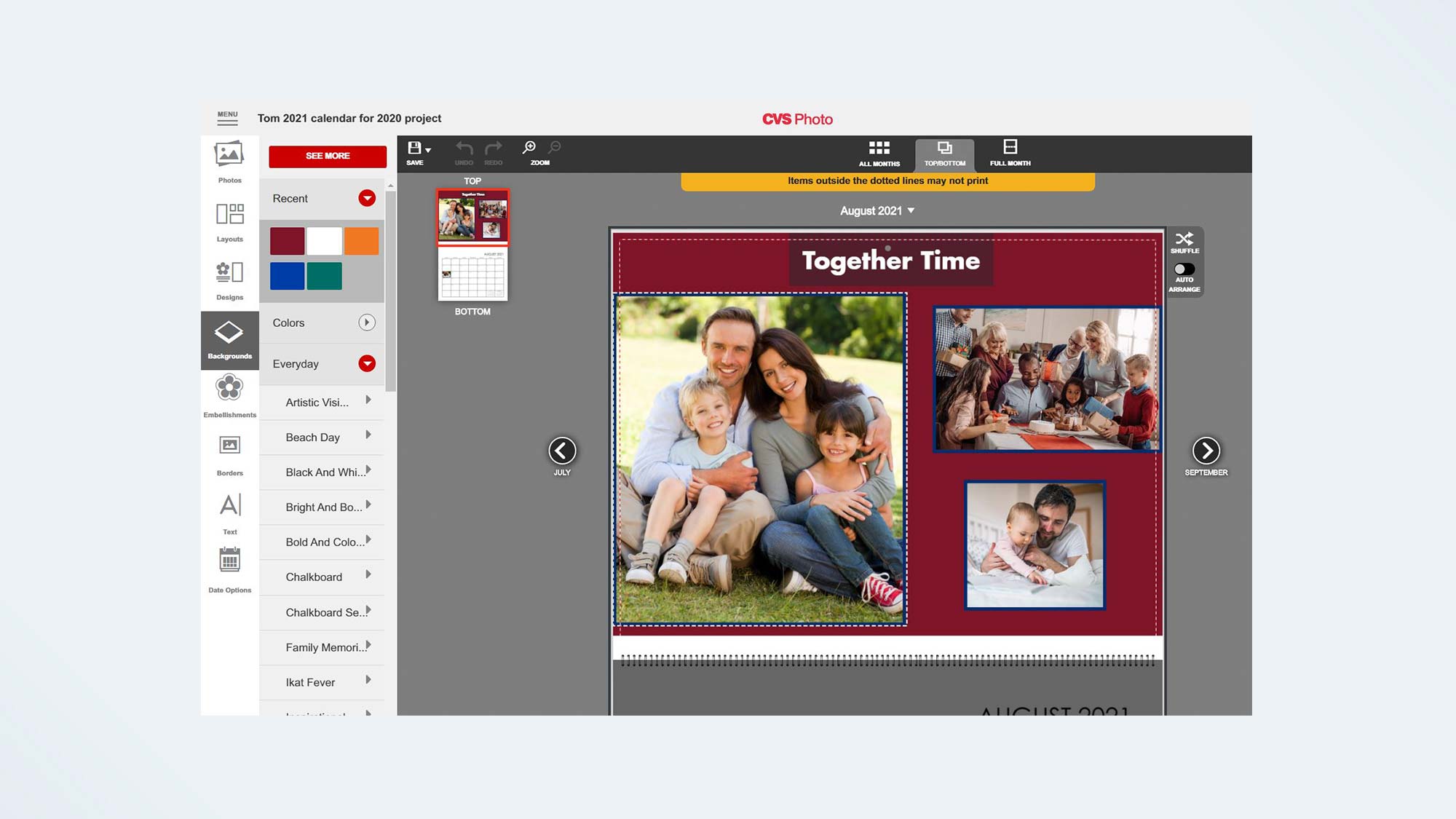
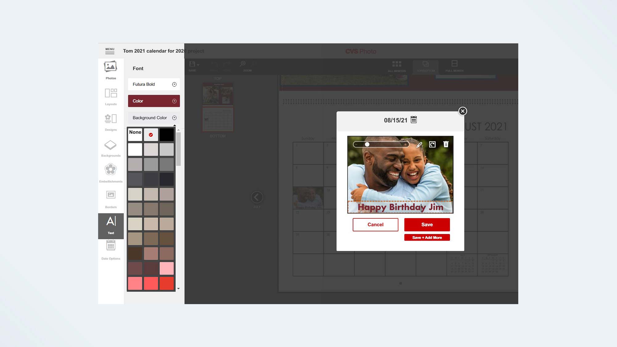
While we couldn't add clip art or alternate backgrounds to the calendar's bottom page, a photo dragged onto a date box automatically resized to fit the box. Double-clicking a date opened up a window where we could zoom/pan the photo, as well as add my date captions, using the software’s text tool.
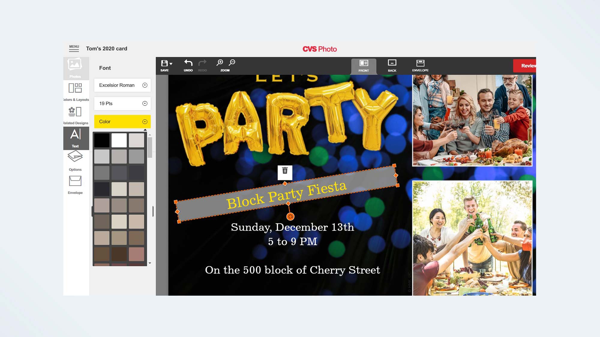
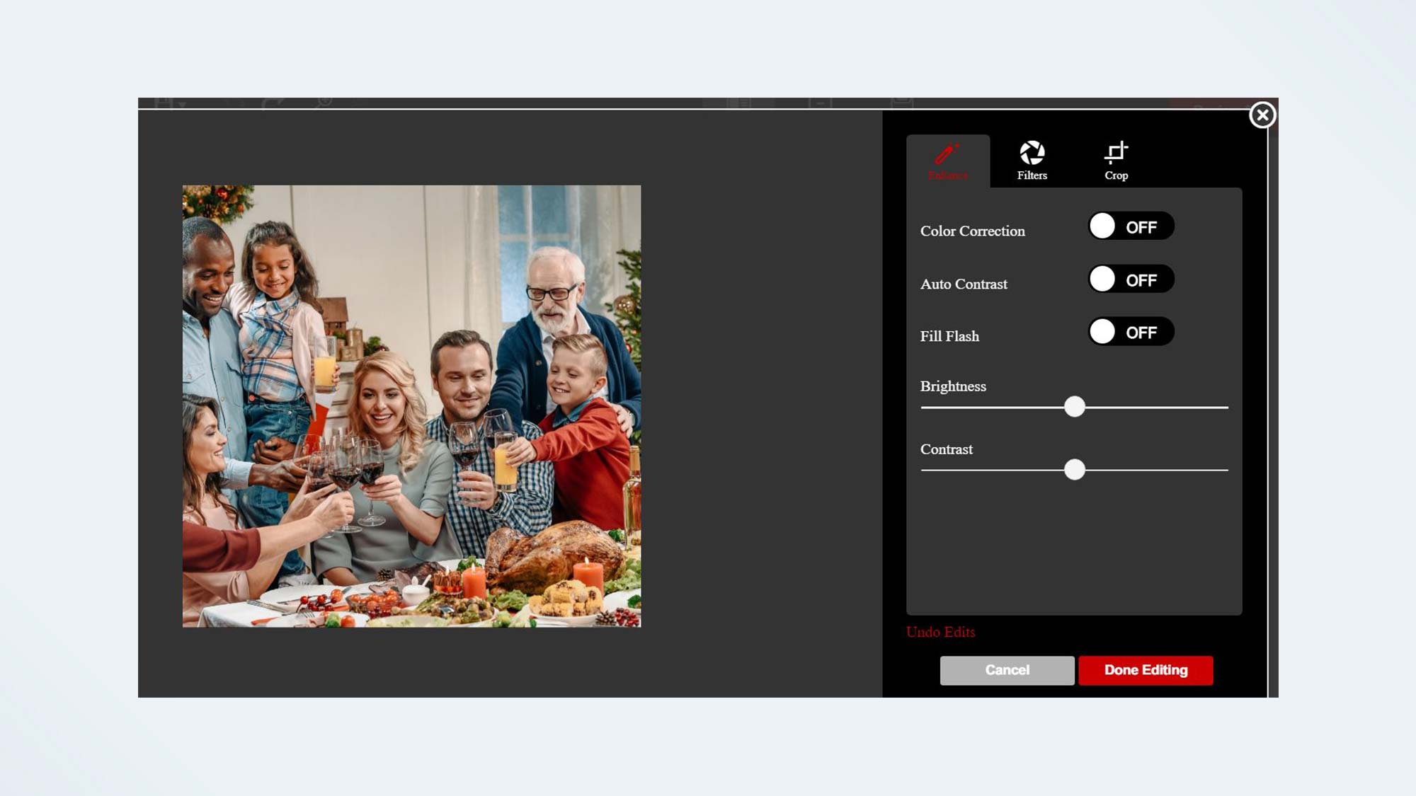
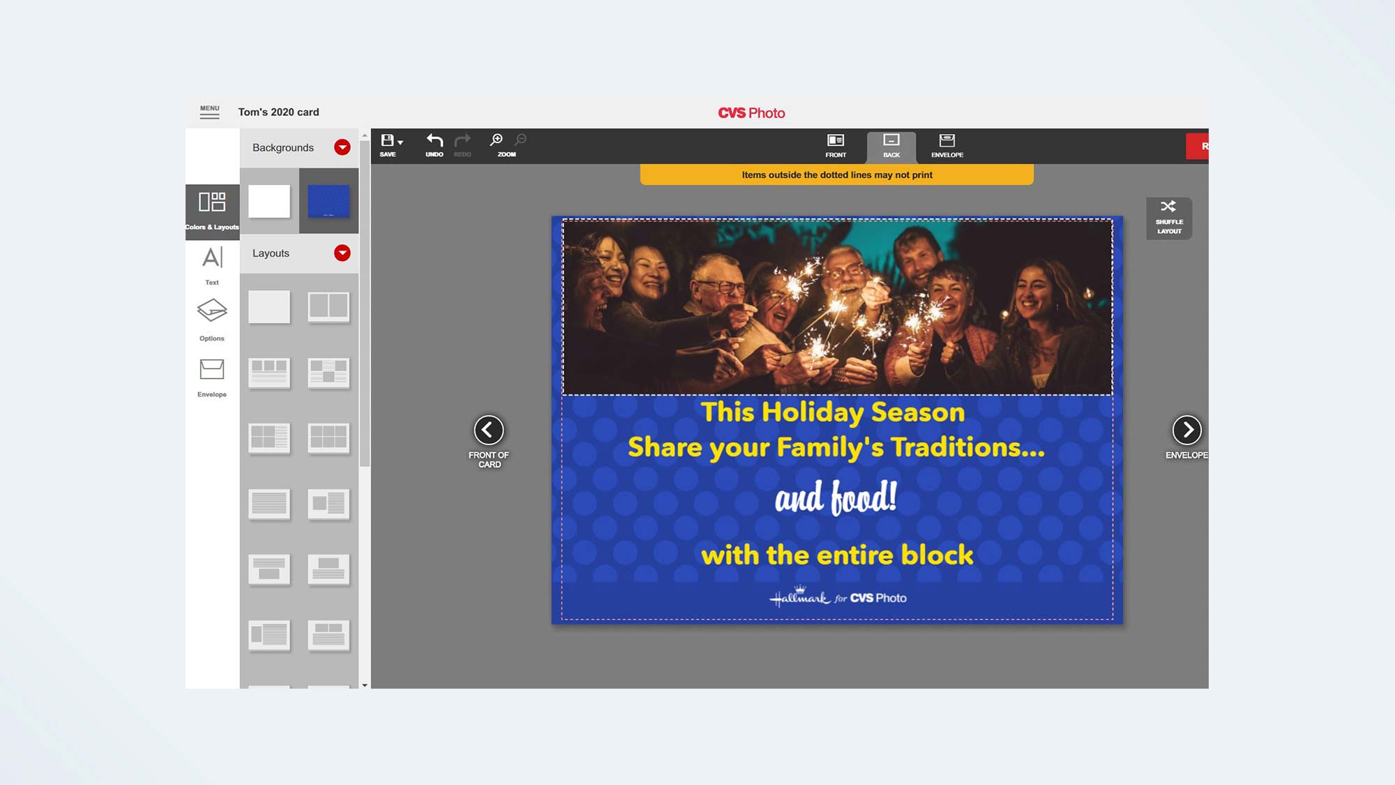
CVS’s card interface is far more limited than the books and calendars. The variety of card templates are wider; however, it was difficult to find one that fit our criteria. That's because clip art, decorative text, and the photo placeholders are fixed on the front of the card. So, we couldn't choose a design we liked that was for, say, an anniversary celebration and use it for a holiday party, because the decorative text that said, "Here’s to 25 more years!" couldn't be deleted. However, we could add, rotate, move and delete text blocks. The back of the card is a bit more editable.
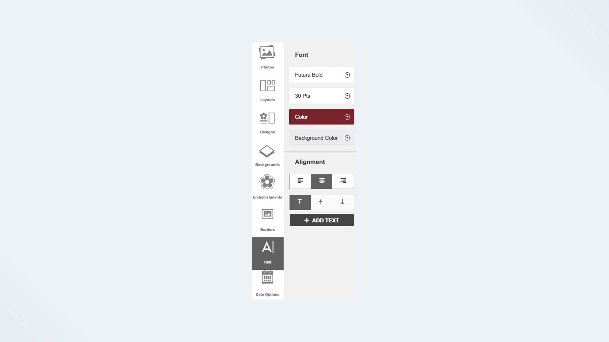
Unfortunately, CVS’s text tool (in all three interfaces) has only the barest necessities: font, size (in set increments), alignment and color. It has no bold or italics option, nor is there a drop shadow. The one nice feature is that you can set a transparent color background for the text box, which can assure that the type will stand out against a photo or background. Color selections for borders and text are limited to a selection of unnamed color blocks, which makes it difficult to match, for instance, your border to your text.
CVS Photo review: Print Quality
CVS photo book
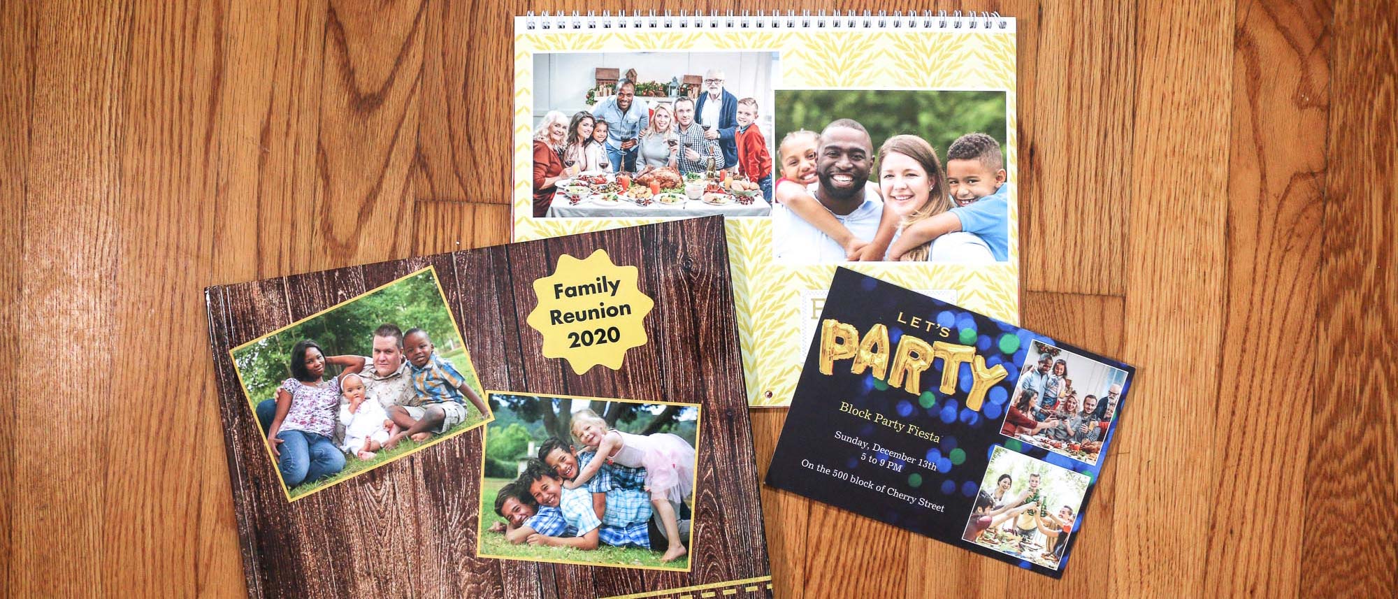
The CVS photo book is cheaply constructed, and the binding was already breaking after a few days. The end papers are an inexpensive textured black with glue that is showing, and the book has no flyleaf papers. While the semi-gloss paper is a bit thin, it has a pleasant smooth feel.
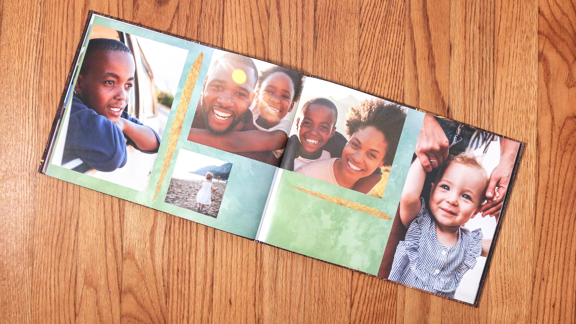
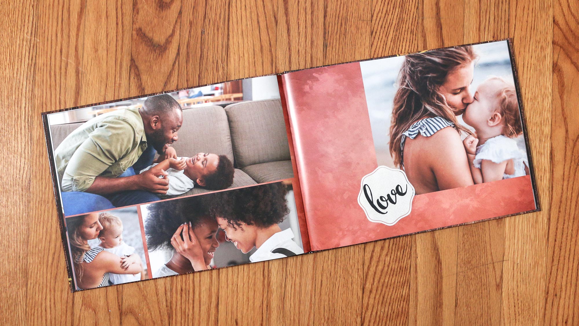
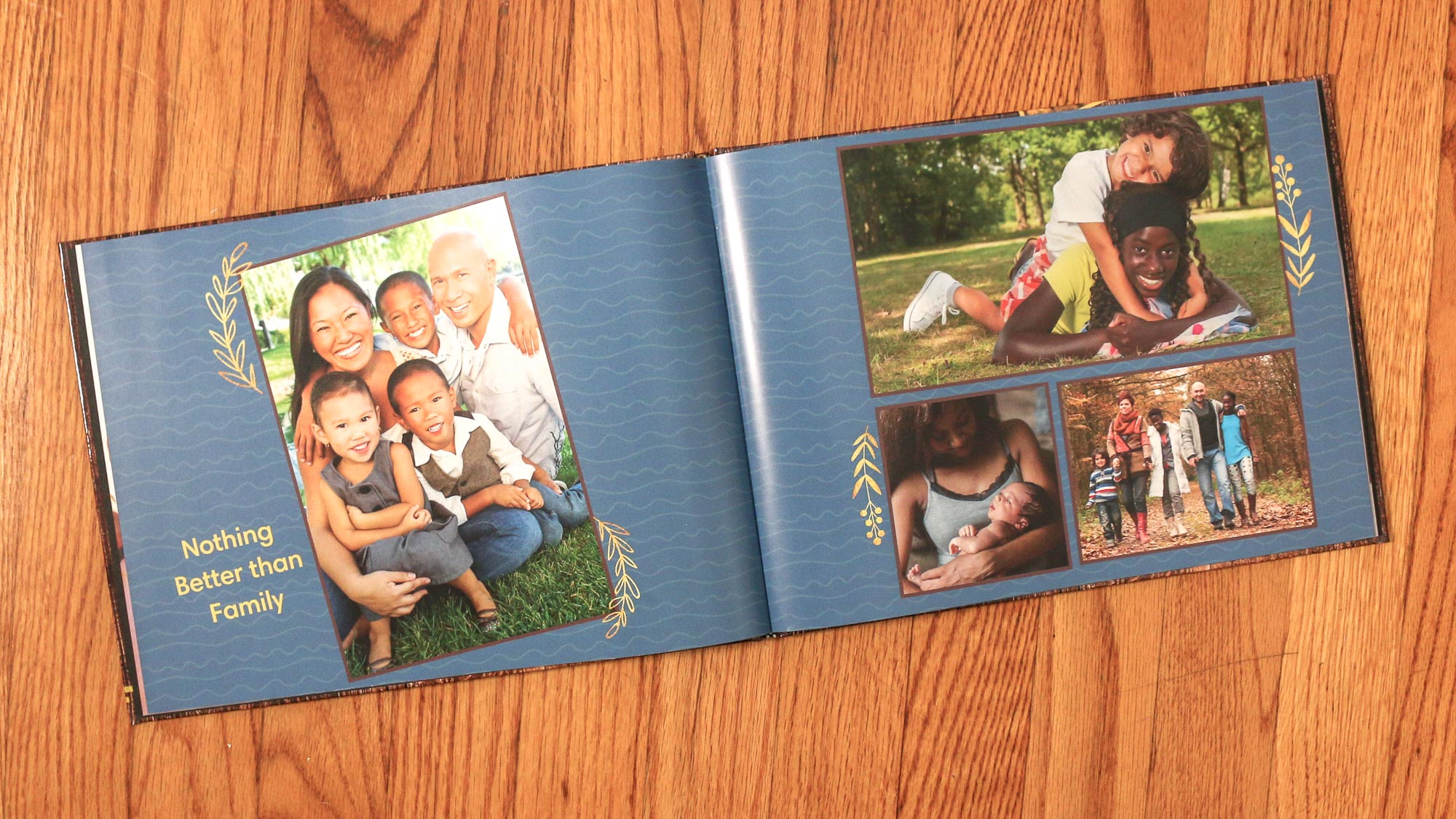
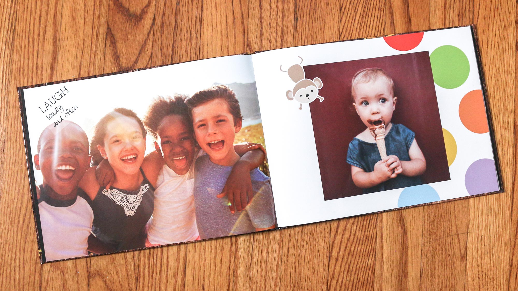

The book’s photo quality is uneven, with a red/orange shift to the colors which is appealing in some pictures, and quite unsettling in others, especially on some faces. Image details and sharpness are generally okay, though some images are soft. The type has margin bleed and jagged edges.
CVS photo calendar
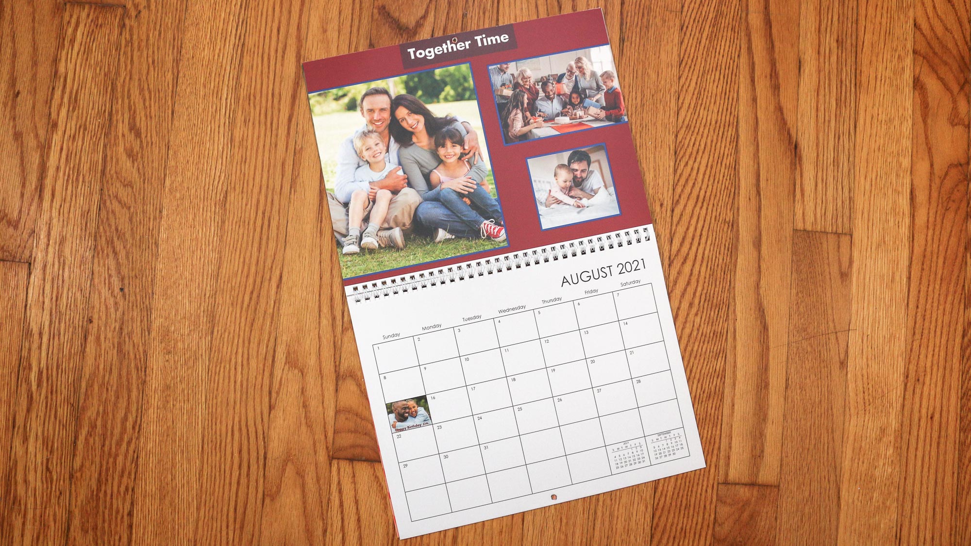
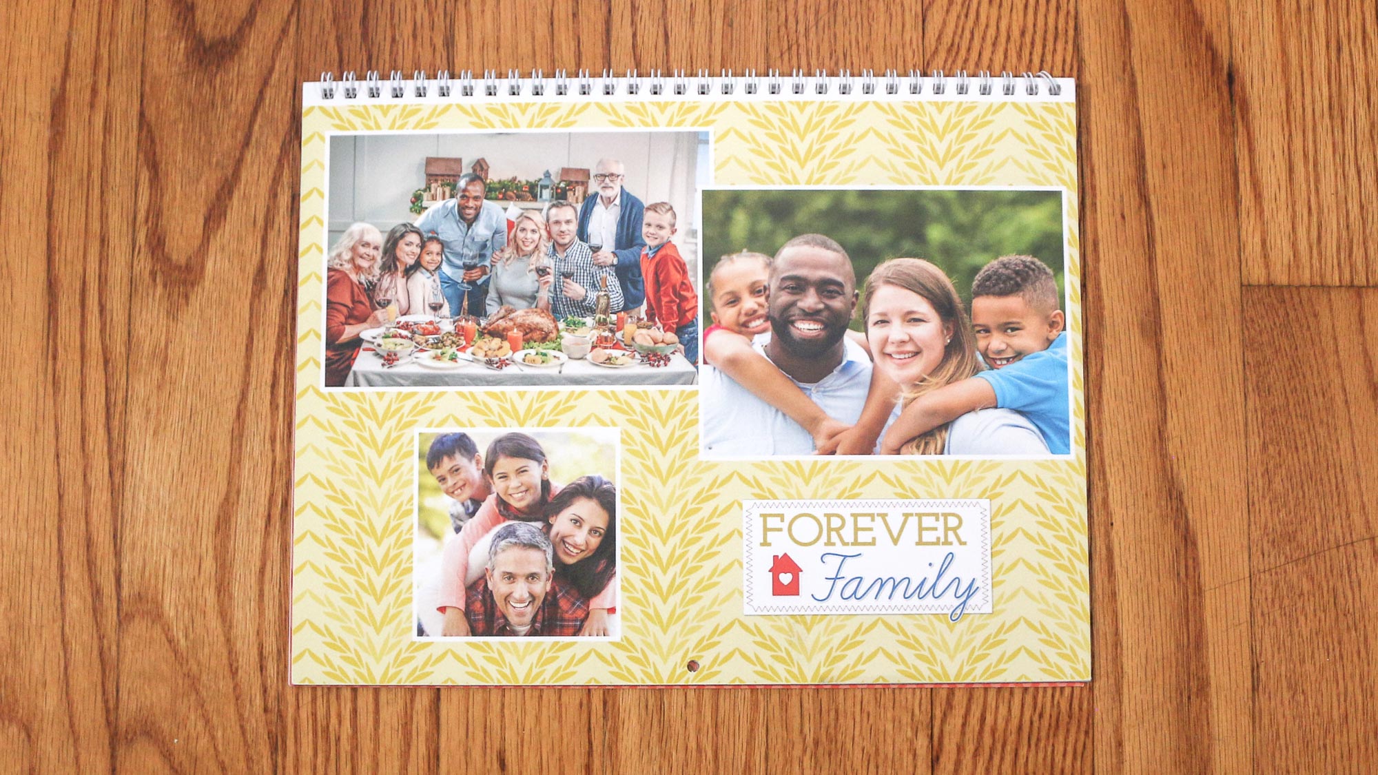
CVS’s printed calendar is unremarkable. Some of the photos are overexposed. In many, the colors are warmer than the originals. Small details are soft, and the pictures exhibit a loss of highlight details. The dot pattern of the print screen is prominent in photos, and it adds to the type’s jagged appearance. Tiny text shows ink loss. More significantly, text is cut off at the bottom of the calendar grid. The paper is average weight and quality.

CVS photo cards
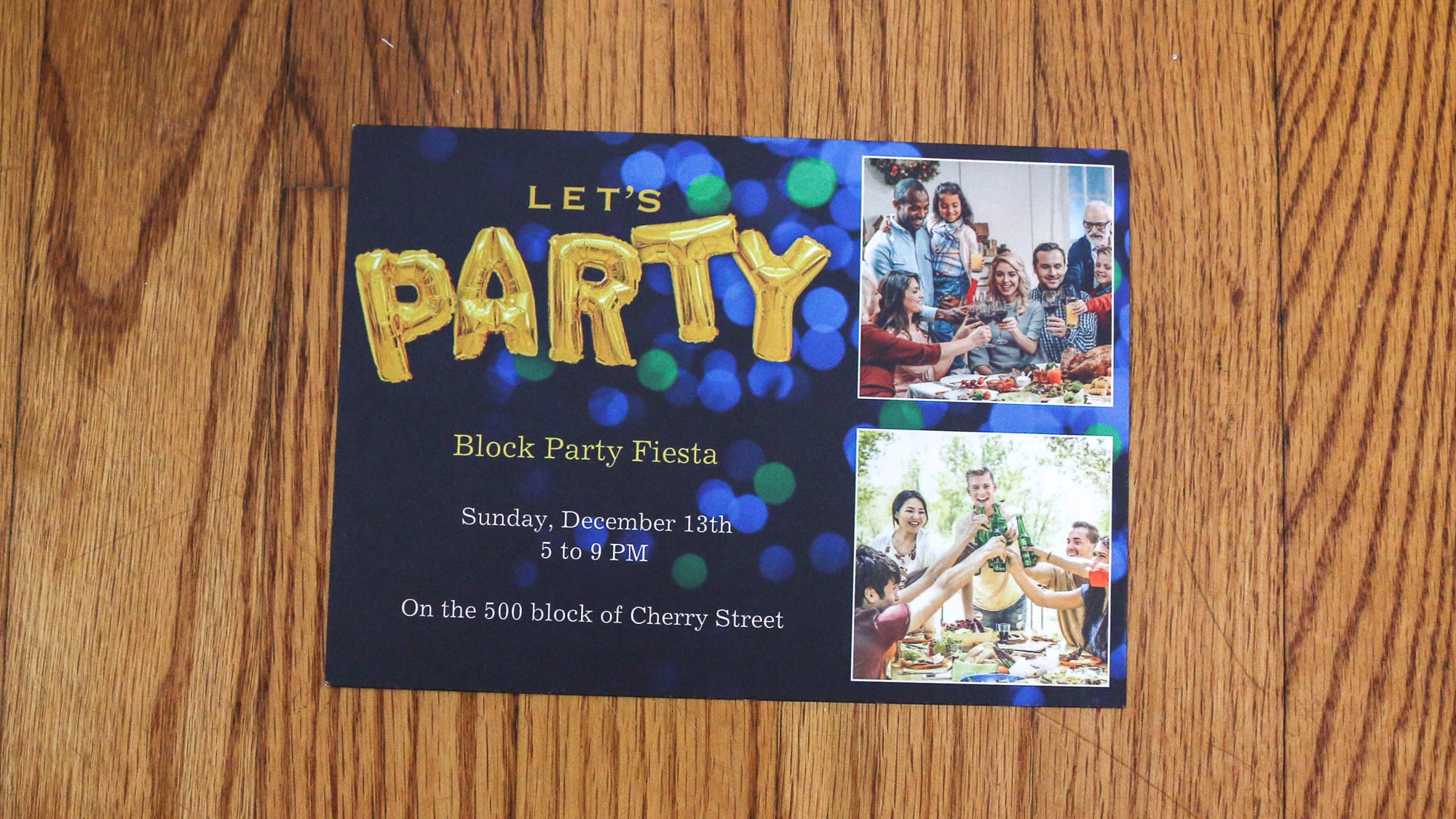
The CVS photo card is dead average. The photos have a nice exposure, and decent color. However, the pictures are a bit soft and exhibit a bit of a sallow shift. The suppressed highlights make the photos dull. Type is jagged with ink dropouts. Since we weren’t impressed last year when we ordered the card on 110-pound paper, this year we selected the more expensive 120-pound paper, which is more in line with most of the other cards we tested.

Note that the above print quality analyses don’t apply to CVS’s books, cards and calendars that are printed in-store for pick up within a day. Those flimsy one-sided cards or bound sheets are really just photographic prints.
CVS Photo review: Verdict
CVS might be great for picking up prescriptions, but not for photo books, cards, and calendars. The software for books and calendars might look good on the surface; however, key features are shallow. The printed photo book is cheaply produced, the calendar is undistinguished, and their photo quality is below average. On the other hand, the card software has few editing options resulting in cookie cutter cards whose print quality is merely average.
For similar prices to CVS’s, go with Mixbook or Printique for far better print quality, and greater fun customizing a card, book or calendar that represents your personal creativity.
Sally Wiener Grotta is the president and lead analyst of DigitalBenchmarks test lab (www.DigitalBenchmarks.com). The scripts she created for various tech publications for testing and evaluating digital cameras, image quality, software and related technologies have become industry standards. Among her numerous books is the first major volume on image processing “Digital Imaging for Visual Artists” (McGraw-Hill), co-authored with Daniel Grotta. Her hundreds of reviews, stories and columns have appeared in scores of magazines, journals and online publications.
-
freaking private name Poor exposure, overpriced, very thin paper. I wonder if they'd even last through the years. CVS would be fine in a pinch if I were familiar with how light/dark their printer prints, but they were so bad I had to throw them away. I'd be embarrassed to send them with the Christmas cards.Reply
I went to the local pro photo shop (Prophotoconnection.com in Irvine CA) and got the same prints, with human color correction, on pro paper, with pro ink (they said CVS was a glorified inkjet print), and on pro paper, for about the same $$. It was done in 3 hours.
