Tom's Guide Verdict
Android 14 brings with it a long list of changes that add up to a much smoother user experience you'll want to try when you can. But Google's not given us a headlining feature this year to help sell the update to users, plus some promised parts of the update are still missing over a month after launch.
Pros
- +
Much improved lock/home screen customization
- +
Simplified privacy settings and data preferences
- +
Welcome audio/visual accessibility improvements
Cons
- -
No standout features
- -
Features like predictive back gesture and lossless USB audio missing at launch
Why you can trust Tom's Guide
You've likely heard of Android 14 by its simple numbered name, but within Google, where new Android versions always get a dessert-themed codename, it's known as Android Upside-Down Cake. This is a much better title for it, since the majority of the new software's added features are hidden from your view upon initial glance.
Even if you're an Android phone power user, Android 14's changes may not be immediately visible. But fear not — Google's made adjustments throughout your phone, and in ways you'll probably enjoy once you find them.
Google squeezed several worthwhile additions into Android 14, improving compatible devices' customizability, accessibility, and privacy, along with adding small refinements to the interface that have filed off some long-standing rough edges. And with the best Android phones offering better upgrade schedules to users, you’re more likely than ever before to get these features on your current device, hopefully saving you from spending money on a hardware upgrade for a little while yet.
There are not really any headline-worthy features in Android 14 as there were in iOS 17, the most recent rival update for iPhones, especially since Google tends to keep its app and OS updates separate from one another. But Android is also designed to work on hundreds of different smartphones from multiple companies. Making sweeping changes is harder when you aren't making software for just your own company's devices.
I've tried out all the big new features added to Android 14, and I'll be giving you my thoughts on what's been added (and what's yet to be added). I'll be sprinkling in links to our related how-to guides where available too, so if something particularly grabs you as a must-try update, you can quickly
But enough dilly-dallying: let's cut a slice of this Upside-Down Cake and give it a taste.
Android 14: Compatibility
Google announced that Android 14 was good to go as of October 4, 2023, and it's now rolled out to anyone using a Pixel 4a 5G or later Google-built. We'd assume any Android phone launched next year will use Android 14 out of the box, but for existing, non-Google phones, things are more complicated.
For instance, Samsung promises that its One UI 6 update will appear on eligible phones from November 13 to December 1. OnePlus phones are getting their Oxygen OS 14 version of the Android update from November 16, but not simultaneously worldwide. Some brands like Motorola and Asus are keeping quiet, but should hopefully send out their updates by early next year at the latest.
Android 14: Design and interface
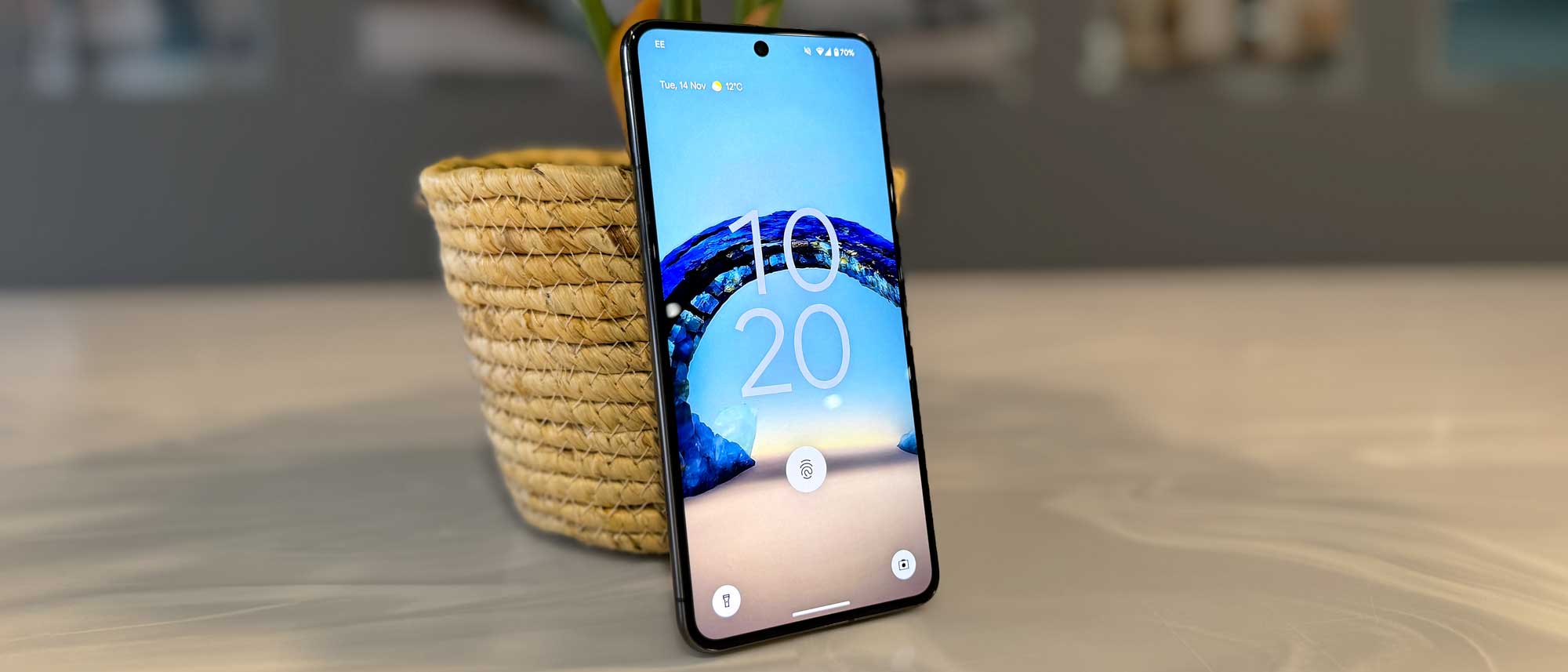
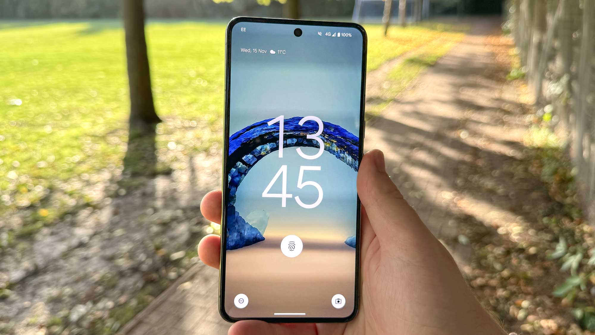
One of the biggest — and most obvious — changes made to Android 14 is the deeper lock screen customization system. You can now access it directly from your lock screen if you have your phone unlocked, with your options now including new clock designs and layout templates, all featuring AI smarts that adjust how prominent your clock is depending on what other info is on display there, like the weather forecast.
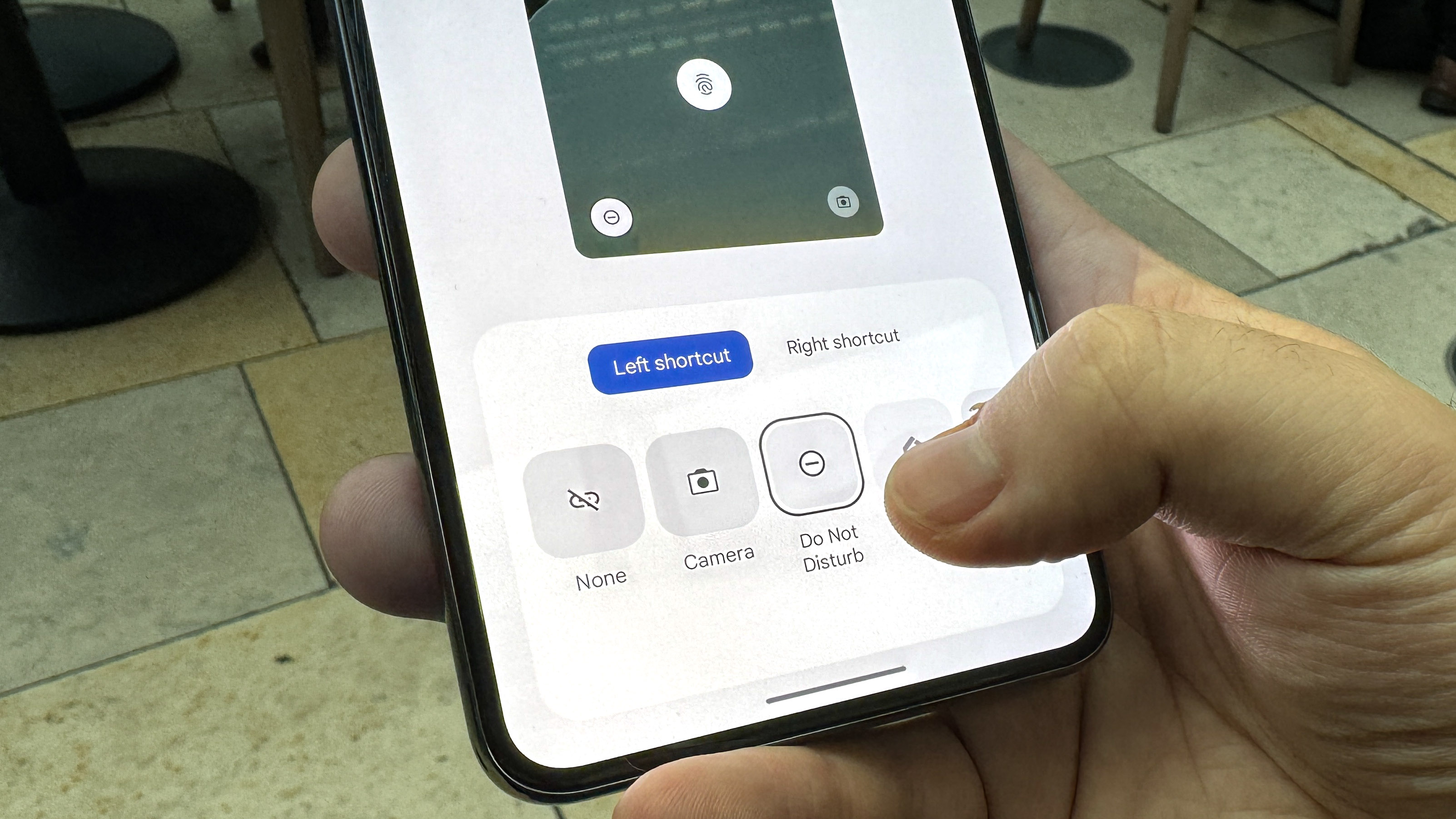
Another key aspect of this is the option to choose different Lock Screen shortcuts. While having the faithful camera/flashlight combination does me fine, being able to opt for a shortcut to your Google Wallet, Do Not Disturb mode or Google Home controls instead is a welcome addition, and something you can’t yet do on iPhones.
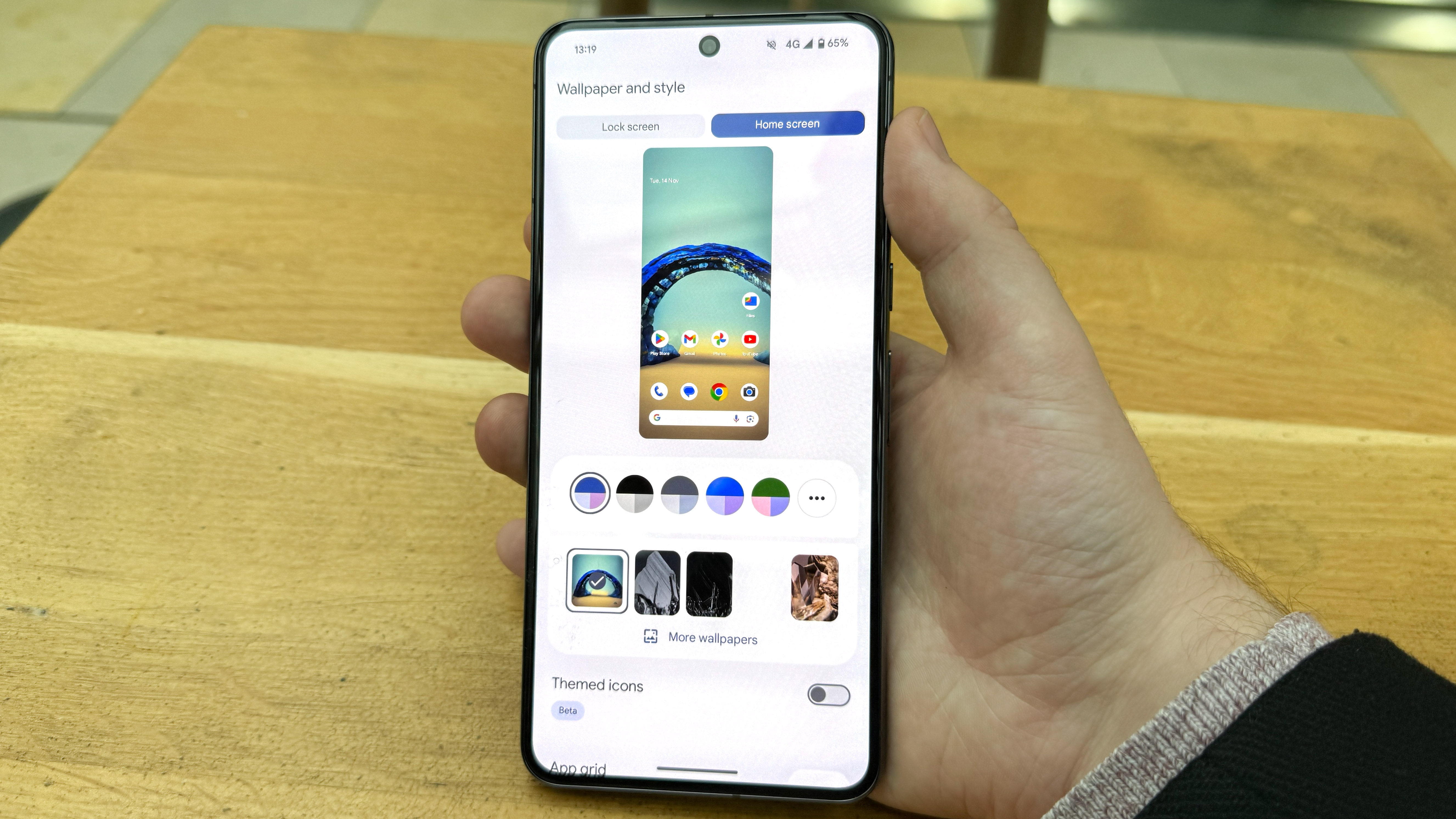
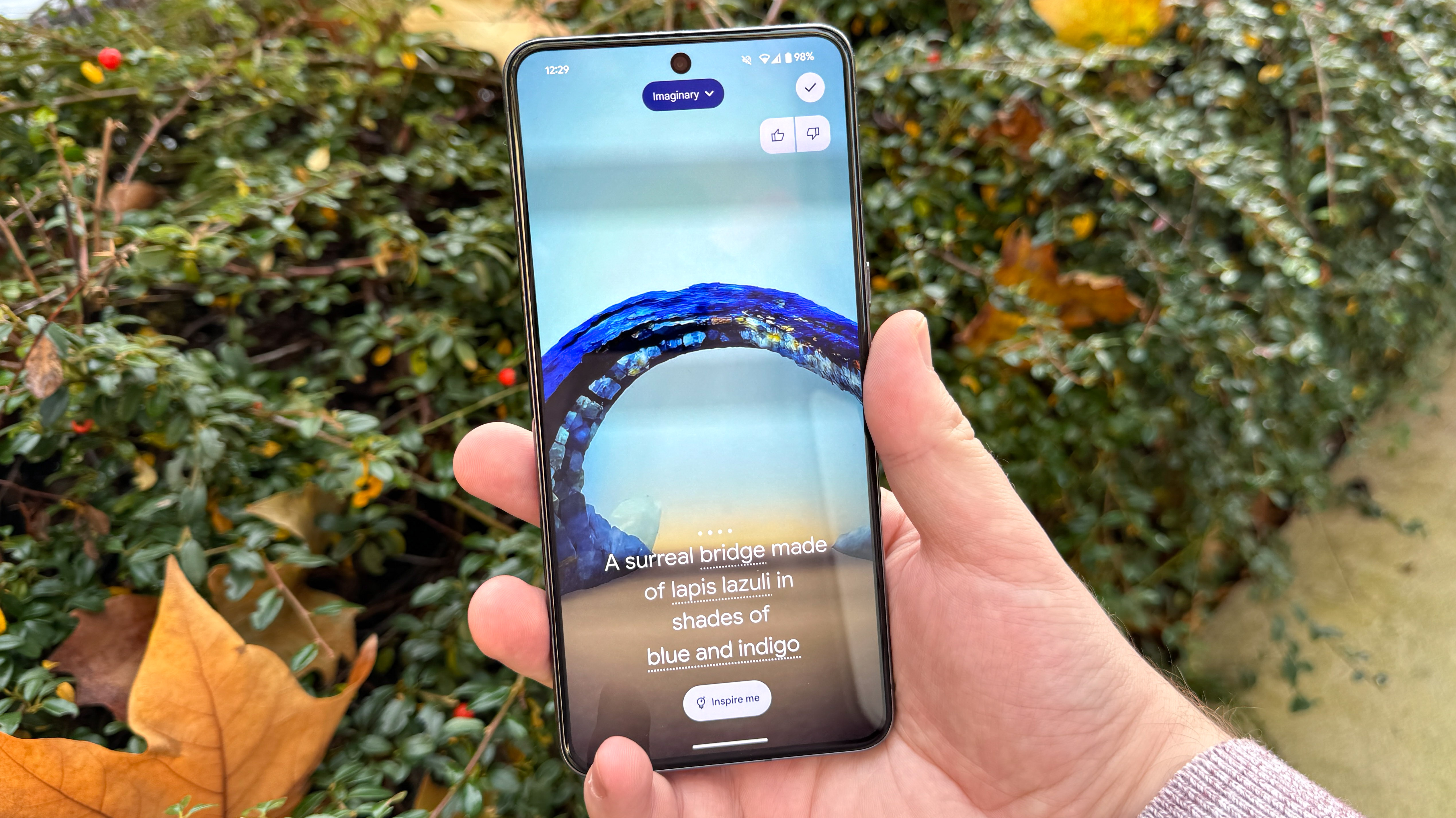
A big part of customizing your phone is choosing a new wallpaper, and for the moments when you can't find the right image to decorate your virtual background with, Android 14 is there to help with its AI wallpaper generator. This works using a set of 12 preset themes, which all contain a pre-loaded prompt with interchangeable keywords. It stops you from having true creative freedom with the feature but there's still enough customizability that you can create a good-sounding prompt and have it suddenly pop into existence just for you.
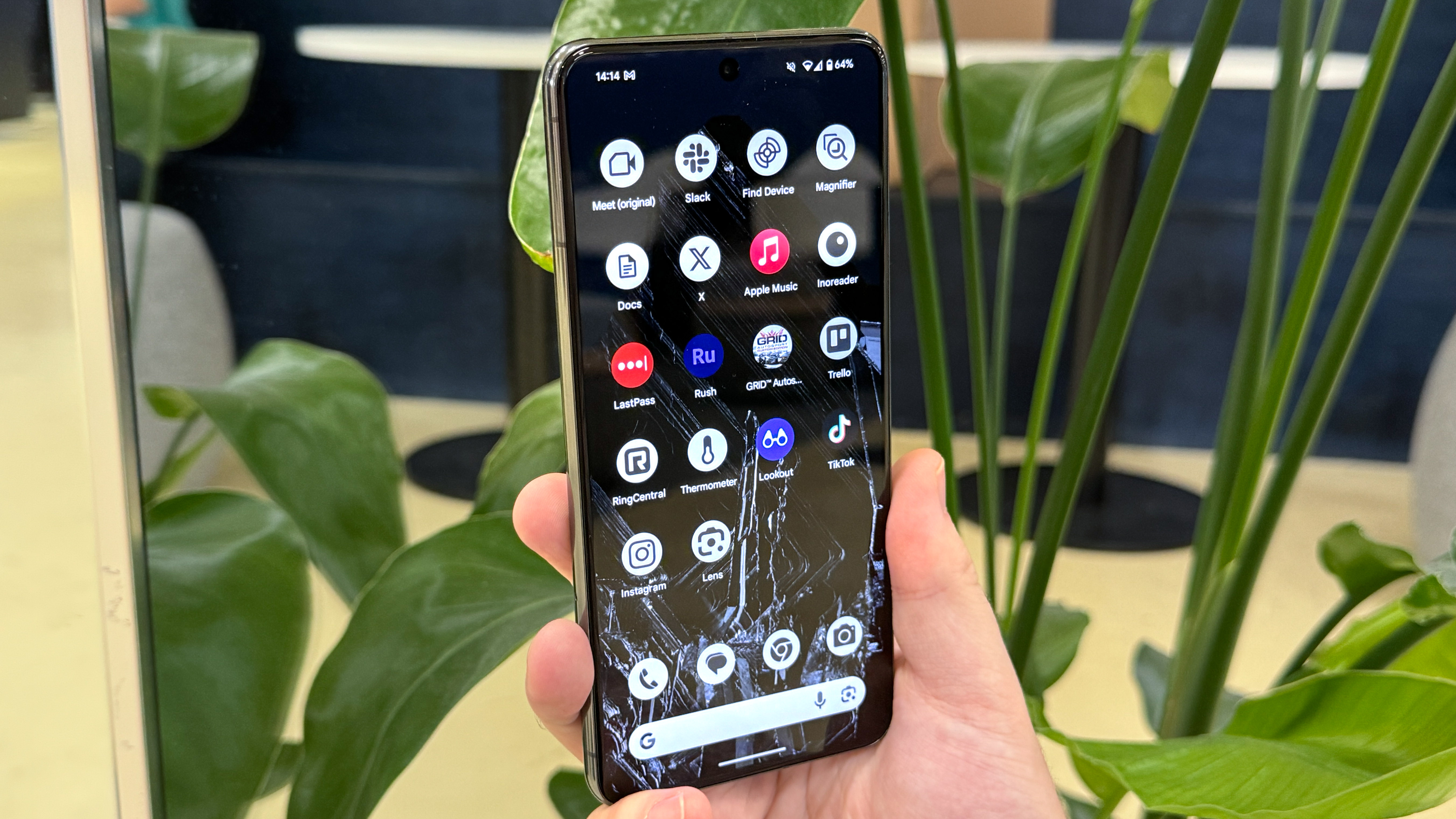
Android 14 still offers dynamic theming for your phone, picking colors for UI elements based on your wallpaper. However, you can now select a Monochrome theme if you'd prefer to keep things simple. This doesn't impact every part of the phone, especially when you enter non-Google apps, but by enabling this, turning on the "Themed icons" beta option and using a suitable grayscale background, and perhaps hiding your disobedient app icons in folders to minimize their impact, you can make your home screen a more calming, neutral place.
One last interface change to mention is the updated At a Glance widget for non-Pixel users, giving others a more modern-looking widget that still communicates important details like the weather and upcoming appointments. The Pixel version of At a Glance still offers more, and offers a lock screen version for added usefulness, but it's still a strong addition for any Android phone's home screen if Google's apps are thoroughly integrated into your life.
Android 14: Cameras and audio
Android 14 brings with it a nice upgrade to photography in the form of Ultra HDR photos, which on most recent flagship phones allows for more accurate colors in your photos, both when taking them and viewing them back. These images will still appear perfectly fine on an SDR screen, just without the extra detail that you'd see on an HDR display.
However, the current issue is that this feature's only to be found on the Pixel 8 and Pixel 8 Pro right now, and it seems to be set to on by default with no method of disabling it. We'll revisit this if and when Google adds a toggle to its camera app to show what the difference between Ultra HDR and non-Ultra HDR photos looks like. But since photo file sizes on the Pixel 8 series seem to be no larger than a typical photo, hopefully this system will prove to be a net benefit.

Audiophiles will be happy to hear that Android 14 is offering Lossless USB Audio, although it's not live as a feature yet, and hasn't yet been given any kind of release window. If you have a set of wired headphones or earbuds, and plug them into your device (likely via a headphone jack to USB-C dongle), you'll be able to enjoy higher quality music when streaming appropriately formatted tracks, or playing them locally. Another feature for us to come back to and test properly, but one that on its face sounds like a great addition.
Android 14: Interface
By default, Android 14 still looks a lot like Android 13 when moving through your home screens, apps and menus, because Google's not added anything new. The good news however is that several basic parts of Android have been expanded in logical and helpful ways.
An addition I've found useful almost daily in Android 14 is the predictive back animation that lets you peek at the page you'll be going back to before committing to the gesture. Annoyingly it's not fully implemented across Android 14 yet, failing to work in some apps that you'd expect it to, but it feels basically complete beyond Google adding a more easily accessible toggle outside of Developer Settings.

If I could nominate a particular Android 14 upgrade for a "One to Watch" award, it would be the developer-focused feature to add unique options to the share sheet. The impact of this addition to Android is going to rely on if and how devs implement it, but there are already a few apps, such as Chrome, that have made good use of it.
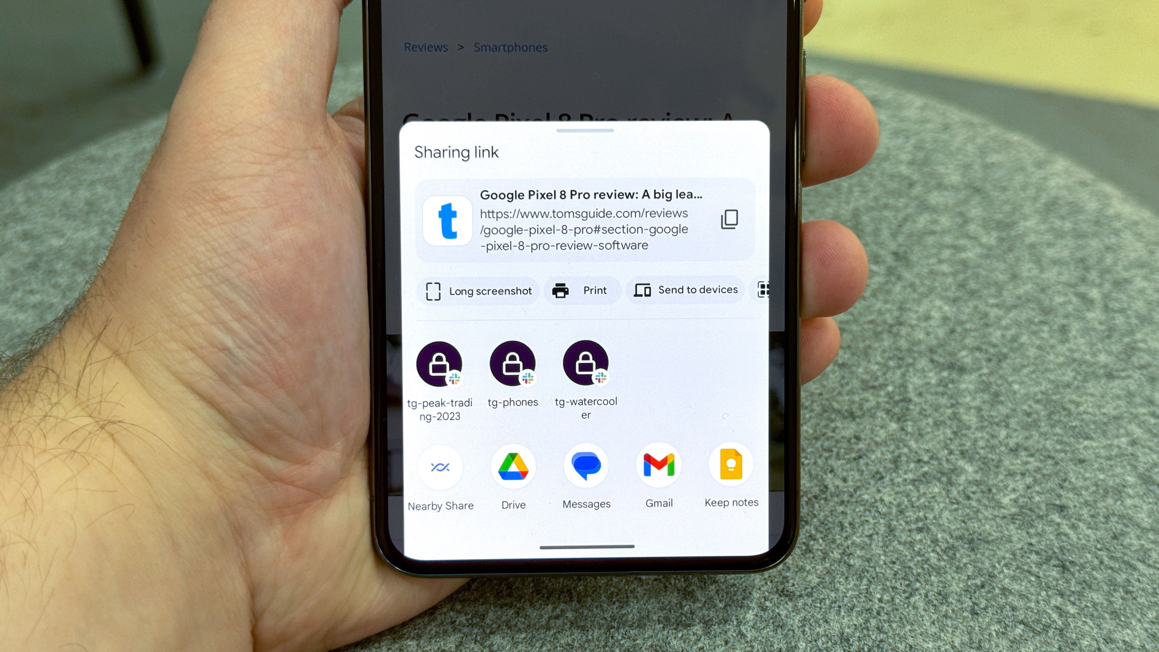
When trying to share a URL in Chrome, the updated share sheet gives you shortcuts to taking a full-page screenshot, making a QR code link or sending the page to one of your connected devices, as well as your usual list of frequent contacts and apps. It makes the share sheet a more versatile, one-stop shop for those wanting to move data and files between apps and beyond their phone, and seems a natural fit. I really hope we see more apps take advantage of this going forward.
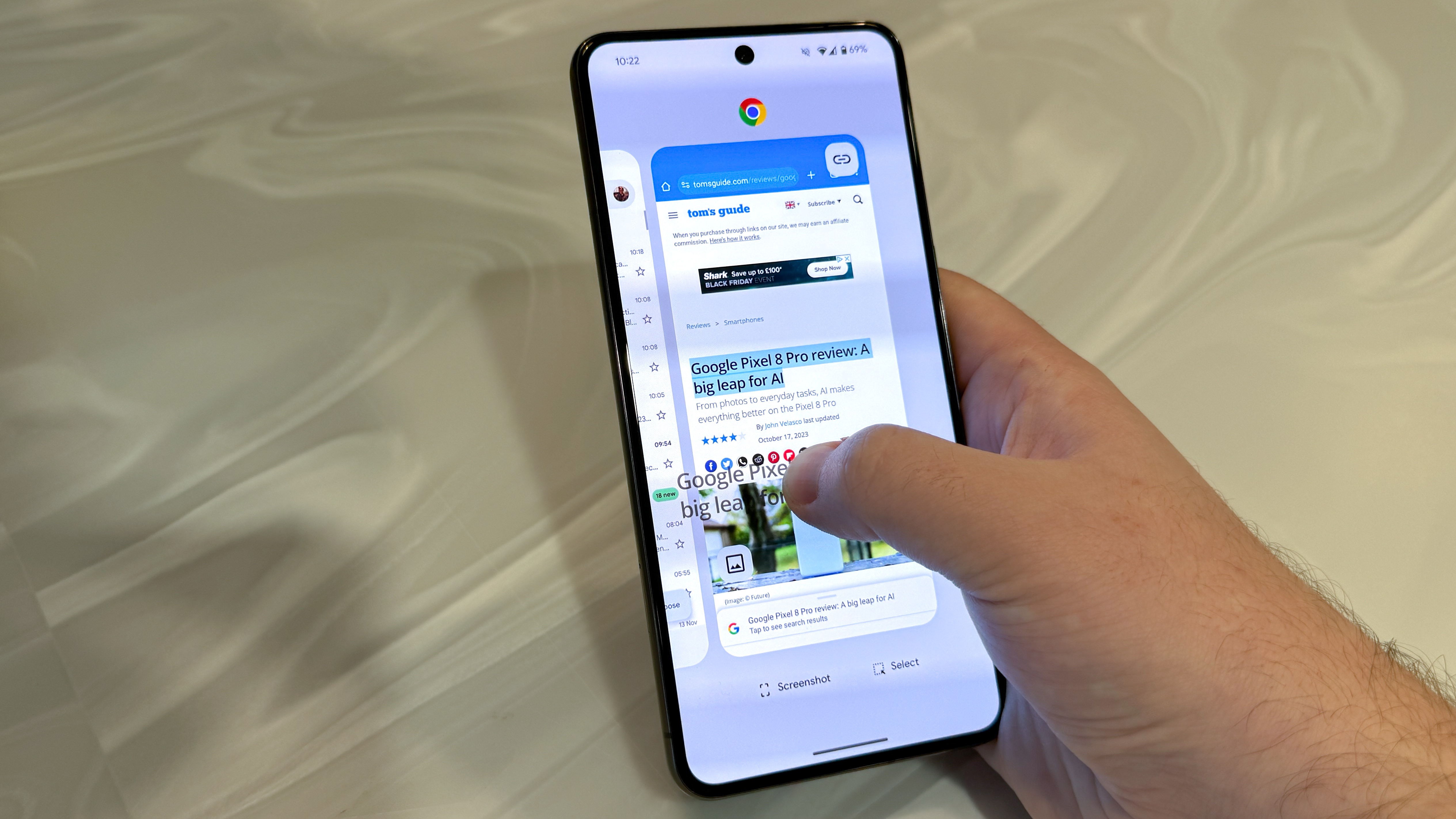
Another everyday feature of your smartphone is copy-paste, which Android 14 has improved by permitting you to drag and drop text or images between apps. Before Android 14, you could only drag and drop elements within the same app window, meaning that most of your copy-paste work would still need to be done with the familiar pop-up buttons. Enabling drag-and-drop copy-paste promises to be especially useful for foldable phone owners, where you're more likely to have several apps open in a multi-window view, and need more from your phone's virtual clipboard as a result.
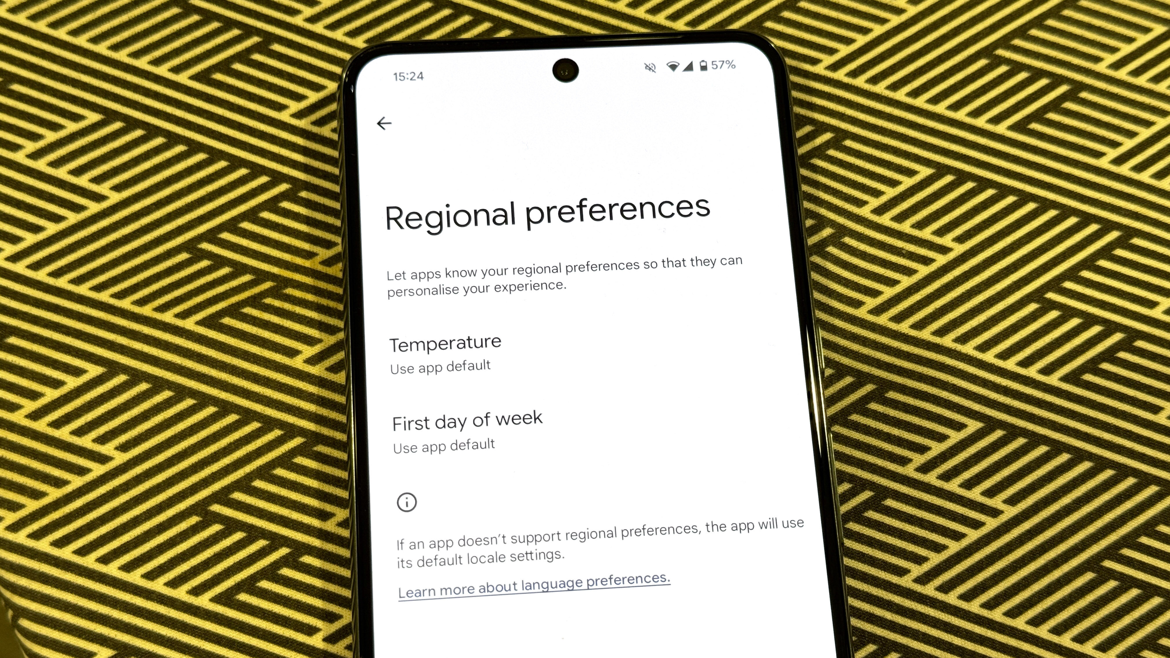
One small but welcome system update is the Regional Preferences menu. This is here to centralize your selection of temperature units, number systems and the first day of the week in a single menu. Much simpler than having to set them individually in each app.
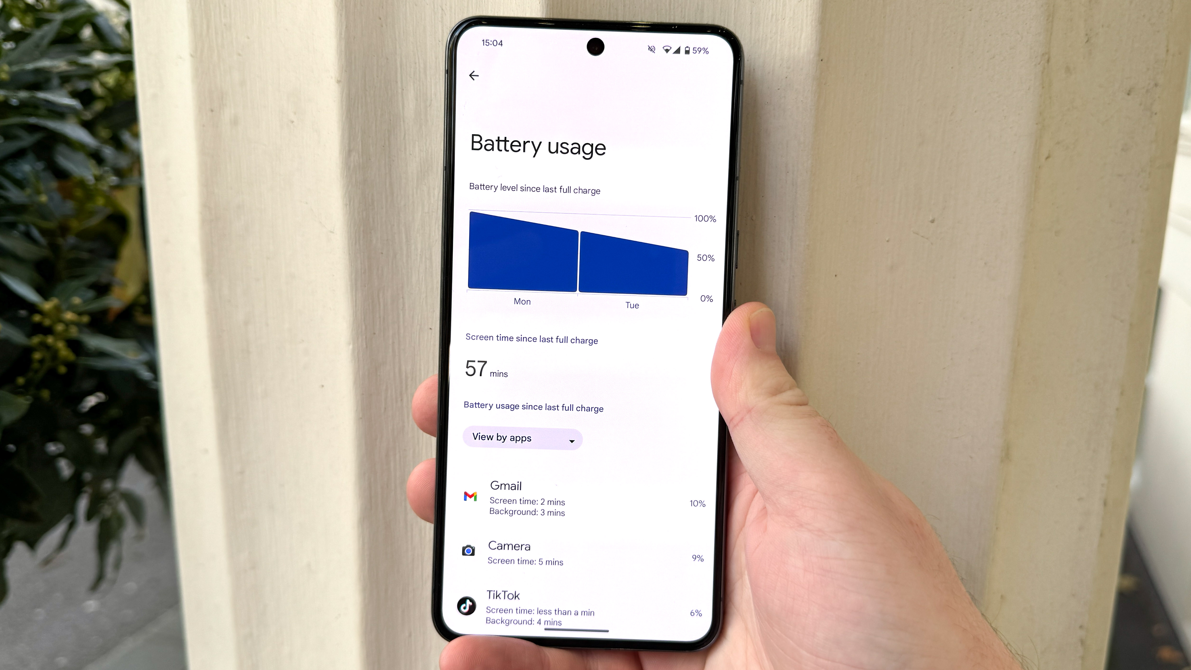
For efficiency-minded users, Google's improved Battery Saver mode now lets you pick whether you enable standard or extreme mode when enabling the battery saver toggle. There's also a new power consumption view that displays more clearly how your battery level's gone down since your last charge, how much screen-on time you've had and which apps and systems you've been using and for how long. After trying an alternate 24-hour battery life view in Android 12 and Android 13, Google's restored straightforward battery and screentime tracking is a return to a more popular method of measuring your phone's usage and power efficiency. It's good to admit when you made a mistake.
Android 14: Data and privacy
Android's steadily become better at taking care of users' information in the past few years, and that continues with Android 14. Much of this happens in the background, or appears once and hides away again once you've made a decision, but it's still there, hopefully providing you with greater peace of mind.
When setting up apps for the first time, you're now likely to come across more detailed permission request pop-ups. Somehow I couldn't get any of these to appear during my own testing, but the samples provided in Google's release materials show it's prepared some good, plain English explanations of what giving, say, your location data to an app will mean happens to your information.
In a similar way, the new Health Connect service acts to keep your health and fitness details together and safe in one single place, rather than having different sets of almost identical data across all your apps, possibly with different security policies. Health Connect encrypts your info and keeps it local, passing it on to fitness apps where needed, making for greater convenience and security simultaneously.

As well as encouraging them to be more informed about their privacy, Google's hoping that it can persuade its users will improve their security in Android 14 by moving to a 6-digit PIN, rather than the bare minimum of four digits. As a reward for using a longer passcode, Android 14 allows users with 6 or more digits in their PIN to unlock their phone just by inputting the PIN, without having to hit an enter key.
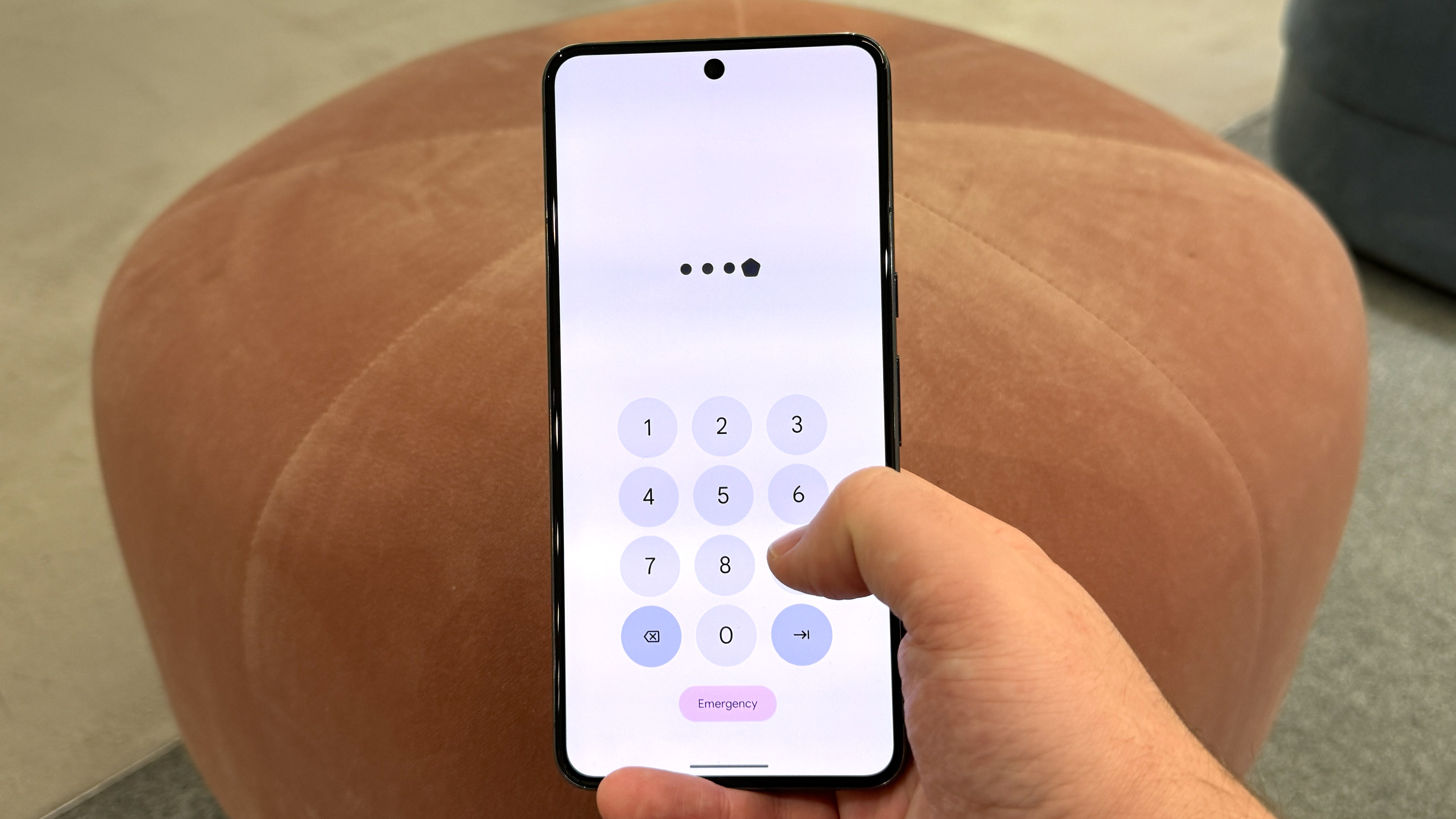
Since most of us rely on biometric recognition in one form or another, upping your PIN to 6 digits seems worthwhile for the safety of your device's data. You can also turn off PIN animations to make it harder for a shoulder-surfing hacker to figure out what your code is.
Android 14: Accessibility
As one of effectively two games in town, Google has a responsibility to ensure as many users as possible have as easy a time as possible using phones powered by Android. It's hard for me as a non-disabled individual to properly guage how effective Android 14's accessibility features are for the users who rely on them, but it's only right to spend some time looking at what Android 14's introduced here. Besides, these features could prove handy for anyone under the right circumstances
Android phone users who rely on Bluetooth-enabled hearing aids to interact with their phone will be relieved to know that Google's promising improved hearing aid support, with a new dedicated set-up system, the option to choose which sounds appear through the hearing aids and which are played via the phone speaker, and a Quick Settings shortcut to easily return to these settings when needed. Some of these features are going to be reliant on the hearing aid manufacturers to implement though, so if you're a hearing aid user, it’s best to check with your manufacturer before trying to make use of these.
Another handy feature for hard-of-hearing users, but possibly those with typical hearing too, is flash notifications, a setting that will use the camera flash on the back of your phone, a colored overlay on the display or both at once, so you can still see when messages are coming in without needing to hear the notification tone or feel the phone vibrating. Rear flash notifications were something I have used sometimes on iPhones, so I'd have been happy to see Android simply reach parity here. But the addition of the display flash mode that Android 14 is an ingenious development of this more established setting, meaning you won't miss your notification flash even if your phone is face down.

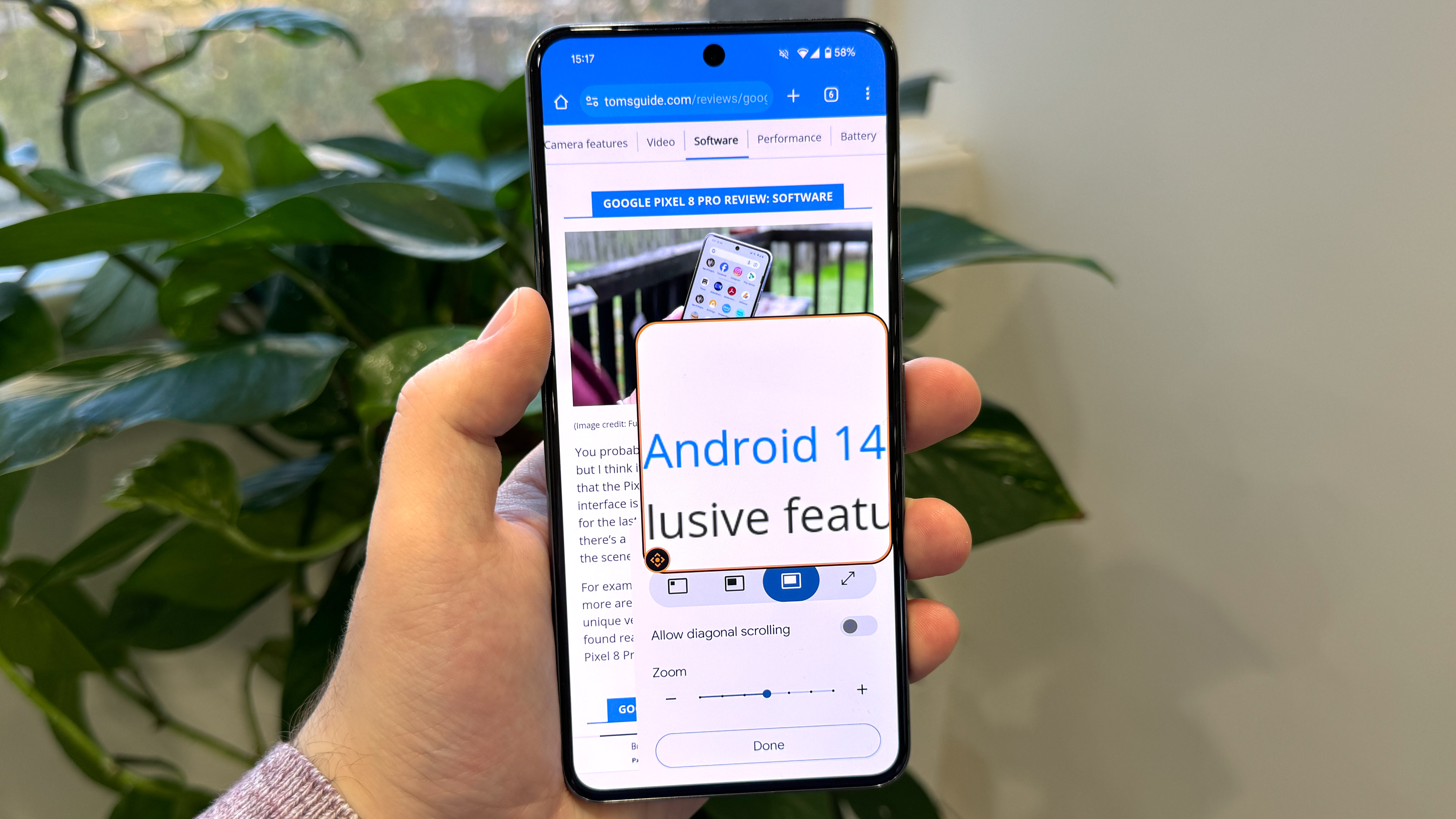
For users with vision impairments, Google reworked its on-screen magnifier tool. You can easily resize or adjust the zoom level on-screen with taps and pinches, and if you want to use it, there's a setting that keeps the magnifier on when swapping apps, preventing you from continuously needing to enable it or disable it. The volume button shortcut for activating the magnifier makes it quick to switch on and off manually when needed though.
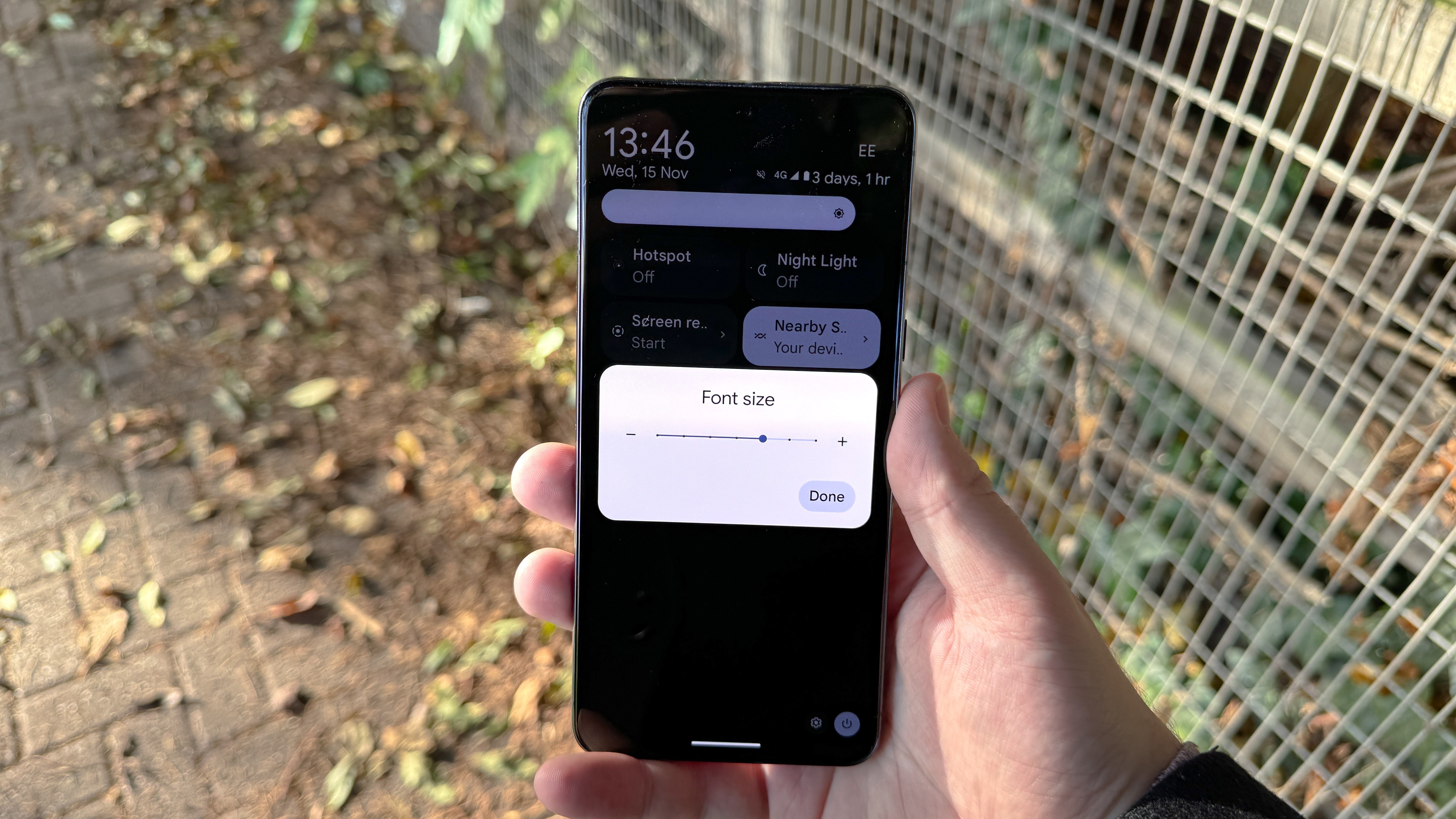
If you need your text permanently enlarged, then you'll need to look at Android 14's improved text scaling system that increases larger text more slowly to avoid suddenly ruining the page layout, and that offers a new maximum size of 200%, up from 130%. There's also the option to add a shortcut for changing the font size in quick settings, should one app or website in particular prove to be hard to read.
Android 14: One UI 6
This review's primarily focused on the vanilla/Pixel version of Android 14, but Android comes in many guises. One of the biggest is Samsung's One UI, since I've been sampling One UI 6 too, let's spend some time looking at what Samsung users will get on top of Google's universal updates.
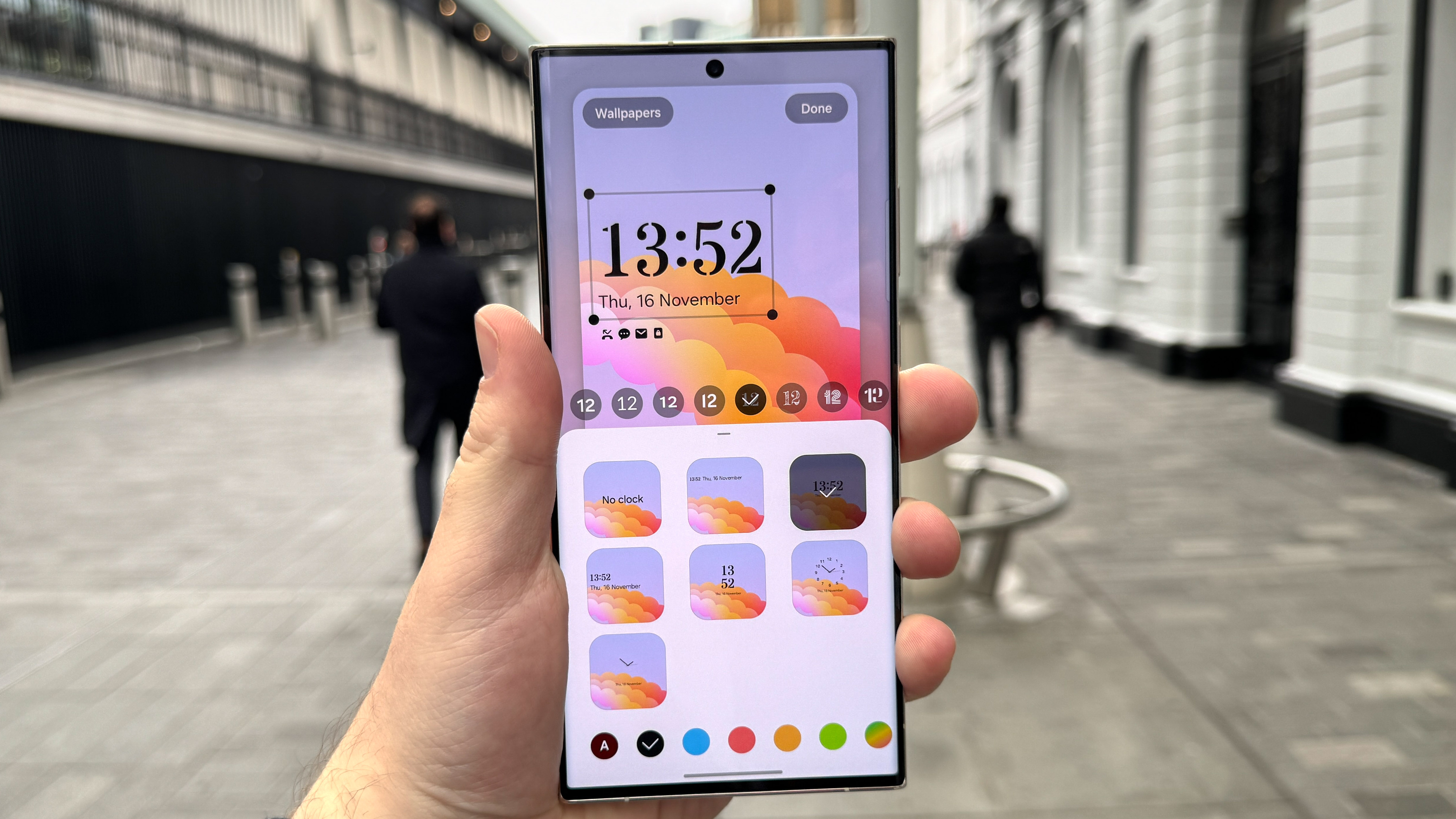
Samsung's taken lock screen customization to another level above the Android 14 default, allowing you to freely move and resize the clock anywhere in the top third of the lock screen. Google's default only has two size presets, and no movement options beyond selecting one of the vertically-aligned clocks, so Galaxy phone users definitely have more power to make their lock screen their own.
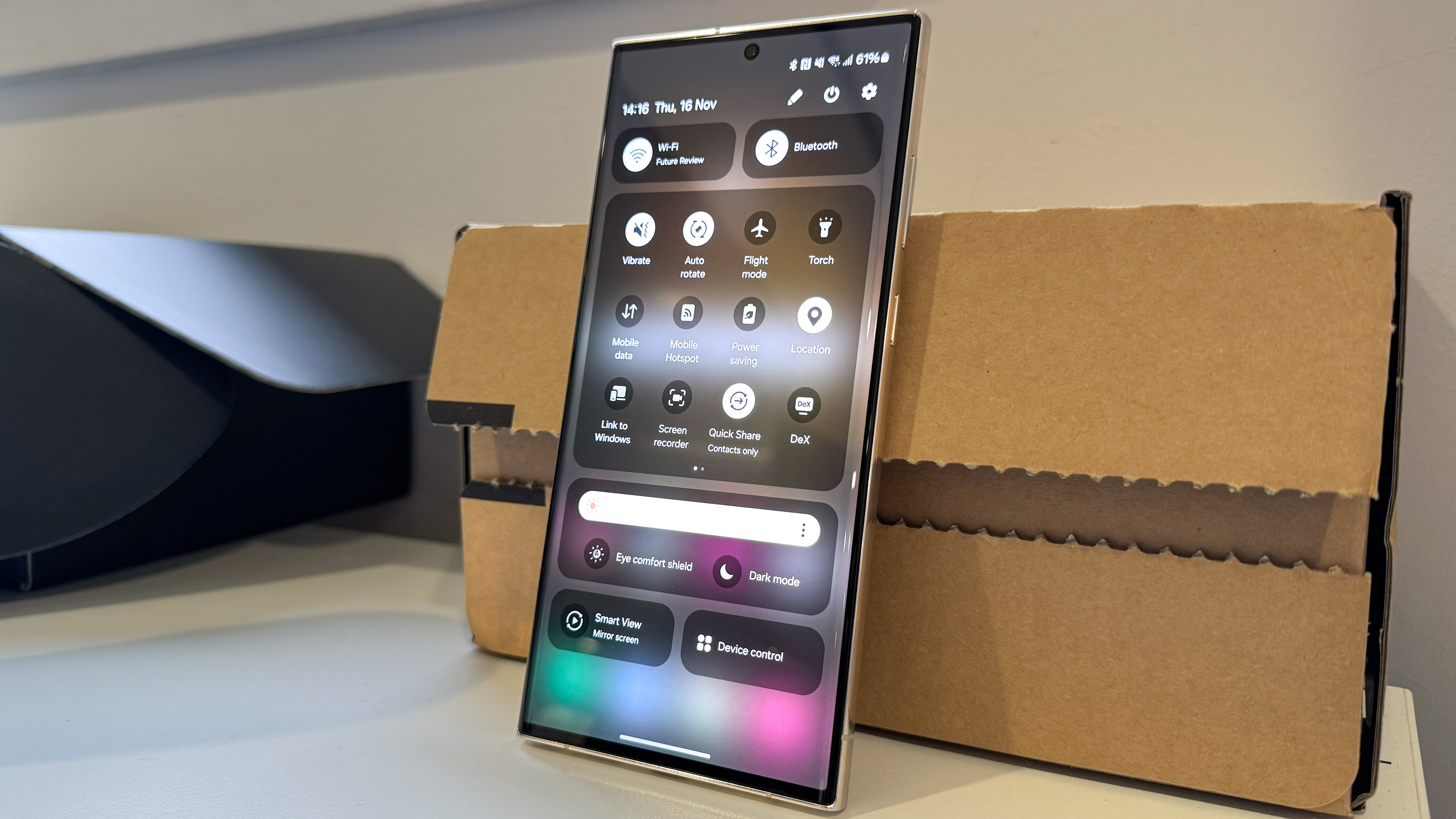
Samsung has also made an attempt to redesign the quick settings panel that houses key options above your notifications. You still get six basic options for controlling basic connectivity settings (and the flashlight), but also a brightness slider for the first time. The main difference is found by swiping down a second time, which opens a full-screen control panel with a grid of 12 options, plus dedicated sections for brightness, Bluetooth and Wi-Fi. It's a far smarter use of space, keeping important functionality within easy reach while also giving the full array of options breathing room when you need to access them.
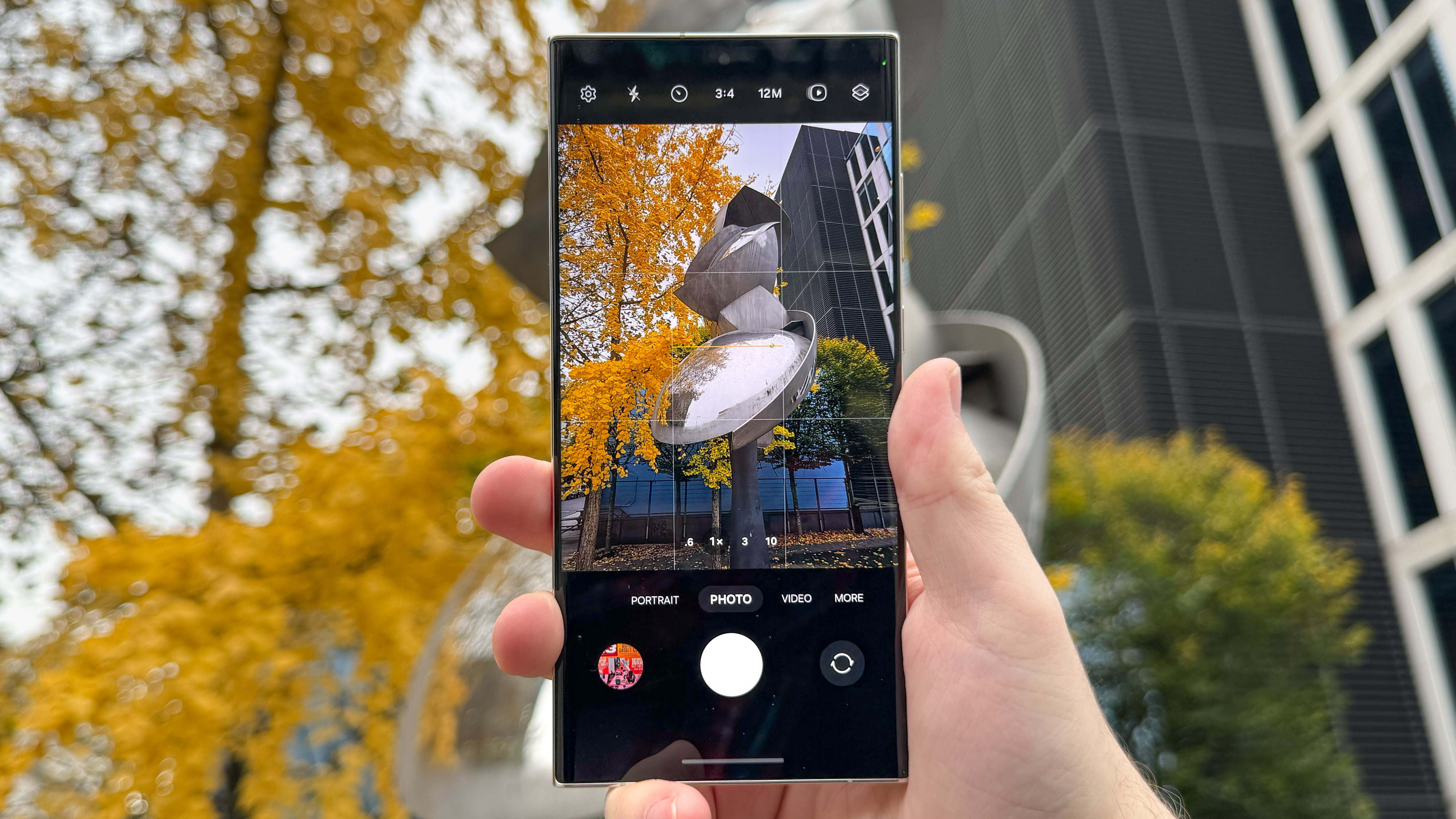
Unlike vanilla Android 14, Samsung's One UI 6 introduced a significant redesign for its camera app. Its layout has also been smartened up, and now features a dedicated resolution button to let you swap between 12MP, 50MP and 200MP main camera modes quickly, assuming your phone's sensor supports this.
You can also jump into the Camera faster from your home screen with the use of Samsung's new camera widget, which you can customize to open either the front or back cameras in a specific mode, and send the photos you take to a selected album.
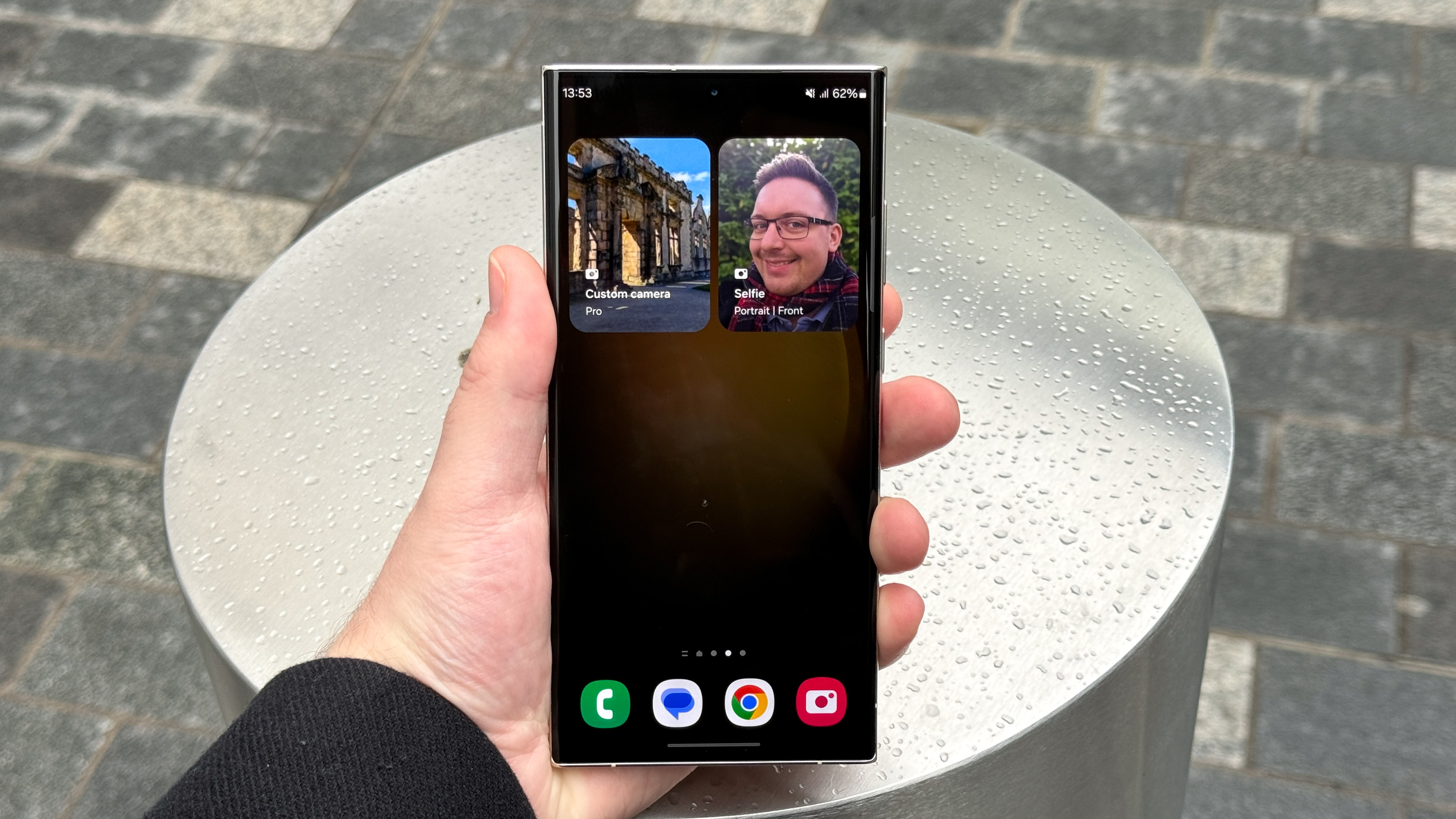
Before now, you could either have the camera app reset to default settings every time you re-opened it, or preserve settings from your previous use. These shortcuts make it much faster to open exactly the settings you need for a given moment, and are a clever way to grow the tried-and-tested lock screen or button-press camera shortcut that other phones use.
Once you've got some images to hand, you can then sample One UI 6's new image editing options, including shortcuts to common functions from an image's details page, and undo/redo buttons for easy checking of how subtle changes impact different parts of a shot.
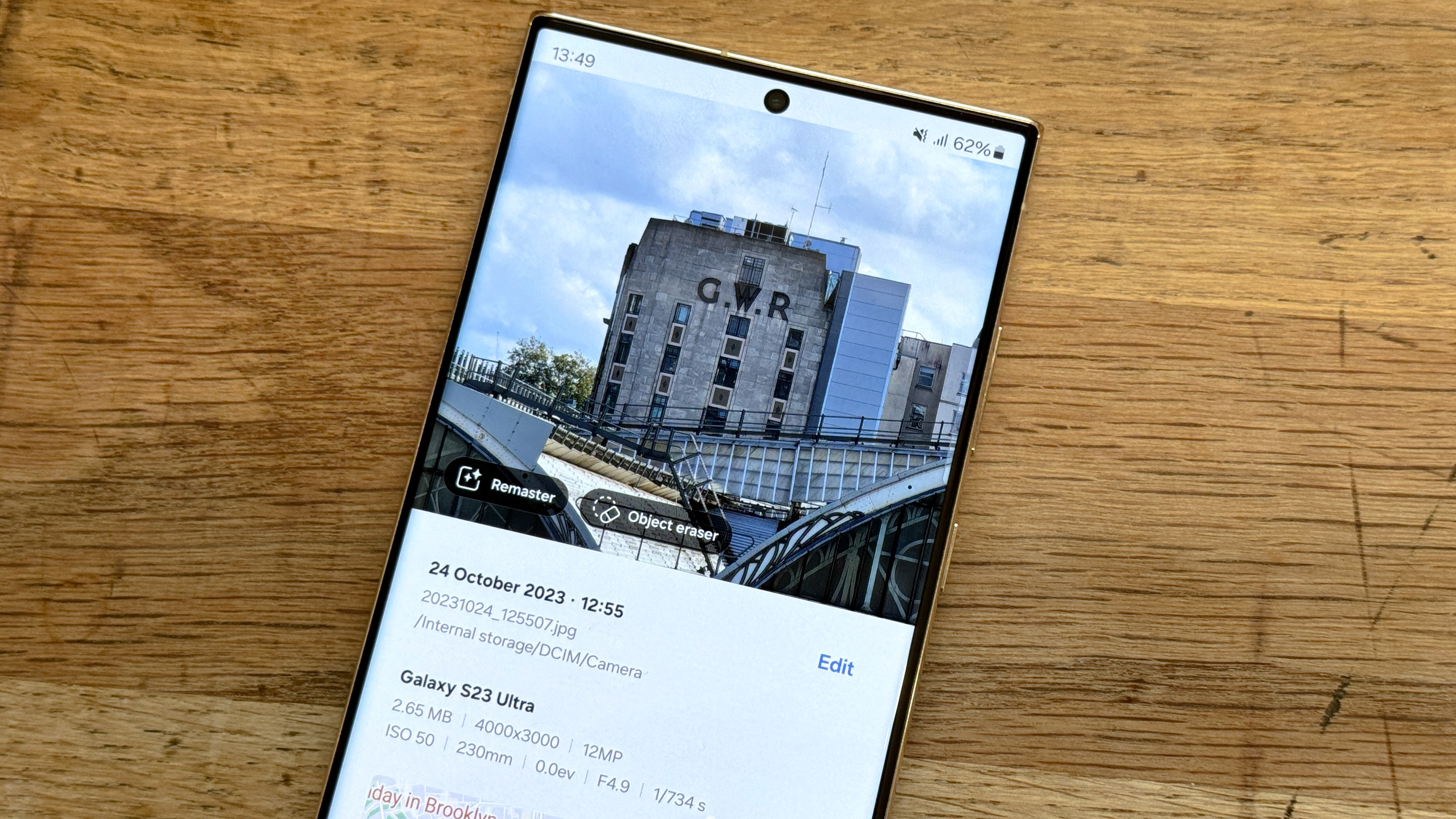
I think I'm a little set in my ways when it comes to phone photos, and perhaps you are too, but these refinements might actually encourage me to put some more post-production work into photos I take with Samsung phones. Samsungs, especially flagship Galaxy S and Galaxy Z devices, have some of the most powerful chips on any Android, so what better way to put them to use than cropping, adjusting and enhancing the images you take with their excellent cameras?
Android 14: Post-launch updates
Google is always working on more stuff for Android, most recently the second beta of the QPR2 (quarterly product release 2) update. This features things like a redesigned notification and quick settings screen, an anti-phishing system and a "Private space" option for keeping certain apps locked away. As this is a beta though, there's a chance some of these features won't arrive in the stable QPR2 update, or could even be held back for Android 15 or later.
Android 14: Verdict
Passing final judgment on a new Android version is hard, since Android 14 isn't feature-complete, and will continue to grow in future 14.x updates and individual manufacturer updates. In fact, as I was writing this, Google started testing its second quarterly platform update for Android 14 which makes more refinements including single-app screen recording.
Taking Android 14 as it is right now though, everything new expands important parts of the Android experience, just in basic ways that blend into the background by design. While some of Google's changes are undeniably clever, there's no upgrade big enough that it can recontextualize the way you use your phone. People aren't going to be excited by AI wallpaper generation in the same way iPhone users were when StandBy Mode appeared on iOS 17.
What's annoying is that Google has introduced exciting software features this year, but they're all Pixel exclusives. If we'd had something like Magic Editor or Magic Eraser, or even just call screening, Android 14 would be an incredible update. But the basic version leaves us wanting more in a bad way.
Everything Android 14 does bring to the table is helpful though, so you'd be misguided to just refuse to install the update. But if you were looking for this version of Android to breathe new life into your phone, you'll have to wait for Android 15 next year and hope it's got more to offer, or rely on your phone maker to add more entertaining extras on top of Google's framework.

Richard is based in London, covering news, reviews and how-tos for phones, tablets, gaming, and whatever else people need advice on. Following on from his MA in Magazine Journalism at the University of Sheffield, he's also written for WIRED U.K., The Register and Creative Bloq. When not at work, he's likely thinking about how to brew the perfect cup of specialty coffee.
-
DENVERSKIER So Samsung my S22 Ultra still has no 6.0 or even the damn November Patch...which last month I got on the 5th of the month...and why did Garbage A series beta start 2 months before mine and why did you make an exception for locked device to beta since you screw us over on update!!! That said seems Google gave and unfinished buggy product...Give me my 6.0 now stop putting garbage phones firstReply
