Tom's Guide Verdict
Android 13 is all about stability, privacy, and security. There aren’t huge sweeping visual changes as there were with Android 12, but permissions receive a welcome suite of changes.
Pros
- +
Focus on stability
- +
Permissions changes
- +
Material You advancements
- +
Per-app language support
- +
Privacy and security enhancements
Cons
- -
A rather small update compared to past versions
- -
Media audio switcher doesn’t support Cast
- -
New media player isn’t pretty
- -
Pixel Launcher search is confusing
Why you can trust Tom's Guide
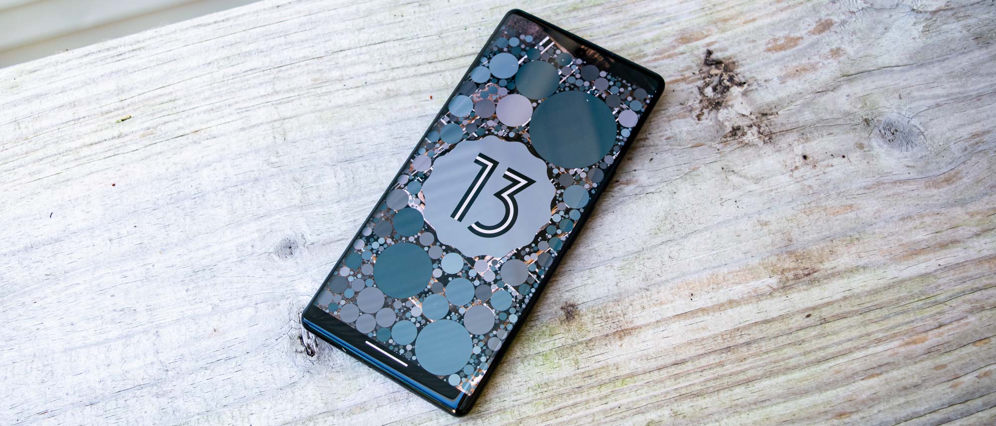
Android 13 is the epitome of iteration. Google decided to take a year off the innovation after the bombshell that was Android 12, focusing on stability and privacy for this year’s mobile software update. So while Android 13 might lack a suite of new features on the level of Material You, it’s nonetheless a solid update for the best Android phones.
Permissions received some improvements, especially for notifications. Android now does what iOS does, asking you if you’d like an app to send you notifications the first time you load it up after installation. Other improvements such as notification runtime permissions seem small, but they’re still important. Material You has advanced a bit, you can set language preferences per app, and privacy continues to take the forefront with options like an iOS-style photo picker — despite Google still falling behind Apple on the privacy front.
The feature set is small, so this Android 13 review won’t be as substantial as its predecessor. However, you should still update when available and I’ll tell you why.
Read about what's in store for Android 14, or why you need to download the March 2023 Android 13 update as a priority.
Android 13 review: Design and UI
Material You
Google introduced Material You in Android 12, which marked a huge new design language akin to Material Design in 2014. A lot has changed since then, but Android 13 continues to improve Material You. You might still find the change controversial, as many do. But regardless, this is Google’s vision, and that continues in this OS version.
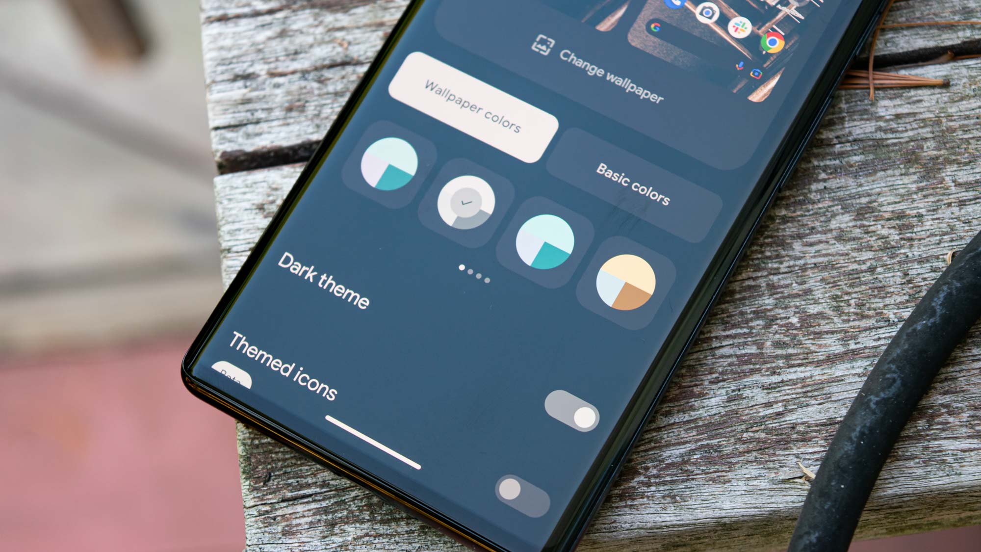
Android 13 offers more color options extracted from your wallpaper. Material You on Android 12 felt a bit uninspired at some points, where I often would choose one of the preset colors to get a look I actually liked. I’m thankful Android 13 went a few steps further with options, allowing me more choices without switching from a wallpaper that I enjoy. You can find these options in Wallpaper & Style in the Settings menu or from a long press on the home screen.
Material You also introduced themed icons, which were limited to Google apps and stood out like a sore thumb alongside regular icons in your app drawer. But now, Google has expanded the themed icons to third-party apps. While nice in practice for a look of uniformity, I have my doubts on its adoption. Android developers are slow to buy into many of Google’s initiatives, especially since they need to opt-in to this.
Google changed a lot with Material You, including some customization options that existed in Android 11. I hope that next year’s Android 14 update reintroduces some of those things that Google has left out of recent versions, such as custom icon shapes. I’m a squircle guy.
System UI
While not monumental, Android 13’s system UI received a few upgrades. One you might notice immediately is the new media player in the notification shade. It’s gotten a minor facelift, including new button placement and a fresh seek bar. The latter is rather odd, as it turns squiggly and animates. What’s so wrong with a straight line?
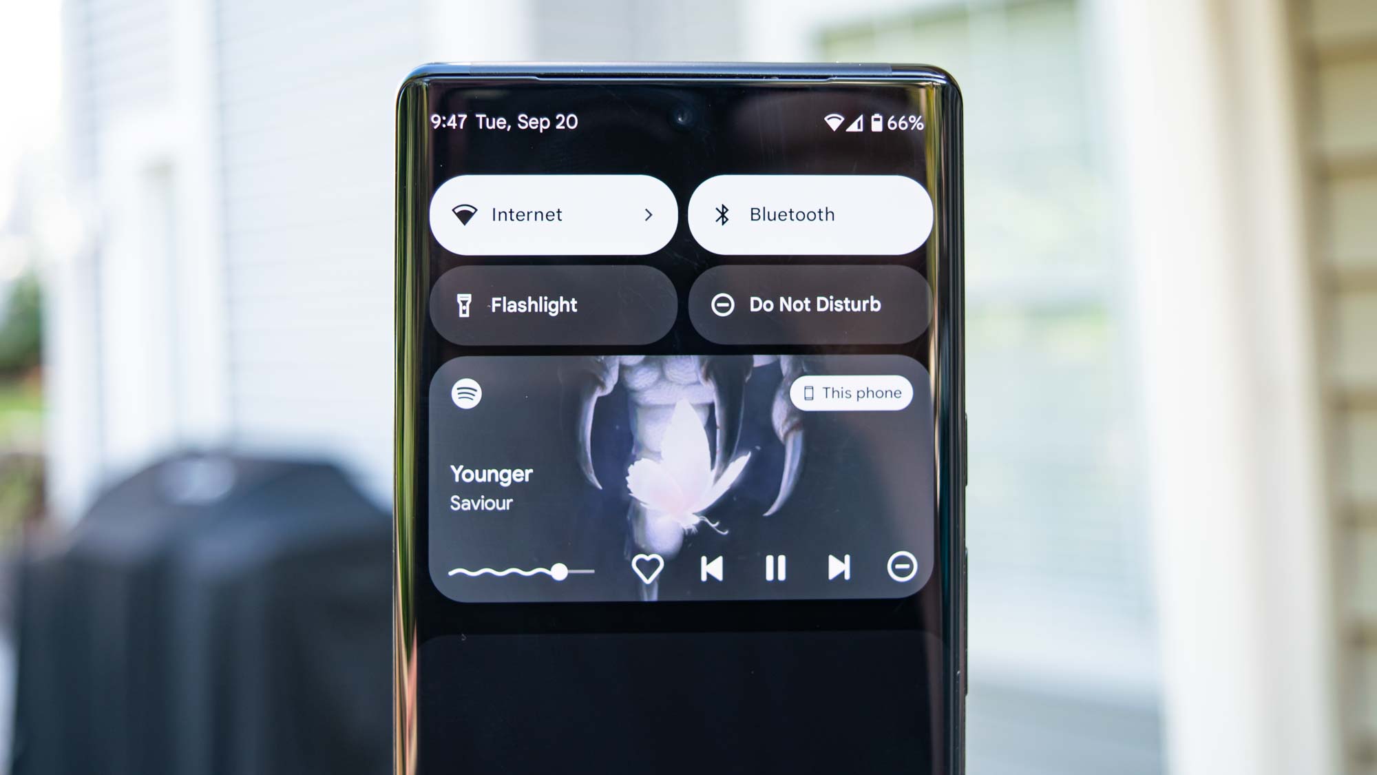
The media player is also always expanded, unlike the compact mode in Android 12. It’s a strange change and I’m not a fan. The album art also now takes full center stage in the background, but only in apps that support it. You might find that some just give you a single color. Spotify, however, looks nice thanks to this change.
While not new to Android per se — this change actually came in Android 12L — the lock screen clock sports a tweak that allows you to banish it to the corner, right where it goes when you have notifications. I don’t mind the chonky clock in the clock in the center of my lock screen, but if you do, Android 13 lets you adjust this via the Double-line clock toggle in Settings > Display > Lock screen.
Pixel Launcher
Not much about the Pixel Launcher has changed visually, but Google messed with the search functionality again. The launcher features two ways to look for things. The Google widget on the home screen functions primarily for web searches, but it can also surface apps as you type.
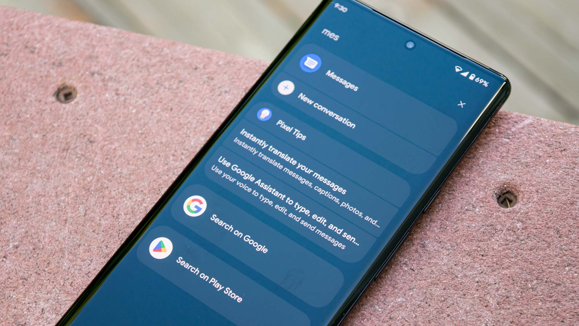
The app drawer search is a lot more like iOS, where you can search for apps, perform web searches, look for stuff on your device, and search the Play Store. But the fact that this is hidden in the app drawer instead of the main Google widget on the home screen is not something I like. I would have preferred Android 13 to unify the two search functionalities into one single spot. It works well on iOS and I think it could work equally well on Android.
Google likes to make things needlessly complicated sometimes and this is yet another example of that tendency.
Android 13 review: Privacy and security
Notifications permissions
Android has finally gotten iOS-style runtime notification permissions. Apps now ask for permission to send you notifications when you load them up for the first time. This is an extremely welcome change and I love to see it. While managing notifications is a lot easier and more robust on Android than on iOS, I prefer Apple’s way of making apps get your consent to send notifications.
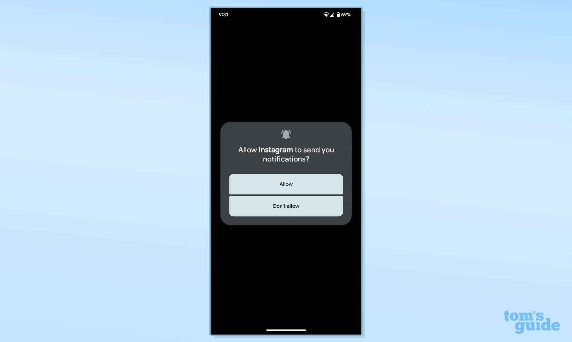
And just like on an iPhone, it’s quite satisfying in Android 13 to deny an app the ability to send you notifications at runtime. I love it.
Photo picker and media permissions
Continuing in the line of permissions, Android 13 now requires apps to ask for access to photos, video, or audio separately instead of all together like before. Google also introduced a new photo picker, again much like the one iOS has. When an app requests access to your photos, the system will bring up a list of your media and whatever you whitelist will get passed to the app.
In theory, it sounds great, but in practice, very few apps support the photo picker at this point; adoption is likely to be slow, if at all. This is something Google needs to enforce if it really is serious about privacy on Android. So far, I think Apple and iOS are quite a ways ahead on the privacy front, and Google doesn’t seem to want to catch up quickly.
Android 13 makes some good changes, don’t get me wrong, but all of the new privacy features should be strictly enforced. Otherwise, Google looks weak and I doubt its commitment. I have a feeling a crackdown is coming sooner rather than later, and we’ll no doubt see developers on the up and up implement these new features, but it might be a slow process.
Task Manager
Android 13 has a proper task manager, which appears at the bottom of the Quick Settings when you have foreground apps running. You can kill any of those apps at will, though beware that this can cause problems if you close the wrong one (such as your music player while you have music going). Google has long resisted adding a task manager into Android, but 2022 is the year it finally listened — and put a stop to those risky task killer apps.
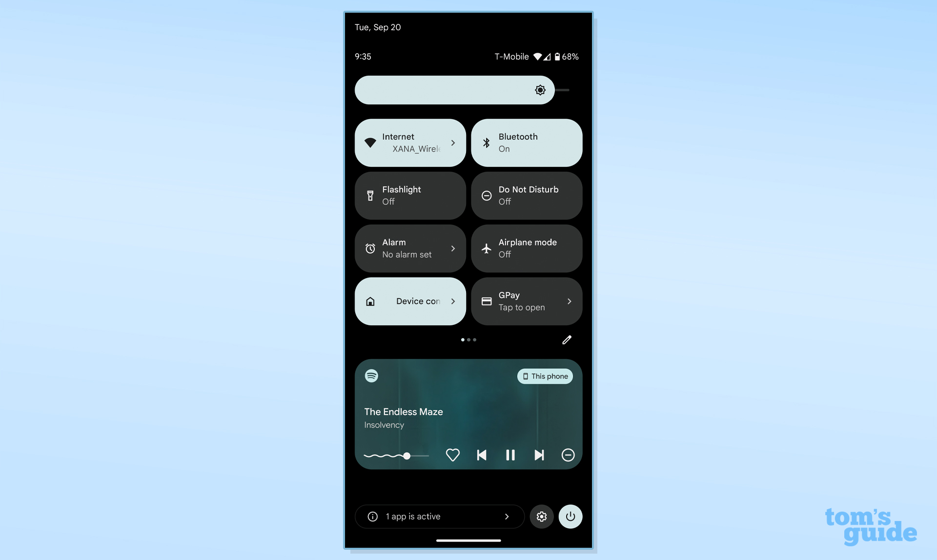
The task manager only applies to foreground apps and services, however. I like this change because it takes over the old way of doing things. Previously, Google mandated that apps had to announce when they were running in the background. The solution to this was a big and ugly notification that sat in the notification shade. If you ran apps constantly such as Tasker, this could get annoying. You’ll still find this notification pop up, but you can now dismiss it.
If you have any apps that you can kill, you’ll see a message along the bottom of Quick Settings that says “X apps are active” with an arrow that will take you to the task manager. There’ll be a list of everything running along with a Stop button. It’s a nice addition, even if a task manager isn’t explicitly new to native Android. It’s just new in this user-facing format.
Android 13 review: Miscellaneous changes
Per-app language preferences
Android 13 now has a great boon for multilingual users: per-app language preferences. You can now set some apps in your native language and others in your secondary one. This would also be beneficial for people trying to use and adjust to a new language or who do a lot of traveling.
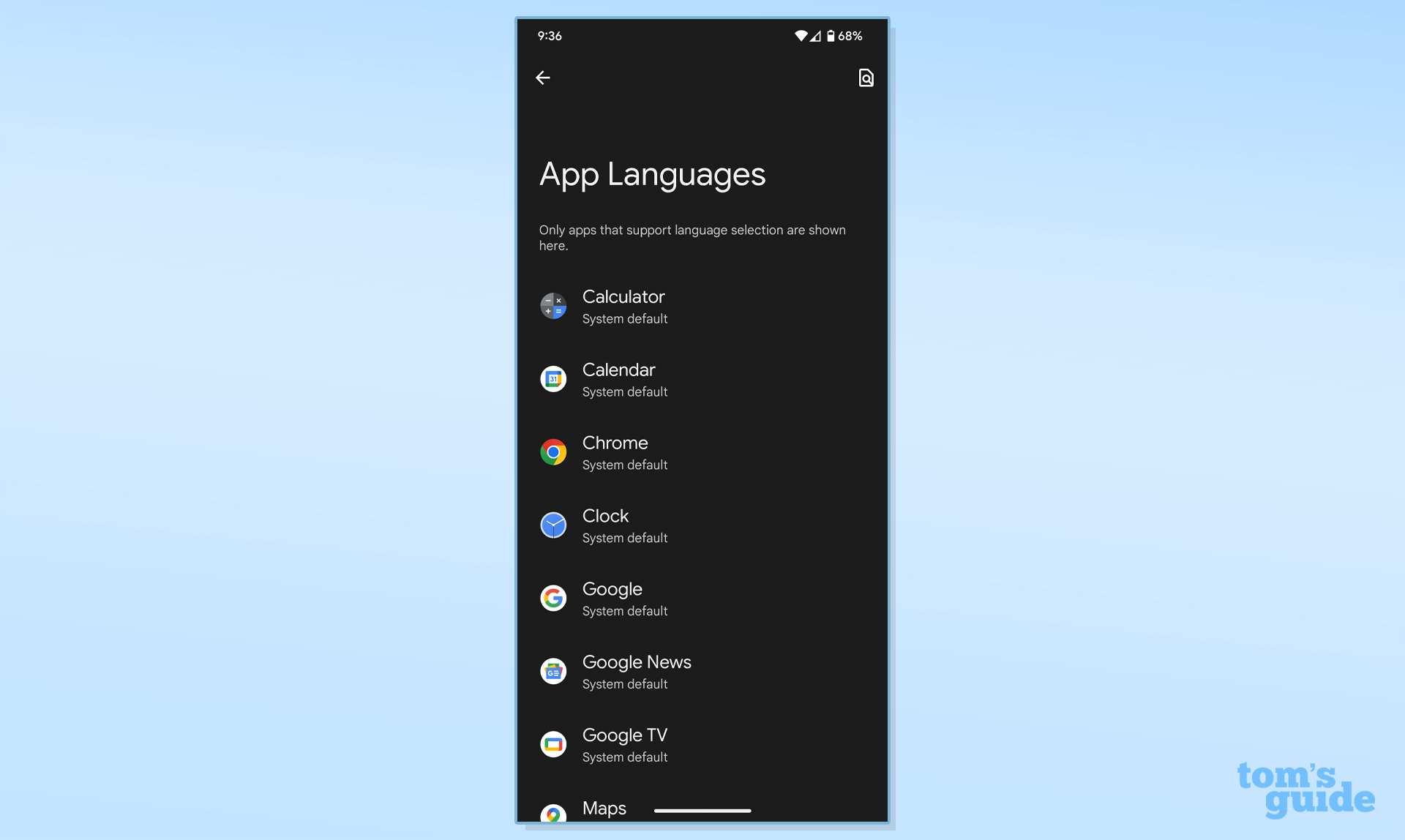
To access this, long press on the app icon until the quick menu appears. Tap the little i option at the top, which will take you to a menu in Settings where you can adjust the app language (where supported). You can also access a list of supported apps by going to Settings > System > Languages & input > App Languages.
Native QR code reader
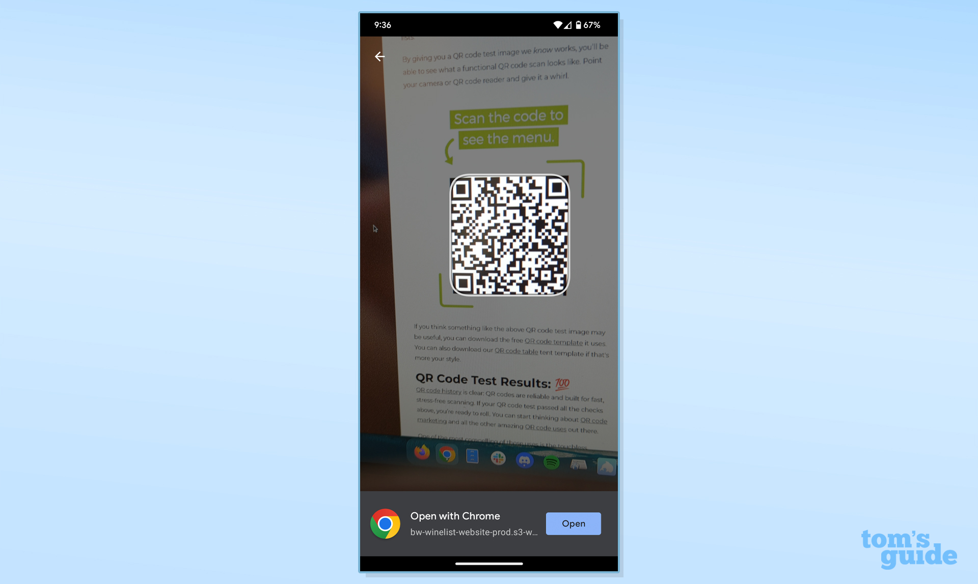
As we saw in the Android 13 Developer Previews and betas, Google introduced a native QR code reader. It sits in a Quick Settings tile, so tap it to open the scanner. It’s incredibly fast and works really well. I find it a lot easier to open the link it finds than other phones that make you reach for a tiny link under the code in the viewfinder (like on an iPhone).
Clipboard editor
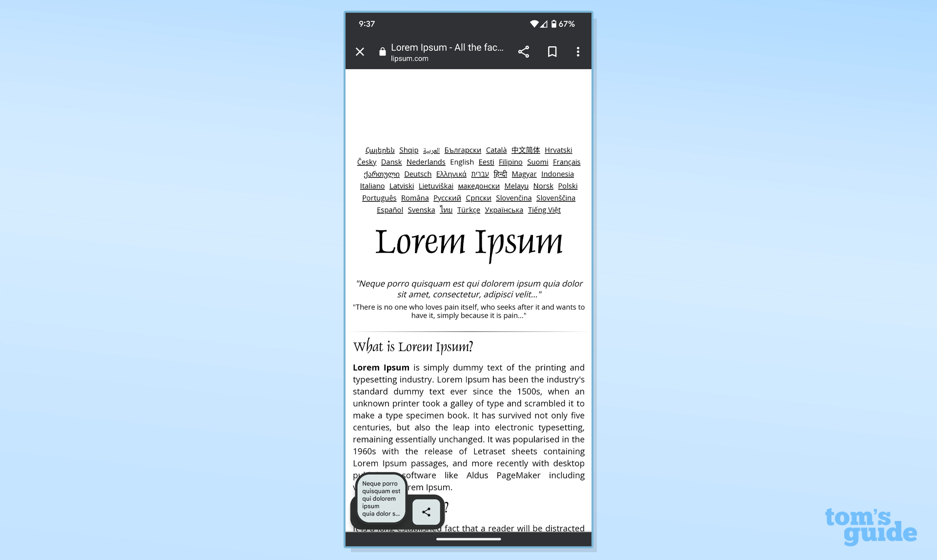
Android 13’s clipboard editor gives you a visual means of editing something you’ve just copied before you paste it, such as if you selected too much text.
Connectivity
Android 13 has support for Wi-Fi 7, the upcoming wireless standard, as well as Bluetooth LE Audio. This is a future-proofing measure.
Android 13 review: Verdict
Android 13 has a few noteworthy features and some interesting changes to say the least, but it’s ultimately a very small update. All the same, I appreciate Android 13. I especially like the new runtime notification permissions, though I wonder how it’ll shape up in the long-term. The photo picker is also nifty, but since it’s not mandatory yet, I am not sure how many developers will adopt it.
It’s fine for Google to take a year off from major OS changes since Android 12 was such a huge deal. I suspected that Android 13 would be a bit more low-key given that Android 12 had some things Google needed to address, notably bugs and shortcomings with Material You.
So it may not be the most exciting update you’ll ever see, but I strongly recommend you update to Android 13 once it becomes available for your phone. In fact, if you’re on a Pixel — or you have one of Google’s Pixel 7 phones — you’ve likely made the leap already with as little drama as an update this size would cause.

Jordan is the Phones Editor for Tom's Guide, covering all things phone-related. He's written about phones for over six years and plans to continue for a long while to come. He loves nothing more than relaxing in his home with a book, game, or his latest personal writing project. Jordan likes finding new things to dive into, from books and games to new mechanical keyboard switches and fun keycap sets. Outside of work, you can find him poring over open-source software and his studies.
