Tom's Guide Verdict
Android 11 marks another useful yet insignificant upgrade for Google’s mobile OS. While the redesigned media, screenshot and permissions controls are convenient, the additions to messaging and notifications aren't where they need to be to make a difference yet.
Pros
- +
Screen recording now built in
- +
Useful new screenshot and media controls
- +
Temporary permissions aid security
Cons
- -
Bubbles not active for everyone yet
- -
Notification groups aren’t intuitive
- -
Not available to everyone yet
Why you can trust Tom's Guide
Android 11 is currently rolling out to Google’s Pixel phones (from 2017’s Pixel 2 and 2 XL to the new Pixel 4a) as well as the OnePlus 8 and OnePlus 8 Pro. It’ll likely reach Samsung’s Galaxy handsets closer to the end of the year or early part of 2021, with priority being granted to the Galaxy S20 and Note 20 lines, as they’re the latest flagships from the company.
If you have a Pixel device but are still waiting for the new software to land on your device, check out our guide on how to get Android 11 right now.
Another year, another update to the world’s most popular mobile operating system — and this year, that means Android 11. But what could Google possibly add to a platform that’s been kicking for more than a decade, that seemingly already contains every feature under the sun?
That’s where Android 11 comes in. As we’ve come to expect from Android updates in recent years, version 11 opts for smaller changes rather than transformative ones, that make navigating Google’s OS a bit more intuitive and convenient. Redesigned screenshots and media playback controls, a new way to message friends and useful tweaks to app permissions may not be earth-shattering additions, but they’re nonetheless appreciated.
Or, at least appreciated by those who can get them. Like with all Android updates, it’ll be awhile before devices that aren’t made by Google — like the Galaxy Note 20, for example — gets to join in on the Android 11 party. (The lone exceptions to that are OnePlus, Xiaomi, Oppo and Realme, which have impressively already issued Android 11 updates to their latest models.)
Our Android 11 review highlights where Google’s latest software succeeds, and which features need a little more work.
Android 11 review: The best new features
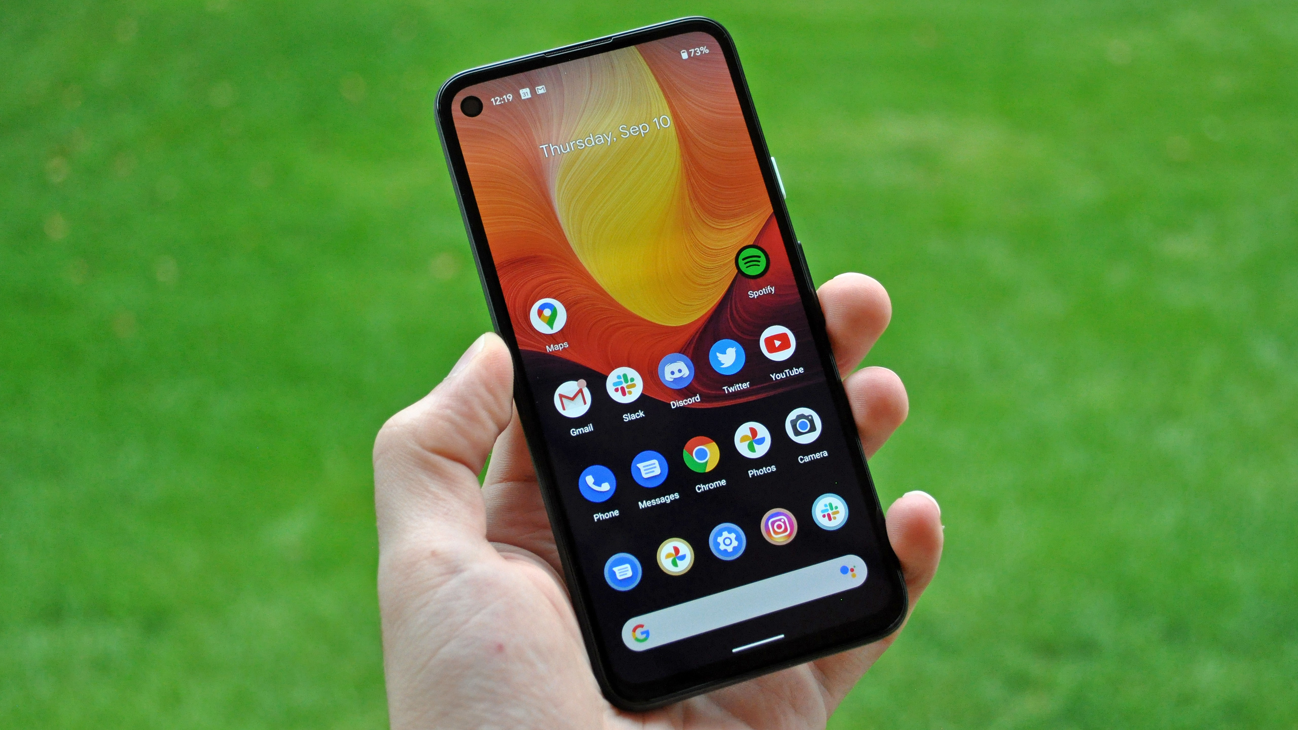
While Android 11 feels like more of a conservative update than, say, iOS 14 and its redesigned widgets and new App Library interface, Google’s OS does introduce some really welcome improvements. Here are the major ones:
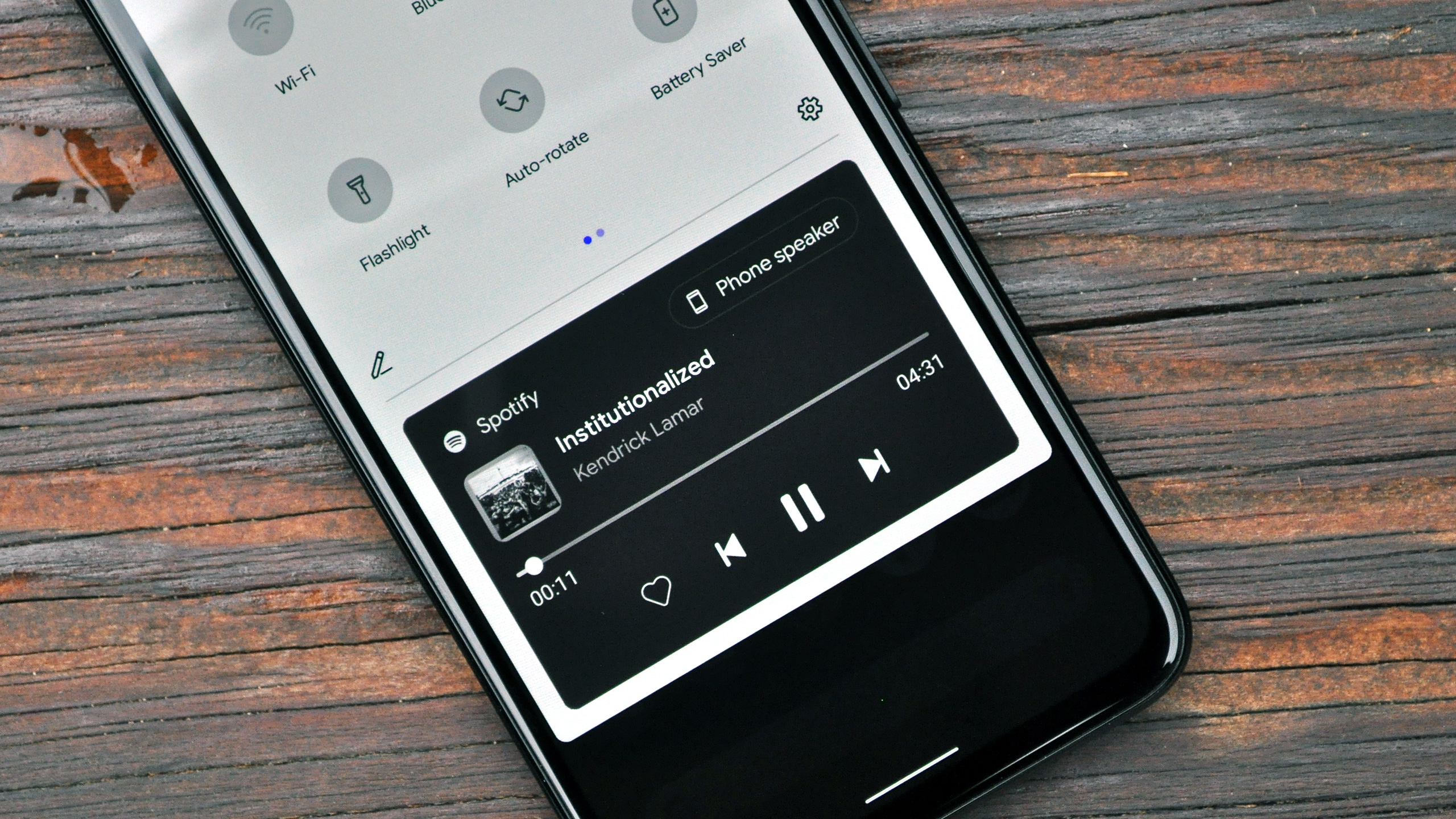
New media controls: Android has always been good about carving out a little space for playback controls in the notification pane, for currently playing media. It’s an approach I much prefer to Apple’s, which splits up some media controls across the lock screen and others in the Control Center, with neither looking all that great or being particularly great at conveying information.
What’s new about Android 11’s approach is that Google has lifted these controls out of the cluster of notifications in which they used to sit and given them priority in a space just underneath your quick toggles. In addition to skip, pause and play actions, a background that’s color-matched to album art and a progress bar that appears when expanded, there’s also a new button that allows you to instantly change the audio device currently playing the media in question.
This makes pivoting from your phone’s speakers to a Bluetooth speaker or a pair of wireless earbuds really, really easy. And it’s a clever shortcut to toss in now, as people have more connected devices at their disposal within their home than ever before. Android 11 will make it easier for you to use them.
New screenshot interface: It wasn’t difficult to markup a recently-captured screenshot through the notification that would pop up after taking one in Android 10. But the notification itself was quite obtrusive. It’d languish up top for seconds at a time, unless you either dismissed it or interacted with it, possibly covering pertinent information all the while.
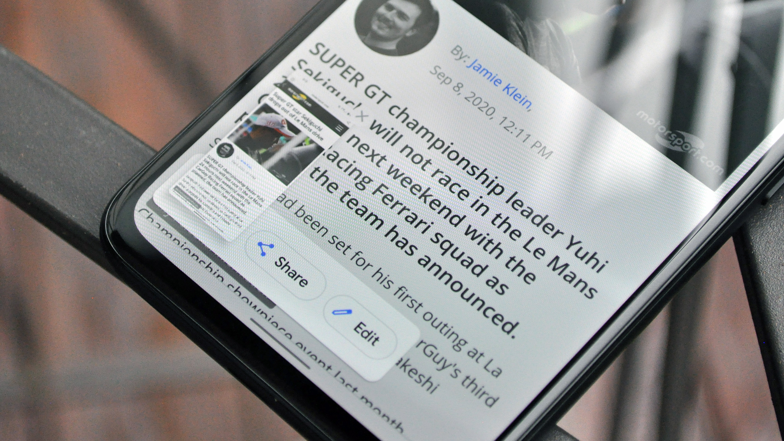
Android 11 fixes that. Now, taking a screenshot produces a thumbnail in the lower-left corner — and it happens quickly. This is good of course, because any delays that impede you from snagging a clip of something and firing it off to a friend tend to be more unwelcome than not.
Next to that thumbnail are share and edit buttons, as well as an “X” button that will simply dismiss the screenshot interface element, but not delete the image itself. It’s all very slick, fast, intuitive and looks great.
However, I have one small issue with the approach Google’s taken here. One of the best things about the way iOS handles screenshots is that it allows you to delete whatever you capture immediately after sending it off. This is really handy, because it means your photo library won’t be flooded with screenshots of one-time, out-of-context snippets of information and memes that you really don’t need living on your phone for days or weeks until you finally get around to deleting them. You can quickly delete screenshots in Android 11 too, but the software doesn’t make it easy, as you have to press or gesture back a bunch of times in succession after sharing a screenshot to return to the markup screen, where you can then hit the little trash icon. A tiny frustration, but one I’d personally like to see addressed.
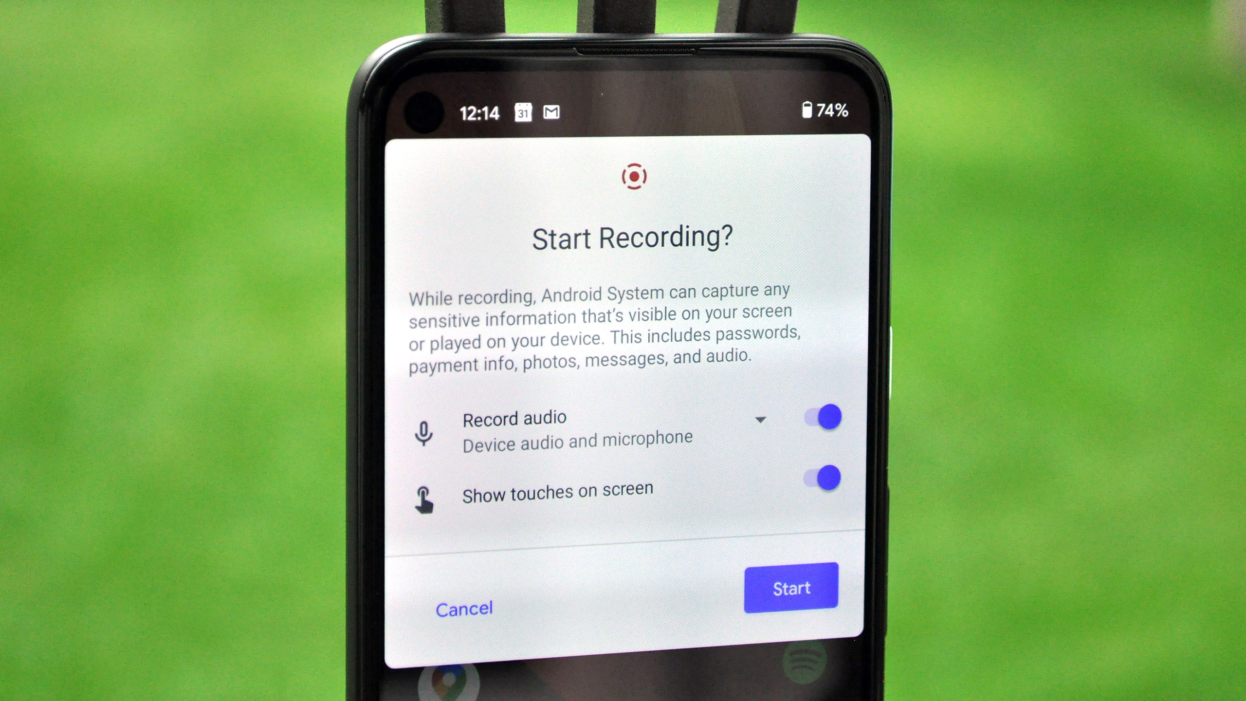
Screen recording built-in: If you’ve been mostly using Android phones from the likes of Samsung and OnePlus over the last several years, you may never have noticed that Android has lacked native screen recording features the entire time. But Pixel users still needed to turn to sketchy, oftentimes ad-ridden third-party solutions to capture activity on their device — until now.
Android 11 finally bakes screen recording right into Android, and it works very, very well on our Pixel 4a. It’s activated from a quick toggle shortcut, and offers options like choosing which audio source you’d like to accompany the visual element (your handset’s microphone versus on-device audio) and whether or not you'd like to highlight taps and gestures. As you’re recording, a red icon in the status bar reminds you that the feature is rolling; to turn it off, simply dip back into the notifications pane and tap the relevant item to stop.
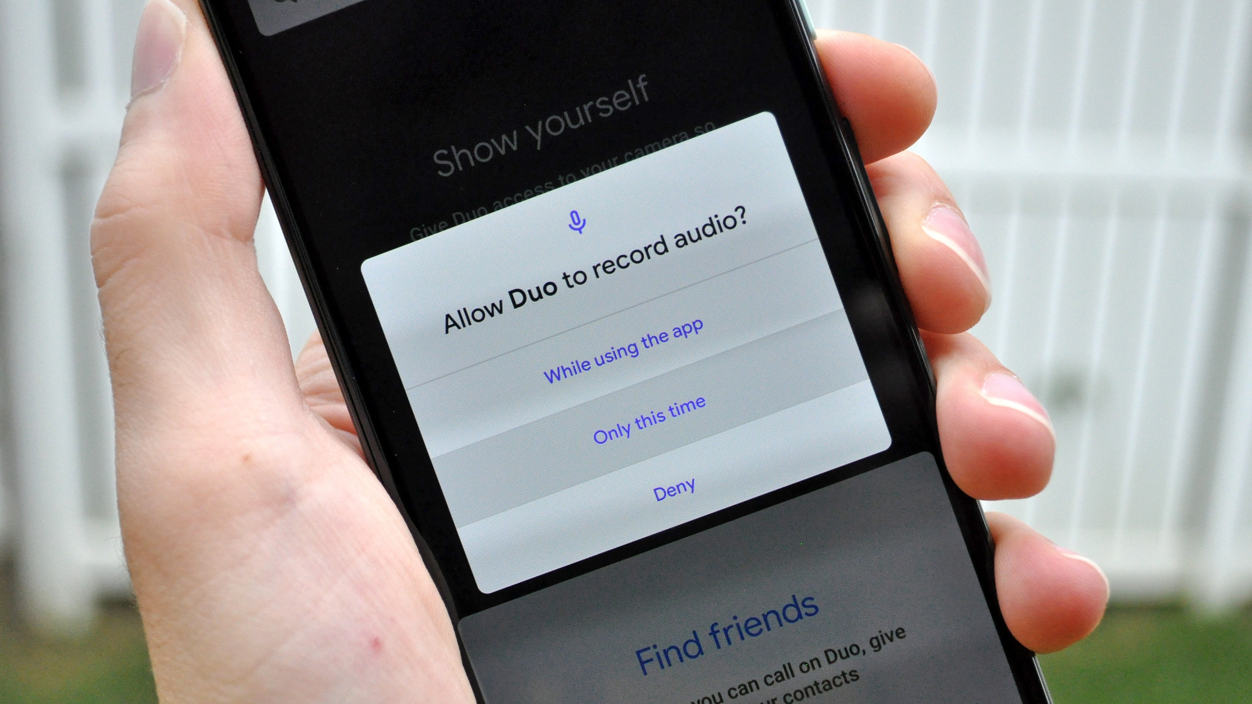
One-time permissions and permission resetting: Every year, it seems like Google and Apple turn up the heat on developers that abuse permissions, by making those permissions more stringent or temporary. With Android 11, users now have the ability to grant a single-use permission for an app they’d like to use once or twice, and then maybe never again.
Android 11 also automatically resets permissions for apps that have sat on your device dormant for months. If there’s an app you rarely use anymore — given the pandemic, I find myself taking far fewer Lyfts and Ubers than I used to — this feature instantly justifies itself. And considering how Uber’s had a concerning track record of abusing location monitoring in the past, I’d say this particular Android 11 addition is overdue.
Android 11 review: What needs work
Every software update is a work in progress, but too many significant features in Android 11 needed a little more attention before the software’s final release.
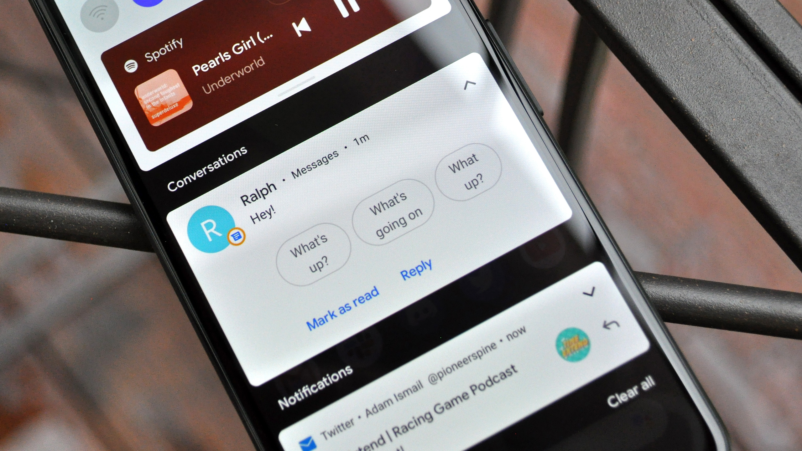
Bubbles: Long teased over successive Android updates but never brought to the public until now, Bubbles is basically Google’s version of Chat Heads — the Facebook Messenger feature that creates shortcuts for conversation threads that float above whatever’s on screen and persist from app to app. The difference with Bubbles is, of course, that this feature extends to messaging apps that aren’t Facebook’s, including the built-in Android Messages app for texting and RCS Chat, as well as WhatsApp and others.
I don’t know if Bubbles are necessarily something that we need on top of all the other distractions and information overload we deal with on our phones’ screens, though that comes down to personal preference. How much mileage you get out of this feature will ultimately differ on a case-by-case basis. But I can’t even get the thing to work on the Pixel 4a I’m using.
In my testing Bubbles don’t seem to appear at all, no matter what I do. The feature is active in Android’s settings; it’s turned on in the built-in Messages app, and I’ve even marked some conversations as Priority, which is supposed to ensure that new texts always arrive in bubble form. And yet, the floating heads of friends and family continue to elude me.
Nevertheless, it’s worth pointing out that even if Bubbles did function as designed on my device, not every app supports the feature as of yet. Telegram and the aforementioned Facebook Messenger are among the few.
Notification grouping: Along with the requisite updates that bring more granular control over permissions, every Android update usually tweaks notification behavior in some way, forcing users to get accustomed to a new system before Google inevitably adjusts it yet again the following year.
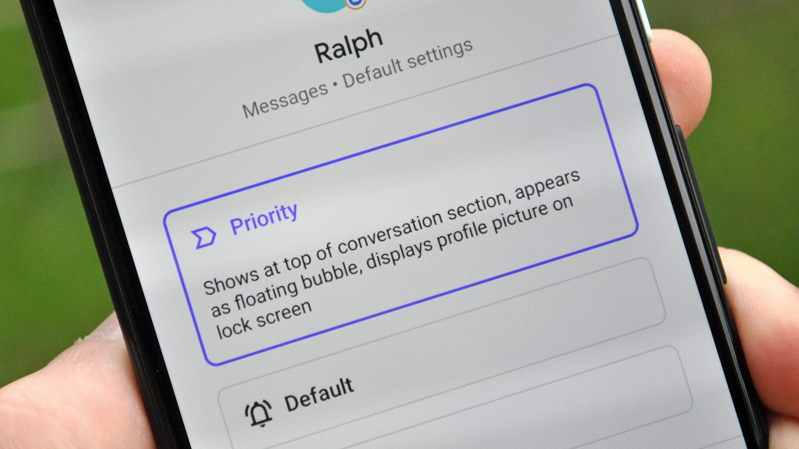
As a longtime Android user, I find that pattern grating even if the ideas at the heart of the updates are typically good. Android 11 breaks conversations out of notifications from other kinds of apps, giving them their own little space to catch your eye. This is reflected to greater effect when you set a thread with a particular individual or group to “Priority,” at which point those notifications will be given higher placement in the pane and also take up space in the status bar with a distinctive icon that reflects their avatar, rather than a generic new message icon.
That’s all fine in theory; the problem is that, in my experience, messages don’t always separate themselves into the conversations group on their own. In fact, to designate one Android Messages thread as a conversation, I actually had to long-press on the alert for that particular thread and manually add it to a list of conversations in the system settings. That’s way too much work, and it’s buried in a series of menus that most users will probably never uncover. This is a notification from a chat app; clearly it’s a conversation and should be classified as such. What else could it possibly be?
I can only assume this, like the issues I’ve encountered with Bubbles, is not an intended behavior. Hopefully, in time notification grouping will be smoothed out.
Android 11 review: Other noteworthy features
You’ll find a few other things in Android 11 that are worth highlighting.
Wireless Android Auto for all: This will only affect you if you have a new car that also happens to support wireless Android Auto. However, if you are among that small contingent of people, you’ll be pleased to know that all Android phones now support Android Auto wirelessly when running Android 11. Previously, only specific devices could connect to vehicles’ infotainment displays without the need for a cable.
A more useful power menu: Beginning with Android 10, Google punched up the Android power menu to include quick access Google Pay cards and passes, as well as power off, screenshot and restart controls. With Android 11, Google Home-connected accessories now appear on this screen as well. Again, how useful this is will likely depend on how smart your home is, but for those living with a bevy of connected products at their disposal, like lights and smart locks, this could be very convenient indeed.
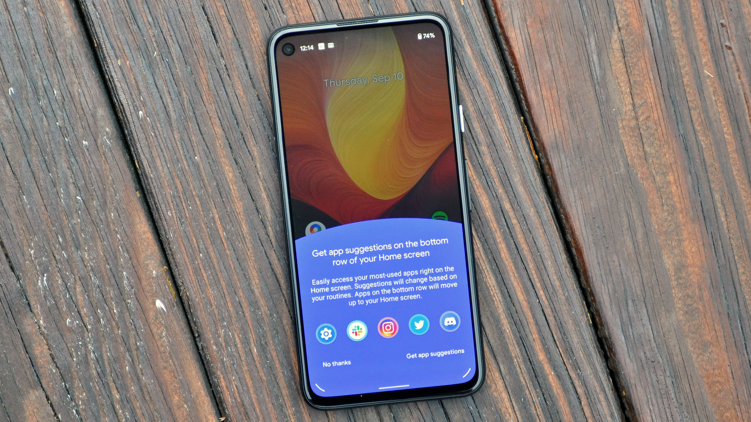
App suggestions on Pixel home screen: This one’s for Google’s phones only, but a new option now devotes space right above the home screen search bar to the apps your Pixel thinks you want to use at any given moment, deriving its recommendations from contextual cues and artificial intelligence. If this sounds like an overreach to you, don't fret — it's not on by default. While I envision some users may like the feature, personally I consider the bottom five apps in my home screen to be the most important on my device, so I'd prefer they remain static.
Android 11 review: Verdict
A worthwhile but hardly revolutionary upgrade, Android 11 certainly won’t make the experience of using your Android phone worse. Given the maturity of Google’s platform at this point, that’s pretty much all you can hope for.
That said, some of its new features — particularly those concerning messaging and notifications — don’t seem ironed out quite yet. In time they likely will be, which is perhaps a consolation to anyone who has an Android phone that isn’t made by Google or OnePlus, and will have to wait some time before the update rolls out to their handset. Rest assured, you’re not missing much here.
Adam Ismail is a staff writer at Jalopnik and previously worked on Tom's Guide covering smartphones, car tech and gaming. His love for all things mobile began with the original Motorola Droid; since then he’s owned a variety of Android and iOS-powered handsets, refusing to stay loyal to one platform. His work has also appeared on Digital Trends and GTPlanet. When he’s not fiddling with the latest devices, he’s at an indie pop show, recording a podcast or playing Sega Dreamcast.
-
bkinnj I for one do not like the new screenshot functionality. Why am I forced to switch to gesture navigation to have access to it? Just put it back on the power menu please.Reply
Why can't they enable changing the grid size on Pixel launcher? -
Jean Yus Losing the swipe up + hold to access recent apps/overview from the middle of any home screen is a major downgrade. (and to piss us off they left the animated image of the feature in settings, just so we can remember how useful this was)Reply
We didn't need a 3rd method of screenshooting and we could already "select" & copy text in Android 10. The last thing I'm worried about is deleting a photo. Solid Explorer >screenshots folder>shortcut to home screen> done.
...& how about Toms guide gets an update to the commenting section. What's the point in creating a burner facebook account if you can't login & comment with it Tom?
