Tom's Guide Verdict
The Amazon Kindle Scribe is a terrific e-reader mated with a mediocre note-taking device and costs far too much for what it offers.
Pros
- +
Excellent reading experience
- +
Large, high-resolution screen
- +
Wide variety of display controls
- +
Multiple high-capacity storage options
Cons
- -
Difficult to justify over other Kindles or similarly priced, more feature-rich tablets
- -
Awkward in-book note handling
- -
Premium Pen does not always feel smooth on screen
- -
Lacks some features found in less-expensive models
Why you can trust Tom's Guide
Price: $339.99 (to start)
Display size: 10.2 inches
Pixel density: 300ppi
Storage: 16GB, 32GB, or 64GB
Battery life: Up to 12 weeks (claimed)
Dimensions: 9.0x7.7x0.22 inches
Weight: 15.3 ounces
Ports: USB Type-C
Wireless charging: No
The Amazon Kindle Scribe (starting at $339.99) introduces a feature I, for one, hadn’t really expected to see anytime soon on the king of e-readers: writing! Now, just as easily (well, more or less) as you read ebooks, you can take notes in them, elaborating on things you might want to remember or sketching pictures to illustrate some important concept, or even create notebooks full of e-paper that you can then fill with lists, doodles, or anything else you can think of. And all that’s required is a swipe of the included pen.
It's a fun addition, and the Scribe in every other way represents the state of the e-reader art, with a strong design sensibility, a terrific and spacious screen, and the kind of well-honed usability you’d expect from Amazon. But considering the price, the product had better be airtight and the writing functionality something you can’t live without, and neither is quite the case. This may be the ideal e-reader for a very specific audience, but most people would likely be better served by one of Amazon’s other less-expensive — but still impressive — Kindles, many of which made our list of the best Kindles on the market.
Amazon Kindle Scribe review: Configurations and pricing
The $339.99 base version of the Scribe gives you 16GB of storage space and includes the Basic Pen. Another $30 gets you the Premium Pen, which also comes standard with the 32GB ($389.99) and 64GB ($419.99) capacities and adds a couple of additional tricks to your writing arsenal (and are discussed below).
Amazon Kindle Scribe review: Design
Measuring 9.0 x 7.7 x 0.22 inches and weighing 15.3 ounces, the Scribe is the biggest Kindle currently available, but unlike the previous champ (the Kindle DX from 2009), it feels in no way bulky. It has a 0.38-inch bezel on the top, bottom, and one side; the final bezel measures about 1.13 inch and can be on either the left or the right depending on how the Scribe is oriented. (The screen rotates automatically as you turn the unit.) Both the Power button (the Scribe’s only physical control; there are no page-turn buttons as there are on the Kindle Oasis) and the USB Type-C port are located near the center of the widest bezel’s side.
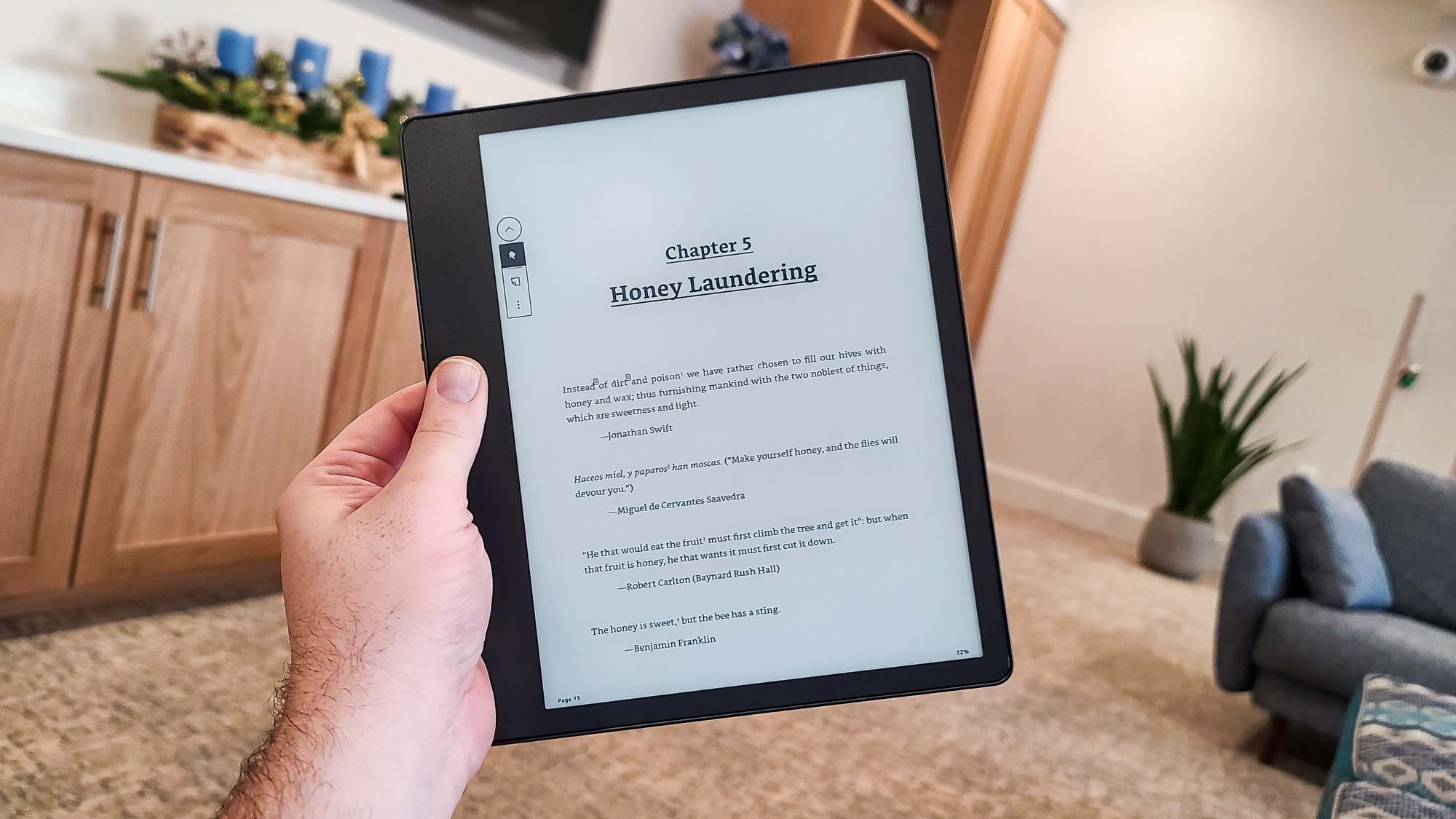
The bezels and the all-metal back (which, aside from the four tiny rubber feet, is adorned only with a black Amazon logo) are a dark gray color Amazon refers to as “Tungsten.” It’s somewhat nondescript, but more stylish than the basic black colors of the currently available base Kindle model and the two Paperwhites.
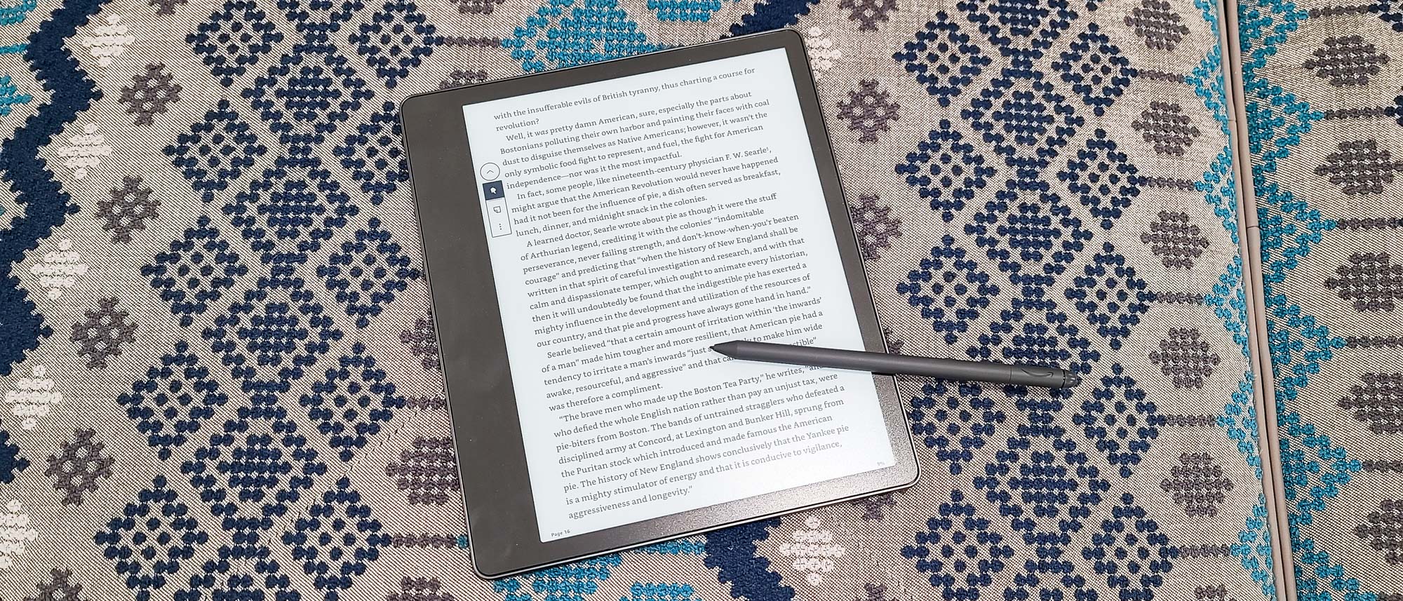
Our review unit came with the Premium Pen, which from tip to eraser is about 6.38 inches long (and about 0.8 inch wide), and is that same Tungsten color. Thanks to its single flat edge, it’s comfortable to hold and unlikely to roll very far if you put it down on a table. The Shortcut button (which we’ll get back to presently) is positioned about 1.5 inches from the tip and just about an ideal spot given where I hold writing instruments. Although the Premium Pen will attach to the (non-button) side of the Scribe with an integrated magnet, I found that the magnet was not especially powerful and the Pen would disconnect easily during just normal reading.
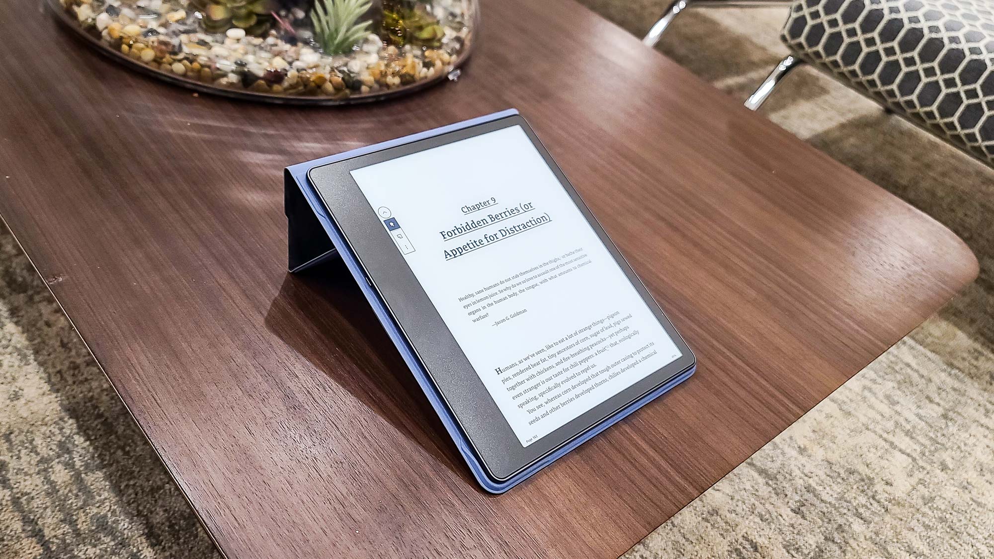
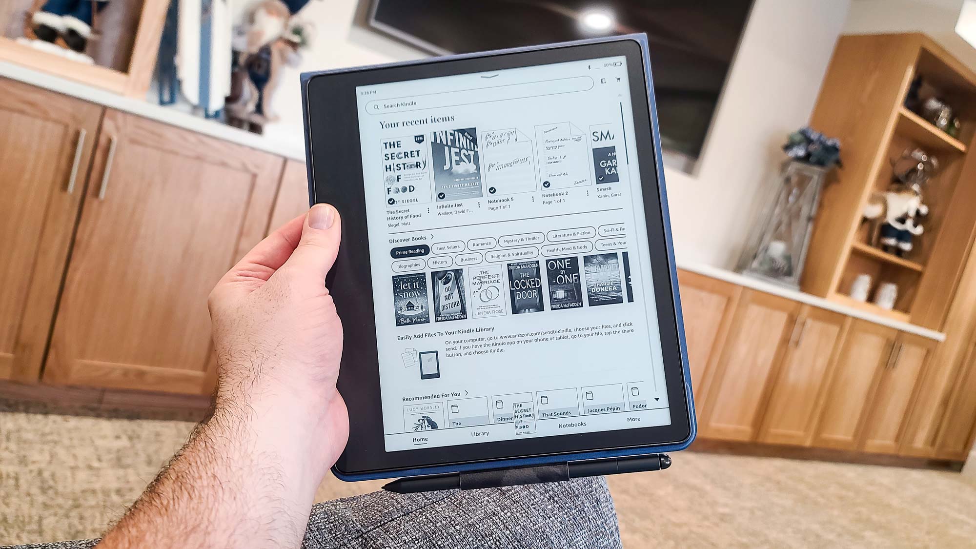
A better storage solution for it — and for the Scribe itself — is to use one of the available folio covers. These are sold separately, and range in price from $59.99 for the Fabric Folio Cover to $99.99 for a swanker premium leather version (like the one our review unit shipped with). The cover holds the Scribe securely and has an integrated loop for the Pen, ensuring it won’t fall off at an inopportune time. Another good reason for the case: Unlike the Oasis and the two Paperwhite models, the Scribe is not waterproof.
Amazon Kindle Scribe review: Display
Kindle displays have never been small, but the one on the Scribe is luxuriously large: 8.2x6.1 inches (HW), and 10.2 inches across the diagonal (half an inch larger than the DX’s screen). This gives you almost as much page real estate as a full-size hardcover, a development I love since it’s not accompanied by the size or weight associated with those physical books.
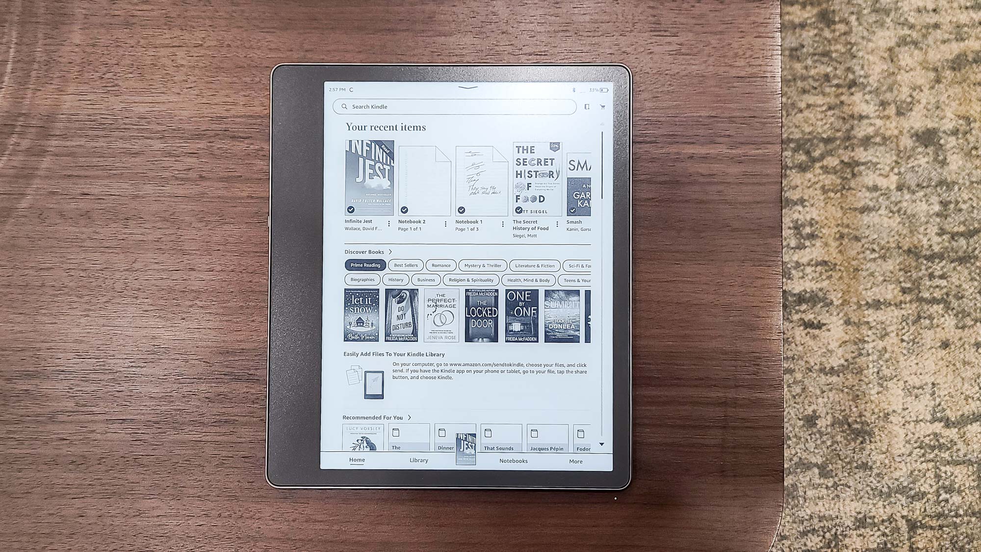
The 300ppi touch screen uses Amazon’s Paperwhite technology, which allows for ultracrisp text and more realistic contrast, which results in a considerably more pleasant reading experience than with traditional Kindles (which were and are, it should be said, totally fine for reading). Add in the advanced backlighting technology, which uses 35 LEDs to ensure evenness across the whole sccreen and features automatically adjusting brightness (though you can also set it yourself using a slider in the top-of-the-screen drop-down menu), and the ability to adjust the screen’s warmth to give the display a more amber hue.
Amazon Kindle Scribe review: Battery Life
Amazon promises hefty battery life on the Scribe — at least under certain conditions. For reading only, the company claims 12 weeks, which puts it at the forefront of the current lineup. Throw in writing, and things get a little murkier, with the claimed time dropping to “merely” three weeks. In both cases, the time is measured with wireless off and the light set to 13 (a touch above medium brightness). In our daily anecdotal observations using Amazon’s criteria, we predict those numbers to be roughly accurate.
During our mixed-use testing period (with wireless networking on, as that’s the way we expect most people will use the Scribe), battery life expectedly dropped more quickly. But even there, we estimate the battery would last most average readers six to eight weeks on a single charge — not at all bad given the size and composition of the screen. (Neither the Pen nor the Premium Pen requires charging.)
When the time eventually comes to charge the Scribe, you can do so with the included USB (Type-A–to–Type-C) cable by plugging it into a computer or a power strip. As is the current trend, no dedicated charger comes with the Scribe.
Amazon Kindle Scribe review: Reading experience
That the Scribe is as good as e-readers get from the reading standpoint should be no surprise — Amazon has been at this, and at a high level, for a long time. Swiping to move between pages is completely fluid. Interacting with the book, such as flipping between chapters, employing highlights, or getting dictionary definitions of unfamiliar words, is still a seamless process. You have tons of control over every aspect of the font and page layout, so you can always read in a way that’s easiest on your eyes. The organization of your library, which in addition to regular books and notebooks (see below) also includes Audible audiobooks you can listen to by pairing a Bluetooth audio device, is clean, thoughtful, and easy to navigate.
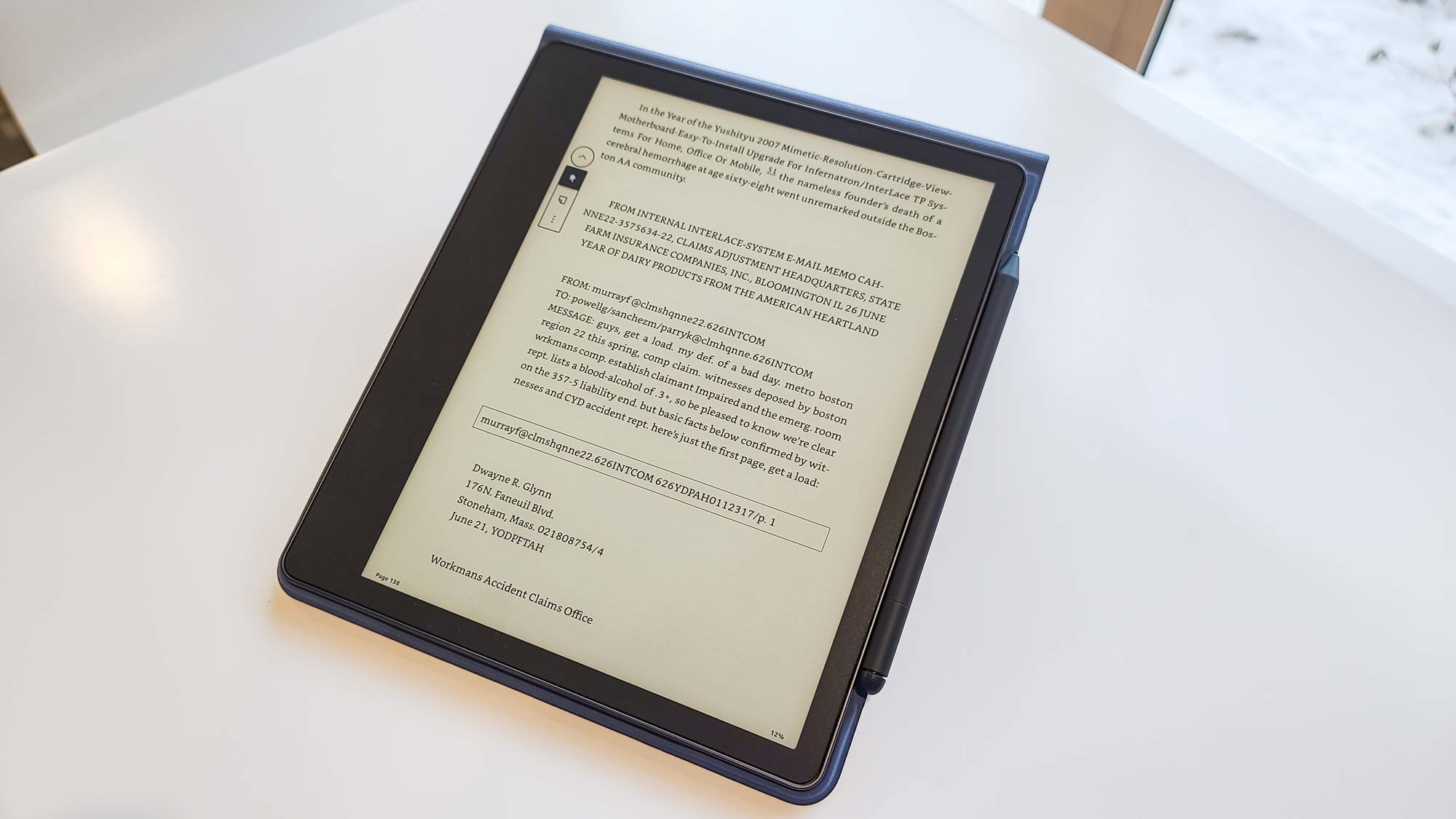
The Paperwhite screen remains a marvel of clarity whether displaying text or images, no matter what the lighting scenario. As I prefer something closer to the look of traditional paper, I never felt the need to adjust the warmth setting, but that gives a nice effect nonetheless.
The only potential wrinkle: Because of its size and lack of buttons, the Scribe is not well suited to one-handed reading. My hands are of above-average size, and I had trouble holding it and turning pages consistently. Otherwise, the Scribe is nearly a peerless e-reader.
Amazon Kindle Scribe review: Writing experience
As the Scribe’s existence is predicated on its ability to take notes within the pages of ebooks, one would expect that functionality to be top-notch, too. Unfortunately, it is not.
Tapping the Page icon in the toolbar of the margin of any ebook lets you place a “sticky” note on the page. This opens a window (consuming more than one-third of the screen) where you can enter the contents of the note using either text (via an on-screen keyboard that consumes still more of the display) or handwriting. If you choose the latter, you can tap on either a Pen icon to create lines or a Highlighter icon to create broader swaths of a light gray (through which pen text can be seen); an Eraser icon lets you, well, erase anything you’ve written or drawn. Tapping a selected icon again lets you change the line thickness and, in the case of the Eraser, also choose to erase merely a selection or a full note page.
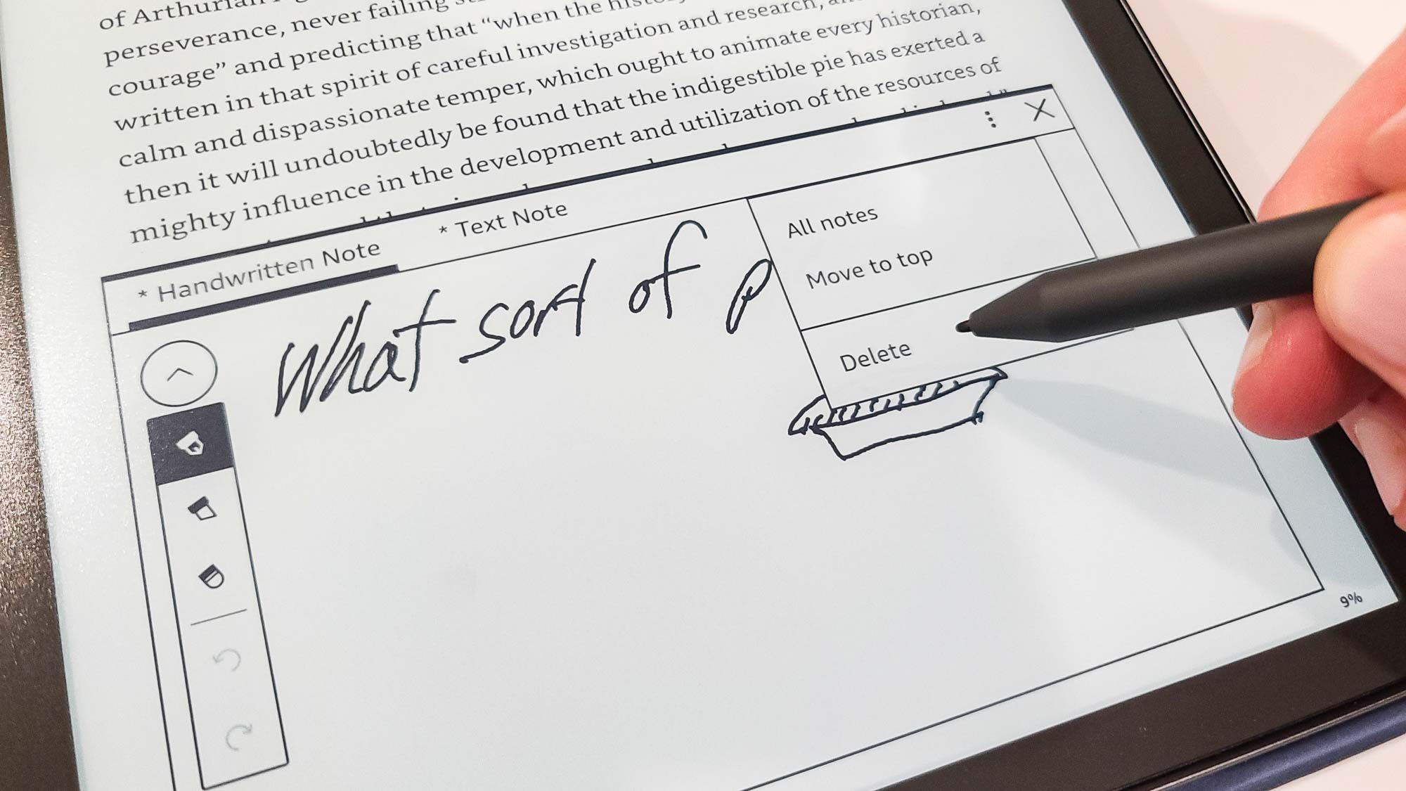
This all works as expected, though I would not agree with Amazon’s claim that writing on the screen feels just like writing on paper; it’s smooth, but not that smooth. I also didn’t love having to reselect the icon each time if I wanted to add multiple notes to a page.
There are bigger issues. The overall note experience is akin to that of other Kindles. Once you close a note, it’s represented in the book as only a tiny page icon above the line, which is not only easy to miss, but it also tends to cover up the letters to which it’s attached. Notes also won’t “stick” just anywhere; each needs to be connected to text, so you can’t just put one in convenient blank space on a page or on an image. I tried to attach a note to a cover picture, for example, and the icon got buried, half off the screen, in the upper-right corner.
As a result, it’s easy to feel that you don’t have precise control over the notes. That’s one thing on a Kindle where you just read, but something substantially different when the notes are the whole point. Precision-tapping those tiny, cumbersome note icons with the pen isn’t easy or enjoyable; a solution that worked with the Scribe’s unique features and hardware would have been preferable.
It's also worth reinforcing that you’re never writing directly on a book’s “pages” — which would seem to be the most natural use for the Scribe — so there is always an extra, fussy step required to see any notes you add. If you import a PDF document through Send to Kindle, then you can write directly on that—but, according to Amazon, that feature isn’t available with PDFs copied via the USB port. Saved text notes are automatically entered into a “My Clippings” book in your library for easy export, but handwritten notes aren’t saved this way; they must be e-mailed separately.
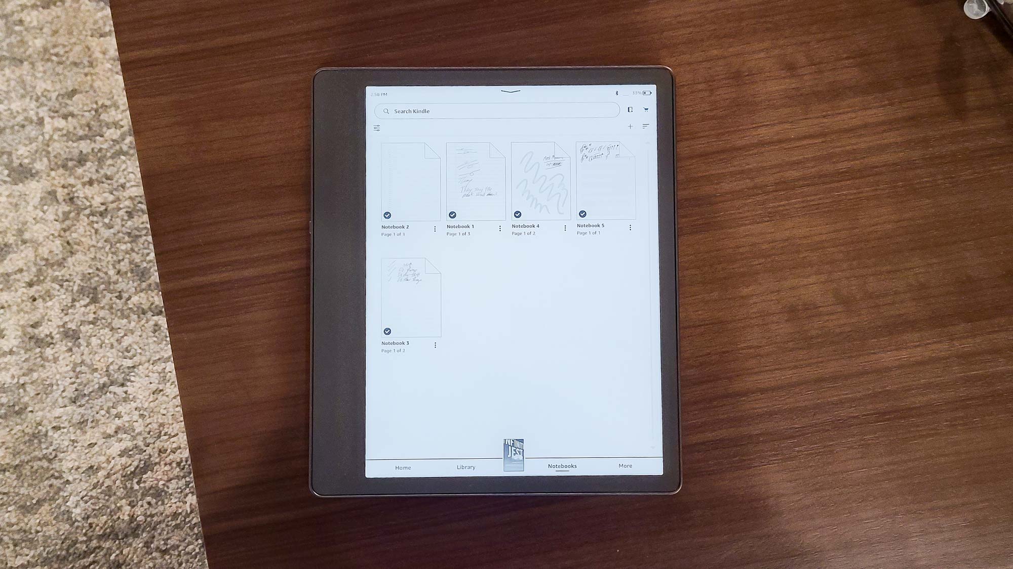
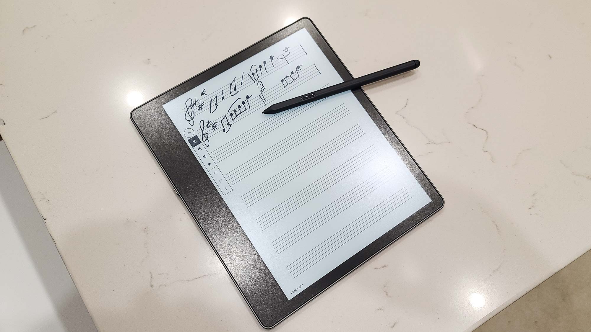
What works better are the Notebooks, accessible from the home screen. Like their dead-tree namesakes, these are groups of digital pages you can create expressly for the purpose of writing in. When you create a new notebook, you can choose from among 18 styles of paper, including college ruled, dictation, graph, memo book, to-do lists, music staff manuscript, or entirely blank, and then write in the pages however you wish. You can’t mix different types of paper within a notebook — you would need to create a folder and populate it with multiple notebooks of different types of paper — but overall, this is the best way to write using the Scribe.
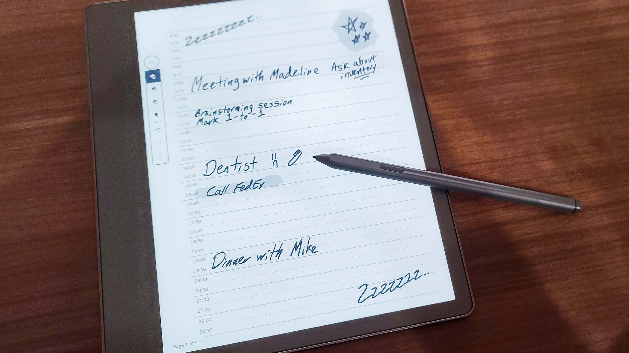
Except: That’s a problem, isn’t it? If you wanted to take notes separately, you could do that on your phone, in a paper notebook, or with another device — maybe one that supports handwriting recognition for conversion to text or other advanced note handling features (like the dedicated “smart paper” notebooks on the market). Having to leave the book you’re reading to enjoy an intuitive writing experience defeats much of the purpose of the Scribe, which should not be the case when you’re paying $340 or more. Amazon is promising “regular, free software updates” to expand the Scribe’s abilities, with new brush types and copy-and-paste tools for notes, more notebook organization options, and the ability to import to the Scribe directly from Microsoft Word. These sound like nice additions that are unlikely to improve the Scribe’s fundamental flaws.
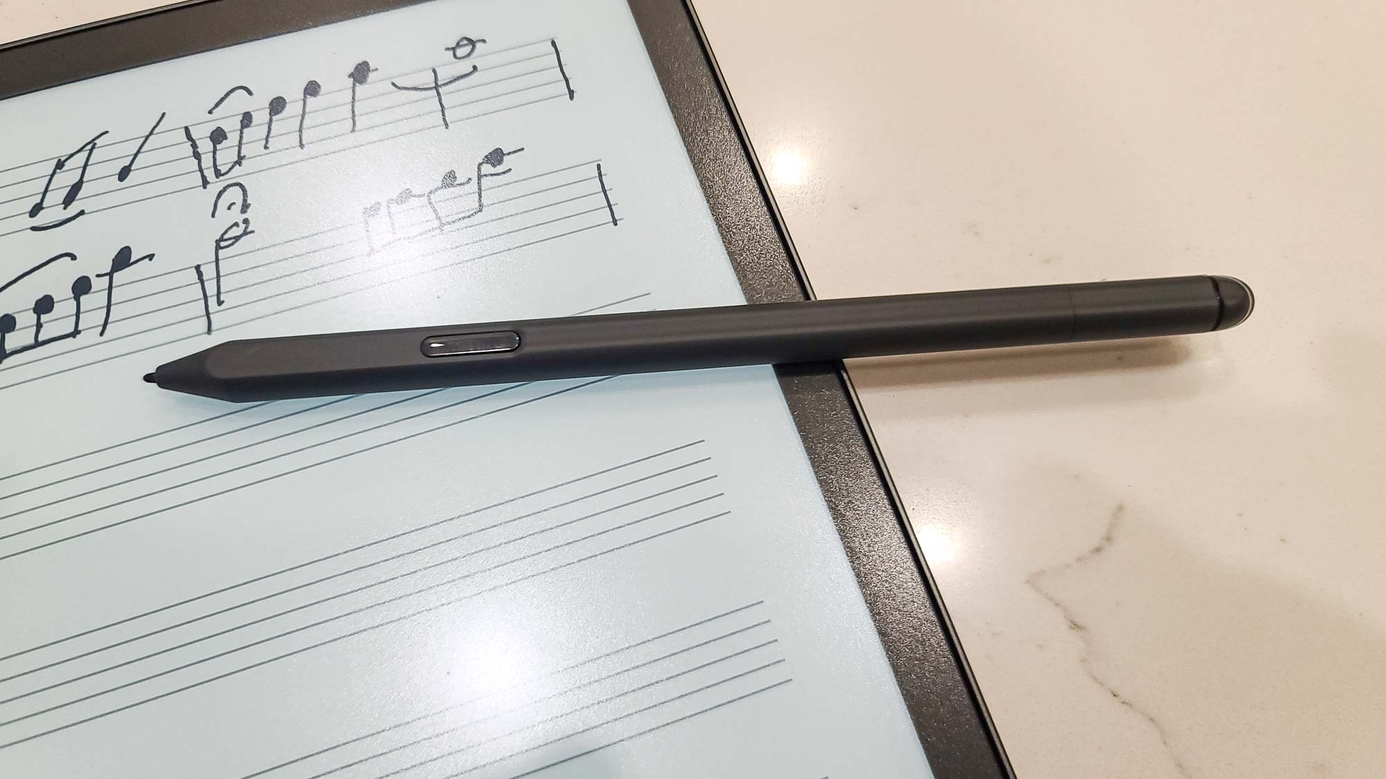
Finally, a word about the Premium Pen. It’s required for creating handwritten notes — your finger won’t do — and it’s comfortable enough to use for extended periods. The tip exhibited notable, if not extreme, wear during our testing, and five additional tips and a removal tool are included with the Scribe, but unless you’re writing a lot, you likely won’t have to worry about replacing the tip more than every six to eight weeks. The Shortcut button, which lets you switch between a Highlighter, Pen, or Eraser, or add a note, depending on what you specify in the settings, works well enough, but I found it just as easy to tap the icon in the toolbar. I did not, however, care much for the eraser. It activates automatically when you push it down, but you have to keep it pushed down while you’re erasing, and the combination of the oddly high amount of force required and the scraping sound the eraser makes when dragged across the screen is unpleasant. It’s understandable why a lighter touch may not be technically feasible for both writing and erasing, but any kind of a more organic feeling would be an improvement.
Amazon Kindle Scribe review: Verdict
In many ways, the Amazon Kindle Scribe is an outstanding product. Building on the features and usability that Amazon has spent a decade and a half perfecting, it offers one of the best raw reading experiences I’ve ever had on a Kindle (and I’ve used every major version). The larger screen size, the screen quality, and the general design are all exactly the combination of elements I would want while reading.
While reading. Ay, there’s the rub. It’s ultimately because of its underbaked writing capabilities — and that price — that the Scribe must ultimately be defined what it can’t do.
At $339.99, it is firmly in tablet territory. And we’re not just talking the likes of, say, the Samsung Galaxy Tab S8 Ultra (starting at $349.99), but even the formidable Apple iPad, with the ninth-generation version starting at $329 and the current one coming in at $449. Any tablet offers more functionality than the Scribe, in color, and with a Kindle app readily available from every major app store. The screens and the reading experience aren’t the same, of course. But they’re good enough, and when you throw in everything else a tablet makes possible, the Scribe looks worse by the second. It doesn’t even compare well against dedicated electronic notebooks, which offer handwriting recognition and more fancy features for about the same price. You’re giving up the polished e-reader experience, true, but that’s not the Scribe’s main selling point anyway.
The compromises might be more forgivable were the price lower, especially for voracious readers. But then Amazon would slam into its own higher-end, no-writing e-readers like the Kindle Paperwhite Signature Edition and the Kindle Oasis, which at $199.99 is already pricey and has a thoroughly satisfying 7-inch screen. And if you’re okay going the minimalistic route, the new entry-level Kindle is superb — and it costs about a quarter as much as the Scribe.
Unless you desperately want to annotate or draw in your books, there’s no good argument for the Scribe. Sure, the notebooks are delightful, but my phone does the exact same thing — and it’s always with me, right in my pocket, whereas the Scribe’s size works against its aspirations to be a constant companion.
At least the Scribe isn’t a bad product, and with some tweaking of what it can do and how much it costs, Amazon might be able to better justify it. What we don’t and can’t know yet is whether Amazon’s planned feature rollouts will make a better case for the Scribe than the launch set. Based on the information currently available, I would say no. But given Amazon’s history, I’m willing to keep an open mind. The full story of the Scribe has not yet been written.
Matthew Murray is the head of testing for Future, coordinating and conducting product testing at Tom’s Guide and other Future publications. He has previously covered technology and performance arts for multiple publications, edited numerous books, and worked as a theatre critic for more than 16 years.
