Samsung Galaxy S25 should steal this feature from iPhone 15
Dynamic Island needs to make the jump to Android
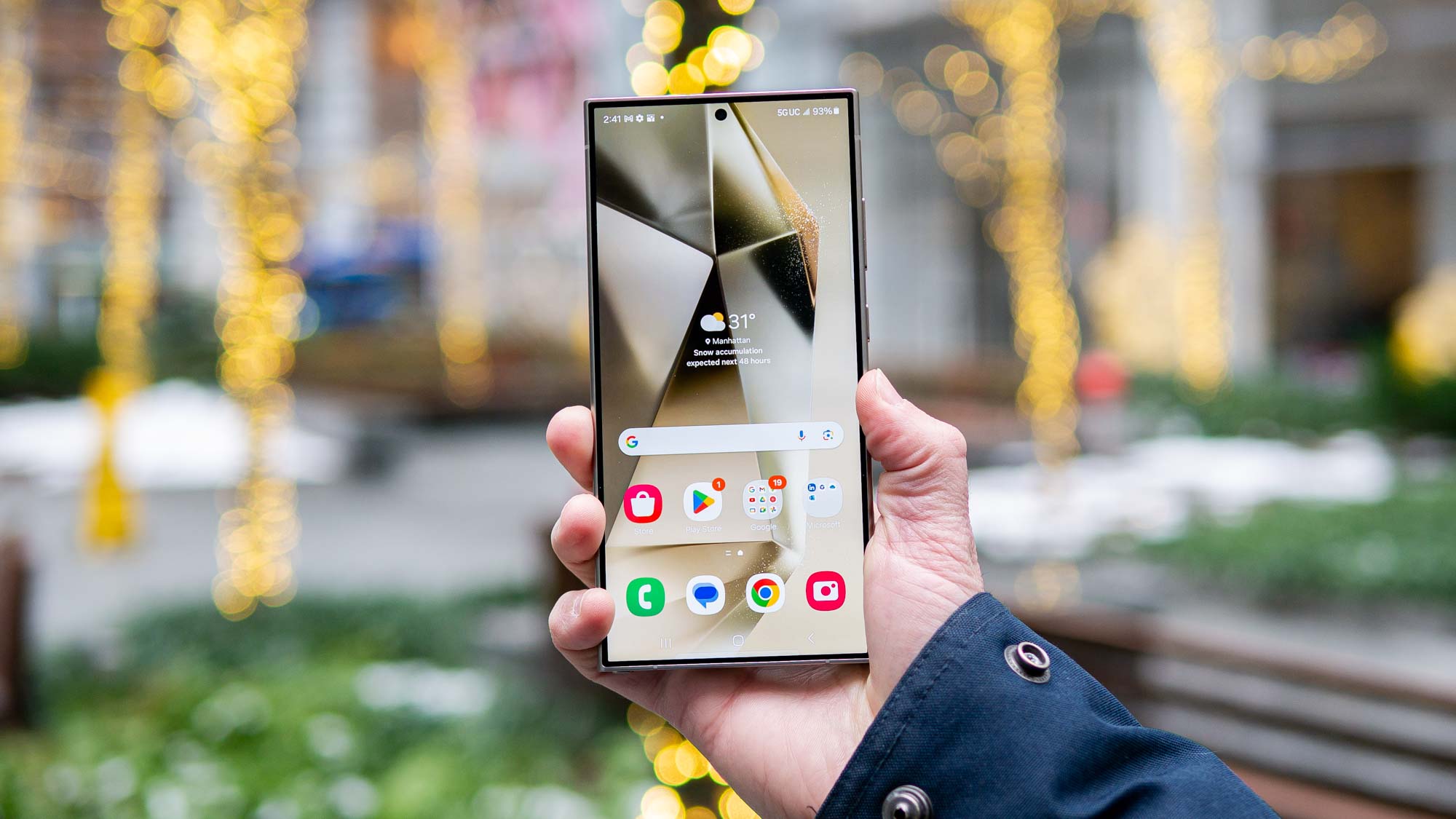
The Samsung Galaxy S24 has a bunch of cool new features for everyone to enjoy, but there are still some capabilities that are missing. Qi2 wireless charging is a notable example, since the first chargers have already arrived and the standard is now available on the iPhone 13 and later, including the iPhone 15.
But there’s one other feature iPhones offer that other phones don’t have: the Dynamic Island. The idea behind the feature seems to be that if phones need to have camera cutouts taking up screen space, there might as well be an extra feature to soften the blow. And it’s something I’d like the Samsung Galaxy S25 to steal.
Dynamic Island makes the most of a bad thing
A few years back, there was a brief period where it wasn’t clear how front-facing cameras were going to continue. The advent of full-screen phones meant that there wasn’t space for selfie cameras to hide in the super-chunky bezels, and the idea of eating up screen space with a notch wasn’t all that popular.
Alternatives to the camera notch arrived pretty quickly. We had fantastical features like pop-up cameras that left the whole screen free to cutouts that minimized screen space without adding extra components. The cut-out won out, and while some companies have been pushing under-display cameras, the jury is still out on those — mainly because the quality is, erm, lackluster at best.
It eventually got to the point where even Apple conceded that the camera notch wasn’t an ideal solution, especially with the additional Face ID sensors its phones need. That led to the iPhone 14 Pro coming with a pill-shaped cutout, a feature that then spread to the standard iPhone 15.
But rather than simply carving some space at the top of the screen, Apple did something nobody else really thought of. It added a feature that sort of puts the cutout to work as something other than a home for camera sensors. Thus, the Dynamic Island was born.
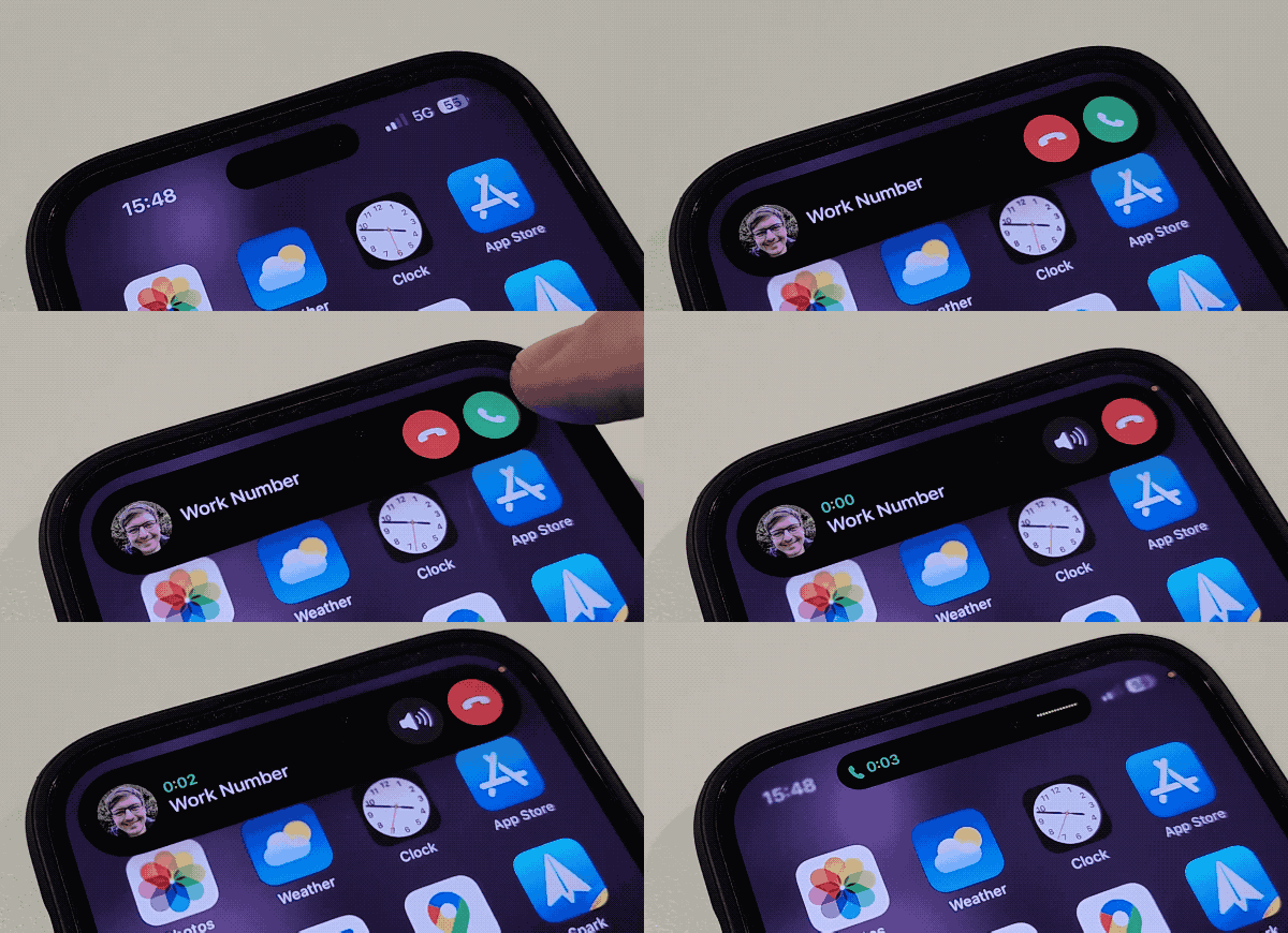
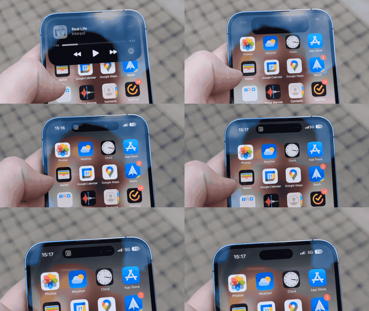
As it turned out, the Dynamic Island was a very cool new feature — one of our favorites from the iPhone 14 Pro. It’s effectively an evolution of the notification center, with the cutout seemingly expanding to show things like incoming phone calls, system notifications, charging status, timer countdowns and all sort of other things that would normally require taking up a much bigger chunk of the screen.
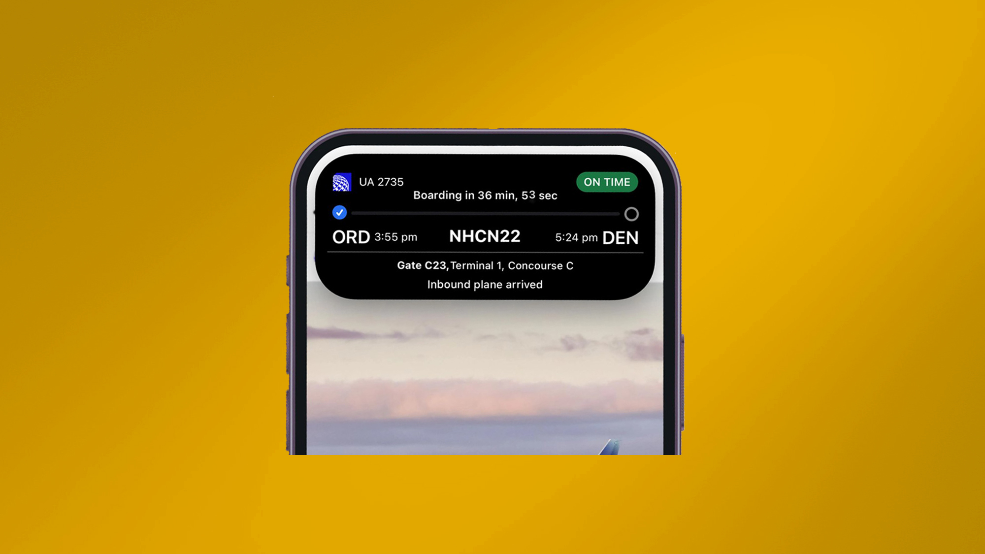
We’ve even seen apps offer stuff like live flight details, media controls, fitness tracking information and more. It doesn’t make the camera cutout magically vanish, but it can hide that glaring hole in the screen behind another useful feature.
Android needs its own Dynamic Island and fast
Some phone makers would like to pretend that Apple isn’t such a big deal, and they don’t really consider what the company’s doing when they make their own new flagship smartphone. Which we all know is nonsense — even if they are the noble types that try to avoid pinching features from the most recent iPhone.
But Dynamic Island is one of those things that has so much potential we can’t afford to not get some kind of official Android equivalent. The same was true for MagSafe charging, which eventually led us to the launch of magnetic Qi2 wireless charging, or Android-like home screen widgets on iOS.
As a full time Android user, I do know that a lot of the stuff Dynamic Island can do could also be available in Android’s Quick Settings menu. There’s a spot for media controls, timers, phone calls and all the other things that Apple put into the Dynamic Island instead. But Android's implmentation is nowhere near as good.
You have to swipe down from the top of the screen to see most of these banners, sometimes twice, which is pretty irritating. A minor complaint, to be sure, but it’s not my only one. Those banners are also pretty terrible a lot of the time. The amount of times I’ve had to swap screens during a phone call and struggled to get back to hang up is ridiculous.
In fact it happens almost every single time I have to make a call, and it makes an annoying task even worse as a result. Not to mention the fact that those banners quickly add up, and there are times where I’ve been stuck unable to remove them without switching off all notifications for a specific app.
I have a Pixel 6 Pro, a phone made by Android developers Google, so this kind of thing should not be happening. It would be much easier, and nicer to look at if there was some kind of Dynamic Island analogue. At the very least we’d be able to pin stuff to the top of our screens while we use the screen for a bunch of other stuff.
It certainly couldn’t make the experience any worse than it already is.
Samsung should be the one to bring Dynamic Island to Android
When it comes to launching major new features on Android, there are two candidates most likely to make it happen. First up is Google, who actually develops Android software, along with Samsung, the biggest Android phone maker around. While a collaboration between the two companies could prove fruitful, this is the kind of feature that needs some serious hardware hype.
I mean no disrespect to the Google Pixel range, but you don’t get that kind of hype from a Google phone.
Samsung is the undisputed king of the Android phone business, and it’s in a much better position to make new software features like this a more immediate success. The more people who get to use this kind of feature, the more likely app developers will be willing to put the effort in to support it. And that’s crucial, because there’s only so far a feature can go if it only works with Google apps.
The only question is when would such a feature arrive. There’s a case to be made that a hypothetical Android Dynamic Island could debut on the Galaxy Z Fold 6 — maybe as a starting point to gauge popular opinion, since the Fold is a niche product that is already a little bit more bizarre than a typical smartphone. But really, the Galaxy S25 would be a much better launching point due to the Galaxy S range’s existing popularity.
Will it happen? Who knows. But in an increasingly competitive smartphone business, any feature you have that helps you stand out could be a great benefit. Even if that means shamelessly mimicking your biggest rival.
More from Tom's Guide
Sign up to get the BEST of Tom's Guide direct to your inbox.
Get instant access to breaking news, the hottest reviews, great deals and helpful tips.

Tom is the Tom's Guide's UK Phones Editor, tackling the latest smartphone news and vocally expressing his opinions about upcoming features or changes. It's long way from his days as editor of Gizmodo UK, when pretty much everything was on the table. He’s usually found trying to squeeze another giant Lego set onto the shelf, draining very large cups of coffee, or complaining about how terrible his Smart TV is.
