I’ve been using iOS 18 for three months — here’s my favorite new features
What I like and what I don't about Apple's latest update
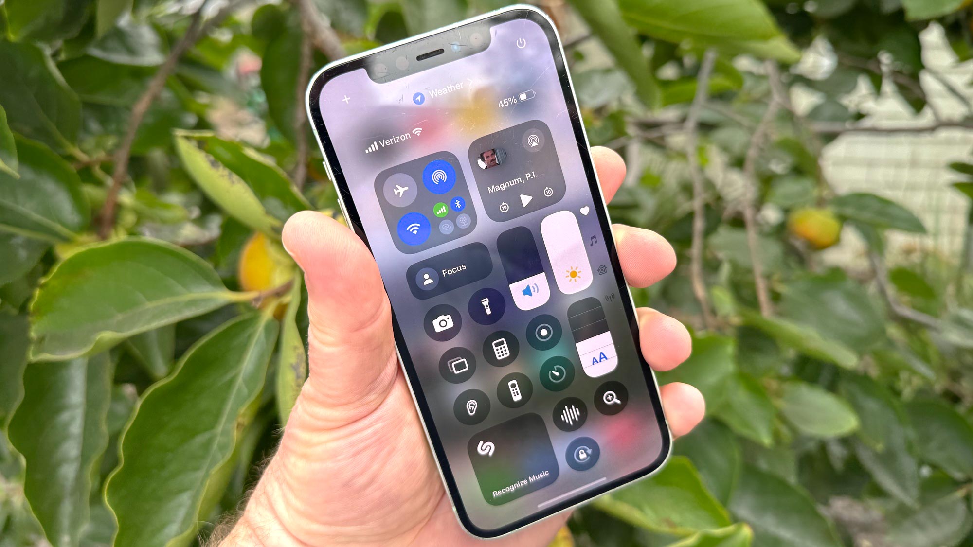
Since Apple wrapped up its WWDC 2024 keynote in early June, I've had iOS 18 on the brain. Apple previews its annual iPhone software update every year at its developer conference, before rolling out a beta featuring those changes and enhancements. It's usually my job to dive deep into that beta, so I can fill the void with profiles, how-tos and assessments of all the changes heading to everyone's iPhones in the fall.
And that's what happened this year with iOS 18. Right after the keynote ended, I installed the iOS 18 developer beta on one iPhone to get an early look at the features Apple previewed during WWDC. By mid-July, I was putting the public beta through its paces. By the time Apple was ready to release a full version of iOS 18 — that happened this past Monday (September 16) — I had some form of the operating system update running on four different devices, including the latest beta on the iPhone 12 I use as my every day phone.
What I'm trying to say here, is that I'm pretty familiar with the ins and outs of this update.
You can get my thoughts on the new iPhone software in my iOS 18 review. But if you can't block out the time you need to make it through that tome — no, Tom's Guide does not pay me by the word — I've prepared this quick-ish summary of what I like about iOS 18 and what I think needs some fine-tuning via the updates Apple will inevitably make to its software.
So if you're ready to download and install iOS 18 and wondering which of the new iPhone features to try out first, here's an overview of my main takeaways from spending the last three months in iOS 18's company.
iOS 18's biggest change: Photos
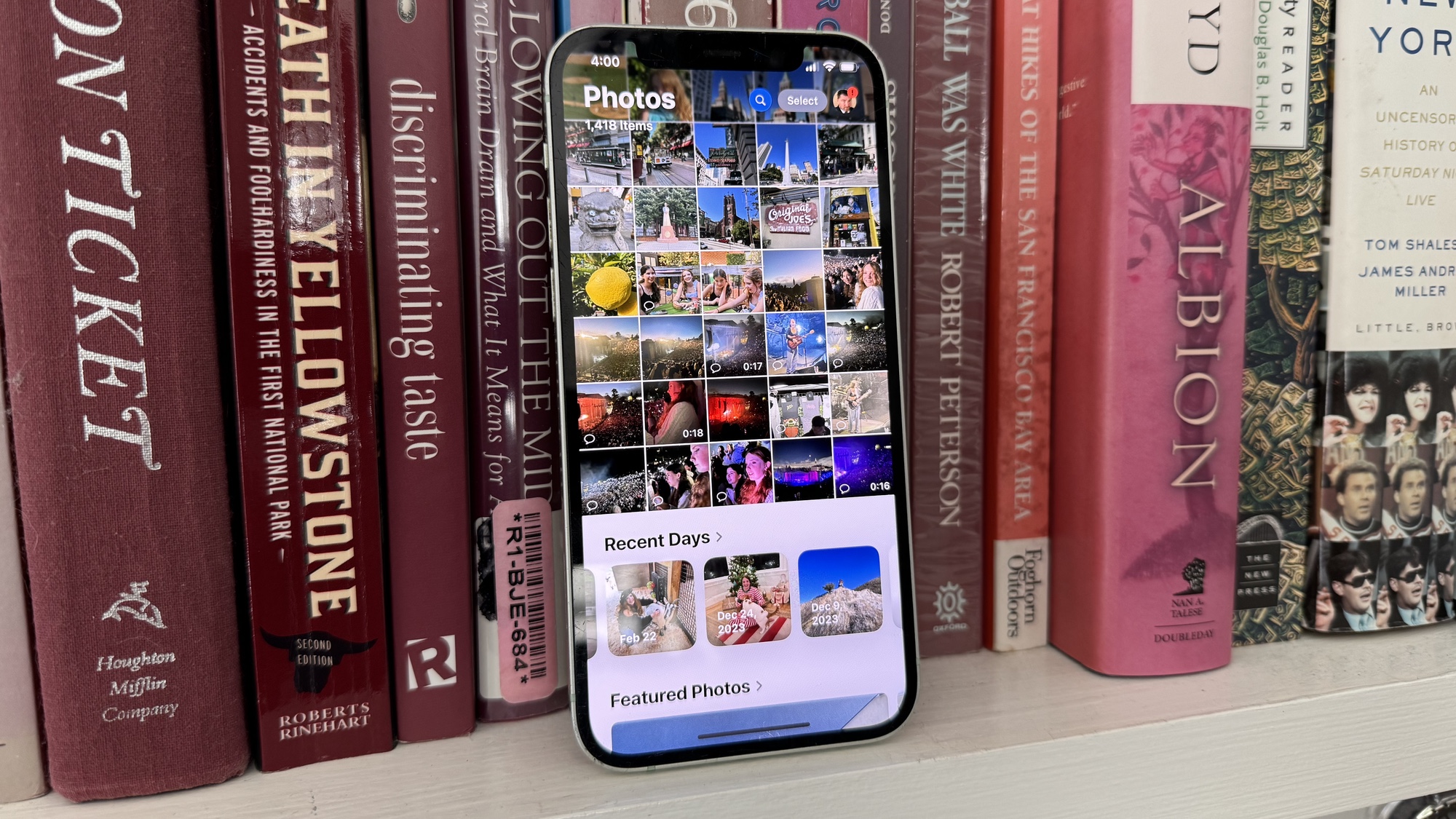
Most of the time when you fire up your iPhone after installing a new OS, everything looks about the same, even if Apple has introduced significant new features. You cannot say that about iOS 18 Photos, which undergoes a significant redesign — the biggest in the history of the app, Apple says.
So substantive are the changes to Photos in iOS 18 that the version of the app appearing in the version released to the public doesn't even look like the one in early versions of the iOS 18 beta. Initially, Apple included a carousel at the top of the Photos app; when you swiped left or right from the default view of your photos library, you would see a collection of photos. But around iOS 18 beta 5, Apple ditched that feature to keep the focus on the photo library, apparently reflecting feedback from the beta process.
That wouldn't have been the feedback I would have given. While I thought early versions of iOS 18 Photos could have made it more apparent that there was something on either side of the photo library should you happen to swipe, I like that the carousel highlighted my favorite thing about Photos — discovering images I might have otherwise forgotten about. Some of that sense of discovery is missing from the current iteration — or at least, it's been relocated.
The basics of the Photos redesign are still in place. Launch the app, and your photo library fills up the top half of the screen while other collections take up the bottom half. A downward swipe takes you deeper into the photo library, while an upward one lets you explore different collections, albums and memories.
It's a look that takes getting used to. I've been using iOS 18 for months, and I'm still not used to it. But at least you have some say in configuring the order in which all those collections, memories and albums appear. Just scroll to the very bottom of the app and tap the Customize & Reorder command.
My favorite iOS 18 feature: Notes
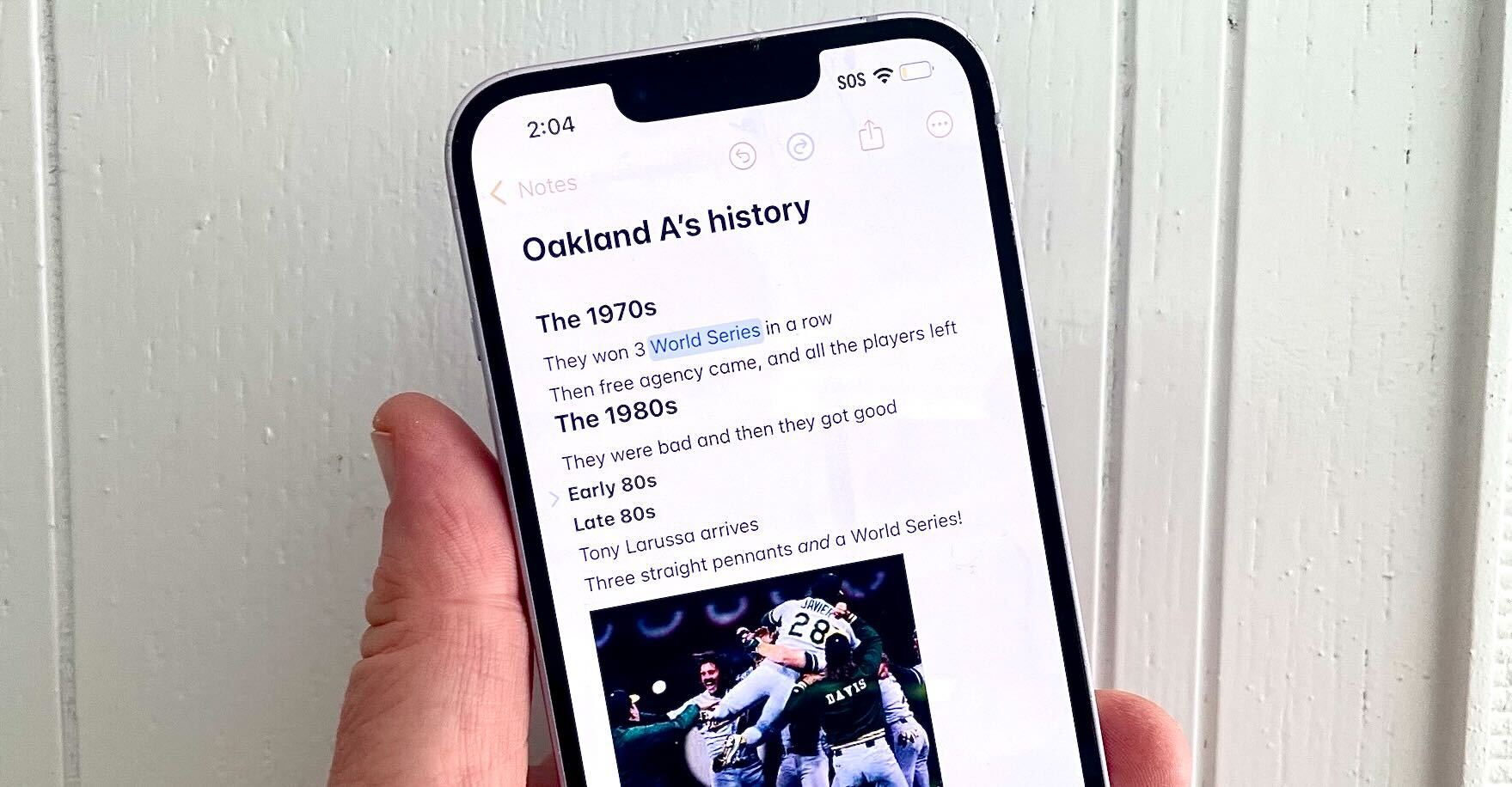
The new version of Notes introduces a handful of significant changes, but each one proves to be better than the last. If you're not using Apple's built-in app to jot down ideas or organize your thoughts, the iOS 18 version should be the one that prompts you to give Notes a try.
Math in Notes is going to draw the most attention because it's flashy — you can scribble down a math formula, and the new built-in calculator will come up with a solution. Honestly, though, it's hard to use this particular feature on a 6.1-inch iPhone screen with your finger as the primary input tool — it works better with an Apple Pencil on an iPad-sized display. Still, Math in Notes also lets you type out formulas, such as a running tally of expenses. As you change the data inputs, Notes will update the total. It's a very clever way of making sure your notes are up to date.
It's the other additions in Notes that really impress me. I like the collapsable sections Apple aded because they help me better oranize my notes. And I think it's great that you can now record an audio note directly in Notes, instead of linking to a recording from the Voice Memos app. The auto-generated transcripts are helpful, too, though not always as accurate as I would like to see.
My other favorite iOS 18 feature: Fitness
I've written elsewhere about how much I've used the Fitness app since iOS 16 made it possible to track your steps without also requiring you to where an Apple Watch. It's really helps encourage me to move, though sometimes the app's constant prodding tries to get me to move when I should be giving my body a rest.
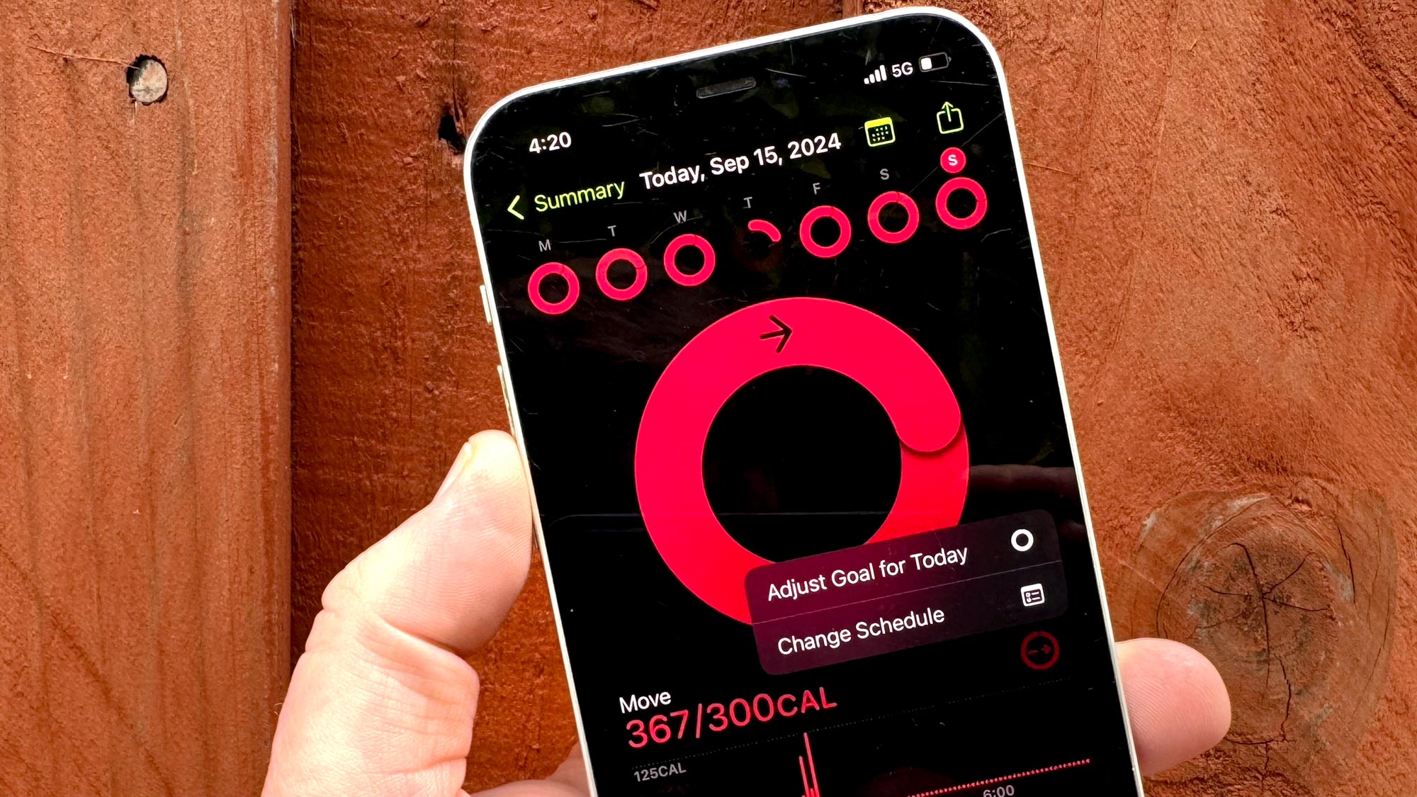
Just like the watchOS 11 update Apple just released, iOS 18 modifies the Fitness app to let you pause activity streaks, so that you can take a day off to recover from injury or illness without losing your progress toward a new badge. (In fact, you can pause your streak indefinitely if you really need some extra recovery time.) Even better, you can adjust your daily move goals for each day of the week, recognizing that some days are going to be more intensive than others.
The iOS 18 version of Fitness finally recognizes that we all approach exercise and movement in different ways and at different times. Of all the customization tools Apple added in this update — and there are a lot of them — this one is the best.
My least favorite iOS 18 feature: Safari's Highlights
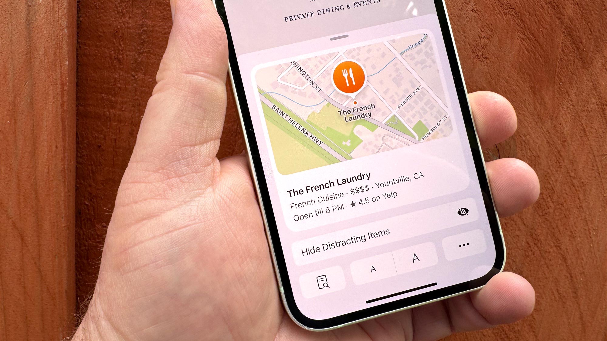
I don't hate the Highlights feature in Safari, which seeks to pull out quick bits of vital information from the web pages you visit. I just don't think it's serving up helpful data in its current iteration, and finding the feature is not very intuitive.
Highlights is supposed to serve up info on places, people, movies, shows and songs, though right now, places seems to be the most consistent thing that pops up. That info tends to be the location of that place on a map, and its hours of operation — information that's arguably easier to look up in the Maps app.
And that assumes you'll even know there are Highlights to be seen in the first place. A tiny purple AI icon in the address bar is supposed to clue you in that there's more to be seen here, but it's very easy to overlook.
Really, all the additions to Safari in iOS 18 feel like they could use a bit more time in development. The most polished feature is the summaries that appear in the Reader view of Safari to give you the gist of the article you're about to read. But by their nature, they only really scratch the surface. A Hide Distractions tool lets you banish distracting elements from a web page with a simple tap, but you do this as you scroll down the page, which feels equally distracting. Better to just look at the page in Reader if possible.
What I'd like to see more of in iOS 18: Customization
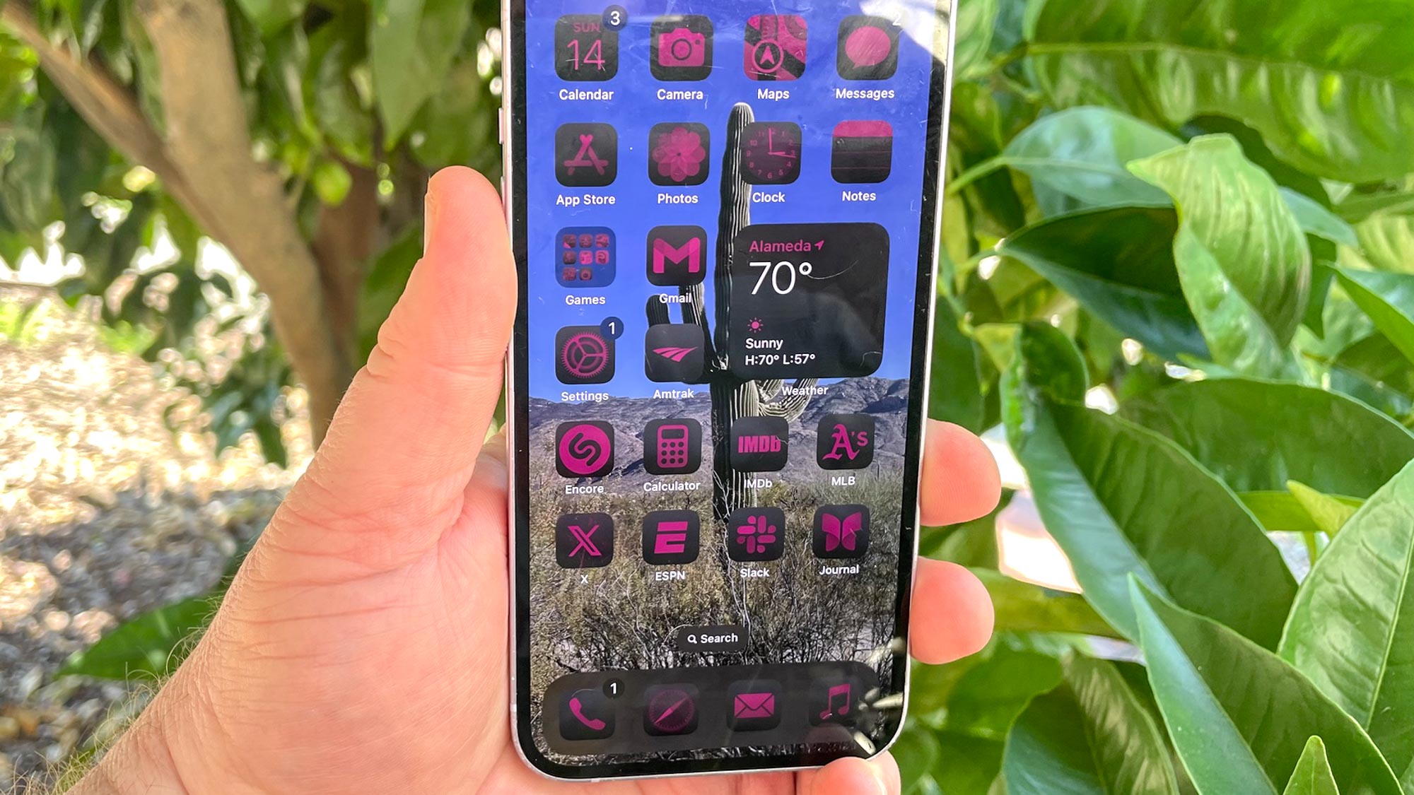
Customization is a big theme in iOS 18. You can change the look of your home screen, placing apps wherever you like instead of in a strict grid. You can even customize the control shortcuts that appear on your lock screen, and several apps let you reorganize things to your own liking.
I think this is a great step for Apple. If anything, I'd like to see the company take it even further.
For instance, as part of the home screen customization tools, you can change the color of app icons. That's great — except that every icon has to have the same tint. I would have liked the ability to assign different colors to different app types for an easy visual cue as to what kind of activity is on each home screen I set up. But that's not an option yet in iOS 18.
Similarly, I like the newfound ability to remove certain interface elements from the Fitness app main screen. But I also would have appreciated the ability to reorder sections of the summary screen, which doesn't seem to be a real option.
What I'm looking forward to trying in iOS 18.1
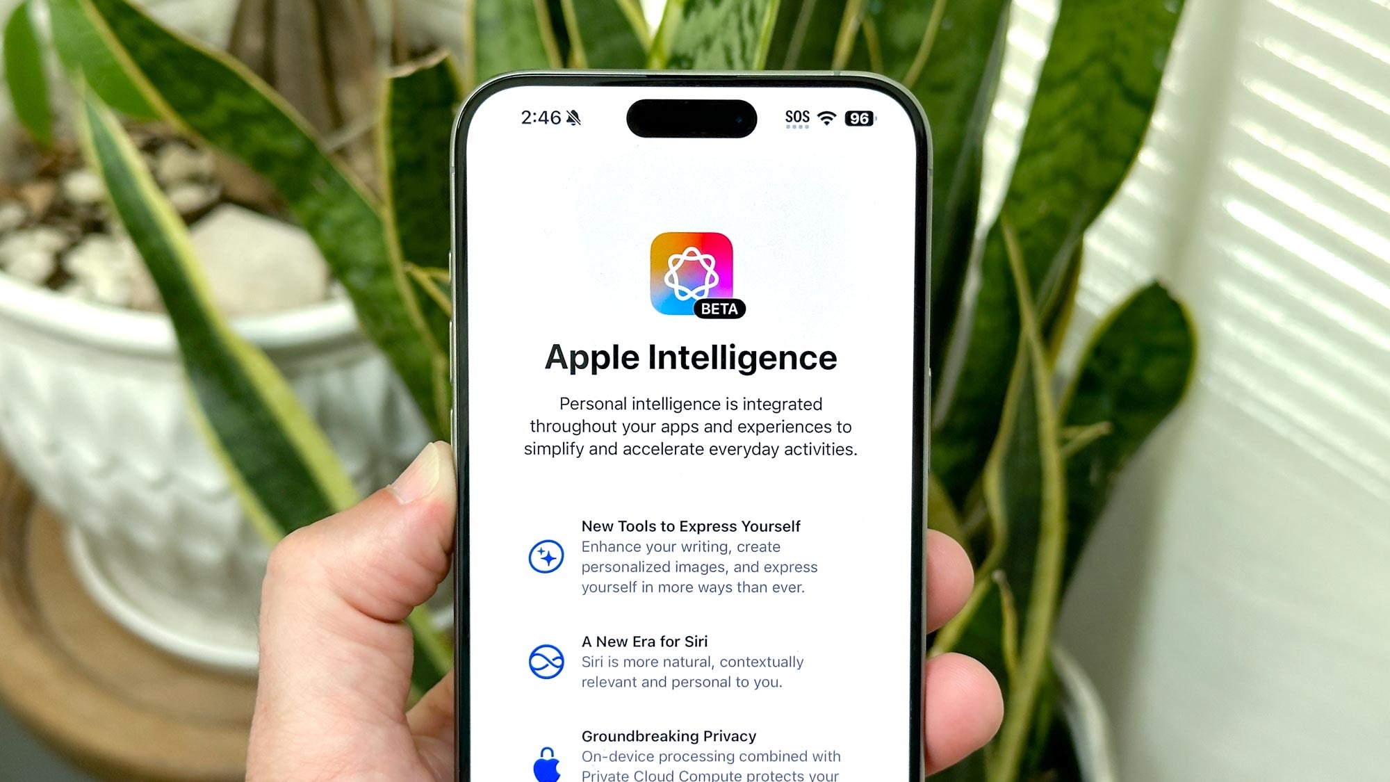
As I noted in my review, Apple Intelligence are missing in action in the version of iOS 18 that Apple just released, though that's by design. Apple is planning to release the first Apple Intelligence features in October as part of the iOS 18.1 update. If you've got a phone capable of running Apple Intelligence — that's one of last year's iPhone 15 Pro models or any of the new iPhone 16 devices hitting stores this Friday (September 20) — that's when you'll be able to try the new writing tools and image-generation features.
Several Apple Intelligence features will arrive in subsequent updates. We may be seeing additions to compatible phones well into 2025, according to some reports.
By necessity, I've been focusing on the main iOS 18 update, though I've dabbled a little bit with the iOS 18.1 developer beta where you can test out initial Apple Intelligence features. As someone with a complicated relationship with Siri, I'm most eager to see how the revamped digital assistant works in daily usage thanks to Apple Intelligence's added smarts. I have a slight stammer that's made past it difficult to communicate with Siri in the past, so I'm especially eager to see if claims that Siri isn't rattled by you correcting yourself mid-sentence are accurate.
Natural language searches for photos also sounds appealing. It should make it much easier to find things using simple language rather than hoping that I've hit upon the right combination of keywords to turn up what I'm looking for. And I'm eager to see whether memory movie — in which you can piece together a slideshow of videos and still images just by using some language prompts — can produce an engaging video.
iOS 18 outlook
As you might have guessed from iOS 18 review — you've read it, right? – I'm fairly bullish on the new software update, though a lot of how I ultimately feel about it will depend on how powerful those Apple Intelligence features turned out to be. With the initial iOS 18 release now out in the opening, I can roll up my sleeves and dig into iOS 18.1 to see how the rest of this software update pans out.
More from Tom's Guide
Sign up to get the BEST of Tom's Guide direct to your inbox.
Get instant access to breaking news, the hottest reviews, great deals and helpful tips.
Philip Michaels is a Managing Editor at Tom's Guide. He's been covering personal technology since 1999 and was in the building when Steve Jobs showed off the iPhone for the first time. He's been evaluating smartphones since that first iPhone debuted in 2007, and he's been following phone carriers and smartphone plans since 2015. He has strong opinions about Apple, the Oakland Athletics, old movies and proper butchery techniques. Follow him at @PhilipMichaels.

