iOS 18 tipped to get a redesign — what I’d like to see Apple introduce
A new look could be coming to Apple's iPhone software
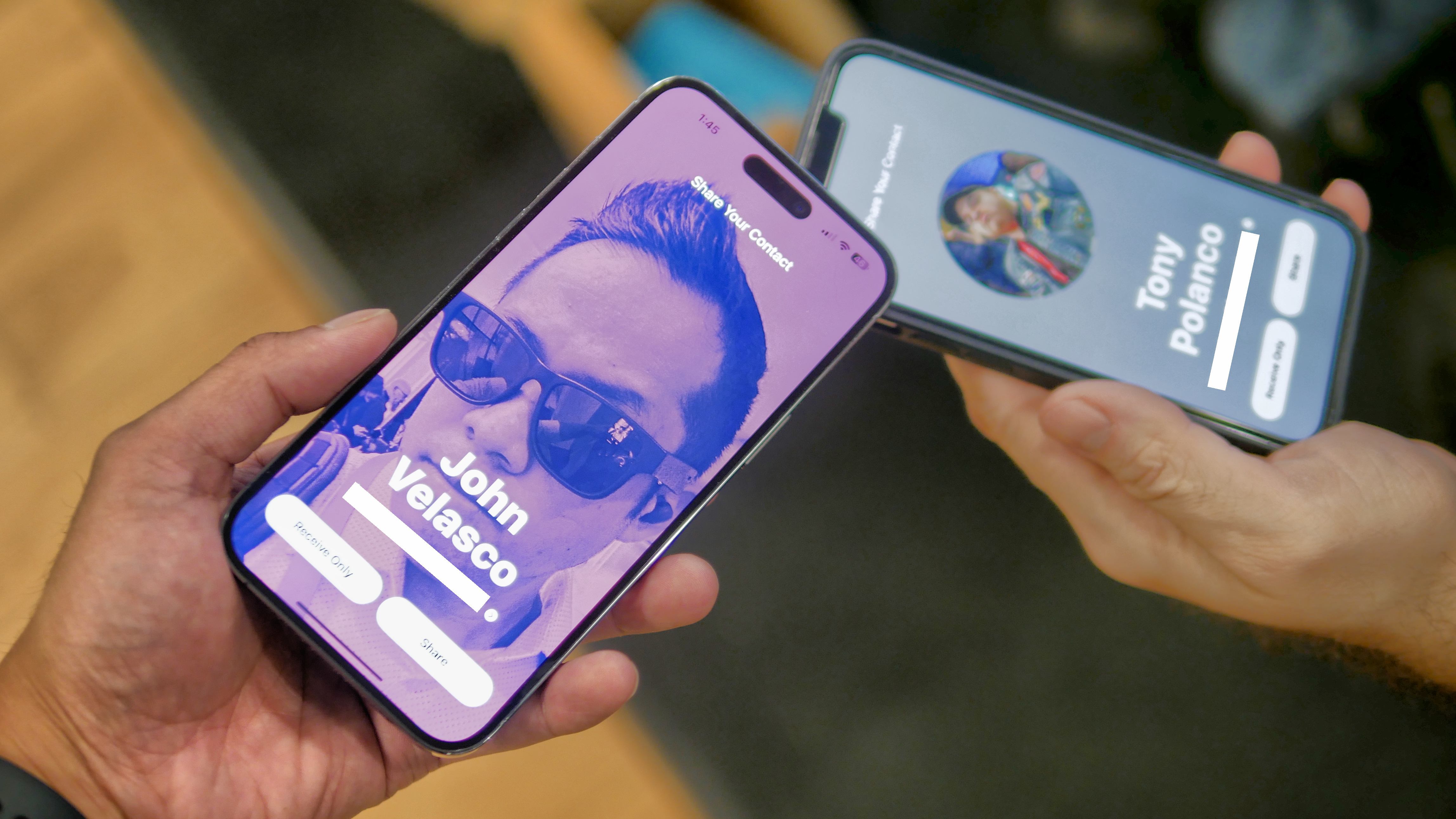
When iOS 18 hits your iPhone later this year, it could bring a new look with it. But just how extensive those interface changes could be remains to be seen.
Word of a new look arriving via iOS 18 comes from Bloomberg's Mark Gurman, who mentions a possible redesign to the iPhone software in his latest column. In the newsletter stemming from that column, Gurman claims that Apple "is indeed working to update the design of iOS as early as this year," according to a report from 9to5Mac.
After redesigning iOS 18, Apple will reportedly turn its attention to macOS, presumably to ensure continuity as you move from one Apple device to another. But Gurman says the macOS changes won't be ready until either 2025 or 2026.
Missing from the report are any details about what Apple has planned for its iOS redesign and whether the changes will be as drastic as the 2013 iOS 7 update that ditched skeuomorphic design elements in favor of flatter-looking icons. One detail that Gurman did mention is that iOS 18 is unlikely to adopt the look and feel of the visionOS interface that debuted on the Apple Vision Pro headset. That software with its 3D buttons and glossy backgrounds is designed with the Vision Pro's pass-through features in find and doesn't really fit in on an iPhone display.
While that detail tells us what iOS 18 won't look like, it doesn't offer much of a clue as to what is in store. And since nature abhors a vacuum, I have a couple of ideas.
Spruced-up widgets

One of my favorite changes introduced in recent versions of iOS was the addition of widgets to the home screen thanks to the iOS 14 update. In particular, I like being able to stack widgets on top of one another to maximize screen space.
What I'd like to see with stacked widgets is more of a visual cue that there's more than one widget with relevant information for me. Right now, you scroll through stacked widgets with a flick of your finger — what I'd prefer is to tap and hold on a widget stack and have all the widgets there fan out in front of me, so I could see all that information at once.
While I'm telling Apple its widget business, I hope the company also expands on the widget interactivity introduced in iOS 17. Right now, you can do things like tick-off completed tasks in a Reminders widget or use widgets to control playback for apps like Music, Podcasts and Books. I'd like to be able to tap on a Mail widget when I want to compose a quick reply without launching the full Mail app or scroll through a multi-day forecast directly from a Weather widget.
More slide-up panels
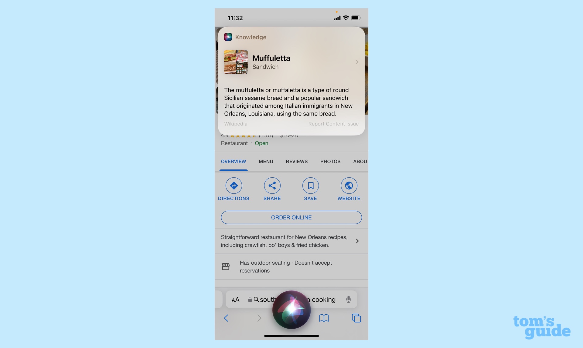
One of the things I appreciate about the Circle to Search feature on the Galaxy S24 is how it uses slide-up panels to bring you search results when you circle or tap on an image to find out more about it. That way, you don't have to leave the app you're in when you want to look up additional information — you simply perform your search, scroll through your results and get back immediately to what you were doing.
Apple already offers this to some extent when you ask Siri a search question. A results window will appear on the top of the screen giving you a quick summary of the digital assistant's response. But tap to find out more, and you jump into an entirely different app with no easy way back to where you were. On the Galaxy S24, you can just tap back arrows to return to where you started once your curiosity has been sated. I'd like to see a future version of iOS adopt a similar approach, especially if we're going to see an influx of AI-powered features in iOS 18 as has been rumored.
Better multitasking
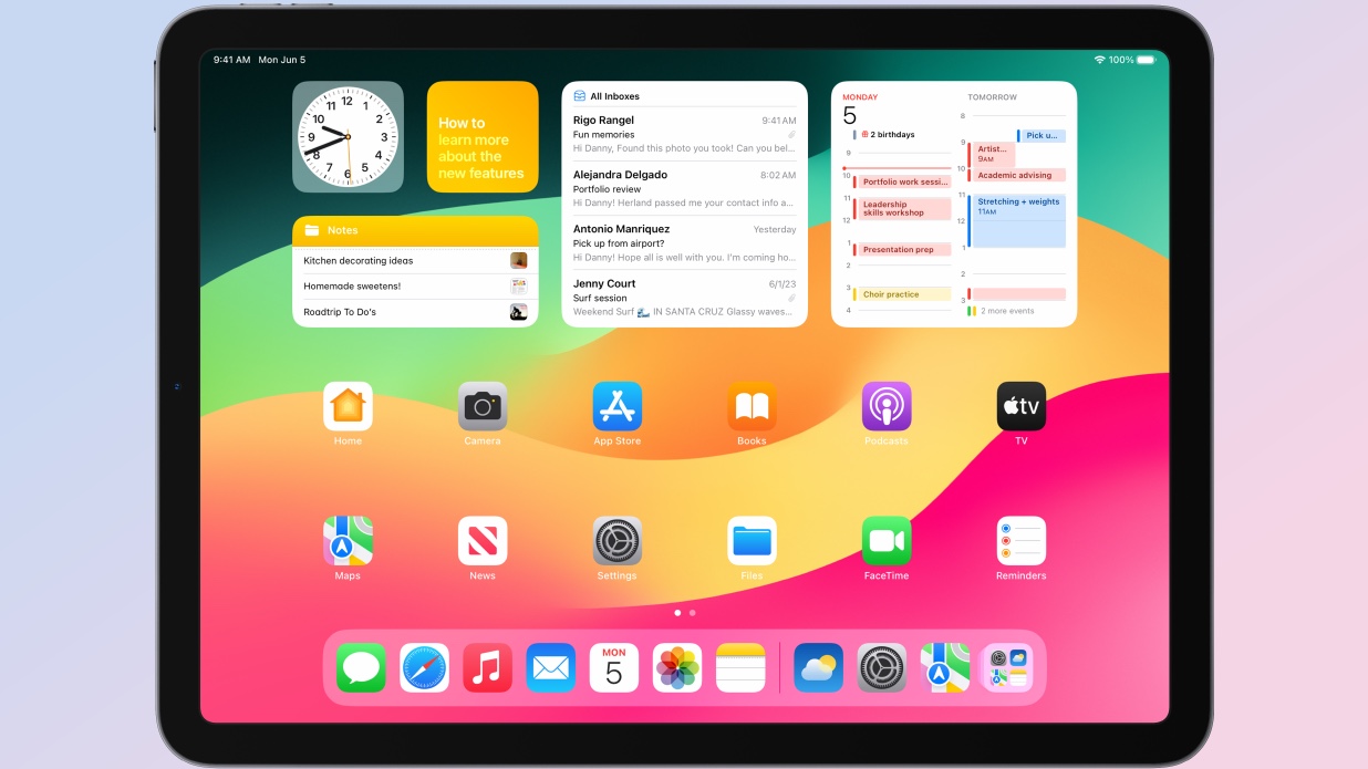
While we're on the subject of more easily jumping between things on your iPhone, I'd like to see Apple make some nod to multitasking on its phones. And I think Apple's own iPadOS offers an easy solution that the iPhone software can copy.
Specifically, iPadOS includes a dock feature where you can swipe up from the bottom of the iPad's screen at any time to get a row of your favorite/most frequently used apps. The closest the iPhone comes to that is to swipe up to get to the App Switcher, but then you have to fan through all the open apps on your phone to find what you want. The iPad's approach is faster and more sensible, even on devices with smaller screens.
Home screen management features
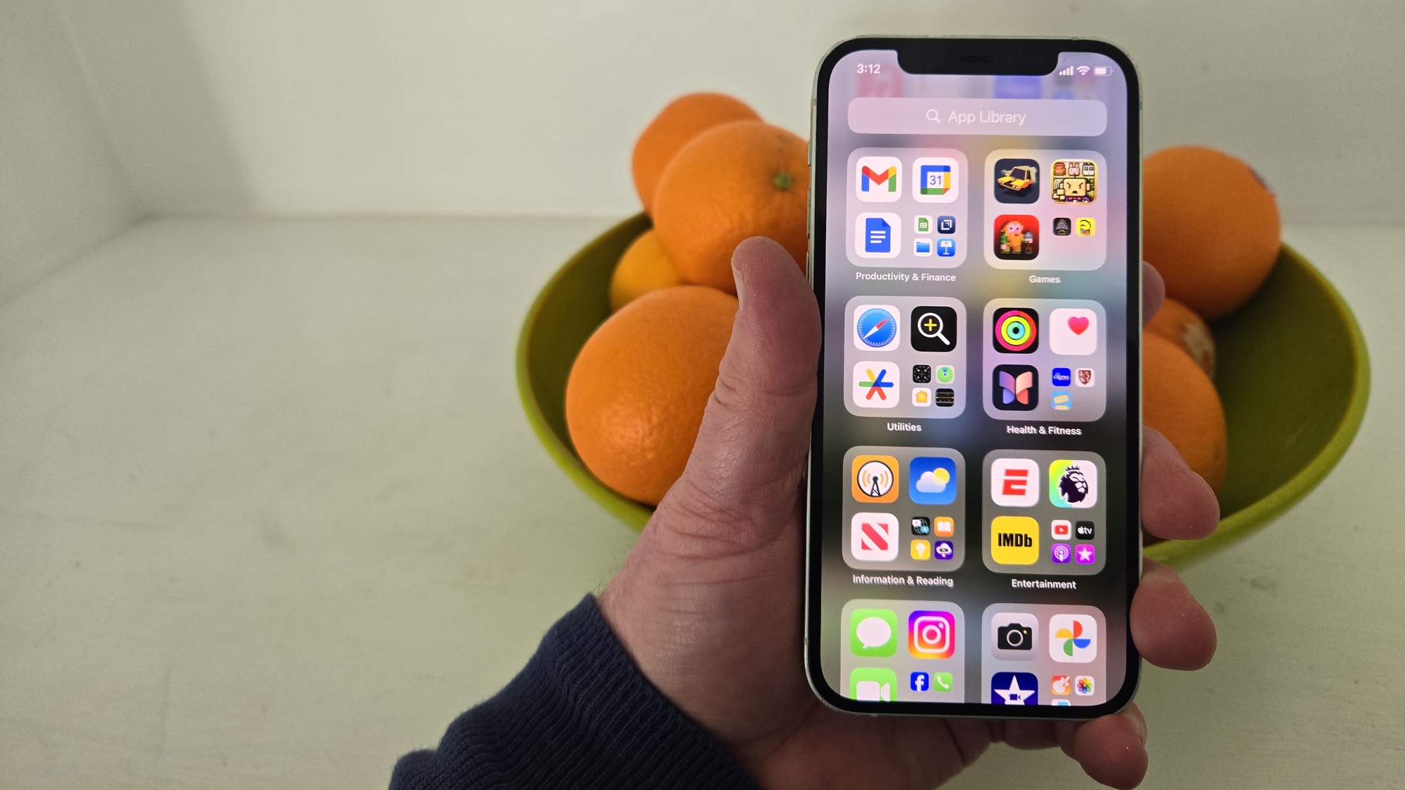
Additions like the App Library and app folders over the years have made iPhone home screens a lot easier to manage. But I don't care for the fact that the only way to rearrange which apps live on which home screens is by physically dragging the app icons from one screen to the next. Drag one icon from its place and the others start rearranging themselves, adding to the amount of tidying up you have to do — it's a real pain in the neck.
It wasn't always like this. Back in the days when you could mange your iPhone via the iTunes app on your Mac, you could rearrange app icons much more easily on a much bigger display. Then, when you synced your iPhone, the rearranged home screens would appear automatically.
I'm not saying we need to go back to managing iPhones through iTunes, especially since iTunes, as an app, doesn't exist any more. (Even when it did, it was profound ill-equipped to deal with all the different iPhone elements it had to manage.) But I wouldn't mind seeing some sort of iPhone management app become available to the Mac that provided another way to tweak home screens to my liking. Maybe it can show up when that macOS overhaul happens in 2025 or 2026.
iOS 18 outlook
Based on the reports we've heard so far about iOS 18, it's the introduction of artificial intelligence features along with a smarter, redesigned Siri that's likely to be the main focus. The rumored redesign doesn't sound like it will be a major overhaul but more of an attempt to freshen up the iPhone software's look after a few years of updates that focused more on adding new features.
Still, I hope Apple doesn't pass up the opportunity to use this apparent redesign to make it easier to jump around to different apps and features on your iPhone. We'll find out soon enough what the company's plans are, if Apple sticks to its usual schedule of previewing any iOS changes at the start of summer.
More from Tom's Guide
- iOS 18 could be 'biggest' iPhone update ever — here’s why
- WWDC 2024 — possible dates, iOS 18 and Apple’s big AI push
- Apple launches Apple Sports for iPhone with live scores, stats and betting odds
Sign up to get the BEST of Tom's Guide direct to your inbox.
Get instant access to breaking news, the hottest reviews, great deals and helpful tips.
Philip Michaels is a Managing Editor at Tom's Guide. He's been covering personal technology since 1999 and was in the building when Steve Jobs showed off the iPhone for the first time. He's been evaluating smartphones since that first iPhone debuted in 2007, and he's been following phone carriers and smartphone plans since 2015. He has strong opinions about Apple, the Oakland Athletics, old movies and proper butchery techniques. Follow him at @PhilipMichaels.

