iOS 18 home screen — 5 biggest upgrades you need to know
iOS 18 lets you change the look and layout of your home screen
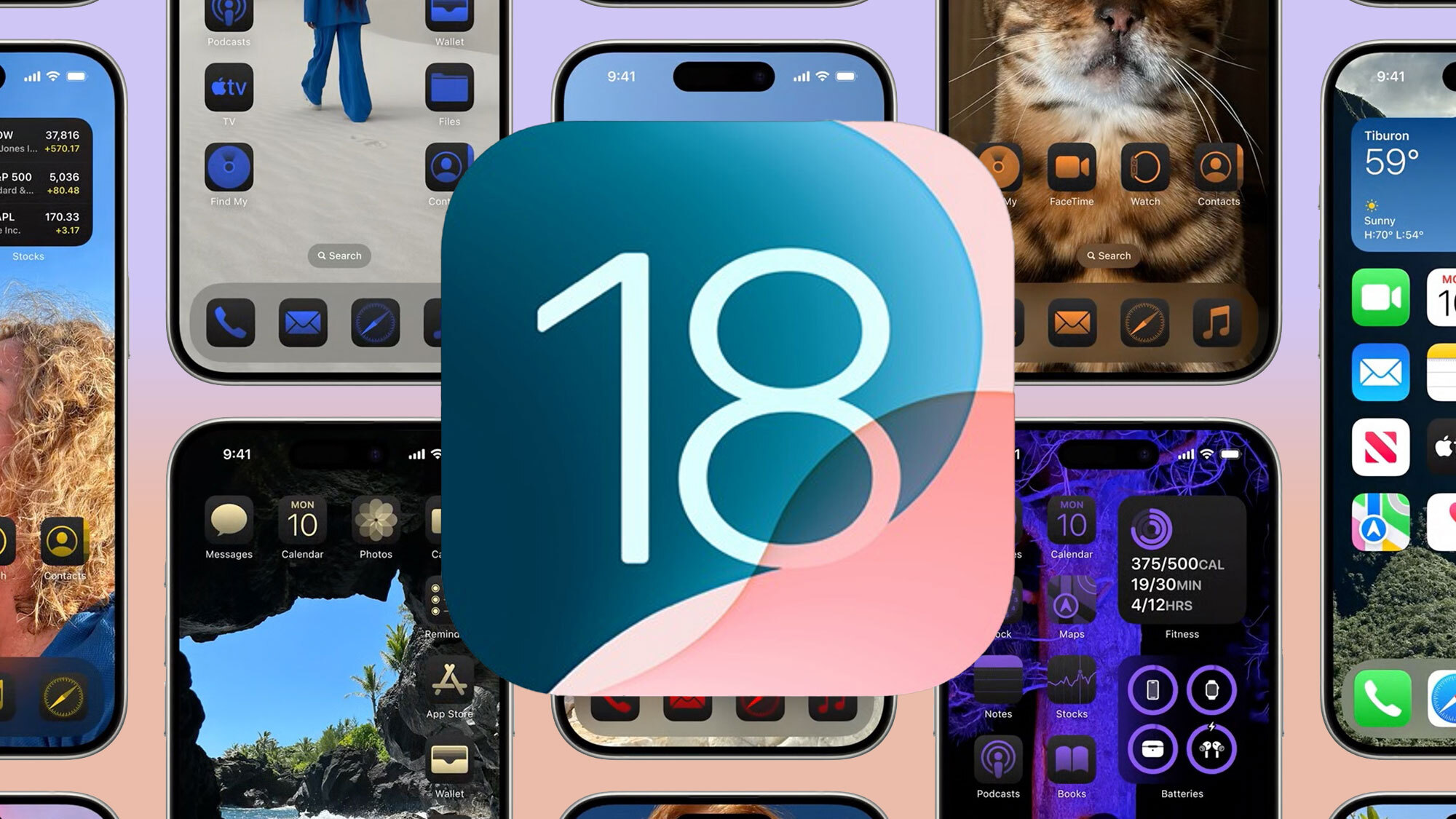
Remember how iOS used to be criticized for its rigid, one-size-fits-all approach to design and layout? At the rate it's introducing customization features to its iPhone software, Apple is doing its best to make you forget about all that.
Recent iOS updates have given you the ability to delete Apple's built-in apps, add widgets to your home screen and even alter the look of your home screen. iOS 18 contributes to this customization push with tools that leave the look of your home screen entirely up to you. No more grids of neatly arranged apps or icons with unalterable colors. Now you caan tweak all that, in the name of making the home screen's layout serve your idea of organization.
It's a bold new direction for iOS, though not necessarily one that will be difficult for iPhone users to master. From what we've seen in Apple's demos of the feature, customizing your home screen will work a lot like dropping in widgets or re-ordering apps does now — only with a lot more options.
We'll find out more once the public beta of iOS 18 arrives, which should be by July. For now, here's what we know about the home page customization capabilities introduced in iOS 18 based on Apple's WWDC 2024 keynote and its iOS 18 preview page.
Customize your home screen layout
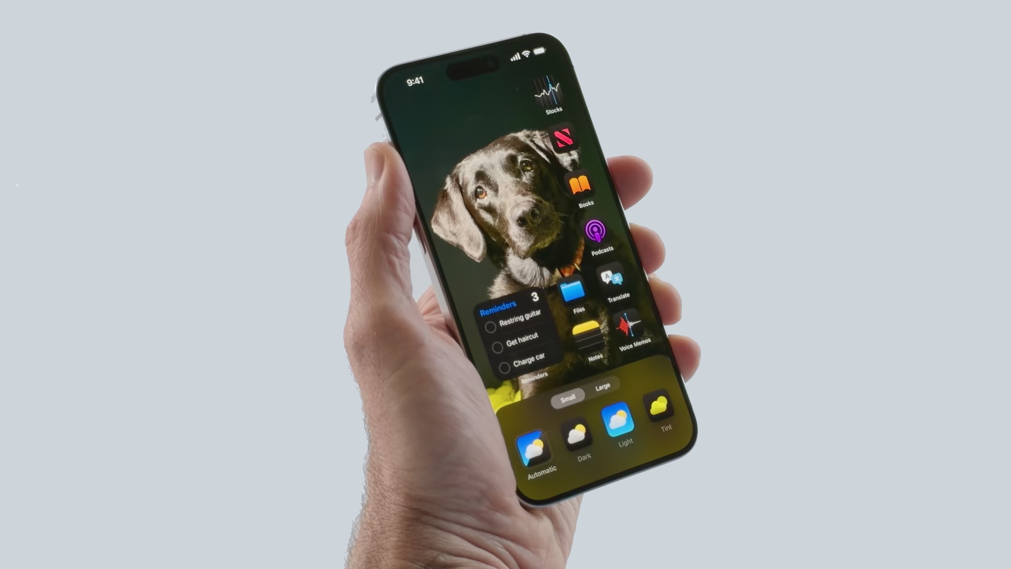
By far, the biggest interface change iOS 18 brings to your iPhone is the ability to adjust your interface however you like. On my iPhone 12, my home screen can be a 4 x 6 grid of app icons; I can place a widget in there, too, but it just takes up the space that would otherwise be allotted to apps.
That changes once I upgrade to iOS 18, which will let me place those apps and widgets anywhere on the home screen. Maybe I've got a particular photo serving as my home screen wallpaper — instead of having apps cover that photo, I can place the icons in such a way that faces or key details are visible. I can also group my apps at the bottom of the screen to make them easier to reach — handy on larger screen iPhones — or place them all on the side of of the display.
One thing appears to be fixed in all the demo screens Apple has shown off thus far. No matter however else you configure your home screen, there's always a dock of four apps at the bottom. (You continue to have the option of optimizing which apps live in that dock, though.)
Sign up to get the BEST of Tom's Guide direct to your inbox.
Get instant access to breaking news, the hottest reviews, great deals and helpful tips.
New looks for app icons
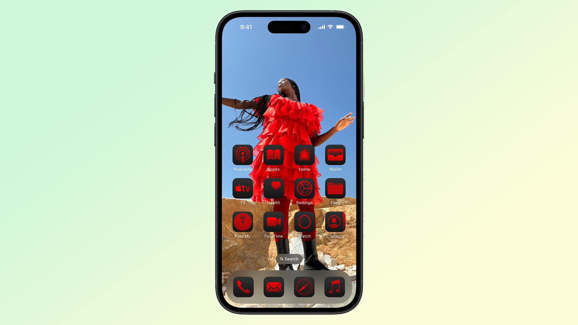
In addition to changing where your apps can live on your home screen, iOS 18 also lets you adjust their look. Apple has added a Dark option, which does for app icons what Dark mode does for your screen — darkening the white parts of the icon. You can toggle between light and dark looks manually, or set things to darken as the sun goes down.
The dark look for icons will apply to built-in apps initially, but presumably developers of third-party apps are getting the tools needed to add support for color changes to their own icons.
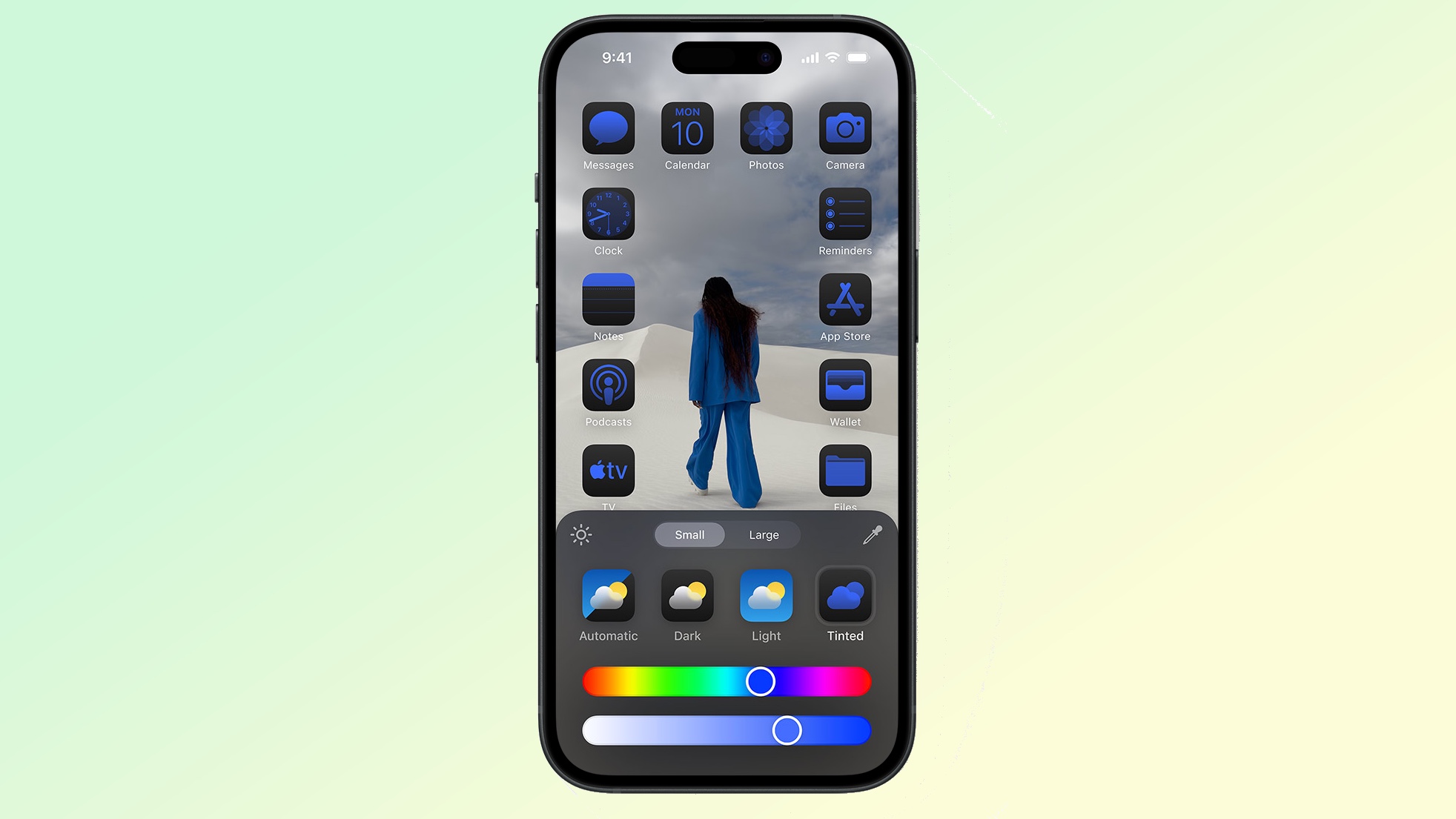
Besides picking between light and dark, you can also add a tint of color, using sliders to adjust both the color and intensity. Color picker tools let you adjust the tint so that it complements or mirrors your home page wallpaper.
Based on the screenshots Apple's made available of customized home screens, adjusting the tint appears to be an all-or-nothing affair. It doesn't appear that you can individually alter the color of specific app icons, say for grouping purposes.
Adjust icon sizes
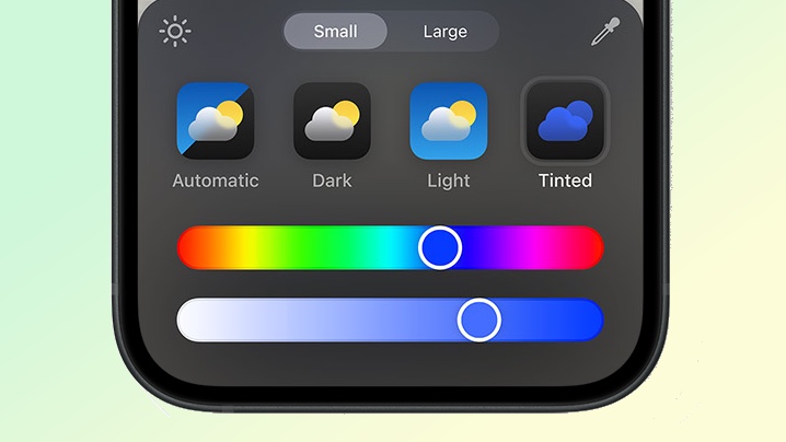
Look carefully at that tool for adjusting the colors of app icons, and you'll see additional buttons labeled Small and Large. These two buttons affect the size of app icons and widgets, with the Large button making them easier to spot.
Since this resizing tool is in the same control panel that adjusts color and tinting, we'd imagine app icon and widget sizing needs to be uniform — there's no making one widget larger than the others.
Locking and hiding apps
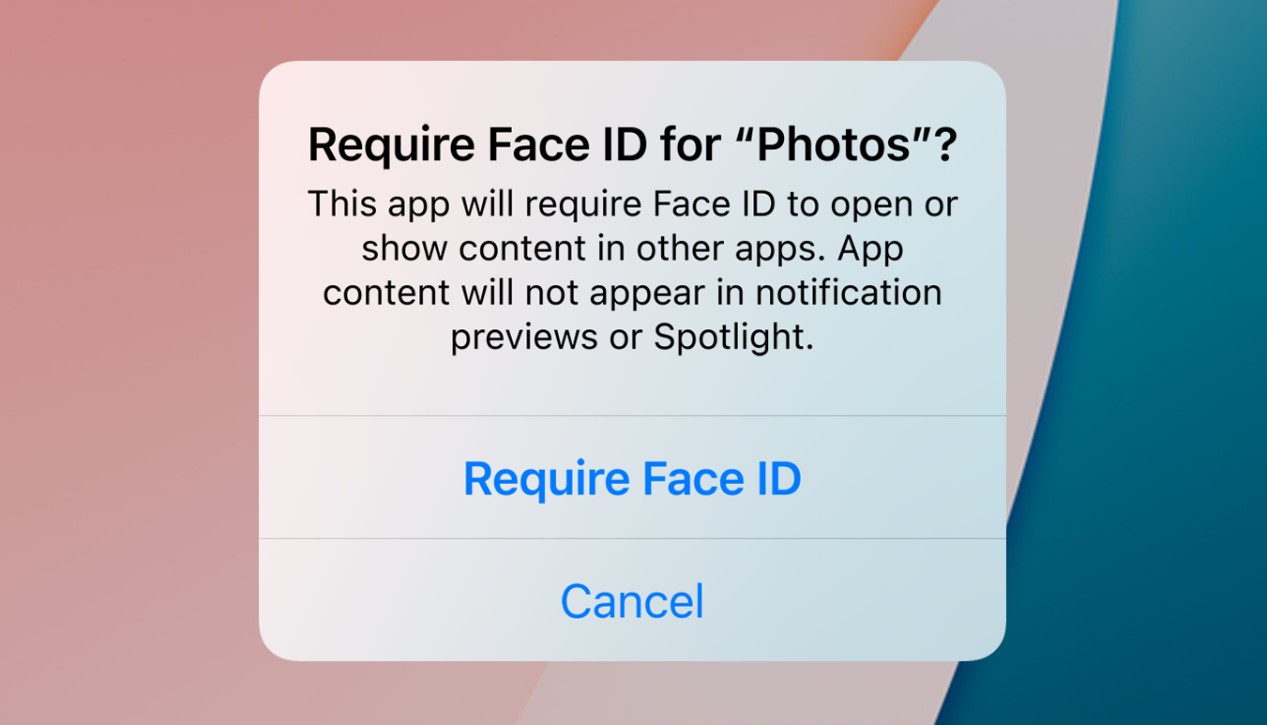
New home screen customization features also include the ability to bolster your privacy by controlling who gets to open apps — or even see that you have them installed on your phone.
In iOS 18, you'll be able to select which apps will require authentication when they're launched. You can require Face ID or passcodes to access an app. (If you've got a phone with Touch ID like an iPhone SE, you can use that method too.) If an app is secure, you won't see things like search results or notifications popping up in plain sight, either.
If that's not secure enough, iOS 18 provides the option of hiding apps from public view. Instead of showing up on a home screen, they'll move to a locked hidden folder that only you can access.
For example, I have a group of apps related to health, including ones for my health insurer, my PPO and the drug store providing my prescriptions. Not only do I not want anyone stumbling across information related to those apps, I'd prefer anyone looking at my home screen not to know that they're even there. iOS 18 adds that level of privacy to my home screen.
Swapping out lock screen controls
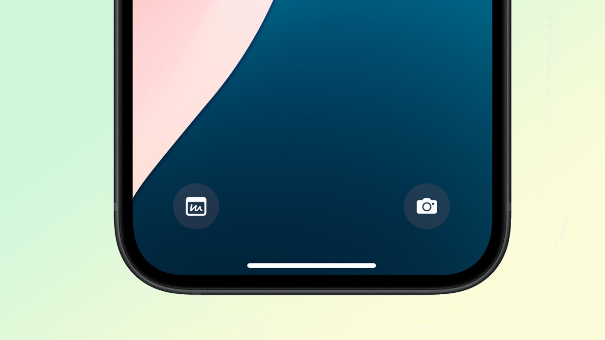
This last feature is related to iOS 18's overhaul of the Control Center — that's a separate profile for another time, but since it involves information appearing on your iPhone's lock screen, I wanted to mention it here.
As you know, your lock screen has two controls at the bottom — one to quick launch the camera to turn on your iPhone's flashlight. Even though you can customize other parts of your iPhone's lock screen, those two controls remain constant — at least until you install iOS 18.
With iOS 18, you can replace the Flashlight and Camera controls with different options, whether it's a quick link to launch the Calculator or to summon up a Note screen for tapping out an idea. If you have a phone equipped with an Action Button — just the iPhone 15 Pro and iPhone 15 Pro Max, presently, though there's a rumor the iPhone 16 is adding this feature — you can apparently access your on-screen controls through the button.
More from Tom's Guide
Philip Michaels is a Managing Editor at Tom's Guide. He's been covering personal technology since 1999 and was in the building when Steve Jobs showed off the iPhone for the first time. He's been evaluating smartphones since that first iPhone debuted in 2007, and he's been following phone carriers and smartphone plans since 2015. He has strong opinions about Apple, the Oakland Athletics, old movies and proper butchery techniques. Follow him at @PhilipMichaels.

