Tom's Guide Verdict
iOS 18 finally feels more complete now that Apple Intelligence is part of the picture on compatible phones. So long as you’re not expecting game-changing features, the initial AI tools are good first steps. And the other improvements to apps like Notes, Fitness, Calendar and more should appeal to all users.
Pros
- +
Existing apps like Notes, Calendar and Maps get great updates
- +
More personalization tools than ever
- +
Apple Intelligence finally available on compatible phones
- +
Welcome privacy improvements
Cons
- -
Photos app redesign takes some getting used to
- -
Siri redesign is a work in progress
Why you can trust Tom's Guide
We're several months out from the September release of iOS 18, and Apple's iPhone software keeps feeling more complete with each new update. That's because the iOS 18.1 and iOS 18.2 updates that have arrived since that initial iOS 18 launch have brought new capabilities that are ushering the iPhone into a new AI-focused era for Apple and its devices.
I'm referring to Apple Intelligence, the suite of AI tools that Apple first previewed in June and is rolling out in via updates to its iPhone software. iOS 18.1 brought an initial round of AI capabilities and now iOS 18.2 delivers things like ChatGPT integration and generative image creation. And the updates will continue into the new year once iOS 18.3 inevitably arrives.
So Apple is far from done adding and expanding iOS 18's tools. But what's there now is more than enough to give you an ideal of how AI's arrival will impact your iPhone use — provided you've got an iPhone that can run Apple Intelligence.
If you do, you won't find much of a revolution, as the Apple Intelligence features available so far deliver simplified ways of using existing tools — searching, summarizing and putting together messages or slideshows should be a little bit easier than they have been prior to Apple Intelligence. iOS 18.2's Genmoji and Image Playground capabilities add creation to the mix, but they're still pretty limited in what they can provide you.
If that’s not earth-shattering news, then at least it fits in with the iOS 18 update as a whole. As you know if you’ve been using iOS 18 since its September release — or even before that when it was available as a public beta — there aren’t any tectonic shifts in the many updates Apple has made to its iPhone software. Instead, what you’re getting is a pretty impressive update that manages to bring some welcome new capabilities to your favorite apps. If you don't have an iPhone capable of running Apple Intelligence features — and that's a lot of us, actually — iOS 18 delivers a lot of positive changes as we’ll discuss in this iOS 18 review. And for those who can benefit from Apple Intelligence, we’ll talk about the impact of these AI tools on your iPhone use.
iOS 18 compatibility: What iPhones support iOS 18?
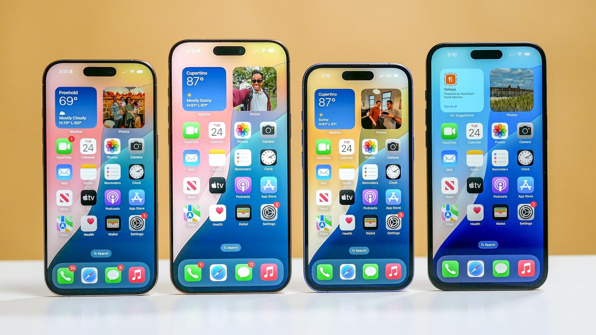
With few exceptions, iOS 18 doesn’t leave any iPhone users behind. If your iPhone can run iOS 17, it will also be able to run the iOS 18 update. That extends support all the way back to the iPhone XR/XS/XS Max models released in 2019.
That said, as with past iOS updates, some iOS 18 features will require more recent hardware. For instance, you'll need an iPhone 12 or later to take advantage of the new audio transcription tools in the Notes and Phone apps, while a TV feature that boosts dialogue so that it's more audible requires at least an iPhone 11. We've got a summary of which iOS 18 features have specific hardware requirements, as well as ones that are restricted to specific regions.
Get instant access to breaking news, the hottest reviews, great deals and helpful tips.
Apple Intelligence further narrows the funnel of which iPhones benefit the most from an iOS 18 update. Only phones with an A17 Pro or later will support Apple’s artificial intelligence features, which limits those capabilities to the iPhone 15 Pro, iPhone 15 Pro Max and all of Apple’s new iPhone 16 models. The Visual Intelligence feature added as part of iOS 18.2 only works on the new iPhone 16 models.
Apple’s reasoning for limiting Apple Intelligence to these models is its preference for keeping most AI features entirely on your device — a move that benefits not only the speed of Apple Intelligence tasks, but also bolsters your privacy. Those are certainly commendable goals, but it’s unlikely to mollify an iPhone 15 user who spent $799 on a phone in the past year, but can’t experience Apple’s AI-powered tools.
iOS 18 and Apple Intelligence: So far, so good-ish

We've now had two rounds of updates adding Apple Intelligence features to iOS 18. With iOS 18.1, you got access to writing tools, a new way to search for Photos, a Clean Up tool in Photos that works a lot like Google’s Magic Eraser feature, and the first in what figures to be months of months of improvements to Siri aimed at making Apple’s assistant more aware of context. Mail sees a whole bunch of improvements, too, and you can get AI-generated summaries of just about anything, including recorded phone calls — a new capability in iOS 18 as a whole.
iOS 18.2 brings even more capabilities, highlighted by Image Playground and Genmoji. In both cases, you're using text prompts to create new images — illustrations and animations for Image Playground and customized emoji for Genmoji. ChatGPt integration comes with iOS 18.2, as does a new capability in writing tools where you can describe the exact change you want — add a more enthusiastic tone, for example — and have AI implement that rewrite.
If you’re looking for the best implementation of Apple Intelligence, head to the Mail app, where emails with deadlines and calls to action now float to the top of your inbox. Apple calls this priority messages, and it’s a good way to ensure that you never miss an important mail. I also appreciate how Mail now shows a two-line summary of a message in your inbox instead of just the first two lines of the letter, though I wish the feature made space for the whole summary.
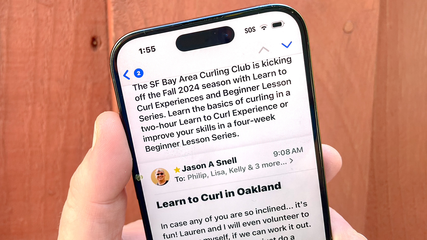
Speaking of summaries, if you go into a long email thread, there’s a summary button at the top that can boil down the most important points of the exchange. I find the Mail summaries to be pretty complete so far, and they certainly save me the trouble of having to parse a multi-message email thread all on my own.
To my way of thinking, that’s the best use of AI, whether it’s Apple Intelligence or the Galaxy AI tools Samsung is now including on many of the best Samsung phones. It’s why I also appreciate Apple Intelligence-fueled changes to use natural language search in Photos to make it easier to find the images i’m looking for. If I want photos of my daughter on our vacation to Los Angeles, I can type exactly that instead of selecting a bunch of keywords and hoping for the best. (Even better, in my testing, phones that don’t support Apple Intelligence, like my iPhone 12, seem to have adopted natural language search on their own, even if not as thoroughly as Apple Intelligence-ready devices.)
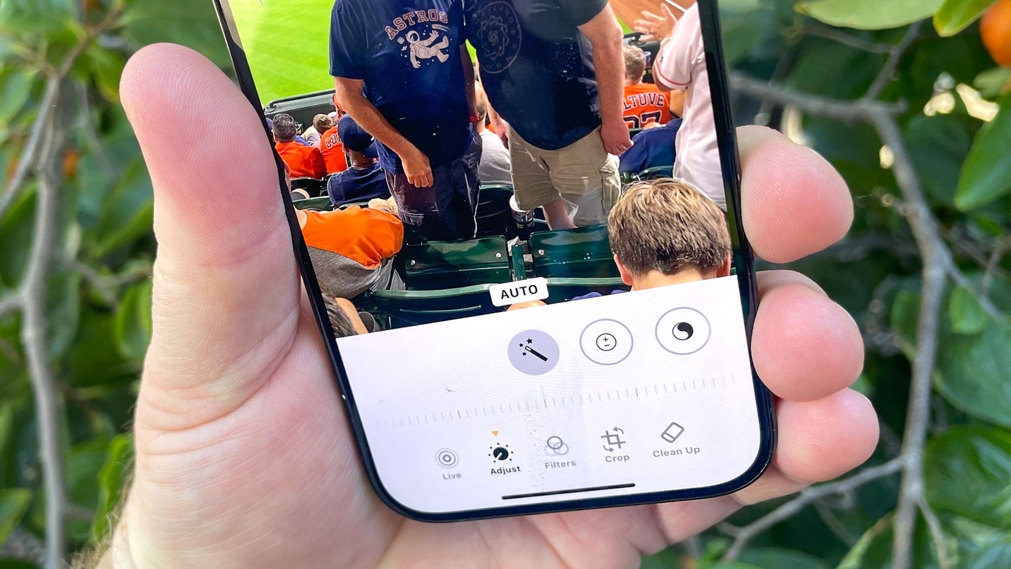
Other Apple Intelligence tools could benefit from some additional fine-tuning. That Clean Up tool in Photos can remove unwanted people and objects from your photos, but when I’ve tried using the feature, I’ve noticed Apple’s version leaves behind more noticeable artifacts than what I’ve spotted with Magic Editor-altered photos on a Pixel phone. I like the idea behind Apple Intelligence’s Memory Movies feature in which you can get an AI-generated slideshow made out of images in your photo library based on a text prompt. But thus far, the slideshows I’ve created lack the flourishes Apple has promised, like narrative arcs, unique chapters and themes. They’re just slideshows, usually arranged in chronological order and sometimes requiring some clean-up on my end like removing irrelevant photos or adding a more imaginative title. (That said, Apple Music subscribers will find that Memory Movies really pop thanks to a tie-in with that service’s extensive music library for your movie’s soundtrack.)
The biggest work-in-progress with Apple Intelligence involves Siri, as Apple builds toward making its assistant more aware of your context, including whatever’s on the screen of your iPhone. But that level of advanced improvement isn’t coming until next year. Instead, iOS 18.1 took some baby steps with a new interface for Siri — your entire iPhone screen flashes when the assistant’s listening, and you can correct yourself mid-query without flummoxing Siri. With iOS 18.2, you can integrate ChatGPT to supplement any holes in Siri's knowledge. It's an opt in feature, and thus far, I've chosen not to opt in, as I have serious reservations about OpenAI, which makes chat GPT, and I'd rather not give them access to anything on my phone.
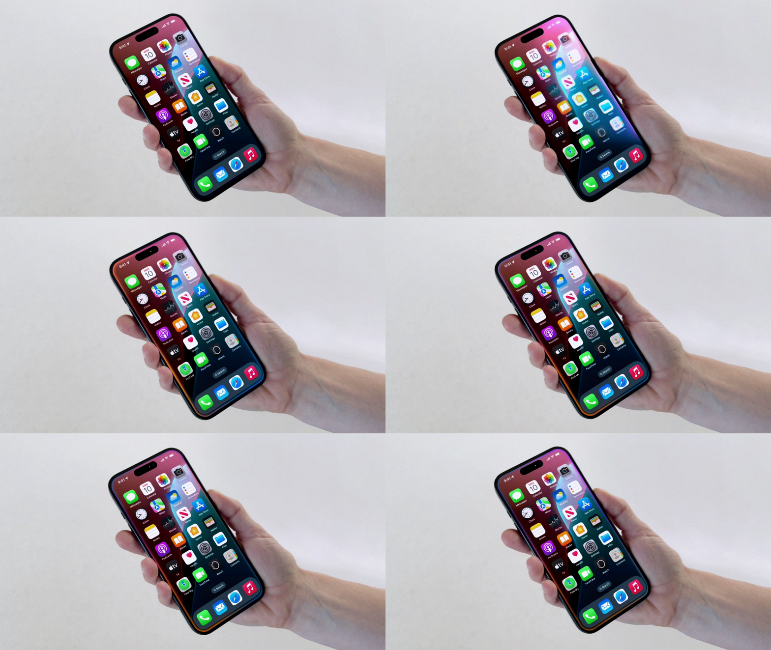
You can ask Siri follow-up questions without having to say “Hey Siri” over and over or remind the assistant what you’re talking about, but I find that improvement only goes so far. I could Siri who won Game 2 of the World Series and then ask when Game 3 was, and Siri knew what I was talking about. But when I asked who the starting pitchers might be, all I got was a list of pitchers on the Dodgers roster, and not the probable starters.
Even with these criticisms, I’m fairly certain all the Apple Intelligence listed above will improve over time. I’m less impressed with Writing Tools, which are available in any app that accepts text input. You can get summaries of Safari pages, text in Notes and the transcripts of recorded phone calls, thanks to Writing Tools. But the real push here is to use AI to improve your writing.
Some of the Writing Tools work quite well. A proofreading tool can catch spelling and grammatical mistakes, while using the Professional tone button can really help turn something you’ve written into a formal cover letter or thank you note. The Friendly tool can come in handy if you fear you’ve written an overly aggressive email and would like suggestions on ways to soften your tone.
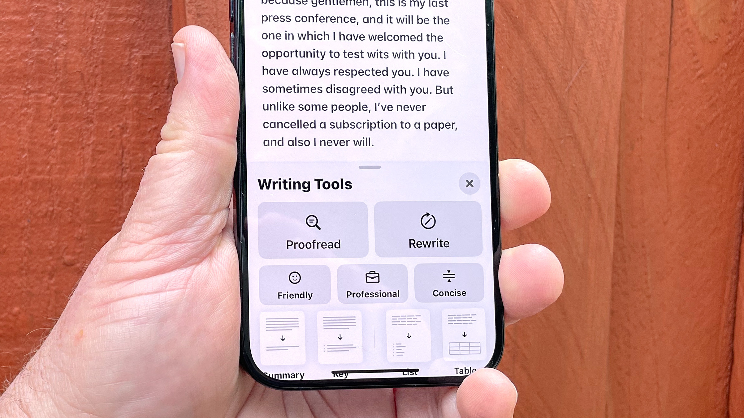
But there’s a Rewrite button in Writing Tools, and the only purpose it seems to serve in my experience is swapping in different synonyms and sanding any sense of personality or style out of your text. The end result of Rewrite is text that’s quite unmistakably been written by a robot — certainly not anything you’d want to share with a friend, colleague or anyone you want to be taken seriously by.
I'm also not terribly impressed with Image Playground. It's not that the images created aren't good — they look decent enough. But Image Playground is limited to two different styles, which means the more you use the app, the more the novelty wears off as images start to look the same. You also can't do all that much with Image Playground images other than text them to friends in Messages or paste them into a Note. They're not flexible enough to use in other contexts as I found when trying to design a Thanksgiving menu with artwork from Image Playground.
Those critiques aside, the additions from Apple Intelligence run the gamut from promising to potentially quite useful, if not exactly life-changing. Install the iOS 18.1 update with that mindset, and you should be quite satisfied with Apple’s initial AI efforts.
iOS 18 home screen customization: A new look, again
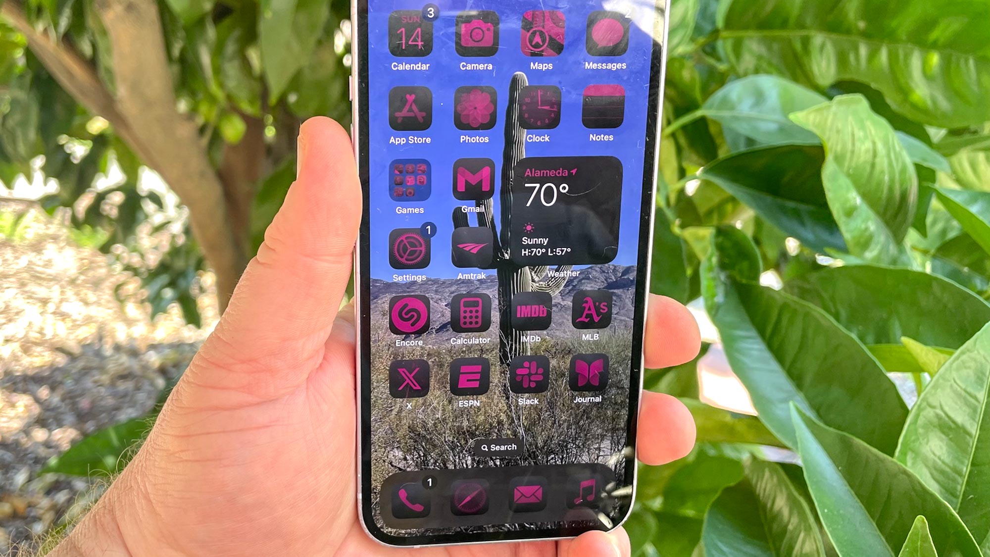
With Apple Intelligence addressed, let’s look at the iOS 18 additions available to anyone who instals Apple’s updated phone software. Recent iOS updates have tried to give users more control over the look of the software, and that continues with iOS 18. The update adds the ability to customize your home screen, forsaking the usual grid of app icons to place those apps anywhere you want on the screen.
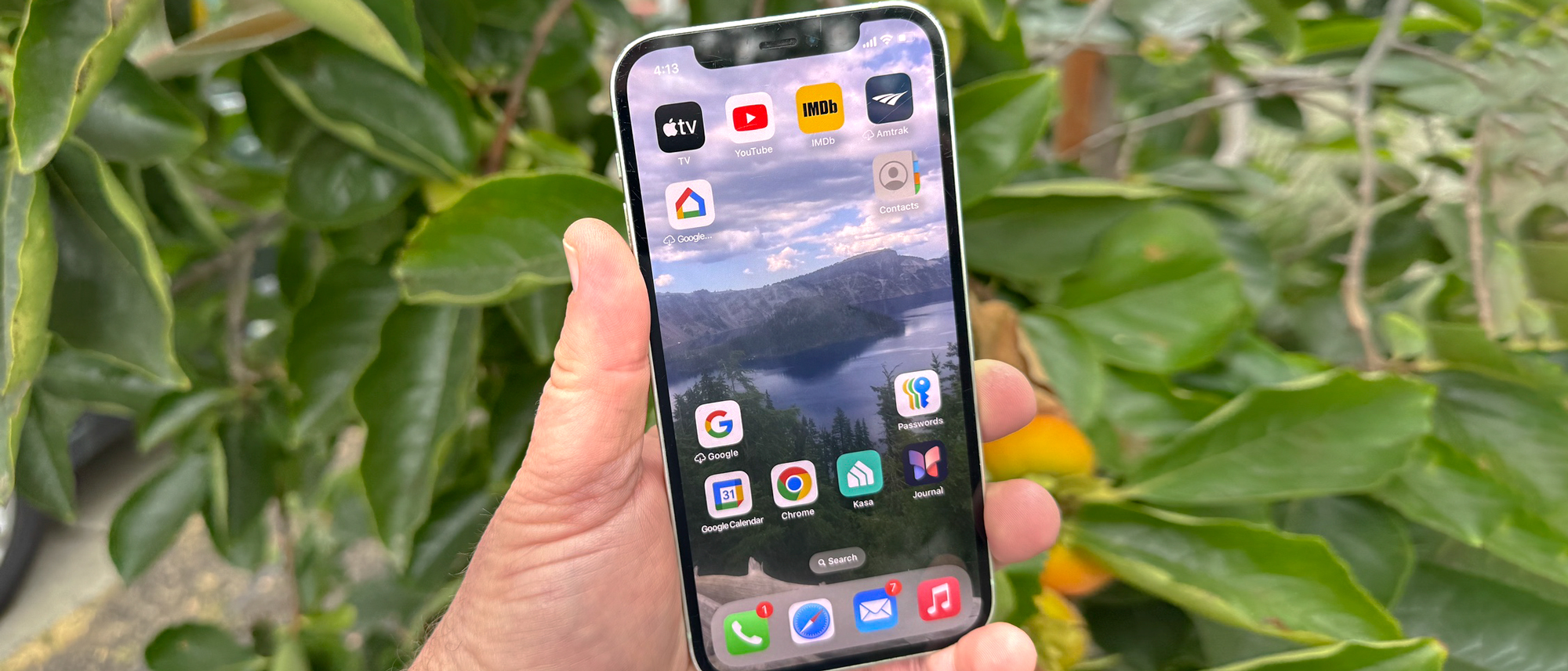
Say you've got a favorite photo that you like using as your home screen wallpaper — you can now arrange your apps to frame the image instead of covering it up. For instance, on one home screen, I’ve arranged my apps in a frame around Wizard Island in a photo I took of Crater Lake. If you preferred, you could also group apps with complementary functions and features together in a specific section of the screen. Really, the look of how apps and widgets get arranged on your home screen is now entirely up to you.
That's not all you can change. iOS 18 also allows you to alter the look of app icons too, opting for light or dark versions, or even an automatic mode that adjusts when your phone goes into Dark Mode. If you prefer, you can change the way app icons are tinted — picking for a color that provides a better contrast with your wallpaper or just going for a particular hue because you like its look. You can switch between small and large sizes for the icons, too. There’s even a clever shortcut for swapping out an app icon with a widget, when one is available, and it's now much easier to resize widgets without having to edit your entire home screen.
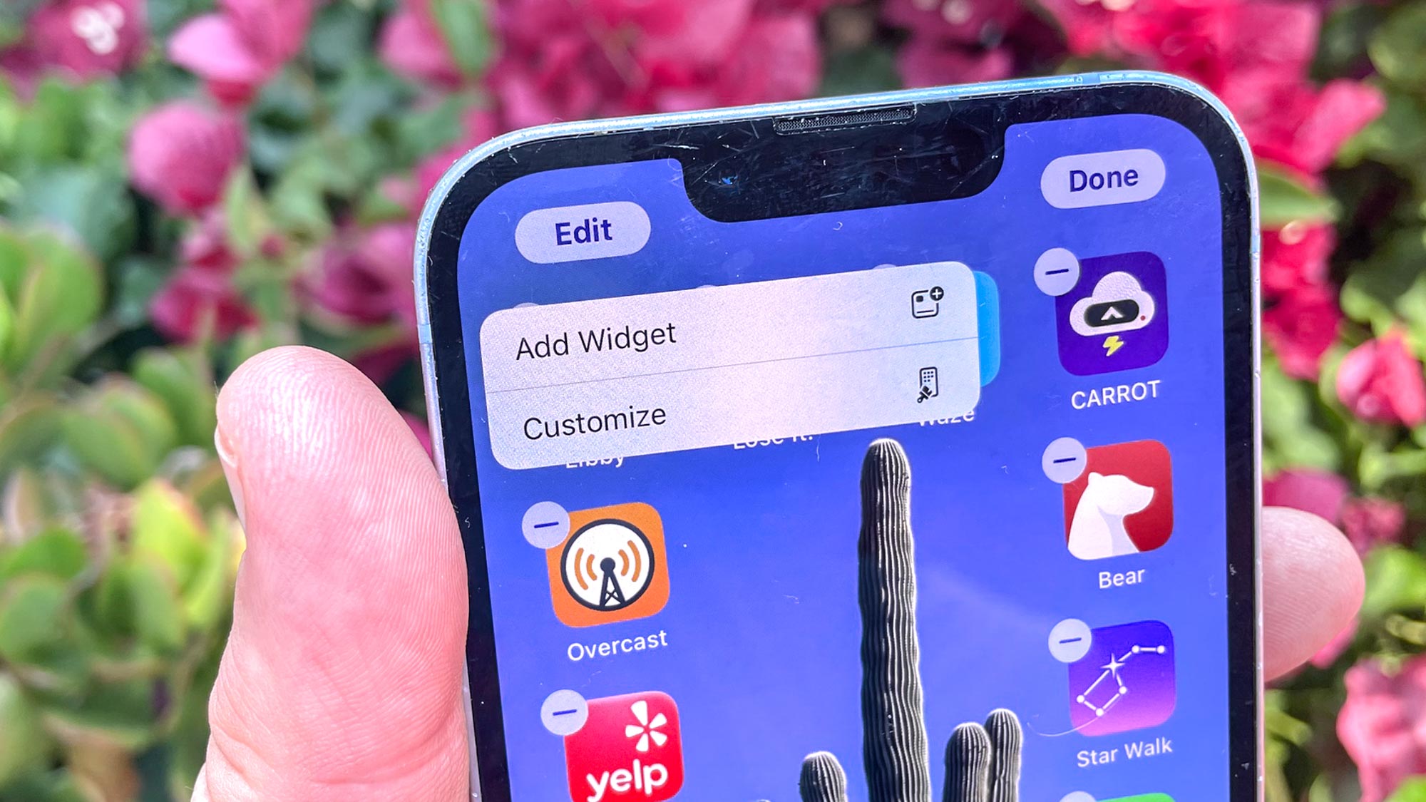
If you find the grid look constraining, you’ll welcome the chance to put your own spin on the home screen layout, but part of me wishes Apple would have gone farther. For instance, when you adjust the app icons, it’s an all-or-nothing affair. You can’t change the tint on some while leaving others the same, which would have let me group together apps by color or use different colors on different home screens for an easy visual cue as to where I am. If you’re going to let people customize things, why do it in half-steps?
That complaint aside, this is a very welcome change to iOS, which has often come under fire for lacking Android's personalization features. You can't really make that argument anymore after recent iOS updates have let you place widgets on your home screen, change up the look of the home screen and now place app icons anywhere you'd like. Apple clearly recognizes that we treat our phones like an extension of our personalities, and it continues to roll out changes to its iPhone software to let us better express ourselves in that manner.
iOS 18 Control Center: A brand new look
The customization in iOS 18 doesn't stop with the home screen. Apple has also given the Control Center a makeover with this update, allowing you to rearrange and even resize controls. The latter task is accomplished by dragging a handle on their lower right corner to expand or shrink them. For instance, I’ve supersized the Shazam shortcut in my Control Center, so that I can more quickly tap the button when I want to identify a song.
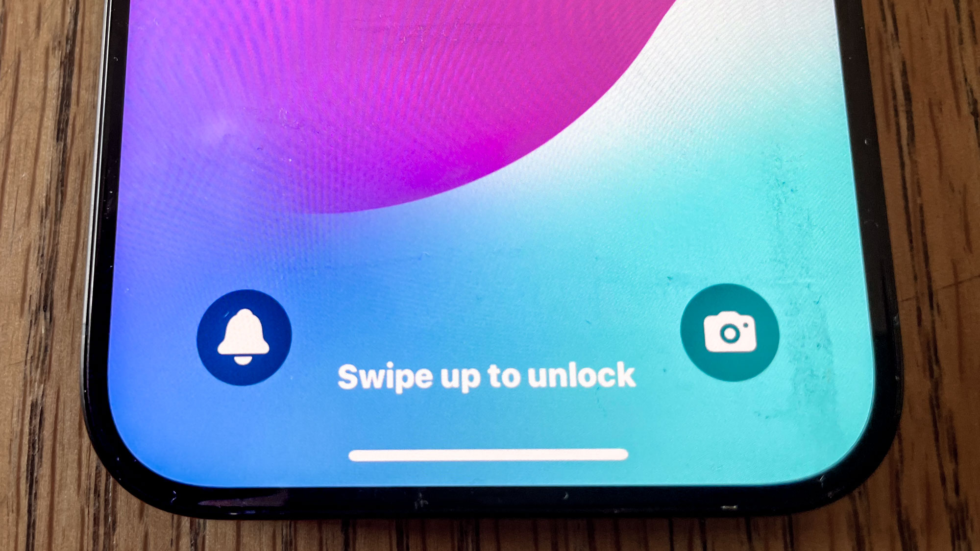
For the first time, you can even change the camera and flashlight controls on the bottom of the lock screen to provide shortcuts to other controls. This seems like a feature built especially for the new iPhone 16 models, which now have a physical Camera Control button to launch the Camera app; now you can swap out that control from your lock screen to add yet another shortcuts. iPhones with Action buttons can achieve the same effect by using the button to turn on the flashlight, freeing up that control widget space on the lock screen. For instance, on an iPhone 15 Pro that I use as a test device, the on-screen flashlight control has given way to a button that silences the phone. There's plenty of different lock screen control shortcuts you can experiment with.
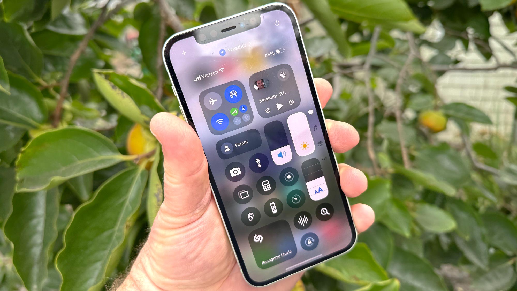
The Control Center itself has expanded into four panels, led off by that customizable main page. It looks a lot like the Control Center found in iOS 17 with a splash of color — the screen brightness icon is yellow, for example, while sliders for volume and text size are now blue.
Keep scrolling from that main page, and you’ll find a separate control panel for media playback, followed by a dedicated screen for Home controls that provide one-tap access to smart home devices and scenes you've created using the built-in Homes app. The fourth panel is a Connectivity screen with access to things like AirPlane mode, VPNs, hotspot features and more.
Part of me wishes Apple gave you more control over the order in which these panels appeared. I don't have a lot of smart home appliances, for example, but I do see myself making frequent use of the connectivity panel. It would be nice if I could flip the order so that the panel I'm more likely to access appears ahead of the one I have little use for — or even better, let me collapse the unused panel completely. Apple has a decent workaround where shortcuts to the four panels appear in a descending row on the right side of the screen — you can just tap the icon to jump to the panel you want.
I like the fact that you no longer need to go into the Settings app to adjust the Control Center layout — iOS 18 gives you the ability to edit the look of the main panel from directly within the Control Center itself. And now that the full version of iOS 18 is here, I expect we'll see a lot of third-party apps release their own controls since Apple gave those tools to app makers during the summer.
iOS 18 Photos: It takes some getting used to
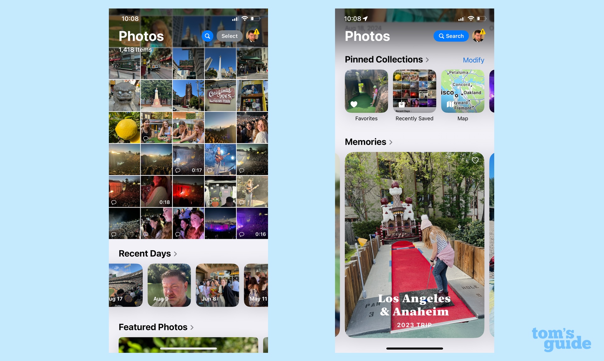
In many ways, the redesigned Photos app in iOS 18 illustrates the value of trying out the beta when Apple offers. Like many, I was taken aback by Photos’ new look when I downloaded the public beta this summer, and for good reason — Apple says this is the biggest overhaul in the app's history. Now that I’ve had a chance to get used to it a little more, I’m a lot more comfortable with the Photos redesign, though I’m not a huge fan of some changes Apple made during the beta process.
Let’s start with how Photos looks in this full release of iOS 18. The tabbed interface of iOS 17's Photos app lets you jump from your library to albums to For You collections gives way to a single screen where you scroll to find things. A downward swipe takes you deeper into your library while an upward swipe lets you explore collections, automatically assembled memories and other photos grouped by categories like People & Pets, Trips and the like. You’re able to customize the order that these different sections appear in, so if you’d prefer Featured Photos to be near the top, you can move them up there.
In the initial iOS beta, you could swipe right or left on your photo library to view collections of photos. Apple dropped that feature, apparently due to user feedback. It also shrunk down the Recent Days section that appears just below your library by default in the name of squeezing more images from your library into the default view.
I thought Apple could have made it more clear that you could swipe right or left to view more photos — the dots letting you know to swipe weren’t very prominent. But one of the things I like best about Photos is how it serves up images from my library I may have forgotten about. I liked that there was a carousel that surfaced those photos, and I don’t care for how the Recent Days area has been shrunken down to postage stamp-size.
You can still scroll down to see various collections of photos, and I have a widget on one of my home screens that serves up a photo of the day. But I still feel like scrolling down in the newly designed Photos creates a sense that you might be overlooking things — especially since you have to scroll left or right under different sections to see more.
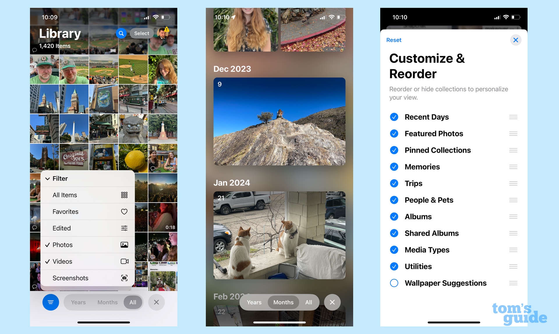
At least Apple has added some clever tools for finding the photos you want. When you swipe into your photo library, tabs appear to let you sort images by years and months. There are other filters, too, for how images get sorted and for filtering out the results you don't need to see. That latter tool is particularly helpful for removing the screenshots stored in your photo library from view.
If the first time you see the new Photos app look is when you install iOS 18, you may not immediately like what you see. Give it time, though, and the new arrangement might grow on you. It certainly has for me, though I do miss that carousel. It helps that Apple seems to be tweaking the Photos app, as even iOS 18.2 introduces some minor changes that further let you customize the app's look to your liking.
iOS 18 Messages: Two practical changes amid the fun
Given the popularity of iMessage as a messaging platform, you'd expect Apple to make a few improvements to the Messages app. That's certainly the case with iOS 18, though I'd categorize a lot of the changes as light-hearted rather than essential additions to the messaging mix.
For instance, iOS 18 lets you use any emoji or sticker you've got stored in your sticker drawer as a tapback. This will doubtlessly thrill anyone who relies on emoji as a communications tool. But for the oldsters like me, it's just another thing to nod and smile politely at.
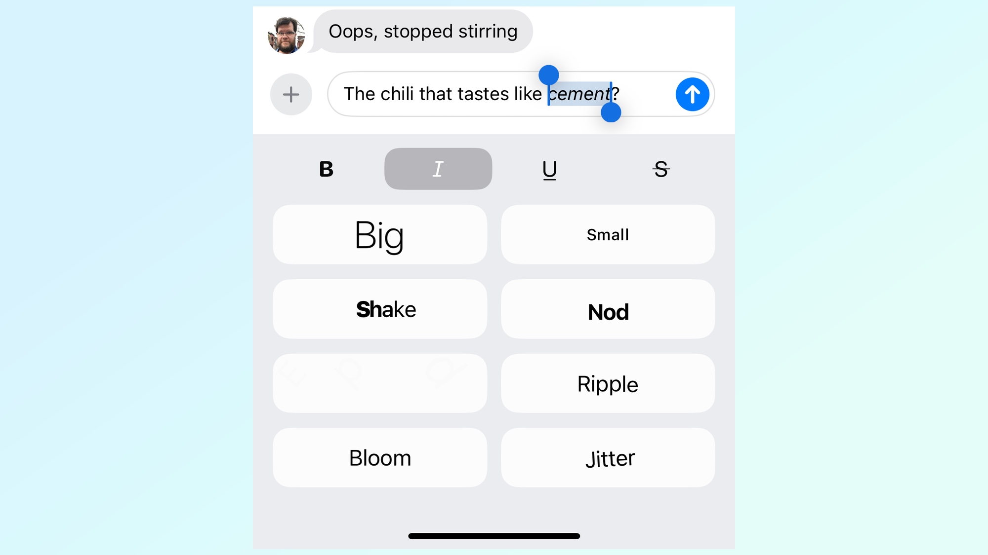
A more widely appealing change is the addition of new text effects that can cause your messages to shake, ripple or even explode — you access them by tapping on your message and selecting Text Effects from the menu. There, you'll even find ways to format words or entire texts with bold, italic, underline or strike-through formatting.
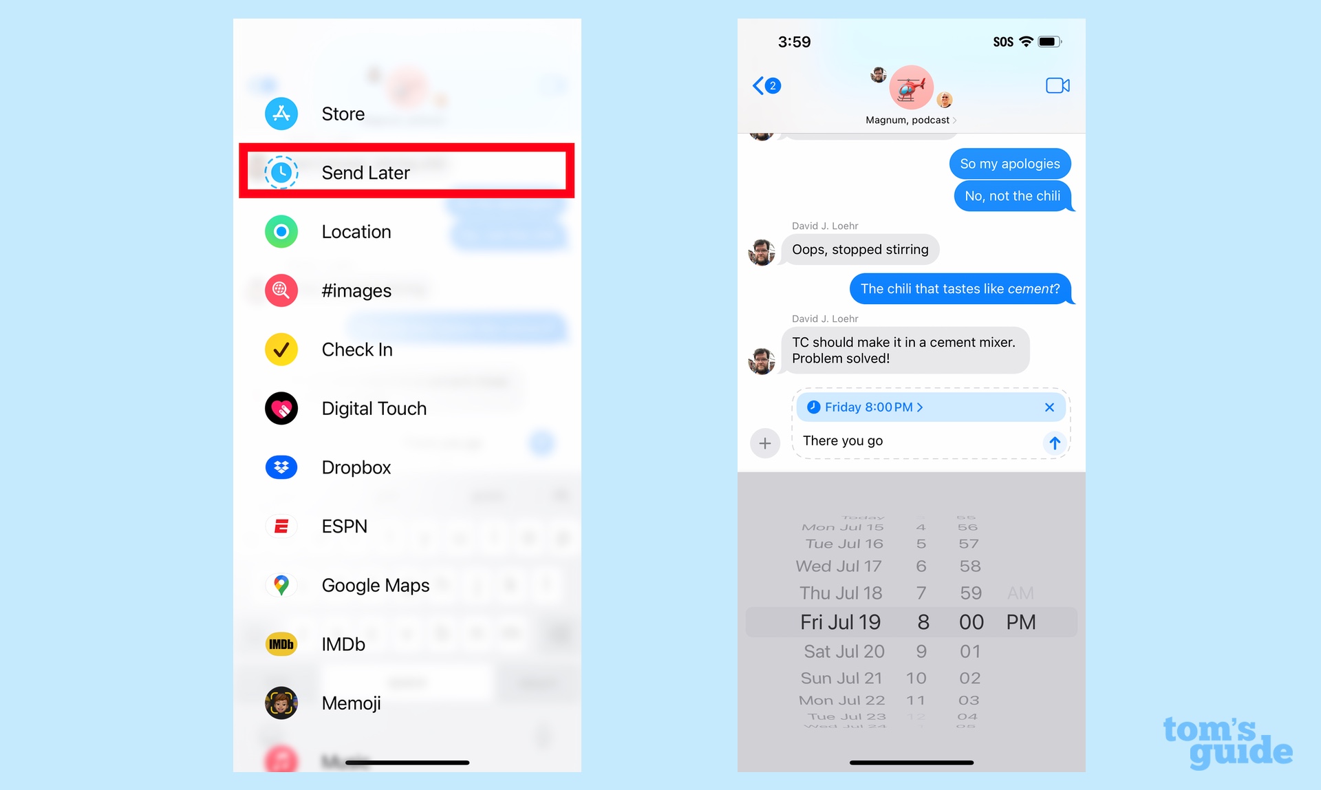
Easily, the most practical change to Messages is the ability to schedule texts to be sent later. This is ideal for those times late at night when you think of a message late at night but don’t want to send it out until a more appropriate hour. Just tap the Plus (+) button where you access functions like the Messages Check In feature or Digital Touch, and tap Send Later. A blue timer will appear over your text listing when the message will go out; tap it to adjust the day and time.
If you've got an iPhone 14 or later, you can take advantage of Messages via satellite, which lets you connect over iMessage even without cellular or Wi-Fi connectivity. Instead, you're using satellites, as the name of the feature confirms, and you get the full benefit of the iMessages platform when texting other iPhone users — that means emoji and tapbacks in addition to text messages. (Texting with a non-iPhone user? You can still send and receive messages using SMS.)
I’ve apparently never wandered free and clear of either Wi-Fi or cellular networks because I have yet to receive the pop-up alert that apparently appears when the phone detects I’m out of network range. (That’s understandable as the iPhone 12 I carry around everywhere doesn’t offer satellite connectivity, and the compatible test devices that I do have on hand haven’t yet ventured out to the open areas where satellite features work best. I’ll update this review should I get a chance to test this feature first-hand.)
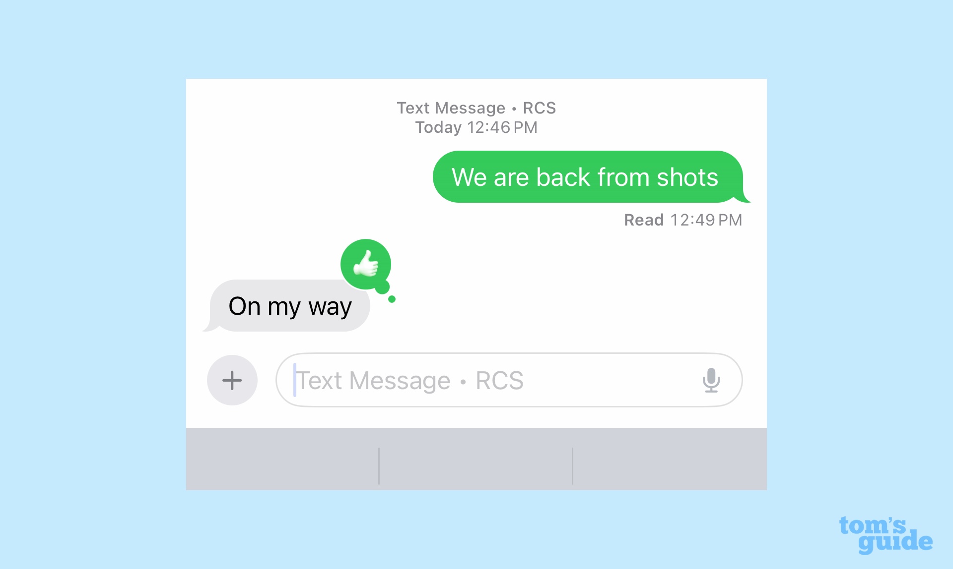
In news that will matter to the cross-platform communicators out there, iOS 18 adds support for RCS, or the Rich Communications Service that's become the favored messaging platform for Android. The addition of RCS means that features normally off-limits to cross-platform messages — read receipts, typing indicators and high-quality images and videos — will now be part of your texts with Android users. Your messages won't be encrypted end-to-end like they are when you text other iPhone users, but RCS is definitely more secure than the SMS/MMS platforms previously in use.
My sister is an Android user — every family’s got one — and she can now see tapbacks when I respond to her messages. The images we share back and forth look better, too. But notably, our text conversation still appears in green bubbles, as Apple would very much like to remind you which messaging platform it thinks is the better option.
iOS 18 Notes: What an updated app should be
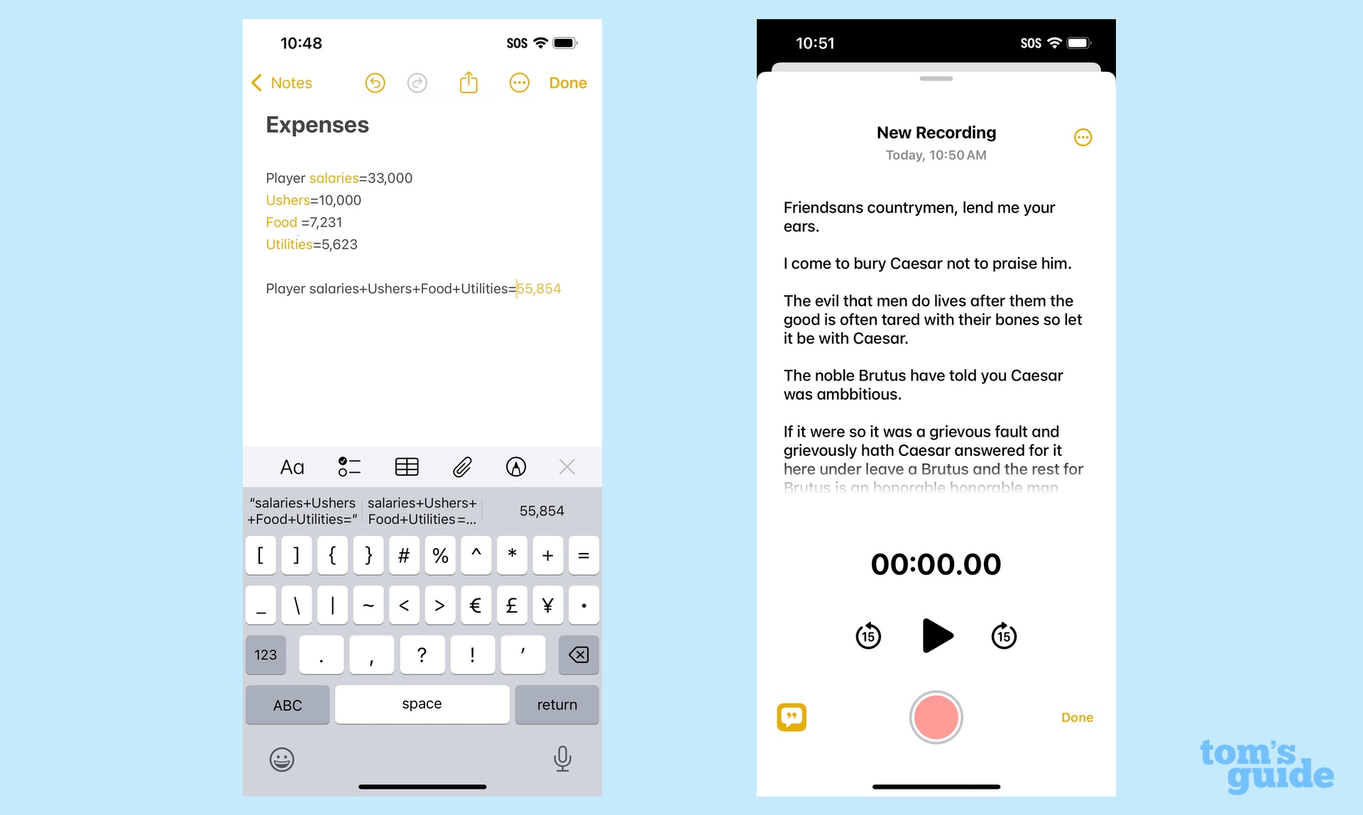
I used to scoff at people who used the built-in Notes app on their iPhone for anything other than jotting down quick lists, but each successive iOS update seems to add new features that seamlessly integrate with what's already done. Notes is practically a full-fledged writing tool at this point, and iOS 18 adds even more capabilities that make this built-in app the first place you should stop when you've got to put ideas down on (virtual) paper.
In iOS 18, Apple has integrated the calculator into Notes to support a new Math Notes feature. There are flashy elements, like the ability to sketch out equations on your phone's screen and have the calculator solve them, though this particular use of Math Notes is better suited for the larger screen of an iPad and the precision of a stylus like an Apple pencil. (For more, see our iPadOS 18 review.) A far better implementation of Math Notes has you type out formulas that the feature can solve. As an example, I can keep a running tally of expenses that automatically adjusts as I add new numbers to the mix.
Changes in Notes don't stop there. Instead of jumping over to the Voice Memos app when you want to make a recording you can link to in your note, the app now comes with an integrated recorder. Even better, Notes transcribes audio recordings and phone calls — even highlighting the text during playback — so that you have a written searchable transcript for your notes.
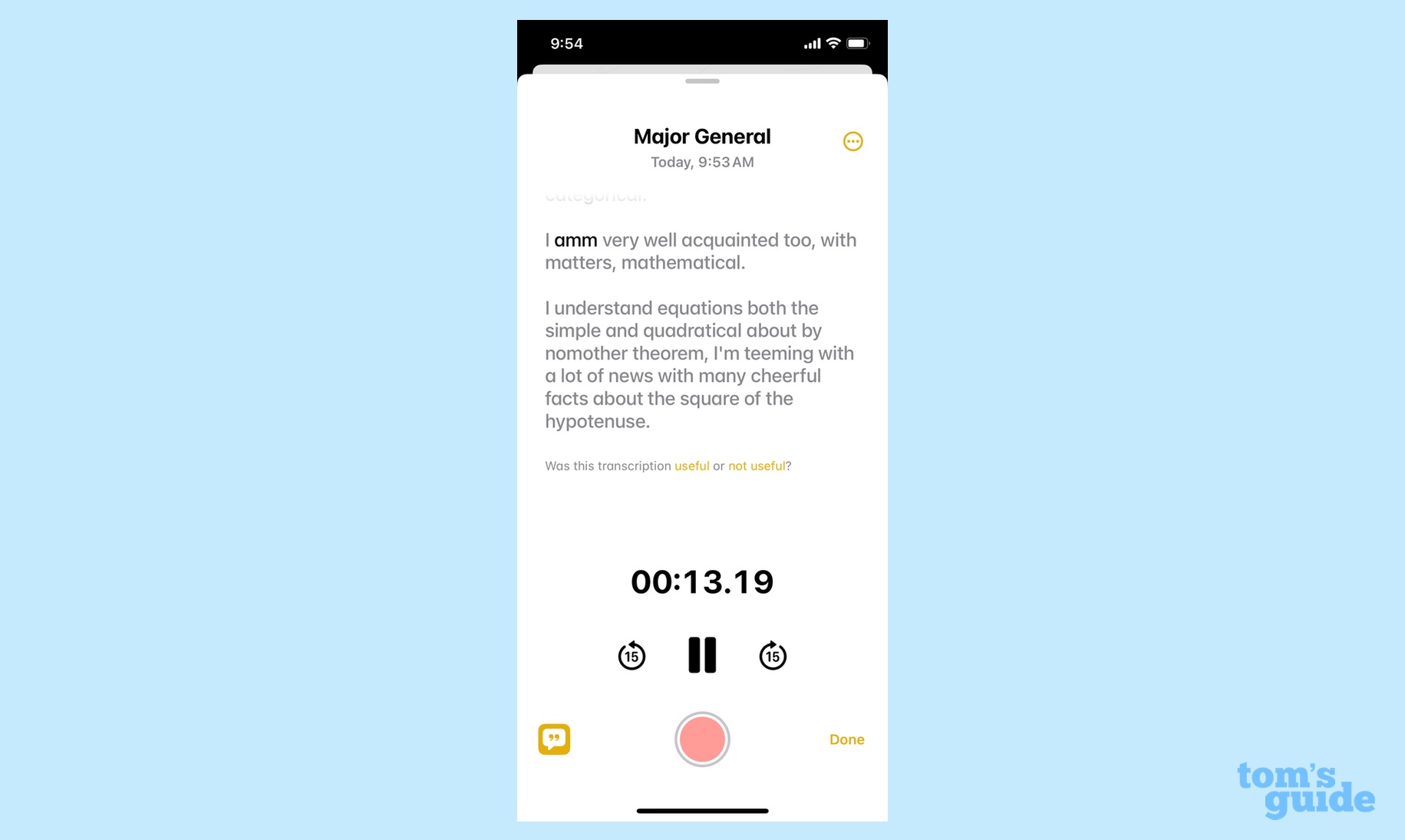
As with similar features on Android devices, transcription accuracy is hit and miss. A recording of me reciting the Major General’s song from Pirates of Penzance had a couple of errors, though we could maybe chalk that up to me not pronouncing “binomial theorem” with utmost clarity. I’ve found that accents and regional dialects throw off the transcription tool, and if anyone speaking is a fast talker, it’s likely that words will run together or get dropped entirely. Fortunately, you can edit transcripts, though you have to add them to your note first, which seems an unnecessary step.
Audio notes aren’t the only thing you transcribe in the iOS 18 Notes app. It’s here that any phone calls you record will be saved and transcribed. (We’ll talk about the new phone recording feature a little bit later in this iOS 18 review.) And as mentioned already, if your phone support Apple Intelligence, you can get summaries of any recording, whether it’s an audio file or a phone call.
If you go to the trouble of fine-tuning the layout of your notes, you'll appreciate the addition of collapsable section headers, which let you better organize notes and hide sections of text in lengthier files. Another new feature lets you change the color of text, essentially allowing you to highlight sections of a note for easier skimming.
iOS 18 Safari: Summaries at your fingertips
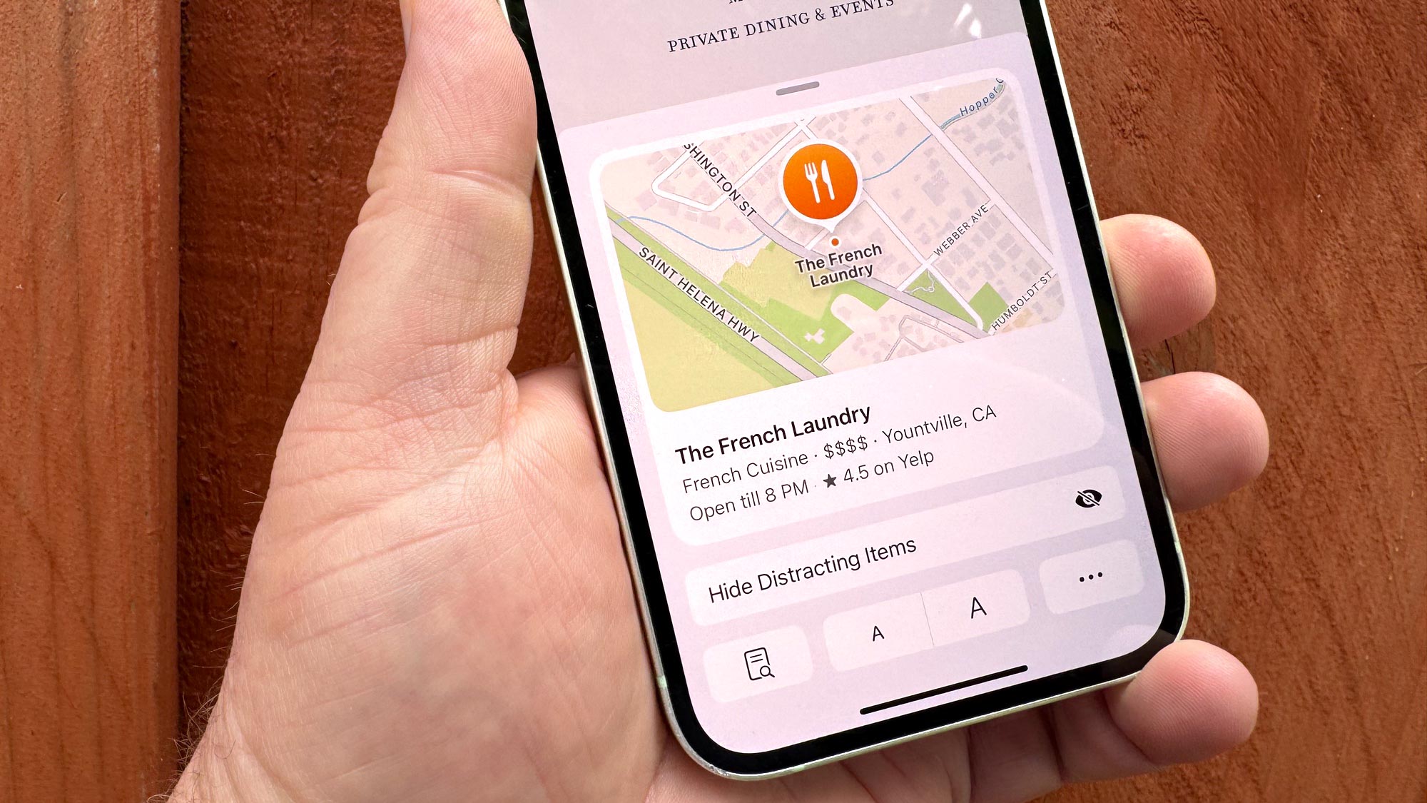
The changes to Safari in iOS 18 aren't nearly so substantial, but they could save you time — if you know where to find them.
A new Highlights feature in Safari focuses on key information about that particular web page. Right now, the primary use for Highlights appears to be directions and operating hours, as I've been able to pull up maps to various sights around San Francisco. (Tapping that summary box takes me to the Maps app where I can get driving directions.) On certain articles, Highlights can include a summary to give you a quick gist of the topic, though the summaries I’ve come across are pretty shallow. Highlights are supposed to also spotlight celebrities, movies, music and TV shows, though I haven’t really come across instances of those when browsing in iOS 18.
The trick to highlights is knowing how to access the feature, as they don’t pop up automatically. Instead, look to the Safari address bar where a tiny purple AI icon appears on what you'd normally tap for more information. If Highlights is to become better integrated in the Safari browsing experience, it feels like Apple should make that visual cue more obvious, and the information itself will need to appear with great consistency. Right now, location data duplicates what’s already available in Maps, for instance, and you’ll have better luck getting information on movies, music and TV shows with a Google search.
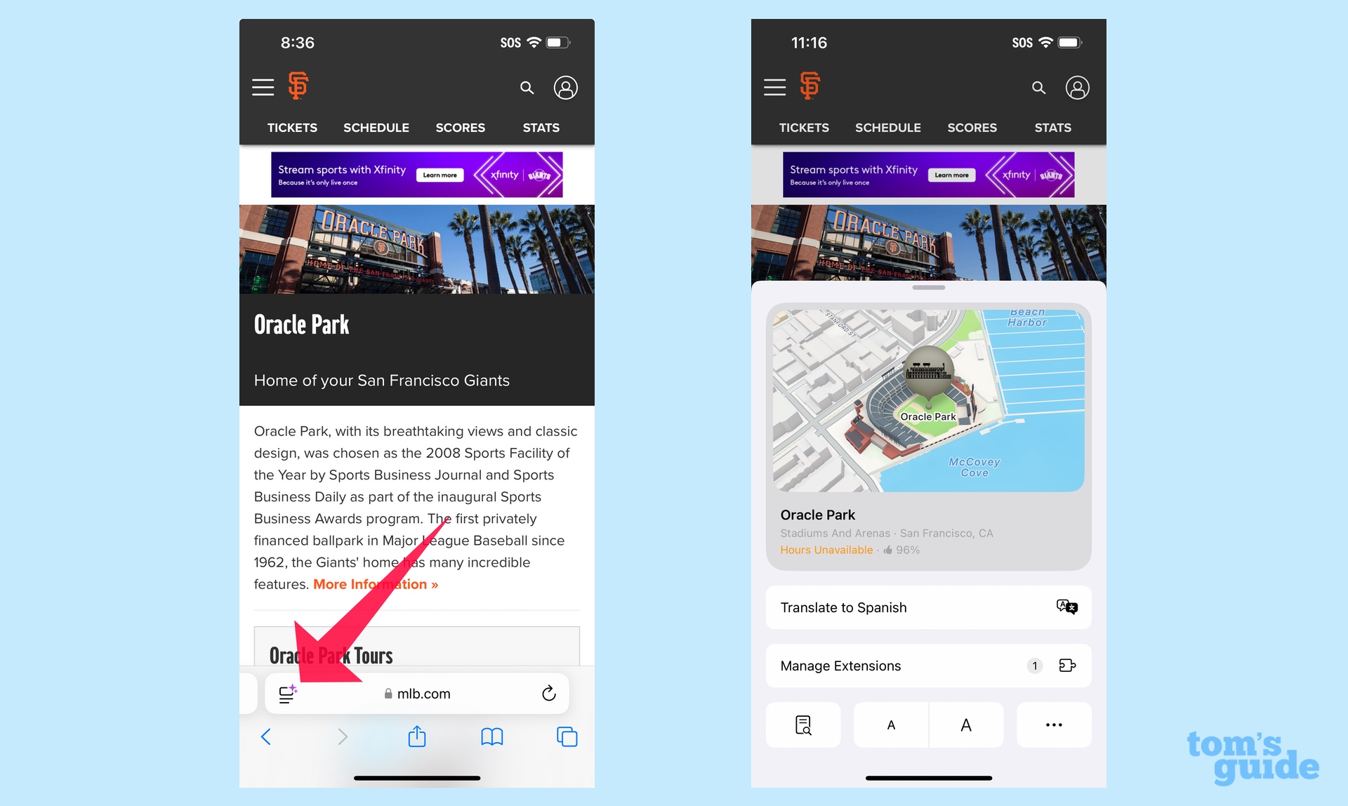
Tapping that purple AI Icon lets you access another iOS 18 Safari addition that lets you hide distracting elements on a web-page — think pop-ups and other items that get in the way of you accessing the content you came to the page for. I’ve used Distraction Control to successfully hide those pop-up videos that annoyingly cover up the text of the article I’m trying to read, but I find the process of hiding distracting items to be too time consuming. Apple hasn’t given you a way to scroll through a page, ticking off the items you want hidden — rather, you have to do it section by section, which strikes me as more of a hassle than the distractions the feature is trying to rid of you.
Better to access articles through Safari’s Reader function, which also sees some changes in iOS 18. Reader still lets you see web articles in a more readable format, with everything stripped away but the text and some key images. But iOS 18 adds a summary at the top of the display for some articles, and longer articles get a table of contents, too. (On Apple Intelligence devices, summaries appear with greater consistency.)
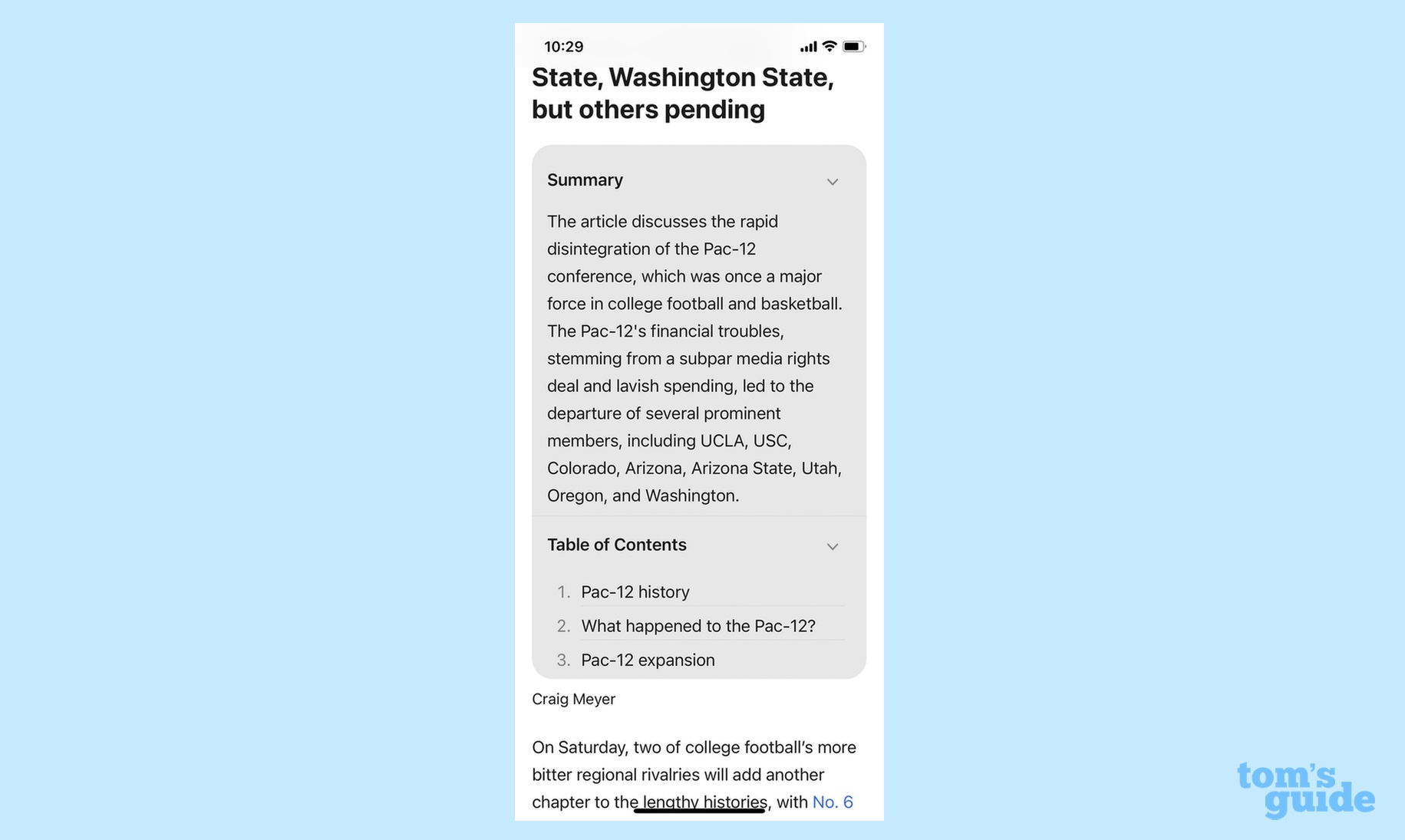
The summaries are accurate enough, though probably not thorough enough to save you much in the way of time. Presumably, if you clicked on the article, you're interested enough to read it no matter what Reader's summary tells you.
iOS 18 privacy and security: New password manager, hidden apps
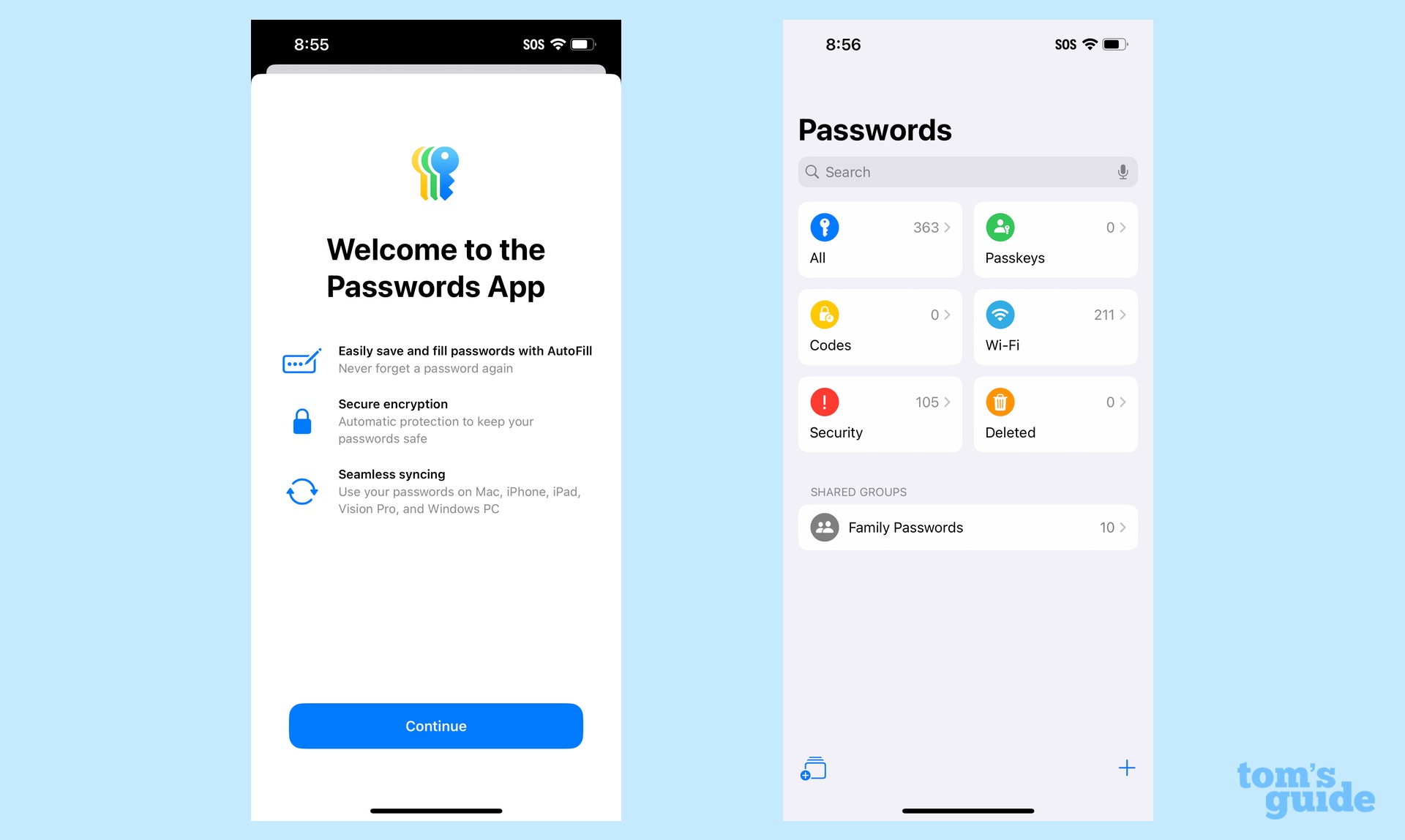
Any iOS update tends to bring with it new attempts to shore up security and privacy on your iPhone, and iOS 18 is no exception. Two changes are part of the iOS 18 public beta that deserve some attention — a new Passwords app and the ability to secure any app you want to the point where you can even hide it from public view.
The Passwords app builds on Apple's keychain for managing passwords. It's a one-stop storage vault for all the passwords you've accrued for various apps and websites. Not only does this help with auto filling in your credentials, it also makes searching for passwords a lot easier. Other tools include alerts for compromised passwords and syncing your passwords across all the Apple devices you own (assuming they're updated to the latest versions of their software, one presumes).
I confess that I find the Passwords interface intimidating, as it's a long string of apps and websites I had forgotten I ever accessed, including some online tools I last used when I worked for a previous employer a decade ago. Amazon alone lists five different passwords tied to five different email accounts, four of which are as defunct as disco. That means I’m going to need to block out some time to pare down these superfluous passwords. Still, this seems like a sensible addition to iOS 18, particularly if it helps you stay on top of any compromised passwords.
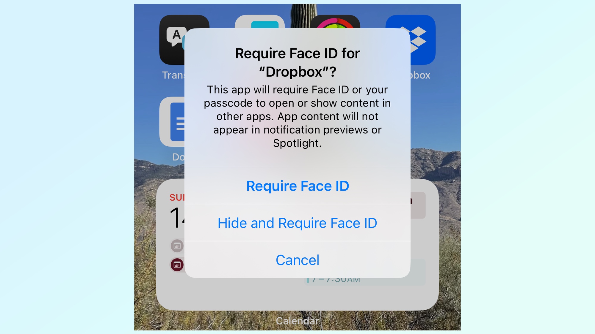
I'm more pleased with the ability to secure apps by requiring a Face ID unlock in order to access them. This adds an extra layer of protection in case your phone is ever unlocked, as you can keep anyone who happens to have your phone from accessing sensitive data in apps that remain unlocked until you verify them. For more security, you can opt to hide apps from public view, where they'll be stored in a folder that only you can access. Best of all, data from locked and hidden apps won't show up in searches, so you won't inadvertently defeat the purpose of securing them in the first place.
There's been some smirking about this feature, as if it would only be used to hide nefarious or embarrassing activity. But I see it as a practical step in a world where you keep a lot of health, banking, and personal information on your phone, and maybe you don't want people popping into the Health app to see what kind of medications you take. It’s also useful for parents who hand over their phone to kids so that they can play games while stuck in line or waiting rooms but may have apps they don’t necessarily want their kids to access. In other words, this is a great addition by Apple at a time when our phones house a lot of critical data about ourselves.
iOS 18: Fitness, Maps, TV and Phone
I wanted to single out four other apps that have seen improvements in iOS 18, as I think these additions make them immeasurably better. Let’s start with Fitness, and some features it picks up from watchOS 11 — the ability to pause your workout streaks and adjust move goals on a daily basis.
I like how Apple’s Fitness app uses awards and badges to inspire to move more, but I’ve been less impressed with the app’s insistence that every day’s workout must be equally intense. Being able to pause activity streaks means you don’t have to be penalized for days when you’re sick or injured; while adjusting move goals for specific days allows you to pursue a more realistic fitness plan. Two years after Apple let iPhone users tap into the Fitness app without requiring Apple Watch, these changes really make the app a better tool
Fitness also gets into the customization act that Apple’s brought to the iOS 18 home screen, as you can edit the summary screen to show information you’re interested in and hide the data you’re not. The customization tools aren’t extensive, but I like the fact that I can now remove superfluous-to-me items like trainer tips to emphasize trends and movement stats
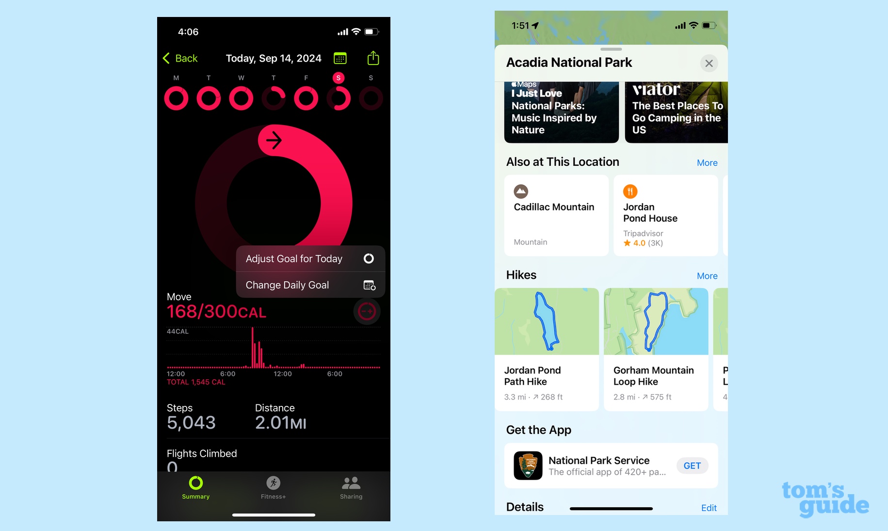
The Maps app in iOS 18 addresses a long-standing complaint I’ve had about the app’s limited utility if you like hiking. With this version, Apple added topographic maps, highlighted by the addition of trail maps for all 63 U.S. National Parks. If anything, I hope Apple expands the feature to one day include maps for state and regional parks, and I’m sure that iPhone users and other countries would appreciate support for trail maps in their part of the world, too. Trail maps works especially well when you combine that feature with the ability to download maps for offline use that Apple added in the iOS 17 update a year ago.
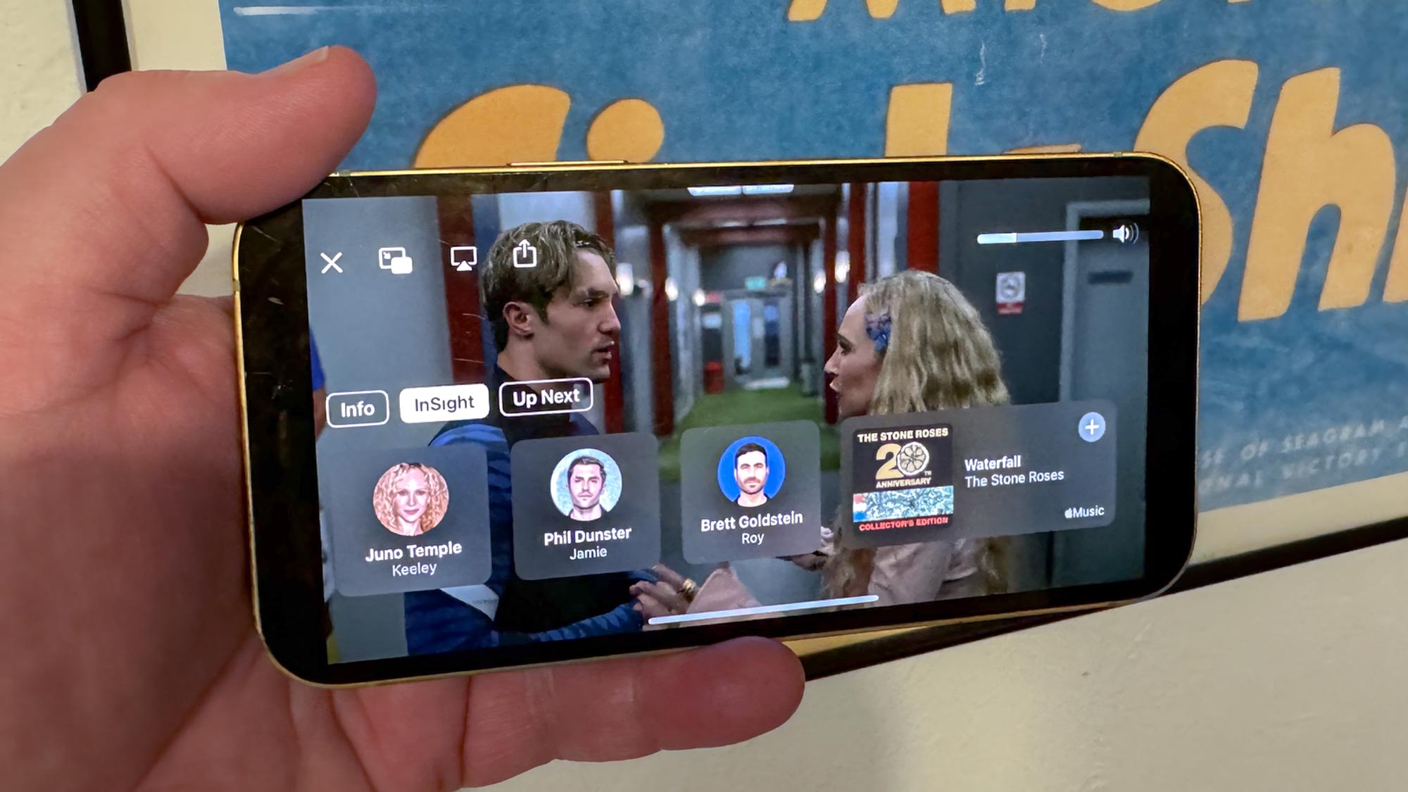
Finally, the TV app picks up a clever feature where closed captioning kicks on automatically when you mute a program. Also, if you skip back to re-watch something that you’ve just played, closed-captions appear automatically to catch you up on any dialogue you may have missed. Apple TV Plus subscribers will also appreciate a new InSight feature that works a lot like Amazon Prime’s X-ray too, bringing up information about actors and music appearing in Apple’s original programming.
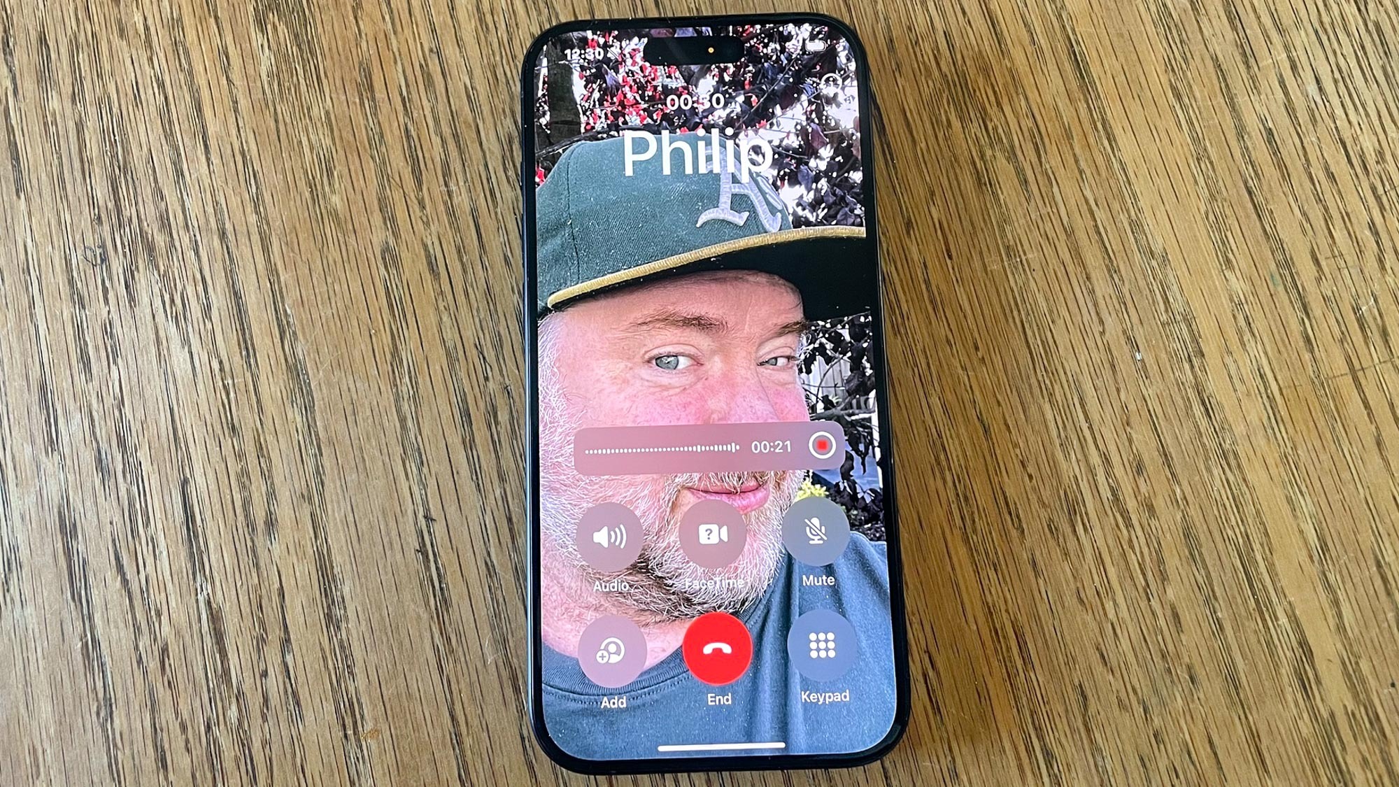
As of iOS 18.1, the Phone app gains the ability to record phone calls, a feature that originally sounded like it would be limited to Apple Intelligence-ready devices. However, at some point in the beta process, Apple extended the feature to older phones like my iPhone 12. (You will need Apple Intelligence to get a summary of the call.)
Recording a phone call on your iPhone is a lot simpler than a similar capability I tested when reviewing the Pixel 9 Pro. Google’s Call Notes feature requires you to tap twice — once to start a recording and again to confirm you want to record a call. On the iPhone, you simply tap once and then have a countdown to reconsider whether you want to record the call after all. When the recording begins, an automated voice announces to everyone that the call’s being recorded.
It’s a drop-dead simple process, with my only complaint being that the white call recording icon in the upper left corner of the screen can blend in with the background of your wallpaper or contact poster. Just remember that you need to go into the Notes app to find your call recordings — there’s no hint of them in the Phone app itself.
iOS 18: Other updates of note
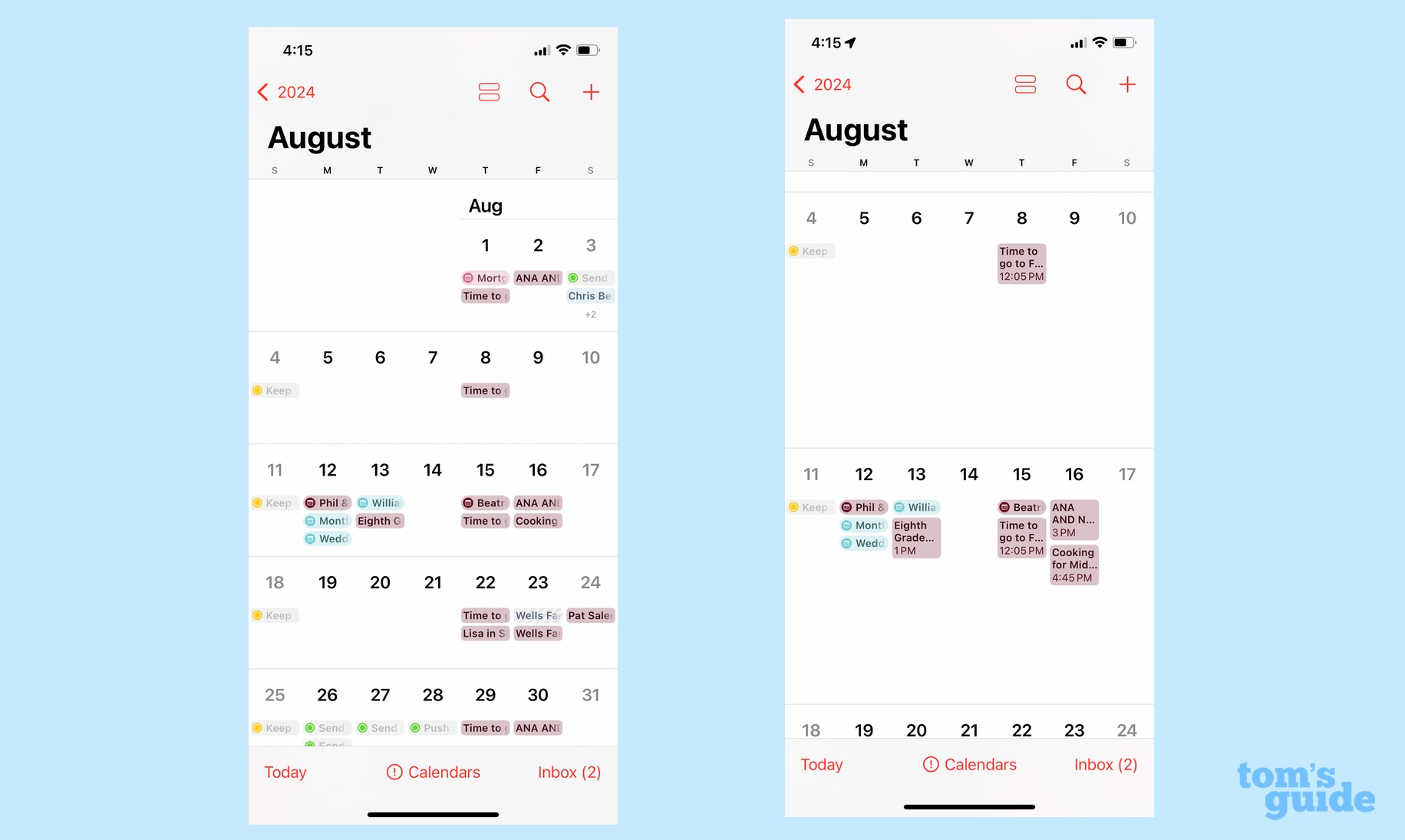
If we go through every change Apple has made in iOS 18, we’re going to have to send out for food and water. So let’s quickly summarize some of the other changes you’ll encounter when you install iOS 18.
Calendar/Reminders integration: You can now create a reminder in the Calendars app, linking it to a specific time and date, and it will also appear in Reminders. (The reverse also works, with tasks in Reminders showing up in your Calendar.) This is a sensible blending of cross-app functionality that saves you the hassle of jumping between apps to keep things synced up.
While we’re talking about the Calendar app, the month view gets a redesign that lets you expand and collapse the view to squeeze in more of an overview of your month ahead or drill down into a more detailed view.
Tap to Cash and venue info in Wallet: There are two improvements in the Wallet app that sound promising, though I haven’t been able to test yet. Hopefully that changes now that iOS 18 is available to a wider audience. Tap to Cash lets you exchange cash payments with other iPhone users simply by placing your phone next to theirs and making an AirDrop-like transfer. Think of it as a way of cutting out Venmo or PayPal from the process of paying back friends and family.
Meanwhile, when you stash tickets in Wallet, participating venues can add information like maps of the venue, when the gates and parking areas open and more. Apple also says that the Wallet app can surface other recommendations — relevant playlists for upcoming concerts, recommendations for nearby eateries, and links to Find My so you can track down the people you're attending the event with.
Journal improvements: I haven't made much use of Journal since Apple added the app a year ago, but some new gamification features in iOS 18 like streaks and stats figure to help get you in the habit of writing on your phone. The app now integrates with another iOS 17 addition, the Health app's mood tracker, so you can see the impact reflective writing is having on your outlook.
The Journal app also adds more formatting tools to make it feel like a full-fledged writing app, and anyone with an iPhone 12 or later can dictate Journal entries in the moment that will get automatically transcribed.
While we’re talking about changes Apple’s already made, let’s address one that’s been promised but that won’t appear until a subsequent update. Mail gets a big change with iOS 18, though not in this initial release. We’re supposed to see Mail’s inbox broken up into different categories for better organization.
iOS 18 review: Verdict
Now that we've had a full three months since iOS 18release, I’m willing to bet that if you’re inclined to upgrade to iOS 18, you’ve done it by now, though perhaps you were waiting for more Apple Intelligence features to take the leap. If so, you should upgrade now — the main features in iOS 18 are pretty polished at this point, and the Apple Intelligence additions are worth trying out, with the caveat that they’re likely to see updates over time.
Inevitably, there will be bugs and things that don’t work as they’re supposed to. I know at least one of my colleagues as having difficulty accessing the Type-to-Siri feature added via Apple Intelligence for starters, and she’s not the only one having issues with Siri. Though iOS 18.2 may be a full release now, you still may run into Apple Intelligence features with some rough edges, so be prepared for that possibility.
Still, if this is your first encounter with iOS 18, you should like the improvements Apple’s made. The changes to Notes are terrific, and I’ve also appreciated how things like Fitness, Maps and Messages are all better in this version. I’m still adapting to Photos and its new look, but I’m still willing to acknowledge that those filtering tools help you track down what you’re looking for. The addition of Apple Intelligence tools is an important step, but just the first one in what figures to be a year-long process in making iPhones smarter.
Philip Michaels is a Managing Editor at Tom's Guide. He's been covering personal technology since 1999 and was in the building when Steve Jobs showed off the iPhone for the first time. He's been evaluating smartphones since that first iPhone debuted in 2007, and he's been following phone carriers and smartphone plans since 2015. He has strong opinions about Apple, the Oakland Athletics, old movies and proper butchery techniques. Follow him at @PhilipMichaels.
