I upgraded to iOS 18 — here’s 3 things I really don’t like
It's not all roses in the iOS 18 beta
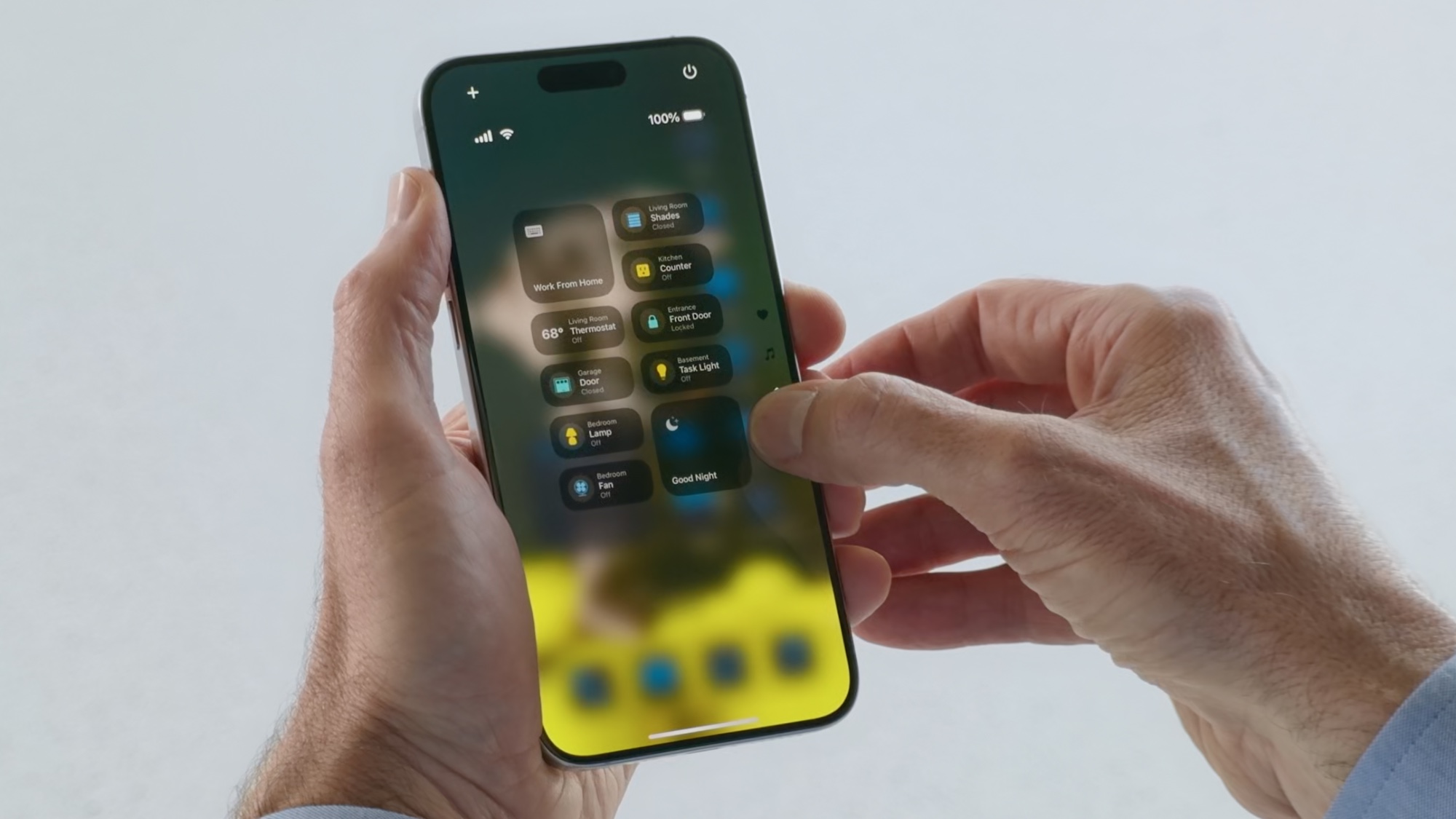
I recently downloaded the iOS 18 public beta to see how it fares, for the most part, it all seems like a major improvement. However, there are a couple of things that I just really don’t like.
I should specify that I am a longtime user of Apple products, I’ve had one since the iPhone 3GS. While I might stray on occasion, especially when it comes to gaming on phones where the foldable has the clear advantage, I am a fan of Apple and the iPhone. That's why I wanted to try out the new update and see how I felt about it.
For the most part, I have to say that the iOS 18 beta runs smoothly and I've had no real issues with battery drain or crashing, something that is always a concern. The issues I had were more with a few menu choices and visual designs that appeared worse than on prior updates.
The Control Center is more fussy
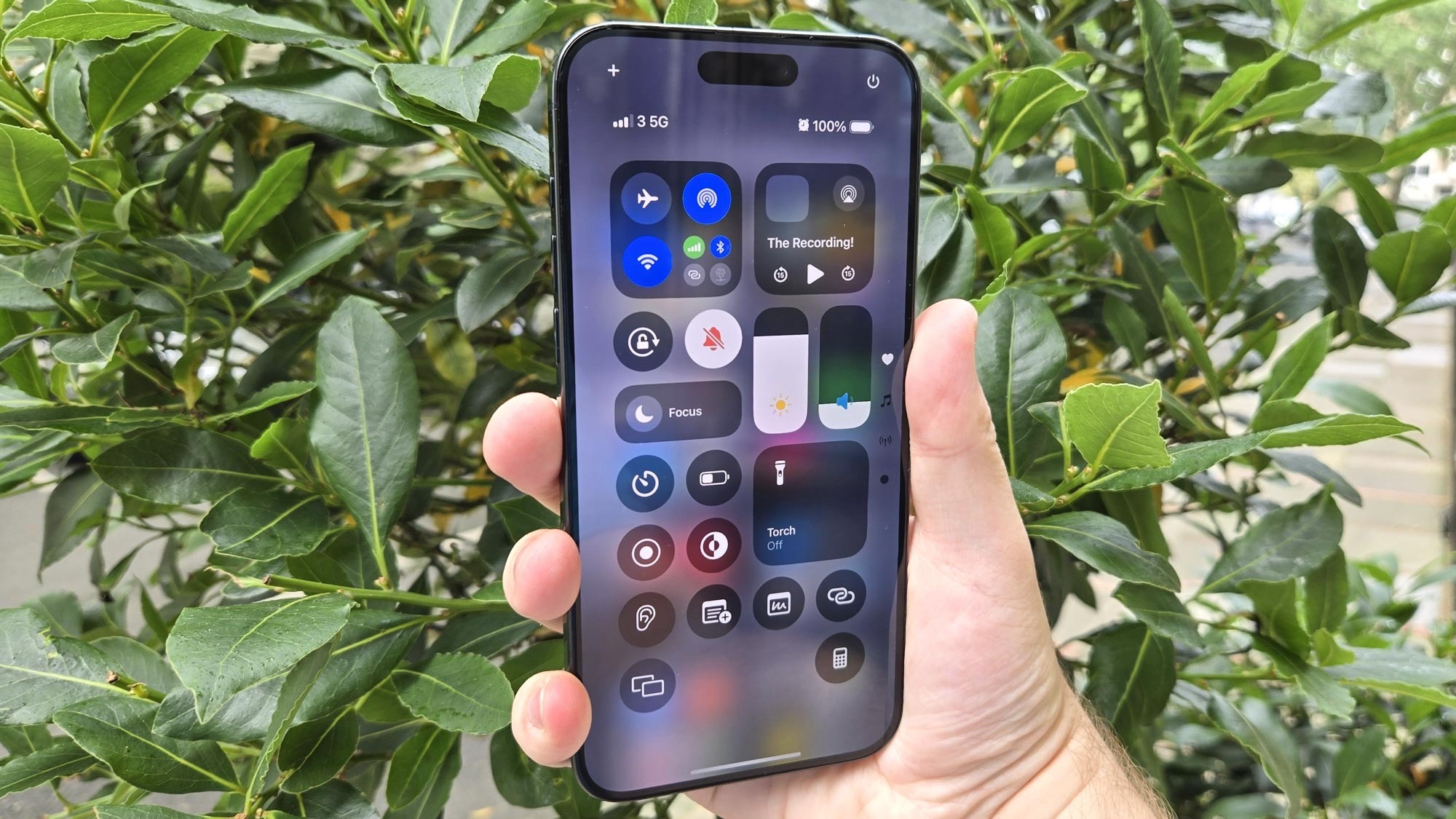
I spend a lot of time listening to music through my Bluetooth headphones, so I need to be able to connect them easily with the phone. This was easy to do in iOS 17: All I had to do was hold the widget in the control center to go to the Bluetooth settings window. However, iOS 18 has made this slightly more complicated by adding extra steps to either reach the settings page or turn off Bluetooth.
Currently, if you want to turn the Bluetooth on or off, you need to press the control center square and then press the Bluetooth widget. I also noticed that holding down the widget no longer takes me to the setting menu, it instead opens up a mini-menu with a third option at the bottom to enter the settings menu. This is a minor issue, but it's made a simple act ever so slightly more annoying.
Ideally, a new OS should streamline things or, if that isn't possible, simply leave them as they were. This change to how you navigate the control center feels like it was added for the sake of adding it. However, it will likely just need some getting used to so hopefully it stops being annoying to me soon.
The Photos app is convoluted
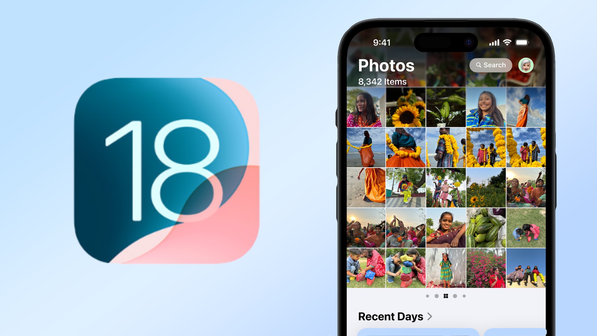
One of the big changes that has come as part of iOS 18 is a complete redesign of the photos app layout. In theory, this new layout is designed to make it easier to find specific images or groups of images. However, the actual app is strangely cumbersome to navigate and it repeats itself a lot, while at the same time seemingly hiding what you want to find.
For instance, the prior Photos app was separated into two sections. One was the library tab, which was for the pictures you had just taken, while the recent tab was for pictures you had just saved. iOS 18's photo app includes "Recent Days" which doesn't include images you have saved to the phone. Now, there is a tab called Recently Saved, but it's right at the bottom of the screen and surprisingly easy to overlook.
Sign up to get the BEST of Tom's Guide direct to your inbox.
Get instant access to breaking news, the hottest reviews, great deals and helpful tips.
This is the fundamental issue I have with the new Photo app. It's just convoluted and hard to navigate. For instance, you can set the Photo app's main library to sort images by date saved rather than date captured, but once again it's hidden. Apple also decided to introduce a carousel, so it's possible to move the library to the side by accident. If you happen to miss the small dots then you would have no way of knowing this was a possibility. I foresee a lot of Apple Genius Bars being overrun by concerned people who "lost" their photo library.
All Apple needs to do is streamline the app and figure out the best places to put its folders. The pieces are all there for this to be a great improvement, they just need rearranging. However, my final issue is more of a concern, at least personally.
App tinting looks strange, and doesn't add anything
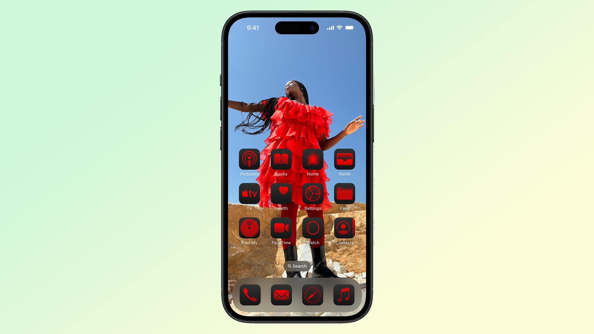
This is more of a personal issue, but I know it isn’t one that I am alone on. I hate the tinting option for the home screen widgets. There’s no real getting around it, I think it looks very dumb. The problem is that it is a singular color, so everything looks the same. For instance, I elected to tint my widgets red, thinking that they would take on a subtle hint of red, maybe tint the background. What it actually does, to my shock, is turn the ENTIRE main element of a widget red.
I would have thought that the third-party apps would have been spared, but this is not the case. If you have ever struggled to find an app that you remember downloading, wait until you have to do it when everything looks like different-shaped red blobs. There are better ways to include tinting in apps, and one of them is certainly not cutting out every color other than the one we choose.
One option would be to make it only change the background. I know that Apple has that capability because that is precisely what changing it from light to dark does! It shouldn't be this complicated to add in tinting, and there is likely an easy fix. However, The feature is still new so some teething problems are to be expected.
That is the crux of my time with iOS 18, while I have found things I dislike, I know that they have a chance to be changed. None of the problems I've found are game-breakers, and each has a relatively easy fix. The question for now is whether Apple will take the time to fix them or not.
For more information about upcoming features, why not check out our full breakdown of the new iOS 18 features mentioned during Apple’s WWDC presentation. We also have a guide for how to download the iOS 18 beta if you want to test out the features yourself.
More from Tom's Guide
- iOS 18 will let you video call 911 this fall — what you need to know
- Having Safari browsing trouble on iPhone? You’re not alone — Apple’s Private Relay system is having problems
- iOS 18 Notes lets you add audio recordings directly in the app — here's how it works

Josh is a staff writer for Tom's Guide and is based in the UK. He has worked for several publications but now works primarily on mobile phones. Outside of phones, he has a passion for video games, novels, and Warhammer.

