I tried every Photographic Style on the iPhone 16 Pro Max — this is a game-changer
Here's what all fourteen Photographic Styles look like in action
Here at Tom’s Guide our expert editors are committed to bringing you the best news, reviews and guides to help you stay informed and ahead of the curve!
You are now subscribed
Your newsletter sign-up was successful
Want to add more newsletters?
Join the club
Get full access to premium articles, exclusive features and a growing list of member rewards.
Beyond its hardware upgrades, the iPhone 16’s changes to Photographic Styles in the Camera and Photos apps is perhaps one of the largest. And having now tried all of them out, it might be my favorite change of any Apple’s made to the iPhone this year — and yet another reason why it's on the list of the best camera phones.
Photographic Styles was originally a feature introduced on the iPhone 13 series with four adjustable presets. But now there are 14 to pick from, all still adjustable, with the option to create your own preset based on your favorite photos. That's a lot of possible customization to think about when you're shooting your images, so it's just as well you can switch between these styles at any time in the Photos app in iOS 18, iPadOS 18 or macOS Sequoia.
As a guide for you, the current (or potential) iPhone 16 owner, I have been snapping photos like crazy since I got an iPhone 16 Pro Max to try and applying Style after Style to see how it impacts your photos. Even if you can't make your mind up in the moment, my hope is that after you've read this, you'll have more of an instinct for which style might benefit your photo and the vibe you're trying to create.
Article continues belowCool Rose
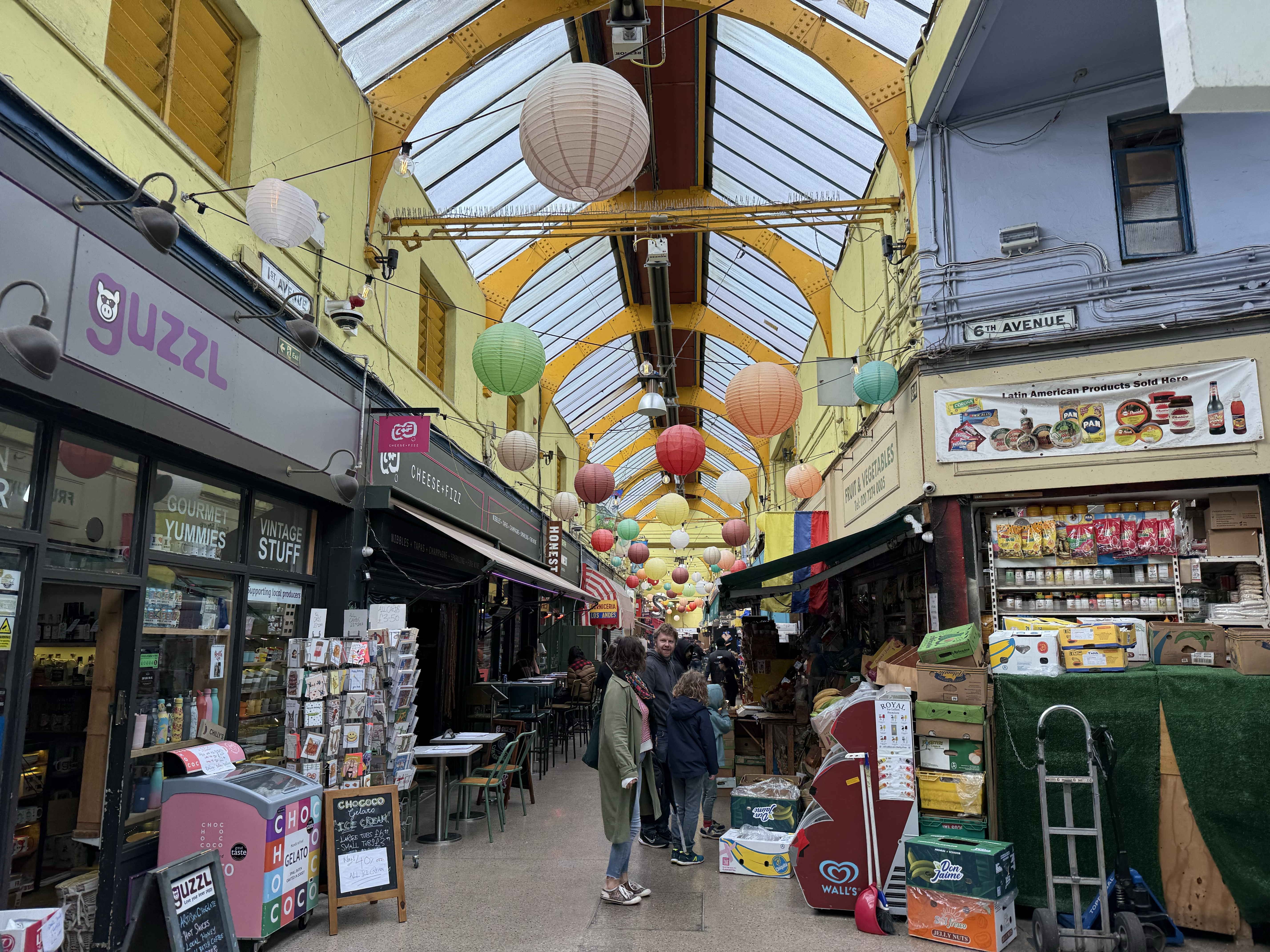

Cool Rose does two things — it cranks up the intensity of the red colors in your image, as well as the blues. This can help accentuate brighter-colored parts of your shot while making sure they don't distract from the cooler elements.
We can see this in action with this shot of Brixton Village market. With the filter applied, the bright yellow ceiling is no longer the center of attention, while the darker shop fronts are brought into balance. I feel this helps bring your attention to the details of the shot more, rather than the color contrast like the original.
Amber

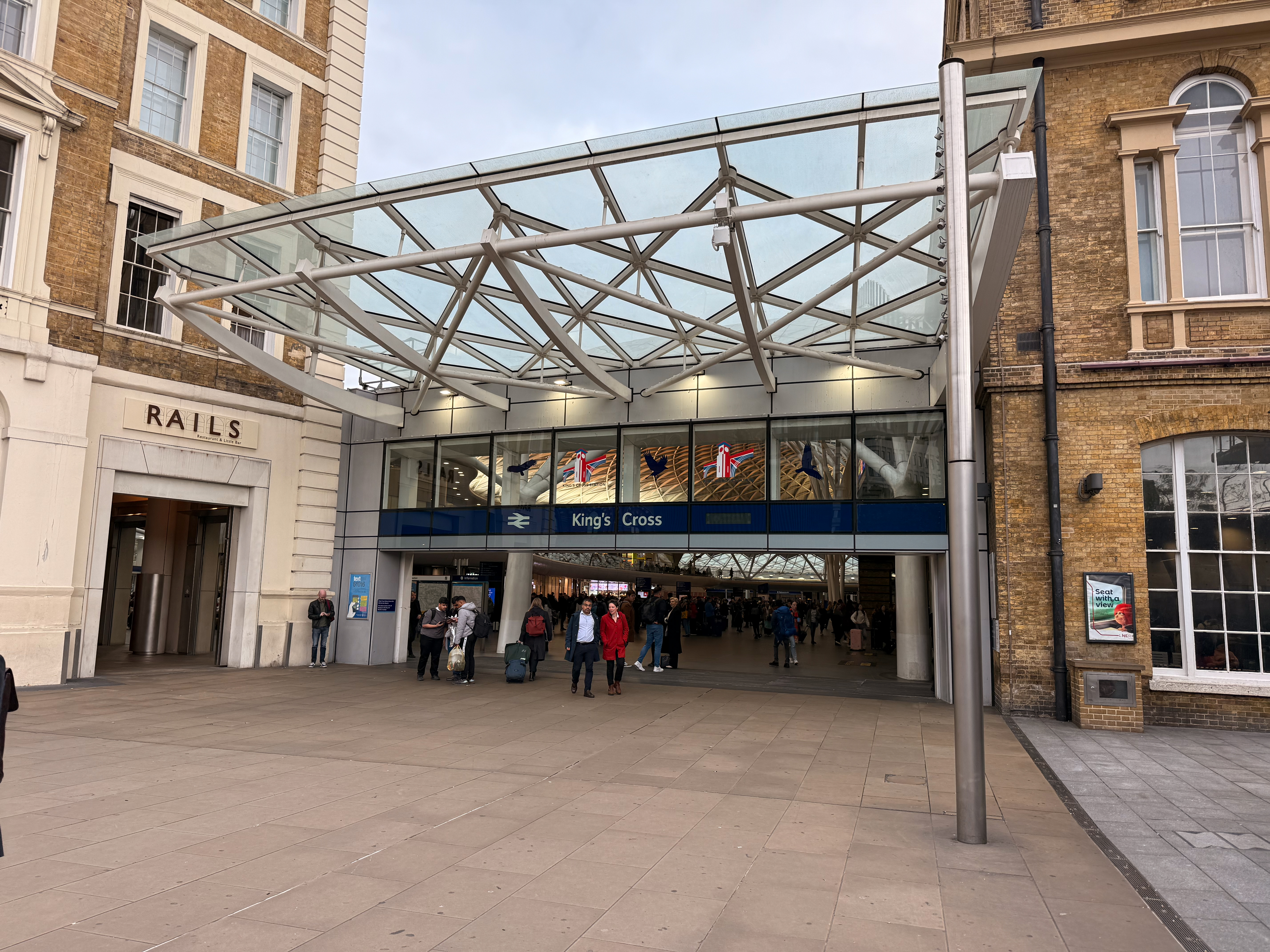
This Photographic Style warms up your image, with a focus on red tones. Seems like a good way to make drab-looking images more appealing and eye-catching.
This shot of the main entrance to London King's Cross station looks fine, but hardly shows one of London's most important gates to the rest of the U.K. in its best light. Applying the Amber style, elements like the sky and the surrounding buildings are warmer, with some spots like the red coat and backpack of the people entering and exiting the station becoming major focal points. I don't claim to be a professional photographer of any sort, but if I had to pick one of these two shots to present to the station's marketing department, the Amber-ified one is the one I'd pick.
Get instant access to breaking news, the hottest reviews, great deals and helpful tips.
Dramatic
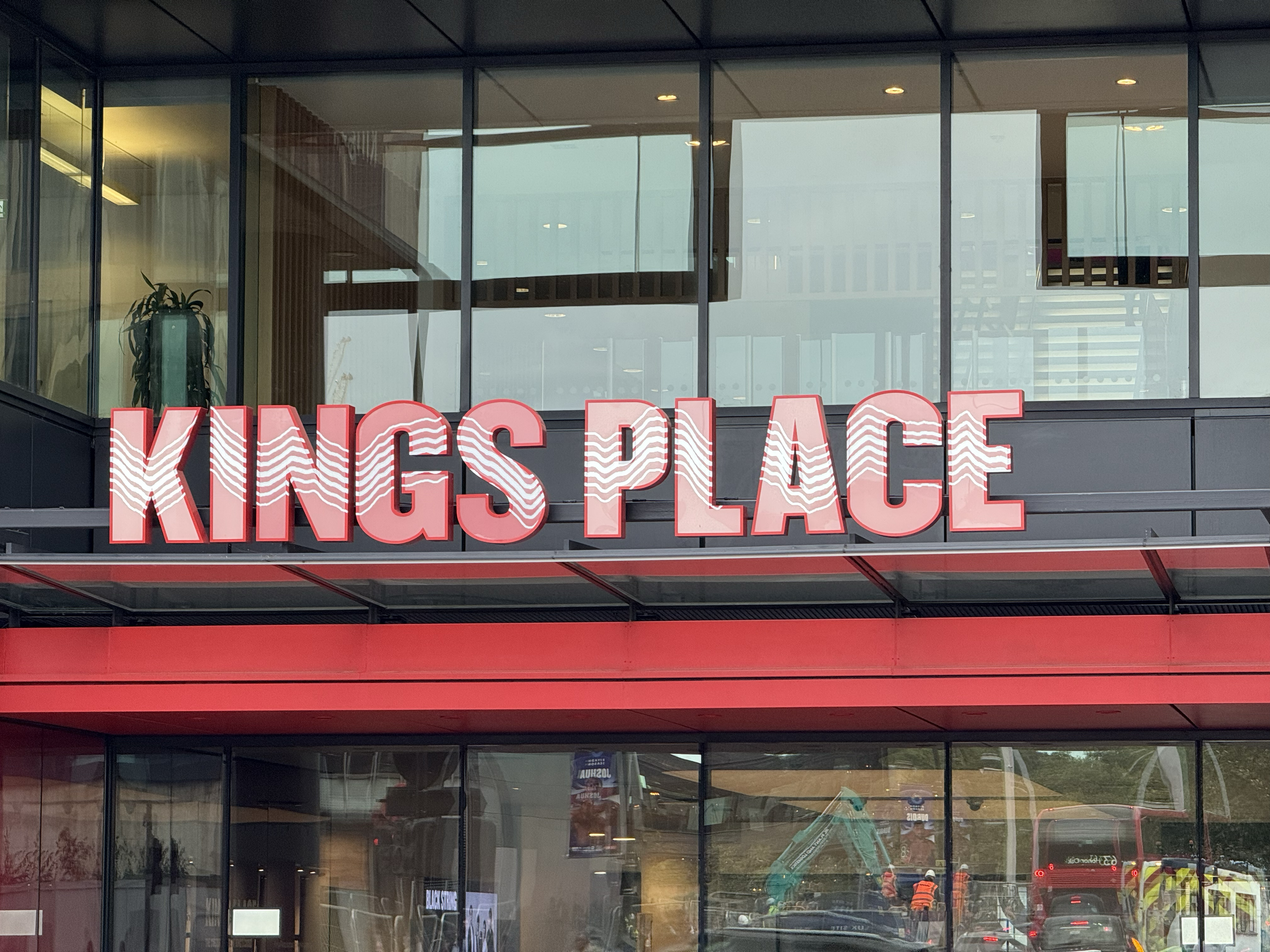
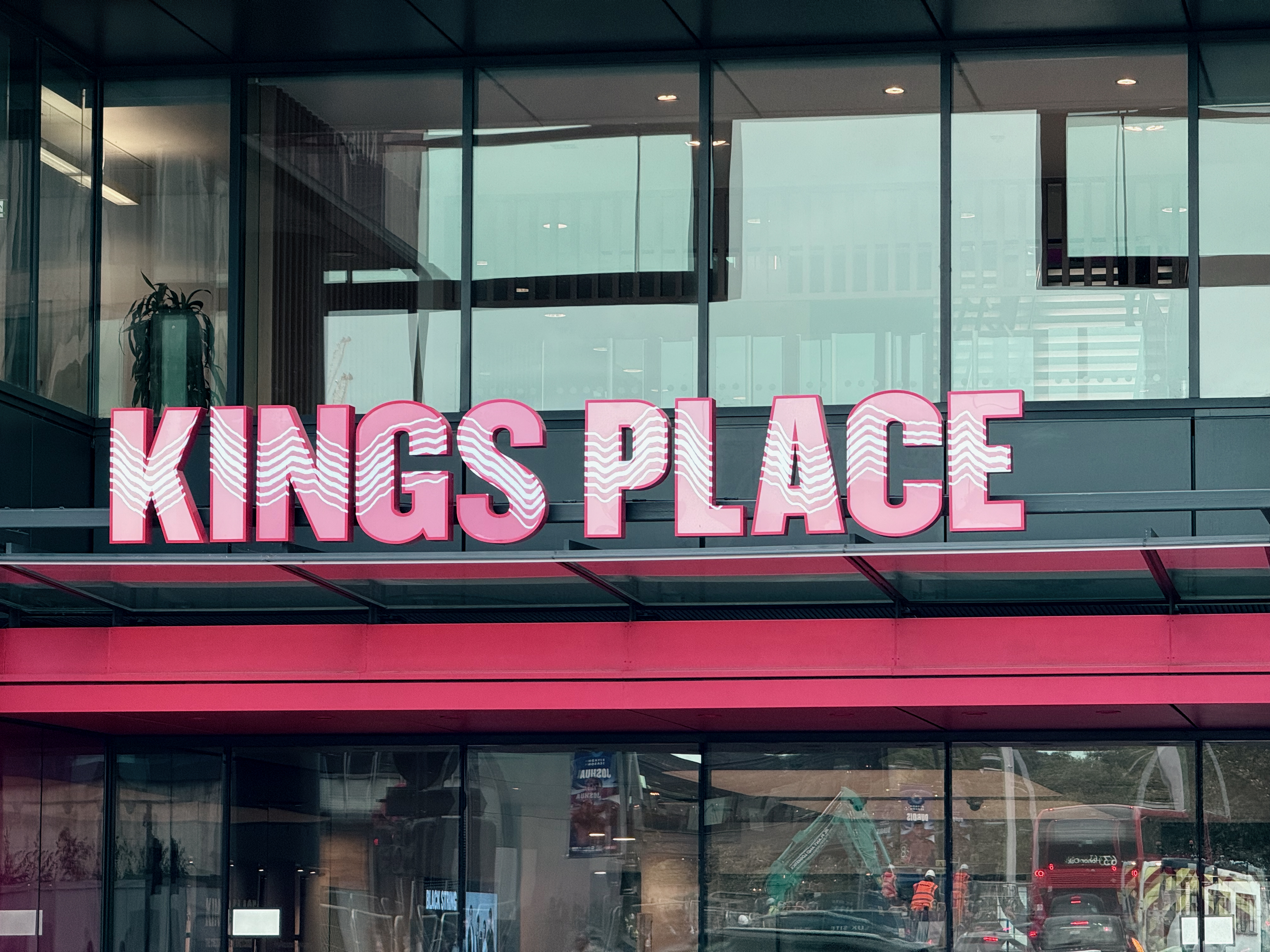
Dramatic is the Photographic Style you need if you need to add some moodiness to a shot. Namely, it tones down red colors and spreads the colors away from mid-level brightness, making them lighter or darker depending which side of the line they fall on.
Kings Place sounds like a place in need of some drama, so I applied the filter. The reds in the sign and above the doors are much more muted, with a blue-gray tone becoming much more dominant. This location now feels like it would now be right at home in one of those grim Scandinavian crime dramas my parents like to watch.
Stark Black and White
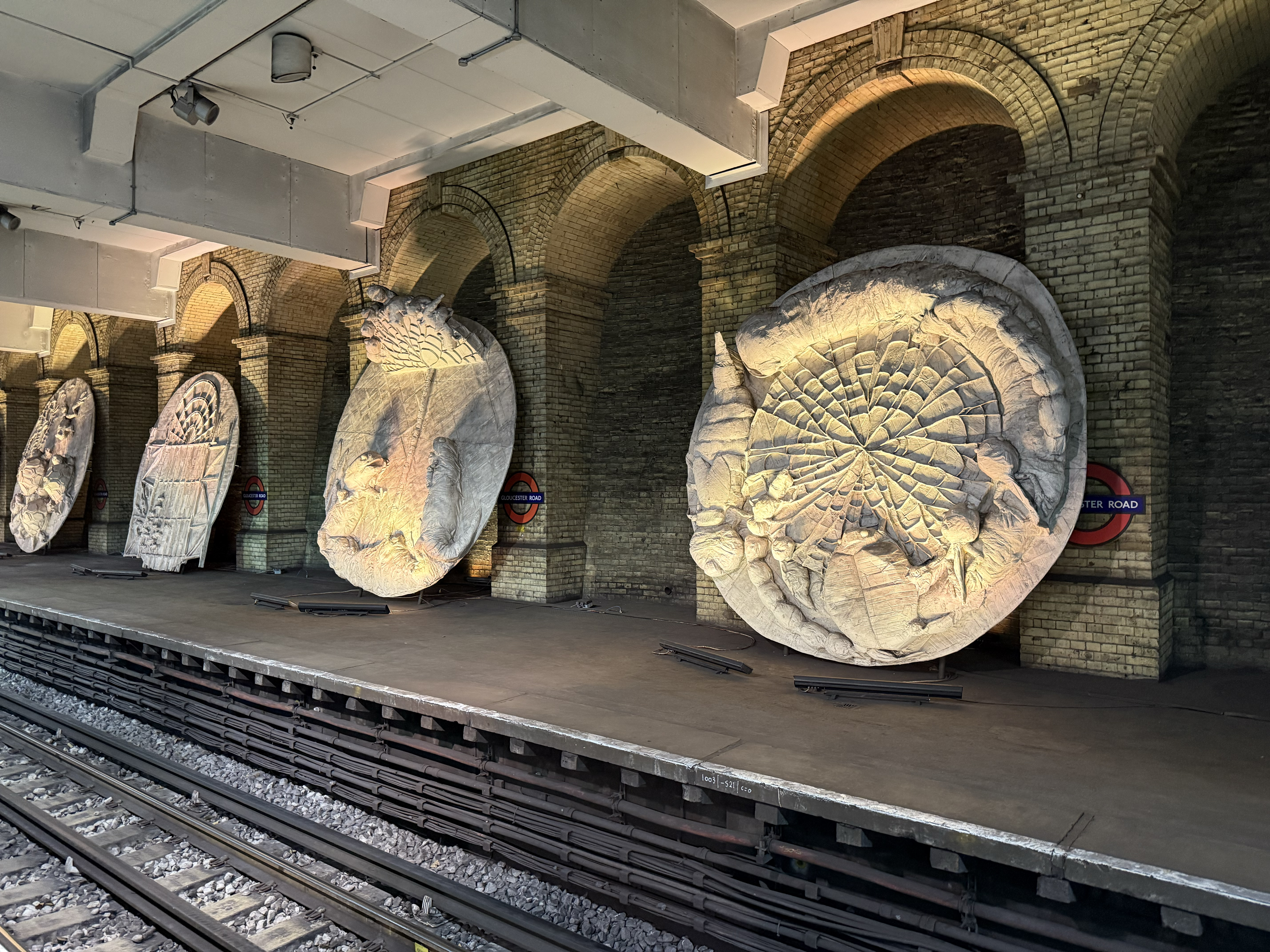
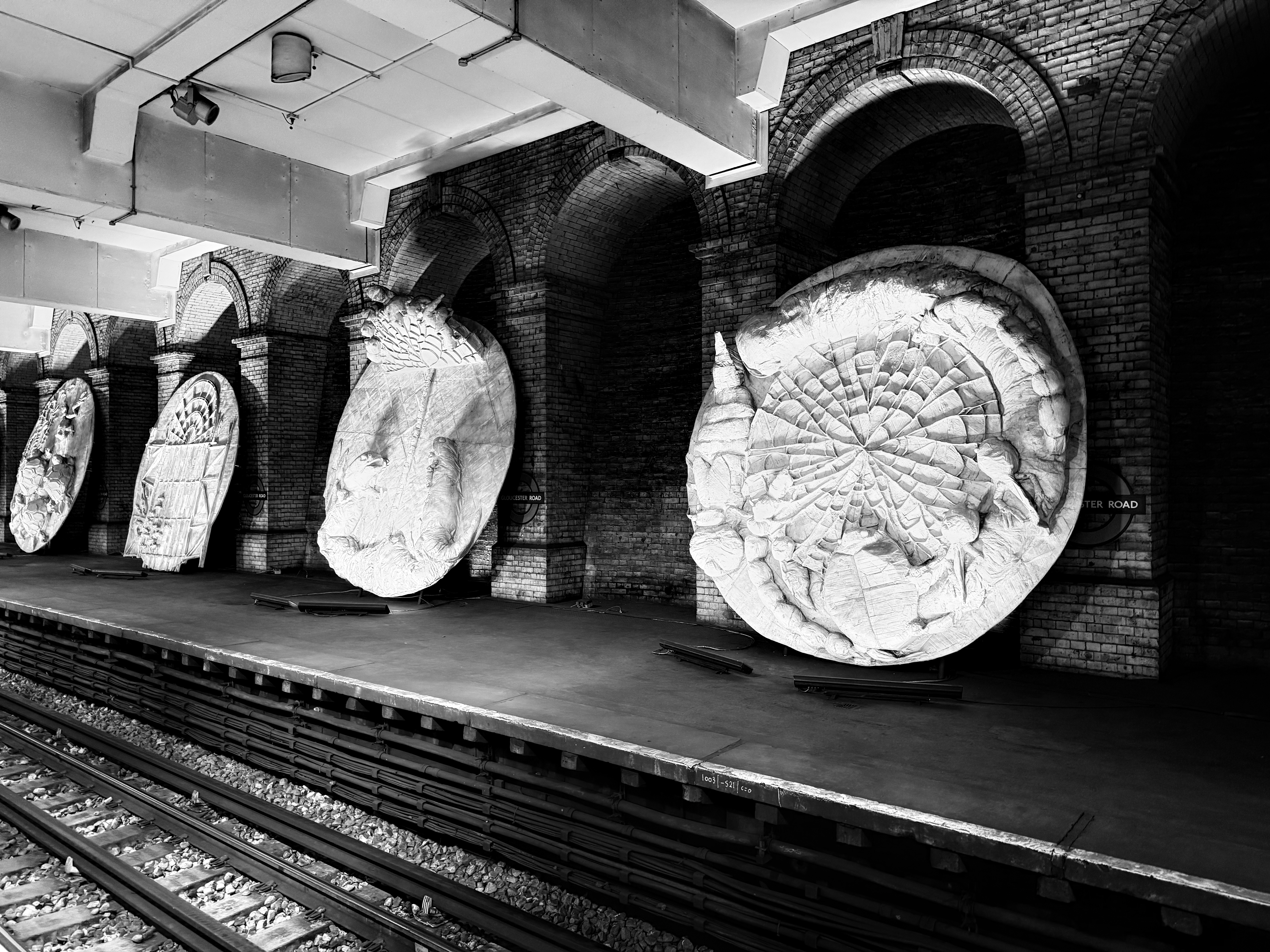
If you want your monochrome photo to punch you in the face with its highlights and shadows, this is the Photographic Style for you. Rather than a desaturated version of your regular photo that the regular B&W mode offers, the Stark B&W style produces a far more dramatic effect.
There are already some dramatic bright and dark spots in this shot of sculptures at the Gloucester Road Underground station. Stark B&W makes this light difference even more, well, stark. Mess around with this photo a little more and I reckon you could get a convincingly old-fashioned black-and-white image.
Luminous
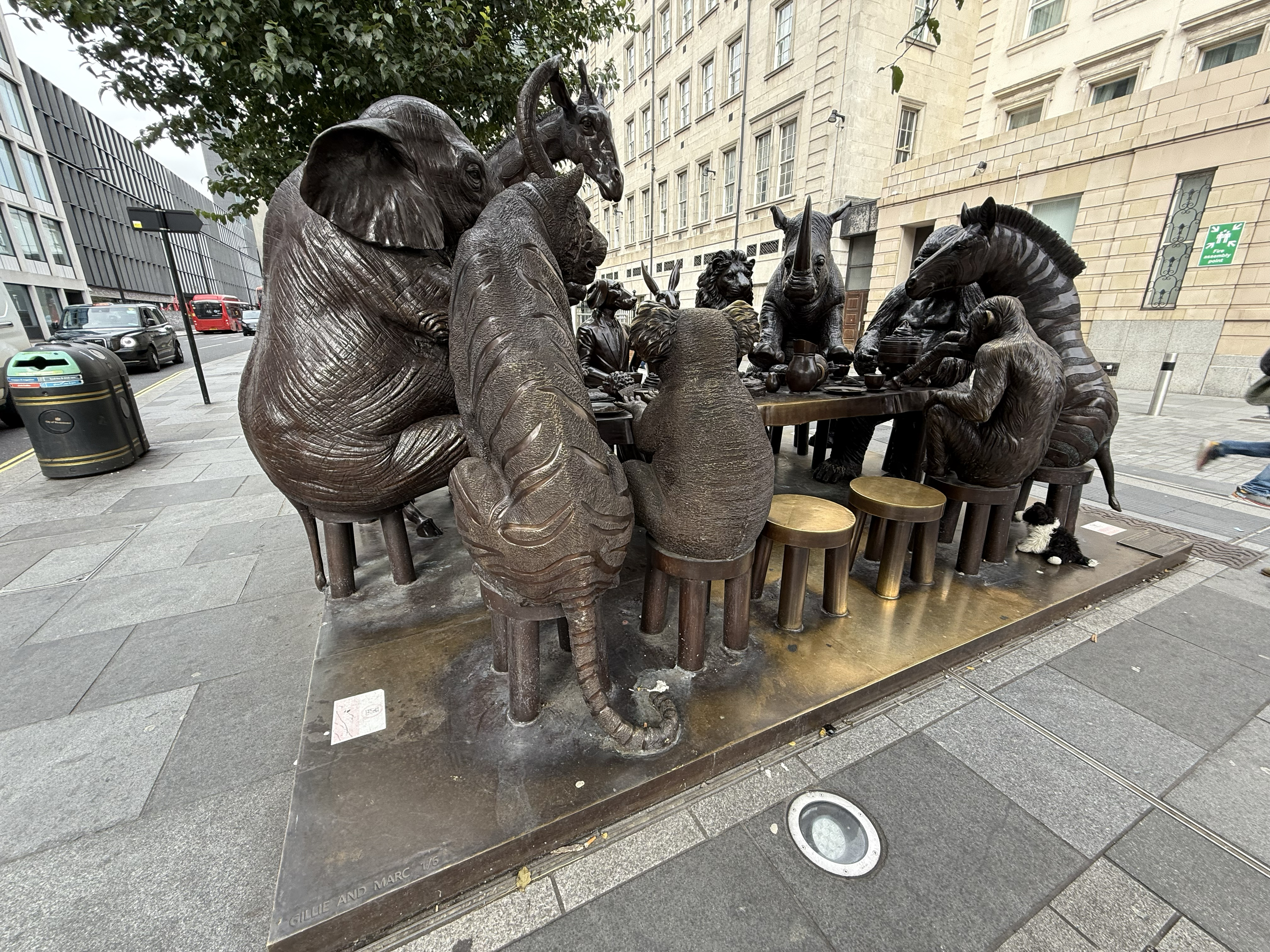
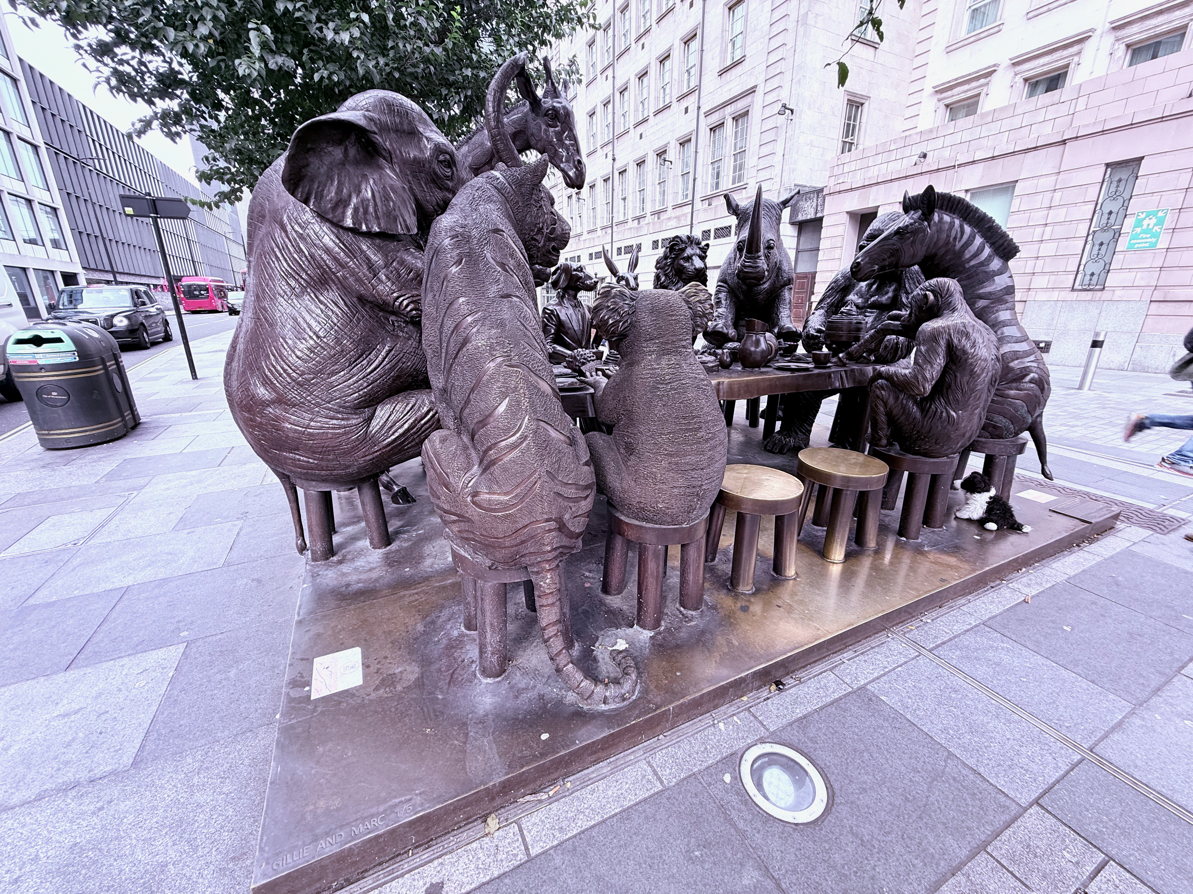
I struggled to find a good way to use Luminous, a Photographic Style that drains the blue out of all but the brightest spots of your photo and cranks up the brightness of the remaining colors. Unless you've got a particularly dark image to begin with, it's hard to know where to use this.
Fortunately, I had this photo of some metal statues outside Paddington Station, which has some awkwardly harsh shadows spoiling the view of this animal dinner party sculpture. But Luminous helps reveal parts of the image like the zebra's face, plus it gives the whole absurd scene a suitably otherworldly vibe thanks to the extreme coloring of the surrounding buildings.
Cozy
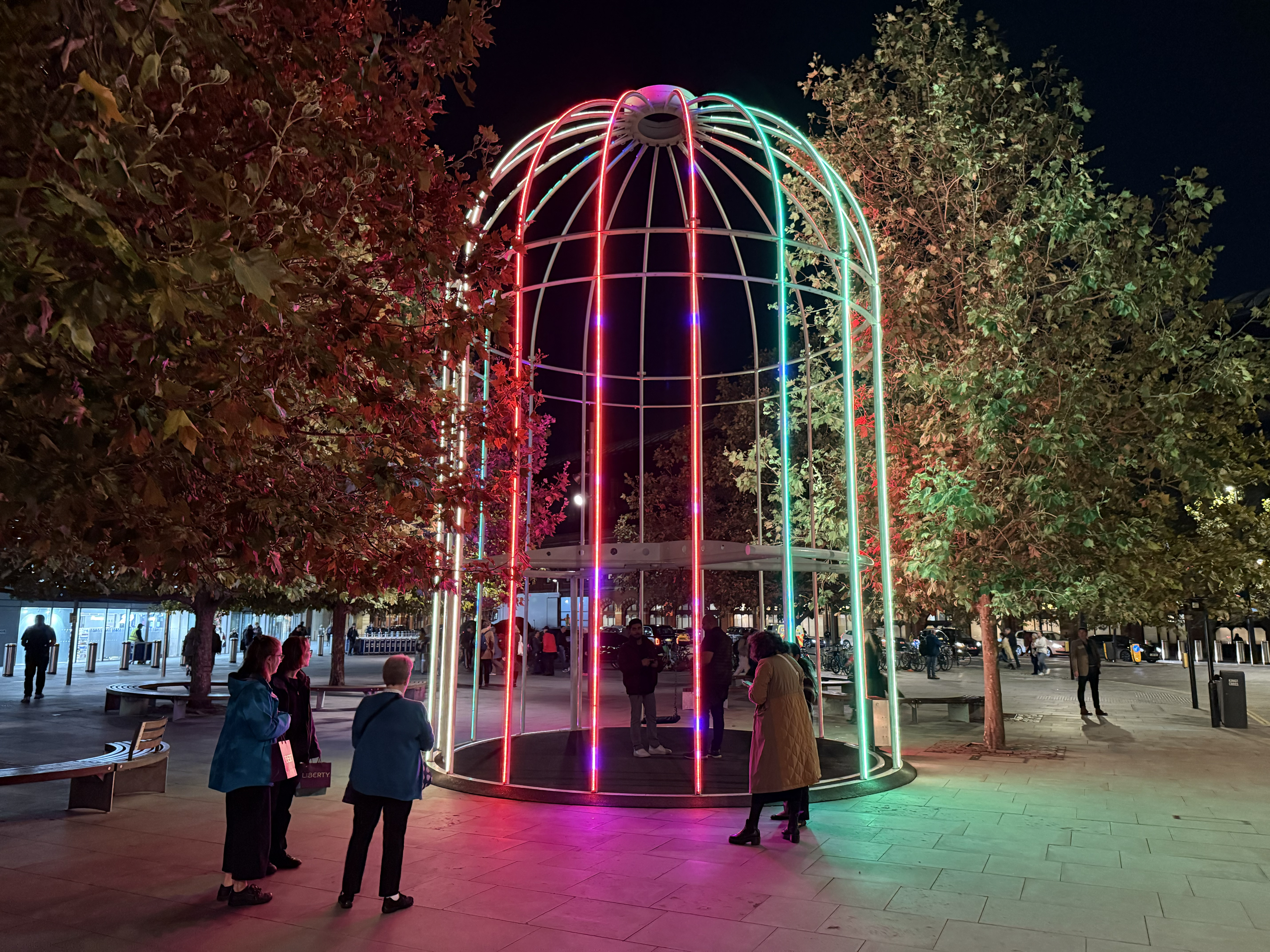
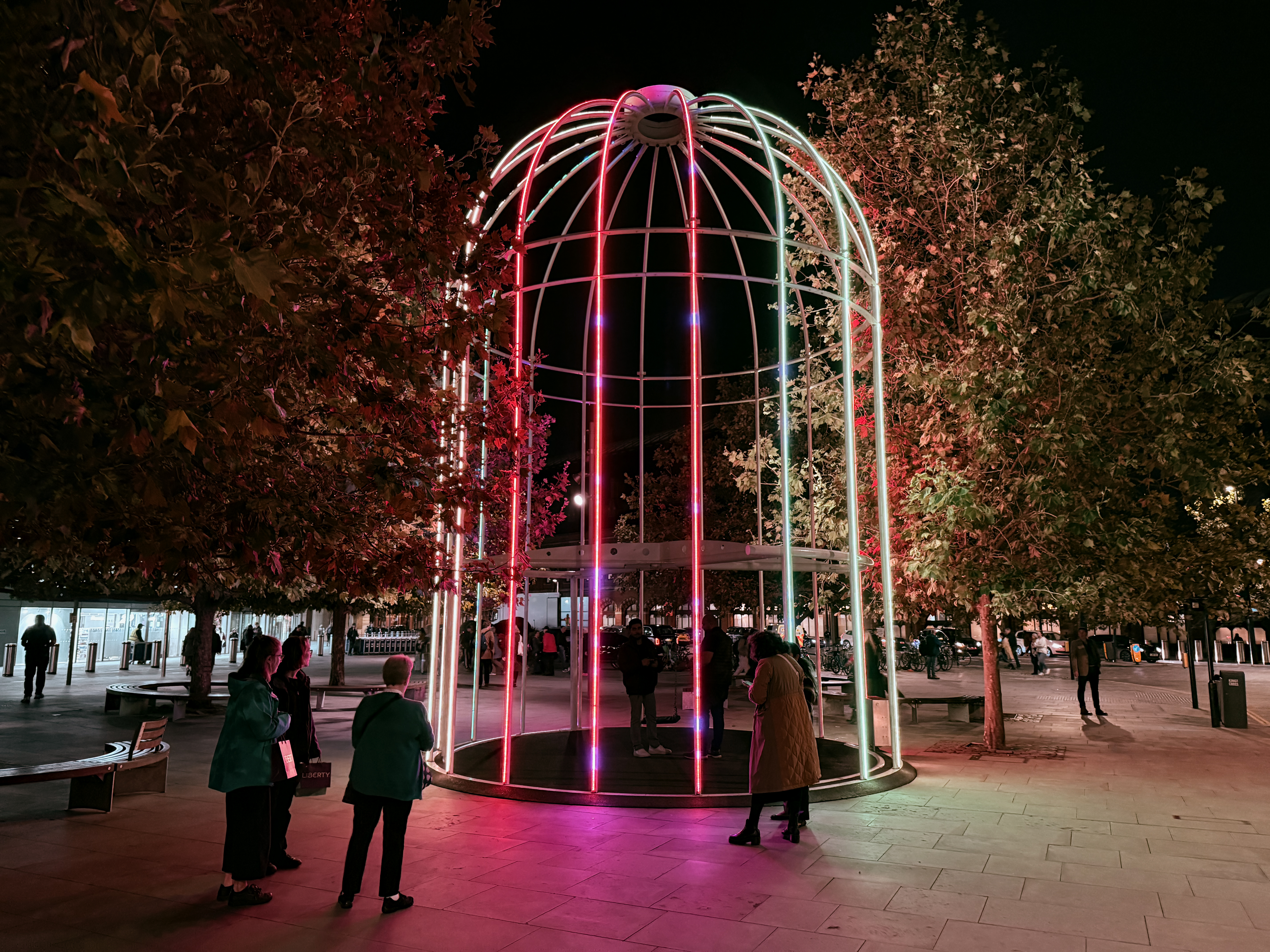
I don't know what it is about brightening a photo's red elements and darkening the blue and yellow ones that makes it cozy, but that is nonetheless what this Photographic Style does.
This was one of the trickier styles to demonstrate in a way I liked, but this photo has benefitted from the Cozy effect in my opinion. The Photographic Style eliminates some of the surrounding light in this scene of a glowing cage structure near Kings Cross, helping to focus the eye on the centerpoint of the scene. And since a large part of the central lit elements are red, the subject pops out even more.
Quiet
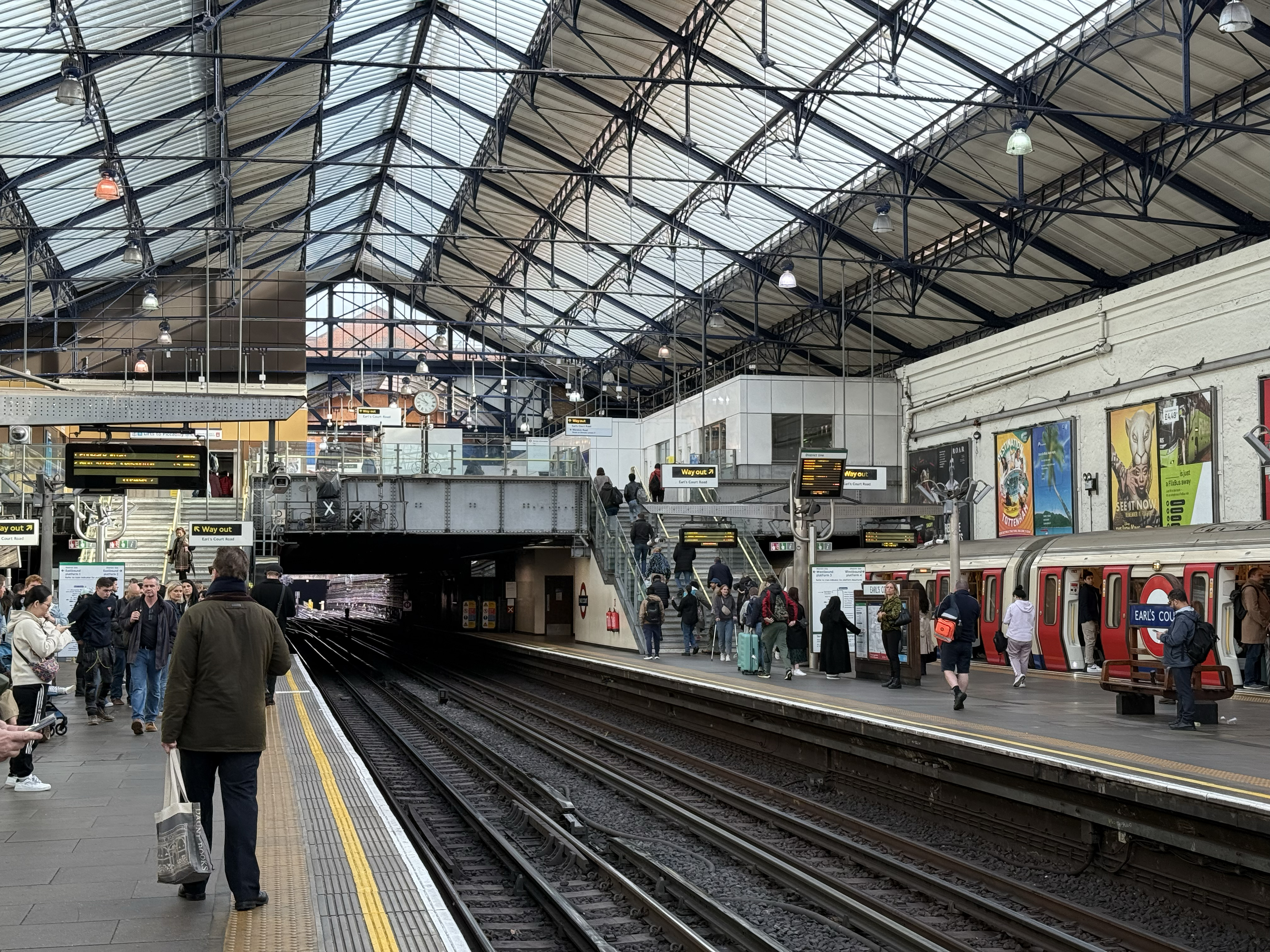
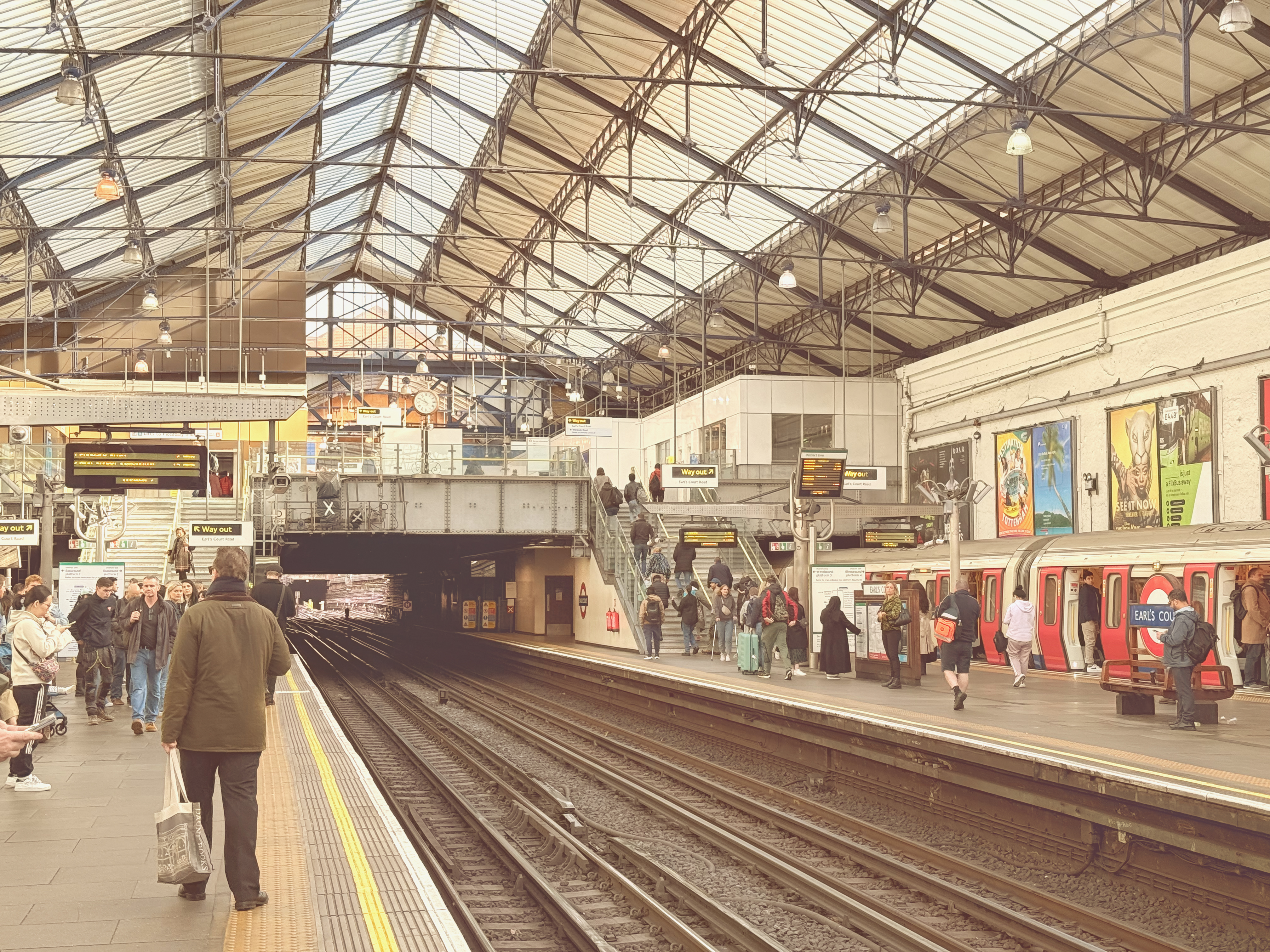
This was the hardest Photographic Style to find a use for in my collection of photos. The sepia-esque effect bundles up all the shadows and warms them up, then darkens the blue, lightens the red, and pushes the green up to the proverbial 11, which doesn't really lend itself to my collection of more modern architecture or nature shots.
Fortunately, a stop at Earl's Court Underground station ended up being a good fit for Quiet. The well-lit indoor space with one obvious shadowy portion under the mezzanine level makes the brightness shift clear, and livens up otherwise drab elements like the opaque parts of the ceiling or the dark clothes of the waiting passengers. The result's a photo with an old-timey feel, suitable for a station that's been operating for over 150 years.
Gold
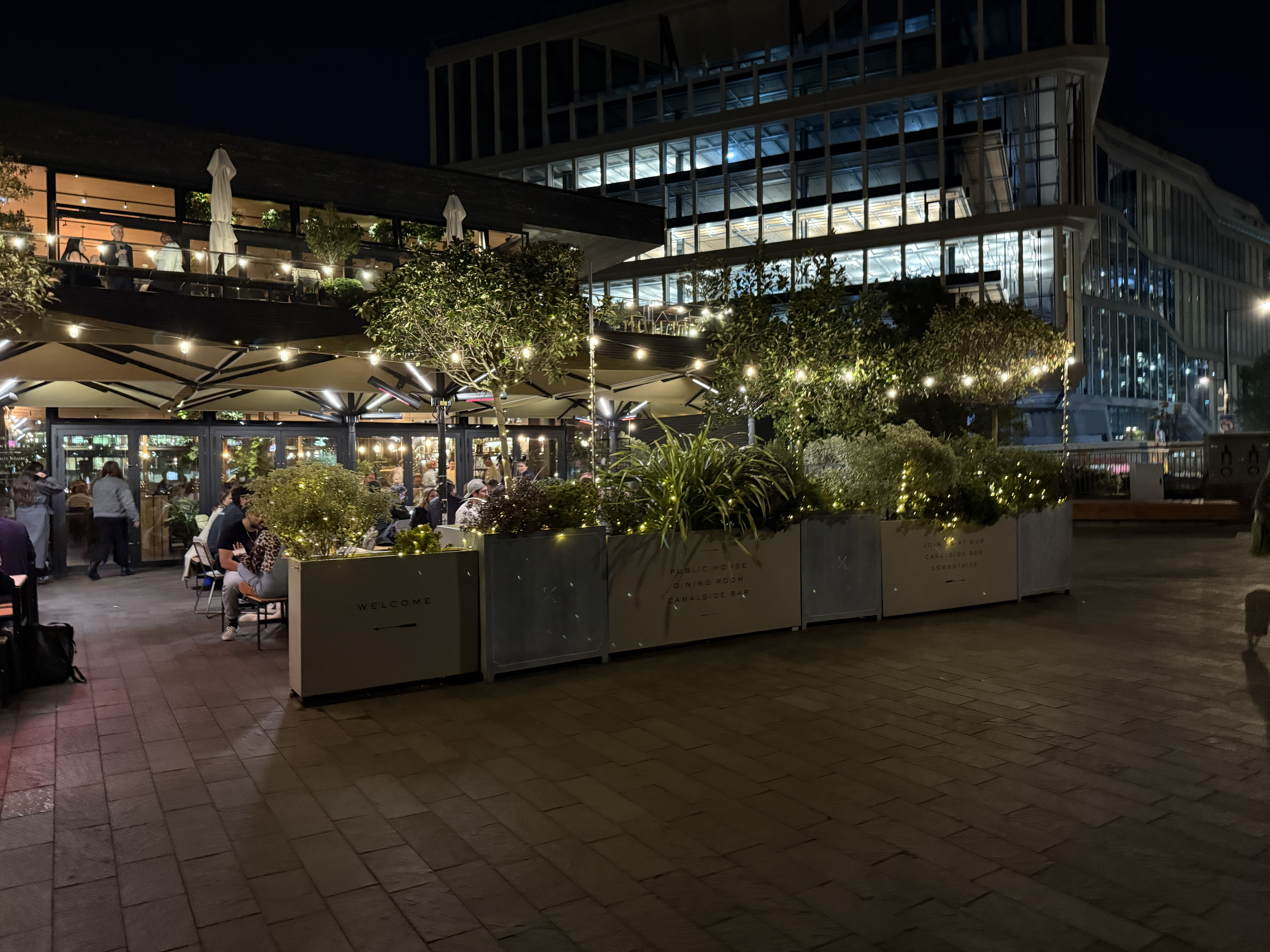
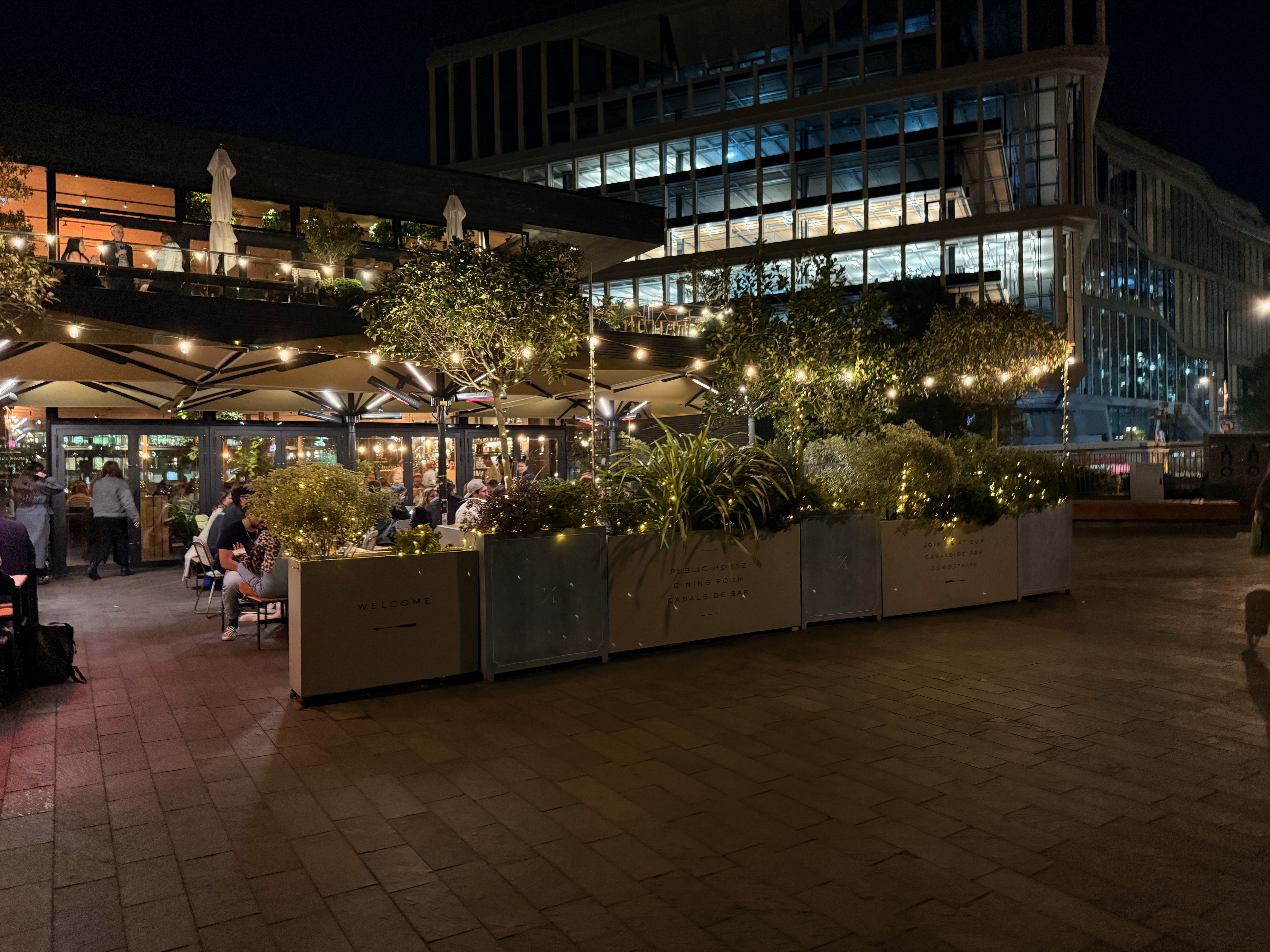
My personal favorite style is Gold, which give your image a little brightness boost and an understandable increase in yellow-orange-red colors. I've found it works basically anywhere you've got a strong source of natural light, or with the right quality of artificial light too.
This shot of a restaurant's outdoor dining area covered with fairy lights looks extra magical with the Gold Photographic Style in use. The warmer color temperature helps the image feel more cohesive, while the brightness increase helps you make out the building in the middle distance.
Neutral
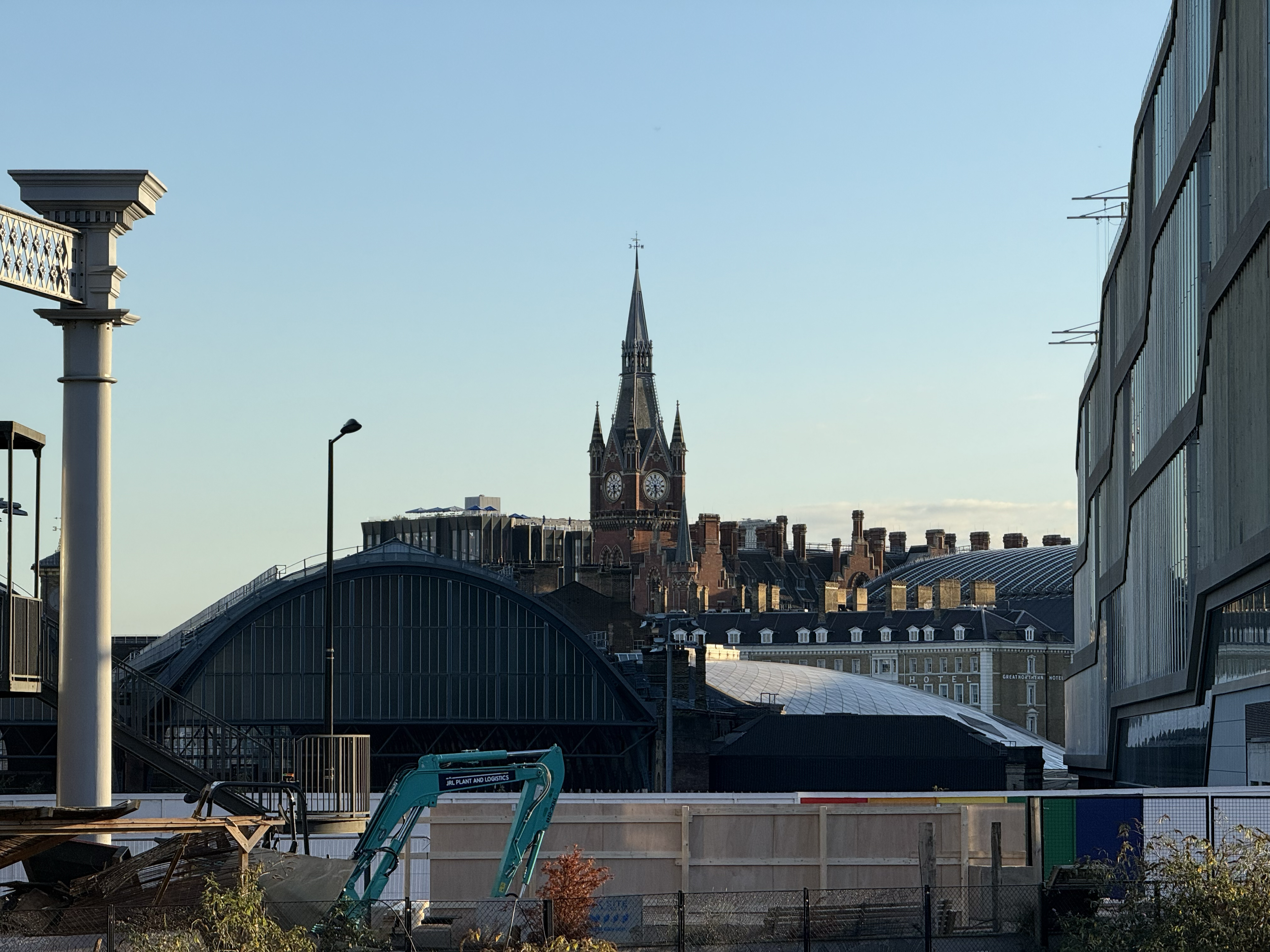
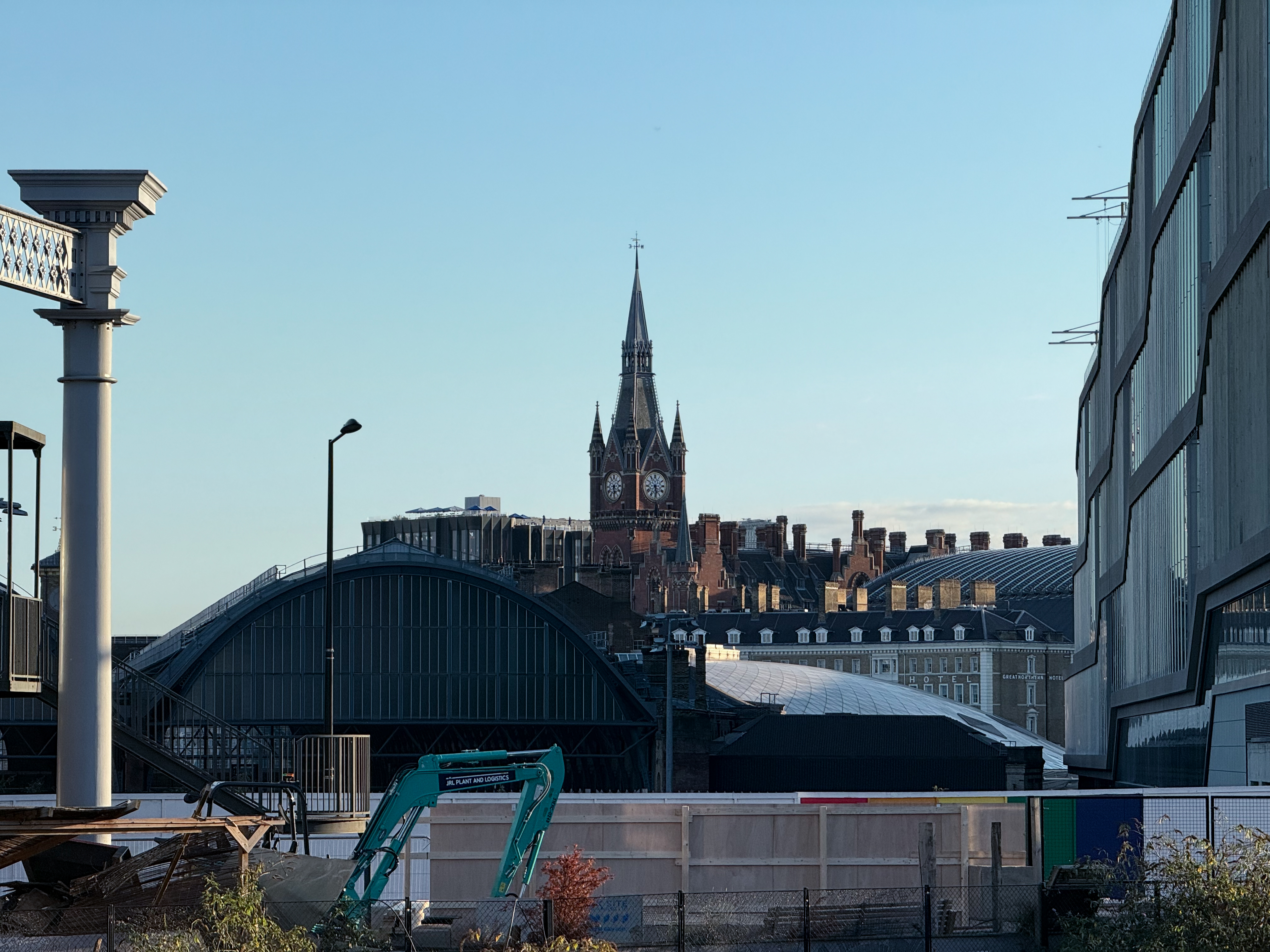
It's hard to describe the effect of the Neutral Photographic Style. It offers a flat bump to all colors around mid to high brightness, which can be very subtle, unless you give it a large-enough canvas to work on.
This shot across Kings Cross station to the St. Pancras Hotel clock tower was taken towards sunset, as you can see from the yellowing sky down towards the horizon. But the Neutral style has eliminated this, making it look as if I took this photo much earlier in the day. Not bad for something as plainly named as the Neutral style.
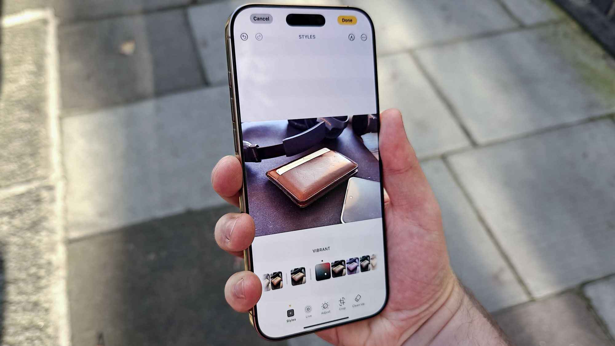
Vibrant
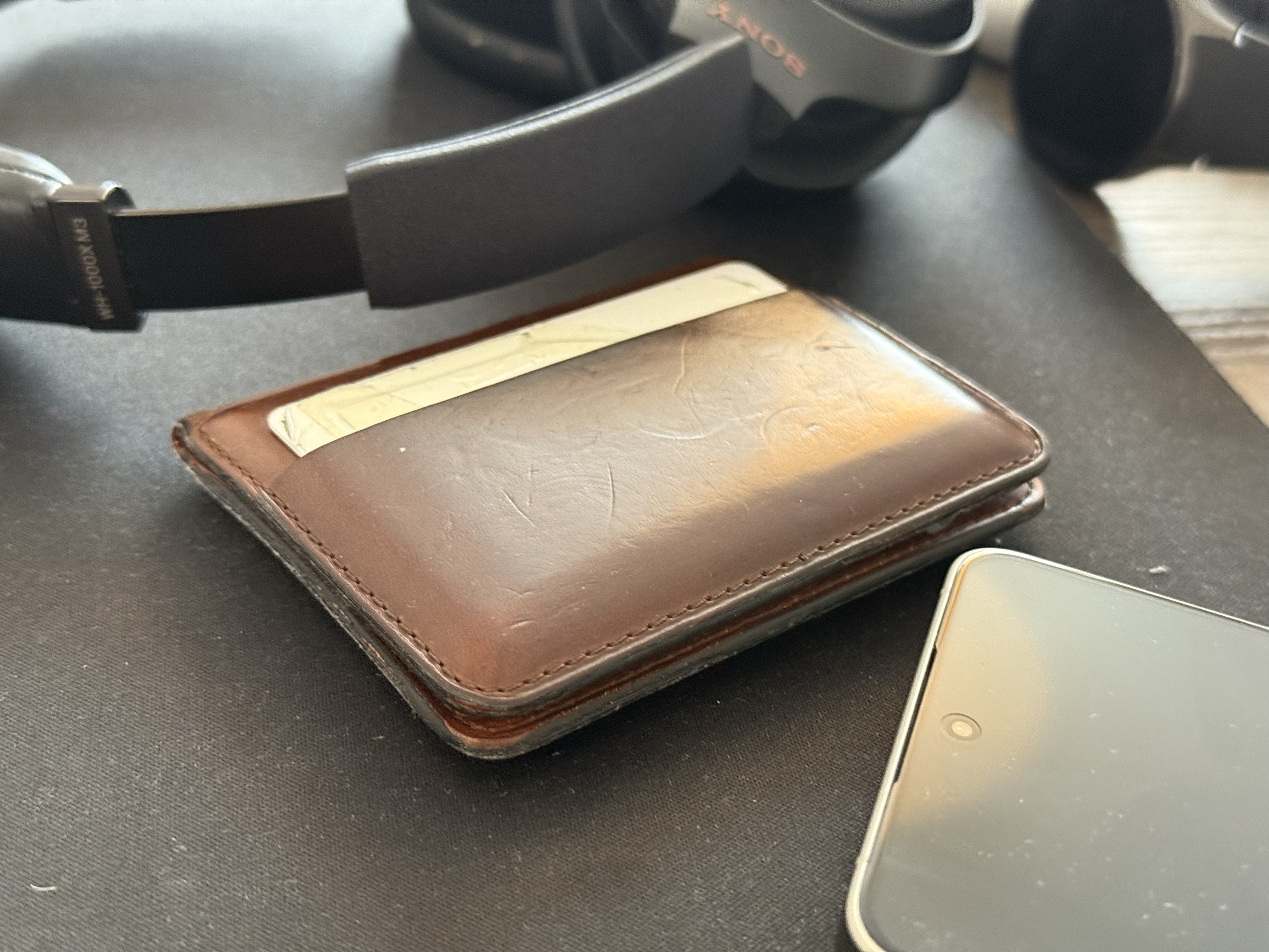
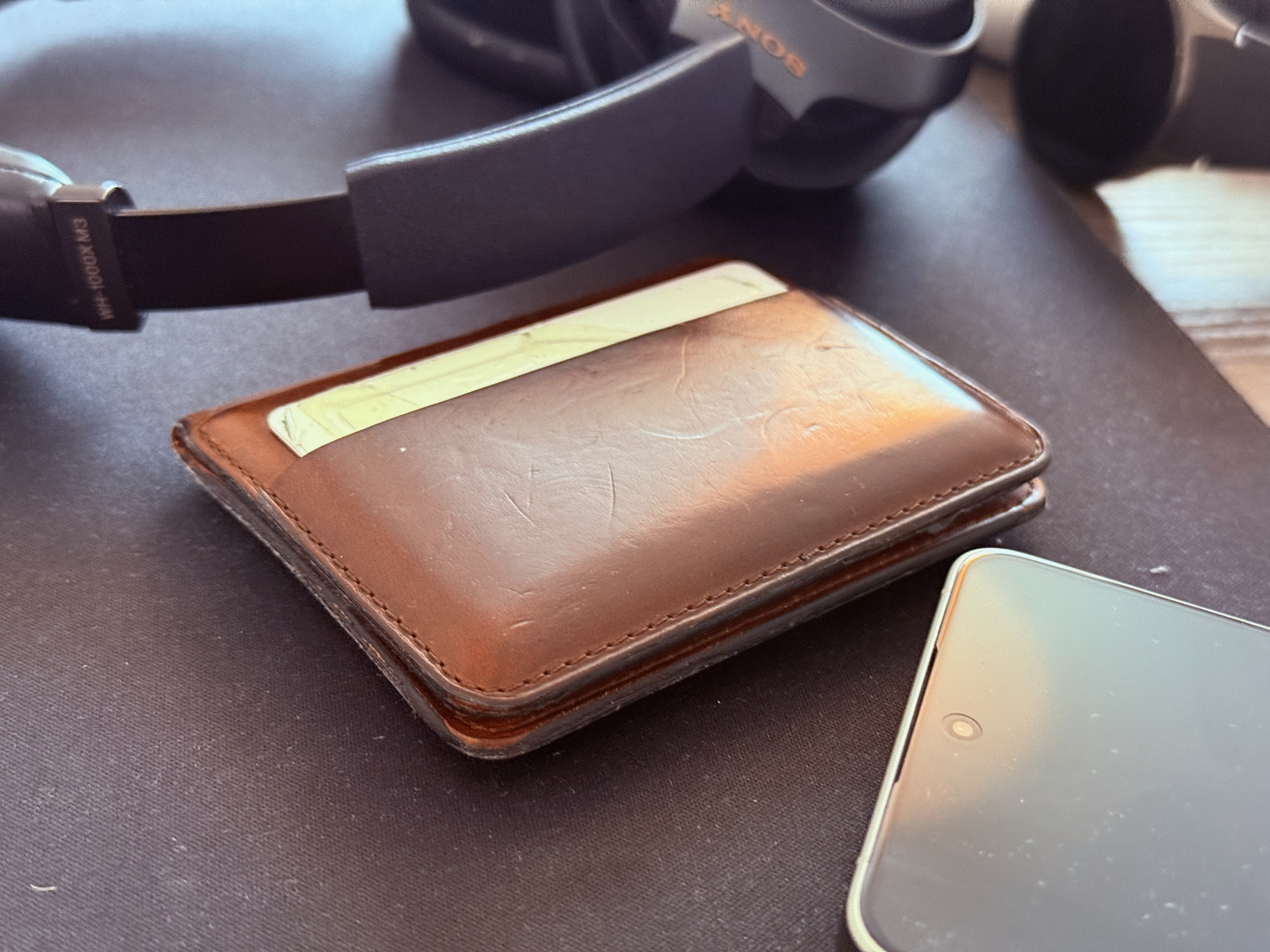
True to its name, Vibrant is the Photographic Style to use if you want to bring out the colors in your image. You lose some of the detail in the highlights in the process, though.
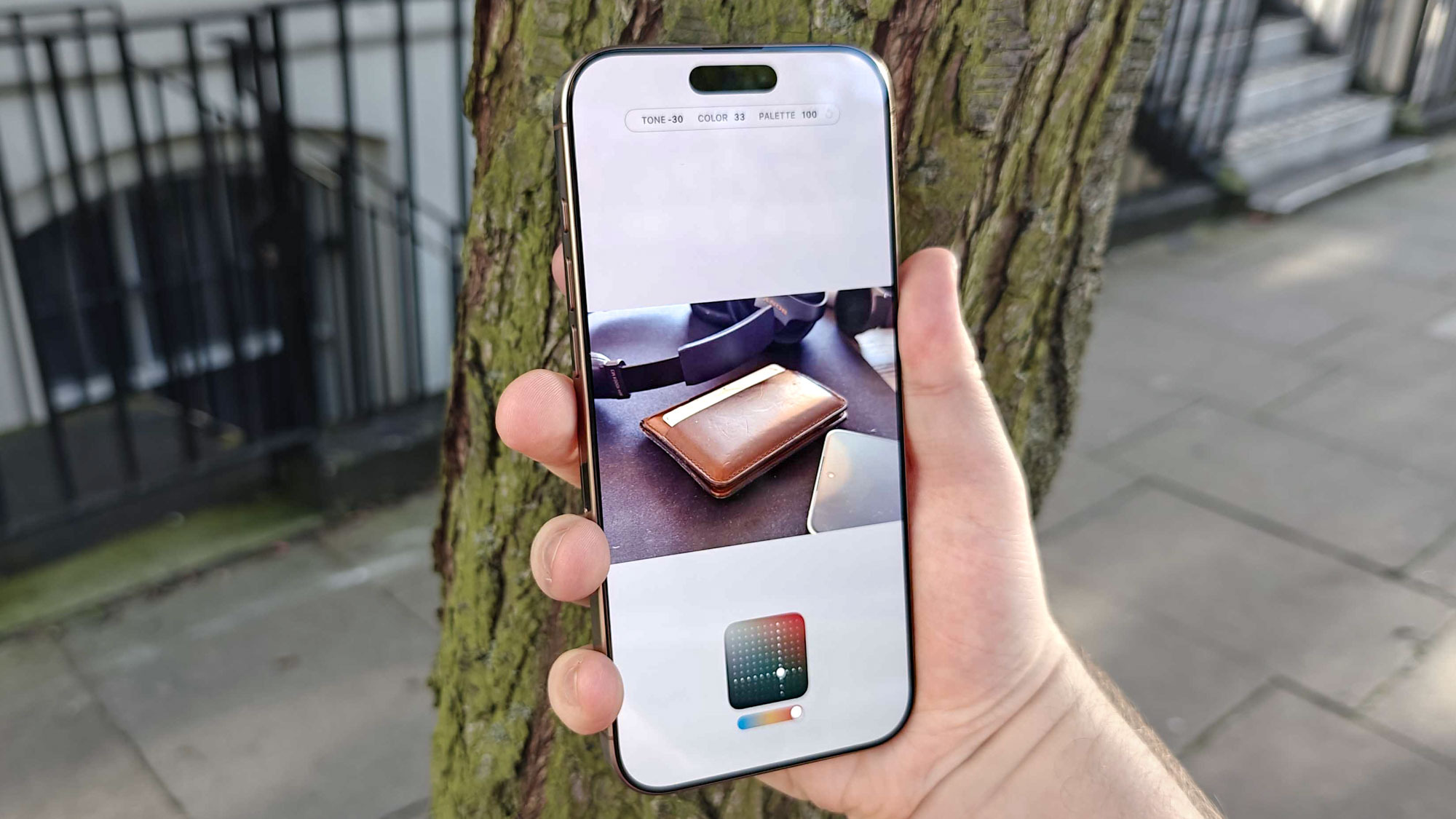
This photo of my wallet surrounded by some other items on my desk wasn't originally intended for this piece. However when messing around with the editing menu, I fell in love with how this photo of one plain brown object surrounded by other plain black ones is given new life. I wouldn't have ever described my old mouse mat as colorful until the Vibrant style revealed the hidden gold and pink tones within.
Rose Gold
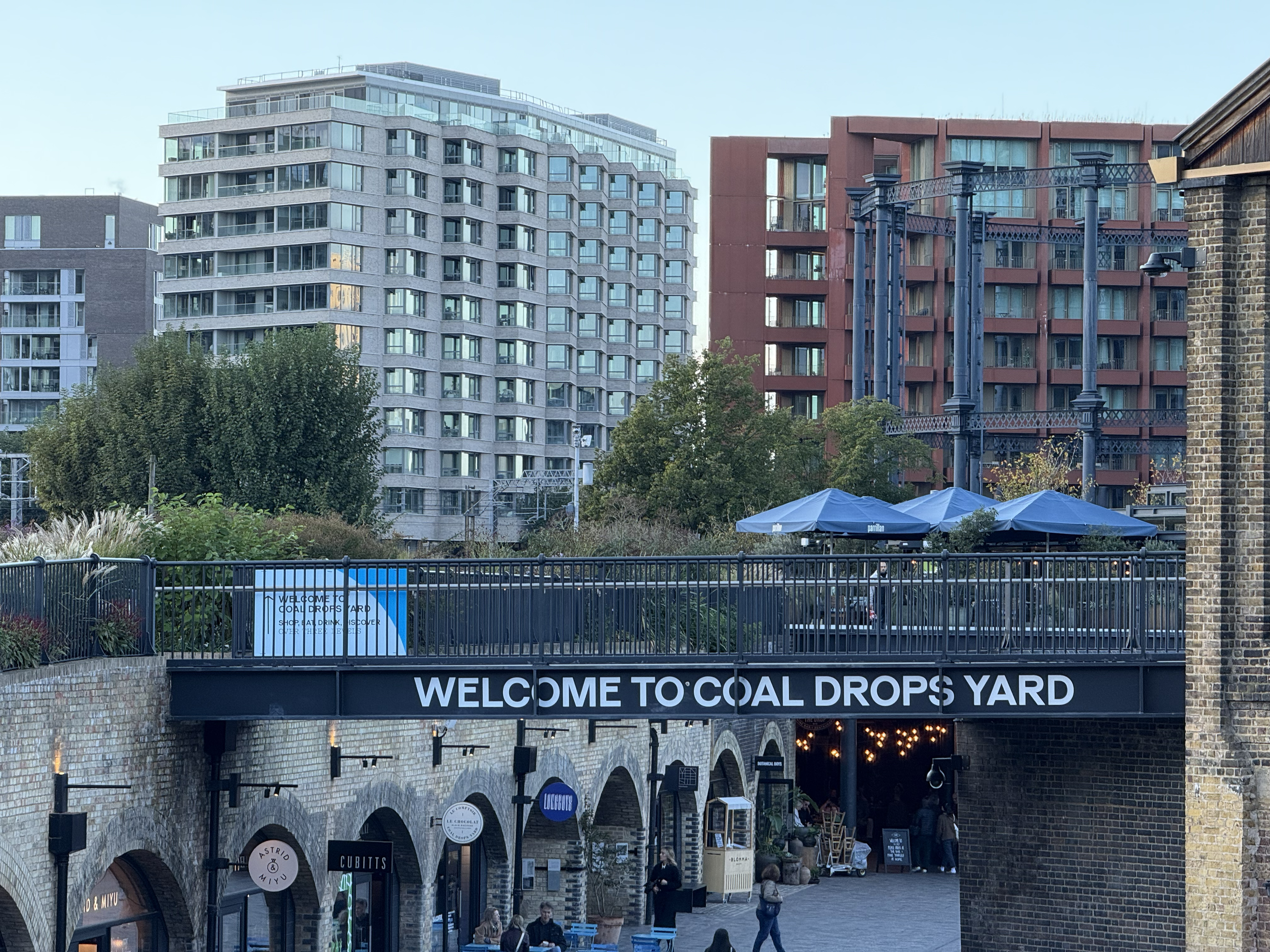
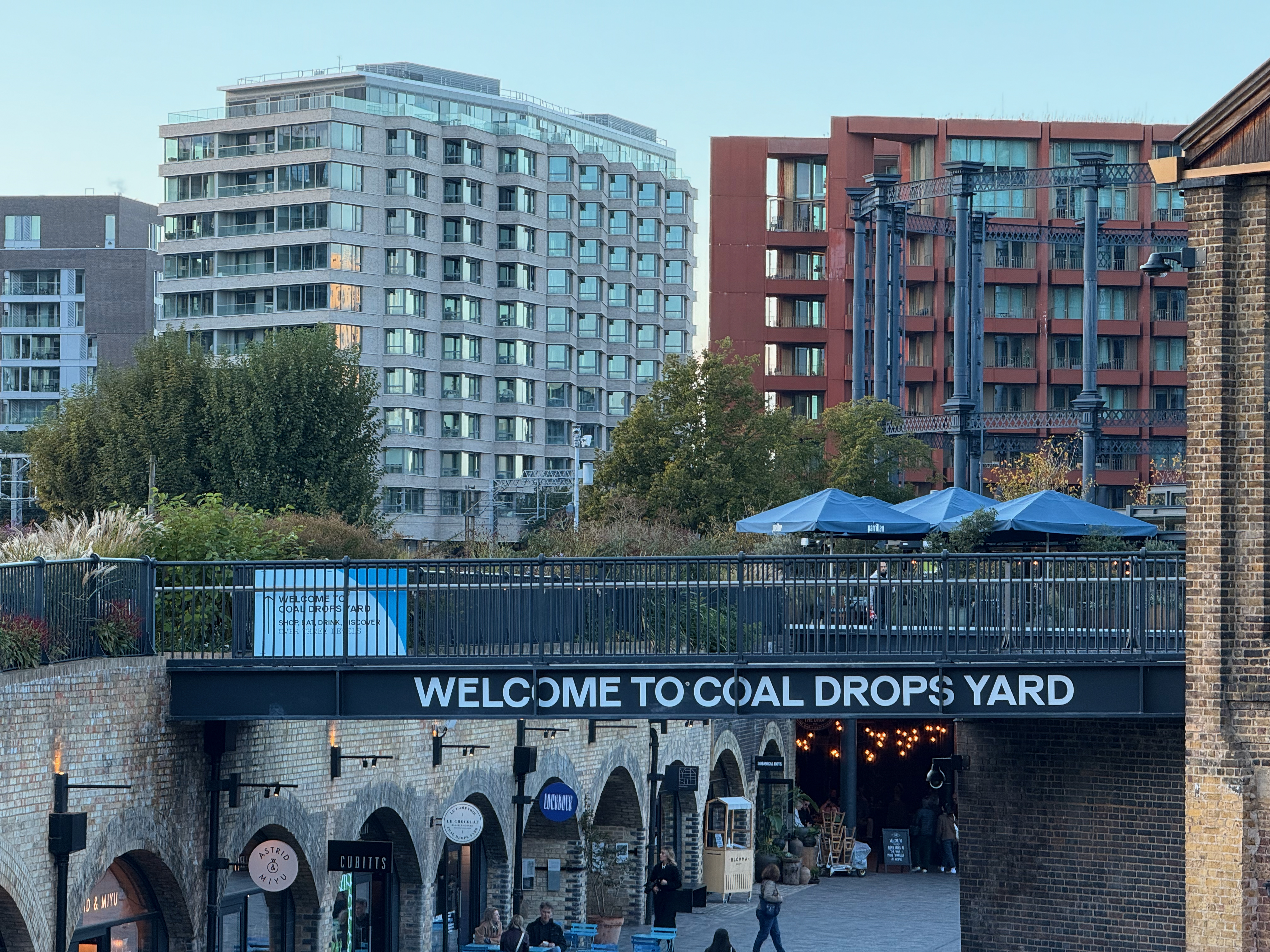
Effectively blending two of the other styles together, Rose Gold Brightens red above a certain threshold and reduces it slightly if below it. This results in a richer, fuller look compared to Cool Rose's additional focus on blues, but one that's less intense than Gold.
We're looking out over Coal Drops Yard in this shot, and our chosen Photographic Style makes the bricks of the surrounding buildings, as well as the sky, brighter and more yellow. The result is a slight shift in apparent the time of day towards sunset. With some more deliberate framing and timing, you could fake your way to a "golden hour" shot with ease via Rose Gold.
Ethereal
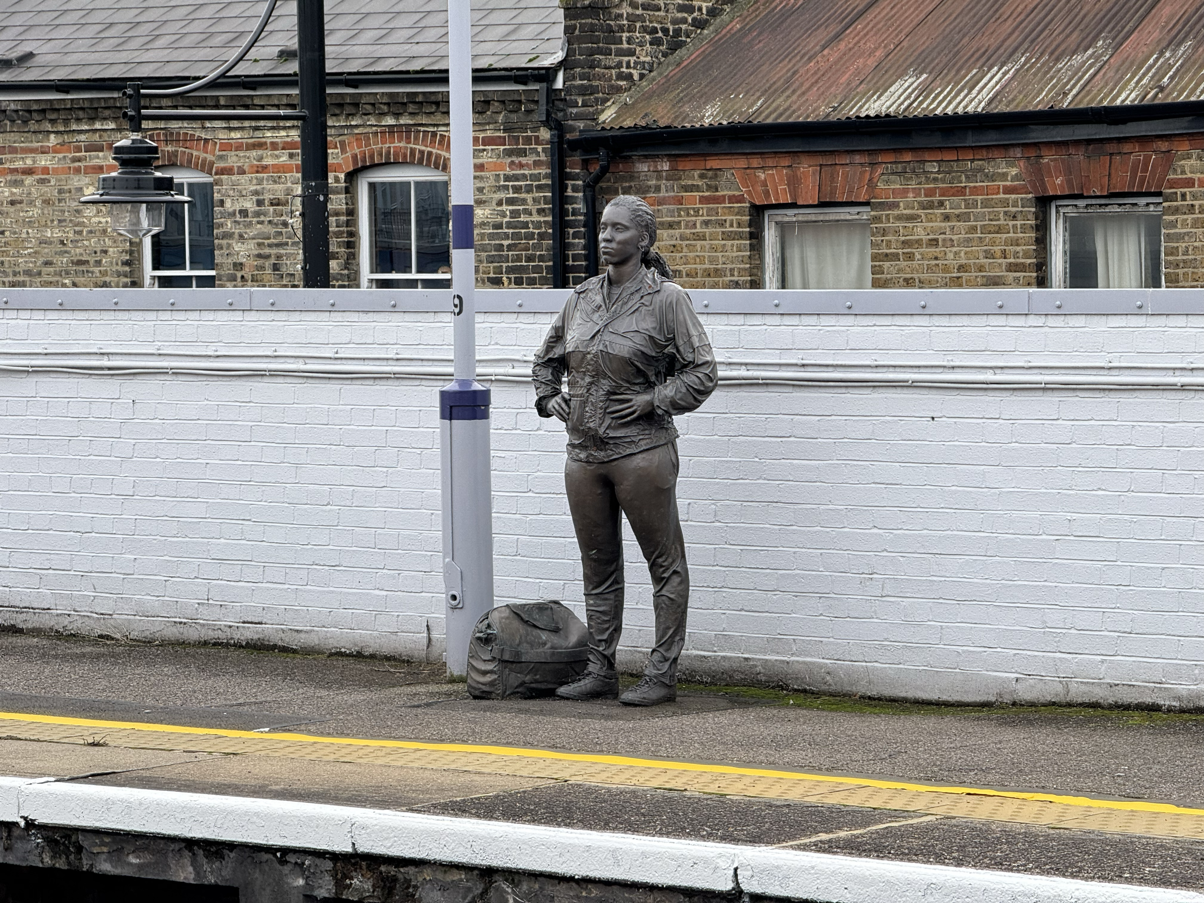
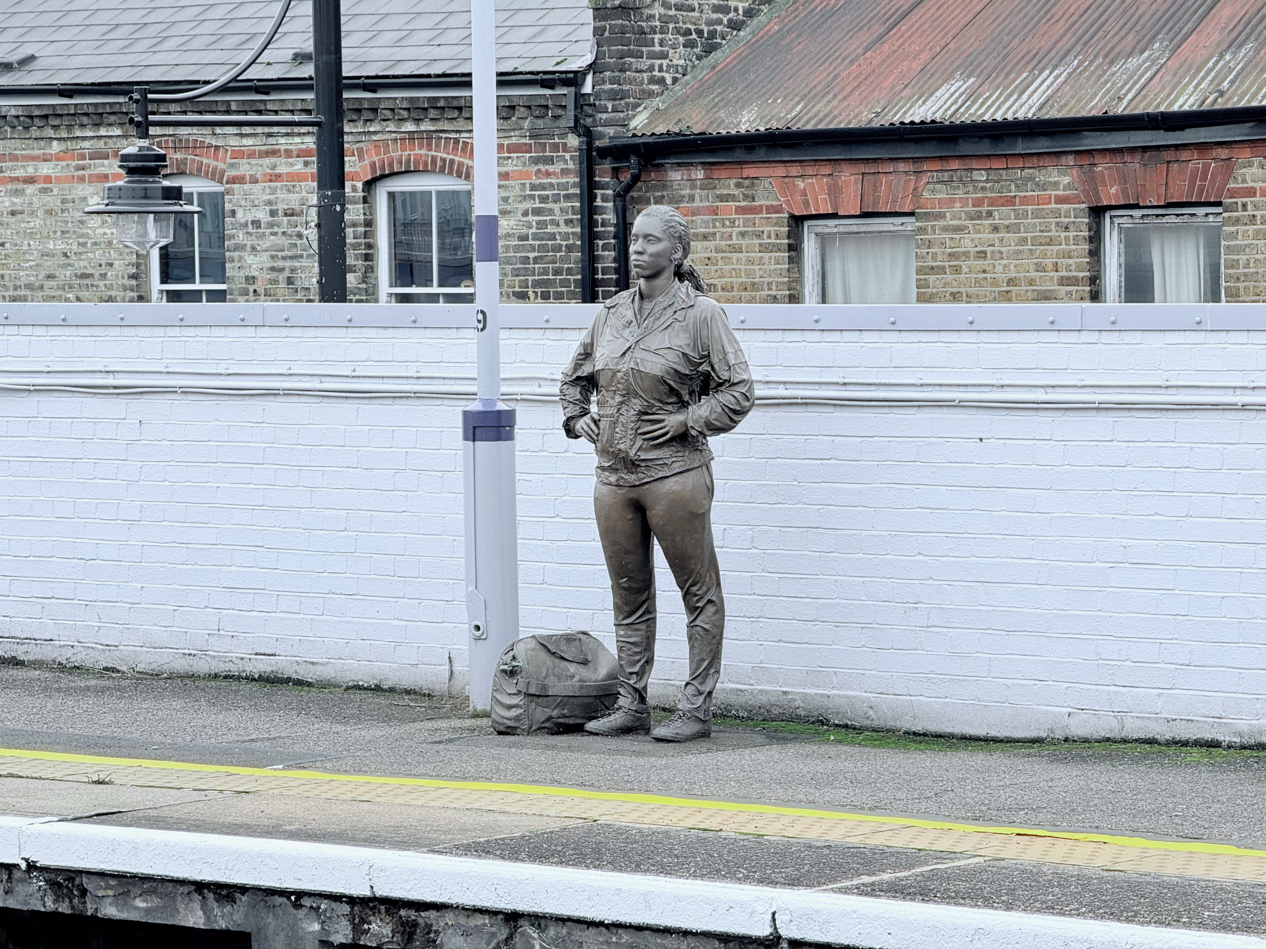
Take your photos to another plane of existence by choosing Ethereal. Or just brighten it up significantly, especially its blue tones.
I like how this shot of a statue on the platform of Brixton station has brightened up the darkest parts of the sculpture. The rest of the image looks a bit washed-out, but it helps sell the unreal look of this style.
Muted B&W
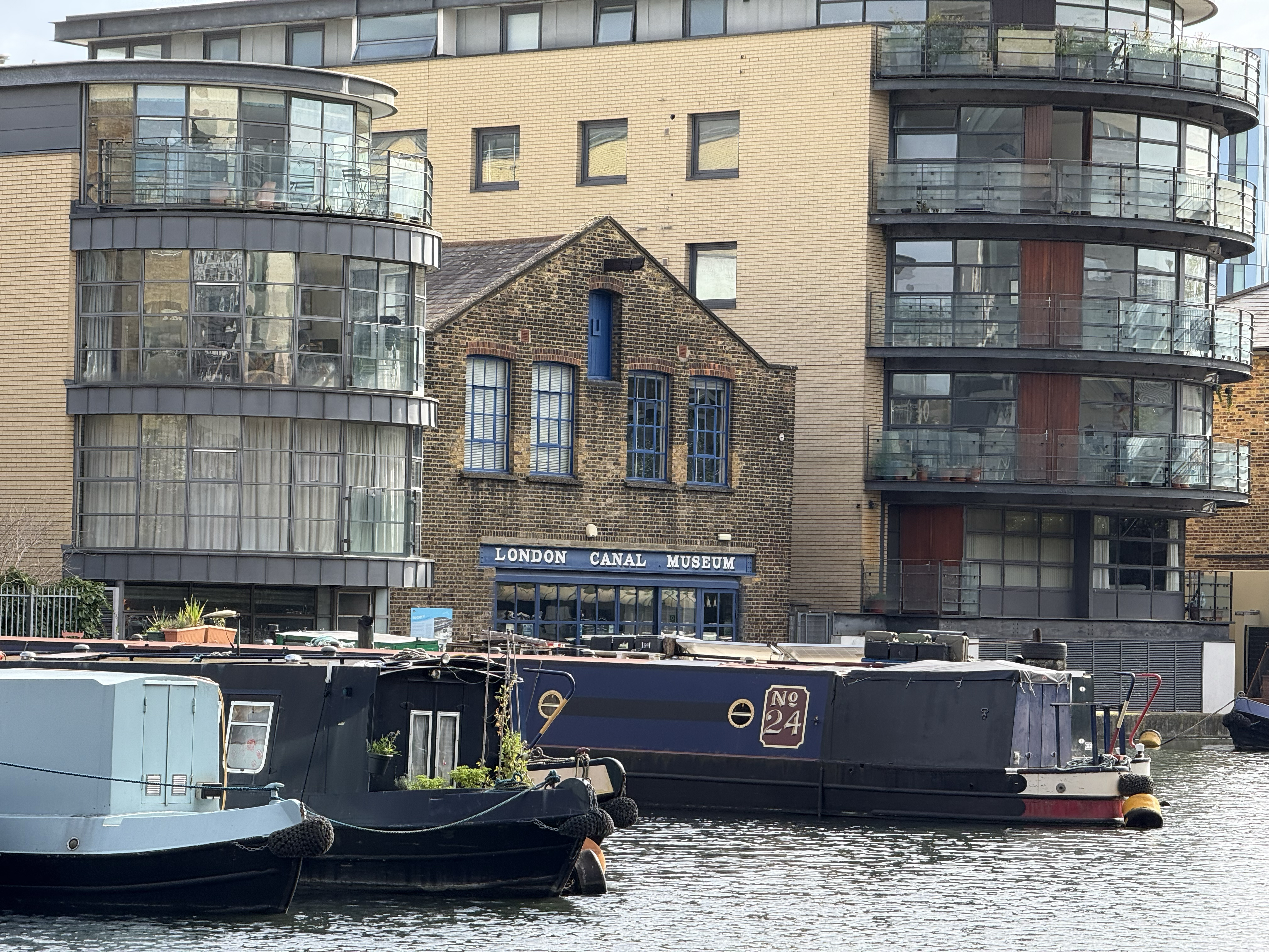
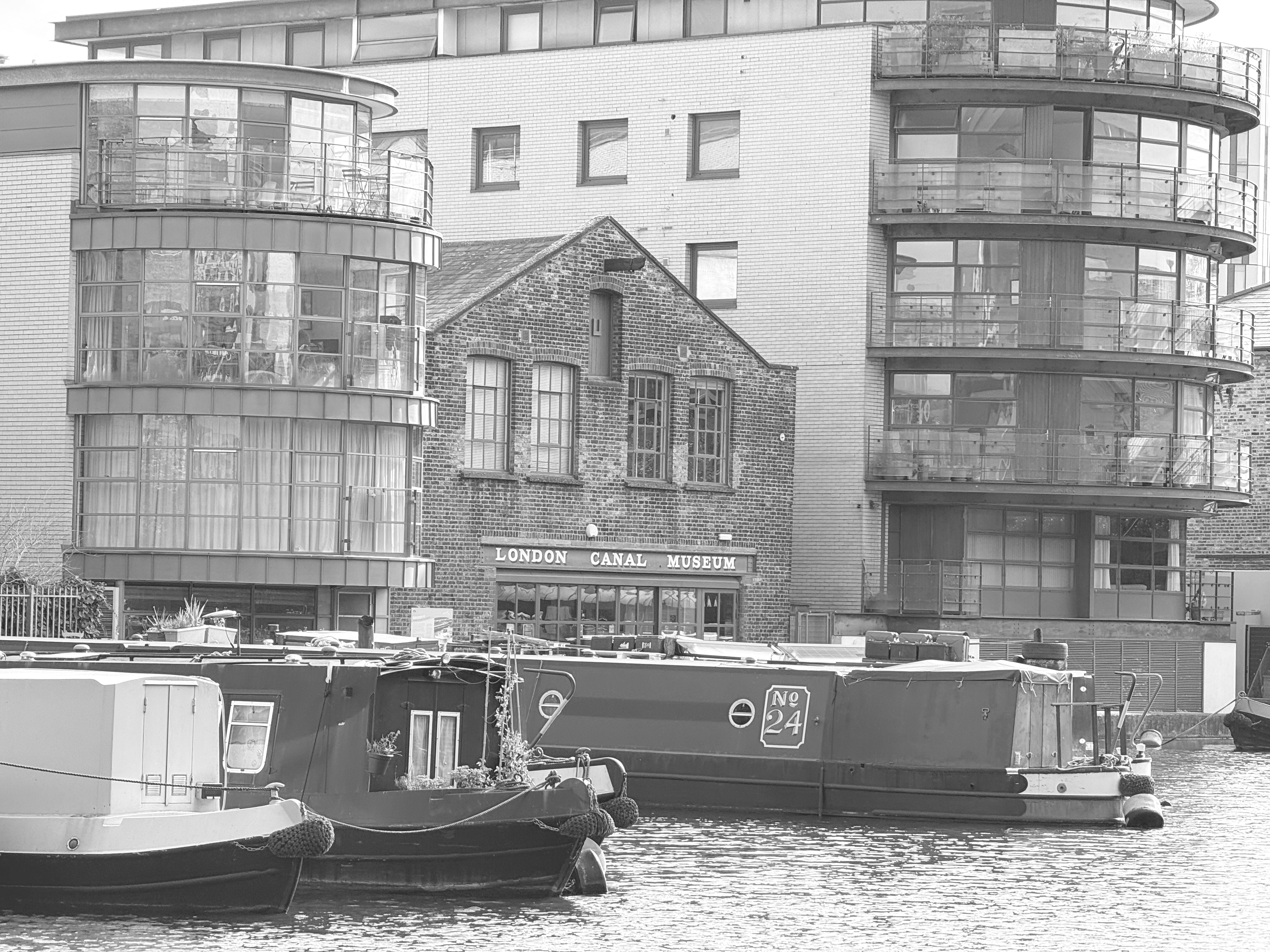
The second of the two black and white styles, Muted B&W removes your photo's colors but also brightens it, helping everything show up better than the Stark B&W style we saw earlier.
Looking towards the London Canal Museum in this shot, a black-and-white effect seemed to suit the historical subject, even with the more modern homes surrounding it. While it's perhaps the simplest of all the Photographic Styles, sometimes you can't beat black and white photos for their classy, timeless look.
Natural
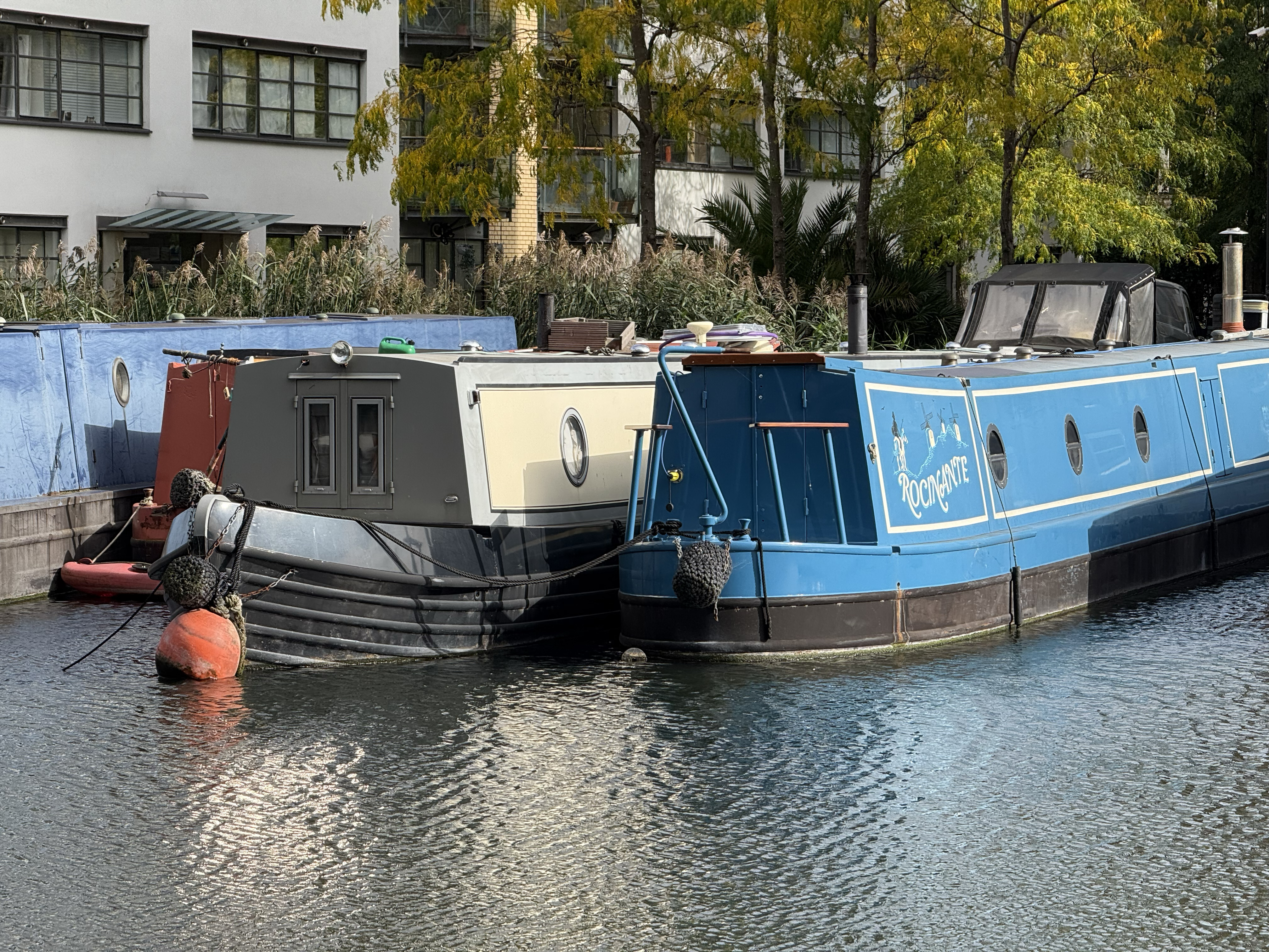

According to this Photographic Style, Natural means flattening the mid-tones and exaggerating the highlights and shadows. So any difference in brightness in your photo is going to be made extra obvious when you go au Natural.
This image of some narrowboats already has a big dynamic range, and that only gets larger with Natural applied. Ironically I think this makes the phone look more artificial, but in a good way. It emulates taking photos on an older device, but without the pain of carrying around a clunky mid-2000s digital camera and the added benefit of hi-res modern sensors.
Outlook
There's far more depth to Photographic Styles than I've been able to explore here. I used the default settings for each style in the photos above, but they can be fine tuned further if you want to minimize or exaggerate certain effects. Then there are all the other editing possibilities available in the iOS Photos app, such as Apple Intelligence's Clean Up, let alone the freedom you have with a dedicated editing app.
Any iPhone 16 owner can benefit from trying out Photographic Styles, especially those with the iPhone 16 Pro and its best-in-category cameras. The fact you can apply them in just a few taps, either before or after you take the photo, means they're incredibly accessible to anyone, and as I've hopefully shown, even without altering the presets, the results can be impressive.
So all I can say to conclude is give these Photographic Styles a try, and you'll be surprised and delighted by how much you can improve (or at least change) your images. Even drab images you might have deleted otherwise can be improved with the application of a little Style.
More from Tom's Guide
- Apple just announced a big change for the iPhone that will help you separate real businesses from spam
- I didn't realize just how good the Pixel 9 Pro battery life is until I went on vacation
- iOS 18 Notes just got a major overhaul — here's how to use it

Richard is based in London, covering news, reviews and how-tos for phones, tablets, gaming, and whatever else people need advice on. Following on from his MA in Magazine Journalism at the University of Sheffield, he's also written for WIRED U.K., The Register and Creative Bloq. When not at work, he's likely thinking about how to brew the perfect cup of specialty coffee.
 Club Benefits


