This handy trick fixes the most annoying thing about iOS 17 Messages — try it yourself now
Make the most of Messages
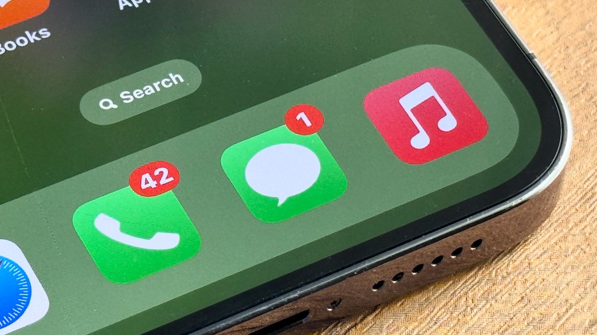
With iOS 17, Apple implemented a range of new iPhone features, including new apps like Journal and new features like StandBy Mode and Check In. As with every major iOS release, though, there were also lots of minor tweaks to existing apps and features.
One of those, which you may have noticed if you use iOS Messages to text your contacts, is the redesigned menu. With iOS 17, Apple changed the Messages menu system — pretty much every feature is now tucked behind a new (+) plus button. Previously, there were separate buttons for inserting photos and running applications.
This change doesn't seem to be unanimously popular. A quick browse online shows forum and Reddit posts from users complaining about the feature. Personally, I think it makes sense: given how many more core iOS features the Messages app now works in tandem with, a catch-all button is more appropriate than the previous App Store button, which in iOS language suggests only user-installed (or uninstallable) apps. I also like that the new vertical plus menu is much larger than the previous banner that sat atop the keyboard, which was rather cramped.
If it isn't for you, though, and has made your navigation of Messages more convoluted, there is a little bit of good news. Apple has integrated a way to customize the plus menu, so you can ensure your most used functions are within a single tap. Here, we'll show you how to do that.
How to rearrange the iOS Messages plus menu
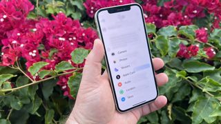
This is an iOS 17 feature — we can show you how to update an iPhone if you haven't yet updated to the latest iOS.
1. In a thread, tap the + button

First up, open a Messages thread and tap the + button.
2. Long tap, drag and drop a feature
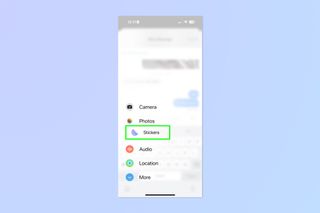
Now simply long tap and drag an app or feature, then drop it where you want it.
3. Tap More and repeat for secondary features
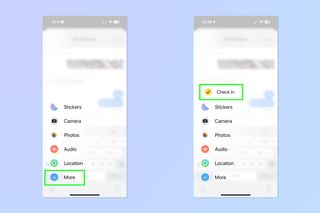
If you want to rearrange secondary features, you can! Simply tap More and repeat step 2 for any features you want to rearrange. If you want to bring secondary features to the primary menu, simply long press and drag them upwards then drop them into the primary menu. One such feature you may want to drop into the primary menu is Check In, which is in the secondary "More" menu by default. This feature is an important one, though, so you may want it to be as close at hand as possible.
There's nothing else to it. You can now rearrange the Messages menu to better suit your preference. Unfortunately, if you really cannot abide by the new layout, there is no way to return to the old one, but hopefully the customization we went thrugh above goes some way to mitigating your annoyance.
Next up: check out how to clear RAM on iPhone.
Sign up to get the BEST of Tom's Guide direct to your inbox.
Get instant access to breaking news, the hottest reviews, great deals and helpful tips.

Peter is Reviews Editor at Tom's Guide. As a writer, he covers topics including tech, photography, gaming, hardware, motoring and food & drink. Outside of work, he's an avid photographer, specialising in architectural and portrait photography. When he's not snapping away on his beloved Fujifilm camera, he can usually be found telling everyone about his greyhounds, riding his motorcycle, squeezing as many FPS as possible out of PC games, and perfecting his espresso shots.
