iPhone 15’s Dynamic Island could have looked a lot worse
Mockups show the notch-replacement ideas that Apple rejected
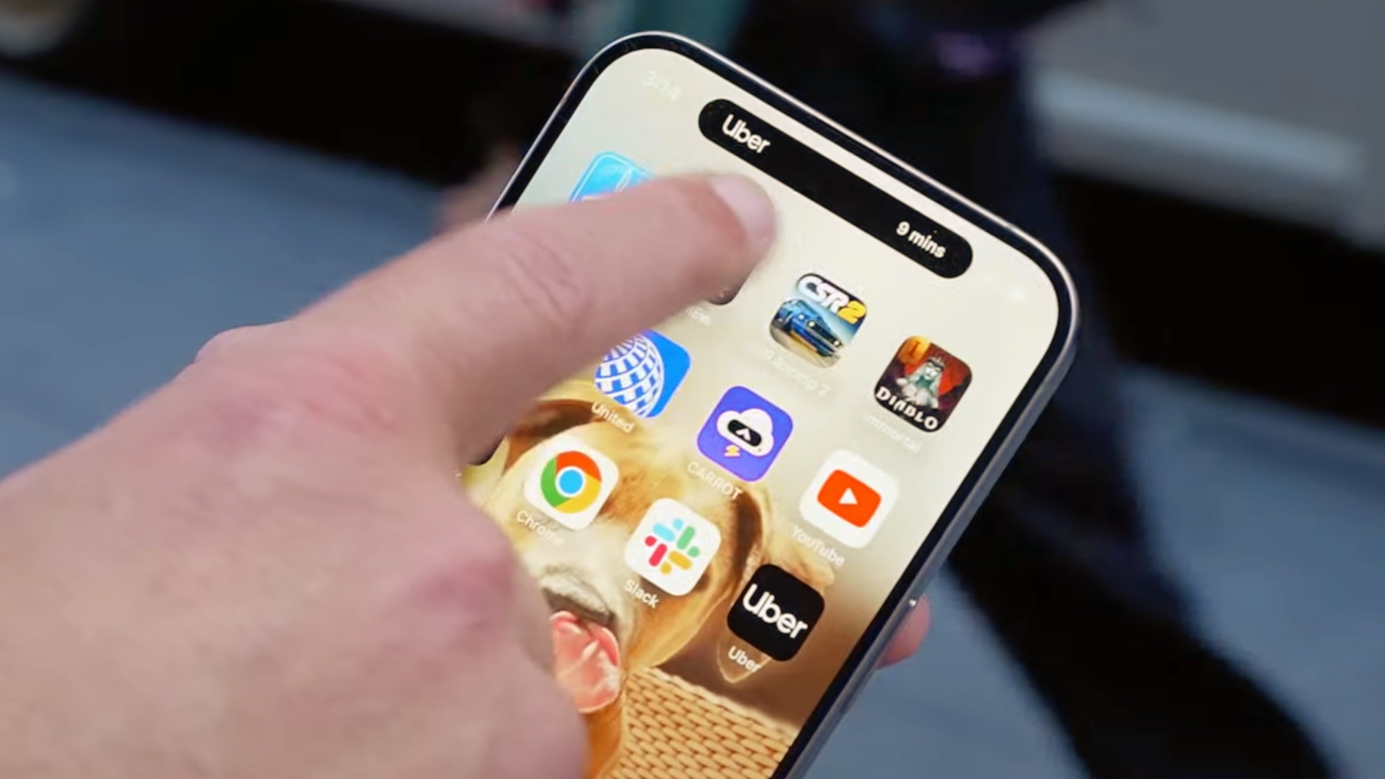
In 2022, Apple finally did away with the much-derided notch on the iPhone 14 Pro with Dynamic Island — a floating camera cutout that seems to change shape to provide extra app data to your home screen.
Last year, it arrived on all models of the iPhone 15, signaling the end of the notch on iPhones (unless the iPhone SE 4 brings it back, as occasionally rumored).
It’s hard to imagine anything else now, but as you would expect for a company of Apple’s stature, alternative options will have been considered. MacRumors has received information on some of these, and created mockups based on what the iPhone 15 might look like in an alternate universe.
The most dramatic of these are pictured below.
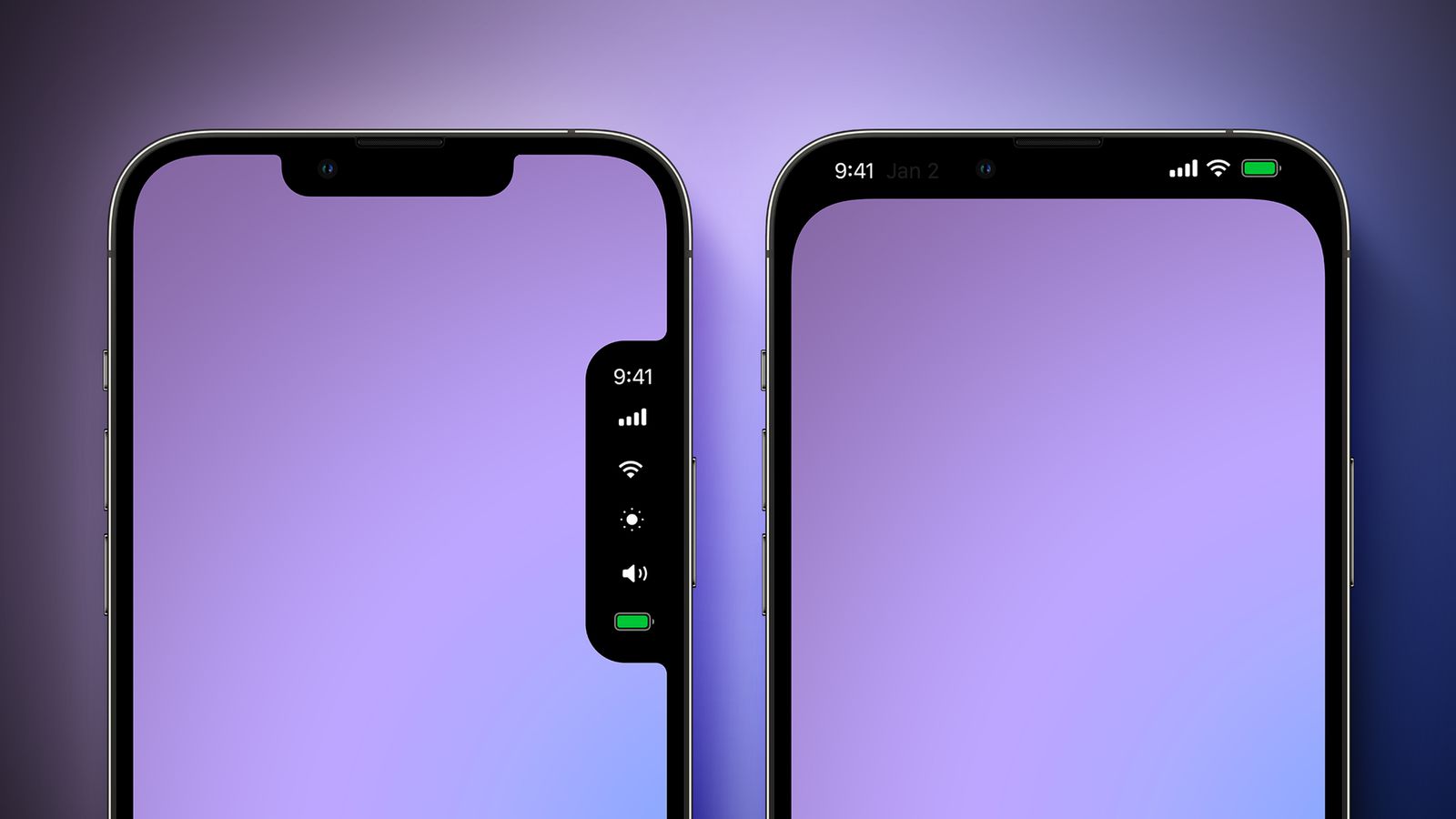
On the right, a design where the notch is essentially extended to a larger forehead, encompassing an all-black status bar with the time, battery life and network symbols. It doesn’t seem a million miles away from TopNotch — a free app for MacBooks with notches that turns the menu bar black to blend in.
The one on the left is more unorthodox — essentially adding a second pop-up notch on the right-hand side containing key status information to make the top one look less lonely and isolated. It’s hard to imagine this one getting far from the drawing board, though the idea of making the notch a desirable feature rather than a design concession was eventually adopted with Dynamic Island.
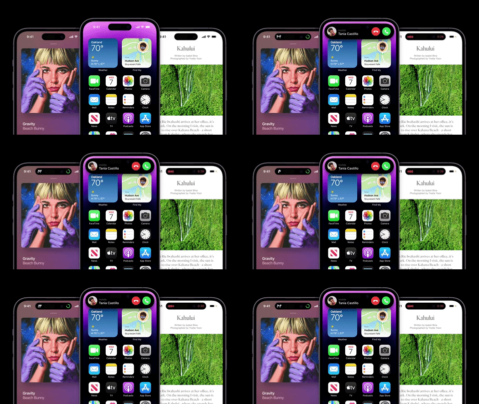
Even within the idea for the floating island, there are a number of different twists. On the MacRumors site, you can see one where app statuses float in bubbles next to the island, another where a green call status icon juts out from the right-hand side, and a third where all of the status icons appear in a giant static island covering the top of the screen.
Sign up to get the BEST of Tom's Guide direct to your inbox.
Get instant access to breaking news, the hottest reviews, great deals and helpful tips.
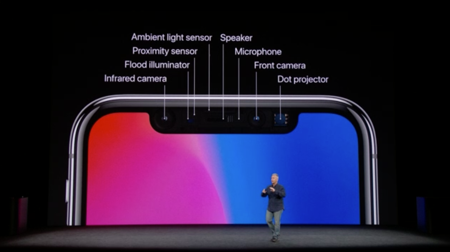
Ultimately, it feels like Apple made the right call with Dynamic Island. It may be a visual trick, but it does a great job of making a design drawback a positive. The complexities of the Face ID sensors (see the picture above) mean that Apple can’t just adopt a pin-hole or under-screen camera like some of the best Android phones, so this is about as good a compromise as can be imagined for the time being.
While these ideas are most likely destined to never see the light of day, it’s possible they’ll be revived on a later iPhone. But with camera technology getting more compact, it feels that Apple’s ultimate aim is to still make the camera tech completely invisible in the long run, with Dynamic Island just a temporary pitstop along the way.
Freelance contributor Alan has been writing about tech for over a decade, covering phones, drones and everything in between. Previously Deputy Editor of tech site Alphr, his words are found all over the web and in the occasional magazine too. When not weighing up the pros and cons of the latest smartwatch, you'll probably find him tackling his ever-growing games backlog. Or, more likely, playing Spelunky for the millionth time.

