I took over 200 photos with the iPhone 16 Pro Max vs Galaxy S24 Ultra — here's the winner
This is the photo shootout everyone's waiting for
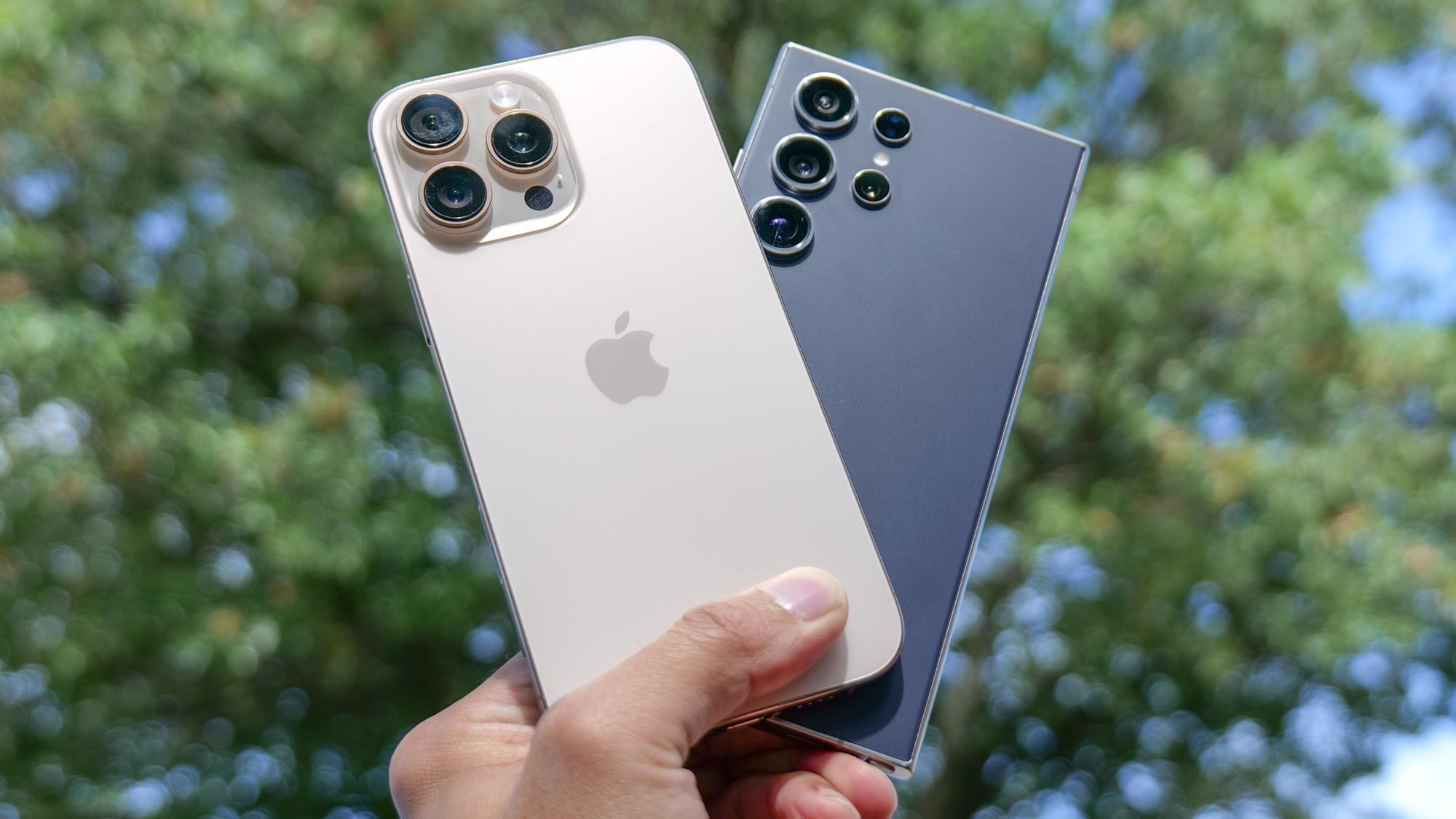
I’m putting the two best camera phones around in a head-to-head showdown to see which is better for photography. In my iPhone 16 Pro Max and Galaxy S24 Ultra, I've taken over 200 photos in varying situations to compare their main cameras, telephoto zooming, macrophotography, low-light performance and more.
iPhone 16 Pro Max vs Galaxy S24 Ultra: The Cameras
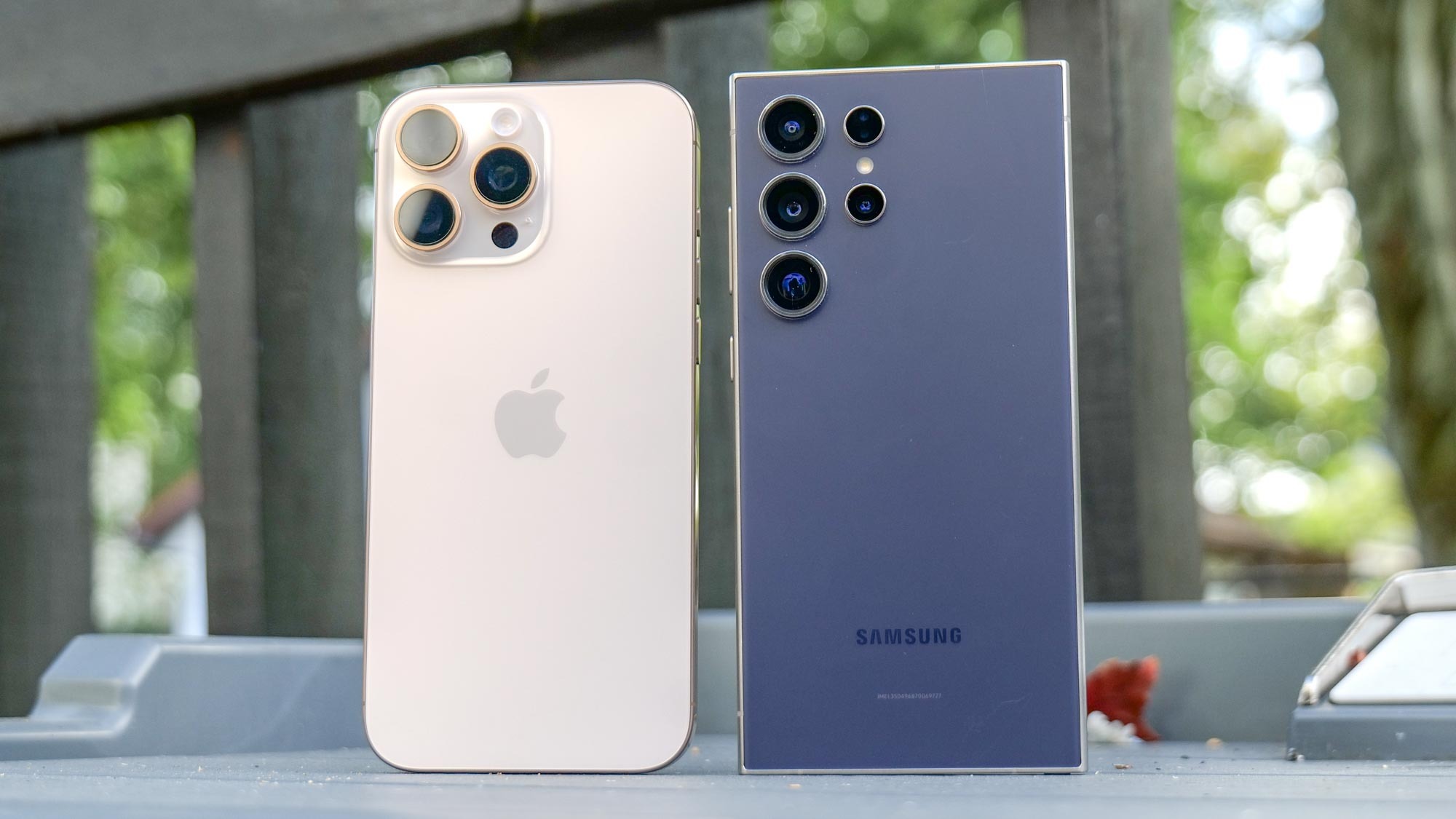
Before I get into the good stuff, I want to quickly talk about the cameras. In our iPhone 16 Pro Max review, it uses a similar triple camera setup as before, but this year’s change is found in the ultrawide. It’s now a 48MP one with a wider f/2.2 aperture, which means it has better light gathering than the iPhone 15 Pro Max. Paired with its 48MP main shooter and 12MP telephoto with 2x zoom, it’s still a power packed camera system.
Meanwhile, I said in my Galaxy S24 Ultra review that it set the bar early in the year in what I want in a camera phone — and that’s despite the controversy around its zoom camera, which goes from a 10x optical zoom to a 5x one instead. Still, I’ve seen that it still pulls out incredible results, but it’s going to need a lot more to beat the newer iPhone 16 Pro Max. You have a 200MP main camera, 12MP ultrawide, 10MP telephoto with 3x zoom, and a 50MP telephoto with 5x zoom.
After Apple’s Glowtime event in Cupertino, I traveled with the two flagship phones to Half Moon Bay to capture the same set of photos with both. Afterwards, I looked through all the comparison photos on a monitor to better tell their differences. I’m excited for this one because it could effectively show me which is the best camera phone for the rest of the year, especially know how my 200 photo shoot out with the iPhone 15 Pro Max vs. Galaxy S24 Ultra turned out earlier this year.
iPhone 16 Pro Max vs Galaxy S24 Ultra: daytime
I was on the beach for these shots and it’s a perfect spot to see how their main cameras compare. Look quickly and you might think they’re the same, but they’re not.
If you zoom into the red Adirondack chair, there’s more detail with the iPhone, especially with the textures around the chair and the screws around it. And while the Galaxy S24 Ultra delivers an excellent shot, it’s too aggressive with the color saturation — which gives the iPhone the more true-to-life look.
Winner: iPhone 16 Pro Max
Get instant access to breaking news, the hottest reviews, great deals and helpful tips.
iPhone 16 Pro Max vs Galaxy S24 Ultra: dynamic range
Next up, I stopped by this brewery in Half Moon Bay with the Tom’s Guide team to grab a drink and the bar was the perfect place to see how they handle dynamic range. That’s because the inside was pretty dark, but the windows on the outside let in strong light.
My eyes instantly gravitate towards the strong contrast look with the Galaxy S24 Ultra, but when I compare it to the iPhone 16 Pro Max, it blows out the highlights. As a result, the outside area loses detail — while the iPhone does a better job of neutralizing the exposure throughout the shot.
Winner: iPhone 16 Pro Max
iPhone 16 Pro Max vs Galaxy S24 Ultra: colors
This next one’s tough because it’s so close between them. In most of the photos I captured, the Galaxy S24 Ultra tends to cast the more saturated color. But with this mosaic I shot in downtown Half Moon Bay, it’s a nearly even matchup.
I really like the colors here, they’re bright and punchy to the eye — so for me, it comes down to the exposure. The iPhone 16 Pro Max does a better job because the Galaxy S24 Ultra is a smidge bright, which results in the colors becoming too washed out.
Winner: iPhone 16 Pro Max
iPhone 16 Pro Max vs Galaxy S24 Ultra: macro
Apple wasn’t kidding around when it said that the iPhone 16 Pro Max is much improved with macro photography. Not only was I able to get much closer to this flower while keeping most of it in focus, it also captures more detail. If you look in the middle, you can even make a hidden spider there.
The Galaxy S24 Ultra also captures an incredible shot, but the over-sharpening effect makes it look too processed when I zoom into it.
Winner: iPhone 16 Pro Max
iPhone 16 Pro Max vs Galaxy S24 Ultra: zoom
Again these two camera phones are evenly matched in the zoom department because they carry telephoto cameras with 5x optical zoom lenses. For these shots, I really have to pixel peep because they’re similar when I look at the overall picture. They’re evenly exposed for the most part, but the iPhone 16 Pro Max does better in the shadows, which you can see in the tree in the lower left.
However, the Galaxy S24 Ultra’s shot has a slightly sharper look. It’s hard to see unless you zoom in, like the letters underneath the giant eye in the middle — as well as the same tree in the lower left corner.
Winner: Galaxy S24 Ultra
iPhone 16 Pro Max vs Galaxy S24 Ultra: selfie
If coverage is important, you’ll get more of it with the iPhone 16 Pro Max’s 12MP front-facing camera. At arm’s length, it offers a wider field of view compared to the Galaxy S24 Ultra’s 12MP one. But when it comes to image quality, I prefer the Samsung because of the better details.
If you zoom into my face, the Galaxy does a better job of gathering more detail and definition with my facial features — like my eyebrows and scruff around my chin. But I will say that the iPhone has a more even exposure.
Winner: Galaxy S24 Ultra
iPhone 16 Pro Max vs Galaxy S24 Ultra: portrait
I shot these portrait photos of my colleague Kate who’s showing off the new Apple Watch Series 10 on her wrist. The first thing that stands out to me are the saturated colors of the Galaxy S24 Ultra. You could say it gives the photo that extra pop, but the iPhone’s more true to life.
On top of that, the iPhone 16 Pro Max’s main camera again pulls in crisper details in these shots at 1x zoom. Take a look at the band on her Apple Watch, it has more definition on it, while the Galaxy S24 Ultra looks more smudgy. Both do a great job at isolating her from the background, but I like the softer look of the background with the iPhone.
Winner: iPhone 16 Pro Max
iPhone 16 Pro Max vs Galaxy S24 Ultra: ultrawide
Apple’s refreshed ultrawide camera mainly gets my attention in these shots because of its brighter looks and better dynamic range performance. The colors are also more realistic, especially when the Galaxy adds a lot more saturation to the greens in the shot.
Winner: iPhone 16 Pro Max
iPhone 16 Pro Max vs Galaxy S24 Ultra: panorama
The panoramas they capture have massive file sizes, but rightfully so because they contain a lot of detail. Overlooking Half Moon Bay itself, there’s plenty of details captured in both — like the boat in the water and the pink flowers on the right. The only reason I’m giving it to the iPhone 16 Pro Max is because of its even exposure.
The right half off the image retains the same exposure as the left, while the Samsung comes out a tad under exposed. And if you zoom into the shadowed part of the bush in the middle, the iPhone’s better dynamic range performance draws out more details.
Winner: iPhone 16 Pro Max
iPhone 16 Pro Max vs Galaxy S24 Ultra: low light
At the same brewery from earlier, I took these shots of my beer in a darker part at the bar. I like how the iPhone 16 Pro Max pulls off the brighter image and how it handles the strong light source that’s reflecting off the back. The Galaxy S24 Ultra looks dark and has this color fringing in the area in the back where the light reflects off from.
I also want to share these other low light shots that my colleague, Mark Spoonauer, took at a park in the late evening. The iPhone again easily pulls off the brighter shot, which I can see with the grass in the foreground — but the sign on the left looks much sharper.
Winner: iPhone 16 Pro Max
iPhone 16 Pro Max vs Galaxy S24 Ultra: Verdict
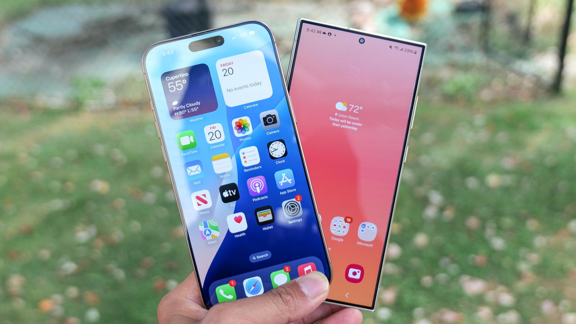
The iPhone 16 Pro Max benefits from a much improved performance that lets it cruise to the finish line here. The areas where I see the biggest improvement is how it performs better with its dynamic range, which brightens up shadows to draw out details that are otherwise hidden. I also know that the iPhone 16 Pro Max's upgraded ultrawide camera gets a boost to deliver sharper details.
As for the Galaxy S24 Ultra? It’s still an excellent camera phone that only loses out by a sliver in each of the categories — but then again, it’s been out since the beginning of the year. Of course, I’m eager to see how Samsung responds with the Galaxy S25 Ultra.
More from Tom's Guide
- iPhone 16 Pro vs iPhone 16 Pro Max: Which new iPhone should you buy?
- iPhone 16 Pro benchmarked — where the new iPhone wins (and loses) vs. Android phones
- The copycats cometh — 3 Android phone makers announce iPhone 16-esque camera control buttons

John’s a senior editor covering phones for Tom’s Guide. He’s no stranger in this area having covered mobile phones and gadgets since 2008 when he started his career. On top of his editor duties, he’s a seasoned videographer being in front and behind the camera producing YouTube videos. Previously, he held editor roles with PhoneArena, Android Authority, Digital Trends, and SPY. Outside of tech, he enjoys producing mini documentaries and fun social clips for small businesses, enjoying the beach life at the Jersey Shore, and recently becoming a first time homeowner.

 Club Benefits


