The Pixel 9 looks oddly like an iPhone — and I couldn’t be happier
The Apple-ification of the Pixel 9's design is definitely a good thing
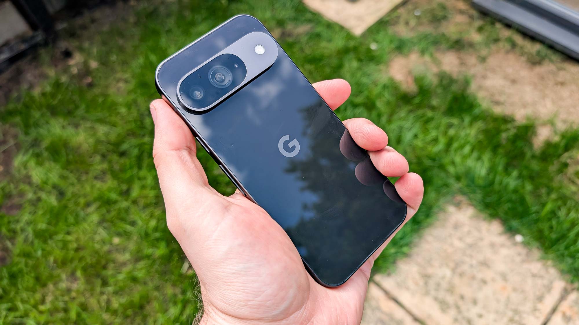
The Google Pixel 9 is, by and large, a pretty good phone. It’s got a solid selection of hardware and software upgrades, albeit with a price tag that’s higher than most people would prefer. The phone has also enjoyed a slight redesign, complete with a brand new camera bump and flatter edges.
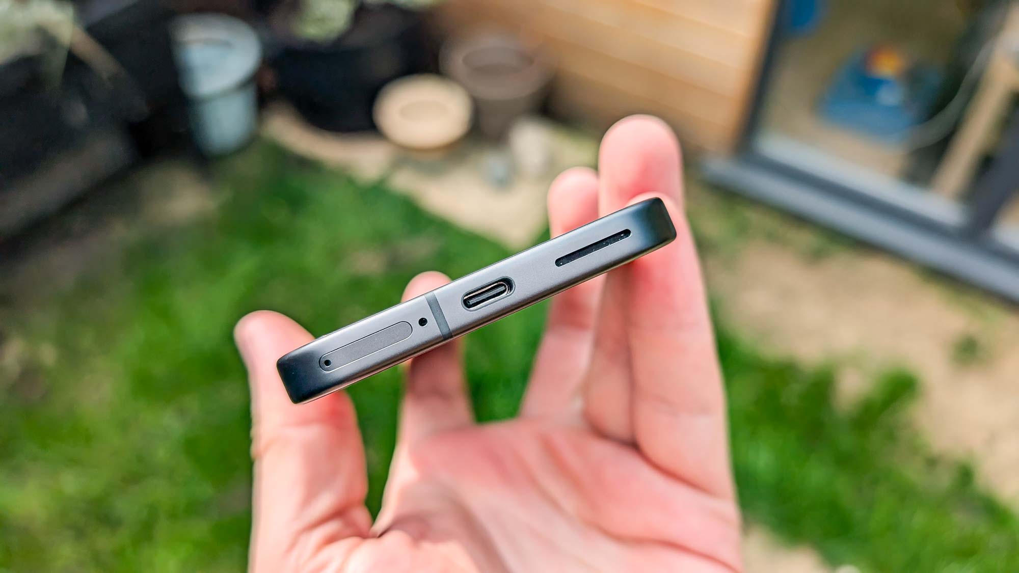
While the camera bump is an evolution of the camera bars from Pixels of years gone by, the flattening of the edges makes the new flagship look an awful lot like an iPhone. Some colors, like Obsidian, even look similar to the titanium frame on the iPhone 15 Pro — despite being made of the much weaker and less premium aluminum.
Camera bump aside, it’s the closest a Pixel has come to that iPhone design — and I for one am all for it.
Apple’s iPhone design is so satisfying
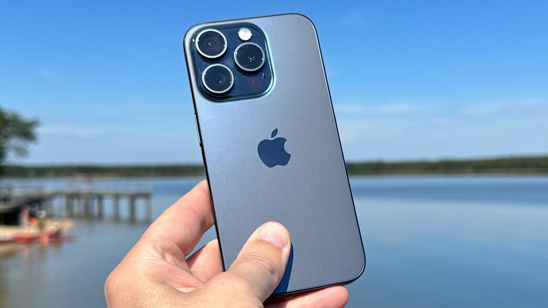
There’s a lot of reasons why I would never buy an iPhone. Price, software, the walled garden, and so on. The one thing I’ve not taken issue with over the years is the design of the iPhone. Not only has Apple never bothered to release a phone with one of those wretched curved displays, it’s also taken the idea of “flat” as far as it will go. Assuming you ignore the protruding cameras.
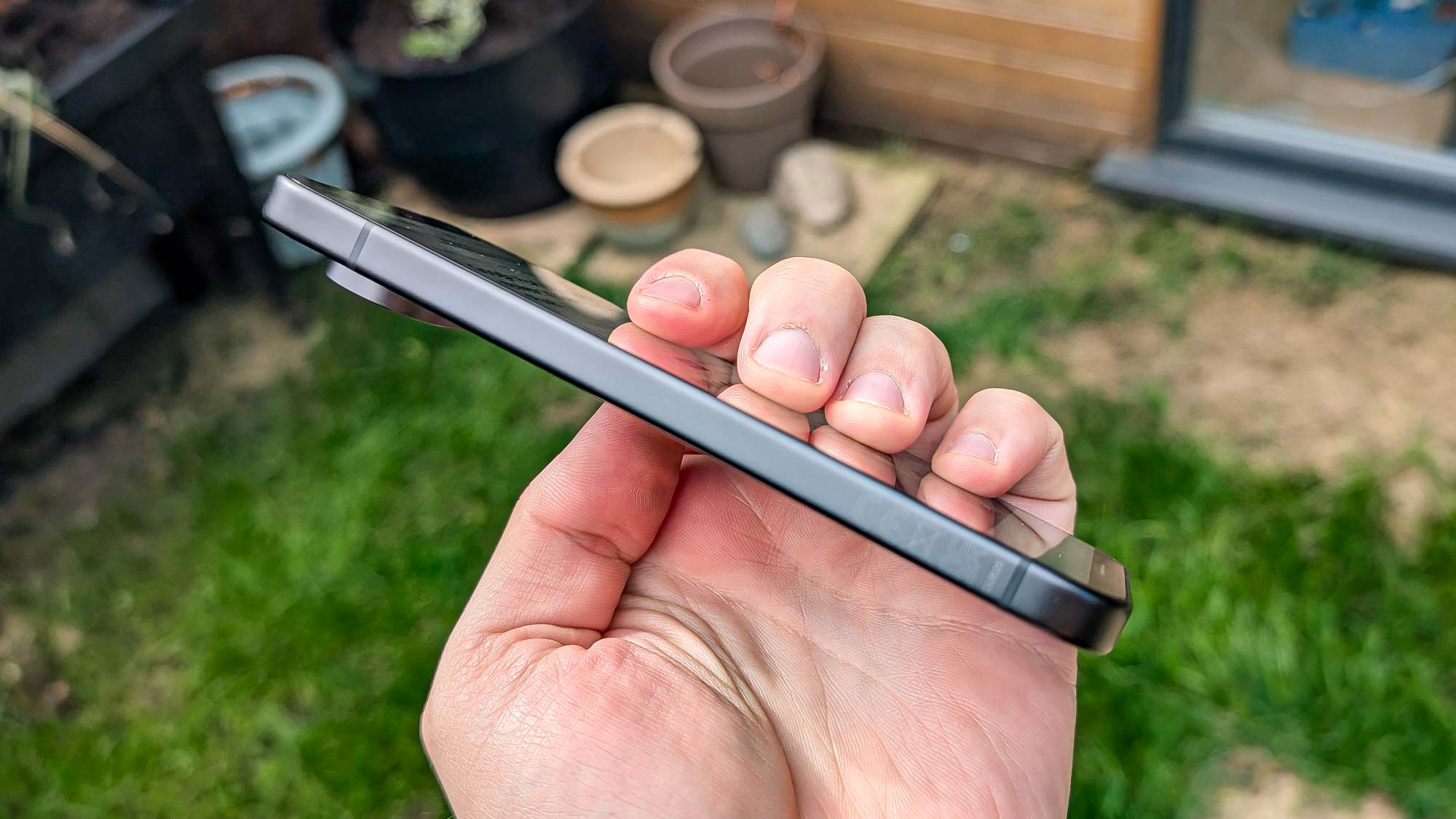
There’s something immensely satisfying about having a smooth, almost-uninterrupted straight edge along the side of your phone. Better still is when that edge rounds off at the corners, so that wouldn't take out someone’s eye in a series of unfortunate circumstances. Or stab the palm of my hand during one-handed use, though that’s a lot less serious an issue.
I don’t know about you, but it’s not just about looks either. I find that straight-edged design easier to hold in my hand. Especially when the phone has some heft to it, like the Pixel 9 series does. Not everyone agrees with that, and some of my colleagues at Tom’s Guide prefer some rounded edges for that grippiness and comfort when they hold their phones.
While there had been rumors Apple might adopt a rounded design on the iPhone 15, which people had plenty of opinions about. If that was the case it wasn’t very noticeable. Those edges are still straight enough I could use an iPhone 15 Pro to draw straight lines — assuming I ever found myself needing to do so in a hurry.
It’s rather surprising that this design hasn’t been picked up a little more widely, to be honest. Often what Apple does ends up being copied so much that it’s impossible to tell who did what first.
There’s only so many design choices to choose from
That’s also true when you consider that there are only so many phone designs for companies to choose from. The fact is, you’re making a glass rectangle that has to be almost 50% screen and that doesn’t give you a whole lot of room to create something new and unique.
It’s part of the reason why round sided, round-backed phones were so prevalent for so long. That’s what the phone companies gravitated to until other factors started prompting various changes. Like how curved backs fell out of favor because they made wireless charging significantly harder.
It would be easy to criticize Google for adopting an iPhone-esque design instead of doing its own thing. But when your options are already pretty limited, it’s only a matter of time before multiple companies land on the same look — even if neither party meant to do it deliberately.
I don’t see the refreshed design as an Apple-ification of Google’s products. After all that camera bump is still distinctly Pixel, even if it’s not quite the same as the one on the Pixel 8. More a case of Google deciding round-edged phones have had their day, and it’s time to try something new.
Although I find it hard to believe that it took quite so long to happen by chance, considering the flat-edged iPhone has been around since 2019’s iPhone 11. More likely that certain companies have been avoiding comparisons to the iPhone until some other factor pushed them into it.
Not that I’m complaining about it happening, I think Apple picked up an excellent design and I’m glad I finally get to experience that day-to-day on a Pixel phone. It’s just a shame it took quite so long to sort out.
Bottom line
There’s a lot to love about the Pixel 9. Battery life is particularly notable, with Google added multiple hours onto the phone’s lifespan compared to the Pixel 8. It may seem a little strange to fixate on what amounts to a pretty minor design change. But it’s still a design that I’ve been envious of for quite some time, but has been out of reach thanks to my refusal to switch to an iPhone.
I would never buy a phone simply because of a design feature I like, otherwise I would have bought myself an iPhone a long time ago. I will avoid specific brands for design choices I loathe, but for the most part I try and look at a phone as a whole before I open up my wallet — which is important when they cost so much. But that doesn’t mean I can appreciate it when the fates align and my next would-be purchase actually looks the way I want it to look.
Now if Google can only do something about the size of the Pixel camera bump, and make it a little less gargantuan, I’ll be a very satisfied customer.
More from Tom's Guide
Sign up to get the BEST of Tom's Guide direct to your inbox.
Get instant access to breaking news, the hottest reviews, great deals and helpful tips.

Tom is the Tom's Guide's UK Phones Editor, tackling the latest smartphone news and vocally expressing his opinions about upcoming features or changes. It's long way from his days as editor of Gizmodo UK, when pretty much everything was on the table. He’s usually found trying to squeeze another giant Lego set onto the shelf, draining very large cups of coffee, or complaining about how terrible his Smart TV is.
