Android 16 could make an iPhone-inspired change to your notifications
The new Quick Settings are not that quick

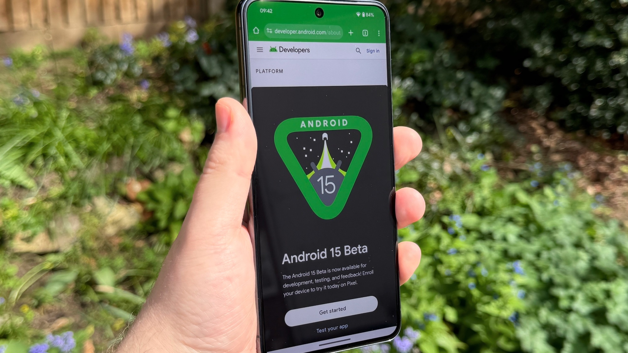
Android 15's full release is only a few weeks away and Google has released the source code as part of the Android Open Source Project this week. This code revealed a change that could come in Android 16, which appears to be more than a little inspired by Apple.
Currently, Android still uses the same Android 12 design for the Notification and Quick Settings panels. This layout shows both panels combined into one screen, making it easy to see everything in one place. However, Android Authority's Mishaal Rahman has recently unearthed lines of code in Android 15 that would change how users interact with the notification and quick settings screens.
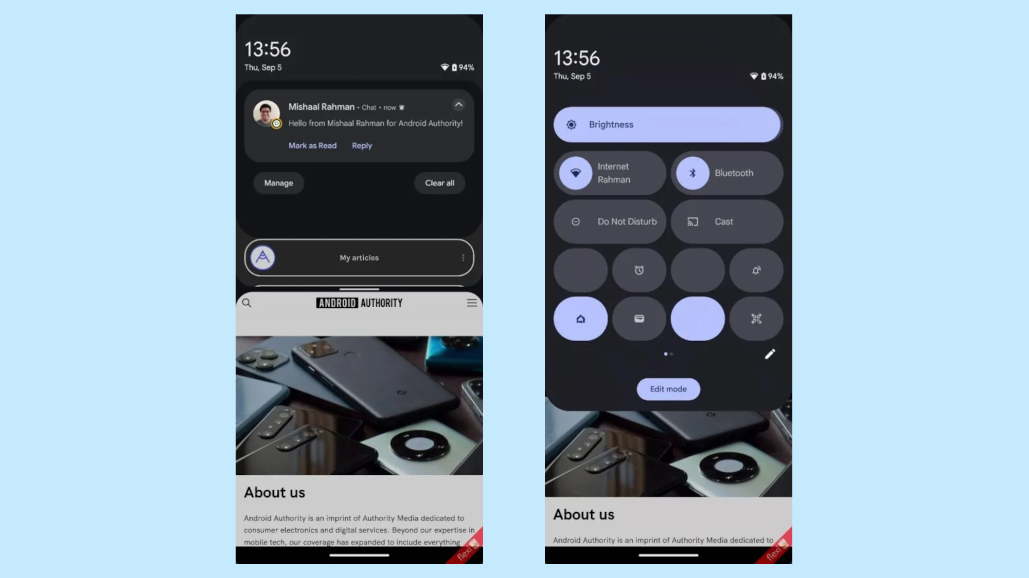
While Mishaal was "tinkering around" with the current Android 15 QPR beta, he managed to activate a new version of the notification and quick settings panels that he suspects is intended for Android 16. In the new version pulling down on the screen will only show the notification panel, which now only takes up a quarter of the screen. While it means that you can no longer see quick settings at a glance, it does allow the app you're currently on to stay in view as you check notifications.

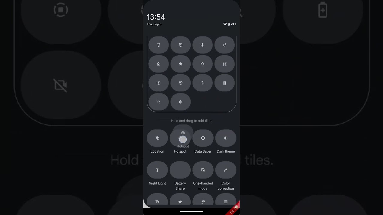
Accessing the Quick Settings panel is a little more complicated, and will take some getting used to for long-time Android users. To see your Quick Settings menu you will need to swipe down with two fingers, which will then replace the notification panel. If you want to access more tiles then you only need to swipe left or right. This also means that the app you are currently using will still be viewable, at least according to the shared screenshots.
Aside from the code, plenty is coming for users in Android 15, even if it isn't all that exciting on the surface. Android 15 might not be as flashy as iOS 18, but that's partially because Android is much further ahead than Apple when it comes to AI and features. Instead, Android 15 adds a lot of background improvements that aim to enhance the user experience. Those updates include upgrades to typography and non-Roman fonts and alphabets, as well as a better camera experience.
It should be noted that lines of code don't always mean a feature is coming anytime soon, or even planned for release. For the time being, we can only wait and see what is planned for the next version of Android OS.
More from Tom's Guide
- Google Photos just got a huge AI upgrade with Ask Photos — here's how to check it out
- One UI 6.1.1 is giving millions of Samsung phones top Galaxy AI features — will your device get them?
- Samsung Galaxy S24 FE design and key specs revealed in new leak
Sign up to get the BEST of Tom's Guide direct to your inbox.
Get instant access to breaking news, the hottest reviews, great deals and helpful tips.

Josh is a staff writer for Tom's Guide and is based in the UK. He has worked for several publications but now works primarily on mobile phones. Outside of phones, he has a passion for video games, novels, and Warhammer.


