Android 15 apps could be forced to display edge-to-edge by Google — what you need to know
The look of some apps may have to fundamentally change
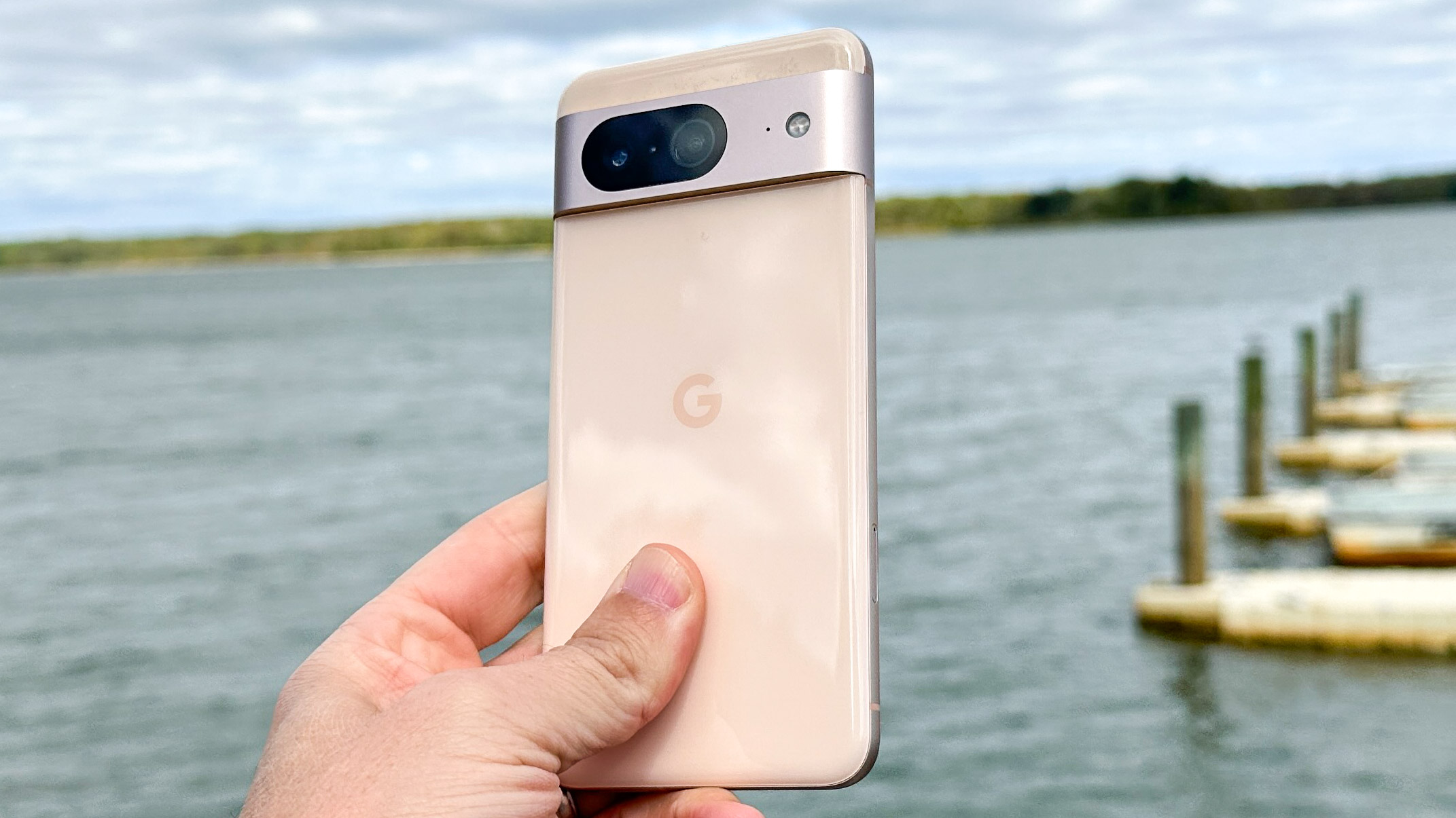
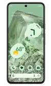
Android 15 could force your apps to make full use of your phone's screen space, based on code found in the latest Android 14 beta by Mishaal Rahman (writing for Android Authority).
The beta contains a mention of "edge to edge by default" within the App Compatibility Changes menu for "vanilla ice cream," Google's internal codename for Android 15. This refers to edge-to-edge mode, an option for Android app developers that lets their app's content appear under the system bars — the status bar at the top where your notifications, clock and other icons live, and the navigation bar where your gesture handle or on-screen buttons live.
Rahman believes that this addition means Google could make it a requirement for Android apps aiming for Android 15 compatibility to display content in edge-to-edge, rather than leaving the space in line with the status and navigation bars blank. Edge-to-edge mode is currently optional, although many apps already use it.
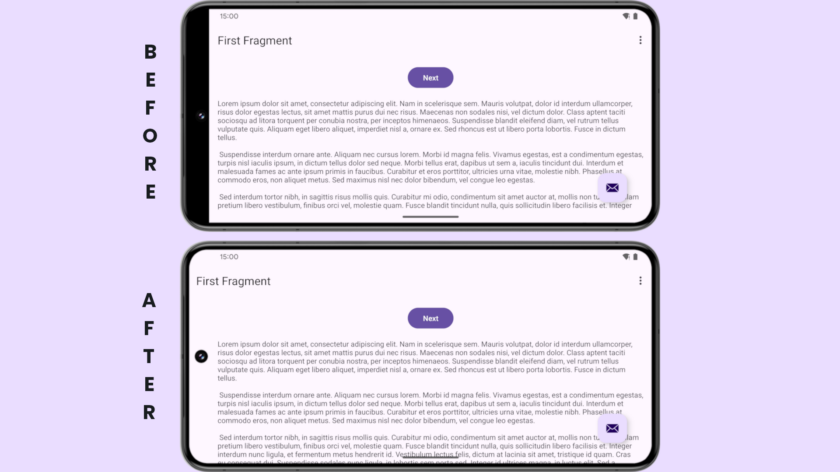
Rahman was also able to enable the change to show what this could mean in practice, as you can see in the screenshots above and below.
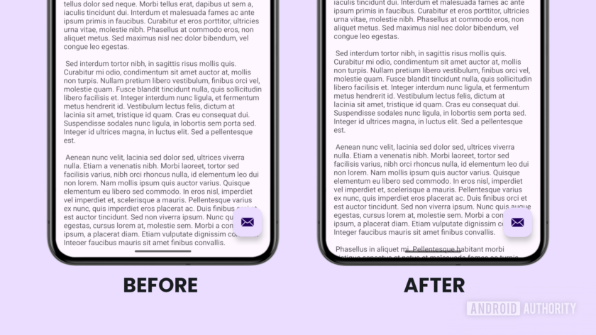
Cutting edge-to-edge design
The main reason apps avoid edge-to-edge mode in Android currently is that they have their own buttons that could interact awkwardly with a system bar. But hopefully with enough warning developers would be able to prepare their apps in time for Android 15's expected full release at the end of 2024.
Conveniently, some developers may already know how this could look since iOS displays apps in an equivalent of edge-to-edge mode already. Google doesn't have to copy Apple's approach simply because it's its main rival, but enforcing a standard that iPhone users and many Android users are already comfortable with makes sense now that most new phones offer full-screen displays.
Android 15 isn't available in any form yet, although we expect we'll see its first developer beta launch this month, if Android 14's timeline was anything to go by. It'll be through tracking these betas that we get more of an idea if Google's serious about making this change stick, as well as its possible restoration of lock screen widgets, or if it'll move its focus elsewhere.
Sign up to get the BEST of Tom's Guide direct to your inbox.
Get instant access to breaking news, the hottest reviews, great deals and helpful tips.
More from Tom's Guide
- The Galaxy S24 is the first truly great Samsung flagship I've tested
- OnePlus 12 updates — OnePlus' president explains why you get 5 years, not 7
- Google Pixel 9 Pro: Everything we know so far

Richard is based in London, covering news, reviews and how-tos for phones, tablets, gaming, and whatever else people need advice on. Following on from his MA in Magazine Journalism at the University of Sheffield, he's also written for WIRED U.K., The Register and Creative Bloq. When not at work, he's likely thinking about how to brew the perfect cup of specialty coffee.


