I'm sorry but touchscreens in cars are stupid
Touchscreens are great for a lot of things, but not where driving's concerned
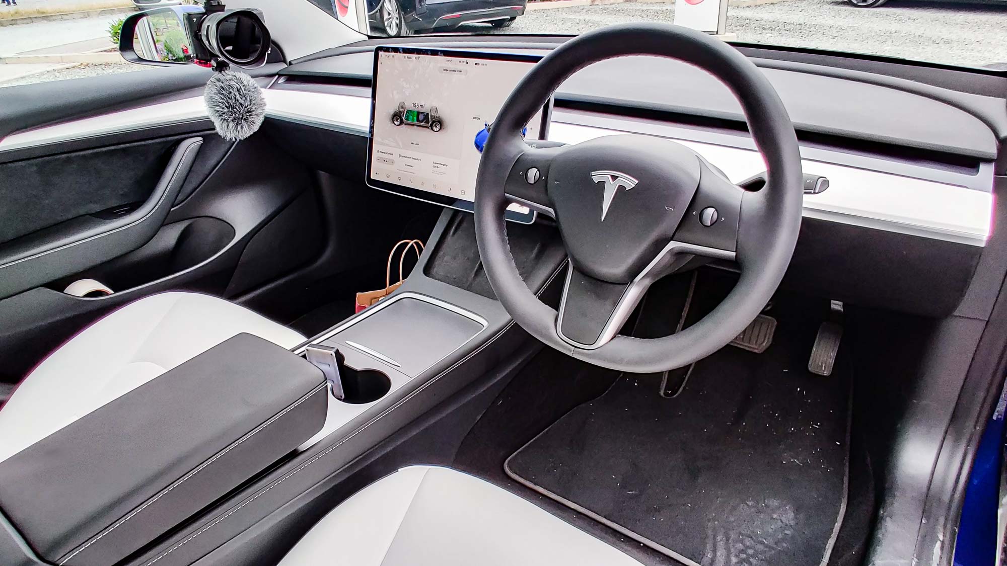
These days you’ll be hard pressed to find a recent car without a touchscreen. Ever since the iPhone proved touchscreens didn’t have to suck, we’ve seen mass adoption of the technology in all sorts of devices: tablets, laptops, watches, and even automobiles.
Here’s the thing, though. As useful and versatile as touchscreens are, they aren’t always the right choice for every piece of technology. Nowhere is that more true than in a car. Old-fashioned or not, physical buttons are still the better option.
- Here’s how to defrost a windshield without damaging it
- Plus: Hey Rivian, exclusive car charging points are a horrible idea
When you're driving, you have to pay attention to the road ahead at all times. Roads are dangerous, complicated places, and drivers have to contend with conditions that change all the time. You’ve got to be able to keep your car centered in the lane while also following the road round the bend and being aware of what other drivers (and possible pedestrians) may do at any given time.
This is easy to handle when all your attention is concentrated on the road ahead, and any extra features inside your car need to ensure you can use them without taking your eyes off the road. Sadly, a lot of automakers seem to have forgotten what it’s like to use a touchscreen.
Taking your eyes off the road means you can’t react to anything that changes, be it another car driving erratically or making sure you avoid pedestrians and other things that may cross into your path. The inevitable consequence of that is some sort of crash, which at the very least means car damage and rising insurance premiums. Worst case you could very easily injure or kill someone, including yourself and your passengers.
Touchscreens are not ideal for eyes-off use
A button is a physical, tactile thing. You can figure out what it is by touch alone. Most importantly, there’s a physical sensation when you press it. That means you can tell the button has been pressed without ever laying eyes on it. Assuming you've memorized the layout of the buttons in question, you could complete this entire process without ever having to use your eyes.
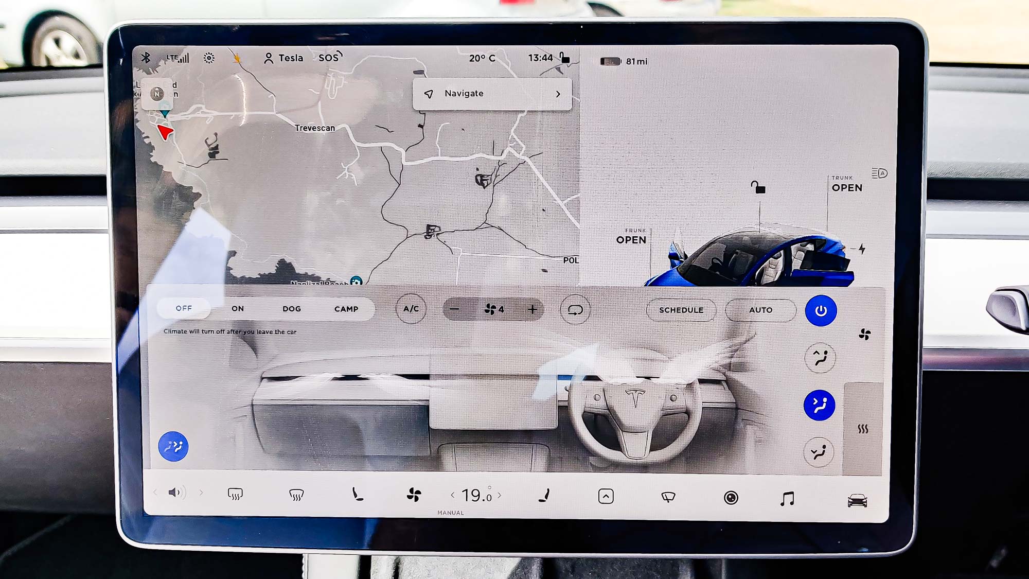
Touchscreens are the exact opposite. They are smooth, glossy, and have no other discernible physical characteristics. The portion of the screen that controls, say, the air conditioner feels exactly the same as the spot that controls navigation or phone calls.
You can memorize which areas do what, or form some sort of muscle memory, but the fact is that doing something on a touchscreen is a totally different experience from pressing a button. Using a touchscreen invariably relies on you looking at what you’re doing, whether it’s to find the spot with the correct on-screen icon, or to have a second look to check that the screen tap actually registered.
On a phone or a tablet, that’s absolutely fine. Chances are you’re doing something that relies on looking at the screen anyway.
When you're driving, you can’t afford to take your eyes off the road for the few seconds you might need to get something done on the touchscreen. Fiddling with a touchscreen on the center console is really no different from texting on your phone.
Touchscreens aren’t all bad
This isn’t to say that touchscreens have no place in cars. As cars get more advanced and drivers expect more out of them, there are some things that are just too awkward to do with a button-only system.
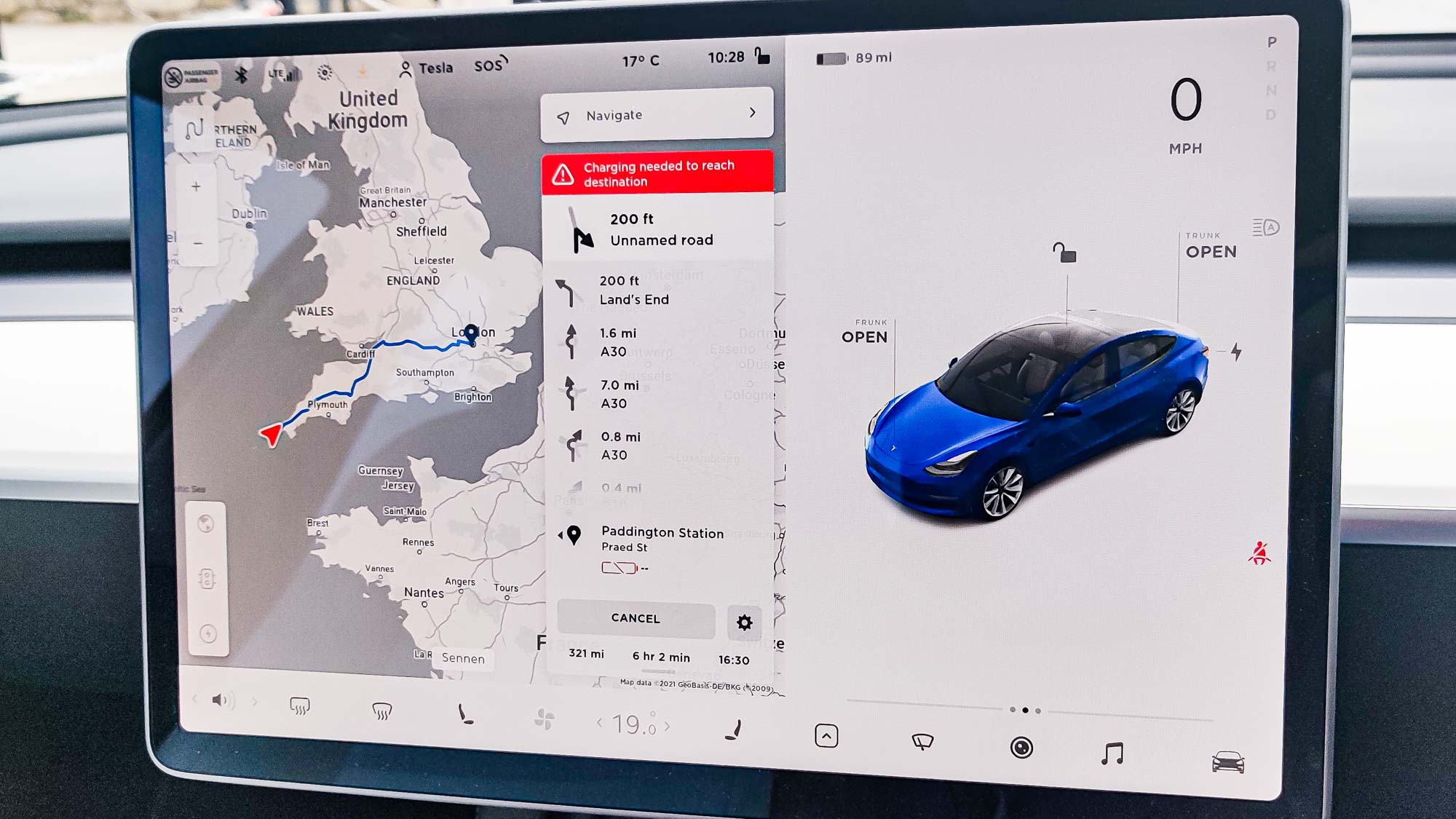
Navigation is a great example. Anyone who’s ever tried to type with a TV remote can confirm that typing on a touchscreen is much more efficient and convenient.
Likewise, as cars become more and more advanced, features come with settings menus that wouldn’t look out of place on a smartphone. For example, Tesla has dedicated screens for software and hardware information and offers the ability to tweak settings for features like regenerative braking and Autopilot.
That said, these are all things that would require some modicum of concentration and aren’t the kind of things you could do or should do while driving.
Bottom line
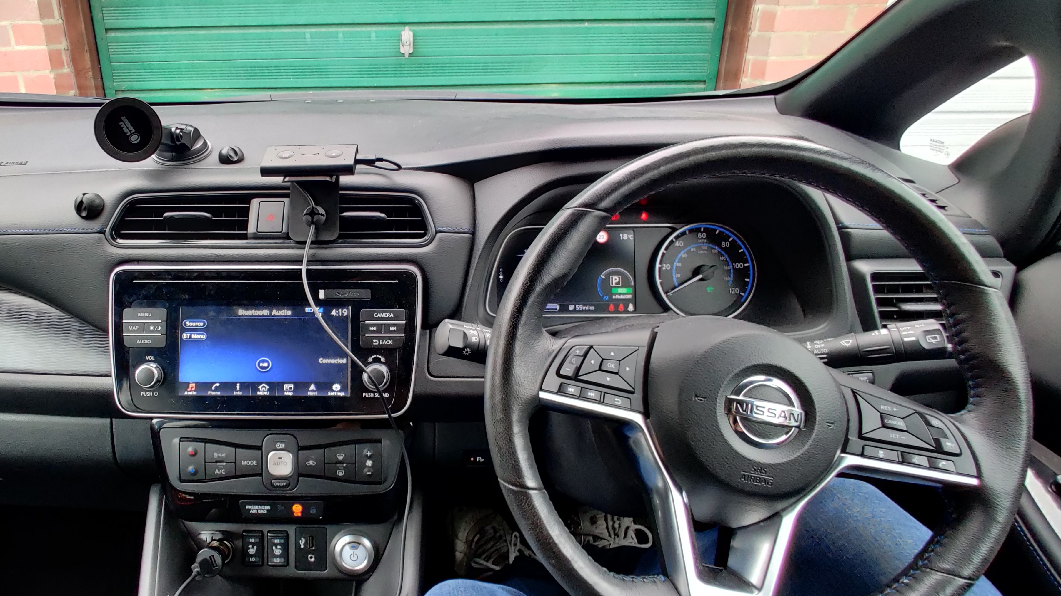
Equipping cars with touchscreens needs to be a balancing act, ensuring that every part of the car is convenient and easy to use — particularly those features you’ll need to use while driving.
My own Nissan Leaf is a great example of that, even though the center console and steering wheel are both littered with all sorts of different buttons. But those buttons have a purpose, be it controlling audio, answering the phone, switching on cruise control or even turning up the fan speed because my windscreen is getting misty. I only ever use my car's touchscreen for navigation because everything else can be handled with a button or a voice command.
I’d just like more automakers to figure out that there are better ways to control your car than by using a touchscreen. Just because Tesla does something doesn’t mean everyone else should blindly copy it.
- More: Best car phone mounts 2021: Tested and rated
Sign up to get the BEST of Tom's Guide direct to your inbox.
Get instant access to breaking news, the hottest reviews, great deals and helpful tips.

Tom is the Tom's Guide's UK Phones Editor, tackling the latest smartphone news and vocally expressing his opinions about upcoming features or changes. It's long way from his days as editor of Gizmodo UK, when pretty much everything was on the table. He’s usually found trying to squeeze another giant Lego set onto the shelf, draining very large cups of coffee, or complaining about how terrible his Smart TV is.
