This mod gives the iMac an all-screen design — there’s just one problem
Extreme surgery moves the iMac’s innards to the back, but it loses its personality

Last year’s addition to the iMac family is generally regarded as a solid step forward for the company’s smallest all-in-one computer. Indeed, in our 24-inch iMac review, we gave the computer a solid four-and-a-half-star rating praising its super screen and speedy performance.
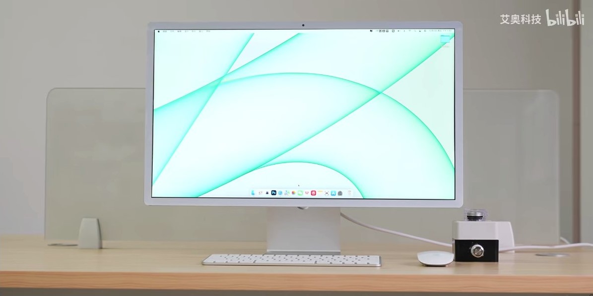
But some people are not fans of the thick chin that sits along the bottom of the iMac underneath the screen, breaking its symmetry. For most, this criticism will only go as far as grumbling in below-the-line comments sections, but some — like these engineers in China — will go to extremes to make the iMac they believe Apple should have created all along. Behold: an iMac without its chin!

The chin is there for a reason, of course: it’s where the actual Mac internals are hidden away, so you can’t just remove it and still have a working computer.
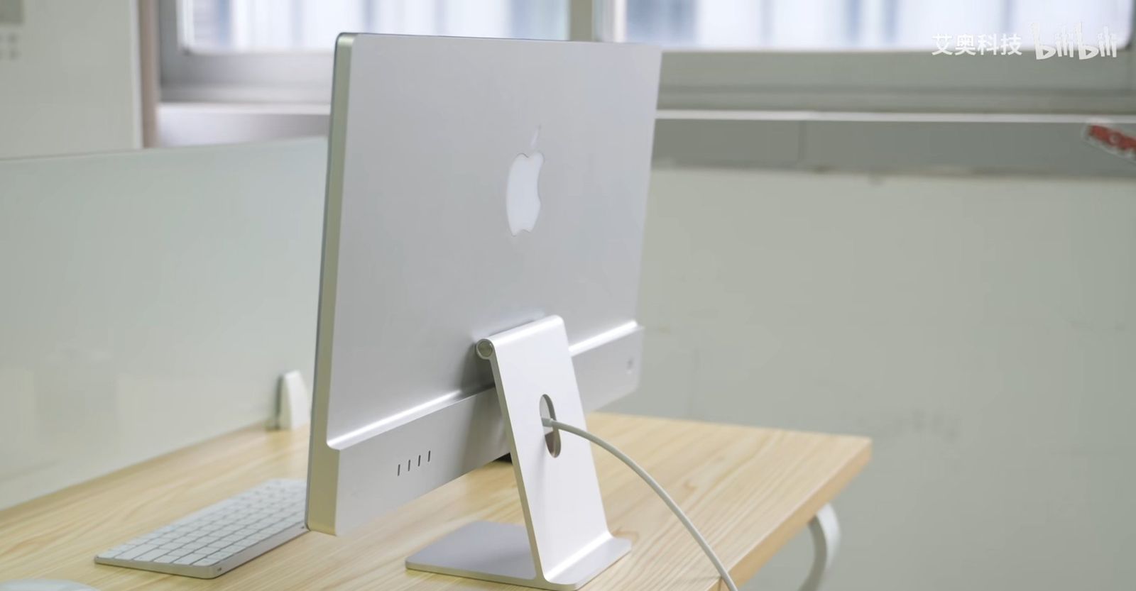
As such, the modders instead relocated it — attaching it to the back of the computer, neatly hidden away and giving you a symmetrical screen from the front, as you can see in the image below.

The process was as intricate and time intensive as you would expect. First the chin area had to be removed, with the edges ground into the same shape as the top. Then a whole new rear casing was 3D printed for testing before being machined out of alumnium and anodized, before the components were placed inside with some extra precautions to reduce the risk of overheating.
It’s undoubtedly an impressive feat of engineering, but I find myself looking at it and missing the old model. If I saw both in a showroom and had to buy one, I think I’d pick Apple’s original design.
Think different
This has little to do with practical concerns. People have suggested that moving the internal components behind the screen could reduce its life of it thanks to inevitable heat dissipation, but for the purposes of this, I’m assuming both works identically.
The main problem I have with it is that it lacks personality. In simple terms, it’s just not an iMac anymore — it could be any (admittedly sleek-looking) monitor from any manufacturer from Samsung to Dell. And to me, Apple products have a distinctive style that actively screams their difference.
For the iMac, it seems that’s the chin. Aside from anything else, it’s where the splash of color is added too, and the teal model is, to my mind, just beautiful.

Although it’s mainly aesthetic, I do have a couple of practical concerns too. Firstly, grabbing onto the chin is how you tilt the screen back for comfortable viewing. If you had to use the new version — well, just make sure you have a microfiber cloth handy for removing those fingerprints. It’s also a handy place for sticking post-it notes, for those of us who aren’t quite ready to trust their digital equivalent.
Maybe this is the direction Apple will move in eventually, but personally, I hope not. The iMac’s chin could be every bit as iconic as the iPod’s click wheel or indeed the classic curved iMac. I hope that Apple stays the course with the iMac Pro 2023.
Sign up to get the BEST of Tom's Guide direct to your inbox.
Get instant access to breaking news, the hottest reviews, great deals and helpful tips.
Freelance contributor Alan has been writing about tech for over a decade, covering phones, drones and everything in between. Previously Deputy Editor of tech site Alphr, his words are found all over the web and in the occasional magazine too. When not weighing up the pros and cons of the latest smartwatch, you'll probably find him tackling his ever-growing games backlog. Or, more likely, playing Spelunky for the millionth time.

