The new MacBook Pro 2021 has a notch — and I’m OK with it
I'll take a notch in this MacBook Pro
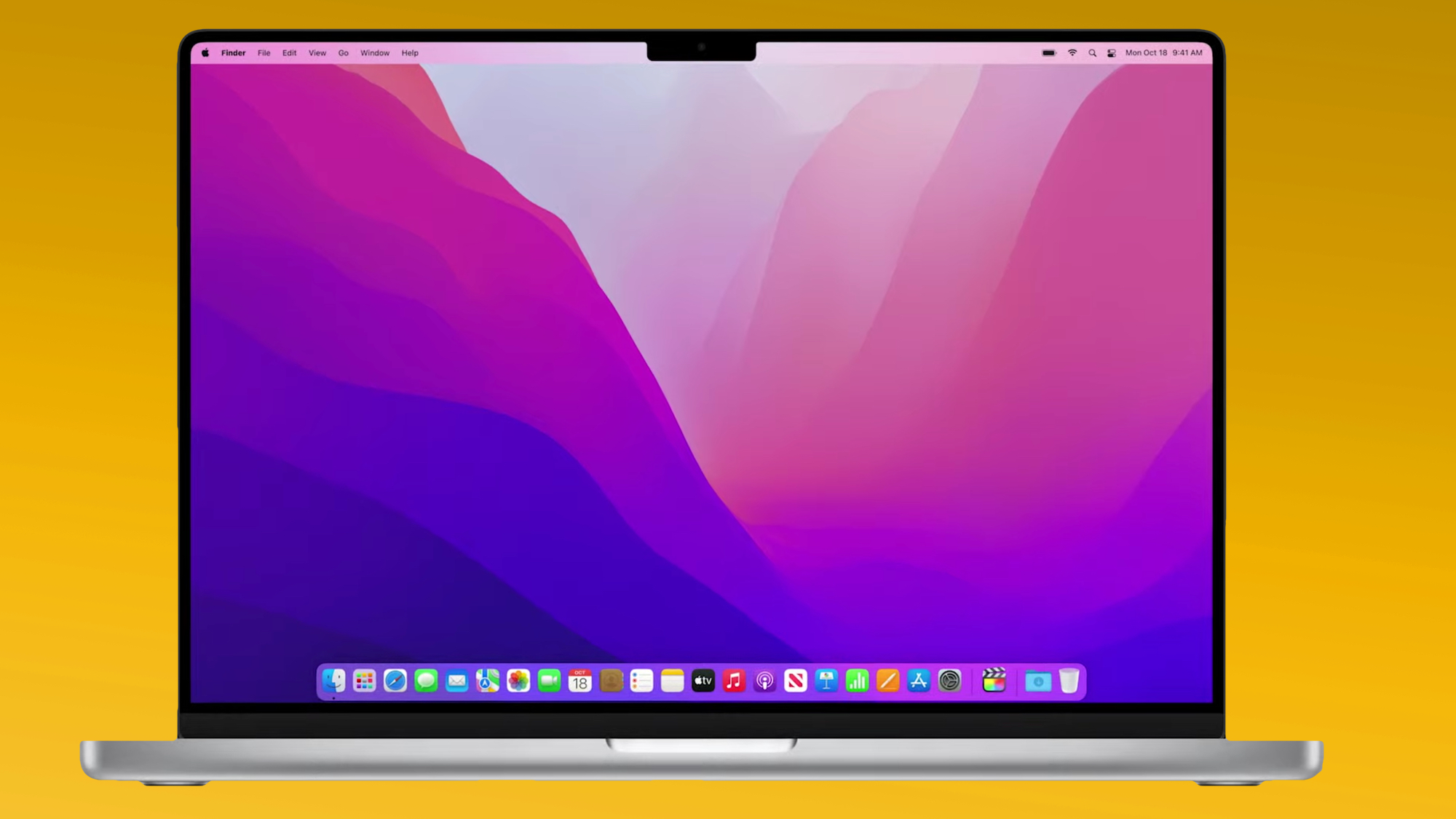
Nearly all of the MacBook Pro 2021 rumors came true, even the one we didn't want to see. Yes, the new MacBook Pro 2021 has a dang notch in the top of the display. But, you know what? I'm not exactly bothered by the notion.
Sure, it looks funny. It's seemingly there to accommodate the camera at the top of the laptop, but it also looks like a marketing decision, to make the MacBook Pro 2021 (14 inch) and MacBook Pro 2021 16-inch more iPhone-like.
Some will definitely mock this for looking like a bad render. But in this moment, right as Apple's announced the new model, it's not stopping me from pre-ordering one for myself. Or from assuming that this won't stop the new MacBook Pro models from being two of the best laptops on the market.
- Meet the new AirPods 3
- Apple event recap: MacBook Pro 2021, AirPods 3, M1 Pro chip and all the big news
- Plus: Google Pixel 6 event disappointment — there's probably no Pixel Watch coming
What we get in exchange for the MacBook Pro notch
For years, laptops such as the Dell XPS 13 have shredded their bezels. All the while, the MacBook Pro's comparably chunky bezels continued to age and age. The notch's presence is acceptable, first and foremost, because that's changing.
But a bit of context to start, the 2018 Huawei MateBook X Pro has 0.2-inch bezels on the top and sides, which still make the 2020 MacBook Pro with M1's 0.3-inch side bezels look thick (and not in a good way) by comparison. And you might ask how big a tenth of an inch is. Well, check it out for yourself. On the left I've got the latest MacBook Pro, and on the right that's the MateBook X Pro (the only thin-bezel laptop I have lying around the house).
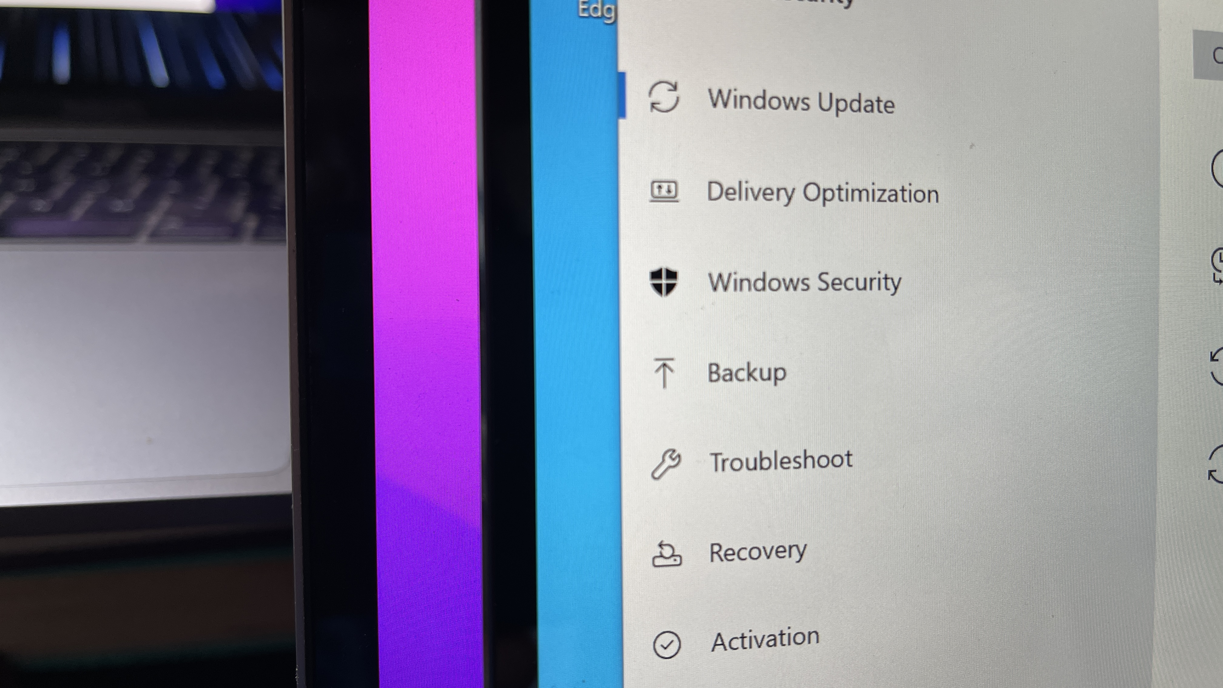
And colleagues with access to the XPS 13 released in Summer 2020 say its bezels measure 0.1 inches on the sides and 0.2 inches on the top.
Apple described the MacBook Pro 2021's side bezels as 24% thinner. That should make for 0.2-inch side bezels. And since that MacBook Pro 2020 had a 0.5-inch top bezel, there was even more room for improvement here (the MateBook X Pro also has 0.2-inch top bezels). And so they cut it down further: from 0.5 inches to 0.1 inches (rounding to the nearest tenth from 0.14).
So for starters, I'm elated that Apple's finally shrinking its bezels down to where they should have been years ago. It's an overdue fix.
Except, you know, where the notch shows up. Apple didn't say how much total space its MacBook Pro notch takes up.
Where the MacBook Pro's notch is OK
The notch, however I think it looks, is forgivable for one easy reason: it will be filling space I don't need for the most of the time.
Most of the time I use a Mac, I can see the Menu Bar, that opaque space at the top of the screen where the menus such as File and Edit live on the left, and the menus for battery life, time and date and Siri live on the right.
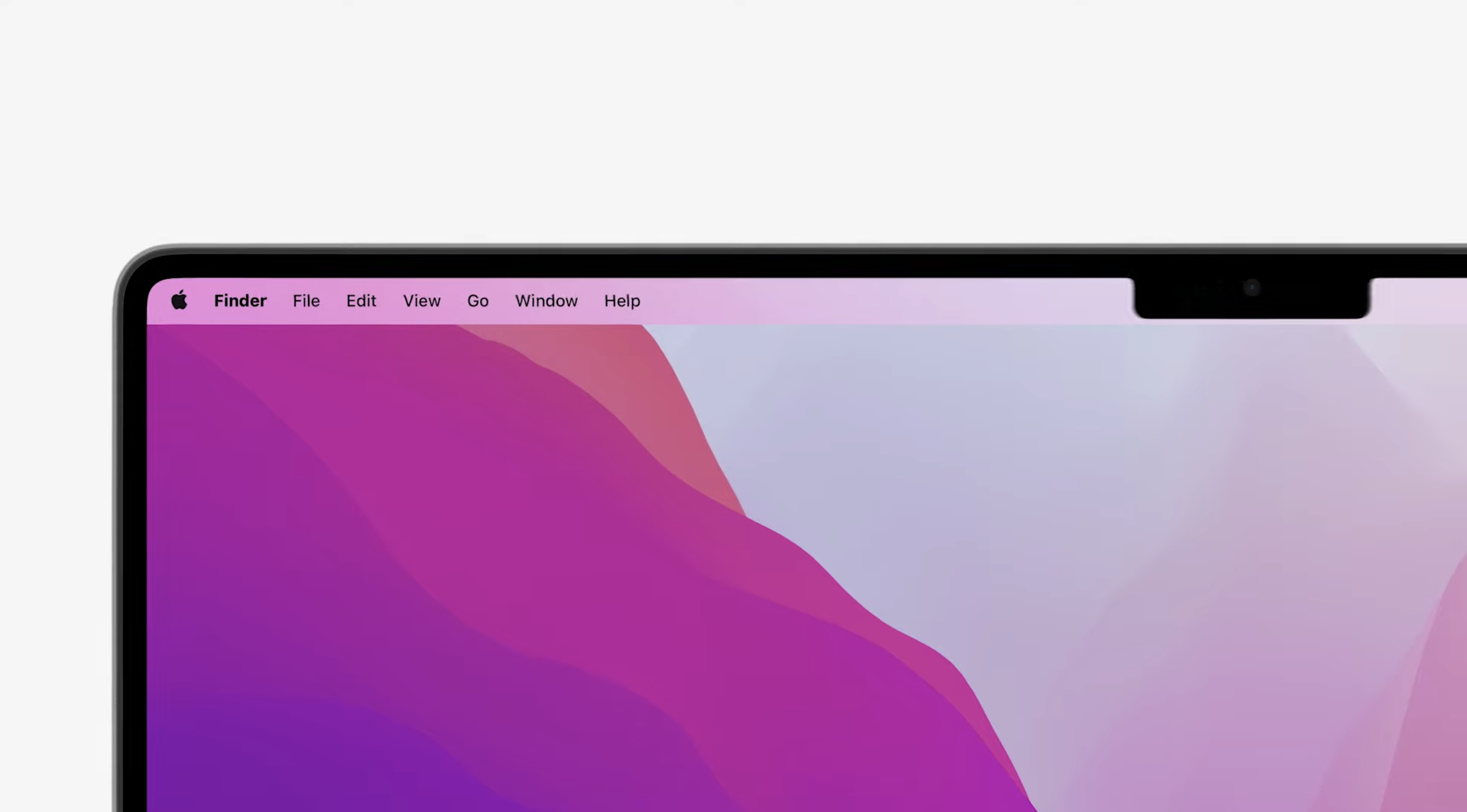
And while I can push the limits of how many apps live in the Menu Bar pretty far, I have been using fewer as of late (and the Bartender utility lets you hide ones you don't need). I just don't see the right side of the screen reaching that far.
So, at this point, the MacBook Pro's notch biggest issue that it's an eye-sore. Which is the last feature Apple ever seems to want for its products. The fact that you basically get to move the Menu Bar up, to take up some of the space that the bezel was formerly taking? That's (probably) worth it.
Where the MacBook Pro's notch hurts
Apple's own presentation revealed the exact moment where it seems the new notch in the MacBook Pro will be a slight annoyance. As seen here, it appears that full-screen applications will basically appear in black on the top, essentially re-growing the top bezel.
So, for anyone using applications that they love to full-screen (I see you, creative professionals using video editing suites, it appears your applications may not appear so bezel-free.
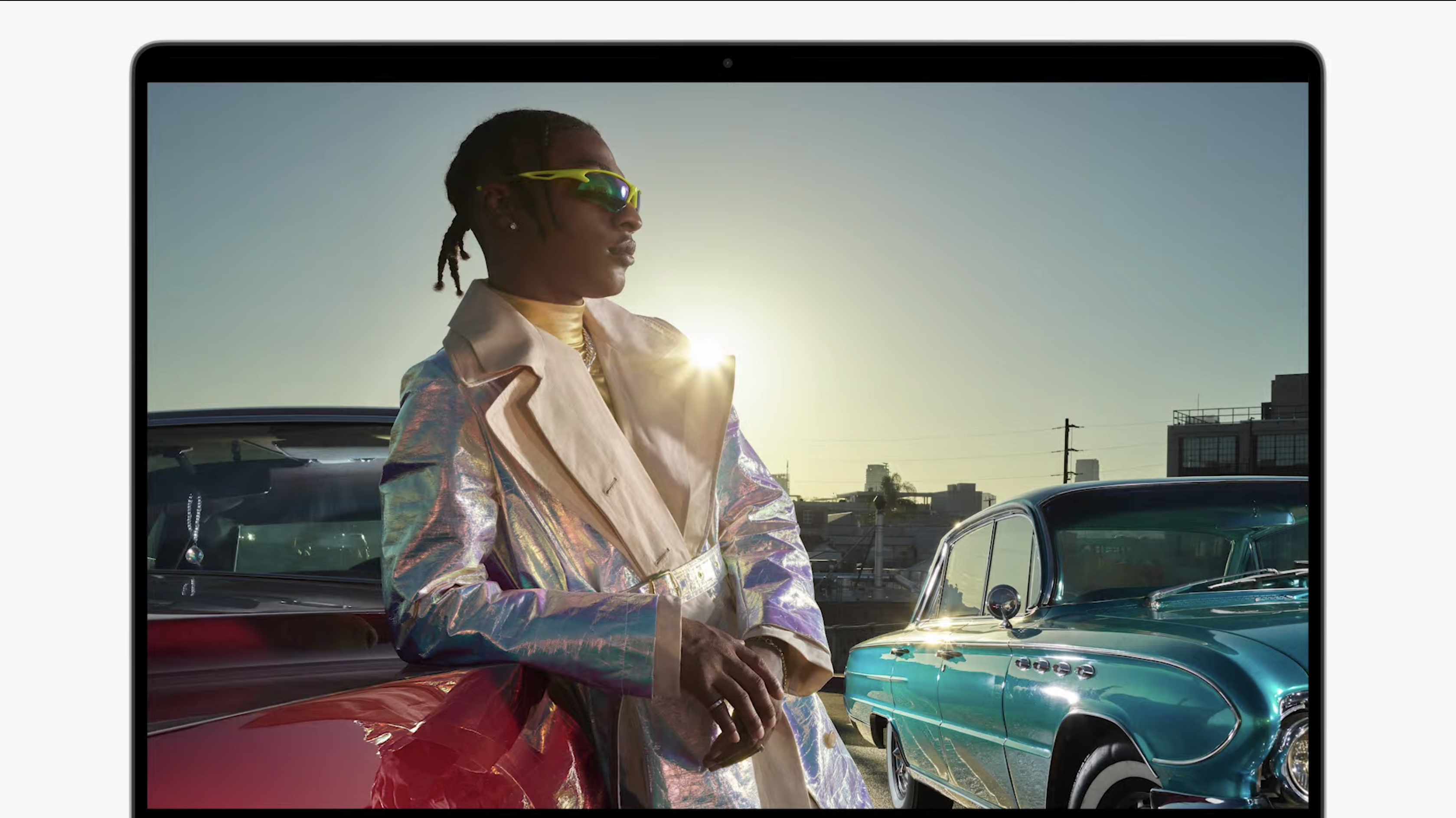
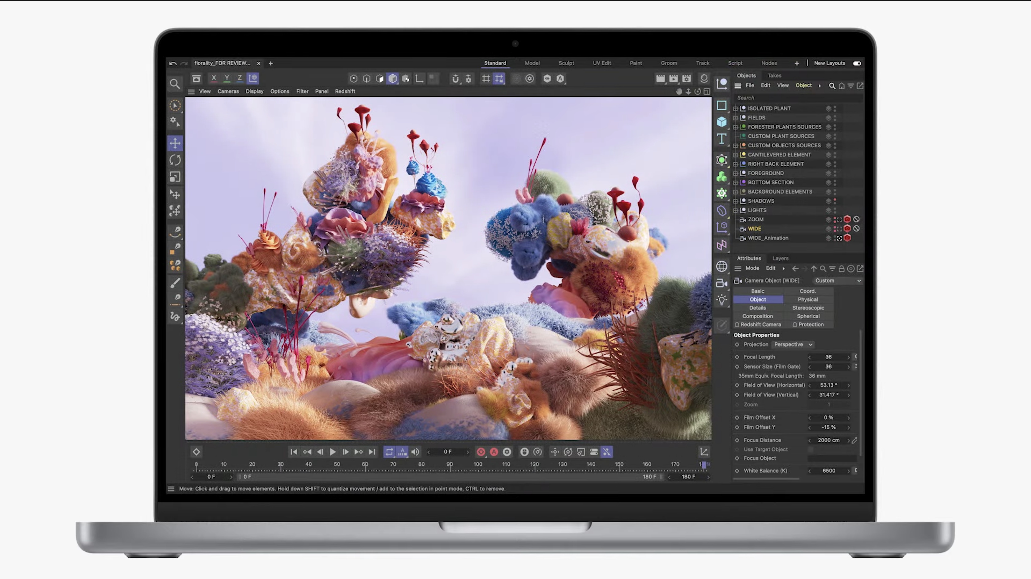
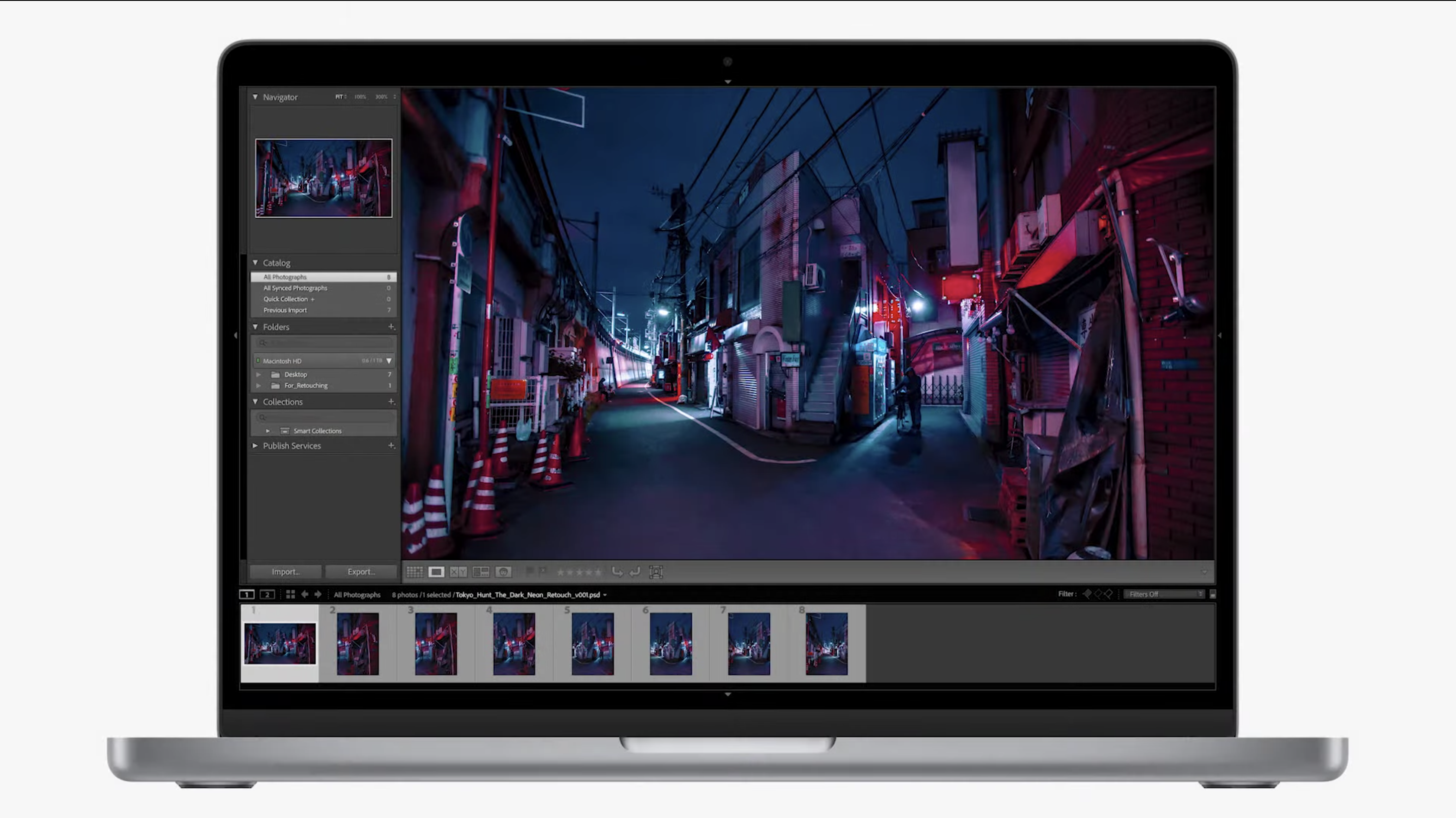
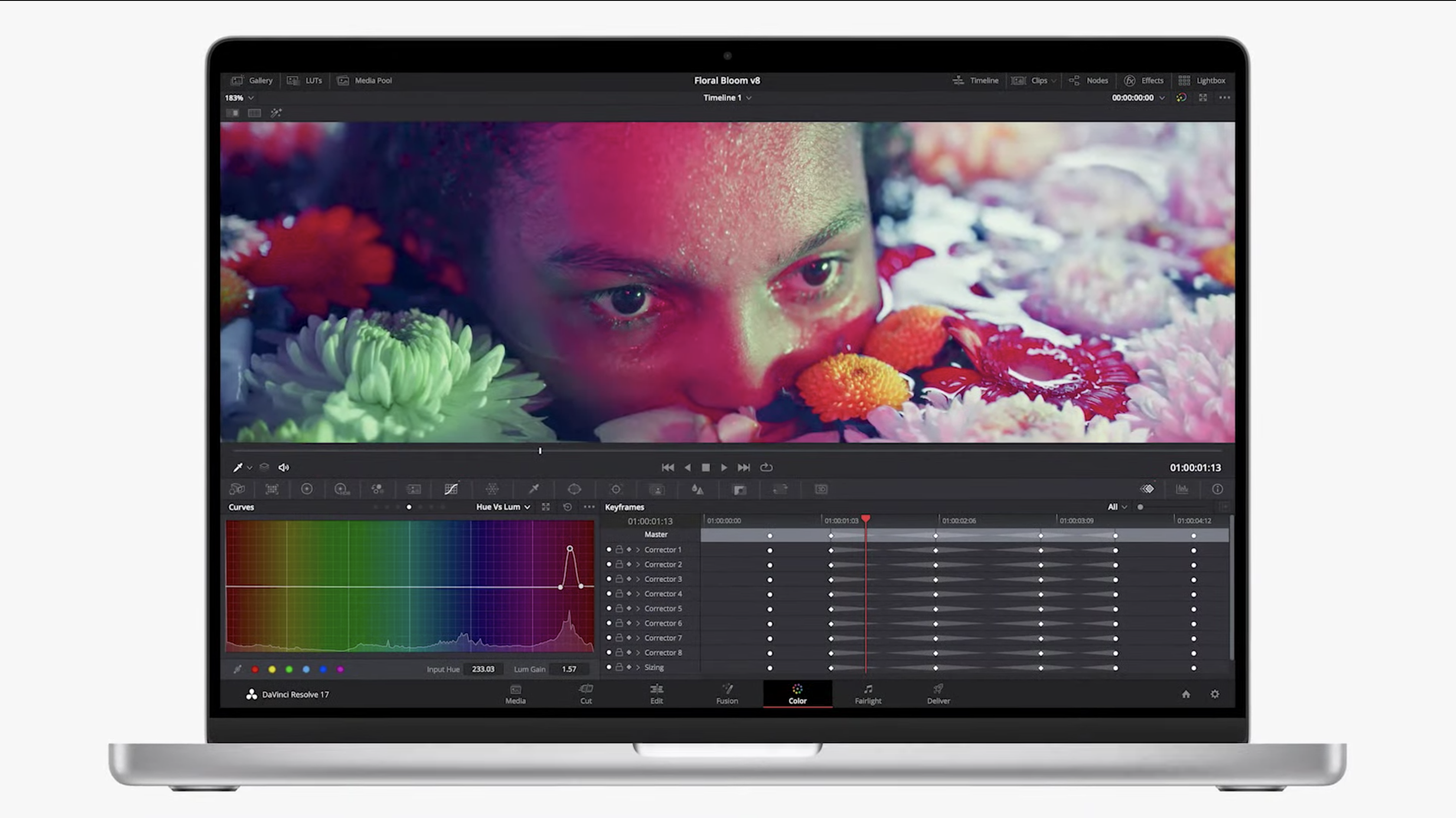
But then again, we've yet to get this notch-bearing MacBook Pro in our hands, to see what it's actually like. Will programs be re-arranged to adapt to a notch? We shall see.
MacBook Pro notch outlook
Much like the notch on the current iPhone, I bet I'll stop thinking about the notch in a week or so after I start using one of the MacBook Pro 2021 models. If I'm able to forget about it on my iPhone — which I use much closer to my face — I'll likely forget it here as well.
I've waited nine whole years to buy a new MacBook Pro. And while I would erase this small blemish if it meant no other trade-offs, the increased screen space via smaller bezels is a worthy exchange.
Sign up to get the BEST of Tom's Guide direct to your inbox.
Get instant access to breaking news, the hottest reviews, great deals and helpful tips.

Henry is a managing editor at Tom’s Guide covering streaming media, laptops and all things Apple, reviewing devices and services for the past seven years. Prior to joining Tom's Guide, he reviewed software and hardware for TechRadar Pro, and interviewed artists for Patek Philippe International Magazine. He's also covered the wild world of professional wrestling for Cageside Seats, interviewing athletes and other industry veterans.
