Spotify's redesign is so bad I’m considering switching to Apple Music
Spotify wants to be TikTok, and that’s not good

“Thanks, I Hate It” is the name of a pretty fun song by pop punk band Simple Creatures, it was also my exact reaction to the news that Spotify is being redesigned. The popular music streaming service is one of my daily essentials, and up until now its well-considered home page and interface were a big part of the reason I largely ignored rivals such as Apple Music.
But the service’s upcoming TikTok-inspired new look has me wondering if the grass might be a little greener on the other side. That’s because despite the fact that Spotify is a music streaming service, the redesigned home page appears to be less about highlighting new tracks, artists and playlists, but rather the focus seems to be on video content and podcasts. And that's got me considering a switch in the near future.
Spotify is trying to fix what isn’t broken

I would argue that redesigning the Spotify home page is a fundamentally flawed endeavor. The app already has a very well-structured interface that is really good at throwing relevant recommendations your way. I've lost count of the number of times it's spotlighted an artist I've never even heard of who quickly became a new favorite.
A great example of this is the fact I’ve spent the better part of the last six months listening to Texas-based artist Dayglow on repeat. And I only discovered the indie-pop singer because of a recommendation on the Spotify homepage. That’s just one example of how Spotify currently does an excellent job of spotlighting new music.
I also love how easy the current Spotify homepage makes jumping into curated playlists. In fact, I’ve all but stopped making my own custom playlists because, after a quick scroll of the Spotify home page, I’ll find half a dozen auto-generated ones that are always stuffed full of songs I love. And usually, they're also sprinkled with new music that appeals to my tastes as well.
To date, I can only describe the user experience on Spotify as exceptional. It’s a huge part of the reason I’ve never even considered canceling my subscription or switching over to an alternative service. But based on what we’ve seen of the new UI, I’m getting increasingly concerned that could change very soon.
The new Spotify isn't about the music
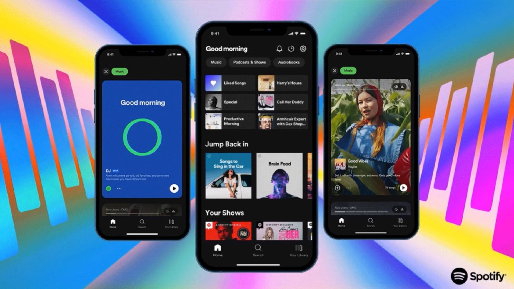
The new Spotify home page has more than a hint of TikTok about it. The rows upon rows of recently played artists, recommended playlists and new music to discover, are set to be replaced with a vertically scrolling feed with large-scale cards that will dominate the whole screen. In short, it sounds awful.
From the preview we’ve seen, it appears that podcasts, audiobooks and video content will also be heavily featured in these cards. Which is something I have absolutely zero interest in.
Rather than being presented with a whole range of options at once, you’ll have to scroll through cards one at a time. This will surely become tedious rather quickly. The new feed looks so offputting that I suspect many users will head for the search bar as a first port of call instead of browsing the home page. This will in turn greatly limit a user's exposure to new music and many people will instead resort to listening to familiar favorites on repeat.
Of course, it’s important to note that there’s been no indication that Spotify’s recommendation algorithm will be changing. So, at least in theory, all the stuff I like about the service's ability to constantly surface relevant new artists should still be there. But as noted, the redesign will just make actually discovering these new artists a more laborious task — hooray!
From the preview we’ve seen, it appears that podcasts, audiobooks and video content will also be heavily featured in these cards. Which is something I have absolutely zero interest in. I get my podcasts from the dedicated iOS Podcast app, and I’m very content with that system. In the past year, I can only recall listening to a single podcast on Spotify — and that was only because it was platform exclusive.
Spotify has invested heavily in podcasts over the last five years, acquiring some big shows as exclusives, so naturally will want to promote these shows to users. And it shouldn’t be forgotten that podcasts are a lot easier to monetize than music giving the service an incentive to overpromote them.
The cynic in me does have to question whether the new home page will regularly recommend new albums to listen to, or will it instead be used to shout about whatever new audio show Spotify just paid thousands of dollars to make exclusive? Confirmation of an option to prevent podcasts from appearing in the new feed would be greatly appreciated.
Apple Music vs Spotify — will I switch sides?

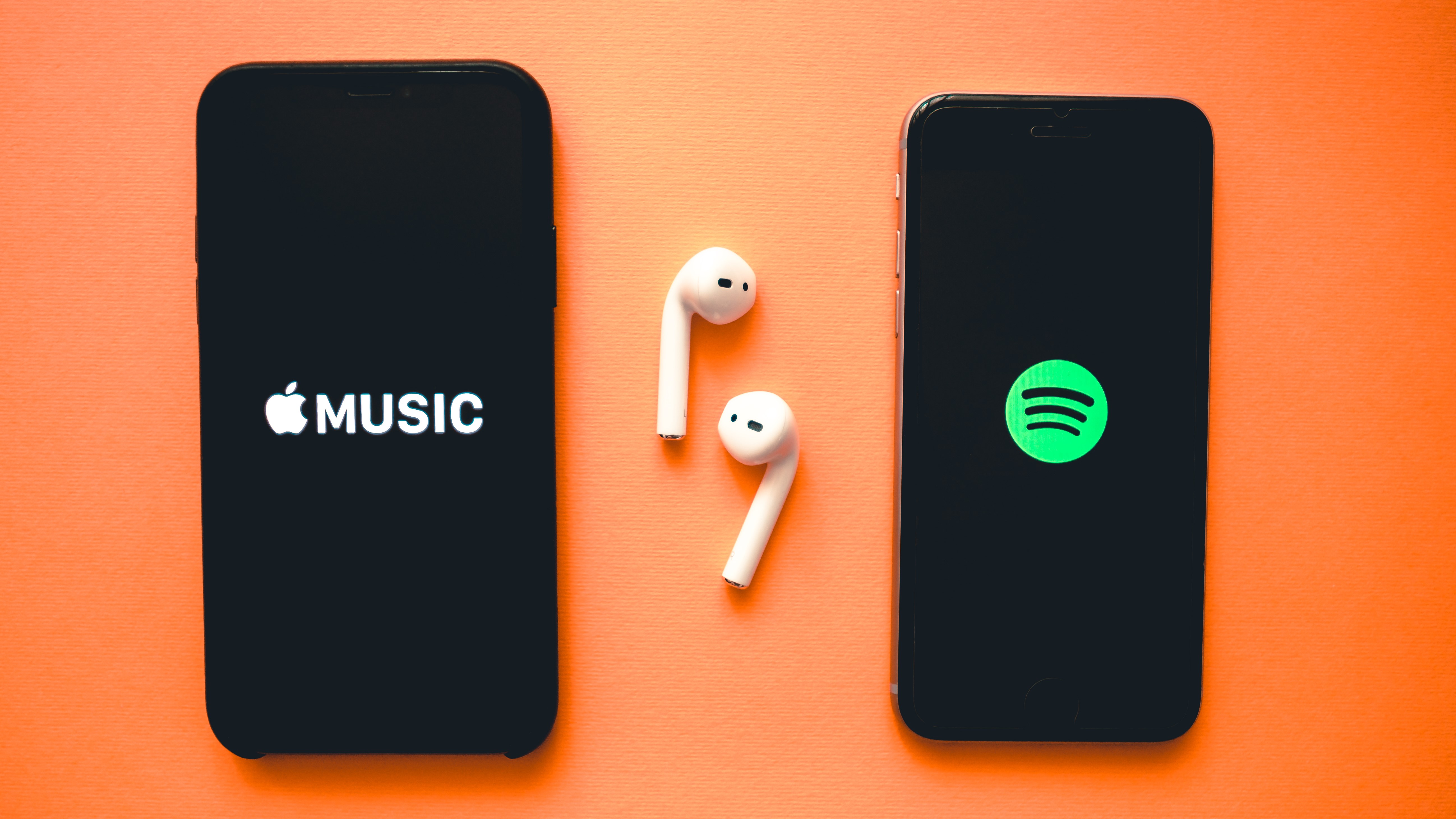
And it's at this point that Apple Music comes into my thinking. The Apple Music vs Spotify debate is one that has raged across the Tom’s Guide office plenty of times in the past, and several of my colleagues make a compelling case for Apple's service, but I’ve always found myself sticking loyally to the green side of the fence.
However, for me, Spotify is solely about music, and this redesign appears to be shifting the focus away from that. That’s a dangerous game for the service to play if it wants to retain my monthly fee.
Right now, I’m trying to force myself to keep an open mind. After all the redesign hasn’t been fully rolled out yet. There is a (very slim) possibility it could pleasantly surprise me once I go hands-on. However, based on what I’ve seen to date, Spotify’s previously ultra-secure position in my streaming portfolio is starting to look a little precarious, and its loss could ultimately be Apple Music’s gain.
More from Tom's Guide
Sign up to get the BEST of Tom's Guide direct to your inbox.
Get instant access to breaking news, the hottest reviews, great deals and helpful tips.

Rory is an Entertainment Editor at Tom’s Guide based in the UK. He covers a wide range of topics but with a particular focus on gaming and streaming. When he’s not reviewing the latest games, searching for hidden gems on Netflix, or writing hot takes on new gaming hardware, TV shows and movies, he can be found attending music festivals and getting far too emotionally invested in his favorite football team.
-
NorbertEngel So, you haven’t actually tried it yet, but decided to write this clickbait to pretend you did…deeply annoying.Reply
