OnePlus' OxygenOS is dead as we know it
The OxygenOS we all loved is gone in favor of the new unified OS

OxygenOS has been my favorite Android skin for years. Once hailed as the epitome of what Android could be by fans and enthusiasts, OxygenOS prided itself on providing a stock-like Android experience with plenty of tweaks on top.
But when OxygenOS 11 released last year, that vision slowly changed. What started as a refined take on Google's own implementation turned into something that resembled Samsung's One UI. Many OnePlus fans, myself included, were not pleased with this change.
- This could potentially be the smartest way to get a Google Pixel 6
- OnePlus ranks in our top picks for the best Android phones
- Plus: Samsung Galaxy S22 charging speeds could be a huge let down
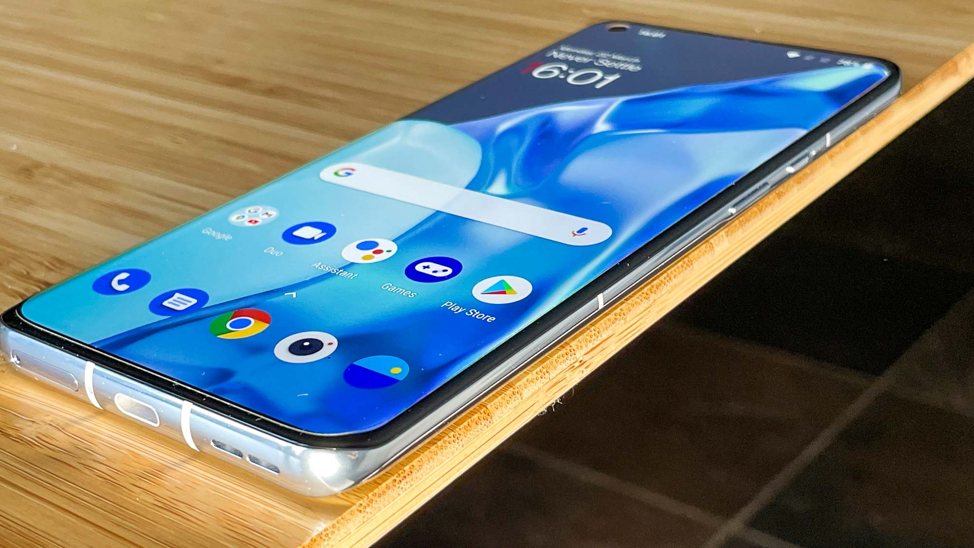
When the OnePlus 9 Pro launched, I adapted to OxygenOS 11 quickly enough. There was enough of the original DNA left and the One UI wannabe elements weren't too offensive. But later in 2021, it came to light that OnePlus and its sister company Oppo were effectively merging. Part of this merger would be a unified codebase between OxygenOS and Oppo's ColorOS.
I inwardly groaned at this, but I wanted to give things a fair chance. However, now that I've played with both the OxygenOS 12 and ColorOS 12 betas, I'm left a bit sad. OxygenOS as we once knew it is dead. Long live the new unified OS, one that strongly favors ColorOS' DNA and design language.
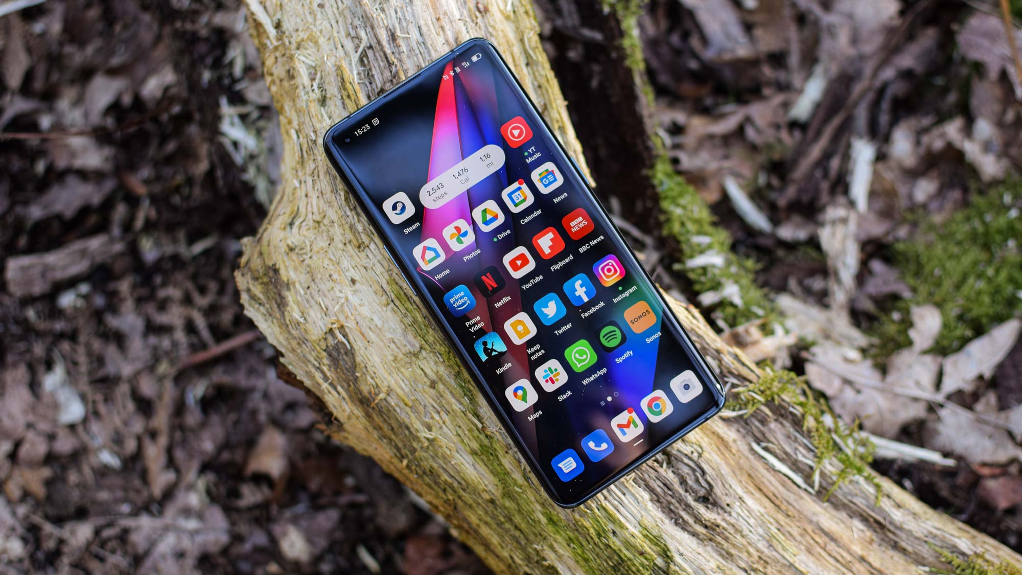
As I use the OnePlus 9 on OxygenOS 12 and the Oppo Find X3 Pro on ColorOS 12, I struggle to find more than a few superficial differences between the two. There are a few color variations between them, and there's OnePlus Sans versus Oppo Sans for alternate font options, but that's about it.

Even the sounds are eerily similar, like when you dismiss your notifications. The customization UI, Terms and Conditions prompts, and even the Settings menu layout all mirror each other. ColorOS 12 isn't bad by any means, but gone is what I and many others considered to be the best Android skin. What this spells for the OnePlus 10 series is up in the air, but I'm not sure I like where this new software design direction is going.
The important distinction is that Oppo doesn't generally sell its phones in North America, with OnePlus filling that void. In markets where Oppo and OnePlus both exist, however, there's very little to separate the phones. Even the hardware is similar — I'm struck by how alike the OnePlus 9 Pro and Find X3 Pro feel and look. The latter is a bit smaller with a different camera bump, but the curves match.
So what do I miss? I miss the close adherence to what Google lays out in stock Android. I used to refer to OxygenOS as a "stock+" experience, meaning that it had the minimalist vibe of stock Android, but with some added tweaks on top like theming options, gestures, and the like. While OxygenOS — and by extension ColorOS — is feature rich, it no longer carries the aesthetic I grew to love and appreciate over years of using OnePlus phones.
We already knew the OnePlus upstart that many had grown to love, despite its blunders throughout the years, was dead. The OnePlus 9T's cancelation was just another nail in the coffin, and so was the OnePlus 9 Pro creeping over $1,000. Yet, OxygenOS held on for fans, but now that's heading out, too. And I don't think we're ever going to get it back.
Sign up to get the BEST of Tom's Guide direct to your inbox.
Get instant access to breaking news, the hottest reviews, great deals and helpful tips.

Jordan is the Phones Editor for Tom's Guide, covering all things phone-related. He's written about phones for over six years and plans to continue for a long while to come. He loves nothing more than relaxing in his home with a book, game, or his latest personal writing project. Jordan likes finding new things to dive into, from books and games to new mechanical keyboard switches and fun keycap sets. Outside of work, you can find him poring over open-source software and his studies.
