Microsoft Surface Duo 2 is one big foldable fail — here's why
Two 5.3-inch screens don't add up to one big workspace on this quasi-foldable phone

After spending just a little time with the Microsoft Surface Duo 2, as I did when reviewing the new dual-screen phone, the improvements over the original model become very clear. While the first Surface Duo was dragged down by out-of-date processors and a single camera, Microsoft corrected those missteps with the sequel.
So yes, the Surface Duo 2 is much better than what came before it, while also keeping the stellar design that made the original standout from the smartphone crowd.
And yet, there's no phone that I've handled this year that makes me angrier than the Surface Duo 2.
When you review products, right away you begin to recognize that not everything that comes across your desk is going to be built with your specific needs in mind. So when assessing a device like the Surface Duo 2, you have to set aside your own biases and focus on whether the product you're looking at addresses the demands of its target audience. In that regard, it's difficult to see the Surface Duo 2 as anything but a well-intentioned failure.
Why foldable phones exist
Ask yourself this: Why would someone want a foldable phone (or in the case of the Surface Duo 2, a dual-screen phone that opens up to reveal 8.3 inches worth of workspace)? Even folded up, a phone that gives you that kind of extra real estate isn't the easiest device to tote around. So there has to be some reason that justifies trying to fit a phone that big into your pocket.

I would argue that the case in favor of the Surface Duo 2 — and indeed for any of the best foldable phones or dual-screen devices — is that it gives you the workspace of a tablet in the form factor of a phone. Smartphones give us the processing power of a portable computer in our pocket — yet, they have the screen size of a device that's ill-suited for anything but quick, easy work. I've tried to edit documents on everything from an iPhone 11 Pro Max down to a compact iPhone SE, and it's a real drag.
Foldable phones like the Galaxy Z Fold 3 as well as dual-screen devices like Microsoft's latest Surface Duo address that problem. Instead of a screen that's confined to a smartphone-sized space, you get a work area that's wider and taller — big enough for full-screen work like marking up documents or editing folders or for running multiple apps at once, if you're so inclined. "The productivity of a tablet in a device the size of a mobile phone" is the sales pitch for foldable devices, and as far as marketing spin goes, it's a pretty compelling argument.
Where the Microsoft Surface Duo 2 falls short
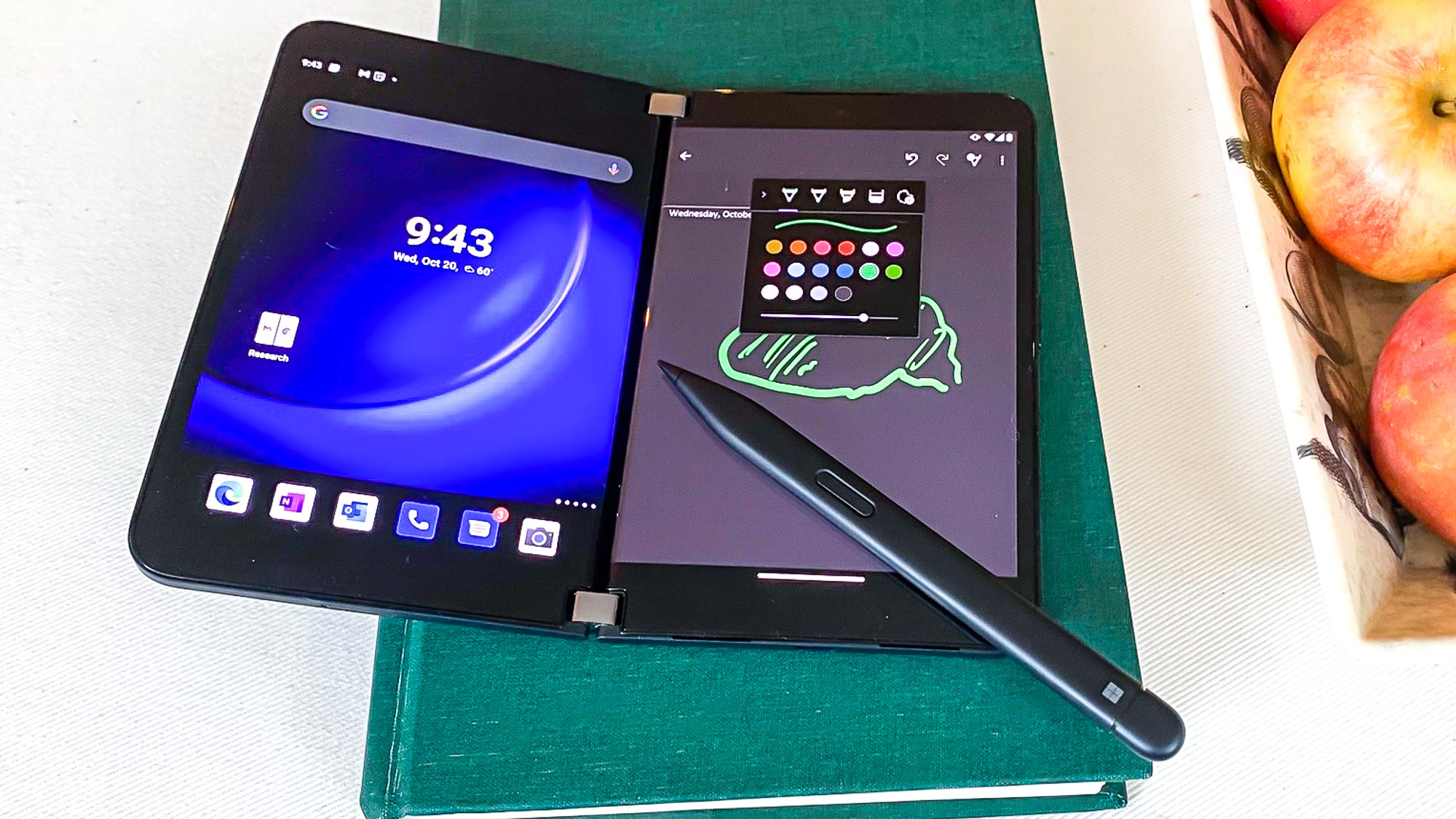
So how does the Surface Duo 2 get this wrong? Because while its two 5.3-inch AMOLED panels can form a larger work area, it's not an uninterrupted display like you get from the best foldable phones.
Open an an app so that it spreads across the Surface Duo 2's screen, and you've got to contend with a noticeable gap where the two panels come together. This is even more prominent than the Galaxy Z Fold 3 and its visible crease where the screens bend - at least that display is fairly seamless. (For more on how these two phones compare, see our Microsoft Surface Duo 2 vs. Samsung Galaxy Z Fold 3 face-off.)

Microsoft might count that you're really not meant to run apps that way. Instead, where the Microsoft Surface Duo 2 really earns its corn is as a multitasking device with two different apps running on opposite panels. You can still drag information aback and forth between the two screens, and you can even pair apps to launch together.
Even then, you're still working on a 5.3-inch screen — not the expansive 8.3-inch space Microsoft promised you. And even that individual panel is cramped — the bezels on the Surface Duo 2 are quite prominent, making the phone feel rather claustrophobic. That's something you should never feel when using a dual-screen device.

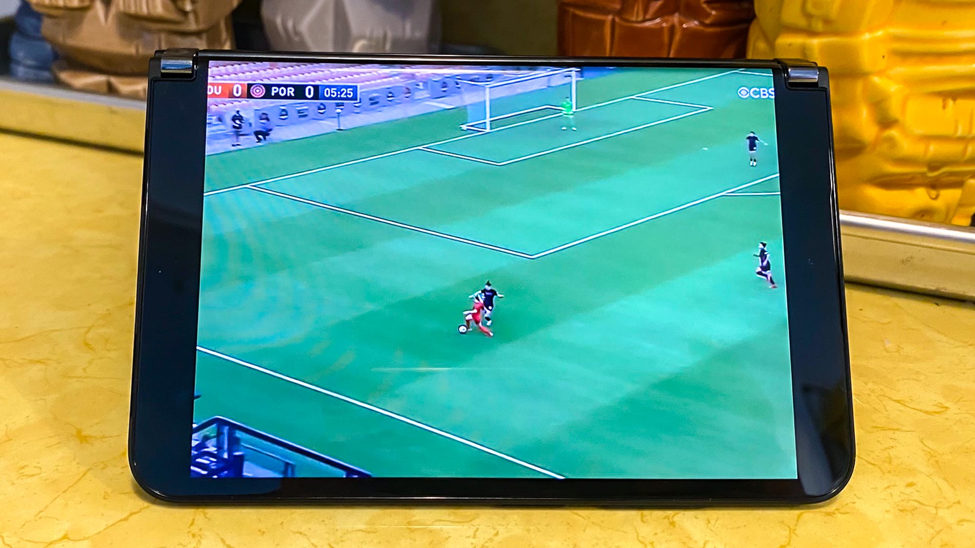
When I tested the Surface Duo 2, I spent some time watching a streaming soccer match with the display in tent mode, propping up the phone so I could watch the action unfold on a single panel. It was all right, but if I had just streamed the game on an iPhone 11 Pro Max, I would have had a more expansive screen area for streaming.
Making the case for the Microsoft Surface Duo 2
Microsoft would counter that its phone has other factors in its favor besides the ability to spread your work across two panels. The phone is compatible with the Surface Slim Pen 2, after all, giving you an accessory for note-taking and drawing on the phone's display (if you're willing to pay another $129 for the stylus on top of the $1,499 the phone already costs). And Microsoft has worked to see that a number of apps are optimized for the Surface Duo 2's dual screen design.
The same things could be said, though, of Samsung's Galaxy Z Fold 3. And while that phone costs $300 more than Microsoft's handset, its truly foldable display doesn't suffer from as many limitations.
Ultimately, the problem with the Surface Duo 2 doesn't come down to its feature set, its price or any of the specs that usually make or break a phone. The problem here is that the phone simply ignores the reason why people would want to turn to a device with more screen space.
Sign up to get the BEST of Tom's Guide direct to your inbox.
Get instant access to breaking news, the hottest reviews, great deals and helpful tips.
Philip Michaels is a Managing Editor at Tom's Guide. He's been covering personal technology since 1999 and was in the building when Steve Jobs showed off the iPhone for the first time. He's been evaluating smartphones since that first iPhone debuted in 2007, and he's been following phone carriers and smartphone plans since 2015. He has strong opinions about Apple, the Oakland Athletics, old movies and proper butchery techniques. Follow him at @PhilipMichaels.
-
Godzillafarts "... Duo 2 fails as a big screen phone..."Reply
Complains that this 5.3 inch device is too big to carry around. Then compares watching videos on it with an iPhone 11 pro max, which is entire 1.1 inches bigger than the duo.
This article is way off point and rife with contradictions.
As stated in the article it's the reviewers job to look at a device unobjectively. All this article does is complain it doesn't suit your needs.
This device definitely isn't for everyone but it's a great dual screen device. It shouldn't be compared to other foldable phones because the duo has a completely different vision than other foldables (it has two screens, not one big folding screen).
And while the gap between the screens is probably its biggest downfall in terms of aesthetics. It's not much different than one folding screen that's constantly warped by the hinge underneath it and it better suits the idea behind the phone which is ultimately multitasking and productivity. -
Giwi I agree. The mention about objectivity is simply to try and ward off and pre empt comments about the niche target use case so as to bring more credibility to his argument. But it fails, as he clearly is just another person who doesn't get it. Perhaps he thinks all phones should be the same, or that people use them just for media consumption and want a big uninterrupted space. It's understandable mind you, given he is an iPhone user, that he cares more about showiness than features.Reply

