iOS 17's most controversial change is moving the End call button — here’s why
People are freaking out over the new iOS 17 End call button

iOS 17 will bring a lot of headline changes to the iPhone, such as StandBy mode, Live Voicemail, Check In and NameDrop. But one of the most controversial has ended up being the End call button being moved. Who would have thought that moving six buttons a couple of inches would have caused such a fuss?
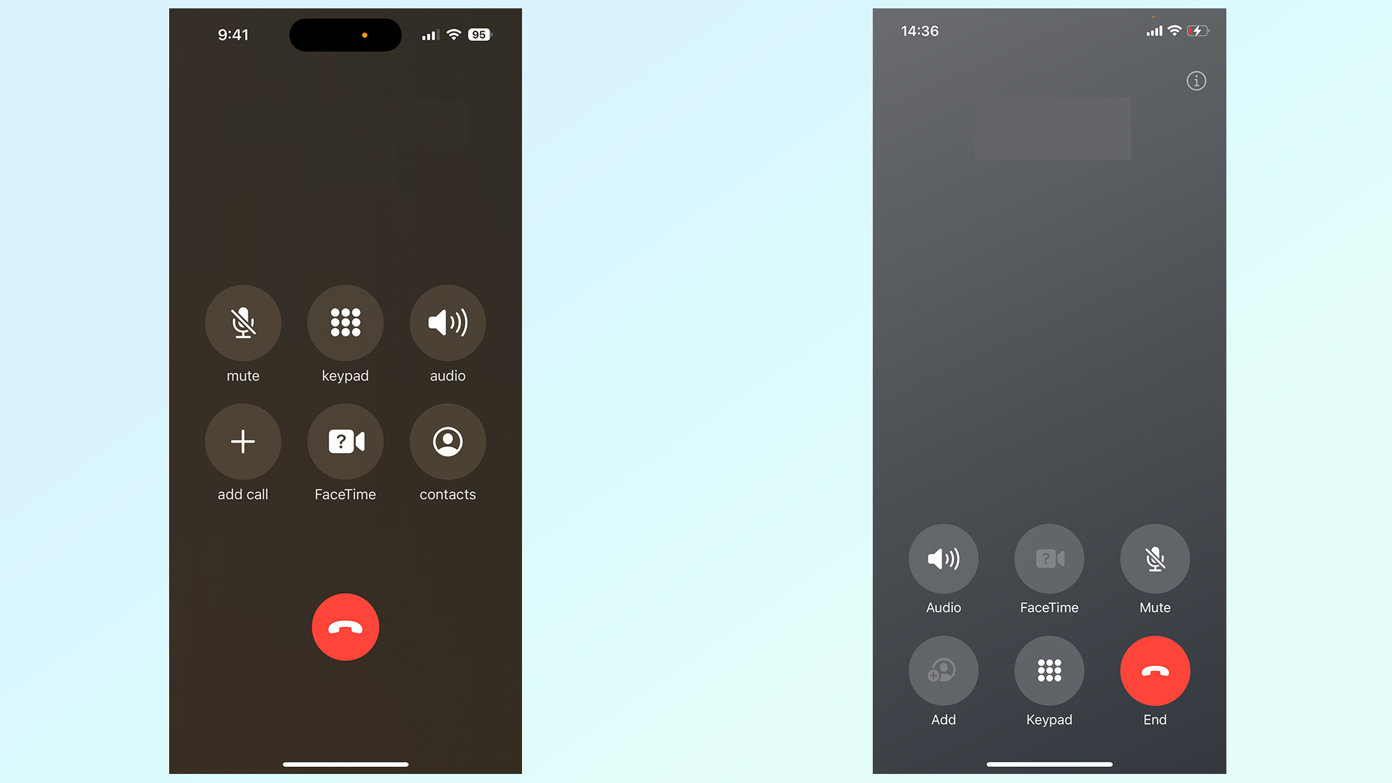
Let's go over what exactly we're dealing with. When in a call on an iPhone running iOS 17, you'll see that compared to the current iOS 16 arrangement, the whole set of controls has been moved from the center of the display — with the End call button in the bottom center — to the bottom third.
The End call button has moved to the right, with its old spot now taken up by the FaceTime button, as well as the very top of the Keypad button. Some other changes, like the removal of the Contacts button and the swapping around of Audio and Mute, have also taken place, but haven't alarmed iPhone users quite so much.

Small change, big effects
Smartphone users like myself, who rely more on the "smart" part than the "phone" part, don't have anything to worry about. If you're anything like me, taking calls only once or twice a week at most, then you don't have muscle memory that could lead you to tapping the wrong button in the iOS 17 update.
When I go to hang up, I always end up looking for the button to end the call, and since it's still bright red, I've not made this mistake since installing the iOS 17 public beta a month or so ago.
That said, I know there are users out there who make far more calls than me, and who would find the button switching places when the stable version of iOS 17 rolls out at the end of the year irritating to get used to.
I also can certainly appreciate the anxiety that accidentally starting a FaceTime call could cause anyone, which feels like the crux of the upset. Perhaps if Apple had moved more buttons around — so a mis-tap would only open the keypad for instance — this wouldn't seem like such an urgent problem.
Equally, with the End call button shifting to one side from its previous central position, I can understand the annoyance any left-handed or small-handed user might have with the End call button moving away from their thumb.
A bright outlook?
Personally, I've not been bothered by the changes to the in-call controls in iOS 17, and I don't see my opinion shifting over time. But if you're completely against these changes, there may be still hope.
Last year, when iOS 15 made big changes to the Safari interface, Apple ended making them optional, with the familiar layout available to swap back to in the Settings menu. Apple may well be prepared to listen to feedback again and let users customize their in-call button layout, or even roll back the change entirely, in the final version of iOS 17.
In the long term, I think Apple should give the in-call controls an even larger overhaul. Like Control Center, having the ability to choose your own layout of buttons feels much more user friendly, and could help people adjust the controls to their preferences and needs. Maybe you'd even be able to move it back to the middle of the screen, and forget all of this ever happened. Fingers crossed that an iOS engineer's reading this and taking notes.
More from Tom's Guide
Sign up to get the BEST of Tom's Guide direct to your inbox.
Get instant access to breaking news, the hottest reviews, great deals and helpful tips.

Richard is based in London, covering news, reviews and how-tos for phones, tablets, gaming, and whatever else people need advice on. Following on from his MA in Magazine Journalism at the University of Sheffield, he's also written for WIRED U.K., The Register and Creative Bloq. When not at work, he's likely thinking about how to brew the perfect cup of specialty coffee.
