iOS 16 lock screen widgets — the best and worst so far
The best widgets from the iOS 16 beta show what developers should build for their own apps
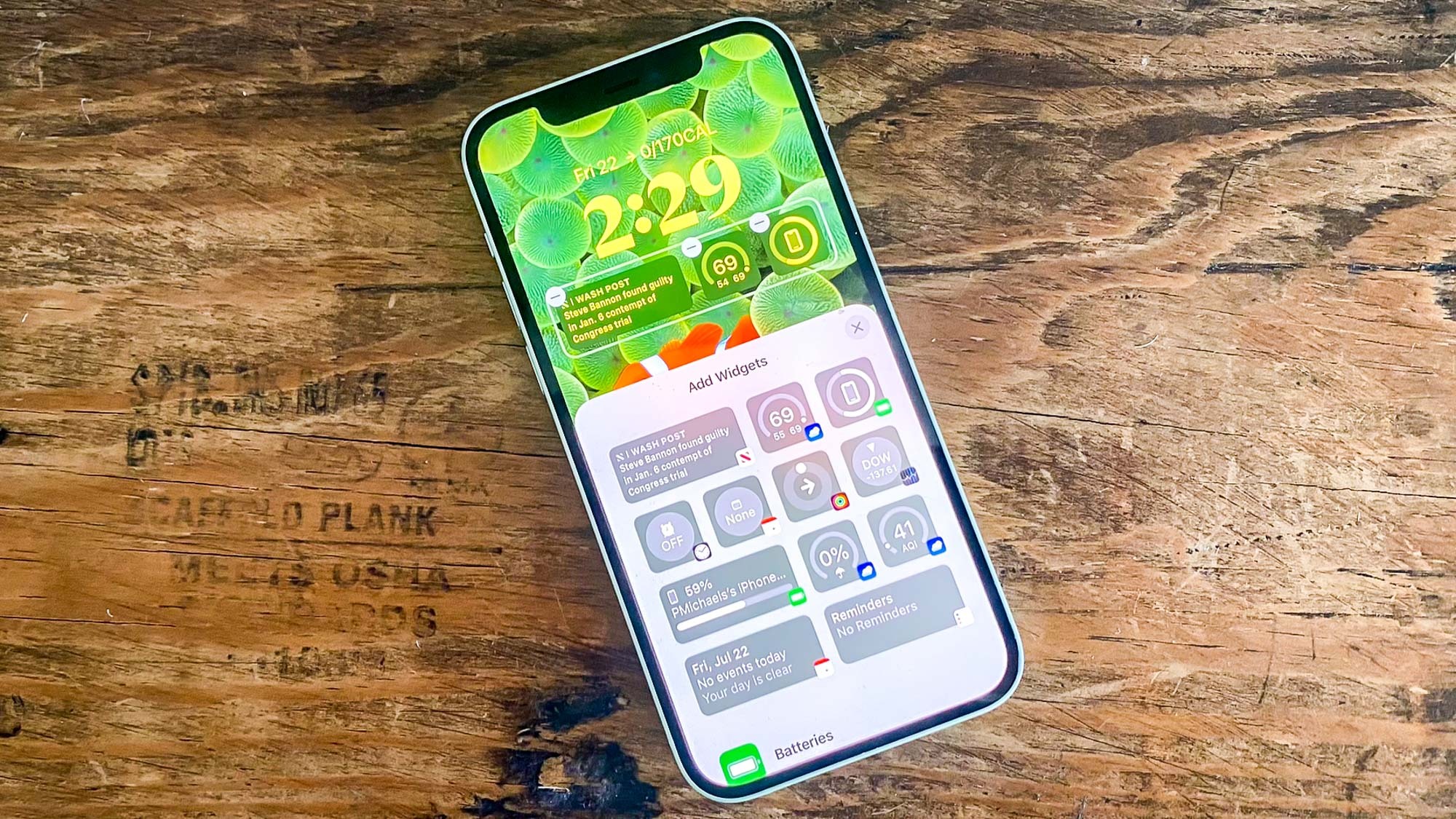
The first thing people are likely to try out after they download the iOS 16 public beta is the new customizable lock screen feature. While you've been able to choose different wallpapers before, the iOS 16 lock screen also allows you to change the font and color of the time and date readouts. You can even add lock screen widgets if you prefer.
Widgets have been around since iOS 14 arrived two years ago. They offer at-a-glance bits of information, saving you from having to fire up an app to see upcoming appointments, the current weather conditions, or whatever other piece of data you need. You've been able to place these widgets on your iPhone's home screen previously, but now new widgets are available for the lock screen, too. (You can also read our guide on the 15 best iOS 16 lock screen widgets to add to your iPhone).
As I said in my iOS 16 public beta hands-on, lock screen widgets are a welcome addition to the iPhone. Not only do they give you more of an ability to put your own personal stamp on your phone, they also let you put information that's important to you front and center. Forget about launching an app to look something up, now you don't even have to unlock your phone. (And lock screen widgets just may be the gateway to an always-on display for the iPhone 14 Pro if rumors about that feature are accurate.)
If you customize your iOS 16 lock screen with widgets, you'll notice that the iOS 16 public beta only offers widgets for Apple's built-in apps. That figures to change in the fall, since Apple has given developers a tool for creating lock screen widgets of their own. Presumably, we'll start seeing more of those once the full version of iOS 16 comes out, and updated apps start appearing on Apple's App Store.
Based on the widgets Apple has included in iOS 16 thus far, some approaches to widget design work better than others. I've been using a beta of Apple's software update since iOS 16 was released to developers last month, so I hope that app makers working on widgets of their own have noticed the same trends that I have.
After spending some time with iOS 16, here are five things that make for an effective lock screen widget.
Keep widgets simple
The best widgets require only a glance to convey vital information, so app makers should resist the temptation to try and pack in information. Uni-taskers make the best lock screen widgets in my experience.
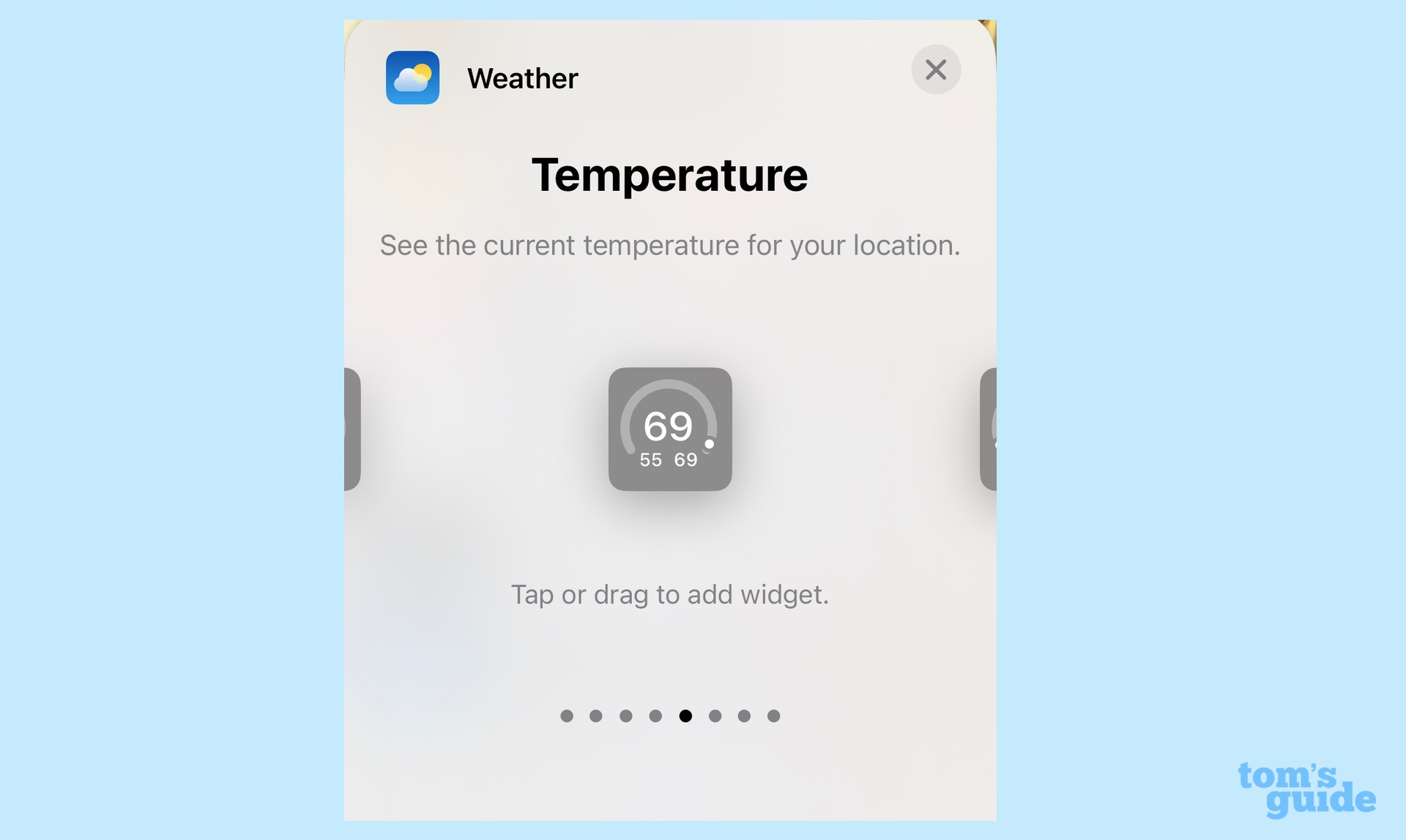
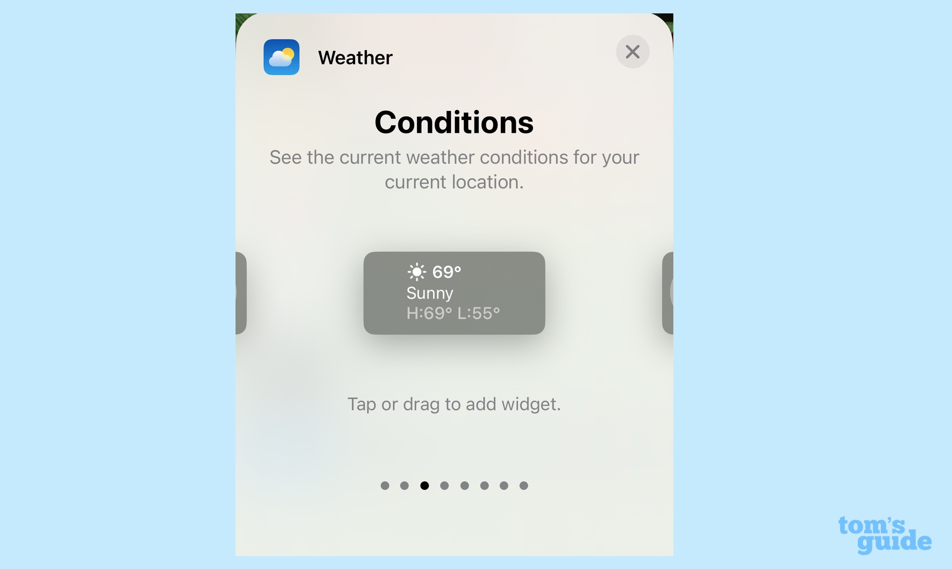
Take Apple's various weather widgets. The best kind put a single piece of information front and center — a widget that shows the current temperature, for example, or another one that displays the current air quality. Apple also offers a slightly larger weather widget that includes the current temperature, a short description of conditions ("sunny," for example) and the forecasted highs and lows for the day. It's thorough, but it's also a lot of info to pack into a tiny space, and therefore, it's not as effective as the more condensed weather widgets.
If I'm looking at a widget on my lock screen, it's because I don't want to spend a lot of time digging around for information. That, to me, is the key thing app makers should keep in mind about their own widgets.
Smaller widgets are generally better than larger ones
iOS 16 offers two different widget sizes — a small square and a larger rectangle. You can fit four of the square widgets underneath the lock screen's clock or two of the rectangular ones. If you mix and match sizes, you can fit a rectangular widget alongside two smaller ones.
This may be a case where bigger isn't necessarily better. My favorite iOS 16 lock screen widgets use the smaller square shape, while I feel the rectangular ones offer a temptation to pack in too much info. The weather widget example above is a case in point, but a square battery widget showing how much charge you have left is more visually compelling than the rectangular widget that shows the same info, only stretched out to fit the space.
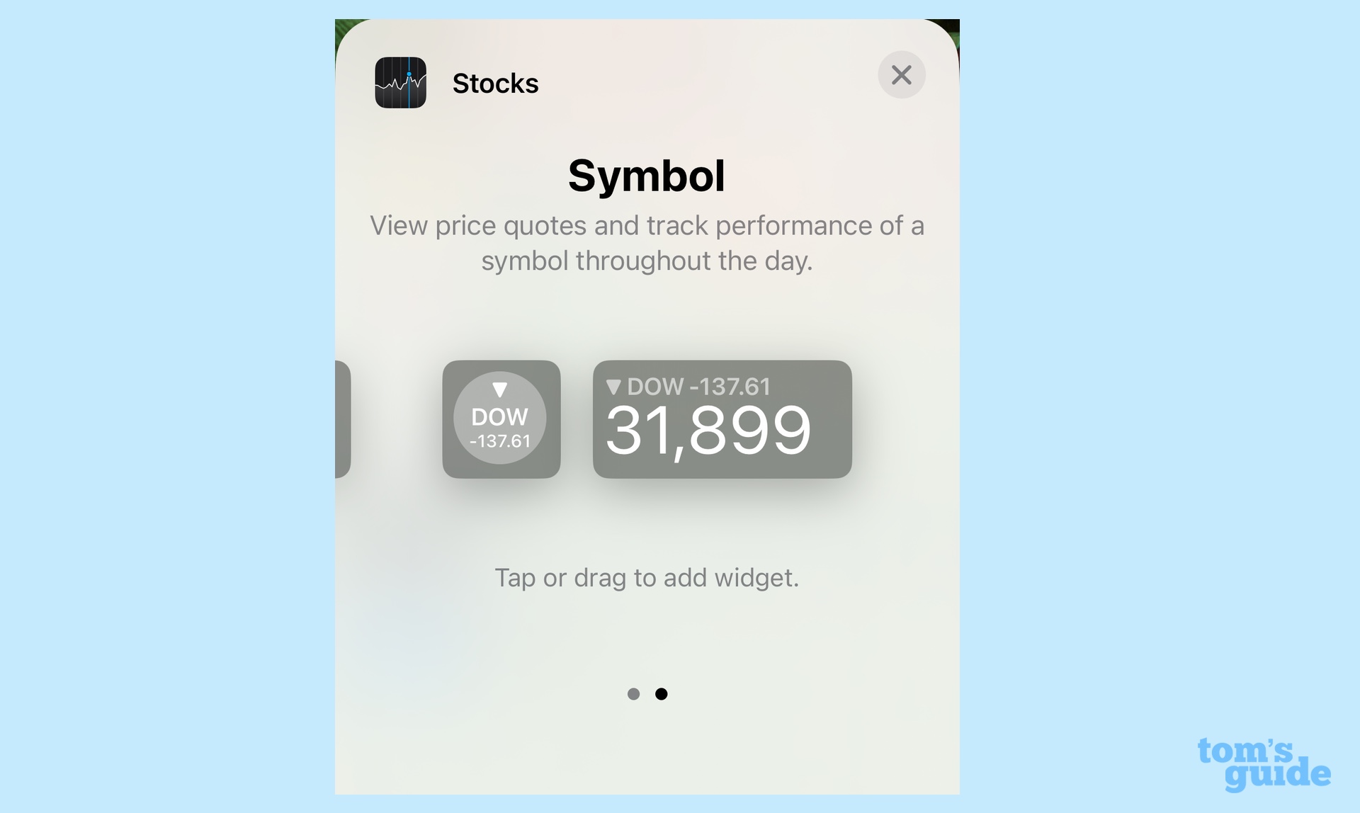
There are exceptions, of course. A calendar widget with upcoming appointment data works much better in rectangular form, as it can include more data on your appointments. Similarly, the stock market widget showing the Dow Jones Industrial index is much easier to glance at with the rectangular widget's larger text.
The less text in a widget, the better
Again, this is a personal preference, but I think widgets that can boil things down to numbers, readouts and symbols are more effective than ones that rely heavily on text.
There are two reasons for this. For starters, even the rectangular widget doesn't afford you a lot space, so the more text that's included in a widget, the smaller the font size needs to be. And small type can be difficult for some iPhone users to make out at a glance.
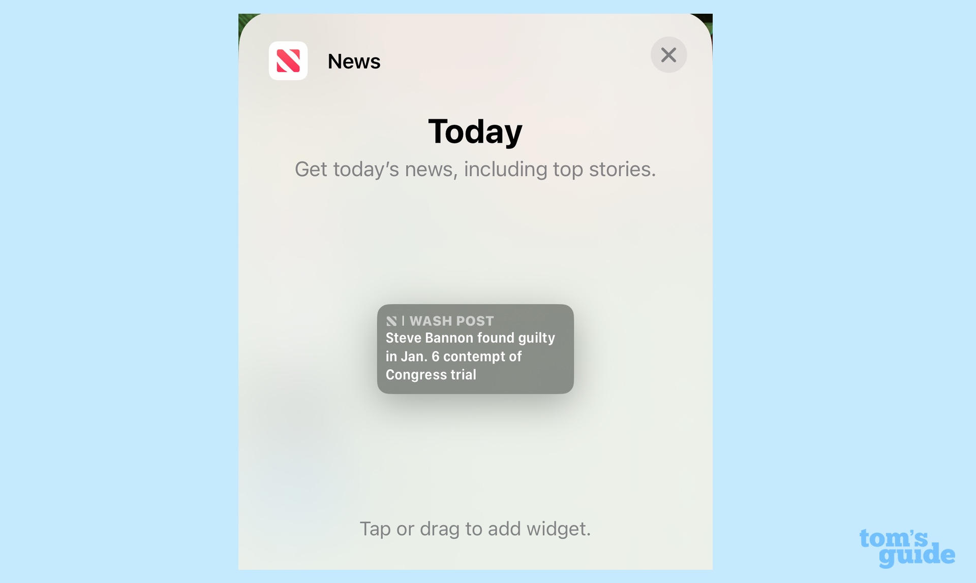
There's also the issue of widget makers not being able to control the wallpaper that their widgets will be stacked on. If your iPhone's lock screen wallpaper contains a lot of detail or shifting colors, that can make text harder to read, especially at the smaller font size noted above.
That said, some widgets have no choice but to use text. The News and Reminder widgets, for example, can't really convey information in any other way. So it's best to keep the text at a legible minimum.
Remember, widgets are actionable
Most of the time, we're just looking at widgets to find out information quickly. But sometimes, you're going to want to dive in deeper. That's why lock screen widgets in iOS 16 can be actionable — tap them and you immediately go to the app in question.
This works best for a widget like the one from the News app, which displays a current headline. Tap on it, and you'll jump straight to the story in News. Similarly, you can reach the Calendar by tapping a widget showing upcoming appointments.
Other widgets don't seem to do as much, though this seems to be the exception rather than the rule. Tapping any of the battery widgets doesn't take you to Settings, but that may be because the battery doesn't really have an app to call its own.
It's my hope that developers find ways to make their widgets actionable, and that if you tap on the widget, it takes you to the relevant portion of the app and not just a generic landing page. Again, Apple's News app widget is a good guide to follow here, as is the Alarm widget, which can take you to the part of the Clock app for setting an alarm when tapped.
The upper widget isn't that useful
There's one other place where widgets can appear on the iOS 16 lock screen and that's right above the clock, next to the date. As you might imagine, the space here is very small and doesn't afford much of an opportunity to include all but the most basic information.
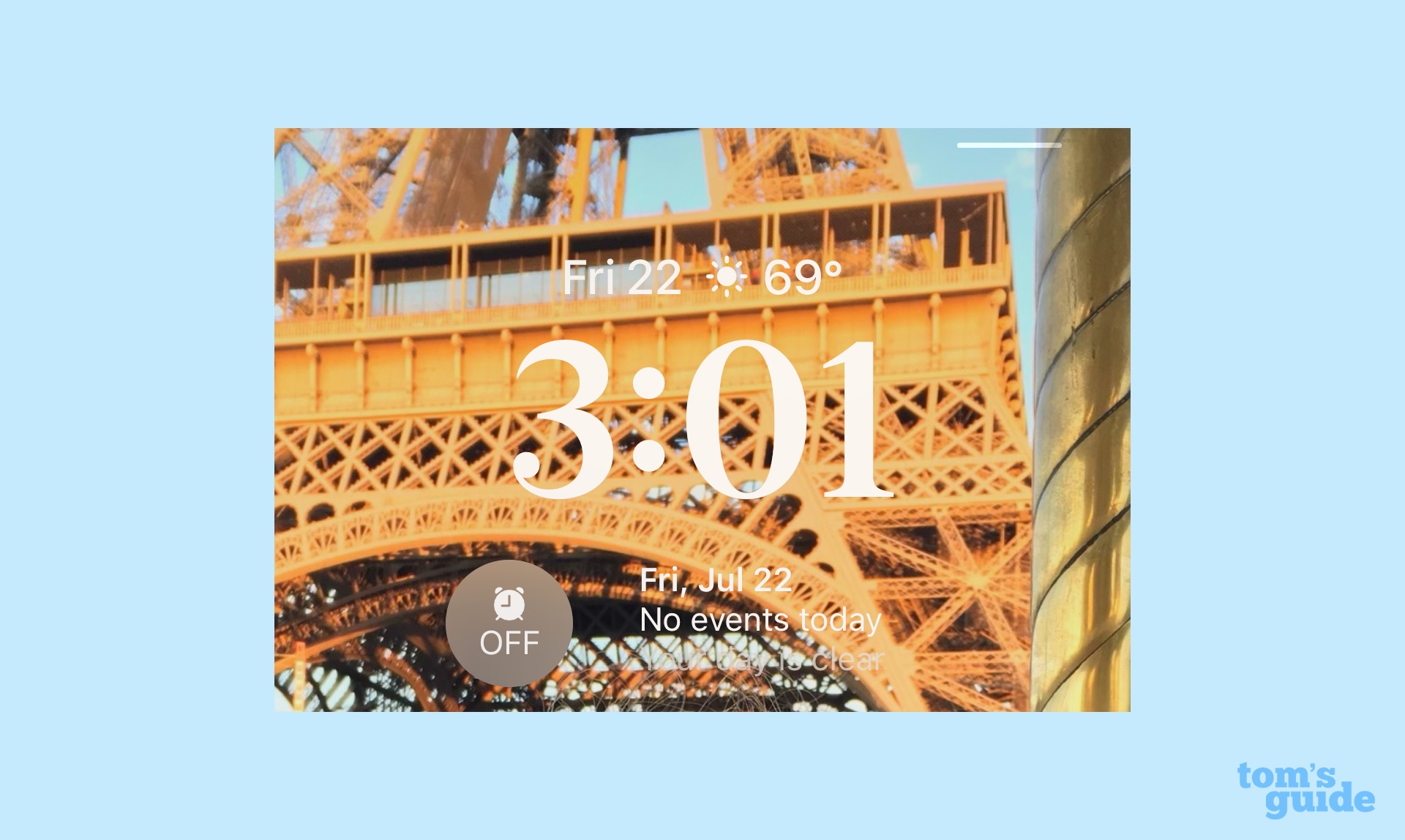
A Weather widget that displays the current temperature is about all that can fit here and still remain informative. I also appreciate that Apples' Fitness widget fits nicely here if you want to chart your progress toward a move goal. But otherwise, I think this ia an area of the lock screen third-party app makers should pass up.
Sign up to get the BEST of Tom's Guide direct to your inbox.
Get instant access to breaking news, the hottest reviews, great deals and helpful tips.
Philip Michaels is a Managing Editor at Tom's Guide. He's been covering personal technology since 1999 and was in the building when Steve Jobs showed off the iPhone for the first time. He's been evaluating smartphones since that first iPhone debuted in 2007, and he's been following phone carriers and smartphone plans since 2015. He has strong opinions about Apple, the Oakland Athletics, old movies and proper butchery techniques. Follow him at @PhilipMichaels.

