I’ll never ditch my Android for an iPhone — unless Apple makes this change
Hey Apple, where's your back button?

A number of my colleagues here at Tom’s Guide have documented their experiences switching from Android to an iPhone. Most of them end up making that switch permanent, finding themselves enamoured with Apple’s smartphone and not wanting to switch back to a Google-powered phone.
I can understand a lot of the appeal with iPhones. Good cameras, solid software, better software update support, some of the best phone battery life and all sorts of other reasons. But every time I’ve used an iPhone over the past decade, I find myself scrambling back to Android’s warm embrace for one single reason: the lack of a proper analogue to Android’s back button.
Apple can’t compete with Android’s back button

Android’s back button has been a staple part of the system’s navigation since its inception, and features on every single Android phone ever to exist. The physical button may be long gone, but the function is still there — whether you prefer the gesture of the virtual on-screen button.
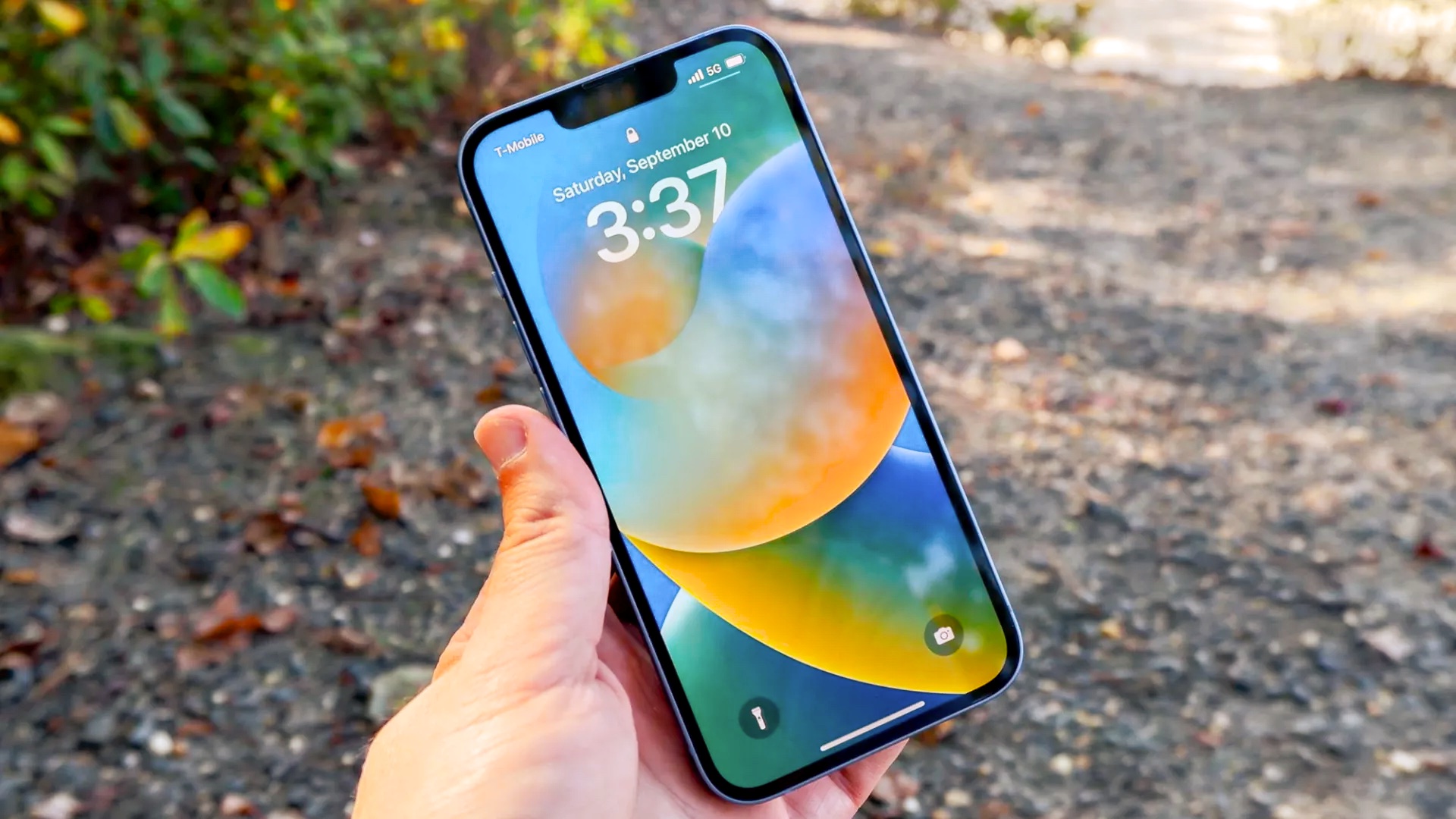
Apple has no such equivalent. Sure Apple did add a backwards gesture several years back, which can function much the same way. The major caveat is that it’s not universally implemented across iOS. Apple’s own apps and the system settings have the gesture, as you would expect, but it seems like there’s no expectation for third party developers to do the same.
One of the unspoken heroes of the Android OS is that no matter where you are or what you’re doing, it’s possible to jump back to the previous screen with the flick of your finger. What’s more, the gesture is paired with a subtle bit of haptic feedback for that added reassurance.
Switching over to an iPhone is a very different experience, and honestly it’s pretty infuriating to have to deal with. To be browsing Reddit and find the image I opened can’t be dismissed with a single swipe to the screen? Trying to do so makes it almost jiggle back and forth, and closing the image means navigating to the big X in the top left corner.
In fact that corner is where most of the iPhone’s reverse navigation seems to be, even when gestures are possible. Frankly I find it a pain to get to, even on a regular-sized iPhone, and that’s before you account for the failed back swipes caused by muscle memory.
Poor navigation is a very un-Apple flaw

Apple’s whole deal is smart design, with an intuitive interface that “just works” as the old saying goes. But for all the iPhone’s positives, that poor navigation system really lets it down. Or at least it does for me, a long-time Android user with that convenience hard-wired into my brain.
iPhone users might disagree with me, because they’re used to the iOS navigation system. And the fact that the only way you can reverse course is by interacting with something on screen. That might have been fine a decade ago, with the iPhone 5’s 4-inch display that allowed one-handed navigation. But in an age where an iPhone can have a 6.7-inch display, or potentially a 6.9-inch display, then we need easier and better navigation.
At the very least eliminating the need to tap the top corner to go backwards would make using an iPhone one-handed a lot easier — especially on the larger Pro Max models. A simple swipe on the left side of the screen, and you’re done. No stretchy, no hassle, and no need to activate reachability mode.
Android has been managing it without a physical button, the bane of Apple’s existence, for the past several years. I refuse to believe for a second Apple can’t take its equivalent, which is far from new, and push for it to be implemented across all iOS apps. Or potentially even developing a better alternative.
iPhones have a lot to offer — but it’s not enough for me

iPhones are, by and large, some of the best phones around. Not only do they come with solid design, aided by the recent push towards flat edges in my opinion, Apple has figured out how to get the best of everything into a single device.
iOS is simple and relatively easy to use, and the settings menu in particular is a lot less complex than Android makes things. There’s a heck of a lot less diving through several layers of menus to get to the one setting you need, or so you can tinker with the various permissions and settings for your apps.
And that platform remains consistent with each passing generation, aided by the fact Apple bothers to support device updates for more than 3-4 years.
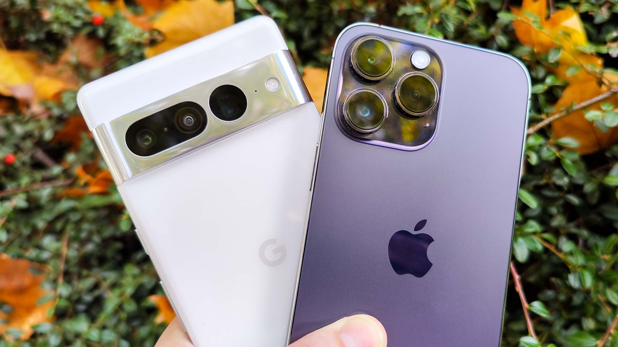
The iPhone 14 Pro Max has some of the best phone battery life, lasting 13 hours and 39 minutes during our rigorous battery life testing cycle. To the point where, so far, the only phones to beat it are ASUS ROG gaming phones with over a third more battery capacity. There are plenty of times where I find myself getting incredibly frustrated with my Pixel 6 Pro’s comparatively pathetic power capabilities.
Then you’ve got the great cameras which, when paired with Apple’s computational software, means iPhones are some of the best camera phones around. Not to mention the fact the latest A16 Bionic chipset (mostly) obliterates competing chips from the likes of Qualcomm and others in performance testing.
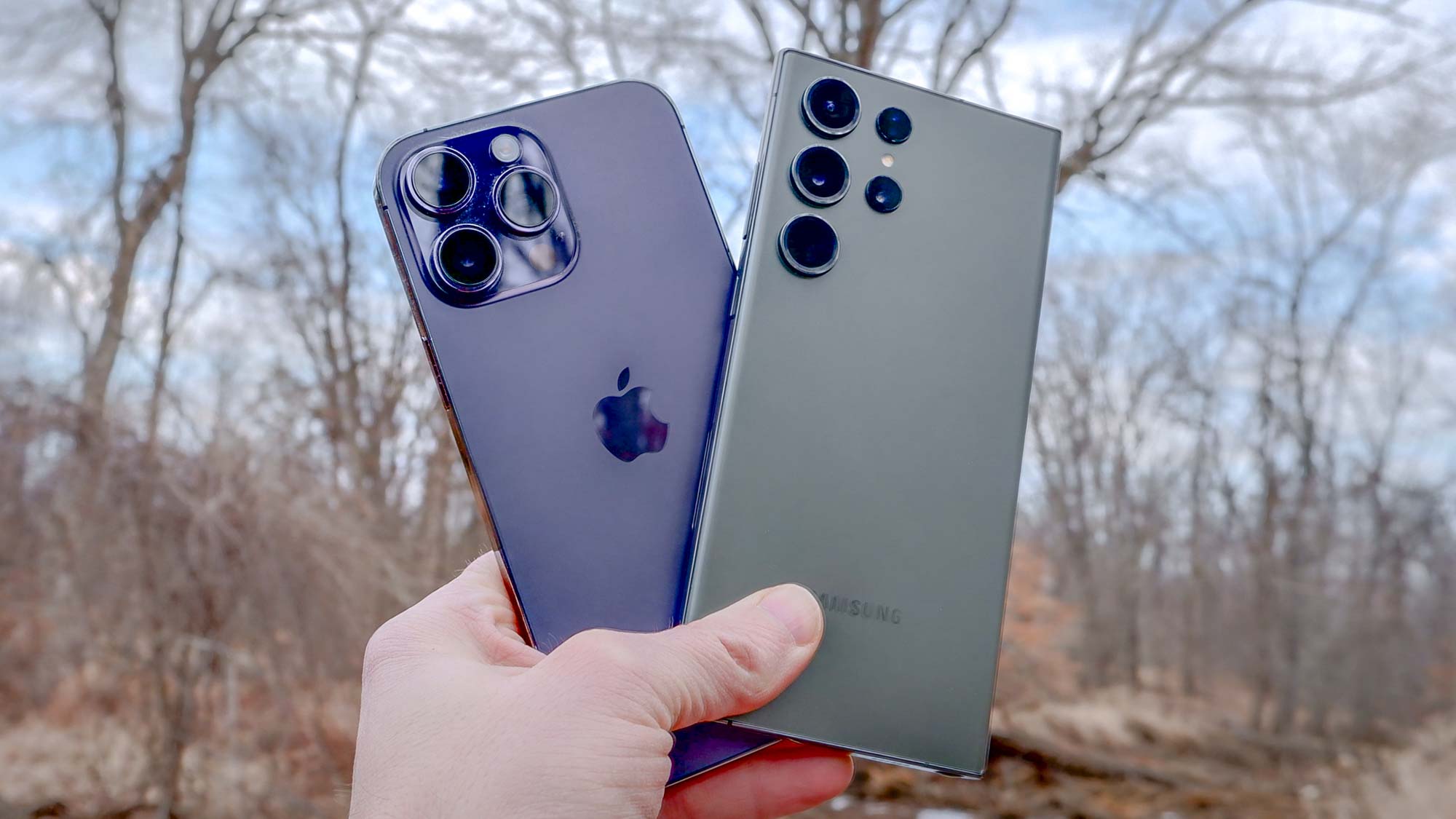
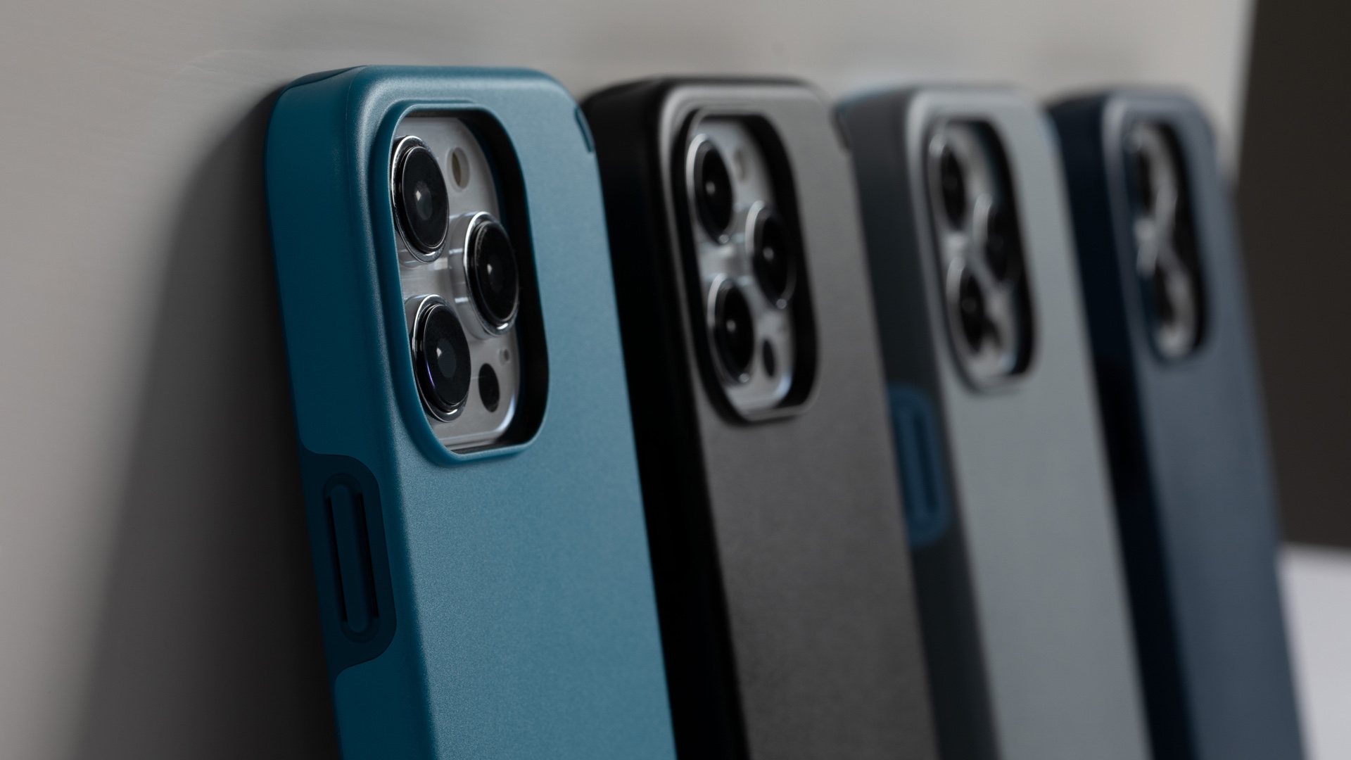
The one thing I’m always truly envious of is how well-served iPhone users are when it comes to accessories. The fact that iPhones are so popular means accessory makers have plenty of incentive to make compatible products, many of which are already to go the day a new batch of phones launches. The only Android brand that would come close to that level of support is Samsung, and even then the amount of choice is dwarfed by the iPhone.
MagSafe is one of the biggest iPhone draws, though not for the wireless charging itself. The fact that there is a ring of magnets in the back of the iPhone offers some additional functionality other phones can’t have. Magnetic car phone mounts and stands, magnetic grips and accessories that can snap on and off without any adhesive. Frankly, I can't wait for the Qi 2 standard to start rolling out, so I can take advantage of something similar on a non-Apple phone.
Bottom Line
Believe it or not my first smartphone was an iPhone 3GS back in 2009, but two years later I left that platform behind in favor of Googlier pastures. At the time Android could offer more features I felt were useful and for a much lower price tag — which was important as a cash-starved college student.
But these days the gap between iPhones and top-tier Android phones is smaller than ever. There are plenty of differences between the best iPhones and best Android phones, but none of them have made me really reconsider my stance as an Android phone user. Aside from that one little thing. The inconsistent navigation that is the bane of my existence every time I use an iPhone.
Until that problem can be solved there is absolutely no way I’ll consider switching back to an Apple phone. No matter what extra benefits may be packed underneath the shell. Good photos and stellar battery life can’t make up for the amount of frustration that one thing can cause me.
More from Tom's Guide
Sign up to get the BEST of Tom's Guide direct to your inbox.
Get instant access to breaking news, the hottest reviews, great deals and helpful tips.

Tom is the Tom's Guide's UK Phones Editor, tackling the latest smartphone news and vocally expressing his opinions about upcoming features or changes. It's long way from his days as editor of Gizmodo UK, when pretty much everything was on the table. He’s usually found trying to squeeze another giant Lego set onto the shelf, draining very large cups of coffee, or complaining about how terrible his Smart TV is.
-
Scubasteve08 Reply
I don't understand how this is actually an article...admin said:Apple has no chance of converting me from team Android until it can sort out its inconsistent backwards navigation.
I’ll never ditch my Android for an iPhone — unless Apple makes this change : Read more
I own both platforms and navigation is quite easy on an iPhone, in fact I prefer it over my Google Pixel 7 Pro I'm using to type this. -
frustyak The IPhone does have a swipe gesture, but unfortunately for us right-handed people (which is most people) Apple put it on the wrong side. Having to swipe from left to right is awkward and has caused me to drop my phone on more than one occasion.Reply -
retrorover It's a welcome sight to find an article about this issue from a reputable tech platform. This exposure might increase the chances of Apple taking notice. It's also the primary reason why I haven't made the switch from my Pixel 6 Pro to an iPhone, despite the iPhone offering superior battery life. The Pixel 6 Pro's camera, especially for point-and-shoot photography, outperforms the iPhone, although these days, the gap between flagship cameras is narrowing. If Apple were to incorporate Android-like gesture navigation, or even improve upon it, I would enthusiastically consider switching to an iPhone in the future. At present, the absence of this feature is a deal-breaker for me.Reply -
Scubasteve08 Reply
Apple has Android-like gesture navigation, in fact that's where the Pixel copied there's from. I have both an iPhone 14 PM and Pixel 7 Pro and get around both platforms with gesture navigation.retrorover said:It's a welcome sight to find an article about this issue from a reputable tech platform. This exposure might increase the chances of Apple taking notice. It's also the primary reason why I haven't made the switch from my Pixel 6 Pro to an iPhone, despite the iPhone offering superior battery life. The Pixel 6 Pro's camera, especially for point-and-shoot photography, outperforms the iPhone, although these days, the gap between flagship cameras is narrowing. If Apple were to incorporate Android-like gesture navigation, or even improve upon it, I would enthusiastically consider switching to an iPhone in the future. At present, the absence of this feature is a deal-breaker for me.
