I tried to replace my phone with the Motorola Razr+'s cover display — here's what happened
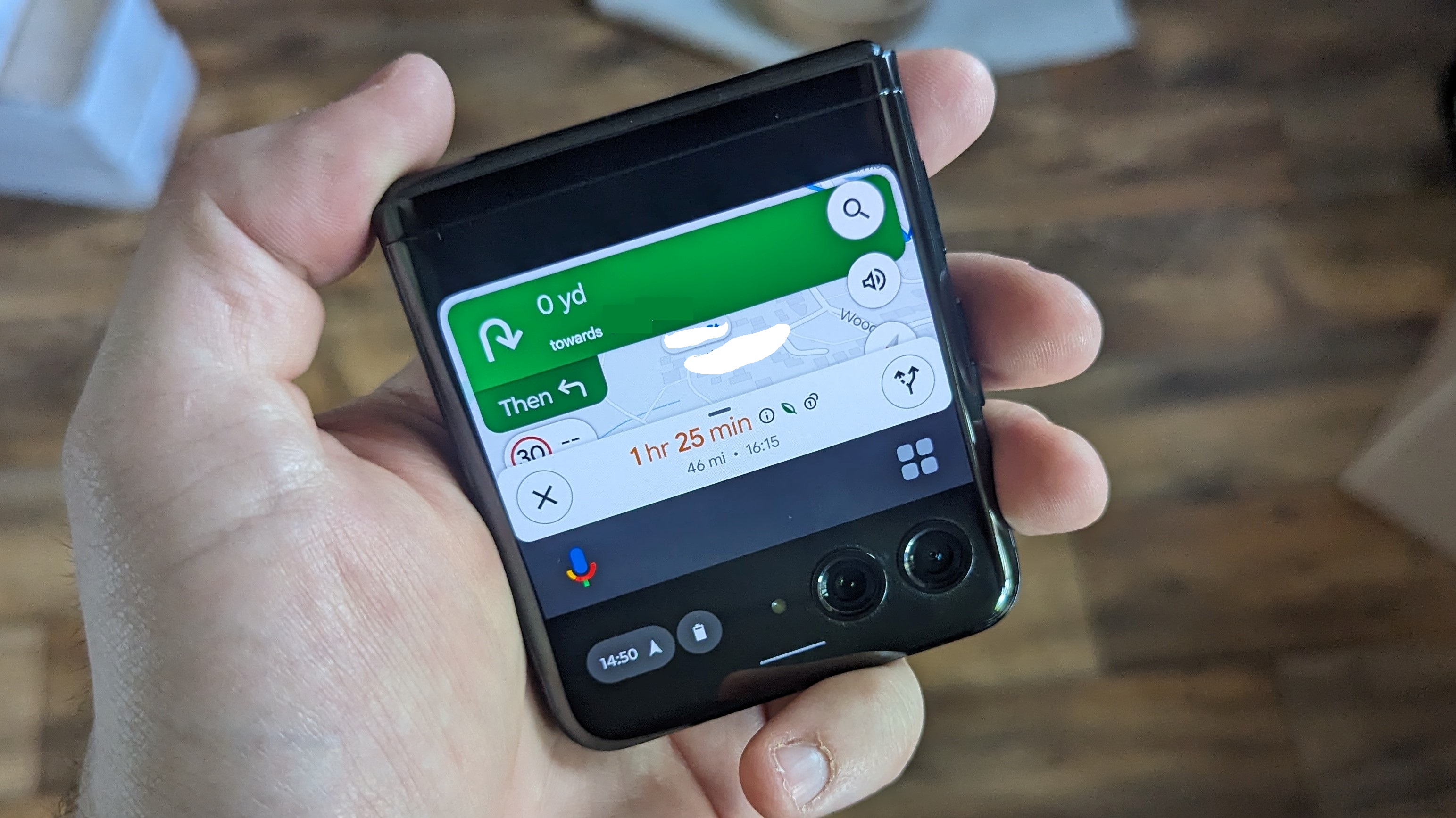
One of the great things about the best foldable phones is the fact they feature two displays: the folding inner display and a smaller, non-folding cover display. Flip phone-style foldables don’t feature particularly big cover displays, but their growth has culminated in the Motorola Razr+’s 3.6-inch outer screen.
That’s a larger screen than the original iPhone, which offered only a 3.5-inch screen. It’s a little factoid that got me thinking, could you use the Razr+’s cover display as a phone in itself — and never unfold the inner display?
I figured this was worth finding out. Because what good is a larger cover display if it can’t function as a substitute for the main screen? As it turns out, the Motorola Razr+’s cover display can’t act as a complete substitute for the main screen, but it doesn’t go down without a fight. Here’s what I found out after a week of use.
How big is it really?
There are some obvious flaws in this plan, which I will outline now. The first being that while the Razr+’s 3.6-inch display is larger than the iPhone’s on paper, there should be a few asterisks attached to that figure.
The first is that the two displays are different dimensions, with early iPhone displays measuring roughly 3 x 2 inches, while the Razr+’s cover display is closer to 2.6 x 2.6 inches. So the Motorola’s display is shorter and wider than Apple’s, which is going to make a difference.
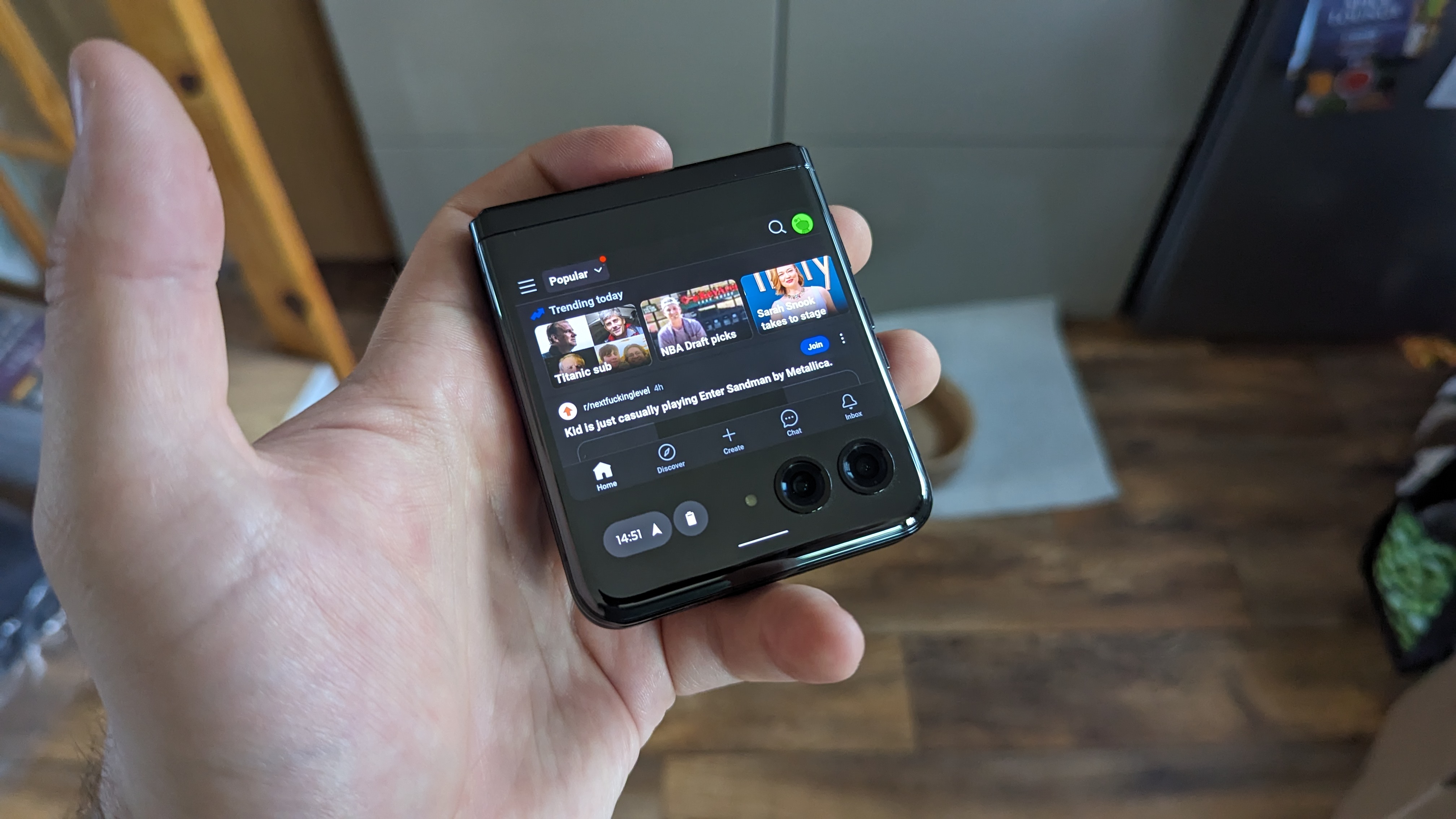
The other notable caveat is that the Razr’s screen size also includes the main camera array — with two lenses and a flash. That eats into your usable space quite considerably, and the chunk of display next to the camera is only really usable for checking notifications and battery level. Apps don't take advantage of this space by default, and while you can force them to stretch to the very bottom of the screen the camera lenses can get in the way.
As a result, the usable screen space is closer to 3 inches in size (1.6 high x 2.6 inches wide), with prominent black borders on both ends of the display. Which is not the best-looking form factor in the world. A lot of modern phone apps aren’t built for such a small display either, which I (correctly) assumed might lead to problems.
3 inches is still a reasonable amount of space, though, and none of these issues mean the Razr+’s cover display is completely unusable. In fact, despite how small the screen is when you look a little closer, most apps didn’t have much of a problem.
Using a Motorola Razr+ while it’s closed is rather nice
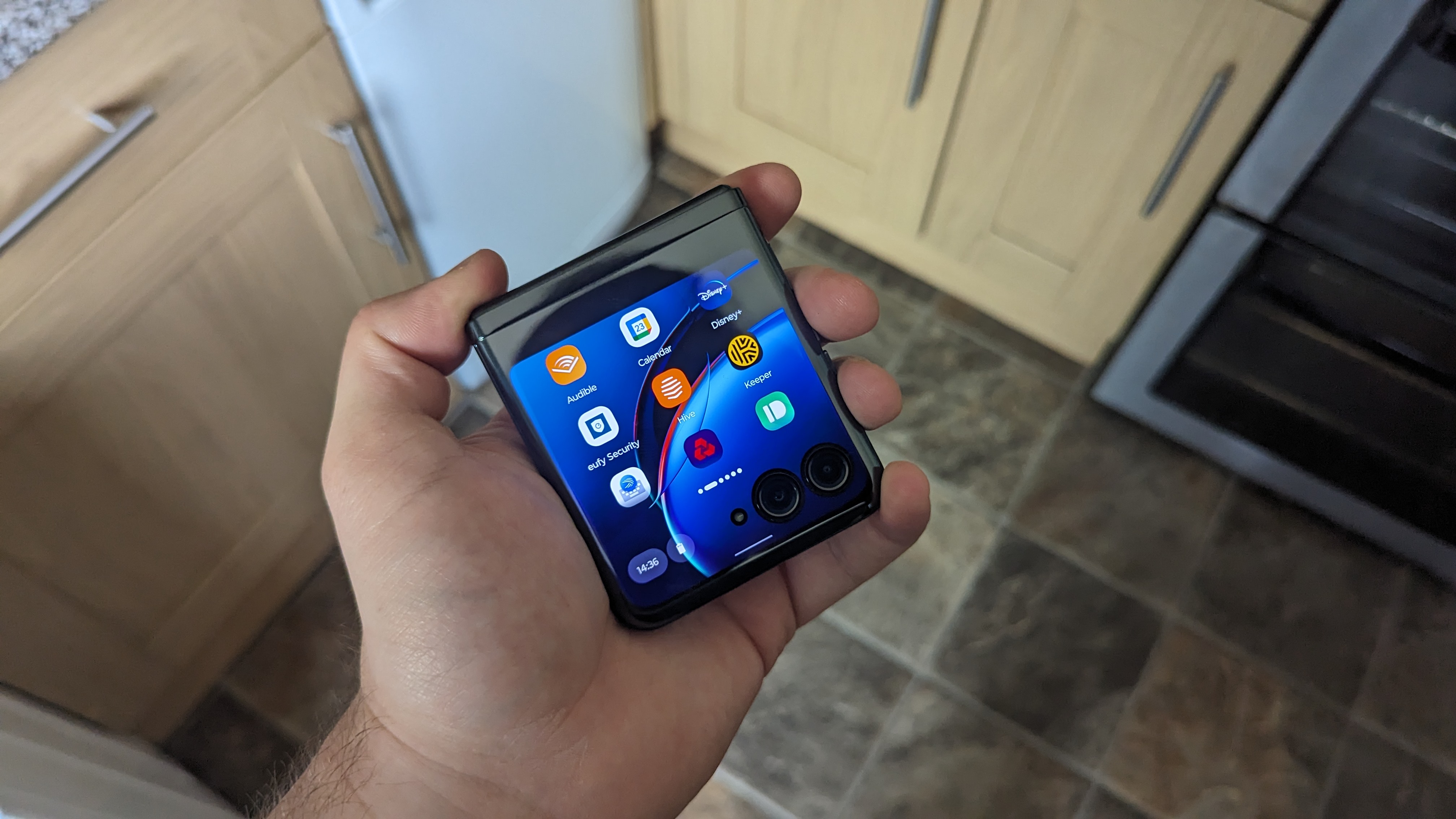
If you’ve ever lamented the size of modern smartphones, or struggle to use the 6-plus inch screens one handed, then the Motorola Razr+’s cover display is going to feel like an absolute dream. In its folded state the clamshell foldable is small, compact, and is a little more suited to being held in your palm.
Though, like all phones, your experience may depend on the size of your hands. Still, a square-shaped phone has proven itself to be a heck of a lot easier to hold than your typical rectangular smartphone. And the smaller screen means it’s a heck of a lot easier to control one-handed.
Typing proved to be a bit of a challenge, but that was primarily down to the fact there’s so little space on the display. In fact, the keyboard takes over the entire screen, and in some instances means you can’t actually see what you’re typing.
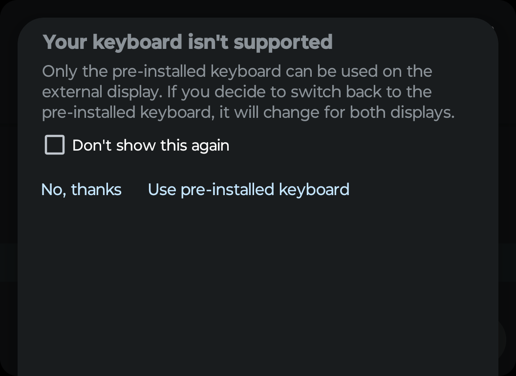
For someone prone to mistyping on touchscreen keyboards, that wasn’t particularly fun. And, unfortunately, third-party keyboards are not supported on the Razr+’s cover display, and makes them practically useless on the main display in the process. So there's no chance to experiment with different options, because GBoard is all you're allowed.
The fact the volume keys are reversed when the phone is closed is still a little mindbending, especially when screenshots are concerned. For some reason my brain keeps jumping to the fact that the down key is actually up, even though the phone is smart enough to know better.
The display itself is also very nice, which is hardly a huge surprise, given the type of hardware Motorola squeezed in. While small this OLED display offers 1056 x 1066 resolution, HDR10+ support and a 144Hz refresh rate that puts other flagship displays to shame.
Most importantly you can tell something is different about the hardware during use — in a good way. I still find myself surprised at how good the display looks, especially when the interface has had to shrink down to match the Razr+ cover display’s meager size.
Android apps and smaller displays work pretty well
I was pleasantly surprised at how well my usual array of apps adapted to use on the Razr+ cover display. Especially since none of them have been optimized for the smaller display, and every single one flashed up a warning when I tried to use them for the first time.
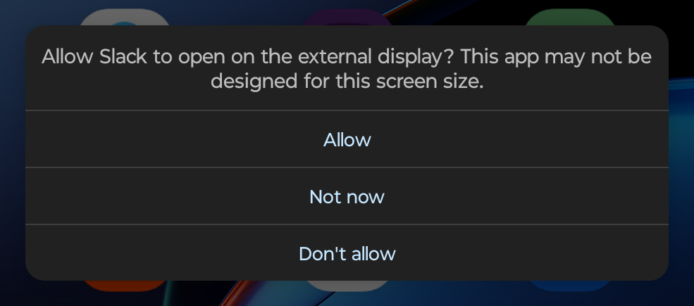
The scaling down was incredibly impressive, and most of the big name apps I use on a regular basis were able to cope fairly well. Perhaps it’s because of the nature of the Android ecosystem, since apps have to automatically adapt to the different screens employed by dozens of manufacturers.
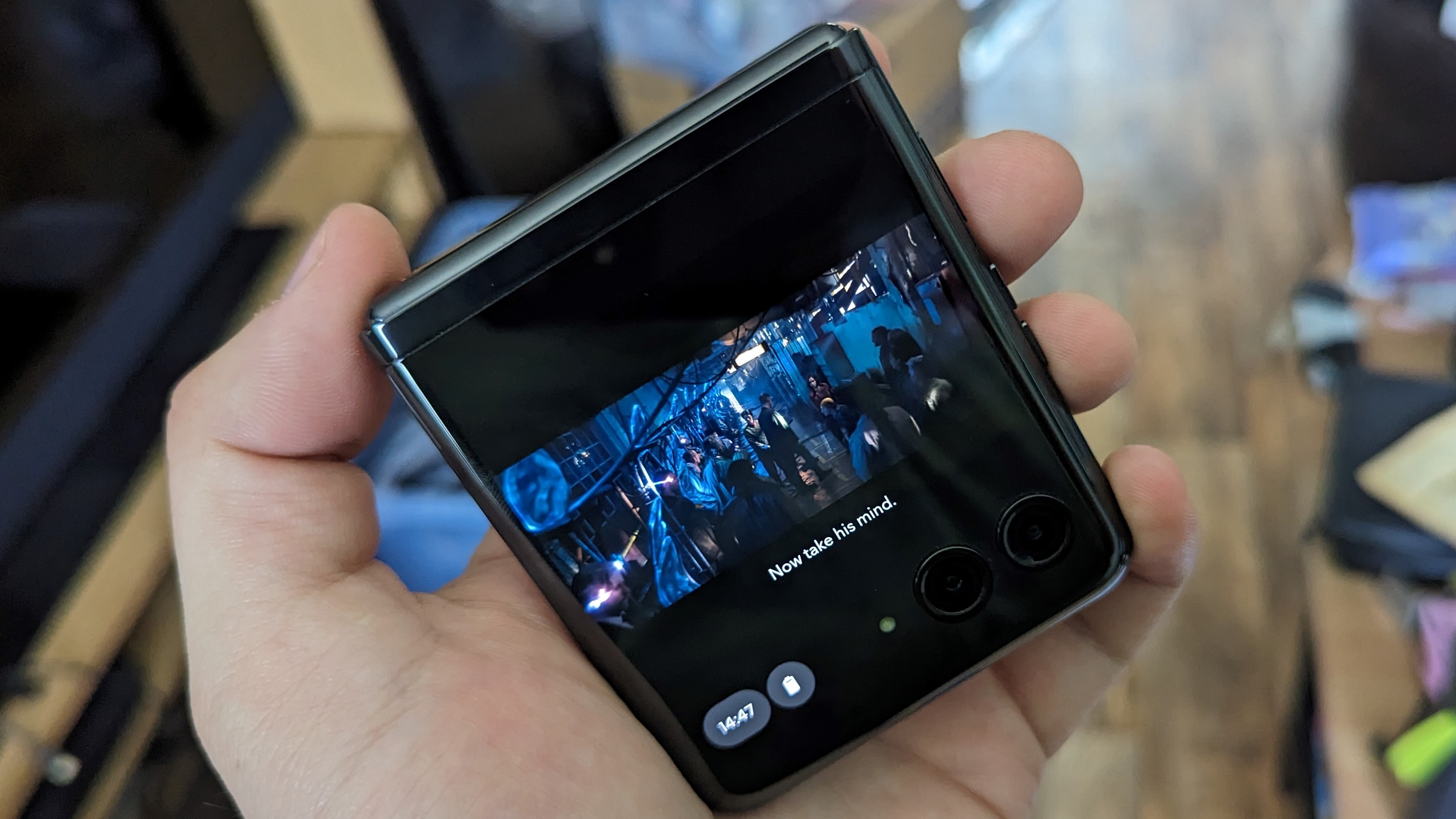
Or perhaps it's because the Razr+’s 2.6-inch-wide display isn’t that much narrower than you’d find on taller phone screens. Maybe it’s a little bit of both. Whatever the reason, it was rare to have an issue fitting the app window on the screen. Even mobile banking worked perfectly, and given the increased security around those kinds of apps I was fully expecting it to not want to play ball.
Even streaming services like Disney Plus and YouTube managed to do reasonably well — provided you play the video in landscape mode. Vertical videos like YouTube Shorts ended up being cropped harder than family photos after your uncle’s divorce. Unfortunately, it also wasn’t the only app that had this issue at times.
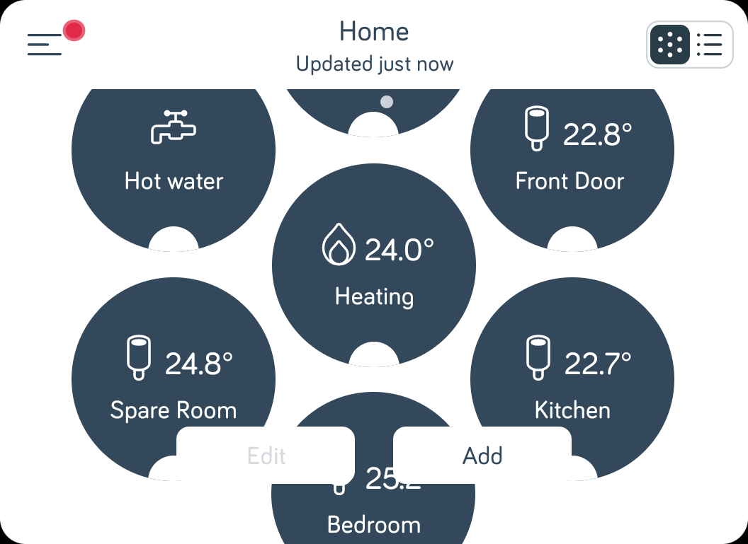
My home heating system is run by Hive, and Hive’s Android app is laid out on my phone in a way that means there’s no scrolling capability For a short display that relies rather heavily on being able to scroll down, that was a problem — and it meant a bunch of icons ended up being trimmed away.
I could just about manage to get where I needed to go, and the option to switch to a list format is there, but it does show the inherent limitations of trying to use such a small display as though it were a full-sized smartphone.

Google Maps was another notable victim of this problem, despite the fact Motorola touted the app as an example of the benefits of a larger cover display. In a similar vein, navigating my Audible library was nigh-impossible, and certain browser ads could be problematic — both for the very same reason.
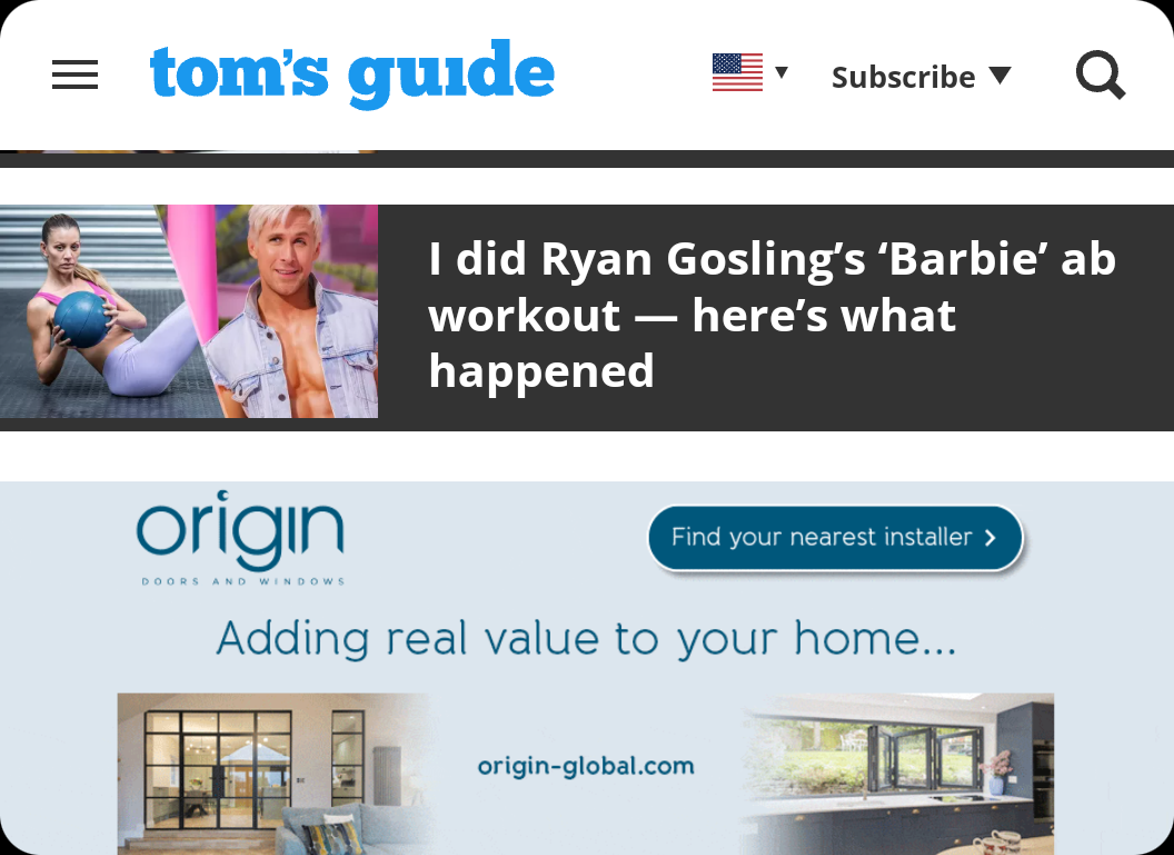
Those ads were especially problematic if they didn’t have any sort of close or dismiss option, and even ads that would be a reasonable size on larger screens stopped me from reading anything more than a couple of sentences at a time.
The cover display can’t handle everything
App-centric problems aside, they were still usable for the most part. But, that doesn’t mean the cover display can do everything. In fact there were a number of times when things just straight-up didn’t work unless you were doing them on the main display — like trying to use a third-party keyboard.
Logging in can be especially tricky, and in some cases can’t be done. I found that logging into my Google account wasn’t possible on the cover display, despite being an absolute breeze on the inner folding screen. Some things just do not work with such a small space, and you need something twice the size to get it done.
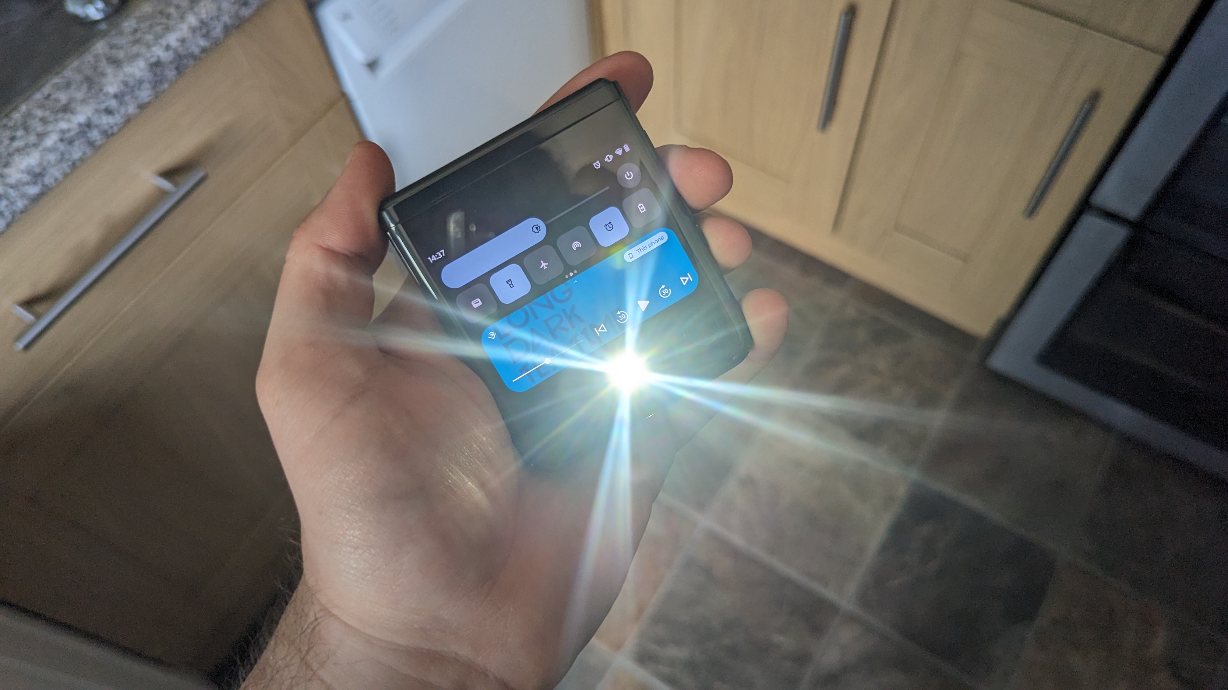
The settings menu is also completely off limits, with no option to access even a trimmed down version of the phone’s various menus. A settings cog is totally absent from the pull-down menu, even if a bunch of quick options are visibly present.
That includes the flashlight, which you absolutely do not want to switch on if you’re using a closed Razr+. The flash module is pointing right at you, and you’ll just end up dazzling yourself.
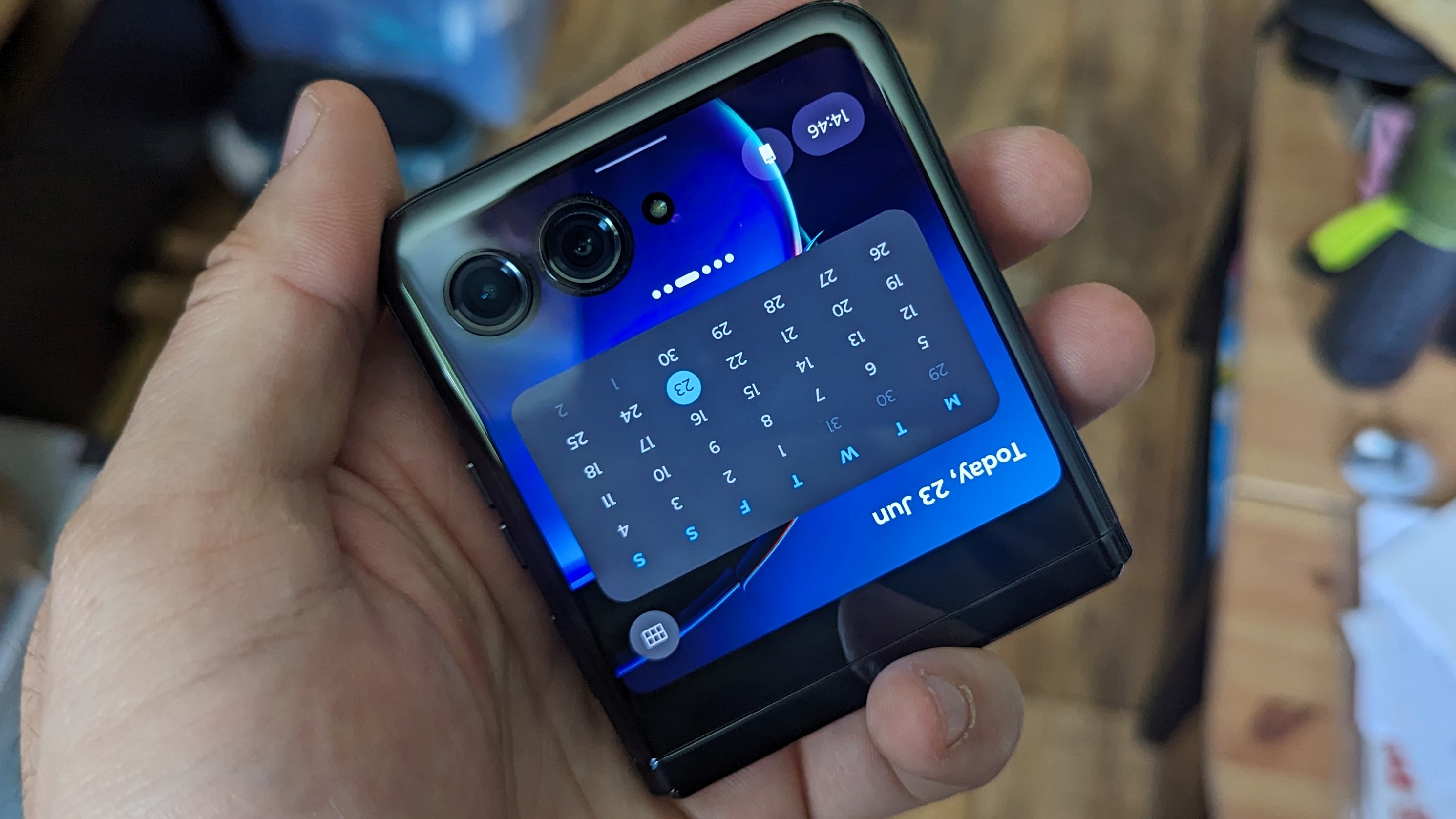
Auto-rotate was another noticeable absence when the Razr+ is closed, and the cover display itself always remains completely static. It doesn’t matter if Auto-rotate is on when the phone is open, or what you might want it to do, that cover display stays in the exact same orientation all the time. Not that rotating would do much good, given its square shape.
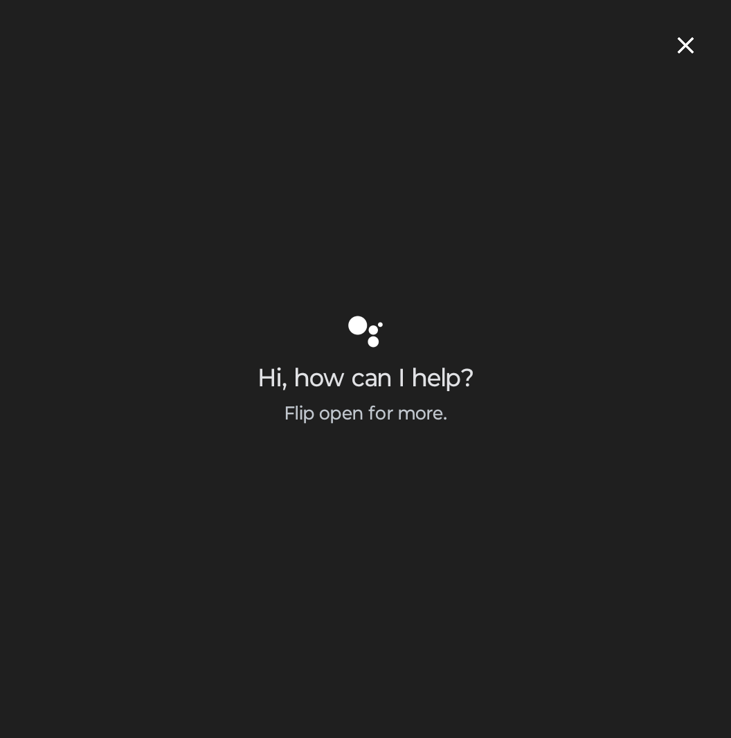
Then there’s Google Assistant, which is kind of a mixed bag. The Razr+ insists that you need to open the phone to handle Google Assistant, but the AI can still hear and respond to your queries when the phone is closed. There’s just no visual results or interface for you to deal with, only audio. How that affects you will all depend on how much you utilize Google Assistant. I don’t use any virtual assistant or voice-activated features outside of my car, so it didn’t matter to me in the slightest.
Bottom Line
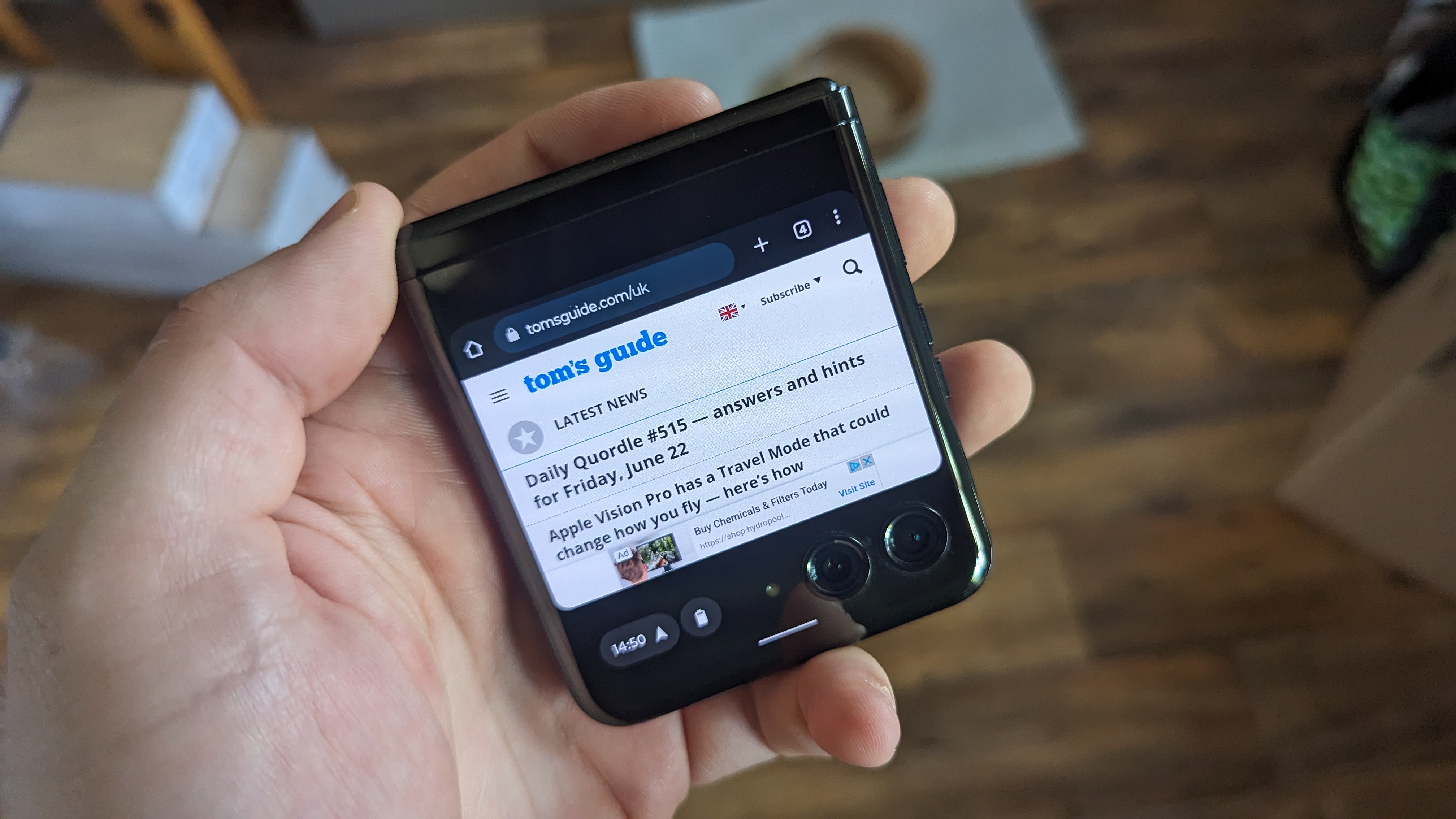
You can use the Motorola Razr+’s cover display for a lot of things, but you can’t totally avoid the main display. Not only are a lot of apps better suited to the larger folding screen, there are some things the phone will not let you do on the smaller display. That being said, it’s still incredibly impressive that the cover display can do as much as it can.
So while you can’t use the Motorola Razr+’s cover display as a permanent replacement for a full-size phone, the phone is pushing the limits of what that exterior screen can do. If you really want to avoid opening up your phone as much as possible, the Razr+ can make that happen. It may not be as comprehensive as the cover display on the likes of the Pixel Fold, but it’s getting really darn close.
Not only do Android apps seem to be inherently versatile when dealing with different-sized screens, the Razr+ cover display is far nicer than it has any right to be. This is absolutely a display built for more than just checking the time and notifications.
More from Tom's Guide
Sign up to get the BEST of Tom's Guide direct to your inbox.
Get instant access to breaking news, the hottest reviews, great deals and helpful tips.

Tom is the Tom's Guide's UK Phones Editor, tackling the latest smartphone news and vocally expressing his opinions about upcoming features or changes. It's long way from his days as editor of Gizmodo UK, when pretty much everything was on the table. He’s usually found trying to squeeze another giant Lego set onto the shelf, draining very large cups of coffee, or complaining about how terrible his Smart TV is.
