I think Apple went overboard on the iPhone 14 Pro always-on display
Apple turned what should be minimal into something too complex

With the iPhone 14 Pro, we now finally have a feature that’s been on Android for years: an always-on display, or AOD. You can’t believe how excited I am for this small yet powerful feature. It’s one I miss constantly on my iPhone 13 Pro Max, and one I love when I look at the Pixel 6 Pro on my desk.
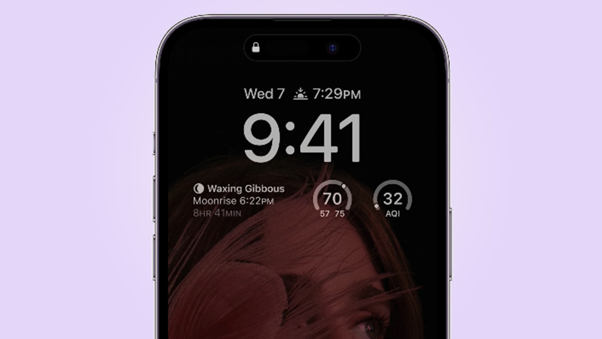
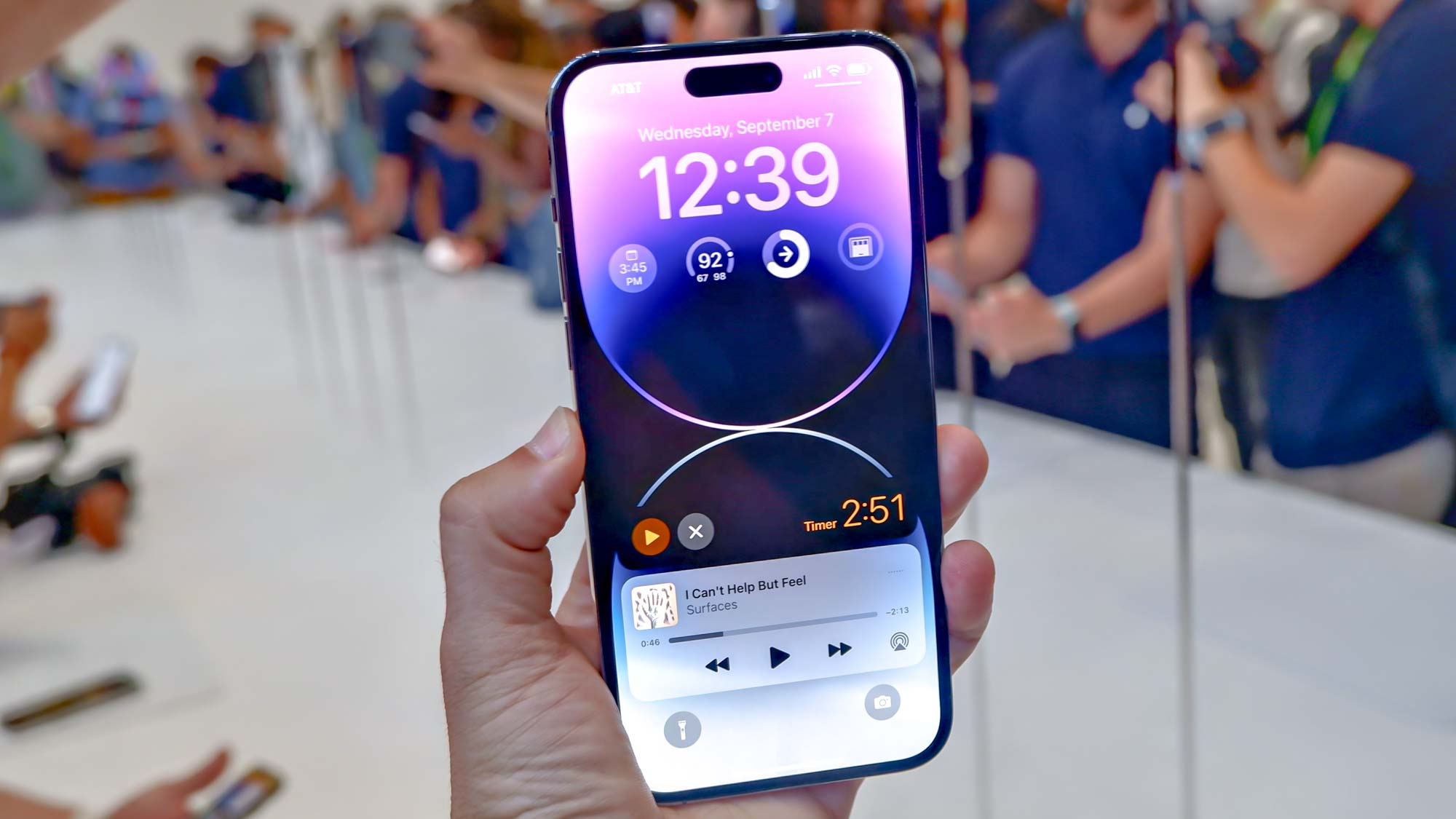
But as thrilled as I am that the iPhone 14 Pro rocks an AOD, I’m less enthused about the execution. To my eye, having seen barely more than what Apple showed off at the Apple event, the new AOD looks too complicated. It’s like Apple over-engineered the solution to a problem, something that isn’t all that uncommon.
I want to preface this by saying I’m a minimal person, though not a minimalist. I like things simple. I keep my technology as minimal as possible, with as few apps or programs as needed, minimal code, plain desktops, clean filesystems — you get the idea. So understand that before going forward.
iPhone 14 Pro always-on display: Welcome but too complicated
Like I said, I am excited for the always-on display when I get my hands on a purple iPhone 14 Pro. It’s a feature I talked about heavily last year before the iPhone 13 launch, and it’s one I’ve continued to mention leading up to this year’s announcement. I love having an AOD on the best Android phones, and I’m glad the iPhone finally has one.

But looking at what Apple revealed, plus bits and pieces from people on the ground at the event, I am left dissatisfied. What I’ve seen looks like too much of a good thing. Let me explain.
The iPhone 14 Pro’s always-on display is essentially a dimmed version of the lock screen, complete with all the widgets and clock typefaces. That’s cool, but an AOD is supposed to (in my humble opinion) provide basic information at a glance. Time, notifications, possibly the weather and calendar events, and battery percentage. Those are the basics I want to see when I glance at the Pixel 6 Pro on my desk, and that’s what the phone provides in a minimal, monochrome format.
Looking at what Apple revealed, I am dissatisfied. It looks like too much of a good thing. It looks over-complicated.
Other Android phones offer a bit more in the AOD area, such as OnePlus letting you change the clock typeface or what can appear on the OnePlus 10 Pro’s AOD. But the core premise remains the same: simplicity. Apple appears to have gone overboard, making for a cluttered AOD. at least from what I’ve seen.
I don’t mind the new iOS 16 lock screen features — I quite like them, in fact — but that doesn’t mean I want a dimmed version of the lock screen as my AOD. I have the same problem with my Apple Watch 7’s AOD. It's a dimmed, colorized version of my watchface, not a basic clock. Instead, I have to set a basic clock watchface to get the AOD I want.
It appears I’ll need to do the same with the iPhone 14 Pro, since the phone will spend more time with the display off than on the lock screen.
iPhone 14 Pro always-on display: Outlook
When I look at the images of the iPhone 14 Pro’s AOD, I am ambivalent, torn if you will. It’s a feature I’ve wanted since making the switch to iPhone early last year, but it doesn’t look like I expected. Is that just the rantings of a curmudgeon resistant to change? You could make that argument.
I will wait to form my full opinion until after I spend some time with the iPhone 14 Pro. Things in theory often work differently in practice, so it’s possible that I will like Apple’s implementation of an always-on display. Or it’s possible that my opinion will further sour.
I plan to keep an open mind about it, but right now, I think Apple overcomplicated the issue.
Next: iPhone 14 sticks with a 60Hz display — and that’s ridiculous.
Sign up to get the BEST of Tom's Guide direct to your inbox.
Get instant access to breaking news, the hottest reviews, great deals and helpful tips.

Jordan is the Phones Editor for Tom's Guide, covering all things phone-related. He's written about phones for over six years and plans to continue for a long while to come. He loves nothing more than relaxing in his home with a book, game, or his latest personal writing project. Jordan likes finding new things to dive into, from books and games to new mechanical keyboard switches and fun keycap sets. Outside of work, you can find him poring over open-source software and his studies.
-
Rac3r4Life I was honestly thinking the same thing. I am not an iOS user. I have had AOD on my Android devices for years, and the simplicity is the reason it's so useful. I think Apple definitely overdid it with their implementation, and it's not what people want. That's Apple, though. It's why I don't use an iPhone.Reply
