I love the design of the Pixel 7 Pro — except for this one thing
The Pixel 7 Pro is too smooth for its own good

Google has packed in some of the best features in its top flagship this year — the Pixel 7 Pro. It has a 50MP camera, new super zoom capabilities, the Tensor G2 chip, brighter display and a striking design. While many companies are now moving away from design innovation and more towards hardware refinements, Google has proven that it is serious about design with its new Pixels.
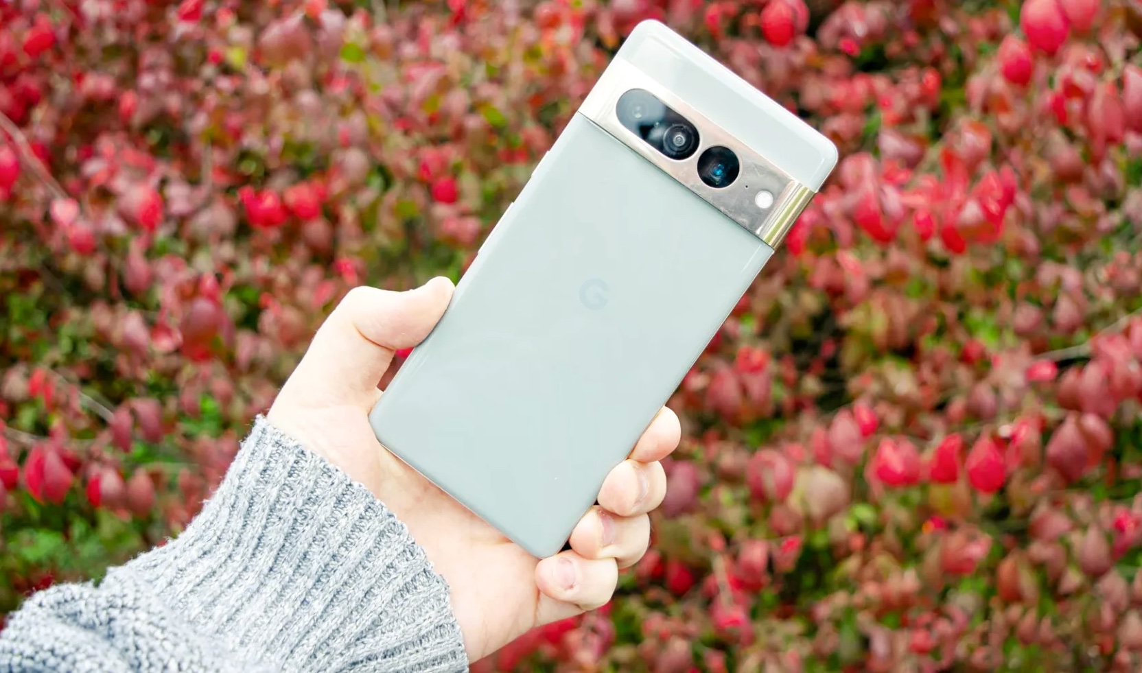
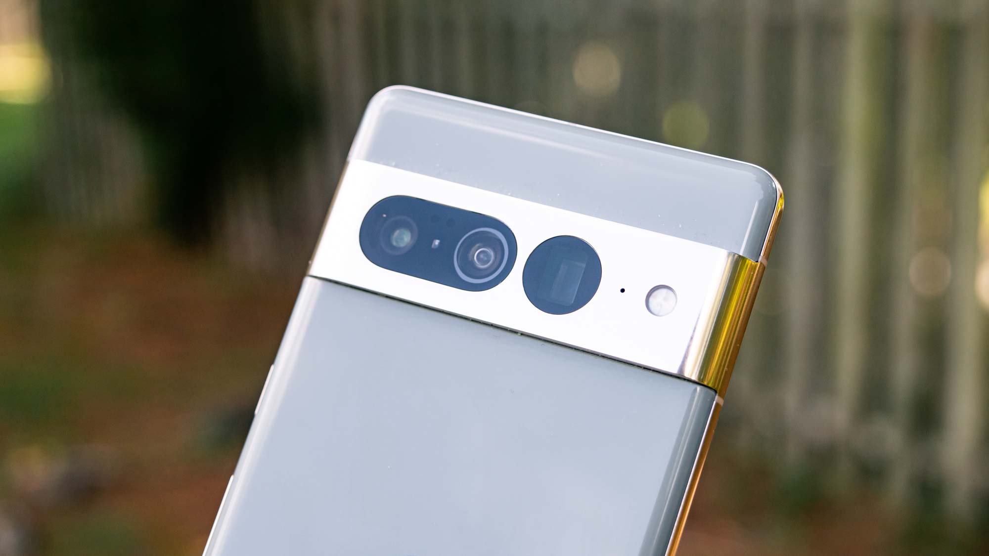
The Pixel 7 Pro doesn’t revolutionize smartphone design but it pleasingly improves what we saw on the Pixel 6 Pro. We still have a bar that runs across the cameras on the back, but it is now flush with the camera lenses in a metallic finish rather than glass. It merges with the side frame that also has a metallic finish on the Pro.

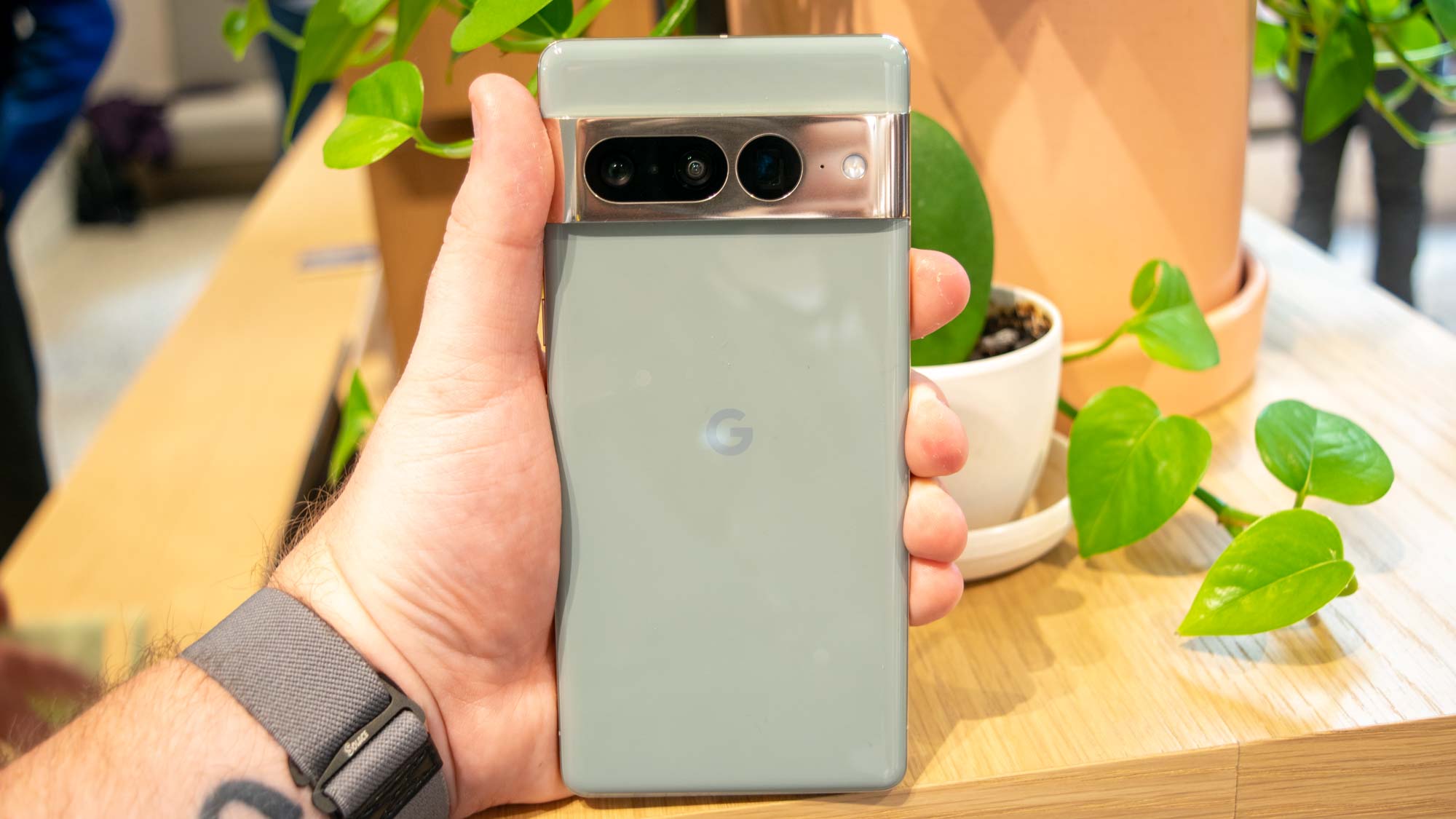
The phone comes in three color variants — Snow (white), Obsidian (black) and a new Hazel color which is more on the light gray spectrum. The two-tone color approach that Google gave the Pixel 6 series is also gone. I prefer the uniform color throughout the phone that makes the metallic strip stand out even more and gives the phone a premium look.
The Pixels are large phones, especially the Pro — because of that, square edges made the Pixel 6 Pro look pretty block-ish. Now, with the Pixel 7 Pro, the edges are more rounded and it looks sleek. I got the Hazel color variant for review and was instantly drawn to the aesthetics of the phone.
Design is a slippery slope with the Pixel 7 Pro

Google emphasized the materials it has used to make the phones at its launch event — everything is made of recycled materials, and the metal bar on the back of the Pixel 7 Pro is made of polished aluminum.
Holding the phone in hand, it feels like it has a very smooth, ceramic finish. While I love the design of the new Pixel 7 Pro, this is exactly where my problem with it lies. It is so smooth that it is extremely slippery to hold.
My Pixel 7 Pro skidded across a pile of books I was lifting like a shuffleboard puck, reminding me that it definitely needs a case.
Google has omitted the issue of fingerprint smudges or even micro scratches with the premium material it now uses for its phones. While it has got the material down to the ‘T’, it seems like it has not paid too much attention to how the phone feels to actually grip. Holding the large phone in my hand a bit of a struggle — but everything is so much softer now that I save it from sliding off my clutch at least twice a day.
I blame this in part on the smooth metal sides but more on the ceramic-like silky finish on the back. Keeping it on top of a pile of books that I was lifting to take somewhere, my Pixel 7 Pro skidded across like a shuffleboard puck, reminding me that it definitely needs a case. I have also used an iPhone 12 briefly and I never faced the same problem without a case.
The sleek design is a slippery slope with the Pixel 7 Pro; it looks stellar but is a whole different story when it comes to actually holding it.
I also realized that by placing the phone down on a flat surface, the camera bar sticks out like some of the Samsung flagships and I am worried about getting scratches on the camera lenses.
My big lesson in using the Pixel 7 Pro is that it should not be used without a case. And if you’re looking at buying the Pixel 7 Pro that would definitely be my one recommendation.
Sign up to get the BEST of Tom's Guide direct to your inbox.
Get instant access to breaking news, the hottest reviews, great deals and helpful tips.

Sanjana loves all things tech. From the latest phones, to quirky gadgets and the best deals, she's in sync with it all. Based in Atlanta, she is the news editor at Tom's Guide. Previously, she produced India's top technology show for NDTV and has been a tech news reporter on TV. Outside work, you can find her on a tennis court or sipping her favorite latte in instagrammable coffee shops in the city. Her work has appeared on NDTV Gadgets 360 and CNBC.
