I just tested a $700 Wi-Fi 7 router with dual screens — and it’s surprisingly great
These dual displays are light years ahead of the LEDs on other routers
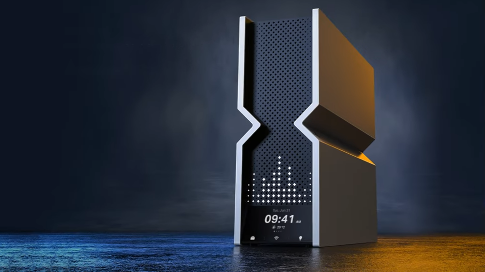
A router with enough blinking colored LEDs to look like a lit up Christmas tree seems so 2015 to me after I lived with the TP-Link Archer BE900 router for two weeks. The Wi-Fi 7 router is not only among the fastest ways to move wireless data around my house, but it has no annoying LEDs. What it does have is two screens that show me what’s going on inside the router and can be a little whimsical. Be warned, it can be addictive.
Taking a new direction with Wi-Fi router design
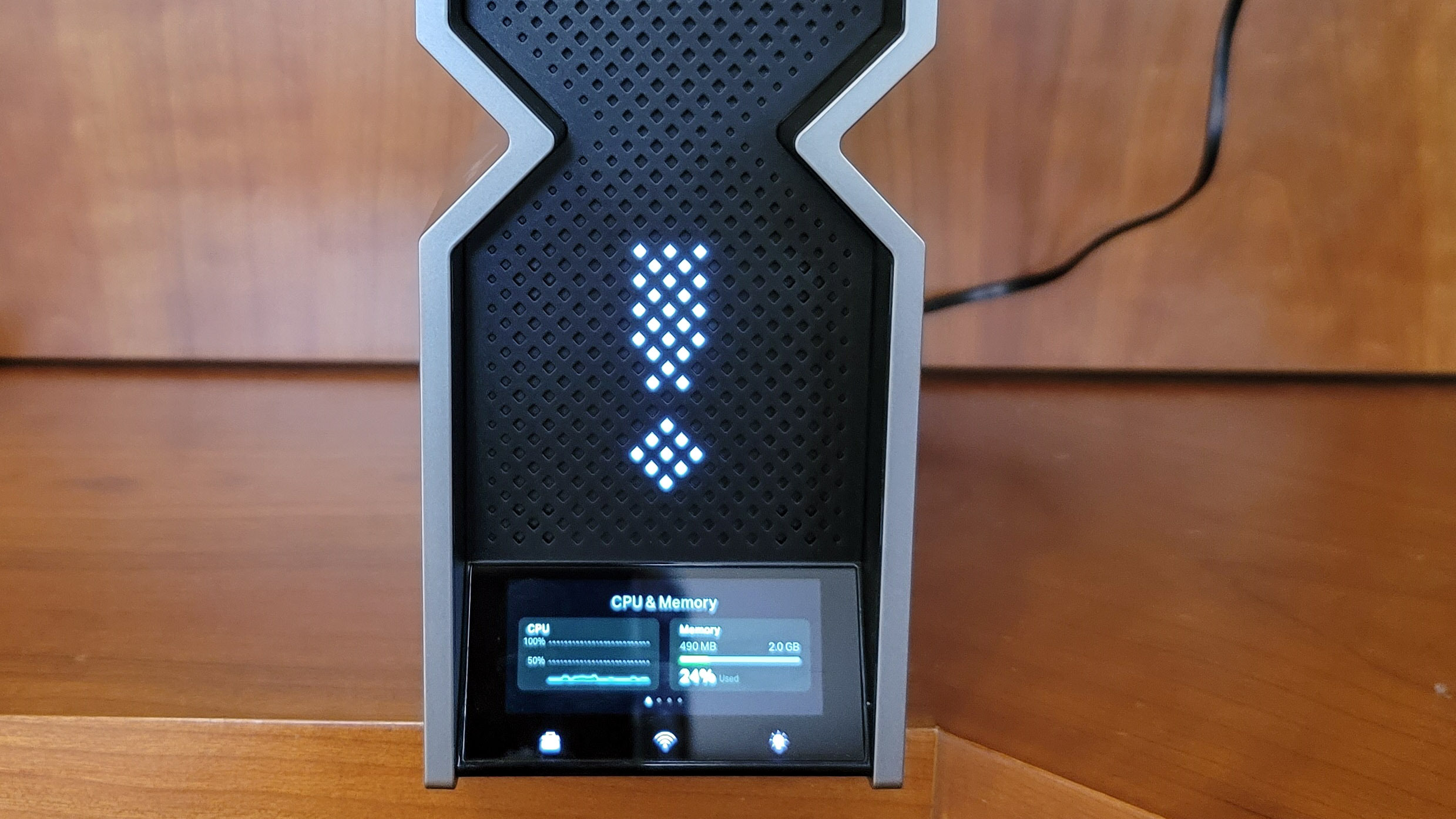
The gray and black Archer BE900’s geometric shape is a bold new design direction for TP-Link that debuted with the Archer BE800 router. Called V Fold, the design language is vertical and squared off with a central pinch that makes the router look like a blocky hourglass.
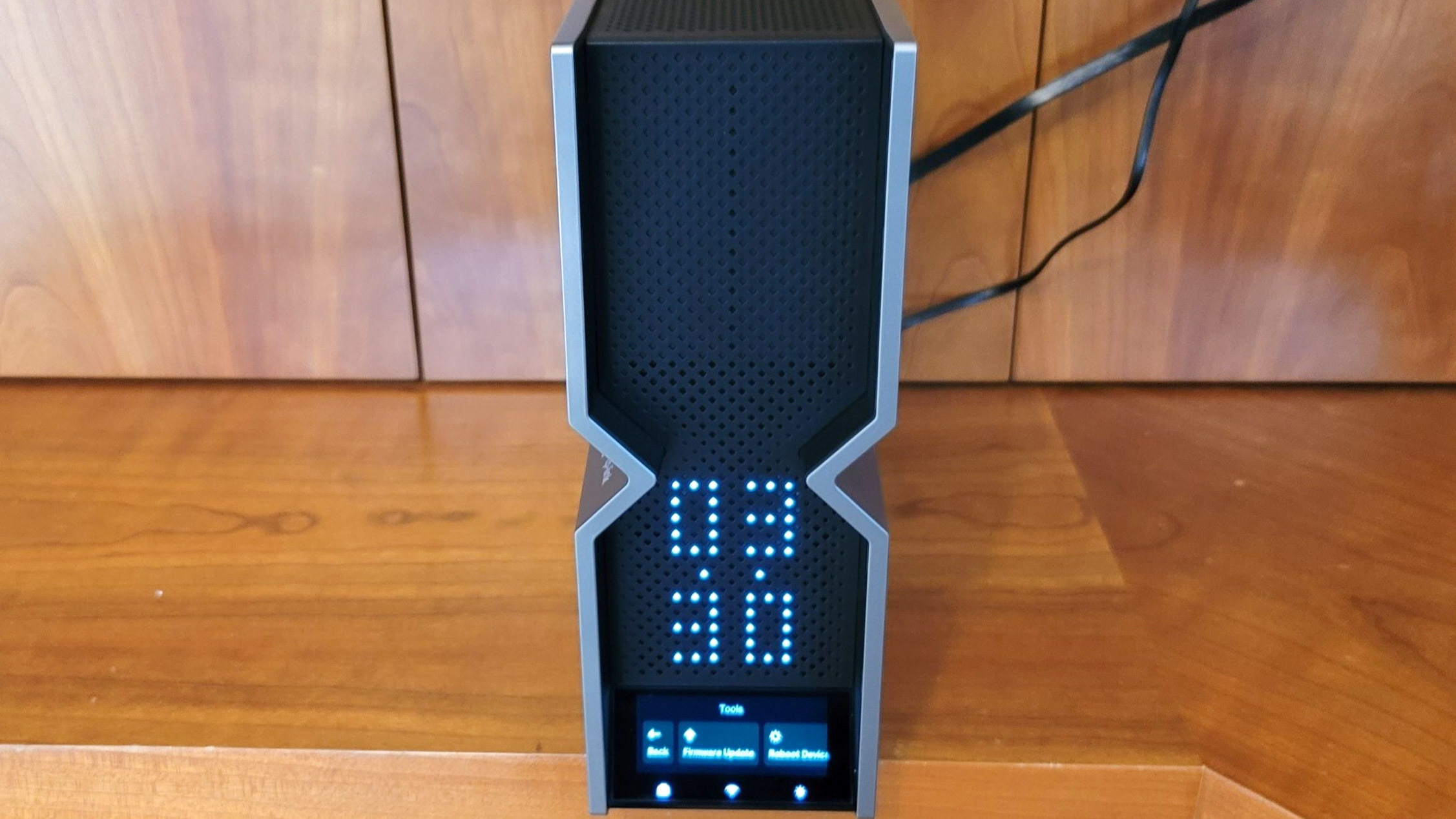
Sure, its look is very different from other routers, but I discovered that the true innovation is the BE 900’s pair of info screens. The 3.0 inch top screen, also used on the Archer BE800, is formed from a series of diamond-shaped cutouts in its grill. Its big white dots act like a basic monochrome display that’s perfect for viewing across the room. The screen allows the router to do things that others can’t, like displaying “Hi” during its initial configuration and showing an exclamation point when it’s offline.
It’s crude but very effective and can show a library of emojis, animation clips or text. It took me a minute with the TP-Link Tether app to have the screen show a sequence of the time, date and a steaming cup at 2 second intervals to remind me that a coffee break is never too far away. If anything, it’s too good at what it does and is so hard to not look at that it’s a bit too habit forming.
A dashboard right on your router
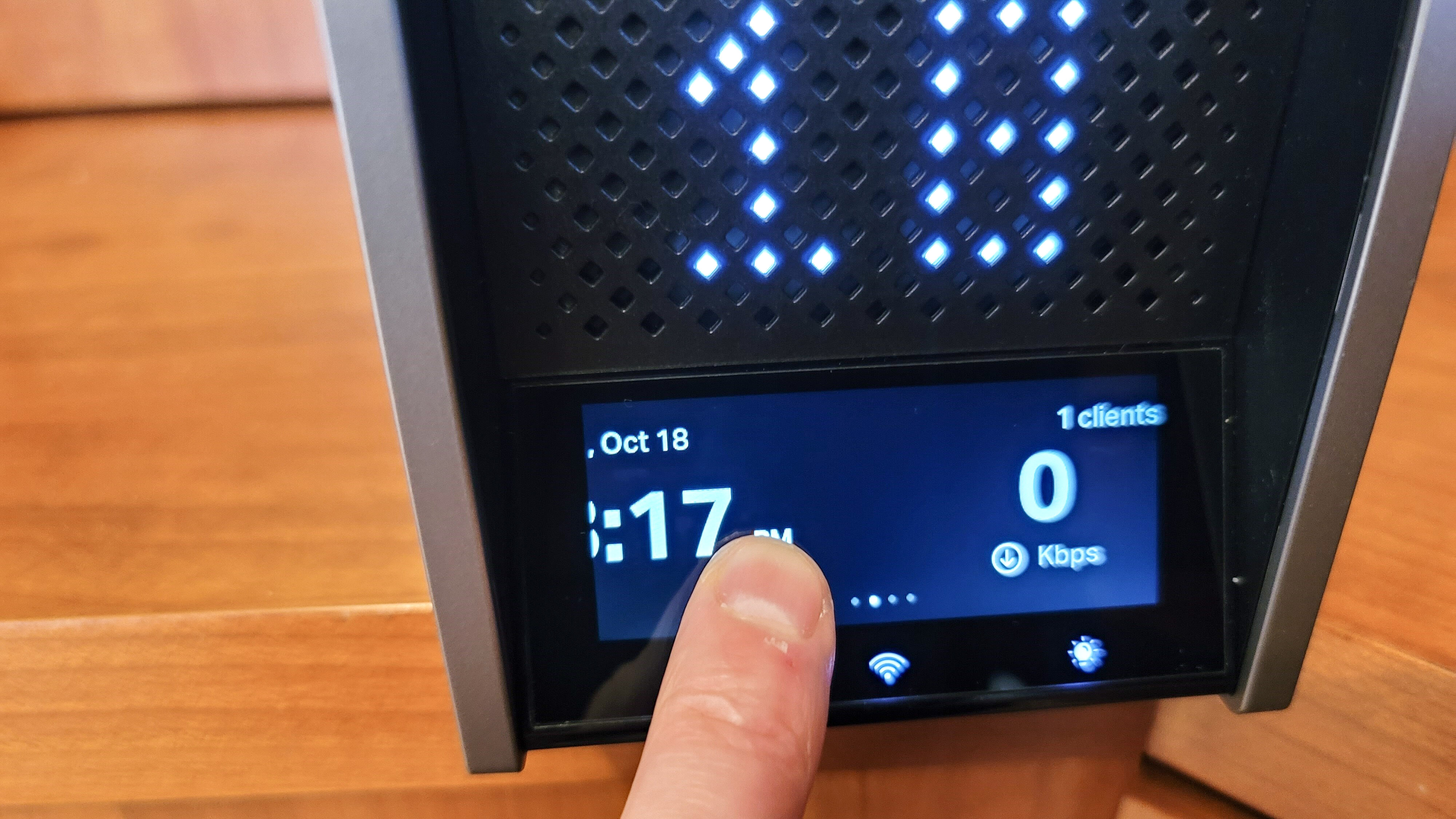
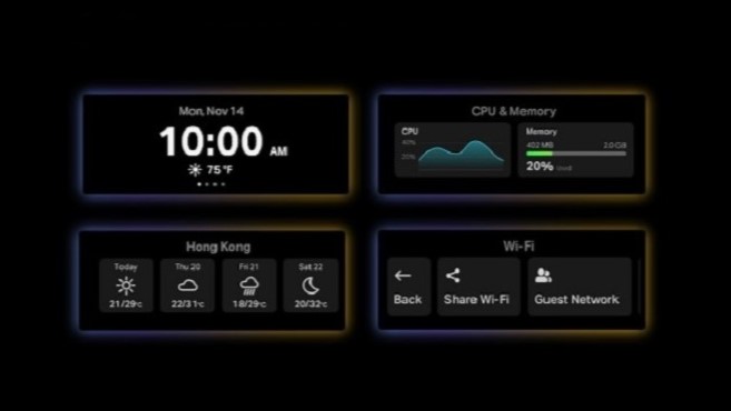
While the BE800 stops there, the BE900 pushes networking display technology even further with a second 2.6-inch color touchscreen. Angled for better visibility, it’s easy to see up close and run my finger over the glass surface to make changes.
This screen shows lots of key data about the router, although its default is a mundane display of date and time. Customizing it couldn’t be easier. I swiped right to show anything from the number of connected clients and throughput to the current weather outside. It can even put up a QR code on the touchscreen so guests can quickly connect to the network. A tap on the left returned me to the default display.
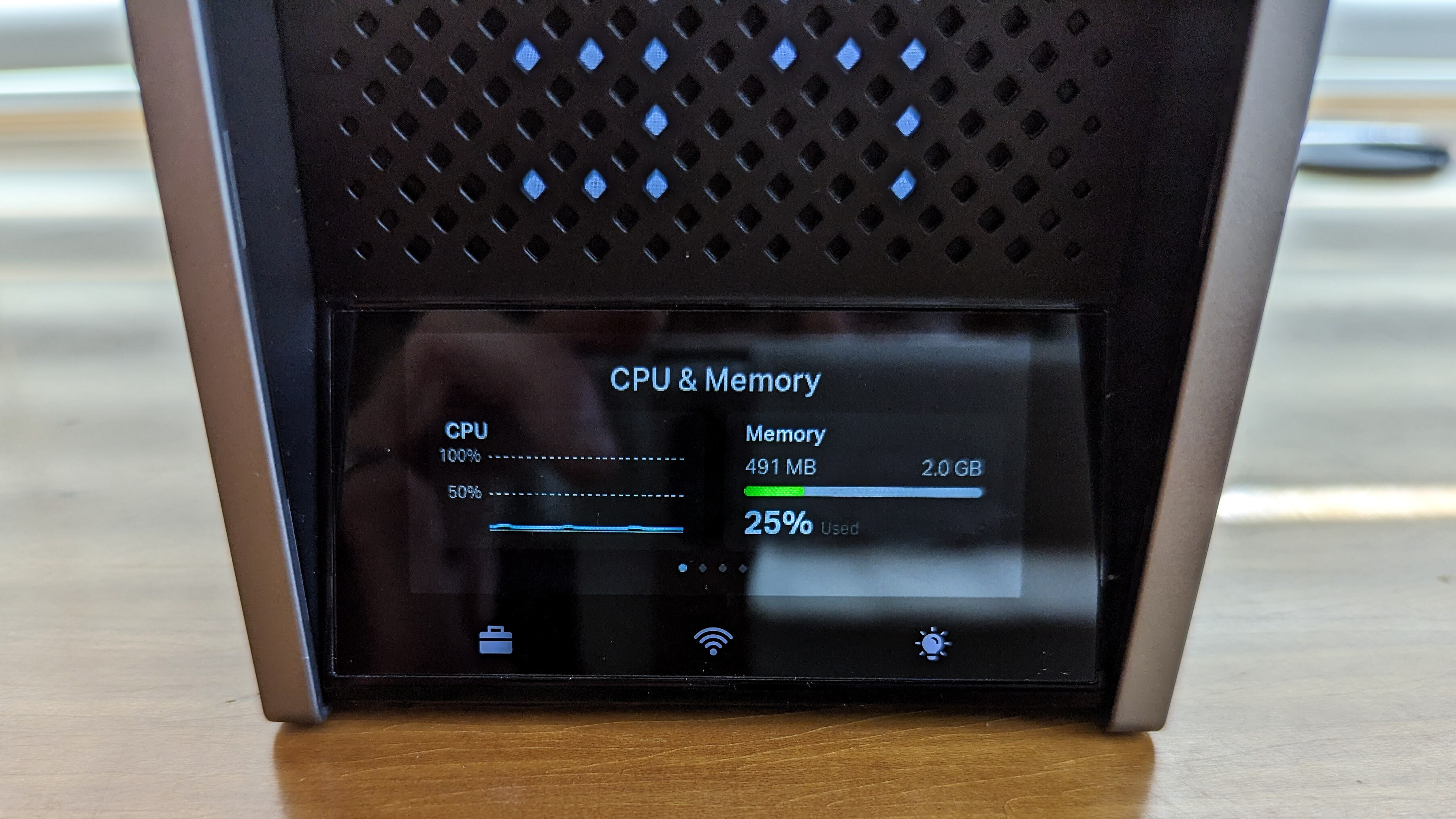
For me, the big step forward is the ability to view graphs of CPU and memory usage over time to see what impact adding new clients or changing settings has on the network. Other routers let me do this via an app or a connected browser, but the BE900 is the rare router that puts it in my face.
The suitcase, Wi-Fi and lightbulb icons at the bottom of the screen are easily missed but incredibly powerful. They lead to downloading new firmware, the current internet speed and turning off the Wi-Fi transmissions. There’s even a section for adjusting the brightness of the displays and even turning them off, something I wouldn’t consider doing.
Spoiler alert, if you hadn’t noticed by now, I’m a big fan of using display technology to show what’s going on inside my router and network. While putting a display front and center seems like the obvious — though long ignored —way to do this, thanks to TP-Link’s thoughtful designers and engineers it’s a proven idea whose time has finally come.
I’m hoping this is the first of many steps in this direction because what the Archer BE800 and BE 900 can do is just a taste of what’s possible. I would have loved to see an analog-looking clock face available or the ability to tap into the router’s HomeShield security software to alert me if an attack is underway or show me that someone (other than me) is hogging too much bandwidth. The possibilities are seemingly endless for this technology.
Plenty of power to match its good looks
One of the top performers for home networking, TP-Link’s Archer BE900 is not just another pretty face. Under its gray and black squared-off skin, the router is Wi-Fi 7 through and through with inputs for a 10Gbps WAN and the ability to tap into 16 independent streams of data over the 2.4-, 5- and 6GHz Wi-Fi bands. It can take advantage of ultra-wide 320MHz data channels and is a screamer for those with high-speed Internet connections.
At $700, the Archer BE900 isn’t cheap. For me, it’s more than worth the price because the Archer BE900 is one of the most interactive routers available anywhere. On the other hand, its pair of screens are just too addictive for someone like me who’s easily distracted while working, watching movies or gaming. While the Archer BE900 was unobtrusively sending packets of data back and forth filling my home with Wi-Fi data, I spent too much time staring at its screens and not enough on my computer’s screen.
More from Tom's Guide
Sign up to get the BEST of Tom's Guide direct to your inbox.
Get instant access to breaking news, the hottest reviews, great deals and helpful tips.
Brian Nadel is a freelance writer and editor who specializes in technology reporting and reviewing. He works out of the suburban New York City area and has covered topics from nuclear power plants and Wi-Fi routers to cars and tablets. The former editor-in-chief of Mobile Computing and Communications, Nadel is the recipient of the TransPacific Writing Award.

