I just realized I need to give Android Launchers a chance — here’s why
My frustration with pre-installed software is reaching a tipping point

In my mind, the Android launcher encapsulates the thing that makes Android great: the customization options. Unlike iPhones, which have been pretty late to that bandwagon, Android has historically offered a lot more freedom to do as you like with your phone. Launchers take that idea to its extreme, and in a simple fashion.
The best Android launchers are plentiful, and they can be installed straight from Google Play. So there’s no messing about with rooting, bootloaders or any other technical things the majority of people don’t know how to do. It’s simple, painless and everybody can take advantage of it.
And yet, I’ve never really used an Android launcher in any meaningful way. Despite my stalwart dedication to the software, I’ve generally just accepted whatever interface is installed on my phone when I open the box. And recently that’s got me wondering, am I missing out?
I’ve always been (mostly) content with what I’m given
Every single phone I’ve had over the past decade or so has been different in the software department. That’s the nature of Android, with most of the big phone makers putting their own spin in the software to do one thing or another. But, for the most part, it’s all been similar enough that the differences from one upgrade to another felt relatively minor.
There were things I definitely didn’t like. Like switching to a phone that wouldn’t let me choose which home screen panel was the primary one, and lumping that honor on the left-most screen regardless of what I wanted.
I resigned myself to the fact that switching phones meant learning to live with various quirks of different Android varieties.
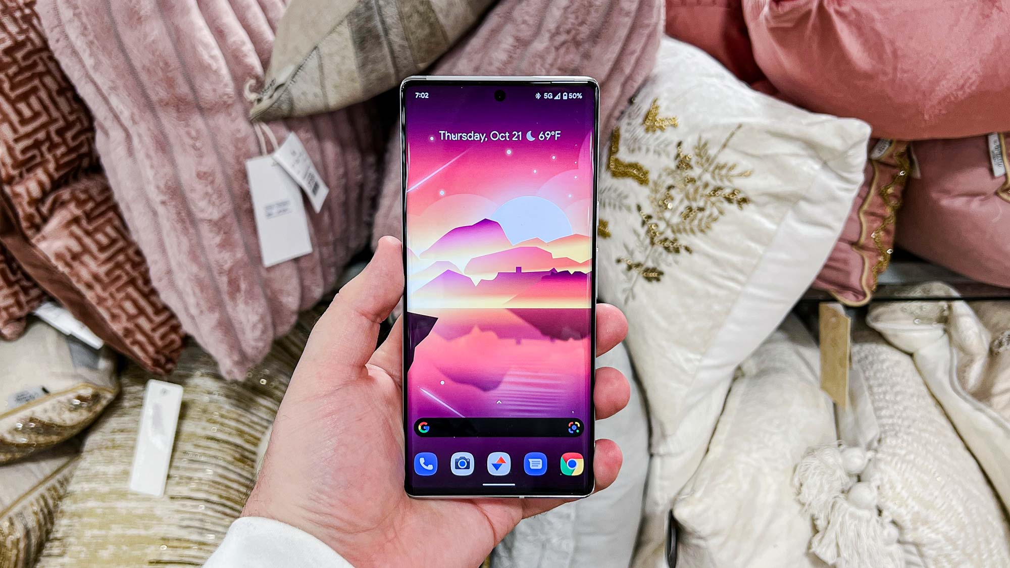
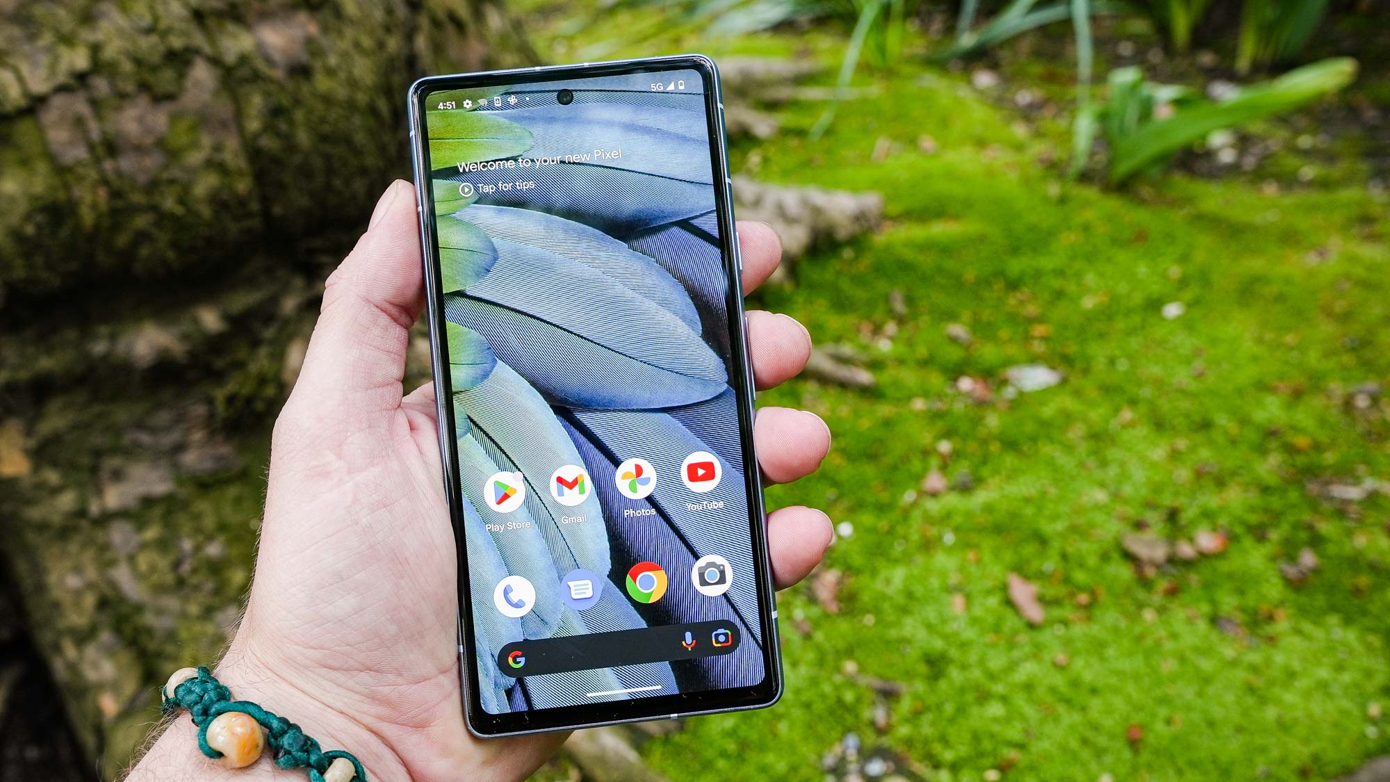
Other examples include losing the OnePlus Shelf when I switched to a Pixel, since that had become my go-to spot for larger widgets that just look cluttered elsewhere — like the calendar. Similarly, the Pixel Launcher has a Google search bar and the “At a glance” menu that use up valuable screen space and can’t be removed no matter how furiously you poke at your screen.
But these things have always been very minor, and I resigned myself to the fact that switching phones meant learning to live with various quirks of different Android varieties. In fact I’ve learned to tune out the Pixel’s Google Search bar so well that I had to double check my phone so I was sure I hadn’t imagined it.
And that meant I’ve never felt the need to install a launcher and organize things in a way that’s more befitting my taste. Not on my phone anyway, since there was one instance where I realized the pre-installed tablet software was not for me.
It was loading up a brand new Huawei tablet for the very first time, back in the days where a number of phone and tablet makers were doing their best to not-so-subtly copy Apple at every turn. In the case of this tablet, it meant there was no app drawer, and few if any customization options on the homescreen.
At this point I’d been using Android for several years, and had gotten used to the ability to place apps and widgets wherever I darn well pleased — keeping everything else hidden away in their own menu. Needless to say, I wasn’t about to switch back, and a launcher proved to be the only simple option of regaining an experience that actually felt like Android.
But I’d argue that was an extreme case, and for a device I didn’t end up using very often — something that always seems to happen with me and tablets. Smartphones, which I use multiple times a day, have never been so immediately distasteful that I was annoyed enough to make that change.
My frustrations with pre-installed launchers are starting to add up

As much as I have learned to live with changes as I transition from one phone to another, I am still getting to the point where enough is enough. The Pixel’s “At a Glance” menu is a prime example of that, taking up an entire row of my home screen that I would prefer to otherwise devote to something else — like a clock, or even empty space to enjoy my wallpaper.
I’ve also got a long-standing pet peeve about widgets that take up more space than they have any right too. A 3 x 1 tile widget shouldn’t take up 3 x 2 tiles of space, and leave massive gaps between it and everything else around it. If there are going to be gaps on my phone screen, then it should be because I want them there — not because some developer decided I should have them.
I want to be in control of what’s on my screen, and that shouldn’t have to fall in line with the whims of some faceless designer or developer in an office on the other side of the world.
Android is, in essence, a system about choice. The choice to pick between devices, the choice to decorate and customize the home screen, or the choice to override everything and scrap the default launcher (almost) in its entirety.
The problem is the default launchers interfere with that choice by imposing certain restrictions — or at least that’s the way it feels to me. And every phone maker is different, so switching phones means readjusting to how this new phone does things. If you want to avoid this, you may feel like you’re stuck buying the same brand of phone time after time — which defeats the purpose of choosing between dozens of handsets.
It’s been rather a slow burn, but it’s got to the point where I’m feeling like my mobile experience shouldn’t have to come with sacrifices or compromises. I want to be in control of what’s on my screen, and that shouldn’t have to fall in line with the whims of some faceless designer or developer in an office on the other side of the world.
Barring a sudden interest and newfound aptitude for software design, which isn’t likely, I either have to make do or start giving one of the best Android launchers a chance. So I’m thinking, what’s the worst that could happen?
It's time to give a launcher a proper chance

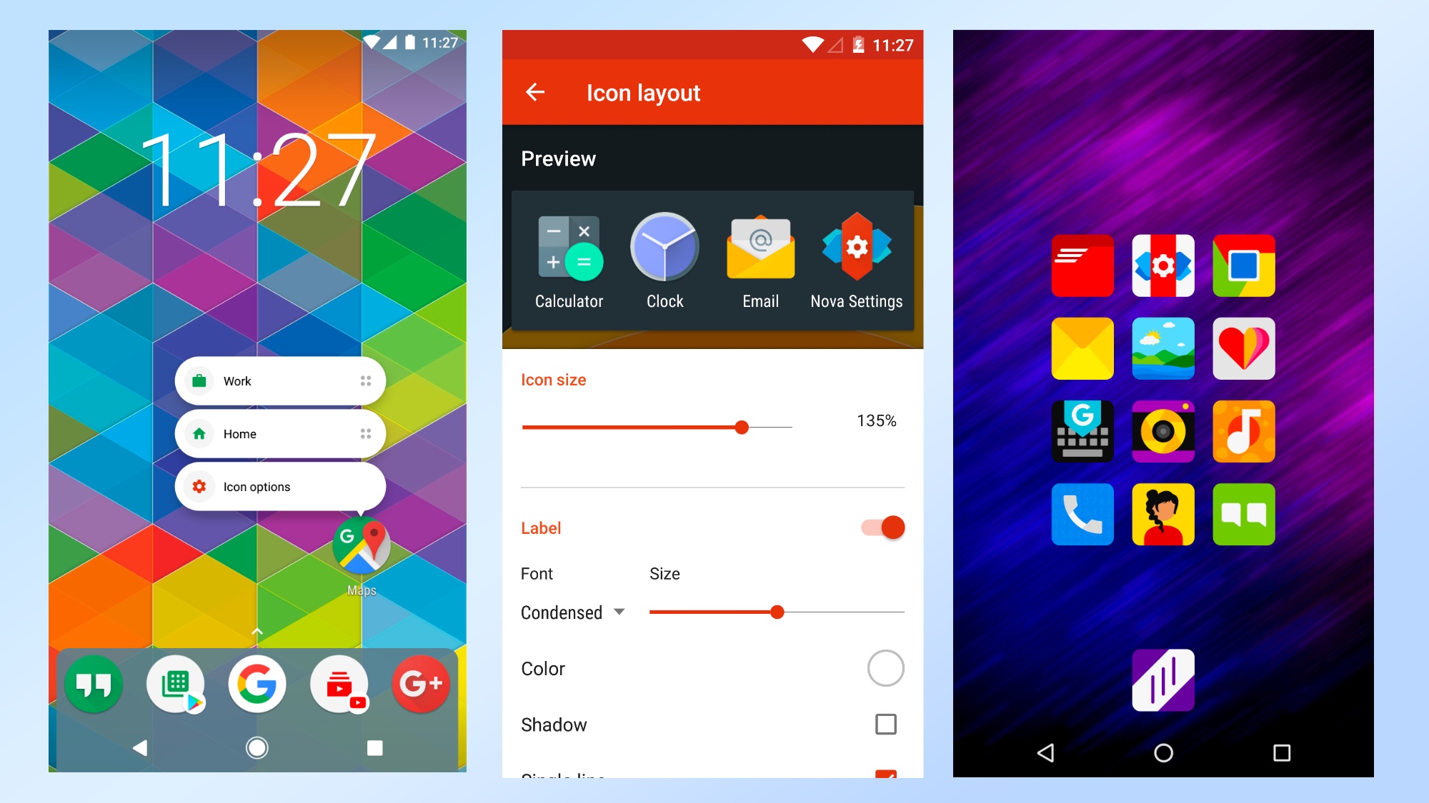
Now is the time for me to pick a launcher, get everything set up and find out whether it can offer a better (and more personal) smartphone experience. There are a lot out there, but I've decided to give Nova Launcher a try. Not only does it claim the top spot on our list of the best Android Launchers, it’s also designed with speed in mind — with minimal impact on performance.
Since my own Pixel 6 Pro runs on a Tensor G1, which is never going to win any benchmarking contests, that’s definitely a good thing.
Not to mention the fact that Nova is built to be highly customizable, with features that are designed to make your home screen truly your own. Given my growing grievances with Android, that’s certainly very appealing. As is the fact the Nova team is continually updating the software with new features.
There’s a lot to get to grips with, mind you. I won’t lie, Nova’s myriad of options does feel a little intimidating from the outside. But there’s only one way to get past that, and that’s take a plunge and start getting everything set up. Wish me luck, and if there's an Android launcher you like to use, please drop us a comment.
More from Tom's Guide
Sign up to get the BEST of Tom's Guide direct to your inbox.
Get instant access to breaking news, the hottest reviews, great deals and helpful tips.

Tom is the Tom's Guide's UK Phones Editor, tackling the latest smartphone news and vocally expressing his opinions about upcoming features or changes. It's long way from his days as editor of Gizmodo UK, when pretty much everything was on the table. He’s usually found trying to squeeze another giant Lego set onto the shelf, draining very large cups of coffee, or complaining about how terrible his Smart TV is.
