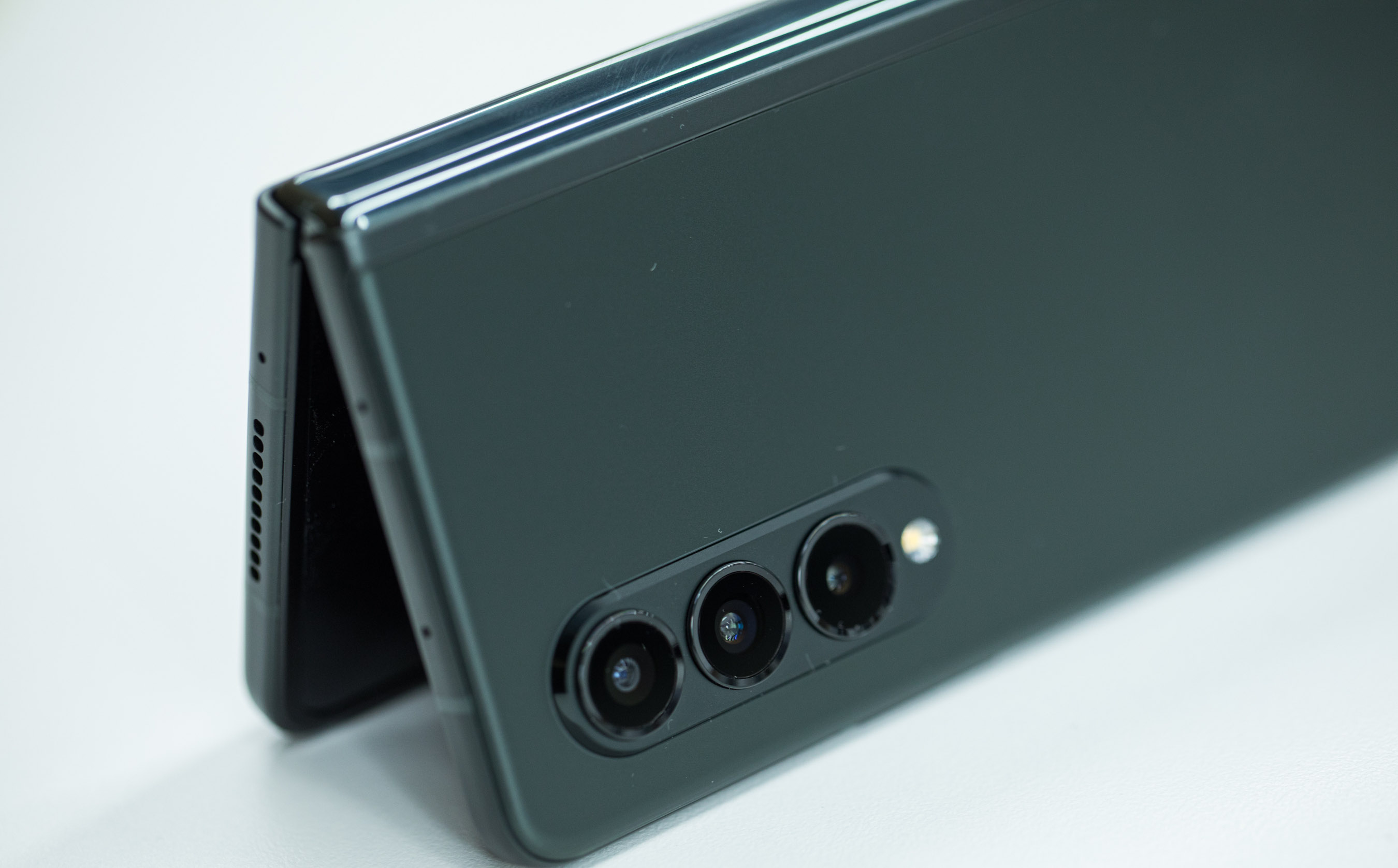
With the Samsung Galaxy Z Fold 3, I've lost the desire of wanting to upgrade my phone every year.
As a tech enthusiast, I always felt that I needed to be at the cutting edge of phone development. I found myself holding on to my T-Mobile Jump plan, which more easily lets me upgrade my devices, hoping that something would come along to satisfy my technological thirst.
But jumping over the years from the LG V30 to the OnePlus 7 Pro, then to the Samsung Galaxy S20 FE became more tedious than enjoyable. Well, after using the Galaxy Z Fold 3 the past few days, I don't feel the need to upgrade anymore. I'm finally satisfied.
- Samsung Galaxy Z Fold 3 review: Our verdict is in
- Samsung Galaxy Z Fold 3: Is it worth $1,799?
- Plus: Samsung Galaxy Note line now looks dead — here's why
The release of the iPhone in 2007 cemented modern phone design. By shifting away from buttons to a single multitouch glass display, it put the onus on software over hardware. And this was a necessary step. Back then, phone companies were adding full QWERTY keyboards and styluses, trying everything necessary to make the smartphone a more complete experience. What we got was a hodgepodge of ideas with no standard intuitive user interface. But the iPhone did for phones what the mouse did for computers.
Over the years as the tech world realized the power and versatility of a single multitouch display, phones began feeling more the same. Apart from the cameras and a few software tweaks, for most users, the experience between the Samsung Galaxy S21 and the OnePlus 9 would not feel too dissimilar. But then Samsung unveiled the original Galaxy Fold. It was expensive, the cover display was too small and the design was too fragile. Shortcomings aside, it pointed to what flexible displays could mean for phones. Things got better with the Z Fold 2, but the $2,000 price point kept it out of reach.
Once Samsung announced the slightly more affordable Galaxy Z Fold 3 at $1,799, and by using this trick to save $850, I pre-ordered a unit.
After using the phone this past weekend, I don't see how I could ever go back to a non-folding phone. Browsing and responding to emails is far more organized and clean on the large 7.6-inch internal display. That's just 0.3 inches smaller than the iPad mini 2019. On my Galaxy S20 FE, bouncing around different emails felt claustrophobic and required too many inputs. Having a bar to the left with all my emails and a section to the right to draft makes the process far more intuitive.
Watching video content feels less squished on the Galaxy Z Fold 3, too, as the larger display makes content more enjoyable. The YouTube app does need an update though. It's missing a few features for content creators, as detailed by YouTuber LinusTechTips, and doesn't have the Shorts feature, an addictive TikTok ripoff.
Reading comics and articles is more gratifying thanks to the larger real estate. The beautiful AMOLED display makes hand-drawn art pop. And reading The New York Times in full width brings the experience closer to the desktop.
One area that reviewers have been more critical is the narrow 6.2-inch front display. To accommodate the hinge, Samsung had to slim down the front display to 2.1 inches in width. This is a significant paring down from my S20 FE, which has a width of 2.6 inches. For most reviewers, I can understand the complaint. But as someone with smaller hands, not having to strain to reach across the display has been a welcome surprise. I can't even tell you the amount of times I've nearly dropped my S20 FE when trying to reach for something with my thumb.
The Galaxy Z Fold 3 is not without its issues. The Galaxy Z Fold 3 battery life is not the best. Plus, many Android apps aren't optimized well enough for tablets, and Samsung's One UI can feel bloated and inefficient. While other launchers can be installed, fan favorites like Microsoft Launcher and Nova Launcher still could use some tweaking for foldables.
It's also annoying and unnecessary that Samsung has a separate store for buying and downloading themes and icon packs. I personally am a fan of Linebit, a robust icon pack with custom icons for 3,700 apps. But Samsung won't let you install an icon pack on its One UI interface that can't be bought via the Galaxy Store. While I'm not against having multiple marketplaces within the Android ecosystem, Samsung's deliberate segregation defeats the benefits that Android has as an operating system over iOS.
Charging also isn't as fast as what can be found with the OnePlus 9 Pro and the cameras are sensors from last year. And after 96 hours of use, I still haven't gotten used to the chunky 9.9 ounces of weight.
Complaints aside, I'm sold on the foldable future. I just hope Apple joins the party soon so that iPhone fans can enjoy what I'm experiencing.
Sign up to get the BEST of Tom's Guide direct to your inbox.
Get instant access to breaking news, the hottest reviews, great deals and helpful tips.
Imad is currently Senior Google and Internet Culture reporter for CNET, but until recently was News Editor at Tom's Guide. Hailing from Texas, Imad started his journalism career in 2013 and has amassed bylines with the New York Times, the Washington Post, ESPN, Wired and Men's Health Magazine, among others. Outside of work, you can find him sitting blankly in front of a Word document trying desperately to write the first pages of a new book.

