I can't wait for the new iOS 16 lock screen — but I was hoping for more
I love the new look, but I wanted to hear more about notifications

Apple's WWDC 2022 keynote revealed a lot about what we can expect this year. The company kicked things off with iOS 16 and perhaps the biggest change coming in a few months: the lock screen.
Yes, Apple is finally tackling the tired, dated lock screen with a fresh design and new customization options.
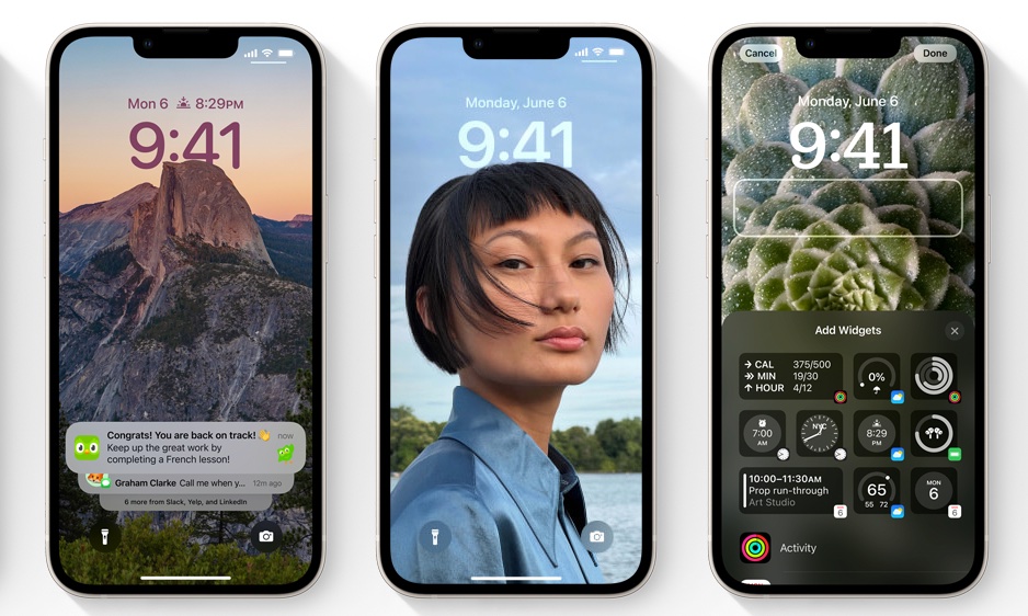
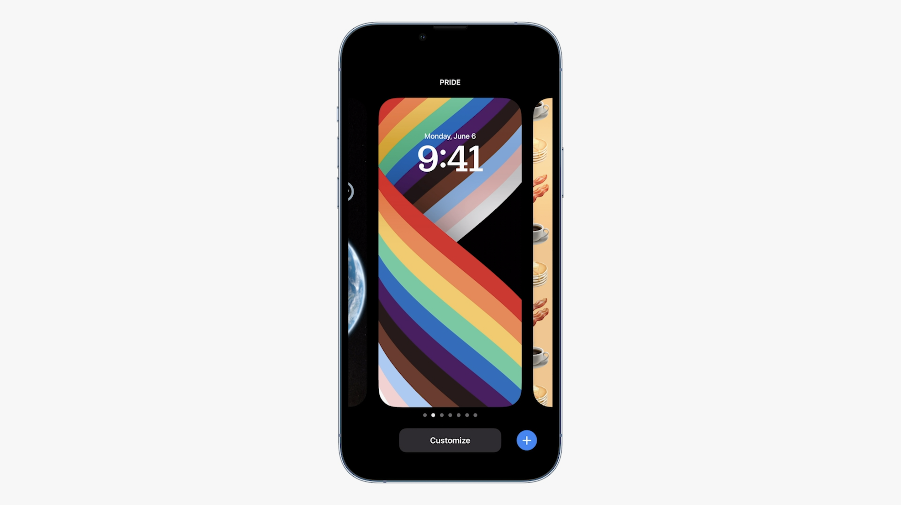
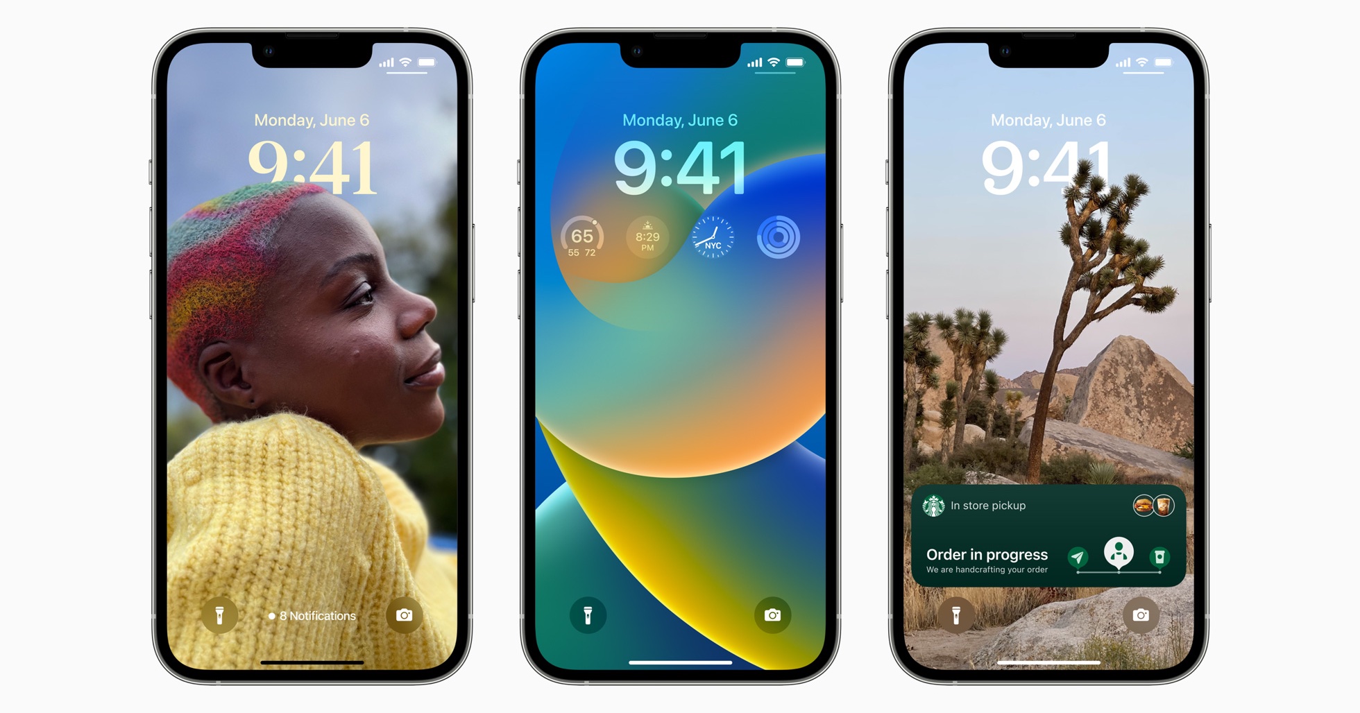
And believe me, I'm excited for this to land this autumn. Apple might finally surpass Android's lock screen, which itself has been fantastic for years now. iOS 16 will let you dive deep into customizations, from the clock's font and color to filters and widgets. You can even have multiple lock screens, which you can tie to Focus modes.
Furthermore, the lock screen redesign will see notifications move to the bottom of the screen instead of taking up the middle. From the imagery we saw during the keynote, this solution looks pretty elegant since the notifications won't obscure your wallpaper — so long as you keep them under control.

Looking back on the keynote and the rumors leading up to it, I think I see where the reports of a change to iOS notifications came from. See, I was hoping for an overhaul to the system, something about which I wrote two months ago. I'm sad to see my hopes dashed, unless Apple didn't reveal everything that iOS 16 has in store.
I'm curious to see if Apple has kept one particularly annoying iOS thing. Right now, unread notifications disappear from your lock screen if you lock your phone. This aggravates me to no end, especially if I happen to lock my phone right as something comes in. Don't get me wrong, I didn't expect Apple to touch on such a seemingly minor thing in its conference keynote, so I'll have to try out the betas to see if iOS 16 resolves this or not.

While I think the change in lock screen notifications is great — especially since iOS 16 will let you hide items to keep things from getting cluttered — I had hoped that Apple would address the weak points in iOS notifications. I've already outlined where I think the company can improve in the article linked above, but to summarize, I wanted to see the following: better grouping, more actions, and an easier way to clear one or all notifications.
I'll grant that the things I had asked for may not be large enough to warrant highlights in the keynote, which had to cover a massive amount of ground in two hours. It's possible we might hear more about iOS 16 notifications later this week in the breakout sessions.
The new lock screen certainly excites me, no doubt, and I'm willing to take what victories I can get. If I've learned anything at this point in my life and career, it's to take the small wins that come to you instead of just complaining about the things you don't have.
I can't wait to start playing with the new lock screen, especially the themes and font options. And I think I'll also like the new notification placement, but I can't help but feel that Apple missed an opportunity to address an area where iOS falls behind its Android rival.
Sign up to get the BEST of Tom's Guide direct to your inbox.
Get instant access to breaking news, the hottest reviews, great deals and helpful tips.

Jordan is the Phones Editor for Tom's Guide, covering all things phone-related. He's written about phones for over six years and plans to continue for a long while to come. He loves nothing more than relaxing in his home with a book, game, or his latest personal writing project. Jordan likes finding new things to dive into, from books and games to new mechanical keyboard switches and fun keycap sets. Outside of work, you can find him poring over open-source software and his studies.
