Galaxy S11 renders look like an iPhone 6 clone — this needs to stop
How longer can manufacturers keep beating this dead design?

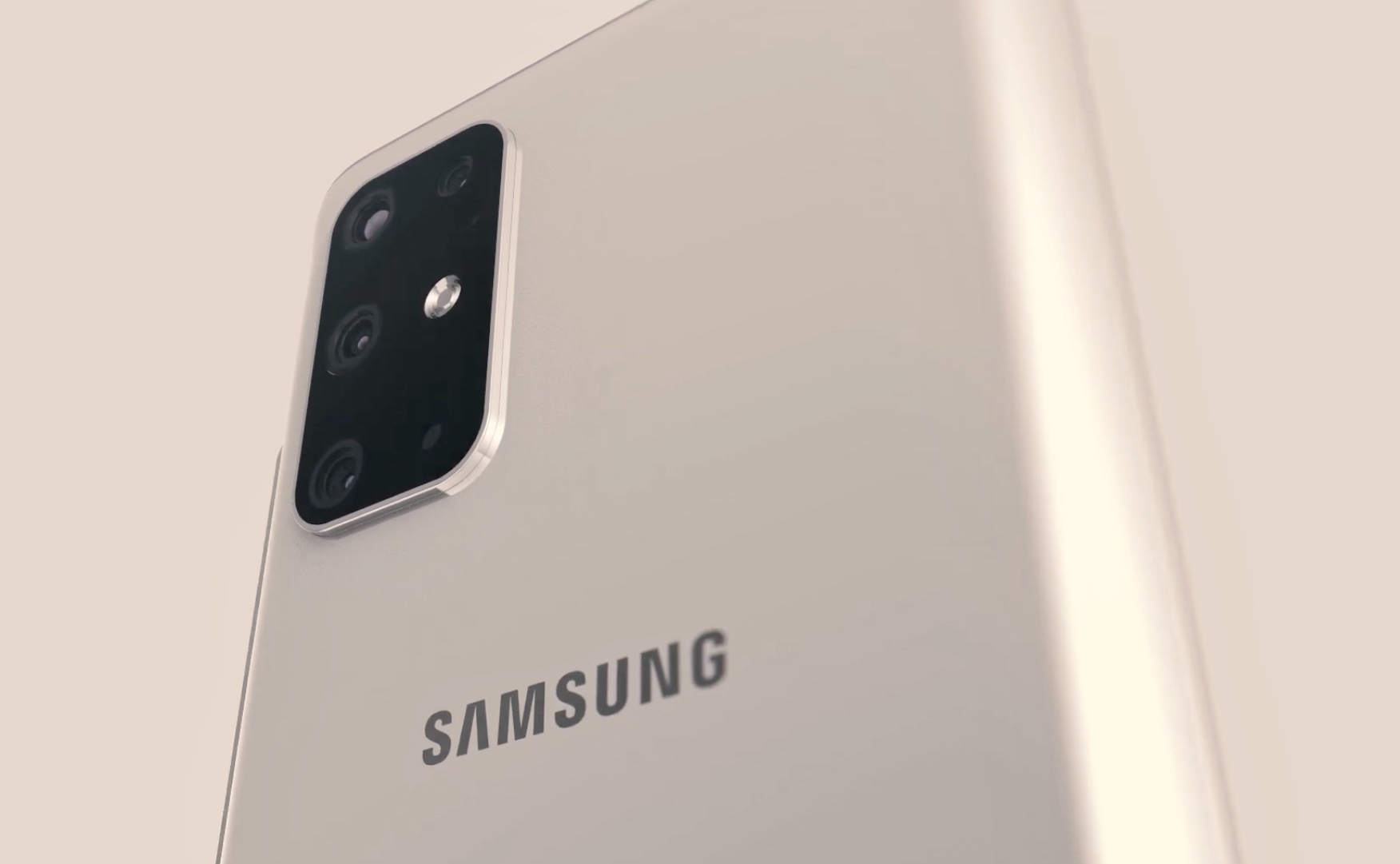
New pretty renders based on the latest confirmed design specs of the Samsung Galaxy S11 are out. But no amount of beautification can’t help: this looks like an iPhone. Or a Huawei. Or a Xiaomi. It’s the same rounded corner design that everyone has been doing for years — now with a camel-sized camera hunchback.
The renders were made by YouTuber Concept Creator based on information by @onleaks, the Twitter handle for French blogger Stephen Hemmerstoffer. Onleaks has been consistently right on all its design unveilings for both Samsung and Apple phones, so this design has 99% probability of being right.
And while @onleaks’ renders are not as picture perfect as Concept Creators’, there’s no amount of shine that can fix the fact that his is just a re-edition of the iPhone 6 with a bigger, full display panel with a camera punch hole and a really large camera pack on the back. Sure. It doesn’t have top and bottom bezels — and no home button. But it’s basically the same unibody design with its characteristic ceramic antennas dividing the chassis.
To put that into perspective, the iPhone 6 was released in 2014. That’s like the Medieval Age in internet years. It was the first phone to come with that design and it was a huge success for Apple. After it, it became the template that almost everyone followed.
The Samsung Galaxy S11 is not different. It’s basically the same but uglier thanks to the five camera package on the back — a literally and figuratively growing trend that is becoming embarrassing at this point.
Why hasn’t anyone tried to actually innovate?
The light at the end of the tunnel
Is this the best design we can aspire to? Is this shape really the most optimal and visually pleasant design companies can think of? I don’t think so. Instead, it seems a matter of playing it safe rather than following solid design principles, like Dieter Rams’ rules for good design.
Looking at Rams, it certainly doesn’t seem to be the most practical design. Oversized and ultrasmooth, these phones are really hard to handle. They are slippery because most manufacturers go for the same type of material, either aluminum or, worse, polished ceramics or glass.
It doesn’t seem to be the most durable design either. These things offer no protection whatsoever which is why people have to cover it with cases like grandmas cover their sofas with plastic wraps. They look great in these hero renders but then that doesn’t matter because people put over a cover (often an ugly one).
But there’s hope. Apple has apparently decided to change their design tune for the iPhone 12, taking it back to what’s perhaps its best cellular handset design— the iPhone 4. Sure, this is a step back, but at least it changes things.

There are Chinese designers who have taken different routes. Beyond the game-oriented phones, the Nubia Z20 is a mainstream flagship that has a distinct feeling, not only with a display on each side but a sharply edged curvature that tappers like an Imperial Star Destroyer instead of going for the old tired slippery curve. There’s Xiaomi too, with the Mi Alpha, an experimental phone with an extruded shape that is 90% screen. It’s not a lot, but at least they diverge from the smooth curves and rounded corner design of the iPhone 6.
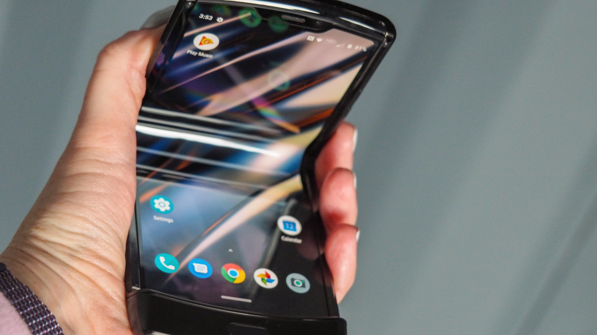
And besides Apple, Xiaomi or Nubia, there are the foldable phones. Love them or hate them, these are our strongest chance of getting manufacturers to think different when it comes to phone design (not in the case of the Fold, which looks like a Galaxy sandwich). It’s not a coincidence that the Motorola Razr 2019 went viral on the internet. There’s the nostalgia factor — like the iPhone 12 — but it is seems to be a sign that people are tired about seeing the same thing rehashed again and again.
Beyond its technological prowess — if you are into lots of cameras — it’s hard to get excited for something like the Galaxy S11 or anything else in the same line.
And I suspect the tired iPhone 6-esque design may be one of the reasons why people don’t buy as many flagships as they use to. Of course, price is the other factor — but if you make an object of desire, you can be sure that more people will make a bigger economic effort to buy it. The Razr seems to be poised to take advantage of that.
Sign up to get the BEST of Tom's Guide direct to your inbox.
Get instant access to breaking news, the hottest reviews, great deals and helpful tips.
Jesus Diaz founded the new Sploid for Gawker Media after seven years working at Gizmodo, where he helmed the lost-in-a-bar iPhone 4 story and wrote old angry man rants, among other things. He's a creative director, screenwriter, and producer at The Magic Sauce, and currently writes for Fast Company and Tom's Guide.

