Which phone has the best design? Galaxy S23 vs iPhone 14 vs Pixel 7 vs OnePlus 11
Which current phone has the best design? Here are our picks

Beauty is in the eye of the beholder, and when it comes to determining the best smartphone design, there's a lot to behold. With new flagship phones from Samsung and OnePlus debuting this month, we've got even more devices looking to catch the eye with unique looks and the right blend of materials.
And make no mistake — there's a surprising amount of variety when it comes to smartphone designs. While it's true the candy-bar design popularized by the original iPhone a decade-and-a-half ago remains ubiquitous, we've spotted a handful of devices that attempt to stand out from the crowd, to varying degrees of success.
Deciding the best phone design is a purely subjective exercise. We can run tests to figure out the best phone battery life or which was the fastest phone of the last year. Phone design, in contract, comes down to personal taste.
So why fight that? We asked our phones team to tap into the expertise that comes from testing and reviewing the best phones and pick their favorite design from the pack. Here's what they came up with when tasked with picking the best designed phone you can buy right now.
Samsung Galaxy S23 Ultra
Samsung's Galaxy S23 Ultra is one of the rare new phones you can pick out of a line-up with the display off, thanks to its trademark rectangular frame. Combined with the individually embedded cameras in the back — now added to the cheaper Galaxy S23 and Galaxy S23 Plus models too — Samsung's done a good job of standing out amongst its Android peers.
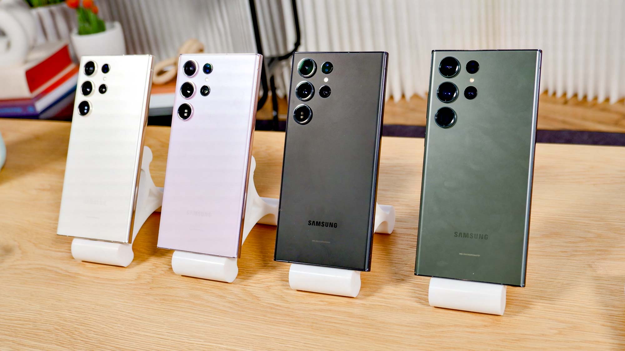
The Ultra model also provides the premium build that users spending $1,199 — or more — deserve. As we noted in our Galaxy S23 Ultra review, the new phone uses the latest in toughened glass front and back to reduce damage. It's also rated IP68 for water/dust resistance, and it features aluminum sides that still look and feel luxurious without weighing the phone down quite as much as Apple's stainless steel-clad rails on the pro iPhone models.
The S23 Ultra also manages to combine the best of both curved and flat-edged phones, by having flatter sides and a subtly curved screen. It helps make the phone easier to hold while reducing the risk of accidental touches, and making the built-in stylus (a feature very few other phones released today have) more usable. You may have your own aesthetic preferences, but it's hard to argue with the effectiveness of the Galaxy S23's design when it comes to the phone's identity and practicality. — Richard Priday
iPhone 14 Pro Max
No matter your opinion on Apple, it’s hard to argue that the company's design prowess is some of the best around — especially where smartphones are concerned. The iPhone is instantly recognizable, no matter which one of the best iPhones you’re talking about, and not just because of the logo on the back. That’s especially true of the iPhone 14 Pro Max.
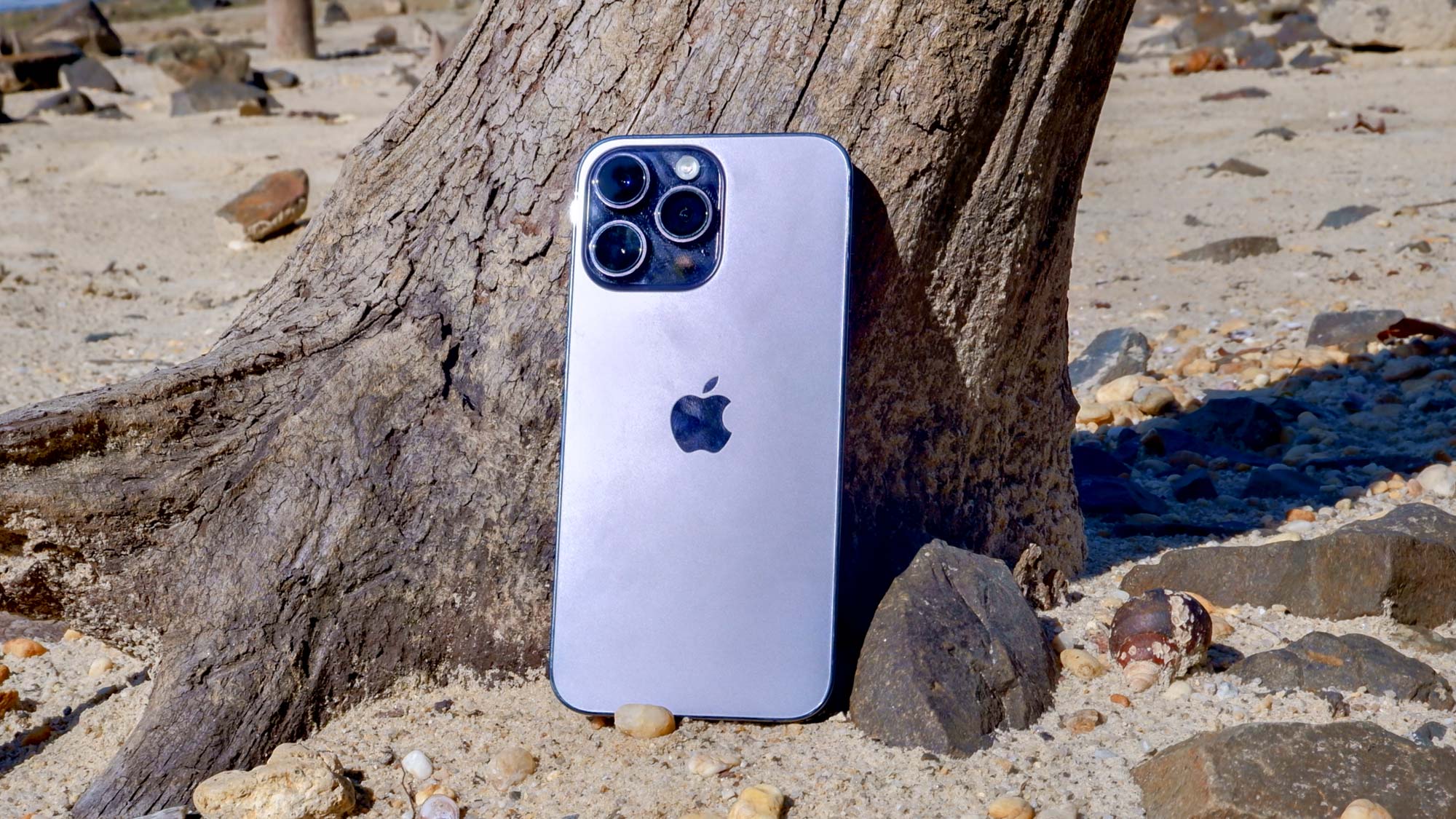
One of the main things I like is that Apple has taken the concept of “flat” to its extreme: flat screen, flat buttons, flat edges and a (mostly) flat back. These days flat can often mean boring, but that minimalist approach works well in the iPhone 14 Pro Max’s favor. To the point where I don’t even mind the prominent black bezel around the phone.
The camera bump spoils that effect a little bit, but I’m willing to forgive it on account of the camera design. That three-lens layout reminds me of vintage video cameras of old — a relic of the 8mm era, but without the hassle of dealing with reels of film. This design has been around for a while, sure, but frankly I hope it never goes away. — Tom Pritchard
Google Pixel 7
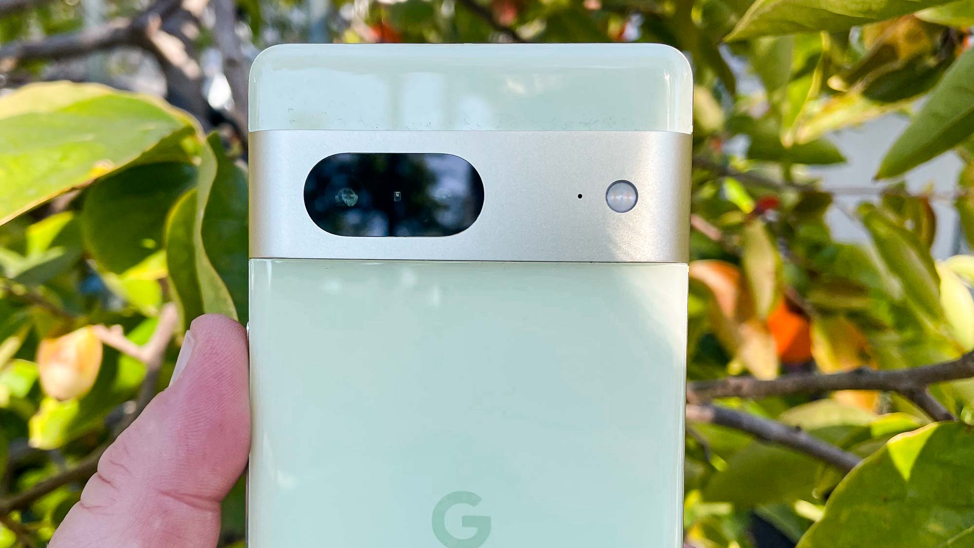
I've got a lot of different phones lying around the office, and the Pixel 7 is the one to consistently bring the hint of a smile to my face when I catch a glimpse of it. I understand that this is not a popular opinion — since Google adopted the horizontal camera bar look for the Pixel 6, that design decision has proven divisive. But the heart wants what it wants, and in my case that's a line of camera lenses horizontally arranged across the back of a phone.
At a time when phones seem to use the same cookie-cutter design — camera array crammed into one corner of the phone — the Pixel forges its own path.
I delight in the Pixel 7's look for several reasons, some aesthetic and some pratical. First, the Pixel just looks different. In a time when phones seem to use the same cookie-cutter design — camera array crammed into one corner of the phone, which comes in a variety of grays, blacks, and off-whites — the Pixel forges its own path. After introducing the camera bar look with the Pixel 6, Google fine-tuned things for the Pixel 7, swapping out the plastic bar for a more stylish aluminum with a matte finish.
On the practical front, I appreciate how the camera bar keeps the Pixel 7 (or the Pixel 7 Pro, if you prefer the larger model) nice and steady when you set down the phone on its back. Other phones with camera arrays that jut out from the back have a perceptible wobble when you put them down screen-up, which I find pretty annoying.
I'll be the first to admit I wish Google had retained the two-tone look of the Pixel 6, where the upper strip above the camera bar was a more vibrant shade of color than the rest of the phone. But otherwise, it's hard to think of a handset outside of the best foldable phones that cuts a more dashing design than the Pixel 7. — Philip Michaels
OnePlus 11
I've always been a fan of OnePlus' phone design, well before the global OnePlus 11 launch earlier this week. As far as looks go, one of my favorite devices of all time remains the red OnePlus 6, which arrived on the scene nearly five years ago.
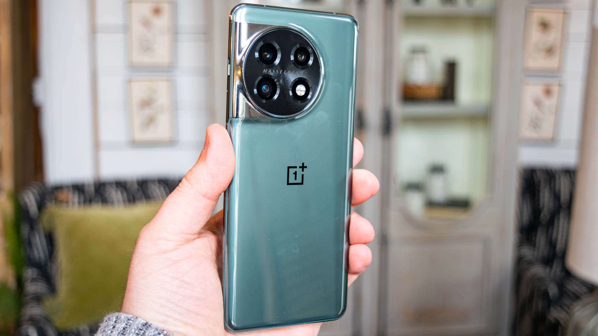
But starting with the OnePlus 10 Pro, I started to see a stronger sense of "maturity" in the phone maker's aesthetic. That came to the forefront with the OnePlus 11, which takes its predecessor's design and improves it by adding a circular camera module. I'm a big fan of the look here, which catches my eye immediately. And unlike the Pixel 7 Pro, it does so in a good way.
As I noted in my OnePlus 11 review, I prefer the black colorway this year, since the OnePlus 11's green variant is shiny and very reflective. (Seriously, phone makers, stop doing this.) The OnePlus 11 isn't the most beautiful phone I've ever seen, but I like it a lot more than the boring iPhone 14 Pro and the polarizing Pixel 7 Pro. — Jordan Palmer
What is the best designed phone?
Agree with one editor in particular? Or did we miss a phone design that you think deserves top honors? Let us hear about it in the comments.
Sign up to get the BEST of Tom's Guide direct to your inbox.
Get instant access to breaking news, the hottest reviews, great deals and helpful tips.
Tom's Guide upgrades your life by helping you decide what products to buy, finding the best deals and showing you how to get the most out of them and solving problems as they arise. Tom's Guide is here to help you accomplish your goals, find great products without the hassle, get the best deals, discover things others don’t want you to know and save time when problems arise. Visit the About Tom's Guide page for more information and to find out how we test products.

