7 Ways Apple Can Make Messages Better in iOS 13
Messages could be a lot better — here's how
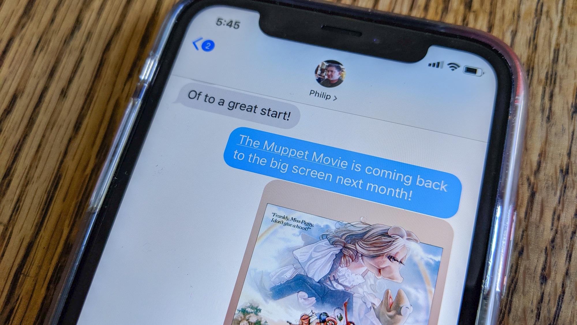
That blue bubble. Apple works to tie its customers to its ecosystem in many different ways, but there's no better symbol of the power of platform lock-in than the blue-bubble users of Apple's Messages app see when they're talking to a fellow member of the Apple tribe. On Android or a feature phone? You get a green bubble. It's just not as good.

And yet for all the importance the Messages app has to Apple's platform, it could be a lot better than it is today. Over the past few years, Apple has introduced features that haven't gone anywhere, while leaving some other potentially powerful features unaddressed.
What's coming to Messages in iOS 13
Before I begin to list the features I wish Messages had, it's worth mentioning a couple of ways in which Messages will improve when iOS 13 arrives this fall. First is the introduction of a common avatar and identity for Apple IDs, which will allow you to share your name and an image of your choice with people you chat with via Messages. It's a big win, since most users don't make an effort to input a bunch of names and photos for their contacts, and even those of us who do make a little effort to keep them up to date.
Second is the addition of trip ETAs, which is technically a new feature of Apple Maps. But I often text people that I'm leaving a place and switching to Maps to give them an estimate of my arrival time. In iOS 13, I won't need to do that anymore. Instead, I'll share my ETA directly within Maps, and they'll be up to speed — even if I am delayed while in transit.
So, that's all good news. But what's next after that? I have a few ideas.
Cleaning up Messages
The most overriding issue is with the iMessage App Store, introduced with fanfare in iOS 10. It's become a collection of sticker packs that unnecessarily muddy the Messages interface.

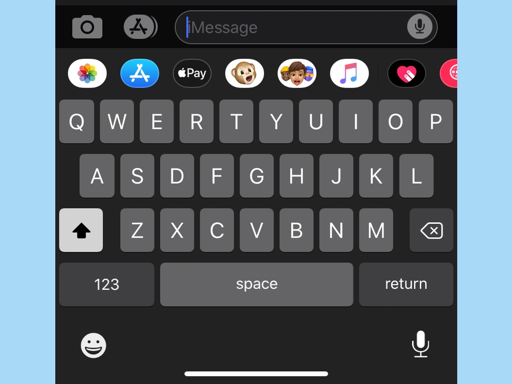
Next to the text entry space on Messages are two icons — a camera button and the iMessage App Store. Tap the App Store and you'll see a list of installed apps, including Apple's stock ones — Photos, Apple Pay, Animoji and Memoji among them.
There are so many things wrong here. If you want to insert a photo you've already taken, you have to switch to the App Store view before tapping on Photos. I can't speak for everyone else, but I insert photos I've already taken far more often than I take photos directly inside Messages. Apple's decision assumes the reverse.
More broadly, when I talk to non-expert users about Messages, they all seem very confused about what the App Store icon is and what the little icons you get when you tap on it are for. I get that Apple wants to make Messages a more fun and powerful app, but this App-Store-within-an-app approach seems misguided and confusing. (Meanwhile, regular emojis are hiding inside the keyboard interface, and people don't seem to have trouble finding them.)
Translation tools needed
If you've ever had to have a text conversation with someone who has trouble speaking your language, perhaps you've had the same thought I have: Why isn't there a translation facility built into Messages?
I realize there are some privacy concerns here, but Apple has proved very clever in building systems that are secure and private. I'd love it if my iPhone could detect the use of another language itself, and then offer me the ability to request a translation. (Of course, the translation can't be 100% private if it relies on a cloud-based translation engine, which is why Messages would need to ask before translating.)
"If you've ever had a text conversation with someone who has trouble speaking your language, you've probably wondered: Why isn't there a translation facility built into Messages?"
Ideally, I would also then be able to reply and have Apple relay not just my English reply, but a translated version of the reply, back to the person I'm talking to.
This sort of feature would benefit travelers and anyone else who spends time bumping up against a language barrier. Yet, so far as I can tell, the only way to do this now is to copy the text, paste it into a web page or third-party app, and then copy and paste the result.
Expand Tapbacks
A few years ago, Apple introduced a bunch of silly Messages features including Digital Touch, an Apple Watch-inspired feature that lets you send a heartbeat or a dumb drawing to a friend.
Digital Touch is a waste of time, but another feature introduced about the same time, Tapbacks, is great. I love being able to quickly tap on a message and send an icon response on the statement I'm reacting to. It's a feature that is kind of like a reaction with emoji, but something about the interface and the simplified set of reactions makes it appealing even to users who would never deign to send an emoji response.

At the risk of making Tapbacks more complicated, I'd love to see Apple expand the Tapback lexicon. There are only six Tapback reactions currently available. Why not expand that, or allow any emoji to be sent as a Tapback? Throw in Animoji and Memoji stickers if you want.
The Tapback interface is so easy, and if the selection of responses could be kept manageable — most notably by floating your most commonly used responses to the top — that I think it would be worth it.
Other changes
Sometimes you want to let someone use your phone but not read your texts, so what about an option to separately lock the Messages app, or even individual text threads, behind a password or biometric validation?
Then there's the plague of finding out that you made a typo or an embarrassing autocorrect only after you've sent your text. Apple should give users an editing grace period (with appropriate marks so the recipient can see that the item has been edited).
And taking a cue from email, sometimes you inadvertently read a message but aren't capable of actually acting on it right away. Why not allow messages to be marked as unread? It would be an especially useful feature if you have "read receipts" turned on, so the person who sent you the text doesn't get the wrong idea.
And finally, here's the big (and silly) request: Given that the blue bubble has come to represent iMessage and even become a cultural signifier of a sort, maybe it's time for Apple to finally abandon the green SMS icon it's been using for iPhone texts since 2007 and dress up iMessage in that familiar, lovable shade of blue.
Sign up to get the BEST of Tom's Guide direct to your inbox.
Get instant access to breaking news, the hottest reviews, great deals and helpful tips.
Jason Snell was lead editor of Macworld for more than a decade and still contributes a weekly column there. He's currently running the Six Colors blog, which covers all of Apple's doings, and he's the creative force behind The Incomparable, a weekly pop culture podcast and network of related shows.
