YouTube TV users say new interface changes are 'disastrous' — here’s why
Changes are coming to YouTube TV's library and live guide

Change is rarely welcome, but modifications to YouTube TV's interface have a handful of users up in arms. And while not everyone's seeing these changes at the moment, it appears to be the new normal for one of the best cable TV alternatives.
A post dated April 27th on the r/YouTube subreddit, submitted by user u/MadPuggie asked "Is it me or is the new library page a horrible mess of watched, unwatched, caught up, 1, 2... ??," and it's generated plenty of responses essentially saying that MadPuggy is not alone.
The angriest comment comes from u/Psyren1317, who replied "Holy hell is this new layout disastrous," before saying "Whoever designed this mess should be fired. Yikes."
Redditor u/DaGrumpyOne lived up to their username, replying "It's unusable now." While u/texaslegrefugee decried the change saying "The entire "library" experience is absolutely terrible. It's as over-designed as it can get, and nothing but confusing chaos. It takes forever to find anything."
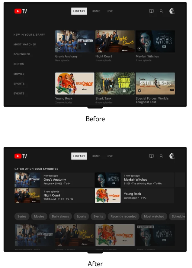
To all the YouTube TV users who don't see new changes (this interface isn't on our accounts at Tom's Guide), here's a look that YouTube TV teased this past January:

Redditor u/Vegetable_Reward_919 points out one of the biggest flaws of the redesign, writing "Newly recorded shows are not visible, not identifiable, and hard to find." If the previewed interface change is true to reality, we should note there is a "Recently recorded" filter, but it's the 6th item in that row of filters.
CordCuttersNews claims that these changes are still in the testing phase, but Esther Ahn, Head of Design for YouTube TV and Primetime Channels, basically wrote as if these were going to become permanent, back in January.
Sign up to get the BEST of Tom's Guide direct to your inbox.
Get instant access to breaking news, the hottest reviews, great deals and helpful tips.
Ahn stated "We’re now starting to roll out updates to the library, which will help you manage your content with improved content filtering and better organizational tools to make your library feel less cluttered. Users should begin seeing this redesign over the next few months."
The Live guide is also supposed to see changes, with the "live guide [becoming] more compact, so folks could quickly take in more information at a glance, reducing the need to keep scrolling." Side panels with shortcuts for adding to library and seeing more information are the other primary changes.
Analysis: YouTube TV's going through some changes
These interface changes come in the wake of good and bad news for YouTube TV subscribers.
On the plus-side, YouTube TV is getting a quad-box multiview, which it began testing with March Madness and should evolve in time for the NFL season. Also, picture quality improvements aimed to reduce compression and pixelation are also on the roadmap for this summer.
The bad news? Well, last month, YouTube TV got an $8 per month price hike, bringing its total base fee to $72 per month.
Those price changes seem to be the norm across the board, as Sling TV also recently raised prices.
More from Tom's Guide

Henry is a managing editor at Tom’s Guide covering streaming media, laptops and all things Apple, reviewing devices and services for the past seven years. Prior to joining Tom's Guide, he reviewed software and hardware for TechRadar Pro, and interviewed artists for Patek Philippe International Magazine. He's also covered the wild world of professional wrestling for Cageside Seats, interviewing athletes and other industry veterans.
