YouTube TV just rolled out a redesign to address complaints — here's what's new
YouTube TV's "new" look rolls things back to the way they were

Two months ago YouTube TV tried to shake things up, and wound up sending some users to the internet to complain. Some said YouTube TV's redesigned library page was 'disastrous,' and one even called for people to be fired. The internet is great for restrained replies.
Specifically, the new library look raised ire for going a bit too far by offering too many options, and straying from the previous and simple look. Fortunately, YouTube TV acknowledged the response in May, saying it "heard your feedback about Library issues and are working on fixes to address the relevancy of Catch Up on your Favorites, incorrect Watch badging, and ordering of Recently Recorded entries."
Over the weekend, a new look for YouTube TV rolled out, as Cord Cutters News shared. The most important change in the redesign applies to the library (i.e. DVR), and reverts things to the way they were when people weren't complaining.
YouTube TV's library sorting options are back on the left side of the page, and the first option ("New in your library") makes it easier to open your most recent recordings, which are likely the ones you're often interested in finding. YouTube TV may also have increased icon size on the home screen.
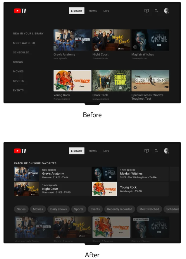
Here's the original graphic from YouTube TV that showed the redesign plans from back in January. The service has now gone back to the "Before" look, away from the "After" layout.

Originally, YouTube TV's Esther Ahn (Head of Design for YouTube TV and Primetime Channels) blogged that this change would "help you manage your content with improved content filtering and better organizational tools to make your library feel less cluttered. Users should begin seeing this redesign over the next few months." That was back on January 18th.
This new look should be available on YouTube TV's apps across all of the best streaming devices. If you don't see it immediately, you'll probably just need to wait. YouTube TV didn't promote this update, so it could easily be something rolling out in waves.
Sign up to get the BEST of Tom's Guide direct to your inbox.
Get instant access to breaking news, the hottest reviews, great deals and helpful tips.
Outlook: The angry mob seems to be appeased
Over on the YouTube TV subreddit, user FrankPoncherello1967 writes that the redesigned interface "is much better now. The A to Z is now standard and the Library options are vertical and on the left side of the screen. Next, please fix the Guide issues." Users beadnej, biggersc08, Psyren1317 echoed that sentiments.
The reaction is not universal, though, as users pawdog and Knighthokie23 liked the change (or at least thought it was getting better).
Either way, it's good to see YouTube TV acknowledging a backlash to a redesign online. Many services and apps just press ahead with their new looks thinking they're right. YouTube TV doing something different helps it keep its high ranking in our list of the best cable TV alternatives.
More from Tom's Guide

Henry is a managing editor at Tom’s Guide covering streaming media, laptops and all things Apple, reviewing devices and services for the past seven years. Prior to joining Tom's Guide, he reviewed software and hardware for TechRadar Pro, and interviewed artists for Patek Philippe International Magazine. He's also covered the wild world of professional wrestling for Cageside Seats, interviewing athletes and other industry veterans.
-
djourney87 I guess everyone complained before the redesign rolled out to my devices.Reply
However my library did get messed up in how it organized my dvr content. But that was fixed a long time ago. 🤷🏾♂️ -
vandamage Reply
weird - I still have the newer messed up version of the librarydjourney87 said:I guess everyone complained before the redesign rolled out to my devices.
However my library did get messed up in how it organized my dvr content. But that was fixed a long time ago. 🤷🏾♂️ -
KEVINJLENZ Stranger for me, I got the fix to the left side menu. But recently mine reverted back to the unpopular version. I don't know anyone who this was done to and Google Help keeps telling me it's that I finally got the January update now...ignoring this article and another from cordcutters I point out from July. Shame, I like the product but this is strike 2 for me in terms of dealing with customer service...surprising to some to hear this from me but customer service wise (CSR knowledge and empowerment) Xfinity blows them out of the waterReply
