Windows 11 looks like a solution in search of a problem
Windows 11 looks stylish, but that may come at the expense of simple navigation

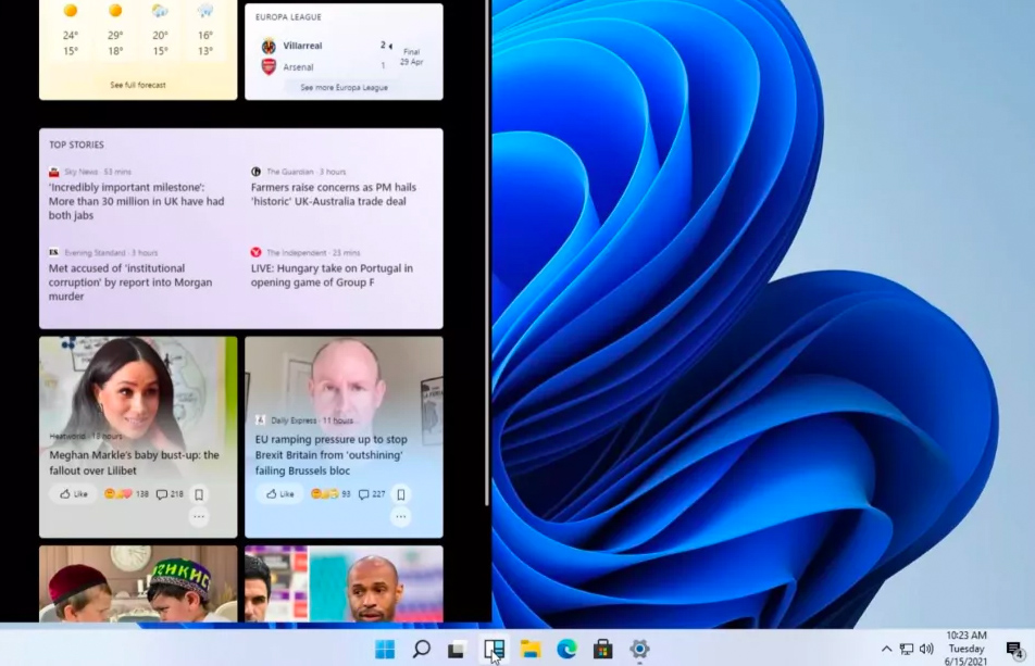
This week, we got our first glimpse at Windows 11, thanks to an unexpected leak on a Chinese server. While we can debate the morality and practicality of downloading Windows 11 and trying it for yourself (you shouldn’t do it, for the record), what we can say for certain is that the new version of Windows will look at lot sleeker than Windows 10. Long lists of programs and complex menus are out; rounded edges and widgets are in. There’s only one problem: Windows doesn’t really need any of these things.
Coming up with a new version of a program is always a difficult balancing act. Change too much, and the program becomes incomprehensible. Change too little, and there’s no real reason to upgrade at all. I’ll reserve judgment on Windows 11’s functionality until I can try it for myself. But from the screenshots, it seems clear that Microsoft wants to mimic a MacOS aesthetic. My colleague Henry T. Casey pointed out that the aesthetic may be closer to ChromeOS, but the point stands either way: Microsoft thinks Windows needs to look more futuristic and minimalist.
- These are the best Windows laptops you can buy right now
- Amazon Prime Day deals 2021 — date and what to expect
- Plus: Here's why you shouldn't install the leaked version of Windows 11
The trouble is, Windows users – to the best of my knowledge – don’t really want an OS that resembles an Apple store. A stylish interface has never been the big selling point of Windows. Rather, Windows absolutely excels in two areas: straightforward navigation, and robust under-the-hood options. The more Microsoft tries to downplay these elements, the more it gets away from the heart of the Windows experience.
How I learned to stop worrying and love Windows 95

I learned how to use a computer with DOS, but it wasn’t until Windows 3.1 that I started to understand what I was doing. Windows made navigation comprehensible in a way that DOS didn’t, associating programs with pictures and locations rather than arbitrary lines of code. But it wasn’t until Windows 95 that Microsoft codified the Windows experience that we all know and love/hate/tolerate today.
Windows 95 introduced the Start menu, the taskbar, the simplified desktop shortcut, and even the clock in the bottom-right corner. The fundamental visual structure of Windows hasn’t changed since Windows 95 (with a few notable digressions). If you were to grab someone born in 2010 and plop them in front of a Windows 95 PC, they’d have a pretty good idea of how to run programs, save documents, and find files. (They might wonder why they have to log onto the Internet with Netscape, granted, and why a talking paperclip is walking them through Microsoft Word.)
If anything, in designing Windows 95, Microsoft did its job too well. The company wanted to create the most comprehensible, straightforward OS possible – and it succeeded right out of the gate. Generally speaking, the best versions of Windows so far are the ones that have stayed true to Windows 95’s design. These include Windows XP, Windows 7 and Windows 10. Conversely, the most problematic versions of Windows so far are the ones that have tried to reinvent the wheel. These include Windows ME, Windows Vista and Windows 8.
Of course, it’s not as though Microsoft could have just stopped short after Windows 95. OSes need constant updates – not just for usability, but for hardware compatibility, software optimization and security reasons as well. Furthermore, some Windows additions over the years have made the OS genuinely better, including the search bar and the pictorial Documents folder. Today, it’s much easier to connect to the Internet, add a second display, hook up a printer, or take a screenshot than it was back in 1995.
Sign up to get the BEST of Tom's Guide direct to your inbox.
Get instant access to breaking news, the hottest reviews, great deals and helpful tips.
Still, I think it’s fair to say that Windows 95 pioneered the current appearance and functionality of the Windows OS. This formula has needed tweaking over the years, but never a radical redesign.
Windows 11 form and function

What we know about Windows 11 is still fairly limited, and the program isn’t out yet. As such, the Windows 11 we eventually install on our Tom’s Guide PCs could ultimately be very different than the one we’ve seen. Furthermore, Windows has always been a very tweakable OS, and I doubt that 11 will break that trend. If users want to make Windows 11 look and behave more like Windows 10, I’m almost certain they’ll be able to.
Still, the default experience looks pretty different from what we’re used to. From File Explorer’s rounded edges, to the centered taskbar, to the non-scrolling Start menu, to the eye-catching widgets, Windows 11 arguably looks like a smartphone OS. The focus is very much on showing you a limited number of options and at-a-glance information, all wrapped in a sleek interface.
I won’t go into excruciating detail about how Windows 11 looks; suffice it to say that it’s pretty different from what we’re used to. The trouble isn’t that Windows 11 is different, however; it’s that it seems to favor form over function.
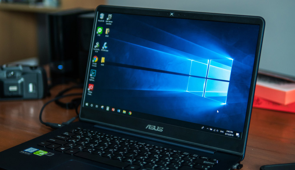
Windows 10 may be a lot of things, but in its default state, it’s hardly a pretty OS. And yet, that doesn’t matter, because it’s ridiculously easy to do what you need to do with it. You always know that if you install a new program, it will be somewhere in the trusty Start menu at the lower-left corner of the screen. And if something goes wrong, you know that you can dive into the Control Panel, or the Properties tab, or the registry, and fix it yourself (usually with a judicious application of Google-fu).
Is Windows clunky? Sure. Because Microsoft hasn’t really removed legacy tools, you could easily find yourself wading through three or four different sound menus if your headphones don’t work, or wading through a complicated string of Command Prompt code simply because you want to bypass the login screen. But on the other hand, it’s good to have those options at your disposal. It gives you a lot more control over Windows than you’d have over, say MacOS or Android.
In the end, these observations may be petty, particularly because Microsoft is unlikely to change the underlying structure of Windows anytime soon. With a little tweaking, I’m sure the Start menu will be just as you left it. And while File Explorer’s rounded edges feel a little hipsterish, they don’t compromise the system’s functionality in any way.
Windows 11 looks glossy and polished. But the core strength of Windows has always been in its simple navigation. Microsoft nailed that aspect back in 1995; let’s hope the company can do so again in 2021.
Marshall Honorof is a senior editor for Tom's Guide, overseeing the site's coverage of gaming hardware and software. He comes from a science writing background, having studied paleomammalogy, biological anthropology, and the history of science and technology. After hours, you can find him practicing taekwondo or doing deep dives on classic sci-fi.

