Windows 10 Start menu gets a major redesign — and the internet isn't happy
Windows 10 iconic Start menu looks set to be cleaner and more intuitive that ever before, but it's not to everyone's taste

The Start menu in Microsoft’s Windows operating system is probably one of its most iconic features. Slowly evolving over the years, it’s remained a one-stop-shop user interface staple that’s almost ingrained into the muscle memory of PC users; we’ll just sweep the early days of the Start-less Windows 8 under the carpet.
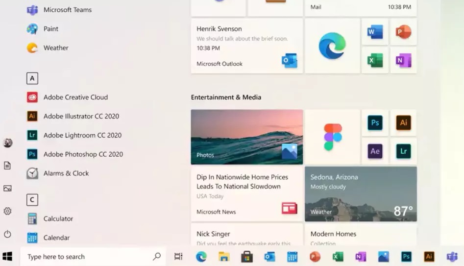
But now Microsoft is looking to give it a redesign, having taken to Twitter to show off what a new Start menu on the ever-evolving Windows 10 might look like. And worry not diehard Windows fans, we’re looking at an evolution not a revolution.
- These are the best laptops you can buy now
- Upgrade your display with one of the best monitors
- Plus: Windows 10 update is 'breaking' PCs — what to do now
In functional terms, the Start menu operates in the same way it currently does for Windows 10; simply click or tap on the Windows icon in the left-hand side of the desktop and the start menu opens up. So far, so familiar.
And the various icons, such as the power and settings buttons, are in the same place as they always were. But then a quick glance at the rest of the menu on and it becomes clear where Microsoft has made the changes.
Created by the @Windows design team, this animated clip illustrates a sliver of the #UX evolution and modernization of the Windows experience. Let us know what you think in the comments below! pic.twitter.com/s4SVXncLEoApril 6, 2020
There’s now a much wider list of apps, with some shedding large tiles in favour of simple text or just app icons, for example, the Microsoft Teams and Notepad tiles have been rejigged with a to hold just a redesigned icon and no labelling text.
WHY are you removing text labels!?! PLEASE tell me this is OPTIONAL and not DEFAULT!?!?When doing tech support, do you know how frustrating it is telling a non-tech to select a non-text icon???Also, not everything has an appropriatly unique iconApril 6, 2020
A few people took exception to this on Twitter, bemoaning that the removal of text labels will make it more difficult for people to identify apps, especially if they are not regular Windows users.
The grey looks horrible. I hope you'll eventually allow us to customise it and make it black, like any proper Dark Theme should be. Otherwise I'll likely just go back to using an alternative start menu :/April 6, 2020
But otherwise, the reaction was positive with many enjoying that Microsoft has opted for a Start menu design that has a more modern look.
Sign up to get the BEST of Tom's Guide direct to your inbox.
Get instant access to breaking news, the hottest reviews, great deals and helpful tips.
The best idea Microsoft has had in the last 40 years!!!!! Looks much more professionalApril 6, 2020
Since making its debut in Windows 8, the tile menu - which at first replaced the Start menu but was later integrated into if after backlash from Windows fans - has been divisive. It injected something new into the Start menu of old, but also added more clutter to what was a simple and effective way to access apps and other Windows 10 functions.
Now the live tile section of the Windows 10 start menu is just something many people have got used to and accept. But that hasn’t stopped Microsoft from looking at ways to move it forward and make it more intuitive.
And that’s the strategy of Windows 10 in general. Microsoft sees it as an operating system to keep building and reworking to suit modern PC and hybrid 2-in-1 needs.
We’re also expecting to see a lot more changes to Windows 10 this year as Microsoft is working on Windows 10X, a retooled version of the OS designed for dual-screened devices like its own Surface Neo and Surface Duo.
Roland Moore-Colyer a Managing Editor at Tom’s Guide with a focus on news, features and opinion articles. He often writes about gaming, phones, laptops and other bits of hardware; he’s also got an interest in cars. When not at his desk Roland can be found wandering around London, often with a look of curiosity on his face.

