Windows 10 could get a massive makeover — here's what to expect
Will Windows 10's Start Menu and Action Center get the Win UI look soon?

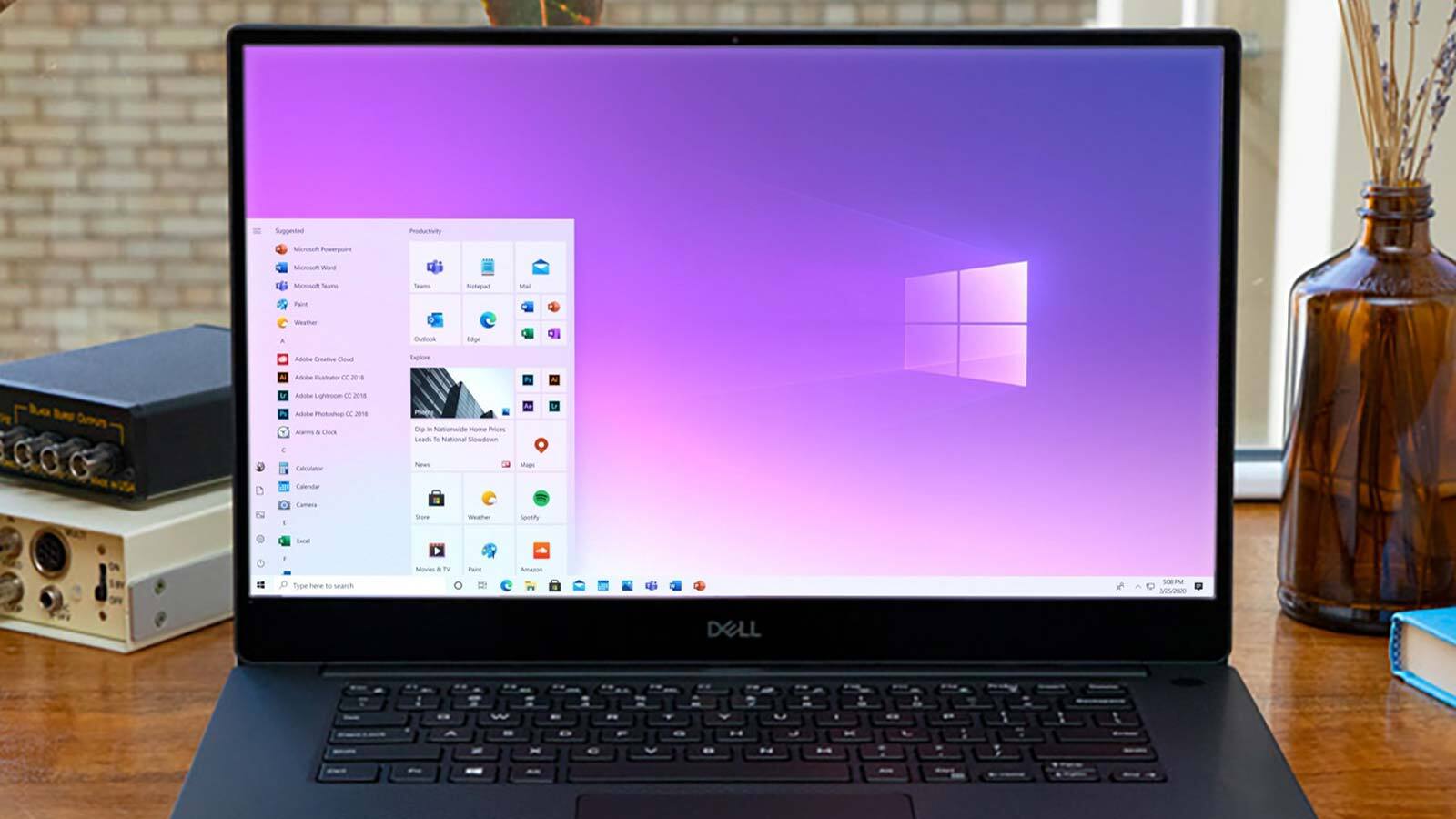
What's the next look for Windows 10? Well, it might be something we've already seen. It appears that the desktop, Start menu and Action Center are about to get a bit more Fluent.
That's according to code spotted by Windows Latest in the latest Dev Channel build of Windows 10, Build 20197. The new release not only includes references to 'WinUI' in the Windows 10’s Start Menu and Action Center, for starters.
- The best laptops to buy now
- How to get the new Windows 10 Start menu
- Laptop vs. Chromebook: What's right for you?
When the Microsoft Program Database (PDB) files were scanned, it was discovered that these three features are being tested internally (so you can't try them in 20197) right now:
- WinUIOnDesktop
- WinUIDesktopActionCenter
- WinUIDesktopStartMenu
What is WinUI?
WinUI is Microsoft's next interface platform, which will be used in Windows 10X and its upcoming foldable devices such as the Surface Duo. It's also been expected to land in Windows 10, but the timeline has never been exactly clear.
On Microsoft's dedicated Github page for WinUI, the company says the new platform "makes it easy to build modern, seamless UIs that feel natural to use on every Windows device. It embodies Fluent Design to enable intuitive, accessible, and powerful experiences and the latest user interface patterns."
This positions WinUI as similar to the recent changes made to the Start Menu, currently still in Windows Insider testing stages. Check out our how to get the new Windows 10 Start menu walkthrough if you want a taste.
For those unfamiliar, the Fluent Design changes — which have included more transparency, opacity, rounded edges, lively icons and gorgeous dimensionality, among a trove of UI goodies — look to give Windows a bit more pop and visual flair.
Sign up to get the BEST of Tom's Guide direct to your inbox.
Get instant access to breaking news, the hottest reviews, great deals and helpful tips.
Putting these changes in the Action Center and Start Menu make sense, as those are some of the most-visible parts of the Windows 10 interface, and this test could give us a chance to see more of Fluent Design in action.
As for when these features will deliver? That's unclear at best, but we've got our eye pointed towards upcoming Windows 10 Insider builds.

Henry is a managing editor at Tom’s Guide covering streaming media, laptops and all things Apple, reviewing devices and services for the past seven years. Prior to joining Tom's Guide, he reviewed software and hardware for TechRadar Pro, and interviewed artists for Patek Philippe International Magazine. He's also covered the wild world of professional wrestling for Cageside Seats, interviewing athletes and other industry veterans.
