watchOS 9 — Apple just gave us an up-close look at the biggest change for Apple Watch
An exclusive deep dive into the new watchOS 9 watch faces
One of the first things you might do when you set up a new Apple Watch is decide what you want to see on your wrist every time you glance at the time. And once you learn how to use the Apple Watch, you might even generate your very own library of Apple Watch faces. Your faces may mirror your personality on your wrist, make your most-used apps easily accessible or simply match your favorite outfits and upcoming occasions.
At the time of this writing, there are more than 50 Apple Watch faces available to choose from. All already offered an abundance of choice and varying degrees of customization in terms of color, typeface and complication style — but watchOS 9, the latest Apple Watch software overhaul, just grew the collection and customization options even further.
“Our team worked incredibly hard on crafting and designing this diverse collection of faces that we think our customers will really enjoy once they get it on their wrist,” said Kevin Chen, human interface designer at Apple. “Faces run the gamut from classic to modern, to fashion to function, and they all, most importantly, feel undoubtedly Apple Watch.”
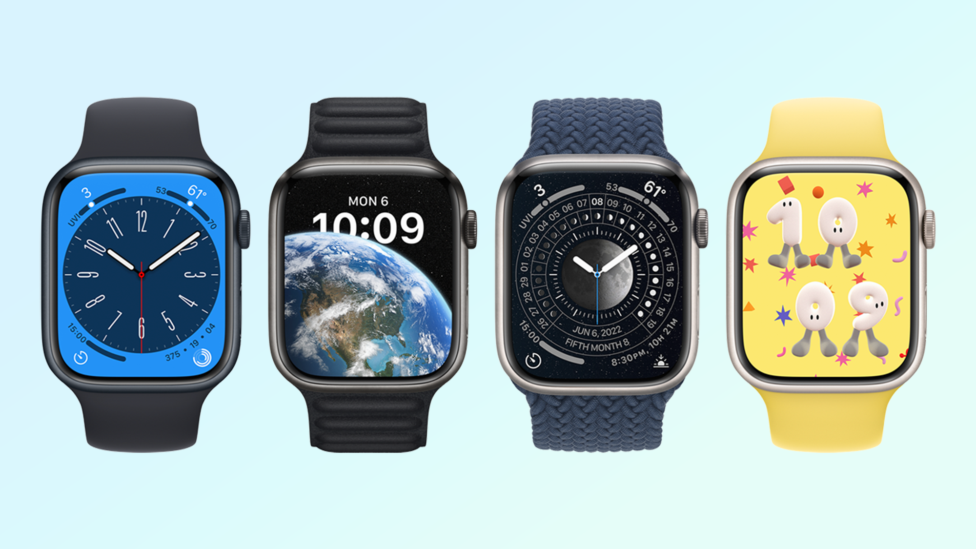
watchOS 9 has introduced four new faces: Lunar, Metropolitan, Astronomy and Playtime. Astronomy has been remastered to provide a more sophisticated glimpse at the globe. A researched selection of lunar calendars enable moon-centric timekeeping, while Metropolitan embodies the sleek city style with inventive typeface manipulation. Last but not least, Playtime is a cunningly charming, character-based artist collaboration with illustrator Joi Fulton.
Together with additional upgrades to existing watch faces, more than ever it's evident personalization is of the utmost importance to the best Apple Watch experience possible. Speaking to Tom’s Guide, Deidre Caldbeck, director of product marketing at Apple, even called the Apple Watch the company’s “most personal device."
“It’s the device that’s always on you.” Caldbeck said. “You wear it on your wrist all day, or for many, all night. With that in mind we continue to offer features to help you stay active, healthy, connected, but all with this underlying premise of personalization and choice, because it is such a personal device. The watch face is really the manifestation of that personalization.”
Chen, Caldbeck and Joi Fulton took us behind the scenes of how prioritizing personality helped create the new watchOS 9 watch faces. Printing 3D models, building custom digital design-space tools and exploring how to leverage Apple Watch fixtures are a few of the tactics that might surprise you. If you’ve ever wondered about what goes into making a watch face for Apple Watch, you can read it here from actual watch face designers.
Sign up to get the BEST of Tom's Guide direct to your inbox.
Get instant access to breaking news, the hottest reviews, great deals and helpful tips.
watchOS 9 new faces — Playtime
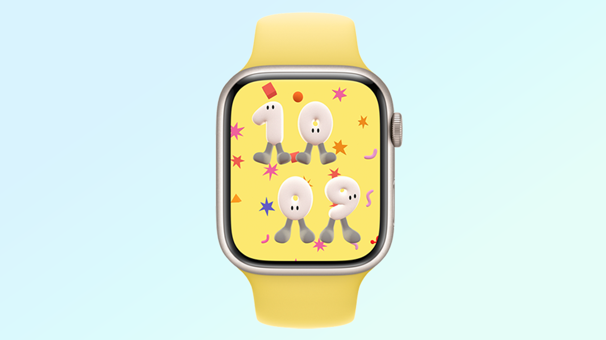
Playtime is the Apple Watch’s second artist collaboration, the first being with Geoff McFetridge for watchOS 7. Chen said it “was sort of an experiment in the beginning but it netted a unique piece of work that neither Geoff nor we as Apple would have done alone.”
Chen’s design team was “blown away” upon discovering Joi Fulton, and initiated a conversation about having the 2D/3D illustrator craft an Apple Watch face. They worked together on a few concepts before committing to creating characters with numbers capturing Joi’s colors and playful illustration style. Hence, the play on words for the watch face name, Playtime.
“We thought about the idea of these characters living inside the watch, but at the first and foremost we wanted to make sure it told the time," Chen said. "It naturally became the numbers were the characters."
“After deep-diving in how we would turn this into the watch face, it was thinking about how [the numbers] are going to interact with each other,” Fulton said. “Some of them being younger and older, the smaller numbers being like little kids and the bigger numbers being elderly — it was breaking down what the possibilities could be.”
As the family of numbers came together, Apple 3D printed the characters, acknowledging that it “may seem a bit overkill,” but that it allowed the designers to see how light reacted to each character. This birthed the idea of the display’s active state seemingly lit by daylight, while in Always On state the characters are sleeping and lit by moonlight.
“We might not have thought’ve this idea if we hadn’t gone the extra mile and played with the models and prototypes we built,” Chen said. “We always see an opportunity to play and experiment with prototypes that lead us down this route of creative ideas.”
“One thing that was really fun for me was truly breaking down the process, whereas on my end, it’s very normal to have a quick idea on a notepad and just do it,” Fulton said. “It was really nice to just sit down over time working and just break down the different aspects, how they’re interacting. I do that with my work, but it’s not as important because I’m just doing it, versus truly thinking about who will be interacting with this.”
watchOS 9 new faces — Metropolitan
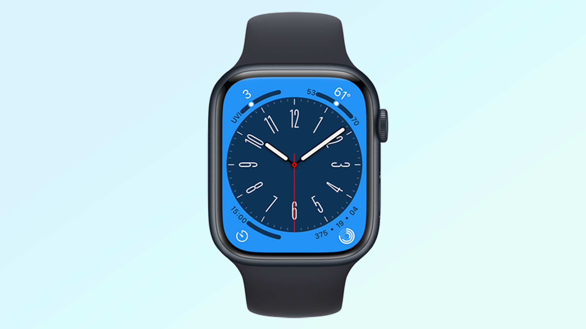
The first time we saw Metropolitan, it felt as though it always existed on the Apple Watch with how it resembled a contemporary clock, yet encouraged interaction.
“We wanted to create a watch face that was super versatile and celebrate the history of typography and watchmaking,” said Chen. “Users can rotate the digital crown and play and wrap with the typography — something that regular watches and even our competitors can’t do, because we have the digital crown.”
Apple developed Metropolitan as a typeface-first experience, taking the company’s own san-serif San Francisco typeface and finding ways to manipulate its dimensions. The in-house font design team created custom tools to contort the numbers on a 3D axis, and realized the manipulation could be replicated for users through the digital crown.
“The type moves dynamically between the most condensed to the most wide,” said Chen. “With the crown you can stop anywhere in between all of those points. We wanted to make sure anywhere a user would stop, the typography was well-crafted, because you could stop anywhere on the type.”
Metropolitan can be customized in terms of color and complications — it tucks four complications in each of the screen’s corners. So not only can you enjoy stretching and squeezing the hour markers, but the face remains highly functional for seeing important information with a raise of the wrist.
watchOS 9 new faces — Lunar Calendar
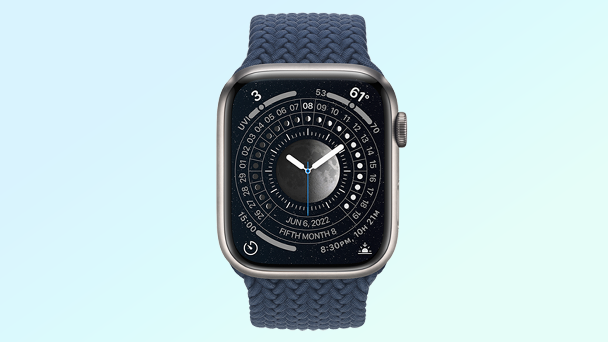
The new Lunar Calendar face for Apple Watch recognizes diverse approaches to timekeeping or charting time around the world and across different cultures. It supports three versions of lunar calendars: Chinese, Hebrew and Islamic.
“Growing up, my parents would bookmark important holidays like Lunar New Year and the Moon Festival, and I realized they were never on the same dates every year,” Chen said. “Later I learned that my parents were actually tracking a lunar calendar versus a Gregorian one.”
Apple worked with both expert designers and “people from all over the world” to achieve the Lunar Calendar watch face you see in watchOS 9. “We wanted to make sure we got this right,” Chen said.
The selected lunar calendar is, of course, at the forefront of the new watch face. Though the relationship with the Gregorian calendar is also noted, so users can see how the calendars line up. And like the Metropolitan face, Lunar Calendar introduces the digital crown to the experience, letting you rotate to go backward or forward in time. It's a fun interaction for those who are interested in timekeeping.
watchOS 9 faces — Astronomy
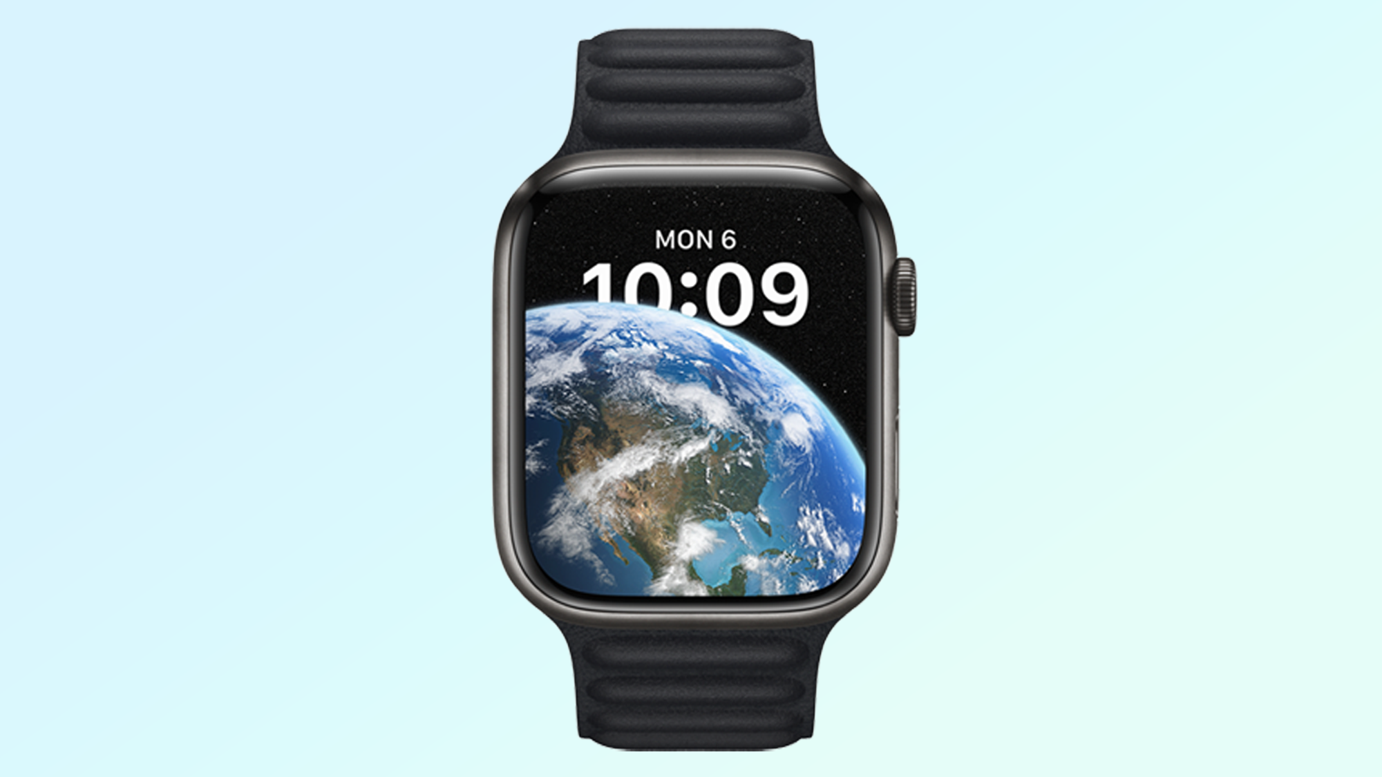
Astronomy is the final new watch face in watchOS 9, yet it’s actually a remaster of the Astronomy face that debuted with the first Apple Watch in 2017.
“As technology has gotten better in the Apple Watch, we saw this as an opportunity to give it a little more fidelity and detail that we couldn’t really do before,” Chen said.
Apple rebuilt the Earth and moon in Astronomy using new rendering techniques to elevate the level of detail. The upgraded face offers new perspectives and angles “never before seen on the Apple Watch.”
It also now simulates real-time cloud data, letting you track real cloud patterns around the world. You can see the current cloud coverage in your location, but also follow where the clouds are going to move throughout the day. Talk about planning your pool days accordingly.
Additional watch face updates in watchOS 9 — Portraits and Modular
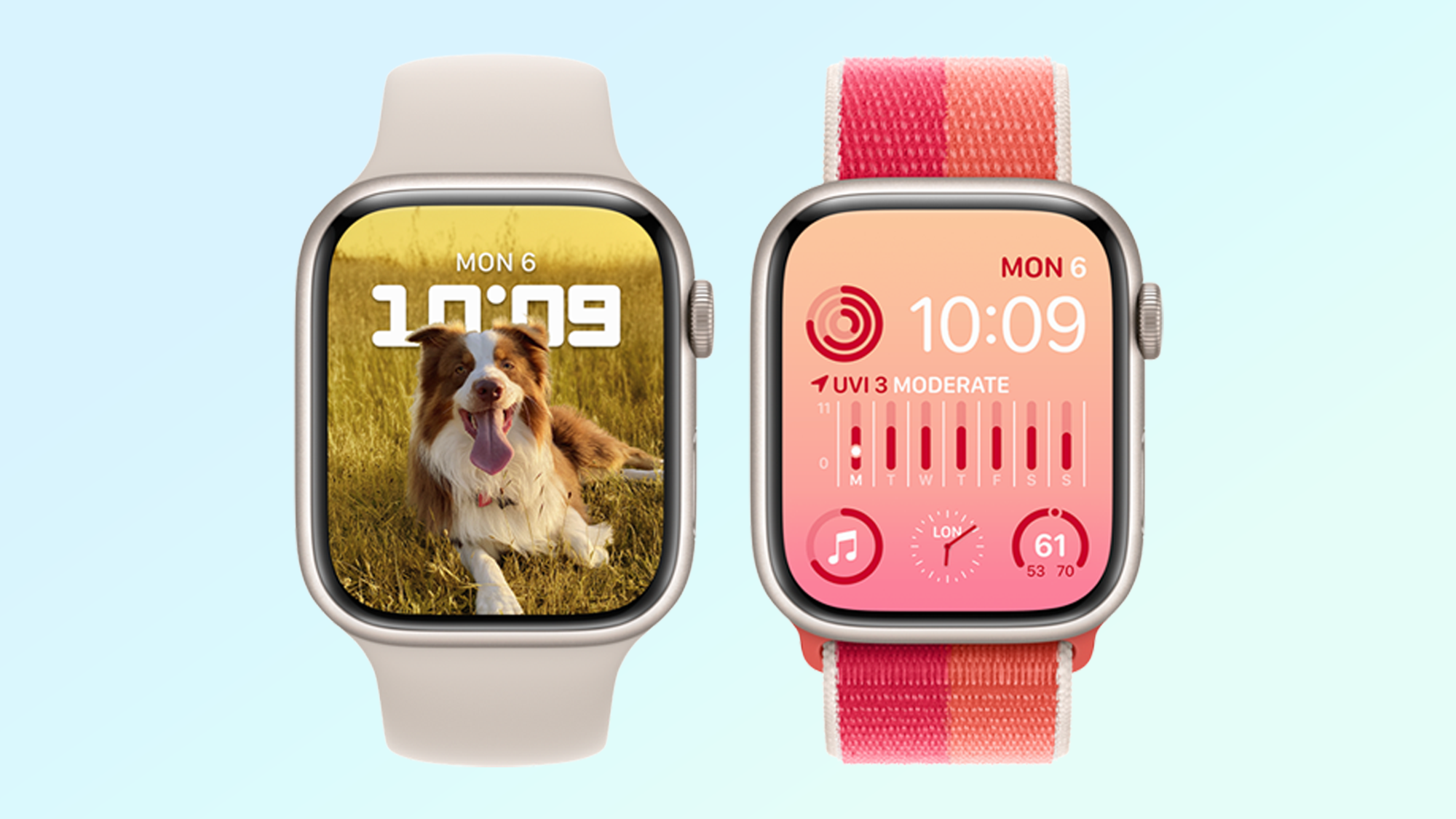
Launching four new face designs wasn’t all Apple did for the display experience in watchOS 9. It made changes to two existing watch faces based on the expansion of the Apple Watch Series 7 and new Apple Watch 7 sizes.
“We do this from time to time, where we look at the latest Watch offering and see what we can take full advantage of,” said Chen. “With the latest Apple Watch, we wanted to really show the expansive display and how much the display got bigger, but also give more personalization features for the user.”
The Portraits watch face now lets you display pictures of your dog or cat. You can also colorize and tint the background layers to match any of the best Apple Watch bands, your preferred style or even the item of clothing you’re wearing.
Modular, a particularly popular face thanks to its user-friendly complication layout, is now editable with a wide range of colors that flood the entire background screen. On the larger Apple Watch 7, the full-color background leaves a greater impact than before.
watchOS and Apple Watch: Evolution of hardware and software
There are years we’re not overly excited about new watch faces, but this is not one of them. In the watchOS 9 collection, Apple demonstrates design ambition that highlights just how far Apple Watch faces have come.
When we asked about milestones for watch faces in the Apple Watch experience, Caldbeck mentioned the Apple Watch Series 4, which significantly shrunk the display bezels and offered more usable screen real estate than the Apple Watch Series 3 (and all earlier Apple Watch generations.)
“With the larger display and the ability to really push things to corners and how we continued that with Series 7, I think technological advancements in both the processing speed and the actual display size is really something that gave the team new opportunities with the design of watch faces,” Caldbeck said.
Chen similarly noted the innovation of the Apple Watch Series 5’s Always On Display. Each existing watch face instantly required an “Always On state,” or version to be shown when your wrist is down. “We had to start rethinking what watch faces mean to users because now folks can see what you’re wearing,” Chen said.
“With the Always On Display, even when you’re not actively using it, the watch face can be a reflection of you, your style, in some ways your identity,” Caldbeck said.
In iOS 16 for iPhone, you might have noticed that the customization options of the new iOS 16 lock screen seem to borrow from the watch face pillars. We asked Apple whether the resemblance was intentional. “Inspirations come from all over the place,” Chen answered.
“Inspiration naturally comes from being around such a small team of close knit designers that have worked together for a very long time,” Chen said. “That’s how our design team works, we draw inspirations from each other, we feed off each other and we help each other in designing these products that we bring to the world.”
watchOS 9 faces – A collection that feels personal
The evolution and diversification of Apple Watch faces has only made the best smartwatch even better. Whether we’re showing off new watch faces on the Tom’s Guide TikTok account, asking friends to share their watch faces with us or looking for our ways to tell our stories with our watch faces, the options are starting to feel endless.
“We pride ourselves on making a diverse set of faces that speak to different people and different audiences, that’s something we care really deeply about,” Chen said. “When we design them, we design them to work individually but also to come together as a collection and as a family. So those two things come into play when we’re thinking about the watch faces that we announce every year.”
Kate Kozuch is the managing editor of social and video at Tom’s Guide. She writes about smartwatches, TVs, audio devices, and some cooking appliances, too. Kate appears on Fox News to talk tech trends and runs the Tom's Guide TikTok account, which you should be following if you don't already. When she’s not filming tech videos, you can find her taking up a new sport, mastering the NYT Crossword or channeling her inner celebrity chef.

