The new Gmail design is here to stay — Google says goodbye to the old interface
Google will not let users revert to the old Gmail design anymore

If you have been using Gmail’s old design, get ready to shift to the email client's look very soon — whether you like it or not.
Earlier this year, Google introduced a huge redesign to Gmail this year that brought apps like Meet, Spaces and Chat within Gmail. Now, Google has announced in a blog post that the new redesign will be the standard and that users will not be able to revert to the old look.
Gmail’s refreshed look was first announced by the tech giant in February before it was rolled out to everyone a few months later. Google did let users keep the old Gmail design and even showed people how to revert to the old design if they didn’t want to make the switch.
But that transition period is over now, as the company is making users switch to Gmail's new look.

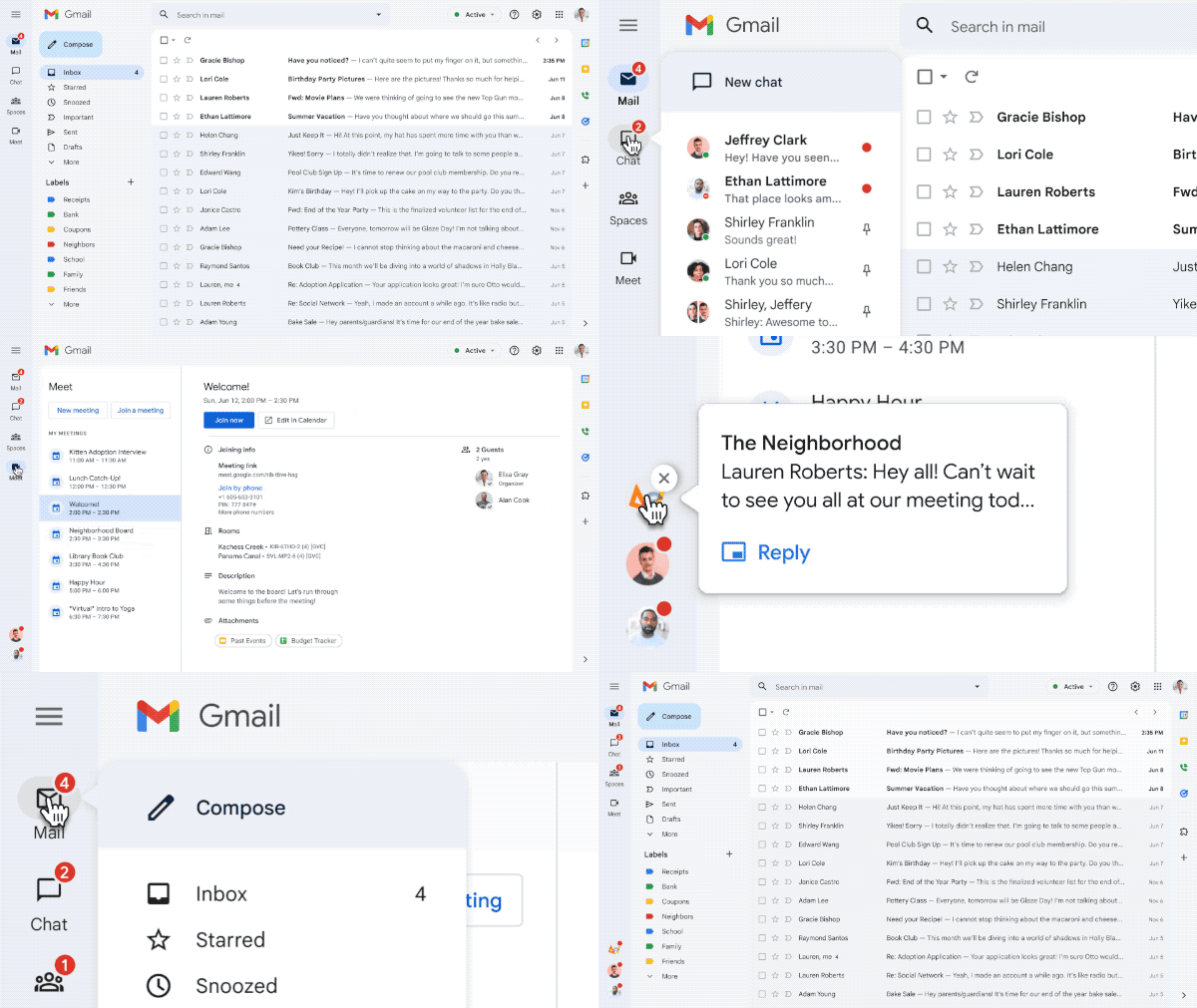
The redesign is one of Gmail's biggest changes in years. Gmail now features a clean, new look that Google’s Material Design 3 brings. The classic red and white color scheme has given way to softer blues on the interface. More importantly, the new interface streamlines Google’s many apps and brings Chat, Spaces and Meet within Gmail. Users can customize which apps they want to have in their Gmail — either the email app alone or with combinations of Google’s other apps.
The new interface will let you switch within the apps, and you will not be bothered by Chat bubbles popping up — a good move to keep distractions at bay. There’s also an option to “Quick reply” to Chat messages which was not there earlier.
“The integrated view with Gmail, Chat, Spaces, and Meet on the left side of the window will also become standard for users who have turned on Chat," said Google, adding that the redesign makes it easier to focus on what’s important instead of switching between apps constantly.
Sign up to get the BEST of Tom's Guide direct to your inbox.
Get instant access to breaking news, the hottest reviews, great deals and helpful tips.
Having been a user of the new Gmail design for the past few months, I think it's safe to say that there is a lot to get used to. It is understandable that Google gave people some time to adjust to the new changes. I still dislike the full screen Spaces, Meet and Chat, and I wish Google had taken a page from iPadOS 16 and given us more multitasking features here.
The mandatory switch to Gmail's new look was inevitable, though. Still, for those who preferred the old Gmail design, this is going to be a bitter pill to swallow.
Next: I just tried all of Gmail’s new features — here's the best and worst. and The Arc browser is here to replace Chrome — and cure your tab chaos.

Sanjana loves all things tech. From the latest phones, to quirky gadgets and the best deals, she's in sync with it all. Based in Atlanta, she is the news editor at Tom's Guide. Previously, she produced India's top technology show for NDTV and has been a tech news reporter on TV. Outside work, you can find her on a tennis court or sipping her favorite latte in instagrammable coffee shops in the city. Her work has appeared on NDTV Gadgets 360 and CNBC.
