It's official — the iPhone SE now looks ridiculously out of date
The iPhone SE has a lot going for it, but good design isn't one of them

The iPhone SE 2022 is a rather important device in Apple’s smartphone lineup. While the assorted iPhone 14 flagship models push the limits of what an Apple phone can be, the SE offers many of the same benefits for a fraction of the price — albeit with some compromises. But those compromises come with one glaring problem: the device's overall design.
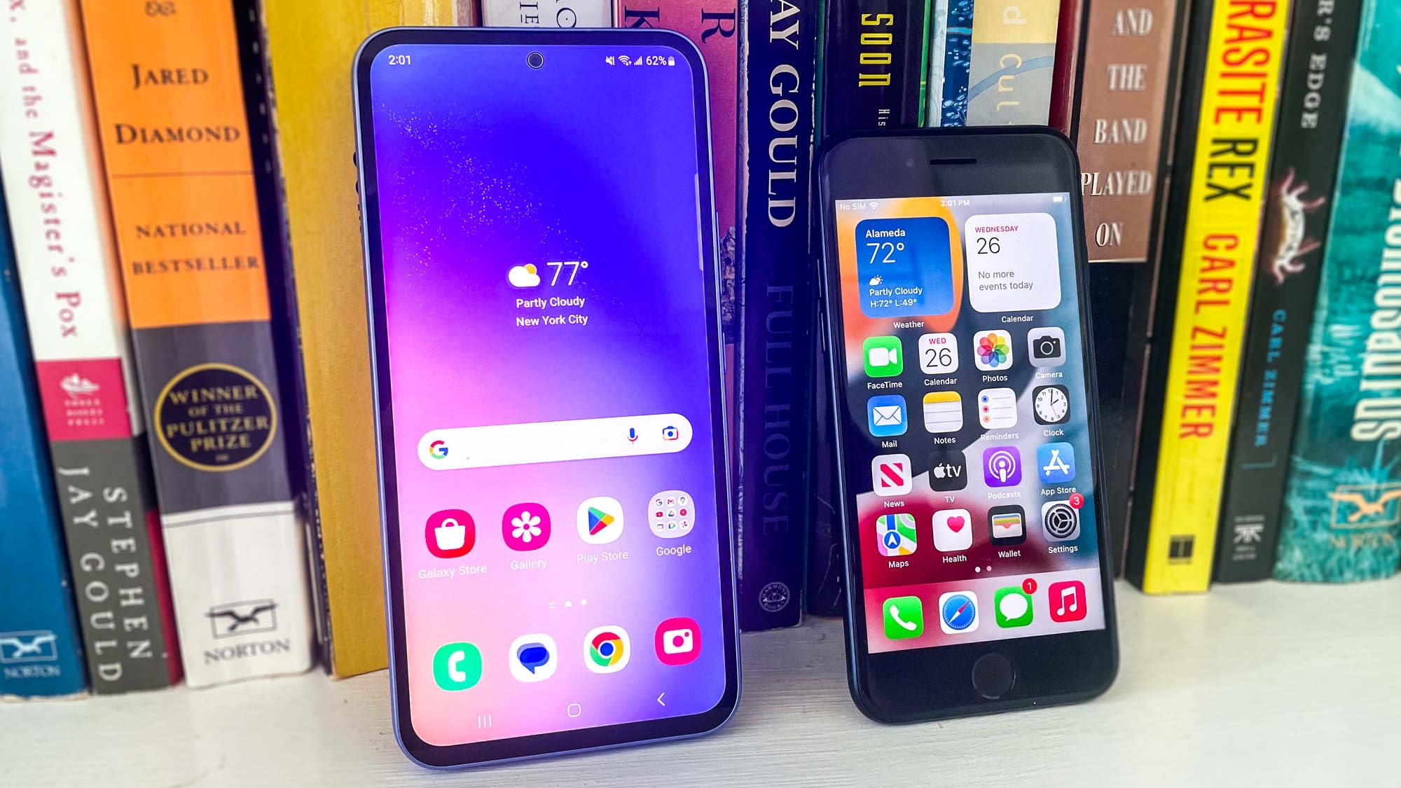
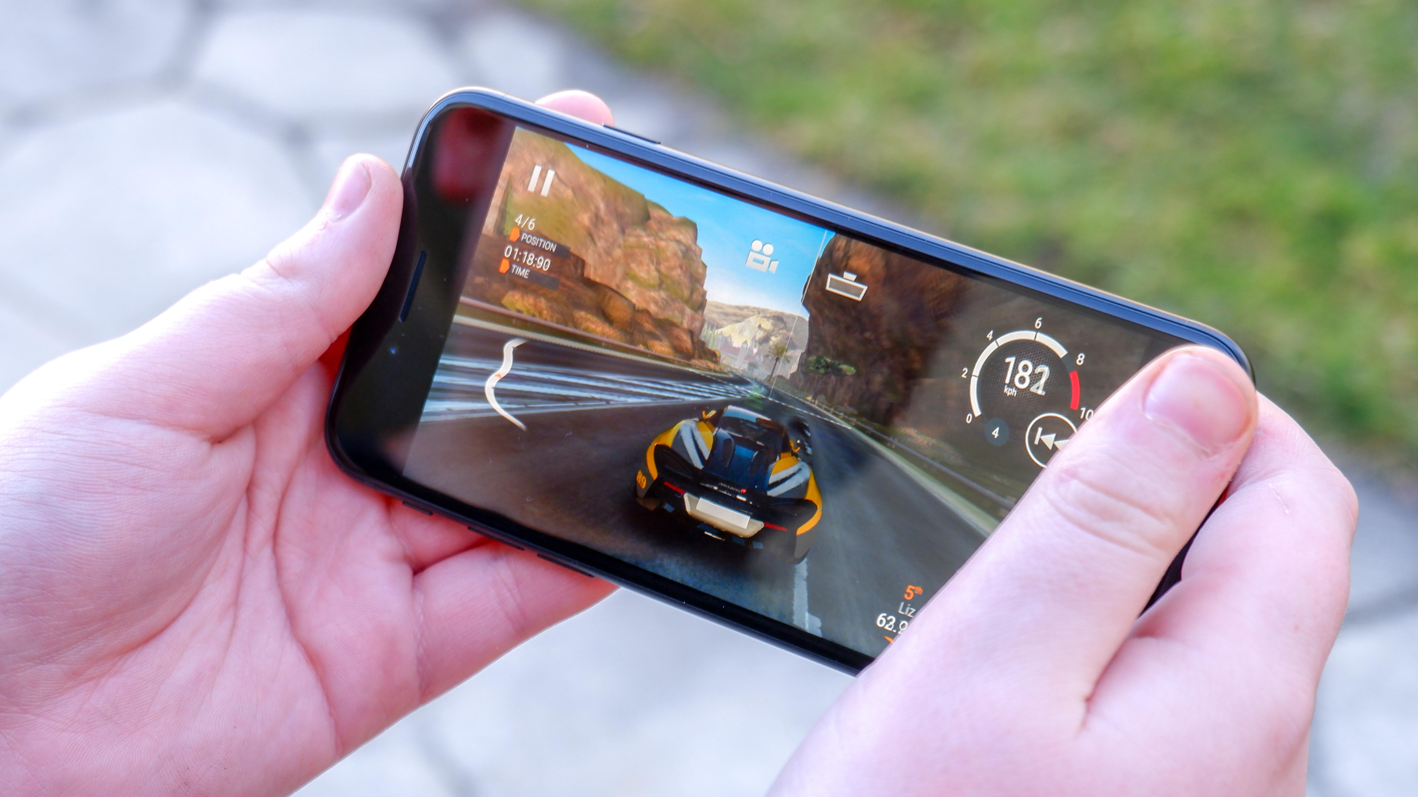
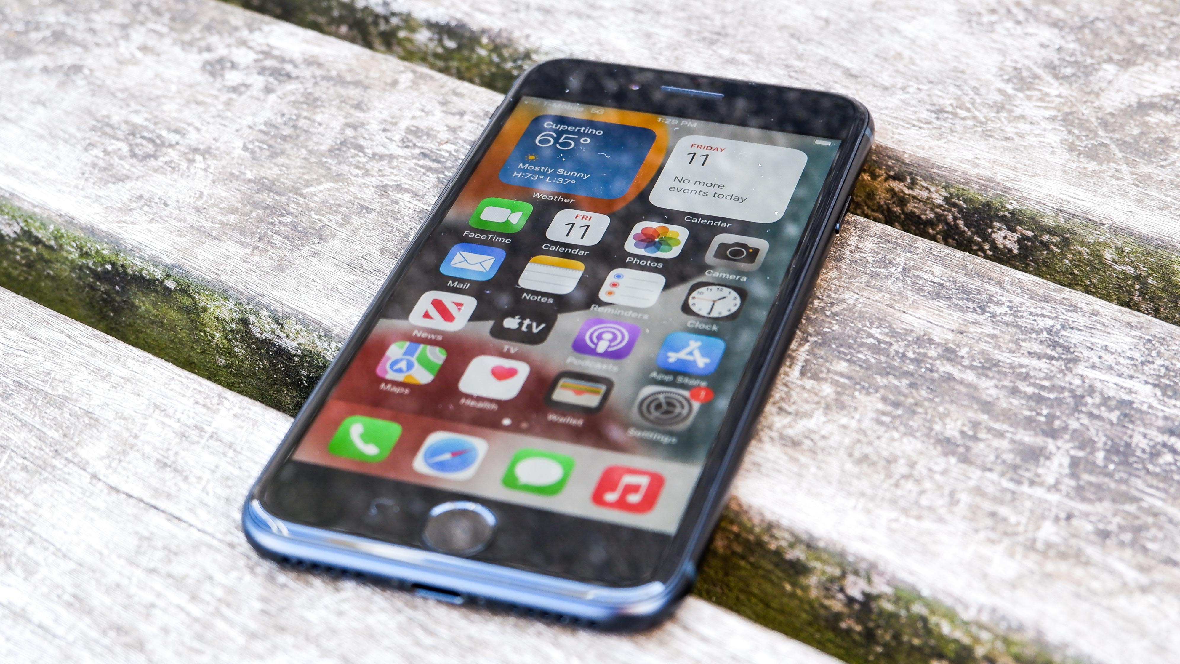
The iPhone SE 2022 has the same puny 4.7-inch display and chunky bezels as the iPhone 8, to the point that the best iPhone SE 2022 cases are interchangeable with the iPhone 8 and the iPhone SE 2020. The iPhone 8 launched almost six years ago, and was the last flagship iPhone to come without a full-screen display.
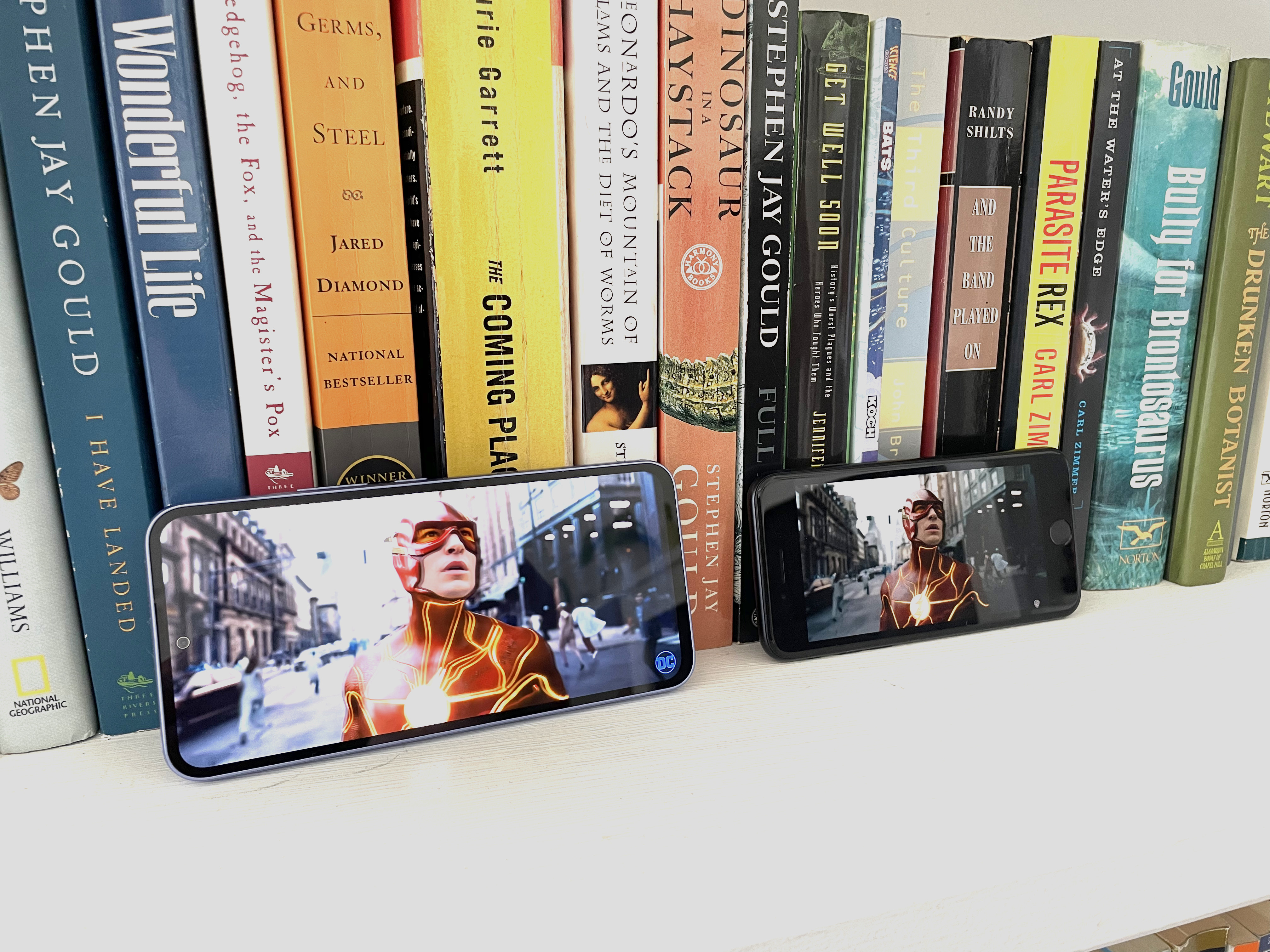
These days, full-screen phones are practically everywhere. It’s a mandatory feature on a premium device, but it’s also increasingly common on mid-range and budget phones. For example, the Samsung Galaxy A54 has 6.4-inch 120Hz display. Even the Moto E, a phone that costs less than $150, has a display that stretches from corner to corner.
The iPhone SE does not, and its 4.7-inch display is still sandwiched between a giant forehead and chin. That kind of design was on the way out back in 2017 — now it just makes the year-old iPhone SE look incredibly dated.
The iPhone SE needs a fresh design, but won’t get one for a while

If Apple were to reveal the iPhone SE for the very first time today, I like to imagine it would be met with an eruption of laughter — and not the good kind. The kind that's followed by a string of opinion columns about Steve Jobs rolling in his grave.
The iPhone SE design is just so laughably bad by modern standards, the only way you could make it seem more dated is by adding a rotary dial.
It’s also a design that only Apple could have gotten away with in 2022. I remember the Google Pixel 3 being criticized for the size of its borders prior to launch, and that was back in 2018 — just one year after the launch of the iPhone 8. It was an indication that this kind of design had outstayed its welcome, certainly on a premium smartphone.
Sign up to get the BEST of Tom's Guide direct to your inbox.
Get instant access to breaking news, the hottest reviews, great deals and helpful tips.
The fact is people and phone makers have long seen the benefits of a full-screen device. A full screen is a lot more aesthetically pleasing than one with giant borders, even if the bezel is rather chunky. You also can squeeze a much larger screen into a smaller device.

The iPhone SE is the antithesis of that idea. While beneficial to someone who wants a Touch ID home button or a small-screen device (especially since there’s no iPhone 14 mini), seeing the SE's design in action is like walking back in time. And there’s no reason why a phone from 2022 should look that aged.
Unfortunately it seems that the design will be sticking around for some time. The iPhone SE 4 may not arrive until around 2025 — or so say the latest rumors. That means we might have at least two more years before Apple could possibly update the design.
Here’s hoping we get something akin to the iPhone XR, as has been rumored for the next SE, or possibly even the slimmed down notch of the iPhone 13 and 14.
The iPhone SE makes compromises, but it’s still a good value

The iPhone SE only costs $429, which is almost half the price of a $799 iPhone 14. Naturally that means that certain compromises have to be made for Apple to be able to charge such a relatively low amount. There’s only one rear camera, the battery isn’t great, you end up with an LCD display panel instead of the more-expensive OLED and so on.
As we noted in our iPhone SE 2022 review, the phone is fairly good value. You get the full iPhone experience for a fraction of the price of a flagship, complete with access to the App Store and the rest of the Apple software ecosystem.
The camera quality is also great considering it’s the same 12MP lens as the iPhone SE 2020. It may not be capable of topping the iPhone 14 for photo output, but it is able to compete with other similarly-priced phones from other companies. That’s aided, in part, because of the A15 Bionic chipset’s computational photography capabilities.
Apple’s prowess with its in-house chips, and the fact the A15 powering the iPhone SE is so recent, means this phone is the fastest in its class. In short, Apple is doing what it does best, and offering a lower-cost phone that provides an experience and quality only Apple can provide.
And yet, Apple has dropped the ball on the design, sticking to a design that is now positively retro by smartphone standards.
Bottom line
We’ll never really know why Apple has stuck with the current iPhone SE design for quite so long, but it’s one of those things that will never make sense to me —especially considering the company has historically prided itself on emphasizing aesthetic appeal.
The design doesn’t change the fact that the iPhone SE is one of the best cheap phones. It offers the typical iPhone experience and some fantastic hardware for a much lower price. It’s just a huge shame that its biggest flaw is so immediately apparent and ages the phone much more than it should.
More from Tom's Guide

Tom is the Tom's Guide's UK Phones Editor, tackling the latest smartphone news and vocally expressing his opinions about upcoming features or changes. It's long way from his days as editor of Gizmodo UK, when pretty much everything was on the table. He’s usually found trying to squeeze another giant Lego set onto the shelf, draining very large cups of coffee, or complaining about how terrible his Smart TV is.
-
lafta This is a terrible article.Reply
As of today, the title of this article is: "It's official — the iPhone SE now looks ridiculously out of date". That is a dumb headline. There is nothing official about it, nothing has changed recently, and this is not headline-appropriate text.
The article is listed under "News". It is not news; it is opinion. ("I like to imagine...", "it’s one of those things that will never make sense to me....") Put it in the Opinion section, if it must be published at all.
The whole article could be replaced by the admission the writer makes toward the end: "In short, Apple is doing what it does best, and offering a lower-cost phone that provides an experience and quality only Apple can provide." The writer does no research, and makes no attempt to interview Apple employees or industry insiders to illuminate the topic any further than the light of his own dim obsession.
Examples of overwrought phrases from this absurd negative puffery:
"Steve Jobs rolling in his grave"
"just so laughably bad by modern standards"
"the only way you could make it seem more dated is by adding a rotary dial"
"this kind of design had outstayed its welcome"
"The iPhone SE is the antithesis of that idea"
"seeing the SE's design in action is like walking back in time"
"a design that is now positively retro by smartphone standards"
Was the writer short on his monthly quota, or grinning like a madman when he banged this one out?
I have valued many pieces by Tom's. This article makes Tom's Guide look bad, and it wastes your readers' time.
