The big Amazon Fire TV update doesn't fix enough — here's why
Amazon should have done more

The latest Amazon Fire TV update took a while to roll out, and I don't think the wait was worth it. While it does offer one new feature that some households will probably love, it's ultimately just another update that keeps Amazon in the back of the pack when it comes to streaming device interfaces.
This may be a case of too long of a wait leading to higher expectations, so let's back up for some context. In September 2020, Amazon announced it was updating the Fire TV user interface for a "new Fire TV experience," that redesigned the layout of the OS. And Amazon did not lie when it said the updates would come "later" that year: it arrived in December 2020. Except not all Fire TV devices got it.
- The best cheap TV deals right now
- All the The Witcher season 2 leaks
- How to watch Mortal Kombat: Release date on HBO Max, trailer, cast and more
At first, only the Fire TV Stick 2020 and Fire TV Stick Lite got the update. Then, this past March, the Amazon’s Fire TV Cube (both 1st and 2nd gen) and the Fire TV Stick 4K finally got in on the fun.
Which is why I'm only now seeing this update, as it so slowly rolled out into my den.
But, first, let's start off with what I actually like about the update.
Amazon Fire TV update: What's better
The big news is that you can have different Fire TV user profiles. This is good for customized recommendations, and getting to see just your apps. For houses that have multiple Fire TV devices, this also makes it easier for everyone to be on the same Amazon account (to share Prime Video access), while just getting their own experience. Just because I downloaded Peacock for WWE doesn't mean the rest of my household needs to have Peacock in their row of the top 5 apps (more on that later) on their home screen.
Also, some apps now have preview rows, where you can see a row of suggested shows related to that program. Unsurprisingly, some apps have more content here than others. Netflix, Disney Plus and Hulu only have one row, while Prime Video and IMDbTV (owned by Amazon) have multiple rows of content. This is keeping with the Fire TV way, where there's simply more of everything Amazon-owned.
Sign up to get the BEST of Tom's Guide direct to your inbox.
Get instant access to breaking news, the hottest reviews, great deals and helpful tips.
What's still wrong (and what got worse)
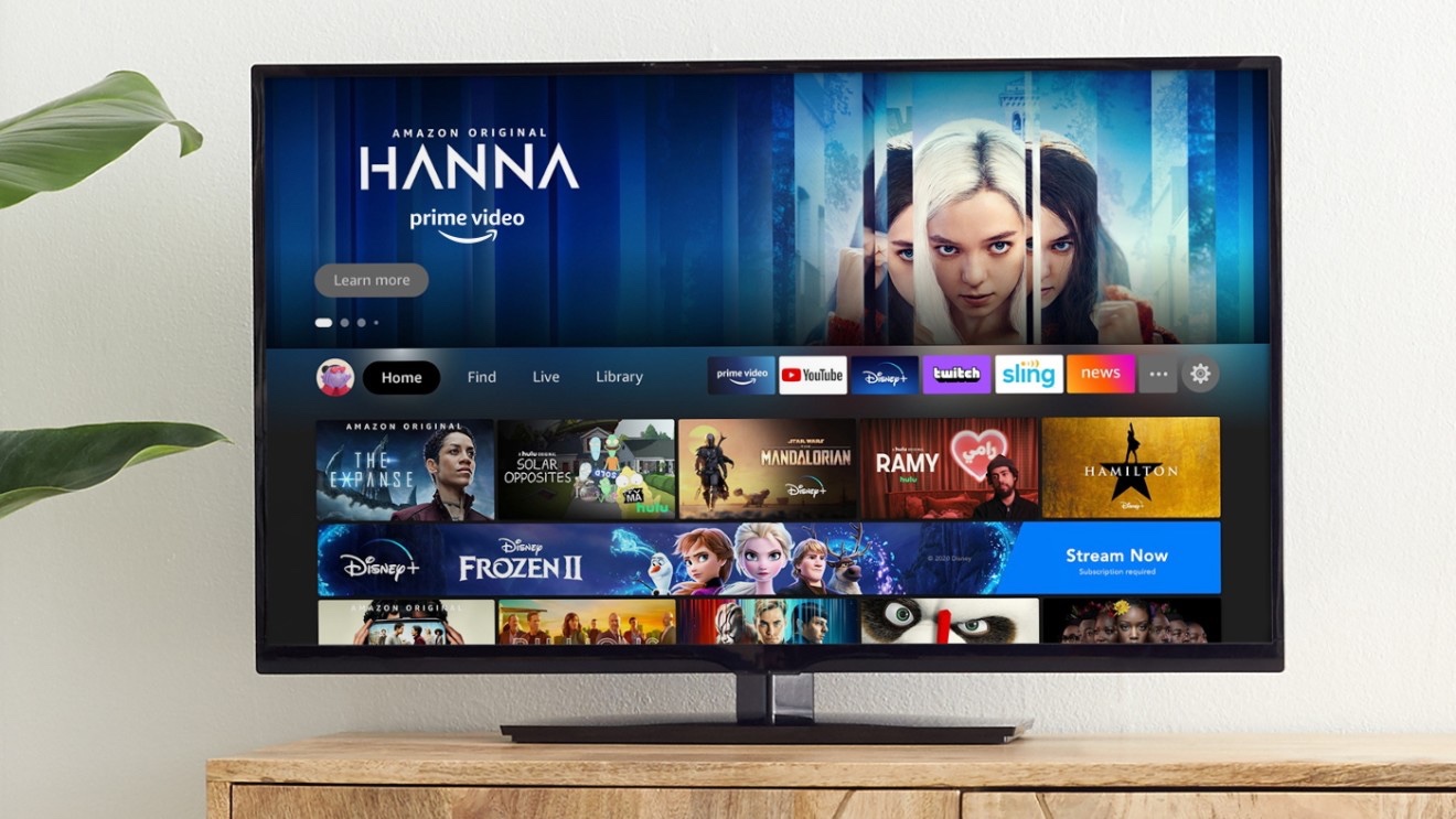
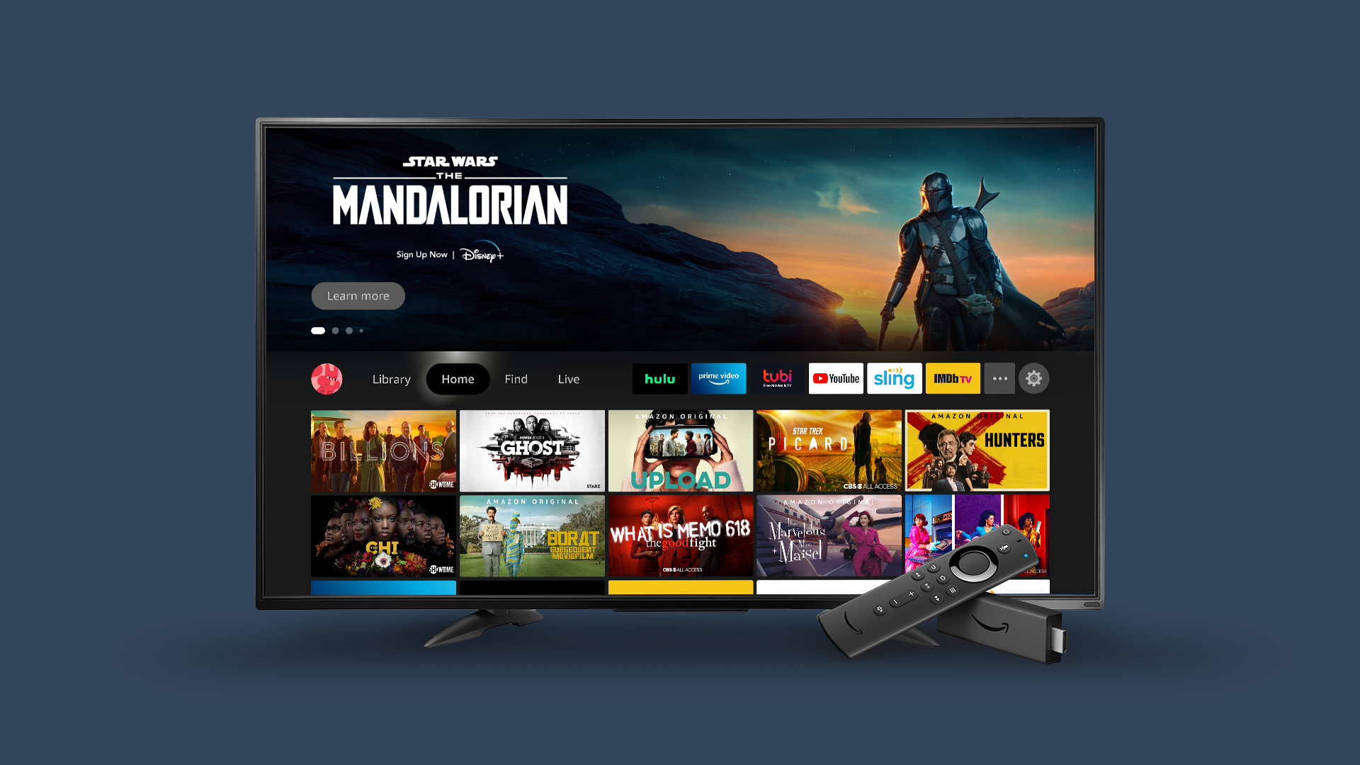
The Fire TV OS is still mostly a funnel for Amazon content. The top of the home screen is still a banner for channels you can subscribe to on Prime Video Channels, movies you can rent through Prime Video and shows on Prime Video that you may have zero interest in. A rare exception, it seems, was made for the HBO Max app's Game of Thrones Iron Anniversary stream.
Also, the top-of-screen navigation tabs are gone, with Amazon moving that content to Home, Find, Live tabs in the middle of the screen, and a Settings gear on the right, next to an Apps button. I kinda wish that the Apps icon (a box with three boxes inside) were more obvious, as you only know what it is if you hover over it. When I showed it to my dad, he couldn't guess what it was.
The home screen still includes more advertisements below the top half of the screen, possibly because Amazon knows it's trained people to ignore the content on that half.
The home screen still includes more advertisements below the top half of the screen, possibly because Amazon knows it's trained people to ignore the content on that half. Scrolling down, I find a Sponsored row, promoting Discovery+ via Prime Video Channels, and when I hover over that — I see and hear an ad in the top right corner.
The "Free to me - Amazon Channels" and "Popular TV on Prime Video Channels" rows are a bit irksome, but I'm used to it with Amazon at this stage. The former is arguably neat because it helps you find value in what you already pay for, but the latter is filled with stuff I don't care about (no, I'm not interested in Star Trek: Lower Decks, an animated series, and can The Walking Dead end already).

A few rows further down, more sponsored content! This time, it's Apps & Games! And this cadence repeats itself, like the Instagram Stories carousel. A bunch of your stuff, then something from Amazon, and so on.
This is bad. Maybe some people love to live the Amazon life, but just because you bought a device from a company doesn't mean you want to be force-fed primarily things from their ecosystem. Apple, which is constantly criticized for its walled gardens, does a pretty good job about making the tvOS interface clean and free of ads.
Amazon, be more like Roku
Amazon doesn't have to look that far to see what it should be doing.
Roku's upcoming OS 10 update (which will hopefully arrive sooner, rather than later) is delivering something called Instant Resume. When you launch an app, you'll go right back to where you were last time. Not many channels support this out of the gate (a batch of 15+, Roku notes, including AT&T TV, FOX News Channel, Fubo, Plex and STARZ), but hopefully more will follow.
Something like this would make it seem like Amazon is truly intent on making the streaming experience better. Otherwise, it just seems like Amazon is finding more ways to deliver its own stuff. And when Amazon's hits are few and far between — we need The Boys season 3, but we will have to wait a while — it's hard to think about a streaming life lived solely inside Amazon's walls.

Henry is a managing editor at Tom’s Guide covering streaming media, laptops and all things Apple, reviewing devices and services for the past seven years. Prior to joining Tom's Guide, he reviewed software and hardware for TechRadar Pro, and interviewed artists for Patek Philippe International Magazine. He's also covered the wild world of professional wrestling for Cageside Seats, interviewing athletes and other industry veterans.
