Samsung OneUI 2.0 Promises Less Clutter on Your Galaxy Phone
First look at new interface

Editors' Note: Updated at 6:59 p.m. ET with additional information from Samsung's developer conference.
SAN JOSE, Calif. — A year after reinventing the interface for its smartphones, Samsung is back with a sequel. And this time, the One UI interface is coming to Samsung watches and tablets.
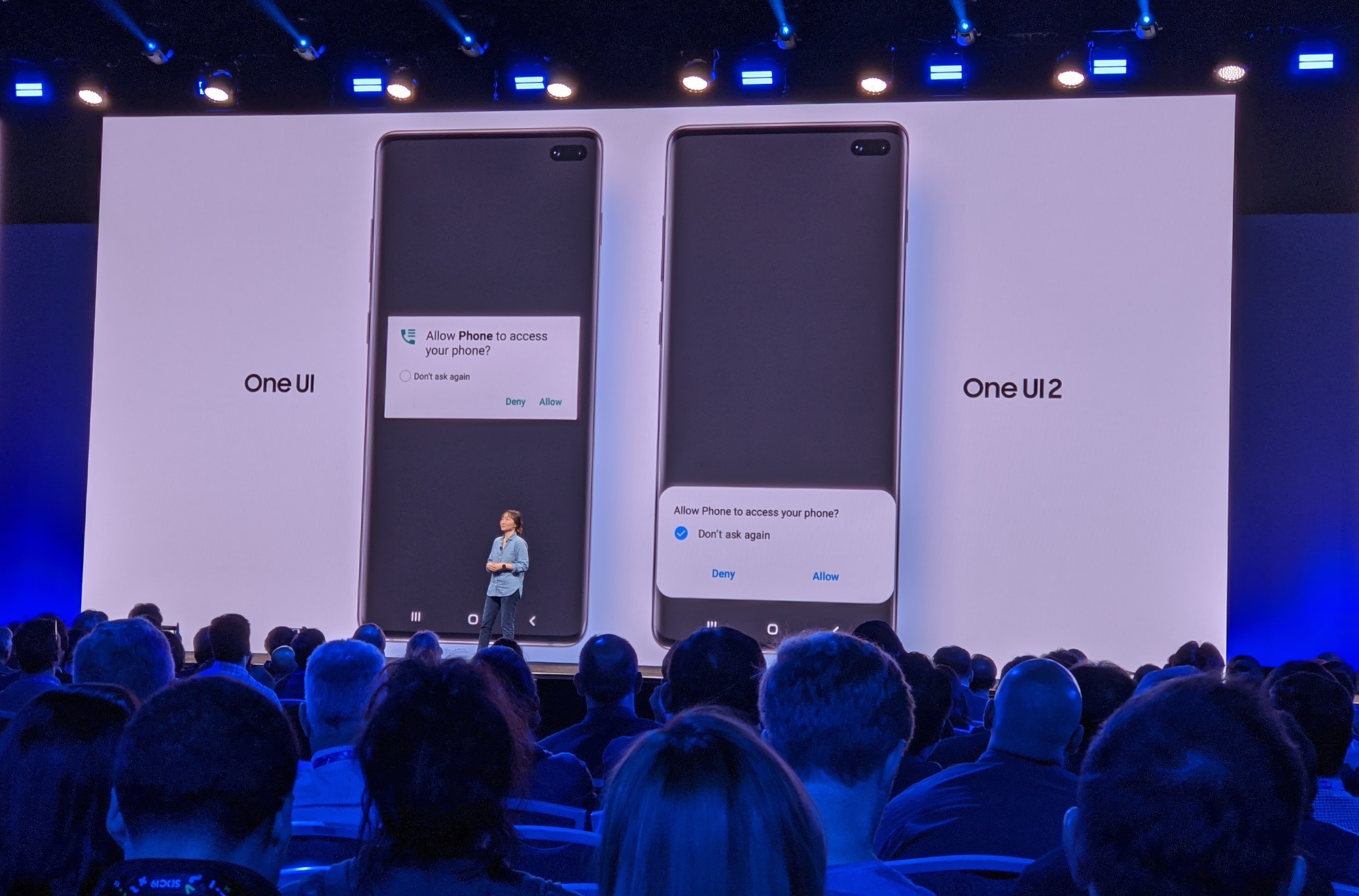
The One UI 2 interface isn't that big a departure from what Samsung unveiled a year ago, with its emphasis on less clutter and ease of use. One UI 2 looks like it's continuing that effort, with an emphasis on more natural interactions and fewer visual distractions.
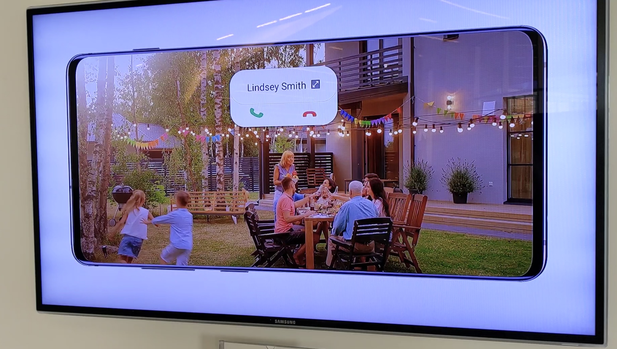
It's that latter feature that could be the most welcome change in One UI 2. Now when you get a notification when watching a video or engaging in some other full-screen activity, that notification won't take up a large chunk of your phone's display. Instead, in an on-stage demo during Samsung's developer conference today (Oct. 29), executive Sally Hyesoon Jeong showed a slender notification of an incoming phone call listing just the caller's name and answer/decline buttons occupying just a faction of a phone screen showing a video.

One UI 2 also shrinks the size of the volume slider when you adjust the volume on your phone, so that it's not distracting you during videos or games. Apple made a similar move with the volume indicator in this fall's iOS 13 update, and it's a welcome reduction of on-screen clutter.
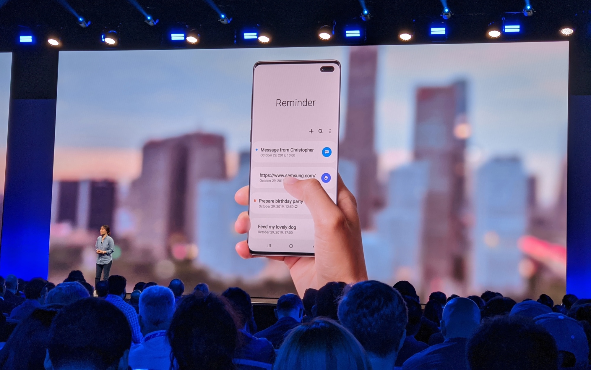
As before, the One UI interface splits the screen in two with the top half intended as a viewing area, and the bottom half designed for interactions. Samsung says it's putting more information in that viewing area. The Messages app, for example, now lists how many unread messages you have the viewing area — a way of making more use of that space without adding to the clutter that One UI is trying to reduce.

One UI introduced a dark mode last year, before Android 10 made it a system-wide feature. This year's version of One UI will extend dark mode to the lock screen and home screen, dimming those when you've got dark mode enabled.
Sign up to get the BEST of Tom's Guide direct to your inbox.
Get instant access to breaking news, the hottest reviews, great deals and helpful tips.
If you use a photo as your phone's wallpaper, One UI will now adjust the time and date info that appears on the lock screen so that it remains readable regardless of the contrast in your image. Should that text fall on a lighter part of your photo, One UI 2 will darken it automatically.
The rounded icons introduced in the original One UI proved divisive, and people who didn't take them last year are unlikely to be swayed by One UI 2's look. The rounded icons are back, only Samsung has chosen more vivid colors, with the intent of making them easier to spot. Some icons will be animated, too, which sounds a bit gimmicky in theory, but a demo showing how the gear in the Settings icon will rotate to show you that an update is being downloaded illustrates how this feature could provide useful visual cues.
Samsung promises a unified experiences across devices, which is why it's bringing One UI to tablets and smartwatches in addition to its smartphones. However, we'd need some more hands-on time with those kinds of devices to get a feel for how One UI will work on those different-sized screens. Presumably, OneUI 2 will also make it to foldable devices like the Galaxy Fold, especially with Samsung promising new form factors like the foldable clamshell device teased during Samsung's developer conference.
Another One UI 2 features being touted by Samsung during demos at its developer conference include an Amplify Ambient Sound feature that amplifies the sound around you; to use it, you connect headphones to your Samsung device and tap an Accessibility button at the bottom of the screen.
One UI 2 is built on Android 10, which came out in September. Samsung launched a beta program this month for its new interface, first for select Galaxy S10 devices and later extending it to the Note 10. Jeong said the company is already getting good feedback from early beta testers.
One UI 2 will be ready in the "next few months," Jeong said. If last year's experience in any indication, that means the new interface — and Android 10 update — will start rolling out to existing Galaxy flagship phones in early 2020. We'd also expect the Galaxy S11 — or whatever Samsung calls its next flagship phone — to ship with the new interface in the spring.
Philip Michaels is a Managing Editor at Tom's Guide. He's been covering personal technology since 1999 and was in the building when Steve Jobs showed off the iPhone for the first time. He's been evaluating smartphones since that first iPhone debuted in 2007, and he's been following phone carriers and smartphone plans since 2015. He has strong opinions about Apple, the Oakland Athletics, old movies and proper butchery techniques. Follow him at @PhilipMichaels.

