Tom's Guide Verdict
The Galaxy Z Flip 4 has a lot of refinements, such as a slimmer, lighter hinge and flatter edges. The new Snapdragon 8 Plus Gen 1 processor ensures that the Flip 4 shines in every task. Battery life is much better. The cameras are good, especially the night mode, but not quite $999 level.
Pros
- +
Much better battery life
- +
More durable than last year
- +
Same $999 price
- +
Great performance
Cons
- -
Minimal camera upgrades
- -
Display crease still prominent
Why you can trust Tom's Guide
Starting price: $999/£999
Software: Android 12, with OneUI 4.1
Inner display: 6.7-inch FHD AMOLED (2640 x 1080)
Outer display: 1.9-inch AMOLED (260 x 512)
Refresh rate: 1-120Hz (inner only)
CPU: Snapdragon 8 Plus Gen 1
RAM: 8GB
Storage: 128GB, 256GB, 512GB
Outer cameras: 12MP main (f/1.8), 12MP ultrawide (f/2.2)
Inner camera: 10MP selfie (f/2.4)
Battery: 3,700 mAh
Battery life: 8:33 (Adaptive), 8:57 (60Hz)
Charging: 25W wired, 5W wireless
Dust/water resistance: IPX8
Size (folded): 2.8 x 3.3 x 0.62 - 0.67 inches (71.9 x 84.9 x 15.9 - 17.1 mm)
Size (unfolded): 2.8 x 6.5 x 0.27 inches (71.9 x 165.2 x 6.9mm)
Weight: 6.5 ounces (187 grams)
Colors: Bora Purple, Graphite, Pink Gold, Blue
The Samsung Galaxy Z Flip 4 focuses less on innovation and more on modernized refinement. It sports slimmer bezels and flatter edges to make for a more premium-feeling device. Even with that, it’s still a fun little phone. Samsung is really leaning into the young crowd with the content creation features and general vibe of the handset, leaving the “mature” and “professional” look for the Galaxy Z Fold 4.
But I could say the same for the Galaxy Z Flip 3. It was also a fun phone, but with heaps of improvements over its predecessor including a radical redesign. So what makes the Galaxy Z Flip 4 stand out? To be perfectly honest, not all that much. But hold your horses, because that's not really a bad thing.
Samsung boosted the cameras a little by using a brighter main sensor for better low-light photos. But the ultrawide camera remains the same and the Galaxy Z Flip 4’s cameras perform practically the same as the Galaxy Z Flip 3’s — that is to say, not on the level of what you would expect from a $999 phone. The night mode, however, is excellent.
As you’ll see in this Galaxy Z Flip 4 review, I find myself rather ambivalent about this phone. It’s not the upgrade I wanted to see over last year, but it’s certainly a notable one, especially when it comes to battery life.
Also, check out our Galaxy Z Flip 4 vs Galaxy S22 comparison to see which Samsung flagship is right for you.
Samsung Galaxy Z Flip 4 review: Price and availability
You can now buy the Galaxy Z Flip 4 from Samsung or other retailers and carriers as of August 26. The Galaxy Z Flip 4 starts at $999/£999/AU$1,499 with 128GB of storage and 8GB of RAM, the same as last year for U.S. customers, but a touch more for U.K. buyers. You can pay extra for a 256GB model ($1,059/£1,059/AU$1,499) or the new 512GB model ($1,179/£1,199/AU$1,849) if you want some more storage room, but that's the only difference. We may be able to knock that price down for you a little with one of our Samsung promo codes.
Samsung Galaxy Z Flip 4 review: Design
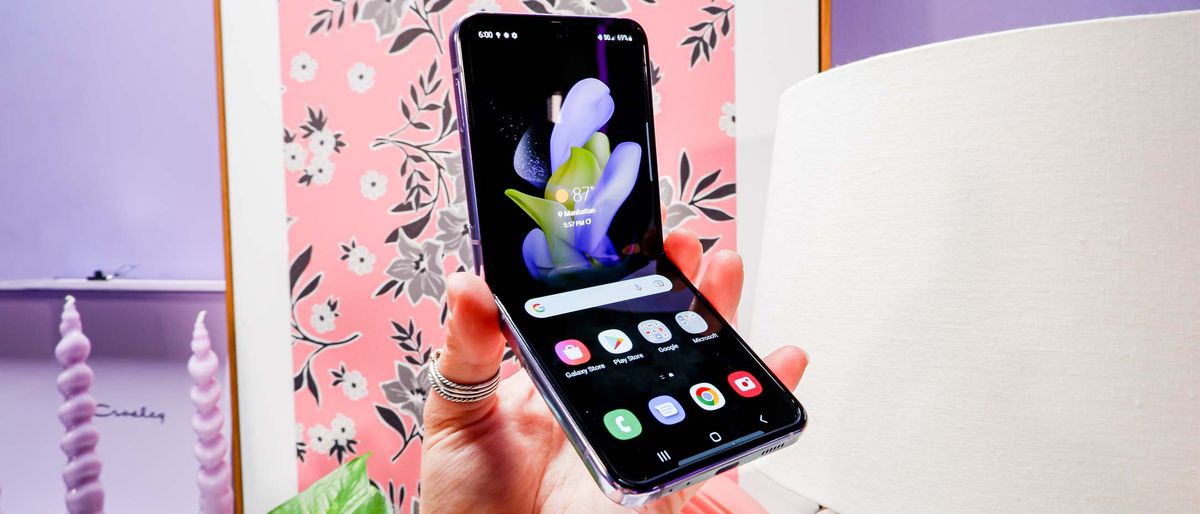
From the outside, the Galaxy Z Flip 4 hardly looks any different. If you love the clamshell foldable design, you’ll probably be OK with this. The phone fits perfectly in my pocket without sticking out like the best big phones do.
The Galaxy Z Flip 3 had some pretty large bezels, so the Galaxy Z Flip 4 looks a lot cleaner and more modern.
Like last year, Samsung has provided a diverse slate of color options for the Galaxy Z Flip 4. There’s the Graphite option if you want something sensible, but you could opt for the more lively Blue, Pink Gold or Bora Purple options.
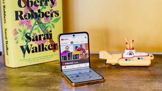
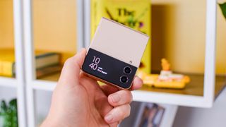
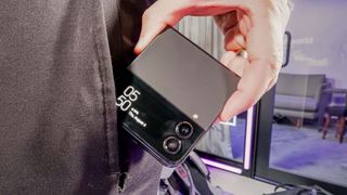
If you look a little further, however, you’ll notice that the Galaxy Z Flip 4 has flatter edges this year. They’re glossy unfortunately, and thus slippery, but they still manage to add some nice grip to an already ergonomic phone. The camera module sticks out a bit more on this model, possibly because of the new main 12MP sensor.
Samsung touted the slimmer and lighter hinge, though the Galaxy Z Flip 4 still has a very noticeable hinge gap when the phone is closed — this is the gap between the two displays at the hinge when folded. I had hoped for a gapless design like the Oppo Find N, as rumors suggested, but it seems Samsung wanted to focus more on the hinge weight and bulk rather than the gap.
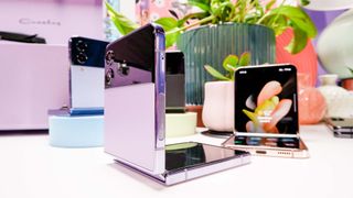
The 1.9-inch cover display remains, offering you useful information and access to things such as Samsung Wallet or SmartThings. Opening the phone, I immediately noticed the slimmer bezels. The Galaxy Z Flip 3 had some pretty large ones, so the Galaxy Z Flip 4 looks a lot cleaner and more modern.
The side-mounted power button also doubles as the fingerprint sensor like last year, and I continue to find its placement awkward and unnaturally high. Don’t get me started on the volume rocker, which is near the top of the upper half’s right side. The fingerprint sensor itself is very quick once you place your finger properly.
The Galaxy Z Flip 4 didn’t revolutionize the design like the Galaxy Z Flip 3 did. This generation very obviously focuses on small improvements.
Samsung Galaxy Z Flip 4 review: Displays
On the inside, the Galaxy Z Flip 4 sports a 6.7-inch Super AMOLED display with a 1080p resolution and an adaptive 1-120Hz refresh rate. Out of the box, it’s deeply saturated in the characteristic Samsung way — gotta show off the AMOLED’s color capabilities. The cover screen measures 1.9 inches and it’s also a Super AMOLED. This is great for if you have a photo for your wallpaper on that little panel.
| Row 0 - Cell 0 | Galaxy Z Flip 4 | Galaxy S22 Plus | iPhone 13 Pro |
| Display size | Inner: 6.7 inches; Cover: 1.9 inches | 6.6 inches | 6.1 inches |
| sRGB (%) | 188 (Vivid) / 110 (Natural) | 212 (Natural) / 128 (Natural) | 117 |
| DCI-P3 (%) | 132 (Vivid) / 78 (Natural) | 150 (Vivid) / 91 (Natural) | 83 |
| Delta-E | 0.36 (Natural) / 0.24 (Natural) | 0.35 (Vivid) / 0.23 (Natural) | 0.27 |
| Peak brightness (nits) | 772 | 1150 | 1024 |
The Galaxy Z Flip 4 falls behind both the Galaxy S22 Plus and iPhone 13 Pro in terms of brightness. While 772 nits is very good and certainly legible outdoors, it's hard to unsee the bright S22 Plus and iPhone displays once you get used to them. But the Flip 4 turned in great results with our color benchmarks, even proving more color accurate than the iPhone 13 Pro. (The Delta-E score measures color accuracy, where 0 is perfect.)
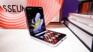
Watching the trailer for Blade Runner 2049, for example, was a wonderful experience with the neons and harsh orange tones. Even the trailer for The Rings of Power looked good on this screen, even if the show itself does not.
The display crease, or the joint where the two displays meet, remains with the Galaxy Z Flip 4. Unfortunately, it also remains rather prominent. You can see it in most circumstances and feel it every time you slide your finger over it. I had hoped that Samsung would have figured out a way to address this with the Flip 4, but that doesn’t seem to be the case. I don’t like it any more than I did with the Galaxy Z Flip 3.
Samsung Galaxy Z Flip 4 review: Cameras
With a 12MP main sensor that Samsung says is 65% brighter, the Galaxy Z Flip 4 made marginal upgrades over the Galaxy Z Flip 3. The 12MP ultrawide camera is the same, as is the 10MP internal selfie cam. And from my testing, the software doesn’t seem to have changed much, either. But the night mode definitely has.
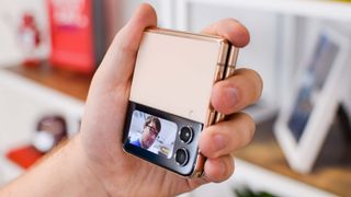
Since the Galaxy Z Flip 4 costs $999, I brought out the similarly-priced iPhone 13 Pro Max for the following photo comparisons. The Pro Max might be $100 more than the Galaxy Z Flip 4, but the $999 iPhone 13 Pro has the same cameras.
Starting off with this playground set outside, the Galaxy Z Flip 4’s image is noticeably brighter and more saturated than the iPhone 13 Pro Max’s. The latter has a more subdued color profile and better exposure control compared to the Flip 4.
The colors of the slide and trees beyond are a lot more accurate than in the Flip 4’s shot. You can see hints of the Flip approaching overexposure in the brightness of the treeline near the sky. Overall, I think the Flip 4 has a good picture, but I prefer the iPhone’s more realistic look.
Staying outside, here’s a bowl of fruit to test the Galaxy Z Flip 4’s color reproduction. As you can see, the fruits are very vibrant, but also too fantastical. This is Samsung’s calling card, or at least it was before the Galaxy S22. I’m not thrilled to see the company’s old oversaturated ways stick around. The photo looks unnatural.
Look at the iPhone 13 Pro Max’s image. The colors are still bright and inviting, but they don’t sear my eyes. It’s also a cooler image, whereas the Flip made my pergola table a bit yellow. I much prefer the iPhone’s shot because it’s got far truer-to-life color accuracy, stronger exposure control, and better white balance.
Heading inside, I took this photo of some brightly colored books. The Galaxy Z Flip 4’s saturation and exposure issue stands out immediately. Some of the book spines look blown out since the phone appeared to try to over-brighten the image. The pinks don’t look good while the reds are too bright.
Contrast this with the iPhone 13 Pro Max’s shot. With much better control of colors and exposure, the iPhone produced an inviting picture that better shows off the books, even the shiny ones. I only had trouble reading a couple of the titles, whereas the Flip 4 had more that I had issues making out. I think the iPhone did a better job here. The Flip 4 seemed to over-correct for the indoor lighting.
Moving over to my kitchen with the same bowl of fruit as before, it’s a slightly better story than outside. The Galaxy Z Flip 4 reined in its oversaturation a tad, but this time lost some of the sharpness in its focus. Some of the fruit, like the lemon, look fuzzy as if they lost some texture. White balance, however, seems fine.
With the iPhone 13 Pro Max, the image has more accurate colors, but I’m not a fan of the warmer tones. But the focus is sharp, adding rich details to the fruits and the basket in which they lie. I don’t think there’s a clear winner in this one.
I tested the Galaxy Z Flip 4’s ultrawide lens with the scene of this pond behind my house. Here we see Samsung’s fantastical look worse than anything from the main camera. Not only are the trees way too green, but I can see the signs of too much warmth — the white balance seems off. Granted, the Flip 4 produced some nice detail in the leaves and I like the sense of depth, but I do not like the yellow-green color profile.
Looking at the iPhone 13 Pro Max’s ultrawide image makes the above observations more obvious. The colors look much more natural and the white balance is in check. However, where the iPhone falls behind the Flip 4 lies in the sky. See how the iPhone’s picture looks too bright right above the trees? You can hardly make out the clouds. Not so in the Flip 4’s.
I have to call a draw on this one. The iPhone loses points for the overexposed sky, but the Flip 4 falters on its colors and white balance.
The portraits from both phones look remarkably similar. The Galaxy Z Flip 4 applied a nice bokeh effect and has good lighting. However, I think it applied too much face smoothing, reducing my natural ruddiness. My eyes are also a bit too dark.
The iPhone 13 Pro Max also has a nice bokeh effect and great lighting. It better captures my likeness and facial complexion, as well as making my eyes brighter and lighter, much like they are in real life. Both images look great, but I give the nod to the iPhone since it ranks higher in accuracy.
I was initially skeptical about the Galaxy Z Flip 4’s nighttime performance, but my testing proved me wrong. The Flip 4 did a great job with the bowl of fruit outdoors at night. The sun had set with only a set of dim deck lights above for lighting. Colors look excellent, focus is sharp, and I like all of the detail. In fact, I like this image of the fruit better than the indoors one from earlier.
But the iPhone 13 Pro Max also put up a good fight. Its effort looks just as good as the Flip 4’s shot. The fruit looks bright and vibrant with great focus and depth. I can’t pick a winner here. The Flip 4 really knocked my socks off, though.
I tried another low-light photo inside in the wee hours of the morning before sunrise. This purple pumpkin centerpiece looks great in both photos, and it’s like there’s full daylight in the room. The Galaxy Z Flip 4 brightened the pumpkin’s purple, whereas the iPhone 13 Pro Max took a much more subdued approach.
I tested both phones with three seconds of exposure. I think the Flip 4 wins here. The pumpkin is much more visible than in the iPhone’s photo, and its purple looks much more pleasant. This might be a time where Samsung boosting the saturation works out.
I’m picky about selfies, and I don’t think the Galaxy Z Flip 4 produced a good one with its 10MP sensor. I see way too much face smoothing, artificially scrubbing out my complexion. The warm tones give my skin a yellow tinge. The only thing I like is that the Flip 4 played up the red in my beard.
The iPhone 13 Pro Max leans into my ruddiness, but darkened my hair more than I’d like. I’m naturally dark blond, but my hair looks brown in the iPhone’s selfie. But I do like that you can see some of the white hairs in my beard. At the end of the day, I’d rather post the iPhone’s picture than the Flip 4’s.

Since the Galaxy Z Flip 4 folds in half, you can use the rear cameras to take selfies. So here’s an example of that. This is a selfie I’d post, even before the iPhone 13 Pro Max’s. I look properly blond and ruddy with my reddish beard. The colors in the background also look great, especially the ominous storm clouds off in the distance.
Samsung Galaxy Z Flip 4 review: Performance
A new year equals a new chipset. Samsung went with the latest silicon from Qualcomm, the Snapdragon 8 Plus Gen 1, to power the Galaxy Z Flip 4 along with 8GB of RAM. We’ve tested this chip previously in phones like the Asus Zenfone 9 and found it to be a powerful option. While its CPU functions don’t serve as that much of an upgrade over the Snapdragon 8 Gen 1 (which the Galaxy S22 uses), the GPU saw some improvements, especially over the Snapdragon 888 in the Galaxy Z Flip 3.
| Row 0 - Cell 0 | Galaxy Z Flip 4 | Galaxy S22 Plus | iPhone 13 Pro |
| CPU | Snapdragon 8 Plus Gen 1 | Snapdragon 8 Gen 1 | A15 Bionic |
| Geekbench 5 (single-core / multicore) | 1291 / 4015 | 1214 / 3361 | 1733 / 4718 |
| 3DMark Wild Life Unlimited (FPS) | 67 | 60 | 70 |
| 3DMark Wild Life Extreme Unlimited (FPS) | 16 | 15 | 17 |
| Adobe Premiere Rush (Mins:Secs) | 0:44 | 0:44 | 0:26 |
As you can see, the Snapdragon 8 Plus Gen 1 is a noticeable improvement over the Snapdragon 8 Gen 1, like the one found in the Galaxy S22 Plus. Single-core performance is about the same, but the gap widens in multicore. But the Galaxy Z Flip 4 is still a long ways from the CPU performance beast that is the iPhone 13 Pro's A15 Bionic.

The Galaxy Z Flip 4 flies through every task, even intense games like Genshin Impact. 8GB of RAM seems low nowadays when we have gaming phones with 16GB or 18GB, but I found it more than sufficient in my use. The Adobe Premiere Rush 4K-1080p transcode test also shows some slight improvement for the Flip 4 over the Galaxy S22 Plus. Apple still has quite a lead, though.
All of this to say, the Galaxy Z Flip 4 is one powerful little phone. It can handle any task with ease, even intense gaming. You won't want for horsepower here.
Samsung Galaxy Z Flip 4 review: Battery life and charging
Samsung listened to criticisms about the Galaxy Z Flip 3’s battery life, which underwhelmed me in the best of circumstances. In the Tom’s Guide battery life test, the Flip 3 went for just 5 hours and 43 minutes in its default adaptive refresh rate mode. That’s by far one of the worst results I’ve seen in a long time.
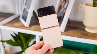
The Galaxy Z Flip 4 got a battery capacity bump from 3,300 mAh to 3,700 mAh. That extra 400 mAh doesn’t seem like much to be frank, but it certainly made a difference.
Here's how the Galaxy Z Flip 4 fared in our battery life test.
| Row 0 - Cell 0 | Galaxy Z Flip 4 | Galaxy S22 Plus | iPhone 13 Pro |
| Battery size | 3,700 mAh | 4,500 mAh | 3,095 mAh (estimated) |
| Battery life (Hrs:Mins) | 8:33 (Adaptive), 8:57 (60Hz) | 9:27 (Adaptive) / 10:26 (60Hz) | 12:18 |
| Charging | 25W | 25W | 20W |
| Recharge percentage (15 mins) | 28 | 37 | 25 |
| Recharge percentage (30 mins) | 54 | 70 | 53 |
Samsung vastly improved the battery life and bumped the charging to 25W (still no included charger), with the Galaxy Z Flip 4 going almost three hours longer in our testing. While it's still below the 10-hour average we like to see, I have to applaud the Flip 4's longevity upgrade. It still dropped noticeable percentage points when out photographing and gaming, but I find it hard to complain whereas I was sorely disappointed last year.
In my Galaxy Z Flip 3 review, I told you to keep a charger or battery pack nearby if you purchased one. Now that advice isn't needed as much. I call that a victory.
Samsung Galaxy Z Flip 4 review: Software and special features
The Galaxy Z Flip 4 ships with OneUI 4.1 over top of Android 12. For the most part, it’s similar to what you get on the Galaxy S22, but that’s not the whole story. The Flip 4 gets access to several features specific to it. The highlight of these is Flex Mode, which takes full advantage of the folding displays.
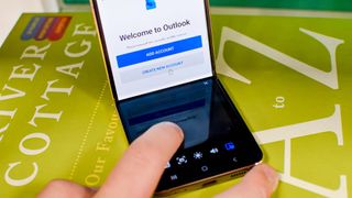
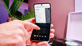
Flex Mode engages when you partially fold the Galaxy Z Flip 4, such as at a 45- or 90-degree angle. Your current app will split, putting the main functionality on the upper half and additional options on the bottom. There’s even a new trackpad feature, helping you navigate apps faster and easier.
Last year, the best examples of this were the Camera and YouTube apps. In the former, you could get all of the shutter controls and options on the bottom half of the phone while the top operated as the viewfinder. With YouTube, you could watch a video on the upper half and browse comments or suggested videos on the bottom much more efficiently than a standard smartphone.
Samsung has set its sights on the creative crowd, with the Galaxy Z Flip 4’s Flex Mode offering many options for things like Instagram Reels, TikToks, videos and vlogs, and more.
However, Samsung has set its sights on the creative crowd, with the Galaxy Z Flip 4’s Flex Mode offering many options for things like Instagram Reels, TikToks, videos and vlogs, and more. While most of this is lost on me, I think all of it might convince more people to try the Galaxy Z Flip 4 for themselves.
OneUI 4.1 is a heavily-modified version of Android, far from Google’s vision. It has a lot of features, such as themes and a smorgasbord of options. The Galaxy Z Flip 4 also has additional options for the cover screen, which has gotten a lot more useful this year. Not only does it show basic info like the Galaxy Z Flip 3 did — such as notifications, battery percentage, weather, and the camera viewfinder — but you can also add more widgets and set a custom background (photo or GIF).
I liked having the calendar widget, too, which let me see my meetings and assignments for the day right from the cover screen. I imagine the music controls would also be handy, though I didn’t have a chance to listen to any tunes during my limited time with the Galaxy Z Flip 4. If you’re a SmartThings user, there’s also a new widget for home controls.
The Galaxy Z Flip 4 lets you reorder the cover screen widgets and choose from many clock faces, showing that Samsung wants you to make the Galaxy Z Flip 4 unique to you. This plays into the beauty of Android’s customization strengths, although if you want even more features there's always CoverScreen OS.
Finally, the Galaxy Z Flip 4 enjoys Samsung’s top-tier update policy. That means the Flip 4 will see four years of platform updates (Android 16) and five years of security patches (2027). That means the Galaxy Z Flip 4 will go for longer before you need to upgrade — at least software-wise — which plays into Samsung’s admirable environmentally conscious initiatives.
When it comes to recommending the best Android phones for longevity, Samsung, with its excellent update policy, is one of my default choices. And with One UI 5 (Android 13) right around the corner, the Galaxy Z FLip 4 is about to get even better.
Samsung Galaxy Z Flip 4 review: Verdict
The Galaxy Z Flip 4, much like the Galaxy Z Fold 4, doesn’t have a huge suite of changes. This year, Samsung focused on incremental improvements, such as the new hinge design and slightly larger battery. The flatter edges clean up the look, and the new chipset makes this one powerful little phone.
I would certainly say the Galaxy Z Flip 4 is much better this year. I'm thrilled about the battery life and the performance is stellar. But for $999, it seems to have some drawbacks. The cameras, for example, do not live up to other similarly-priced handsets, at least in my testing.
Don’t get me wrong, the Galaxy Z Flip 4 is a fun device, but I noticed that the Galaxy Z Flip 3’s novelty wore off pretty quickly last year. I’m concerned the same will hold true this time around — and in the months since the release, it definitely has for me.

Jordan is the Phones Editor for Tom's Guide, covering all things phone-related. He's written about phones for over six years and plans to continue for a long while to come. He loves nothing more than relaxing in his home with a book, game, or his latest personal writing project. Jordan likes finding new things to dive into, from books and games to new mechanical keyboard switches and fun keycap sets. Outside of work, you can find him poring over open-source software and his studies.
- Richard PridayAssistant Phones Editor
-
Hebekiah I work construction and was wondering about it because it seems durable and IPX8 and easier to fit in whatever pocket I have available. Regular phones fall out too easily and since I'm often in awkward physical positions and tight places while checking a picture or diagram on it a dedicated pocket or holder isn't always useful.Reply
So, is this a good choice for that? -
stochasticprocessor Are there any cases or covers from any manufacturer which cover and block all the lenses from seeing anything? I.e., a "hardware" failsafe against a hacker remotely taking pictures?Reply -
COLGeek Reply
Depends on the phone, I suppose. There is always tape.stochasticprocessor said:Are there any cases or covers from any manufacturer which cover and block all the lenses from seeing anything? I.e., a "hardware" failsafe against a hacker remotely taking pictures? -
COLGeek Reply
Like this?stochasticprocessor said:Z Flip4.
https://www.amazon.com/Magnetic-Kickstand-Military-Protective-Shockproof/dp/B0B6ZSJ58C?th=1 -
stochasticprocessor Yes, thanks for the link. That';s the sort of thing ... maybe. Searching on Amazon forReply
slide camera cover z flip 4
brings up several others.
Do you know whether any of these cover the front camera lens? That''s the most crucial lens to block, and might also be the most difficult. For iPhone, Spy Fy which only does iPhones) is the only case/cover manufacturer I know of which covers front lens as well as rear.
I've heard warnings against applying tape on camera lenses due to possible overheating or something. I don't know how valid those concerns are, and have not heard specifically with regard to this phone. -
COLGeek The front camera should be secure when the phone is in the closed position. Otherwise (when open), I don't know of a case that will cover that one. Given time and demand, I suspect someone will come up with such a thing.Reply
If security is such a concern, phones should not allowed in sensitive areas anyway. -
COLGeek Reply
No, I understand. Just don't see a solution yet in a case. A thumb or some temporary cover would suffice. Same for nearly any smartphone for that matter.stochasticprocessor said:To clarify, need to cover the front lens when phone is open.
