Samsung Galaxy Note 20 design makes the Galaxy S20 look boring
This Galaxy Note 20 design takes the S20’s looks and makes it even better

The Galaxy Note 20 is where Samsung fans are now focussing their attention, since the Galaxy S20 series has now launched and is on sale. After seeing such a significant step-up in tech and design between the two generations of its standard flagship, everyone’s curious to see how the other big Samsung phone will look.
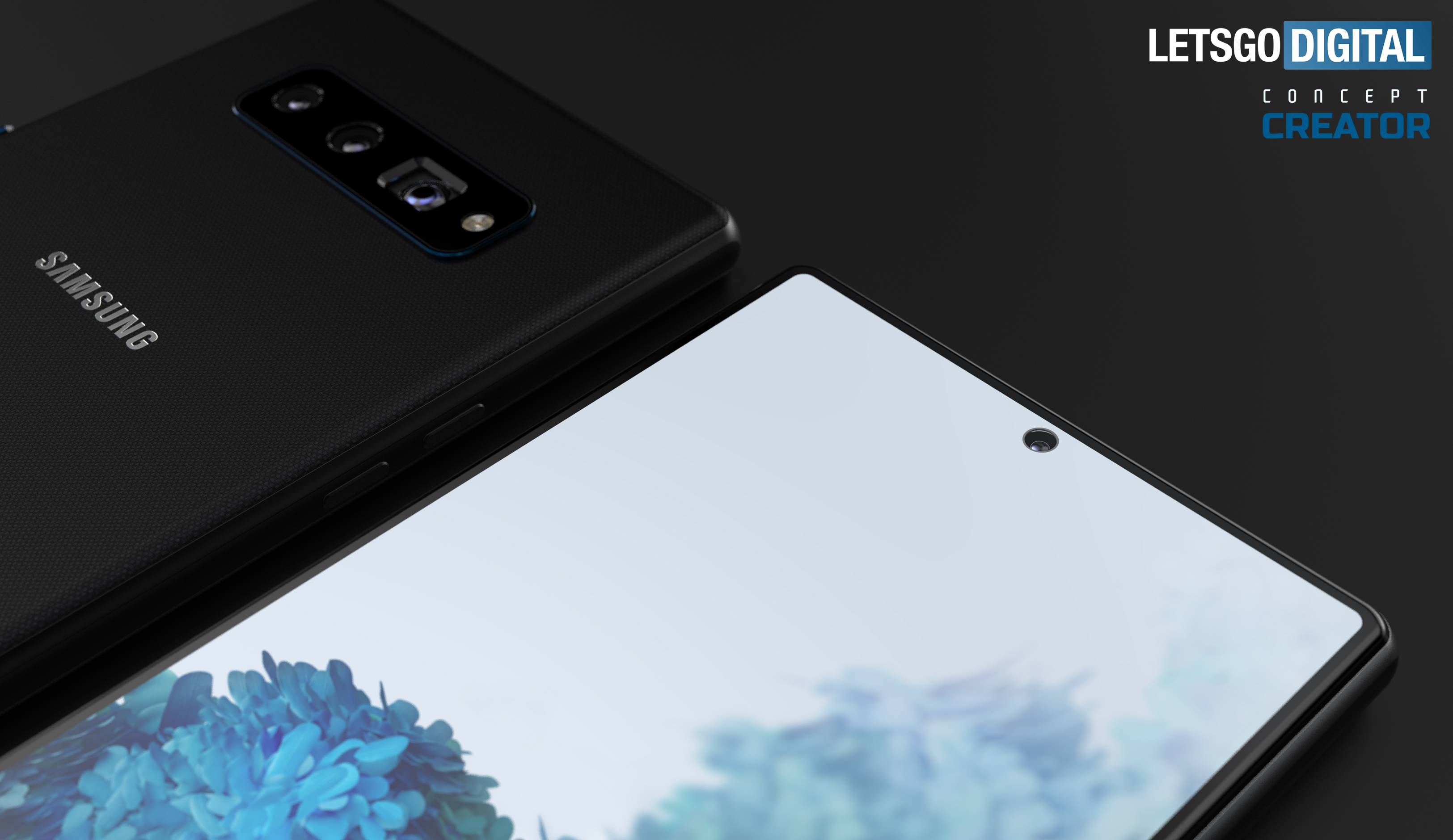
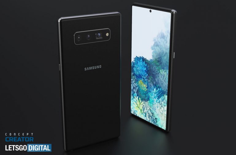
A design made by Jermaine Smit, a.k.a. Concept Creator and posted by LetsGoDigital has shown us what Samsung’s next stylus-wielding phablet could look like. It’s certainly handsome, but one or two details have us confused.
- Galaxy Note 20: Release date, specs, price and more
- Lego Super Mario could be the coolest toys-to-life game yet
- Plus: Samsung will sanitize your Galaxy S20 — or any other phone — to fight off coronavirus

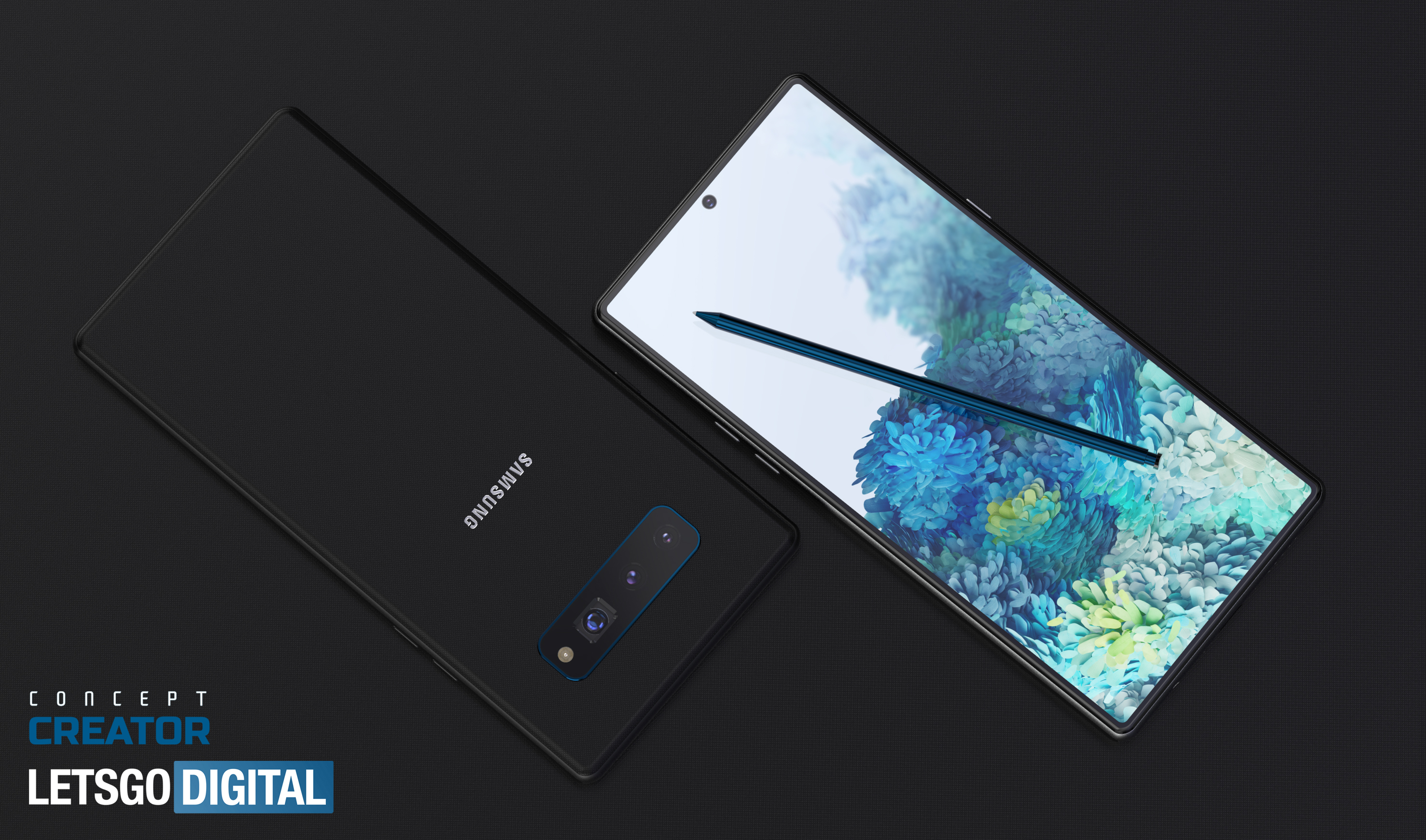
The front of this Galaxy Note 20 design is very similar to that of the Galaxy S20 series, except the rounded corners are replaced with sharper right-angles, which helps the phone look a lot smarter and more mature. Gone are the curved edges, but we’ve once again got an Infinity-O (aka punch-hole) display. We’re hoping that Samsung will give the Note 20 series a 120Hz refresh rate like the S20 series, since it’s one of the phone’s best features, except this time with the ability to use it at the full QHD resolution by default.
We’re also expecting a size increase, since the smallest Galaxy S20 is now 6.2 inches, and the largest Galaxy S20 Ultra is 6.9 inches, the 6.3-inch and 6.8-inch versions of the Note 10 and Galaxy Note 10 Plus don’t really feel that big any more.
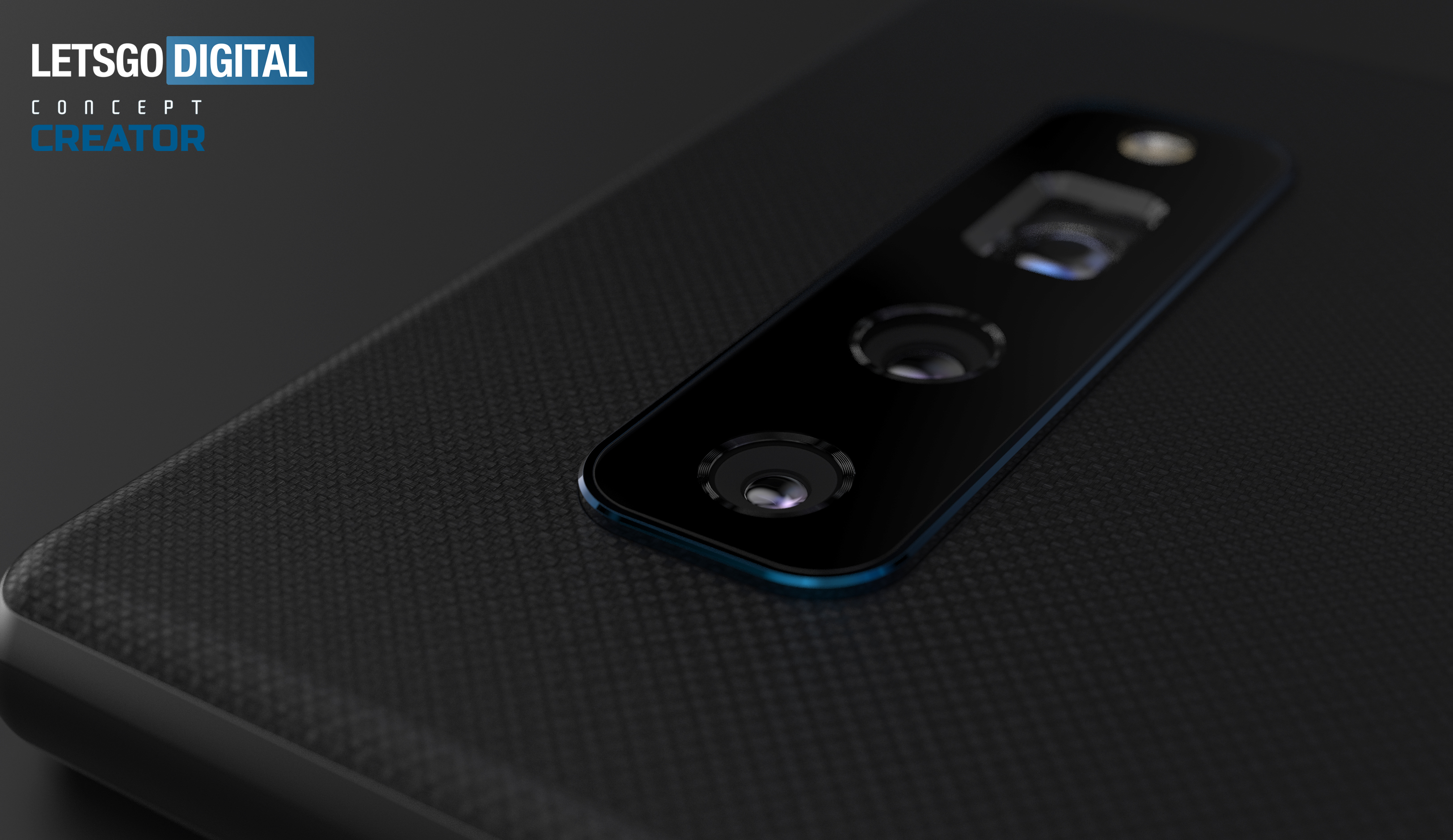
Strangely, this concept puts the cameras in a horizontal row in the upper-center of the phone’s back. It looks more like last year’s Galaxy S10 than either the Note 10 or the S20. It would be quite odd if Samsung decided to go back to this design for real, particularly if it wants to fit in the large periscope zoom cameras from the Galaxy S20 Ultra. However, its more symmetrical look does make this concept look a lot better balanced from the back than any version of the S20.

Of course, with this being a Galaxy Note series phone, the S-Pen is back. Looking quite skinny in this render, we’re hoping to see more unique abilities added to the stylus. Last year's Note 10, for example, saw the introduction of air gestures. And Ice Universe has leaked that the codename for the Galaxy Note 20 is Project Canvas, which could mean big S Pen upgrades are on the way.
A version of this stylus is also tipped to be included with the Galaxy Fold 2 foldable, making the most of its enormous fold-out display.
Sign up to get the BEST of Tom's Guide direct to your inbox.
Get instant access to breaking news, the hottest reviews, great deals and helpful tips.

This render is only of the standard Note 20, not the larger Note 20 Plus version. We’ve not seen any rumors of an equivalent “Ultra” version like we saw on the S20, but like the S20 the Note 20 series will be available with 4G and 5G.
We’ll find out for sure if this design’s accurate around August, if last year’s Note 10 launch is anything to go by. Samsung could certainly do a lot worse than give us a phone like the one Concept Creator has presented here.

Richard is based in London, covering news, reviews and how-tos for phones, tablets, gaming, and whatever else people need advice on. Following on from his MA in Magazine Journalism at the University of Sheffield, he's also written for WIRED U.K., The Register and Creative Bloq. When not at work, he's likely thinking about how to brew the perfect cup of specialty coffee.
